Course
Data analysts often need to show different types of data on the same chart to compare them and reveal hidden trends and patterns. In this tutorial, we'll explore a special type of chart that is perfect in such cases, called combo charts. We'll explore their features, types, uses, creation, formatting, and strengths and weaknesses.
If you would like to learn or brush up on the basics of Excel before we get started, our comprehensive Introduction to Excel course is a helpful companion.
What Is a Combo Chart?
A combo chart, also known as a combination chart, refers to charts that combine two or more chart types, such as line, bar, or area charts, into a single visual. Most often, a combo chart displays an evolution of different types of data over the same period, which makes this kind of visualization particularly helpful for identifying essential discrepancies, tendencies, trends, and patterns.
Key Features of a Combo Chart
What distinguishes a combo chart? While some of its features may be readily apparent, others are more subtle. Let's delve into its key characteristics.
- Multiple Chart Types in One Visual: The defining feature of a combo chart is the inclusion of more than one (different) chart type within the same visual, such as combining a line chart with a bar chart.
- Multiple Data Series: Combo charts display multiple data series in the chart legend and when interacting with the chart area, similar to stacked bar charts and multi-line charts.
- Secondary Axis: Combo charts often feature a secondary axis for different data series with varying scales, which is also common in multi-line charts.
- Differentiation by Colors and Labels: Data series in combo charts are easily distinguishable by different colors, transparencies, or data labels, a feature shared with other charts like stacked bar and area charts.
To quickly explore Excel's various data visualization options that can help you analyze and interpret your data, feel free to refer to this tutorial: Visualizing Data in Excel.
Why Create a Combo Chart in Excel?
Combo charts offer a lot of advantages and are very helpful for a number of reasons. In this section, we will outline the main reasons in favor of creating combo charts in Excel.
- Comparing Different Data Series: A combo chart allows us to trace the evolution of multiple data series simultaneously. Different chart types in the same visual facilitate effective comparisons, such as a line chart for price changes alongside a bar chart for product sales.
- Highlighting Specific Trends and Patterns: Combo charts help capture major trends and patterns by comparing multiple data series. These insights are more informed and sometimes unique to combo charts, as they cannot be seen in single data type plots.
- Enhancing Data Presentation: Combo charts improve the data-ink ratio, leading to clearer and more effective visualizations by reducing unnecessary elements. They combine multiple chart types into one visual, maximizing information within a single view and utilizing Excel's features to enhance appearance and readability.
- Improving Decision-Making: The comprehensive view provided by combo charts supports well-grounded, data-driven decisions. This aids in planning sound business strategies and offers a broader vision for future market changes.
Popular Chart Combinations
Let's see now what kind of charts we can combine on a combo chart. We'll use a publicly available Kaggle dataset, Lamborghini Sales and Stocks. For now, we are not interested in the real meaning and actual values of the data series. Rather, we are practicing creating different chart-type combinations.
Line chart + bar chart
Combining a line chart with a bar chart is great for showing a trend alongside individual values.
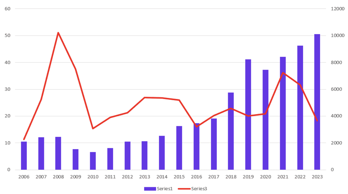
Line and bar chart combo. Image by Author
Multiple line chart + bar chart
Combining multiple line charts with a bar chart is useful for comparing several trends against a backdrop of individual values.
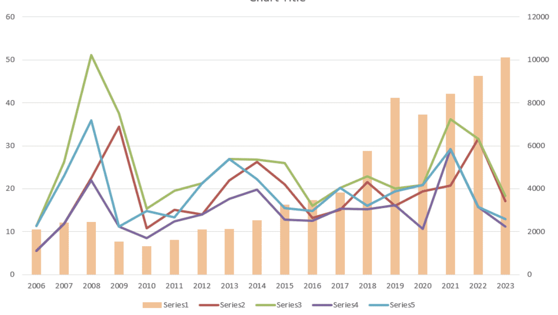
Multiple line and bar chart combo. Image by Author
Area chart + bar chart
Combining an area chart with a bar chart can emphasize the cumulative total and discrete data points.
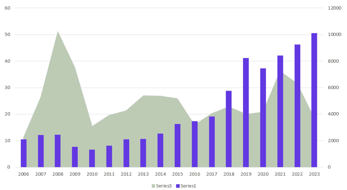 Area and bar chart combo. Image by Author
Stacked area chart + bar chart
Combining a stacked area chart with a bar chart highlights the composition of values while also showing individual bar values.
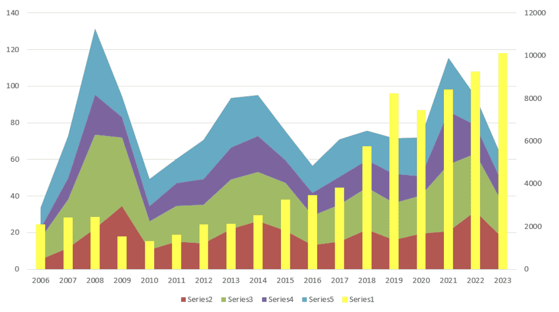
Stacked area and bar chart combo. Image by Author
Line chart + grouped bar chart
Combining a line chart with a grouped bar chart is effective for comparing trends across multiple categories.
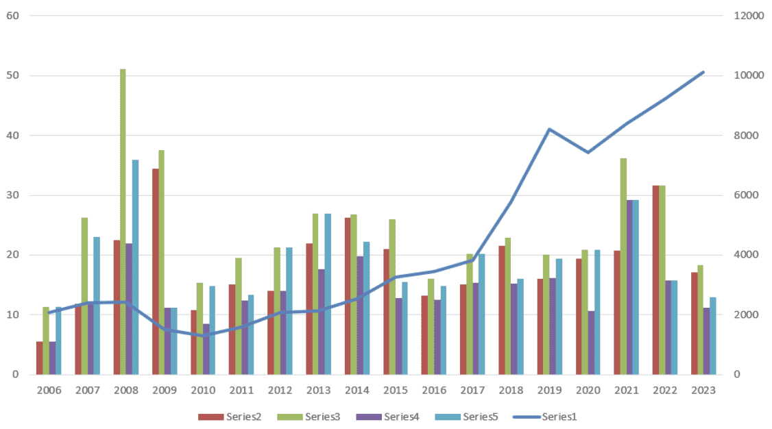
Line and grouped bar chart combo. Image by Author
Line chart + stacked bar chart
Combining a line chart with a stacked bar chart is useful for displaying the trend line while also showing the breakdown of stacked categories.
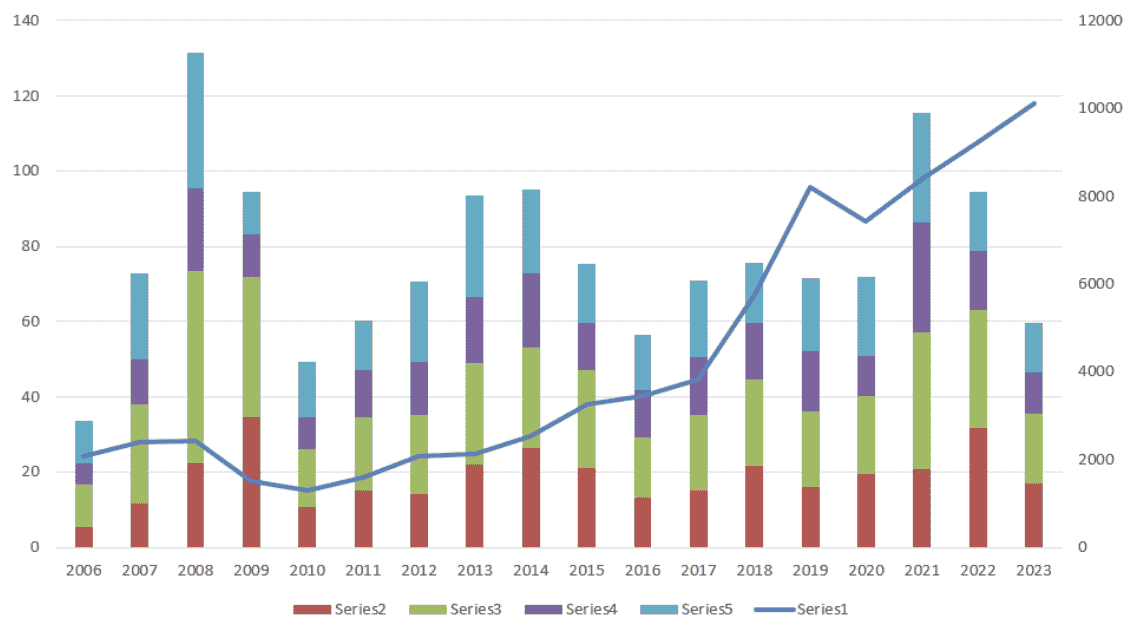
Line and stacked bar chart combo. Image by Author
Line chart + 100% stacked bar chart
Combining a line chart with a 100% stacked bar chart is ideal for showing the trend while emphasizing the proportion of categories that make up the whole.
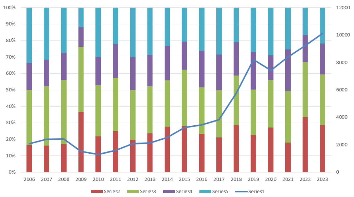
Line and 100% stacked bar chart combo. Image by Author
For a deeper dive into various techniques and nuances of visualizing data in Excel, the Data Visualization in Excel course is a great place to start.
Best use cases table
Using the right chart combination in a combo chart can greatly enhance data interpretation. Here's a heuristic to help you decide which chart combination to use:
| Chart Combination | Best Use Case | Example |
|---|---|---|
| Line and bar chart | Trend (line) with individual values (bars) | Monthly revenue (bars) and growth trend (line) |
| Multiple line and bar chart | Multiple trends (lines) with values (bars) | Product sales trends (lines) with monthly sales (bars) |
| Area and bar chart | Cumulative totals (area) with discrete values (bars) | Cumulative sales (area) and monthly sales (bars) |
| Stacked area and bar chart | Composition (stacked area) with values (bars) | Sales by region (stacked area) and total sales (bars) |
| Line and grouped bar chart | Trends (line) across categories (grouped bars) | Annual revenue (line) by department (grouped bars) |
| Line and stacked bar chart | Trend (line) with category breakdown (stacked bars) | Total revenue (line) by product (stacked bars) |
| Line and 100% stacked bar chart | Trends (line) with proportion (100% stacked bars) | Market share trend (line) by company (100% stacked bars) |
Combo chart best use cases table.
How to Create a Combo Chart in Excel
Creating a combo chart in Excel involves a few simple steps.
Select the data in your Excel worksheet.
Open the Insert tab and go to the Charts group.
Click on the Recommended Charts button.
Open the All Charts tab.
Select the Combo option at the end of the list.
Select a chart type for each data series. You will likely need to select a secondary axis for one of them.
Press OK.
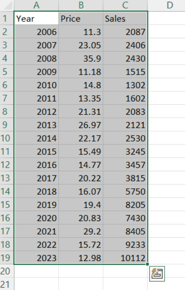
Selecting data. Image by Author

Opening recommended charts. Image by Author
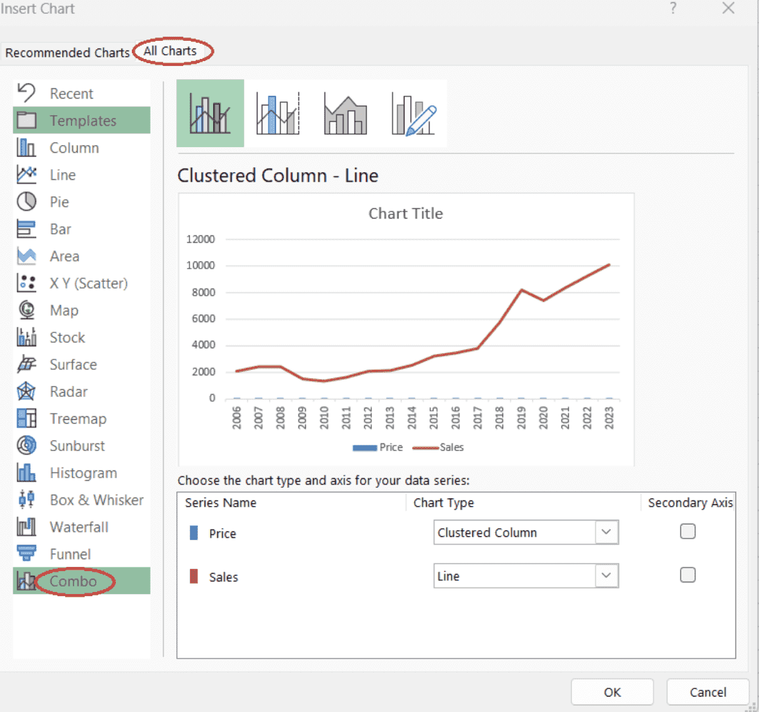
Opening combo chart option. Image by Author
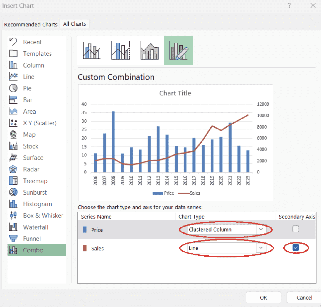
Setting data series for a combo chart. Image by Author
How to Format a Combo Chart in Excel
Once you have created your combo chart, the next step is to customize its elements to enhance clarity and visual appeal. Here's how you can add or remove chart elements to better represent your data:
How to add or remove chart elements
- Select the chart area.
- Press the Chart Elements button.
- Select the chart elements you want to be displayed.
- You can also hover over the name of the chart element until a drop-down appears to refine your choice.
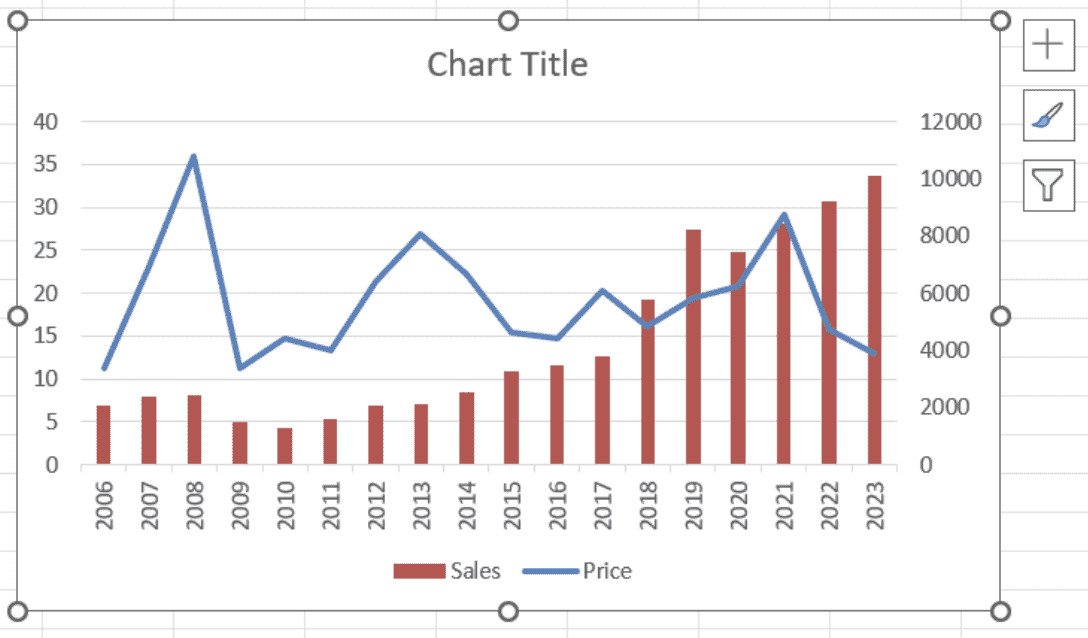
Selecting the chart area in Excel. Image by Author
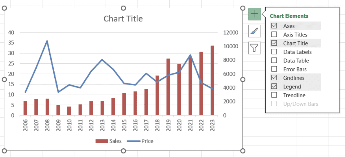 Opening the available chart element options in Excel. Image by Author
How to change chart style and color scheme
- Select the chart area.
- Press the Chart Styles button.
- Select a suitable style for your chart on the Style tab.
- Select a suitable color scheme for your chart on the Color tab:
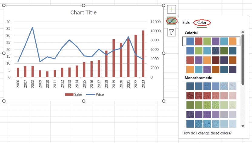 Selecting a color scheme. Image by Author
How to add or remove filters
- Select the chart area.
- Press the Chart Filters button.
- To add a filter, deselect the unwanted series and/or categories on the Values tab and press Apply.
- To modify the filter, introduce the necessary modifications on the Values tab and press Apply.
- To remove the filter, Select All for both series and categories on the Values tab and press Apply:
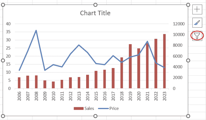 Opening the available chart filter options in Excel. Image by Author
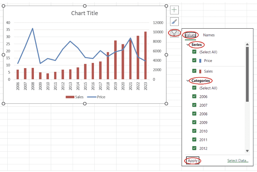 Adding a chart filter for a chart in Excel. Image by Author
Having clean data is a crucial prerequisite for building meaningful data visualizations and being able to extract from them precious insights. The course on Data Preparation in Excel will help you understand how to prepare Excel data through logical functions, nested formulas, lookup functions, and pivot tables.
How to format data series
- Select the data series you want to format, right-click and select Format Data Series.
- For a line chart, you may want to adjust the Color, Transparency, Width, and Dash type on the Line sub-tab of the Fill & Line tab. You may also want to adjust the marker Type, Size, Color, and Border on the Marker sub-tab of the Fill & Line tab.
- For a bar chart, you may want to adjust the bar Fill, Color, Border color, Transparency, Width, and Dash type on the Fill & Line tab.
- You may also want to adjust the bar Gap Width on the Series Options tab.
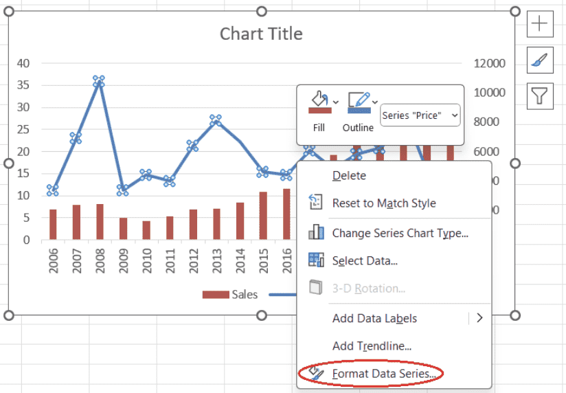 Opening the pane to format data series. Image by Author
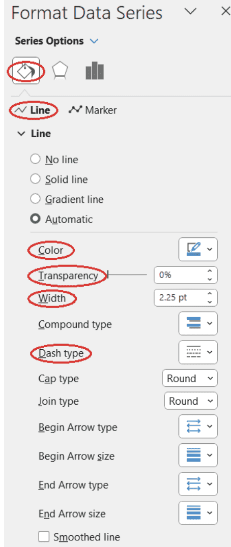 Adjusting line properties for a line chart. Image by Author
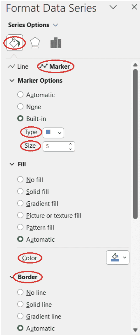 Adjusting marker properties for a line chart. Image by Author
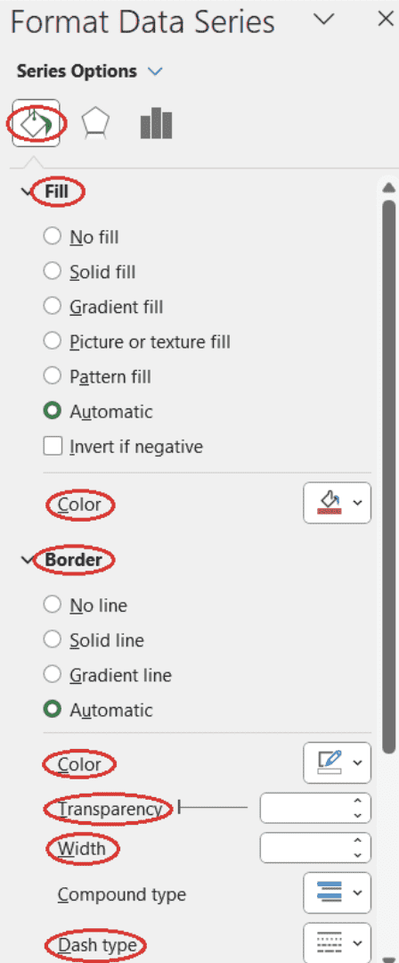 Adjusting bar properties for a bar chart. Image by Author
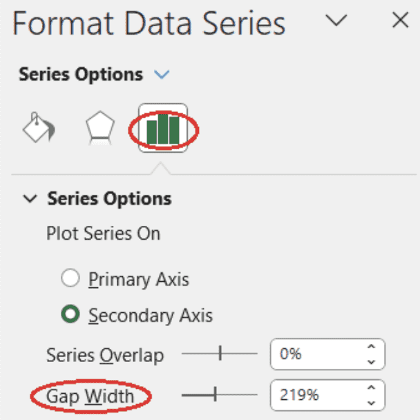 Adjusting bar gap width for a bar chart. Image by Author
How to change legend position
- On the chart area, select the legend, right-click on your mouse, and select Format Legend. The Format Legend pane will appear on the left side of your Excel worksheet.
- Select a suitable legend position on the Legend Options sub-tab of the Legend Options tab.
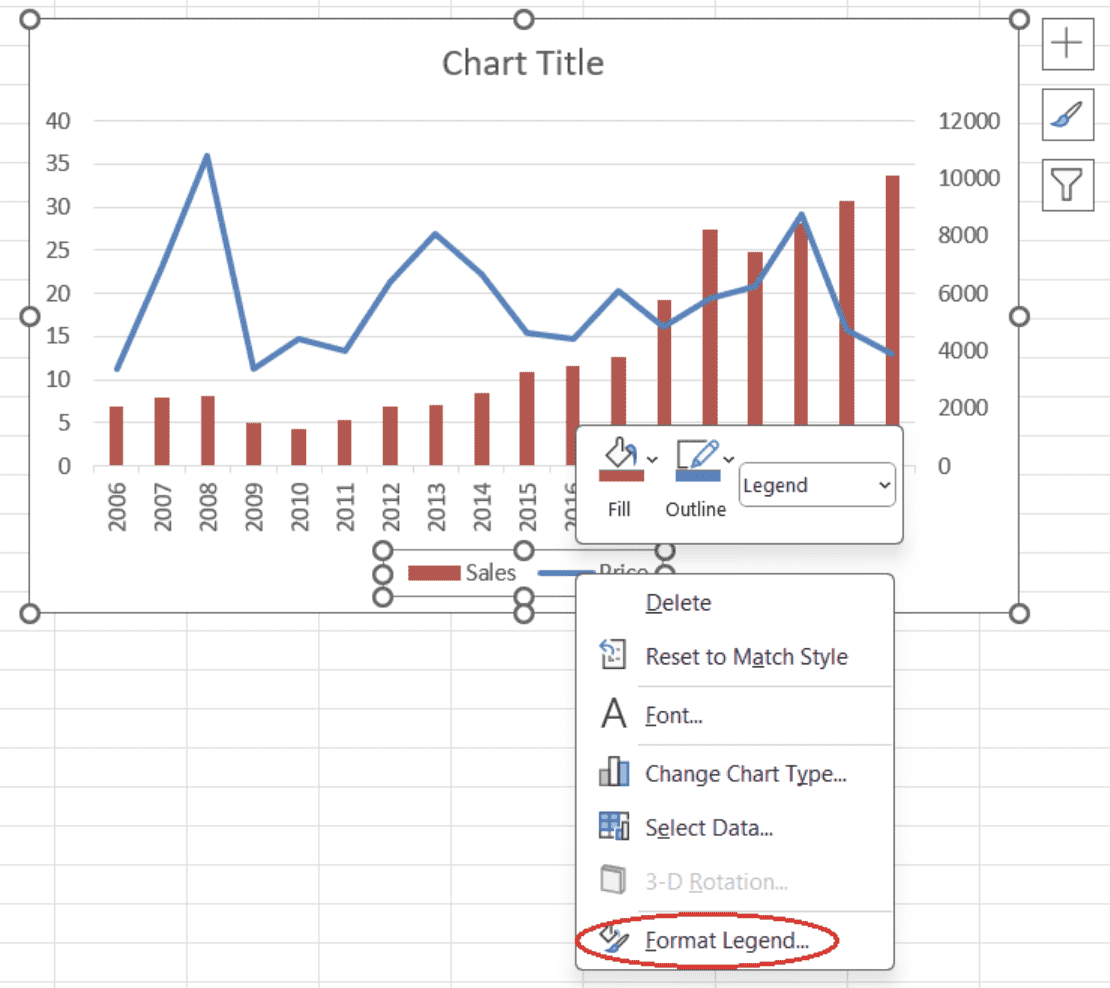 Opening the pane to format the legend. Image by Author
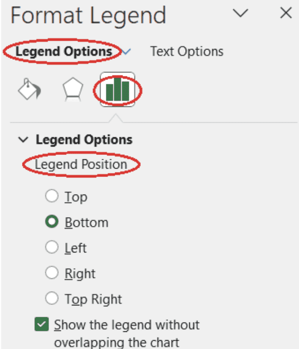 Selecting the legend position. Image by Author
How to customize text
- Select the chart element containing the text you want to customize, right-click and select Font.
- On the Font tab of the pop-up window that appears, you may want to adjust the font itself and/or font Style, Size, and Color.
- Press OK.
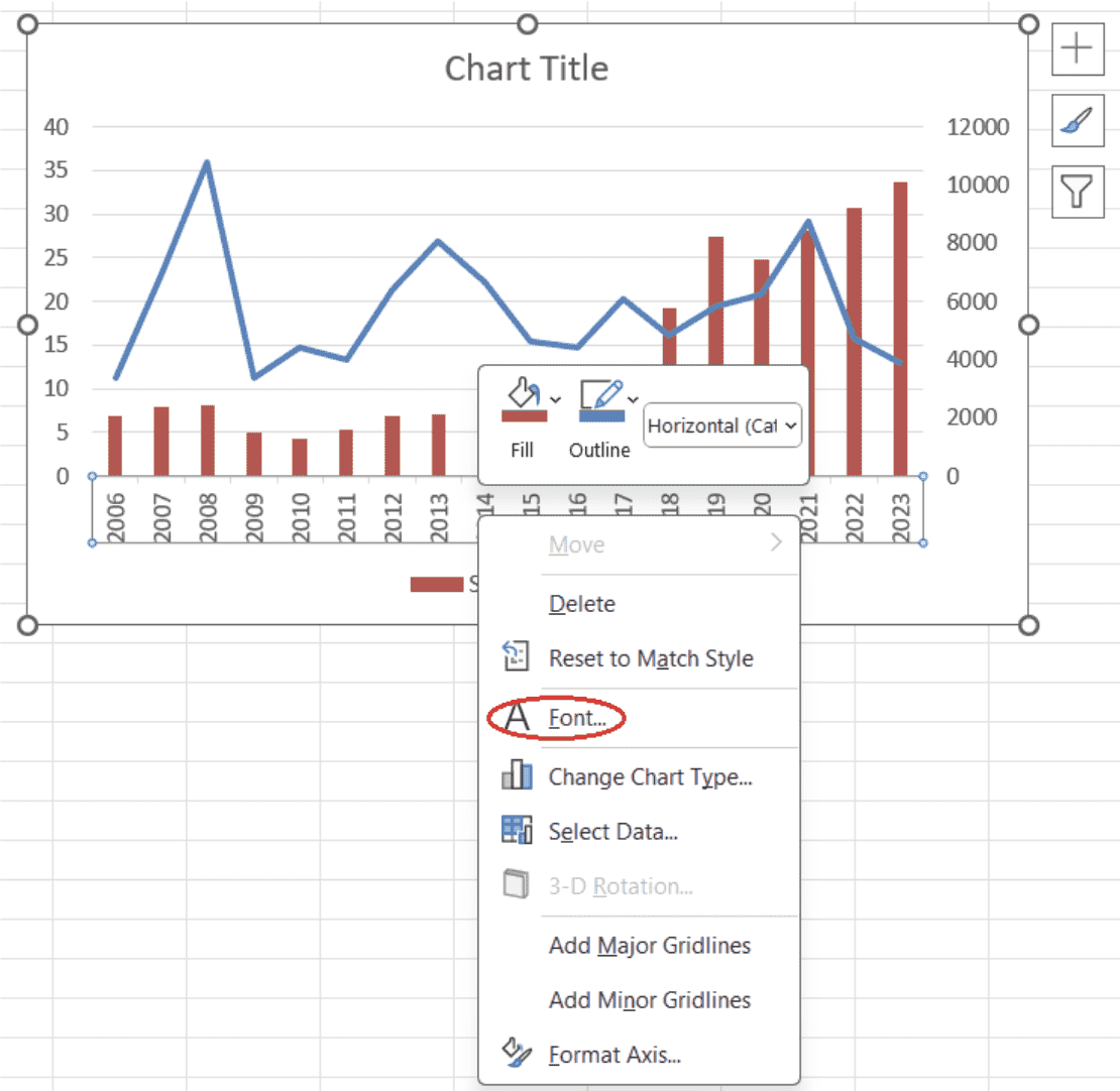
Opening font options for a chart element. Image by Author
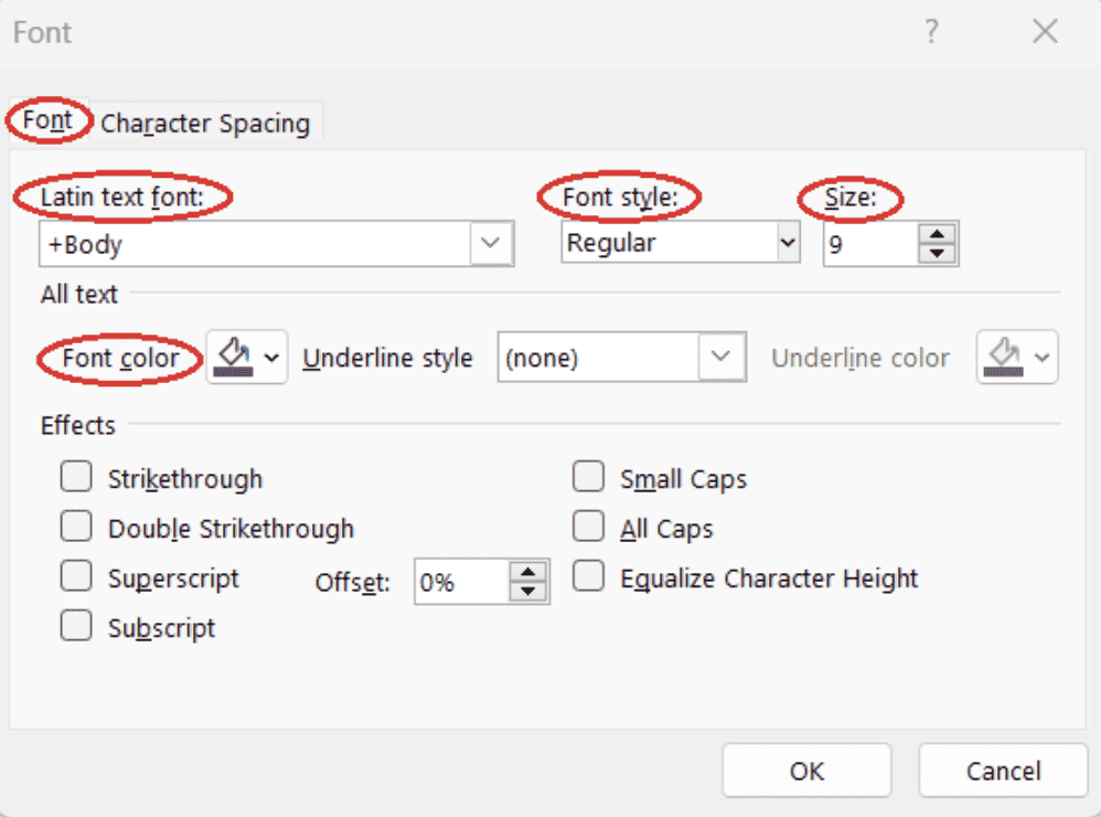
Adjusting font options for a chart element. Image by Author
Considerations When Using Combo Charts
While a combo chart in Excel has numerous advantages, it also has some intrinsic weaknesses that we should consider.
- Scale/Magnitude Differences: The use of a secondary axis can cause discrepancies in the perceived impact of data series. A change in one scale may not correspond to a similar magnitude change in the second scale, leading to potential misinterpretation of the data.
- Information Overabundance: Combining more than two chart types in a combo chart can result in a cluttered and visually overwhelming presentation. This makes the chart difficult to interpret and reduces its effectiveness.
- Restricted Choice of Chart Types: While Excel offers many chart types for building combo charts, it does not include every possible chart type. This limitation can sometimes necessitate the use of other software or tools for more specialized charting needs.
Conclusion
In this tutorial, we learned what a combo chart in Excel is, when and why it's helpful, what key features it has, what chart types can be combined on it, how to create and format a combo chart in Excel, and what potential issues we can encounter when working with this kind of data visualization.
To propel your Excel skills to the next level, consider taking an all-inclusive and beginner-friendly Excel Fundamentals skill track that will teach you everything you need to know to carry out data analysis in Excel in real-world scenarios.
Frequently Asked Questions
What is a combo chart?
A combo chart, or a combination chart, is a chart that combines two or more chart types, each representing a different type of data, into a single visual. Commonly, a combo chart displays an evolution of different data series over the same period.
What are the key features of a combo chart?
Key features of a combo chart include having more than one chart type on the same visual, more than one data series on the chart legend, secondary axis label and values, and different colors, transparencies, or data labels.
What kind of charts can be combined on a combo chart?
Some of the most common chart type combinations in a combo chart are line chart and bar chart, multiple line chart and bar chart, area chart and bar chart, stacked area chart and bar chart, line chart and grouped bar chart, and line chart and stacked bar chart.
What chart types for creating a combo chart are available in Excel?
Column, bar, line, area, pie, scatter, and radar chart types, each including its variations. In Excel, column chart types refer to vertical bar chart types, while bar chart types refer to horizontal bar chart types.
Is it possible to combine three or more chart types on a combo chart in Excel?
Technically, it's possible. However, the best practice is to combine two chart types on a combo chart, to avoid making the resulting visual cumbersome, overwhelming, and difficult to interpret.
What are the advantages of combo charts in Excel?
The advantages of combo charts in Excel include easy comparison of different data series, efficient highlighting of specific trends and patterns, enhanced data presentation, and improved decision-making.
What are some weaknesses of combo charts in Excel?
Some weaknesses of combo charts in Excel are scale and magnitude differences in the presence of the secondary axis, information overabundance specifically when having more than two chart types on the same combo chart, and restricted choice of chart types.
How to find the feature for creating a combo chart in Excel?
By opening the Insert tab of the ribbon, clicking on the Recommended Charts button of the Charts group, opening the All Charts tab in the pop-up window, and selecting the Combo option at the end of the list.
How to add or remove chart elements on a combo chart in Excel?
By selecting the chart area, clicking on the Chart Elements button, and selecting the necessary chart elements. For a more granular selection, we need to hover over the name of the chart element of interest until a drop-down arrow appears, open the drop-down list, and refine our choice.
How to filter out data series on a combo chart in Excel?
By selecting the chart area, clicking on the Chart Filters button, selecting the necessary series or deselecting the unwanted ones on the Values tab, and pressing Apply.

IBM Certified Data Scientist (2020), previously Petroleum Geologist/Geomodeler of oil and gas fields worldwide with 12+ years of international work experience. Proficient in Python, R, and SQL. Areas of expertise: data cleaning, data manipulation, data visualization, data analysis, data modeling, statistics, storytelling, machine learning. Extensive experience in managing data science communities and writing/reviewing articles and tutorials on data science and career topics.
