
How to Create a Histogram in Excel: A Step-by-Step Guide

Master the art of visualizing data in Excel using histograms! This step-by-step guide will walk you through various methods, such as built-in charts, formulas, and the Analysis ToolPak, to help you analyze frequency distributions like a pro.
Mar 24, 2025  · 8 min read

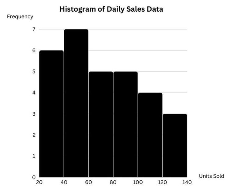
Think of histograms as enhanced bar charts illustrating how your data is distributed, such as how many students scored between 80 and 90 on a test or how often a specific sales figure appears. Unlike regular column charts comparing individual values, histograms group numbers into ranges (or bins), allowing you to spot trends and patterns quickly.

And the best part? You don’t need to be an Excel expert to create one! Whether you’re using the built-in histogram tool, formulas, or the Analysis ToolPak, Excel provides multiple ways to get the job done. This guide will break everything down into simple, easy-to-follow steps, even if you've never created this chart before.

By the end, you’ll be able to create histograms like a pro, avoid common pitfalls, and impress your boss, professor, or even yourself.

What Is a Histogram in Excel?

A histogram is a type of chart that displays the frequency distribution of numerical data. It groups data into intervals, known as bins, and shows the number of occurrences in each bin as a bar.

You might be wondering, how do histograms differ from column charts? Three things:

  • Histograms show grouped data distributions, while column charts compare individual values.
  • Histogram bins follow a numeric sequence, whereas column charts use categorical labels.
  • Histogram bars have no gaps, reinforcing the idea of continuous data.

For example, a histogram can display student exam scores grouped into ranges, such as 0-50, 51-70, and 71-100, rather than individual scores.

Creating a Histogram in Excel Using Histogram Chart

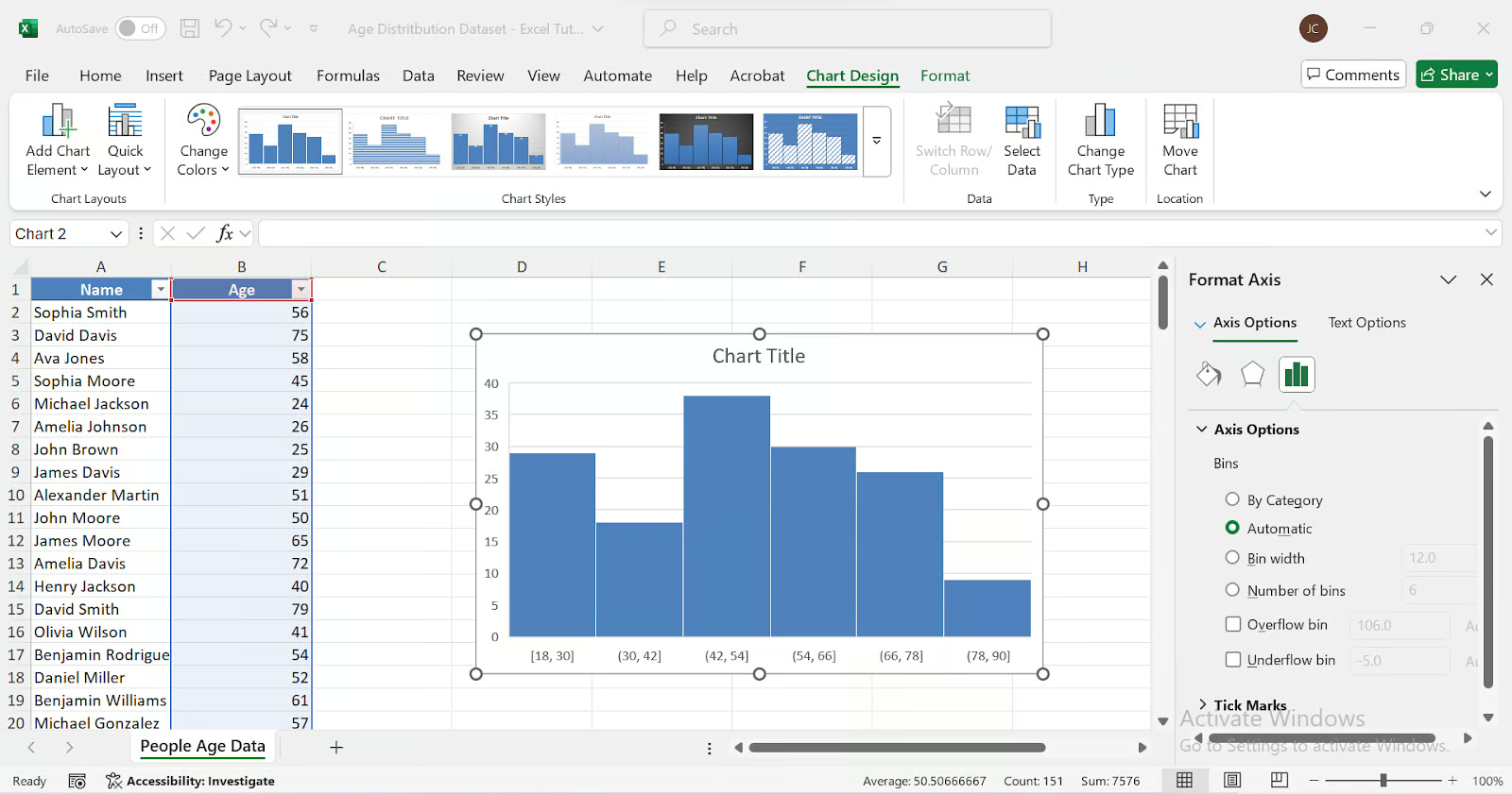
For this section, we will use an Age Distribution Dataset containing the names and ages of individuals.

1. Select your data

  1. Open the Excel file and navigate to the sheet containing the People Age Data.

  2. Select the Age column (excluding the "Name" column).

2. Insert a histogram chart

  1. Click on the Insert tab in the ribbon.

  2. Go to Insert Statistic ChartHistogram.

  3. Excel will generate a default histogram chart based on your selected data.

3. Adjust the bin settings:

  1. Click on the horizontal axis of the chart.

  2. Right-click and select Format Axis.

  3. Under the Axis Options panel, locate the Bin Width settings.

  4. Adjust the bin width manually or let Excel determine it automatically.

  5. Optionally, use the Overflow Bin and Underflow Bin to group extreme values.

4. Customize by modifying the title, colors, and labels.

Creating a Histogram in Excel Using Formulas

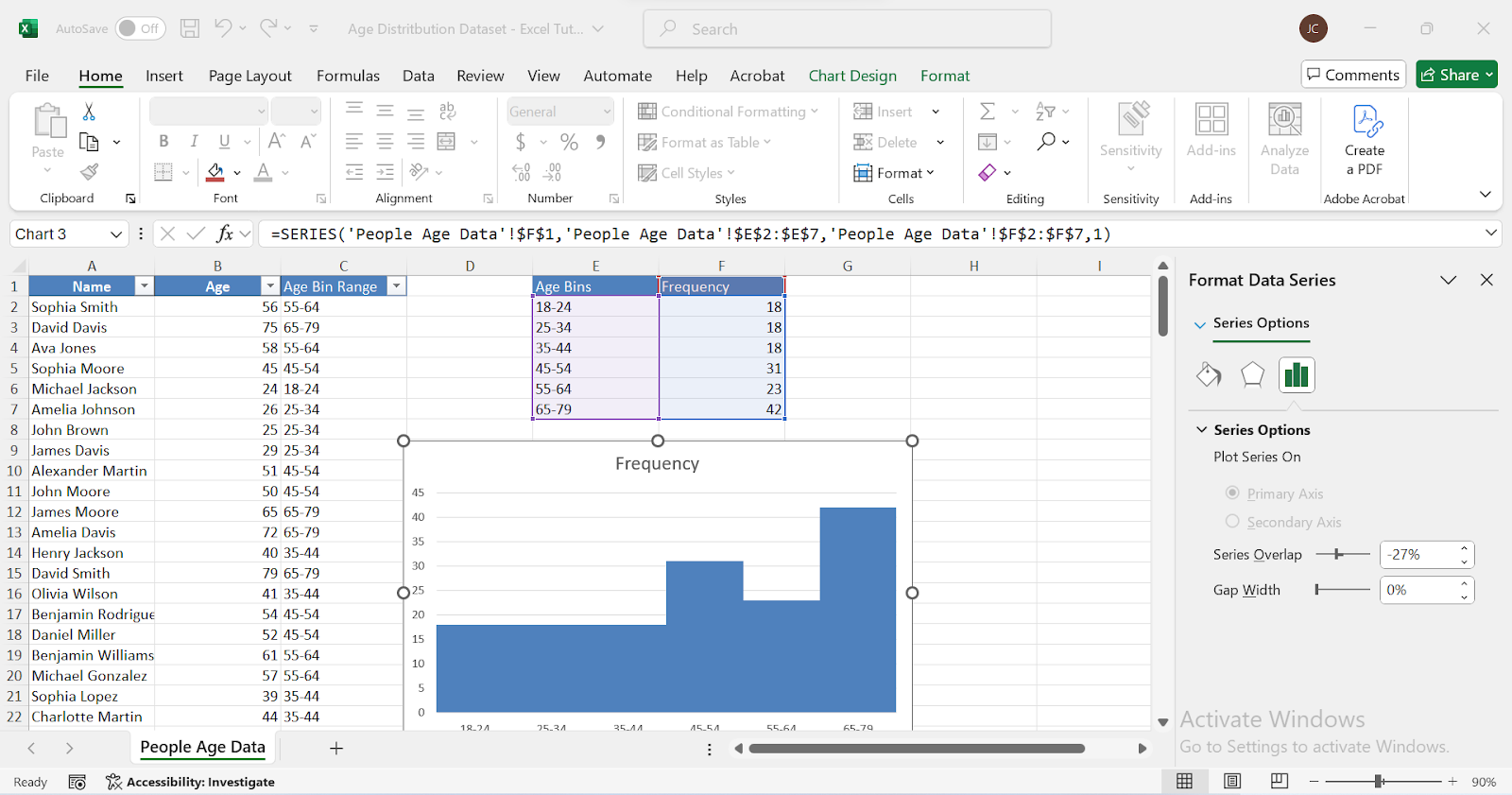
In order to create a histogram in Excel, you have to know the count in each bin. To find that count, we could use either the COUNTIFS() function or the FREQUENCY() function. I'll show both methods and you can decide which one you like best. 

Using COUNTIFS() to create a custom histogram

This method works in all Excel versions, making it a flexible alternative to the built-in histogram chart. Instead of relying on Excel's automatic binning, we manually define bins and count occurrences using the COUNTIFS() function.

1. Create bin ranges

If not already available, manually create the bin ranges in Column C using the following formula in C2 and drag it down. This formula categorizes each age in Column B into the correct bin.

=IF(B2<=24, "18-24", IF(B2<=34, "25-34", IF(B2<=44, "35-44", IF(B2<=54, "45-54", IF(B2<=64, "55-64", "65-79")))))

In Column E, list only the unique bin labels to be used for frequency calculations. This column will act as a reference for creating the histogram.

2. Calculate frequency using COUNTIFS()

In Column F (Frequency), next to your bin ranges, enter the COUNTIFS formula. This formula automatically extracts the lower and upper bounds from Column C. In F2, enter the following formula:

=COUNTIFS(Age_Numbers,">="&LEFT(E2,2),Age_Numbers,"<="&RIGHT(E2,2))

Drag the formula down for all the bins.

3. Create a histogram chart

  1. Select Column E (Bins) and Column F (Frequency).
  2. Go to InsertColumn ChartClustered Column.
  3. Right-click the bars and select Format Data Series.
  4. Set Gap Width to 0% to make it look like a histogram.

4. Customize the chart as needed.

Using the FREQUENCY() function for dynamic histograms

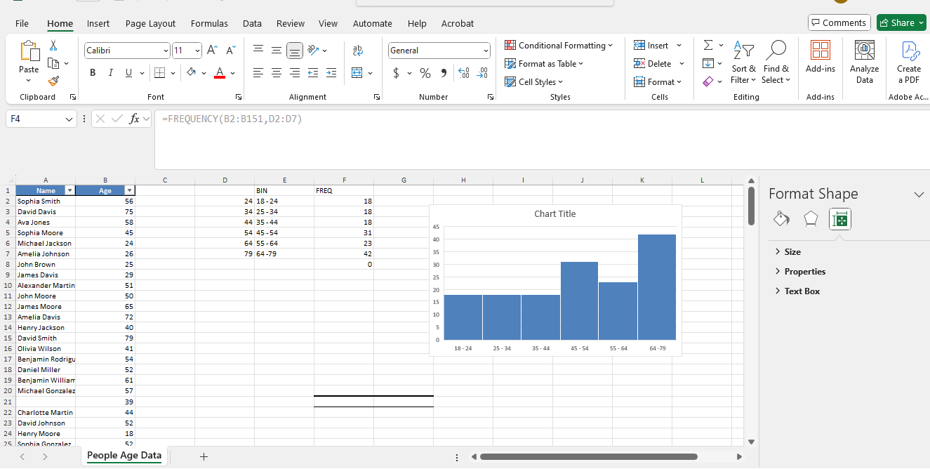
The FREQUENCY() function in Excel counts the number of times values fall within specific ranges, known as bins. It updates automatically whenever the data changes, making it an excellent tool for creating dynamic histograms.

Step 1: Defining bins:

  1. Create a list of bin ranges (for example, 18-24, 25-34, 35-44, 45-54, 55-64, 65-79.)
  2. Place these bin ranges in a separate column E.
  3. In an empty column D, list the upper boundaries of the bins (24, 34, 44, 54, 64, 79). 

Step 2: Applying the FREQUENCY() function:

Select a range adjacent to the bins where you want to store the frequency values, column F. Enter the formula:

=FREQUENCY(B2:B105, D2:D7)

Where:

  • B2:B105 → The range containing the Ages.
  • D2:D7 → The range containing the bin upper limits.

Press Ctrl + Shift + Enter if using an older version of Excel (to apply as an array formula).

Step 3: Create the histogram

  1. Select the bin labels column and frequency counts column.
  2. Go to Insert → Charts → Insert Statistic Chart → Histogram.
  3. Format the chart to remove gaps between bars.
  4. Adjust axis labels and title for clarity.

Creating a Histogram in Excel Using the Data Analysis ToolPak

The older versions of Excel require this add-in. To enable it:

  • Go to File → Options → Add-ins → Manage Excel Add-ins
  • Enable Analysis ToolPak.

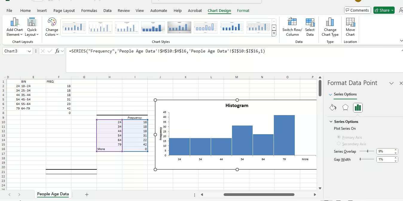
Now we are ready to generate a histogram:

  • Move to Data → Data Analysis → Histogram.
  • Set Input Range to ages and Bin Range to predefined bins.
  • Choose Output Range and enable Chart Output.

Finally we can customize the chart. Adjust bin width, labels, and formatting.

Excel Histogram Best Practices

Avoid issues by thinking about these important things:

  • Choose inappropriate bin sizes: Too few bins oversimplify; too many clutter the chart.
  • Don't forget to remove gaps in column charts.
  • Label axes clearly so there is no misinterpretation.
  • Don't use the wrong data type: Histograms work with numerical, continuous data.
  • Interpret histograms correctly, and don't talk about them like bar charts.

Pros and Cons of the Different Histogram Methods

Method

Pros

Cons

Built-in Histogram Chart

Very easy to use, quick to create

Only works in Excel 2016 and later, not very flexible

COUNTIFS Function

Works in all Excel versions, allows custom bin sizes

You have to manually create the bins

FREQUENCY Function

Updates automatically when data changes

A bit tricky to set up for beginners

Data Analysis ToolPak

Does all calculations for you, fast setup

Requires installation, generates static charts

Conclusion

Creating a histogram in Excel is an effective way to visualize data and understand frequency distributions. Whether you choose the built-in histogram chart, the Analysis Toolpak, or pair formulas like COUNTIFS() and FREQUENCY() with the correct charting step, each method offers unique strengths and flexibility. Just remember to select the appropriate bin size, remove gaps in column charts, and clearly label your axes for accurate interpretation.

Now it’s your turn—open Excel and start experimenting! If you want to enhance your data analysis skills further, consider exploring our related courses, such as our Introduction to Excel or Data Analysis in Excel


Jachimma Christian's photo
Author
Jachimma Christian
LinkedIn

Data analyst and analytics mentor specializing in Excel, SQL, and Python. Focusing on actionable insights, I empower businesses of all sizes to drive meaningful change while inspiring new data learners on their journeys.

FAQs

What is a histogram in Excel?

A histogram is a chart that displays the frequency distribution of numerical data by grouping values into bins, making it easier to identify patterns.

How is a histogram different from a column chart?

Unlike column charts, histograms group data into ranges (bins) and show distributions, whereas column charts compare individual data points.

Can I create a histogram in older Excel versions?

Yes! You can use formulas like COUNTIFS() or the Analysis ToolPak to create histograms in Excel versions before 2016.

How do I adjust bin size in a histogram?

In Excel’s built-in histogram tool, you can adjust bin width manually in the Format Axis settings or use the Overflow/Underflow bin options.

What’s the easiest way to make a histogram in Excel?

If you're using Excel 2016 or later, the built-in histogram chart is the quickest and easiest method. Just select your data, go to Insert > Statistic Chart > Histogram and customize

Topics

Learn with DataCamp

Course

Data Analysis in Excel

3 hr
80.7K
Learn how to analyze data with PivotTables and intermediate logical functions before moving on to tools such as what-if analysis and forecasting.
See DetailsRight Arrow
Start Course
See MoreRight Arrow
Related

blog

What is a Frequency Histogram? A Comprehensive Guide For Beginners

Learn everything about histograms, including their types, steps to create them, which tools to use, mistakes to avoid, and best practices for effective results.
Arunn Thevapalan's photo

Arunn Thevapalan

8 min

Tutorial

How to Create a Line Graph in Excel: A Step-by-Step Guide

Learn to create clear and informative line graphs in Excel. This guide walks you through each step, from setting up your data to customizing the graph for better readability.
Derrick Mwiti's photo

Derrick Mwiti

8 min

Tutorial

How to Make a Histogram in Base R

Discover how to create a histogram with Base R using our comprehensive 6-step tutorial. Customize your plots and visualize data distributions effectively.

Kevin Babitz

10 min

Tutorial

A Comprehensive Guide to Calculating Frequency Distributions in Excel

Follow our step-by-step guide to create frequency distributions in Excel by using the FREQUENCY() function with just two arguments: data_array and bins_array.
Arunn Thevapalan's photo

Arunn Thevapalan

11 min

Excel Dashboard Strategy

Tutorial

How to Create a Dashboard in Excel in 3 Easy Steps

Learn everything you need to know about how to create a dashboard in Excel, with tips and examples.
Joleen Bothma's photo

Joleen Bothma

12 min

Tutorial

Graphs in Spreadsheets

In this tutorial, you'll learn how to create visualizations to display data and gain more meaningful insights with spreadsheets.
Aditya Sharma's photo

Aditya Sharma

12 min

See MoreSee More