Course
Data visualization is one of the best ways (if not the best way) for data analysts and data scientists to represent complex information and generate meaningful insights. To make the most of your opportunity to communicate with stakeholders, I’ve compiled helpful information about Matplotlib colormaps.
As you will see in this article, Matplotlib is an extremely versatile and extensible visualization library in Python. It offers every option, from simple charts to fully interactive visuals. If you are not generally familiar with Python, I encourage you to enroll in our Introduction to Python course before we get started to understand its foundation. Personally, I also keep the Python Cheat Sheet close by because it is a useful reference for common functions.
Choosing the Right Matplotlib Colormap
One of the first things to consider is deciding between sequential, diverging, or categorical colormaps. Other important factors to consider when choosing colormaps include perceptual uniformity, meaning that equal differences in data values are perceived as equal differences in color, and using colorblind-friendly colormap options to make your visuals accessible to all audiences.
You should also consider different domain standards when choosing colormaps. For example, different shades of blue represent different water depths in oceanographic studies. If you are unsure about the right colormap for your visualization, different tools and resources are available for guidance. In particular, our own Introduction to Data Visualization with Matplotlib course helps you work through many scenarios.
Different Colormaps in Matplotlib
In Python, the matplotlib.colormaps module provides access to built-in colormaps, which helps you select the most best scheme for your project. The following are the most common categories of options:
Sequential colormaps
Sequential colormaps represent ordered data that progresses from low to high values. They transition from light to dark hues, showing the data magnitude at different levels. An example of a sequential colormap is in heatmaps for temperature data, where lighter colors represent cooler temperatures and darker shades represent hotter temperatures.
Assume you have a dataset with date and temperature columns. The following code will create a heatmap for the temperature.
# Import required libraries
import numpy as np
import pandas as pd
import matplotlib.pyplot as plt
import matplotlib.colors as mcolors

# Step 1: Extract month and day information from the date column
calendar_data = temperature_data.copy()   # Create a copy to work with
calendar_data['Month'] = calendar_data['Date'].dt.strftime('%B')
calendar_data['Day'] = calendar_data['Date'].dt.day

# Step 2: Define the order of months for a natural calendar sequence
month_names = ['January', 'February', 'March', 'April', 'May', 'June',
               'July', 'August', 'September', 'October', 'November', 'December']

# Convert the 'Month' column to a categorical type with the specified order
calendar_data['Month'] = pd.Categorical(calendar_data['Month'], categories=month_names, ordered=True)

# Step 3: Pivot the data to create a structured table for the heatmap
monthly_temperature_table = calendar_data.pivot(index='Month', columns='Day', values='Temperature')

# Step 4: Set up the plot for the heatmap
plt.figure(figsize=(12, 8))

# Define a custom normalization for temperature range (optional)
norm = mcolors.Normalize(vmin=15, vmax=35)

# Create the heatmap with a sequential colormap
heatmap = plt.imshow(monthly_temperature_table, cmap='YlOrRd', aspect='auto', norm=norm)

# Add color bar to represent temperature
colorbar = plt.colorbar(heatmap, orientation='horizontal')
colorbar.set_label('Temperature (°C)', labelpad=10)

# Label the axes
plt.xlabel('Day of the Month')
plt.ylabel('Month')

# Set y-ticks to display month names instead of numbers
plt.yticks(ticks=np.arange(len(month_names)), labels=month_names)

# Add a title to the heatmap
plt.title('Monthly Temperature Heatmap (Sequential Colormap)')

# Display the plot
plt.grid(False)
plt.show()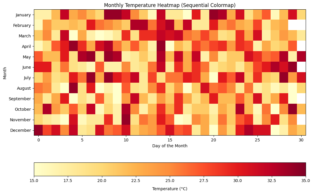
Matplotlib sequential colormaps visualization example. Image by Author
Diverging colormaps
Diverging colormaps highlight data with deviations from a central value in both directions. The diverging colormaps have contrasting colors for the positive and negative directions. A common application of diverging colormaps is in financial data to represent profit and loss.
# Set 'Month' as the index
profit_loss_df.set_index('Month', inplace=True)

# Set the figure size
plt.figure(figsize=(8, 4))

# Create a diverging colormap
cmap = plt.cm.RdYlGn

# Display the data as a heatmap using imshow
im = plt.imshow(profit_loss_df.T, cmap=cmap, aspect='auto', vmin=-np.max(np.abs(profit_loss_data)), vmax=np.max(np.abs(profit_loss_data)))

# Add color bar with label
cbar = plt.colorbar(im)
cbar.set_label('Profit/Loss ($)')

# Add annotations to each cell
for i, month in enumerate(profit_loss_df.index):
    plt.text(i, 0, f'{profit_loss_df.loc[month, "Profit/Loss"]:.2f}', ha='center', va='center', color='black')

# Set x-axis and y-axis labels and ticks
plt.xlabel('Month')
plt.ylabel('')  # No label needed for y-axis
plt.xticks(ticks=range(len(profit_loss_df.index)), labels=profit_loss_df.index, rotation=45)
plt.yticks([])  # Hide y-axis ticks as we only have one row

# Add title
plt.title('Profit/Loss Heatmap (Diverging Colormap)')

# Adjust layout for better display
plt.tight_layout()

# Show plot
plt.show()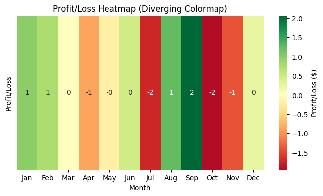
Matplotlib diverging colormap visualization example. Image by Author.
Cyclic colormaps
Cyclic colormaps are useful for visualizing data representing a repeating or cyclical pattern, such as angles, wave phases, or time of day. An example of a cyclic colormap in action is visualizing the phases of a periodic function, such as a sine wave.
# Create data for a sine wave
x = np.linspace(0, 2 * np.pi, 100)  # X values from 0 to 2π (one complete cycle)
y = np.sin(x)  # Y values (sine of X)

# Create a figure and axis
plt.figure(figsize=(10, 6))

# Create a scatter plot with a cyclic colormap
# Color points by their position in the sine wave cycle
points = plt.scatter(x, y, c=x, cmap='twilight', edgecolor='black')

# Add a color bar to show the phase of the wave
cbar = plt.colorbar(points)
cbar.set_label('Wave Phase (Radians)', rotation=270, labelpad=15)

# Label the axes
plt.xlabel('Angle (Radians)')
plt.ylabel('Sine Value')

# Add a title
plt.title('Sine Wave with Cyclic Colormap (Twilight)')

# Display the plot
plt.grid(True)
plt.show()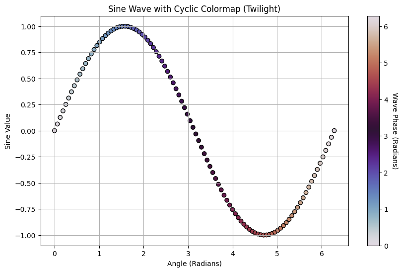
Matplotlib cyclic colormap visualization example. Image by Author.
Qualitative colormaps
Qualitative colormaps are ideal to represent categorical data with no particular order of the categories. A common use case of qualitative colormaps is a pie chart where each segment represents a different category that can be easily distinguished.
# Sample categorical data
categories = ['Category A', 'Category B', 'Category C', 'Category D', 'Category E']
values = [20, 35, 25, 10, 10]

# Set the figure size
plt.figure(figsize=(8, 8))

# Define a qualitative colormap manually
colors = ['#8dd3c7', '#ffffb3', '#bebada', '#fb8072', '#80b1d3']  # Manually selected color hex codes

# Create a pie chart
plt.pie(values, labels=categories, autopct='%1.1f%%', startangle=90, colors=colors)

# Equal aspect ratio ensures the pie is drawn as a circle
plt.axis('equal')

# Add a title
plt.title('Pie Chart with Qualitative Colormap')

# Display the chart
plt.show()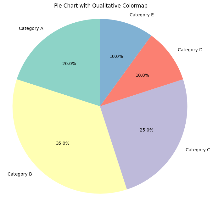
Matplotlib qualitative colormap visualization example. Image by Author.
Rainbow colormaps
Rainbow colormaps like hsv are used when a broad range of hues is needed.
# Generate cyclic data
x = np.linspace(0, 2 * np.pi, 500)
y = np.sin(x)

# Create a plot with rainbow colormap
plt.scatter(x, y, c=x, cmap='hsv', s=50)

# Add a color bar
plt.colorbar(label='Phase')

# Add labels and title
plt.xlabel('Angle (radians)')
plt.ylabel('Sine Value')
plt.title('Cyclic Data Visualization using HSV Colormap')

# Display the plot
plt.show()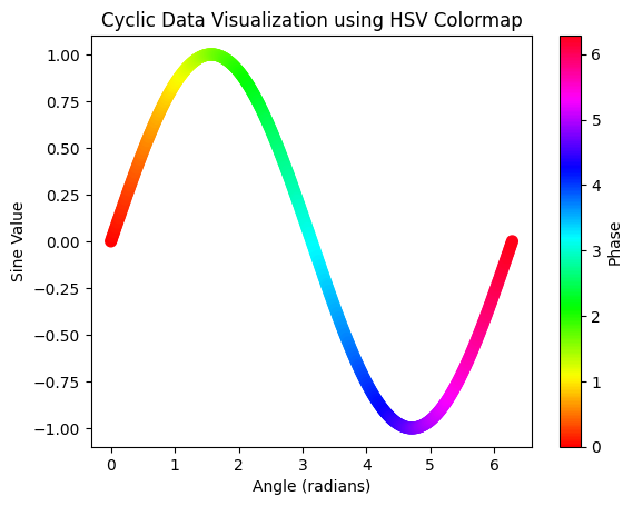
Matplotlib rainbow colormap visualization example. Image by Author.
Perceptually uniform colormaps
Colormaps like inferno and plasma offer better visibility across different display mediums.
# Generate synthetic elevation data
x = np.linspace(-5, 5, 100)
y = np.linspace(-5, 5, 100)
X, Y = np.meshgrid(x, y)
Z = np.sin(np.sqrt(X**2 + Y**2)) * 100  # Elevation data

# Plot the elevation data using the 'plasma' colormap
plt.contourf(X, Y, Z, cmap='plasma')

# Add a color bar
plt.colorbar(label='Elevation (m)')

# Add title and labels
plt.title('Topographic Map (Plasma Colormap)')
plt.xlabel('X Coordinate')
plt.ylabel('Y Coordinate')

# Display the plot
plt.show()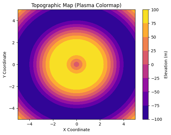
Matplotlib perceptually uniform colormap visualization example. Image by Author.
Creating and Modifying Matplotlib Colormaps
Although Matplotlib has a wide variety of built-in colormaps, there are scenarios where you would want to customize your colors. The key tools for creating custom colormaps in Matplotlib are ListedColormap and LinearSegmentedColormap.
Creating a custom colormap with ListedColormap
ListedColomap allows you to create a colormap from a list of specific colors. This method is useful when assigning specific colors to distinct categories in categorical data.
from matplotlib.colors import ListedColormap

# Categorical data
categories = ['Category A', 'Category B', 'Category C', 'Category D']
values = [25, 40, 35, 30]

# Custom color list for the colormap (e.g., shades of blue, green, red, and purple)
custom_colors = ['#1f77b4', '#2ca02c', '#d62728', '#9467bd']

# Create a ListedColormap using the custom colors
custom_cmap = ListedColormap(custom_colors)

# Set the figure size
plt.figure(figsize=(8, 6))

# Create a bar plot with the custom colormap
bars = plt.bar(categories, values, color=custom_cmap.colors)

# Add a title
plt.title('Bar Chart with Custom ListedColormap')

# Label the axes
plt.xlabel('Categories')
plt.ylabel('Values')

# Display the plot
plt.show()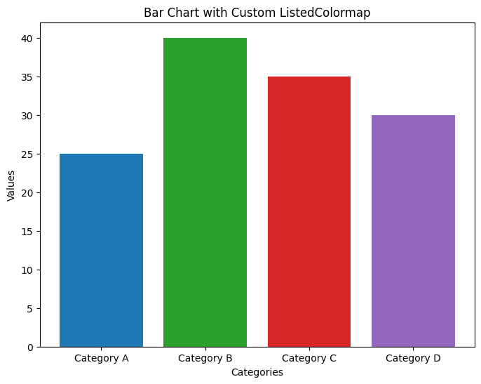
Matplotlib custom colormap with ListedColormap. Image by Author.
Creating a custom colormap with LinearSegmentedColormap
LinearSegmentedColormap allows you to create colormaps that transition smoothly between colors. This is worth knowing because continuous data often requires gradient color changes. Here, I am also specifying the number of intervals I want for my visual.
from matplotlib.colors import LinearSegmentedColormap

# Create a grid of values for a 2D Gaussian function
x = np.linspace(-2, 2, 500)
y = np.linspace(-2, 2, 500)
X, Y = np.meshgrid(x, y)
Z = np.exp(- (X**2 + Y**2))

# Define a custom colormap that transitions from blue to white to red
colors = ['blue', 'white', 'red']
custom_cmap = LinearSegmentedColormap.from_list('blue_white_red', colors)

# Adjust the number of color classes (discrete levels)
# Specify the number of levels (e.g., 10 for 10 distinct color bands)
num_classes = 10
levels = np.linspace(Z.min(), Z.max(), num_classes)

# Set the figure size
plt.figure(figsize=(8, 6))

# Plot the 2D Gaussian function with the adjusted colormap
contour = plt.contourf(X, Y, Z, levels=levels, cmap=custom_cmap)

# Add a color bar to show the discrete color classes
plt.colorbar(contour, label='Gaussian Function Value')

# Add labels for the axes
plt.xlabel('X')
plt.ylabel('Y')

# Add a title
plt.title(f'2D Gaussian with {num_classes} Discrete Color Classes')

# Display the plot
plt.show()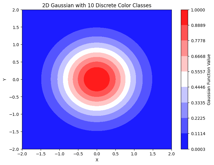
Matplotlib custom adjusting the number of color classes. Image by Author.
Customizing color ranges and intensity
You can control the intensity or range of colors in an existing colormap by manipulating its normalization or slicing it to use a subset of the available colors. In the following example, the color ranges are sliced to show temperatures between 16 and 40 degrees Celcius.
# Set up the plot for the heatmap
plt.figure(figsize=(12, 8))

# Define a custom normalization for temperature range
norm = mcolors.Normalize(vmin=16, vmax=40)

# Create the heatmap with a sequential colormap
heatmap = plt.imshow(monthly_temperature_table, cmap='YlOrRd', aspect='auto', norm=norm)

# Add color bar to represent temperature
colorbar = plt.colorbar(heatmap, orientation='horizontal')
colorbar.set_label('Temperature (°C)', labelpad=10)

# Label the axes
plt.xlabel('Day of the Month')
plt.ylabel('Month')

# Set y-ticks to display month names instead of numbers
plt.yticks(ticks=np.arange(len(month_names)), labels=month_names)

# Add a title to the heatmap
plt.title('Monthly Temperature Heatmap (Sequential Colormap)')

# Display the plot
plt.grid(False)
plt.show()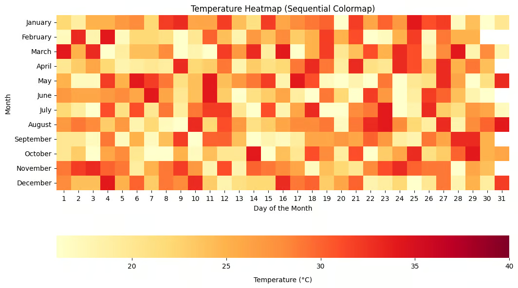
Matplotlib customizing color ranges and intensity. Image by Author.
Combining existing colormaps
You can also combine existing colormaps by blending multiple colormaps to create more complex visualizations.
from matplotlib.colors import LinearSegmentedColormap, Normalize

# Create synthetic elevation data
x = np.linspace(-180, 180, 500)  # Longitude
y = np.linspace(-90, 90, 250)    # Latitude
X, Y = np.meshgrid(x, y)
Z = 5000 * np.sin(np.sqrt(X**2 + Y**2) * np.pi / 180)  # Synthetic elevation data

# Define the base colormaps ('viridis' and 'cividis')
cmap1 = plt.get_cmap('viridis')
cmap2 = plt.get_cmap('cividis')

# Create a custom colormap by blending the two base colormaps
def blend_colormaps(cmap1, cmap2, blend_ratio=0.5):
    """Blend two colormaps together."""
    c1 = cmap1(np.linspace(0, 1, 256))
    c2 = cmap2(np.linspace(0, 1, 256))
    blended_colors = (1 - blend_ratio) * c1 + blend_ratio * c2
    return LinearSegmentedColormap.from_list('blended_cmap', blended_colors)

# Create the blended colormap
custom_cmap = blend_colormaps(cmap1, cmap2, blend_ratio=0.5)

# Normalize the data for visualization
norm = Normalize(vmin=-5000, vmax=5000)

# Set the figure size
plt.figure(figsize=(12, 6))

# Plot the synthetic elevation data with the blended colormap
contour = plt.contourf(X, Y, Z, levels=100, cmap=custom_cmap, norm=norm)

# Add a color bar to show the blended color mapping
plt.colorbar(contour, label='Elevation (meters)')

# Add labels for the axes
plt.xlabel('Longitude')
plt.ylabel('Latitude')

# Add a title
plt.title('Geographical Elevation Data with Blended Colormap (Viridis + Cividis)')

# Display the plot
plt.show()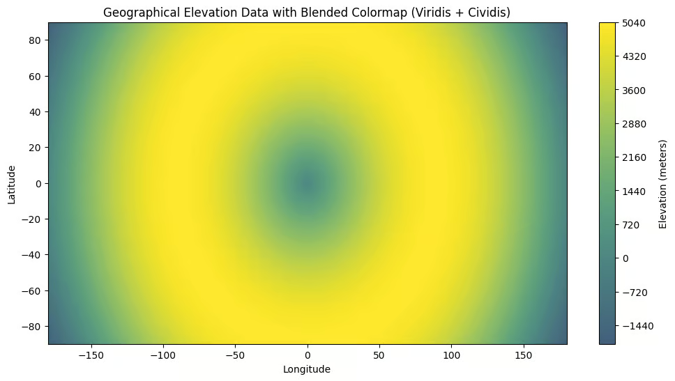
Matplotlib Combining existing colormaps. Image by Author.
Reversing colormaps using the _r suffix
You can reverse any colormap in Matplotlib by appending the suffix _r in its name.
# Set up the plot for the heatmap
plt.figure(figsize=(12, 8))

# Create a custom normalization for the color range
norm = mcolors.Normalize(vmin=16, vmax=40)

# Plot the heatmap using imshow with the sequential colormap
im = plt.imshow(monthly_temperature_table, cmap='YlOrRd_r', norm=norm, aspect='equal')

# Add a color bar with a horizontal orientation
cbar = plt.colorbar(im, orientation='horizontal', pad=0.1)
cbar.set_label('Temperature (°C)', labelpad=10)

# Add labels for the axes
plt.xlabel('Day of the Month')
plt.ylabel('Month')

# Set y-ticks to display month names instead of numbers
plt.yticks(ticks=np.arange(len(month_names)), labels=month_names)

# Add a title
plt.title('Temperature Heatmap (Sequential Colormap)')

# Display the plot
plt.show()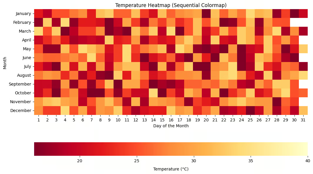
Matplotlib Reversing colormaps using the _r suffix. Image by Author.
Handling Common Errors in Matplotlib Colormaps
When working with colormaps in Matplotlib, you may encounter errors that affect your workflow. The following are some of the errors and how to troubleshoot them.
AttributeError: module 'matplotlib' has no attribute 'colormaps’
This error occurs when you use Matplotlib versions before 3.4.0 to access matplotlib.colormaps. The colormaps attribute was introduced in Matplotlib 3.4.0. First, check your Matplotlib version using the code below to troubleshoot this error.
import matplotlib
print(matplotlib.__version__)
Upgrade using the following pip command.
pip install --upgrade matplotlibIf you experience problems upgrading your Matplotlib version, try the following method to access colormaps.
plt.get_cmap('viridis') # instead of matplotlib.colormaps['viridis']Incorrect color assignments
You might experience incorrect color assignments when you pass a value outside the expected range or when the colormap is applied incorrectly. Incorrect color assignment might also arise if the colormap is meant for continuous data but is applied to categorical data or vice versa.
To ensure your data is within the expected range, always normalize or scale it using the vmax and vmin parameters.
import matplotlib.colors as mcolors

# Create a sample temperature dataset
data = np.random.rand(10, 10) * 100  # Adjust the range to match your data

# Create a color normalization instance to scale the data to the colormap's range
norm = mcolors.Normalize(vmin=0, vmax=100)

# Create a heatmap using the 'viridis' colormap and the specified normalization
plt.imshow(data, cmap='viridis', norm=norm, interpolation='nearest')
plt.colorbar()
plt.show()
For finer control, you can explicitly define the color boundaries using the boundaries or norm parameters in the plotting functions.
Visual artifacts and unexpected results
When working with discrete or low-resolution data, you may experience unintended color bands, excessive contrast, or color bleeding. The problem occurs when your data has a limited range but is displayed with a continuous colormap.
To solve this problem, use more data points or adjust the number of color levels to smooth out the transitions.
# Increase the number of bins in the colormap
cmap = plt.get_cmap('viridis', 256)
plt.imshow(data, cmap=cmap)
You can split the colormap into fixed levels to handle discrete data where appropriate.
cmap = plt.get_cmap('inferno', 10)  # Divide colormap into 10 discrete levels
plt.imshow(data, cmap=cmap)
You can also check the display settings and adjust the resolution especially when saving the visualizations to avoid low-resolution charts
plt.savefig('plot.png', dpi=300) # Save the figure with a higher resolutionColor distortion due to clipping
Color distortion occurs when data contains extreme values outside the expected color range. This causes parts of the data to be clipped and assigned the minimum or maximum color in the colormap.
To avoid color distortion, adjust the color limits using vmin and vmax to match the range of your data, preventing clipping.
plt.imshow(data, cmap='plasma', vmin=0, vmax=100)You should also use robust scaling to handle outliers by setting custom limits that exclude extreme values.
import numpy as np
robust_vmin, robust_vmax = np.percentile(data, [2, 98])  # Use percentiles to remove extreme outliers
plt.imshow(data, cmap='inferno', vmin=robust_vmin, vmax=robust_vmax)
Colormap not displaying correctly in 3D plots
If there is an issue with how data is mapped in the 3D surface, colormaps may not show correctly in the 3D visualizations. To solve, make sure that the z-axis data is normalized to fit within the colormap’s expected range. Also, use the appropriate colormap limits to capture the full range of the z-values.
from mpl_toolkits.mplot3d import Axes3D

# Generate sample data for a 3D surface plot
X, Y = np.meshgrid(np.linspace(-5, 5, 50), np.linspace(-5, 5, 50))
Z = np.sin(np.sqrt(X**2 + Y**2))

# Create a 3D axes object
ax = plt.axes(projection='3d')

# Plot the surface using the 'viridis' colormap and adjusting the color limits
ax.plot_surface(X, Y, Z, cmap='viridis', vmin=np.min(Z), vmax=np.max(Z))
plt.show()
Conclusion
Choosing the right colormap is an important step because it really affects how users view and understand your data. In my opinion, spending a lot of time on data analysis while being sloppy in the final step, which is the part where you communicate your findings, is a big mistake.
Luckily, Matplotlib offers many options to make sure that your visuals tell a compelling story. Enroll in our course, Introduction to Data Visualization with Matplotlib, to become an expert. Also, if you are a Python user who also uses Seaborn for visualization (it's great to know both), read our Quick Guide to Picking Colors in Seaborn and follow it up with our Introduction to Data Visualization with Seaborn course.
Matplotlib Colormaps FAQs
What is the default colormap in Matplotlib?
The default colormap in Matplotlib is viridis.
How do I fix the error 'AttributeError: module 'matplotlib' has no attribute 'colormaps'?
To fix the error AttributeError: module 'matplotlib' has no attribute 'colormaps', upgrade your Matplotlib library to a version later than version 3.4.0.
How can I test colormap accessibility for colorblind users?
You can test colormap accessibility for colorblind users using tools such as Coblis (Color Blindness Simulator) or third-party libraries like palettable to simulate how colormaps appear to colorblind viewers.
What is a perceptually uniform colormap?
A perceptually uniform colormap ensures that equal steps in data result in equal perceptual changes in color, allowing for accurate visualization interpretation.
Can I use custom colormaps from external libraries in Matplotlib?
Yes, external libraries like palettable or cmocean offer custom colormaps that can be integrated with Matplotlib for specialized visualization needs.


