Course
In this article, I will give you a tour of bar plots in Python using the most well-known libraries- Matplotlib, Seaborn, Plotly, Plotnine, and Pandas. You can eyeball the visuals and choose which library you like best. For each method, I will start with the basics of creating simple bar plots, and then I will gradually move into customization techniques.
I'll be as comprehensive and clear as I can, but remember that in data analysis and data science, bar plots are just one thing. For a wide view and to practice with real datasets, obtain a much-coveted certification, and start a career in the field, enroll in our Associate Data Scientist in Python career track today.
Learn Python From Scratch
Ways to Make a Python Bar Plot
Let's look into how to create and customize bar plots using some of the most popular Python libraries. Each library offers unique features and different levels of customization.
Create a bar chart with Matplotlib
I'll start with Matplotlib, which is a foundational plotting library in Python that has lots of customization options.
Basic bar plots
To get started with Matplotlib, you need to import the necessary libraries. The pyplot module from Matplotlib provides functions for creating plots. In this example, we will use some sample data showing the number of people who prefer different visualization libraries. Here, the library list holds the names of the libraries, which appear as labels on the x-axis, and the chosen_by list contains the corresponding number of enthusiasts, displayed as bar heights on the y-axis.
import matplotlib.pyplot as plt
# Number of preferences for different libraries
library = ['Matplotlib', 'Seaborn', 'Plotly', 'Plotnine']
chosen_by = [2500, 1800, 3000, 2200]
Creating a vertical bar plot involves calling the plt.bar() function with the library names and preference data. I'm choosing the color as skyblue. The plt.xlabel(), plt.ylabel(), and plt.title() functions add labels to the x-axis and y-axis and set a title for the plot. Finally, plt.show() displays the plot.
# Vertical Bar Plot
plt.bar(library, chosen_by, color='skyblue')
plt.xlabel('Visualization Library')
plt.ylabel('Number of Enthusiasts')
plt.title('Which Visualization Library Do People Prefer?')
plt.show()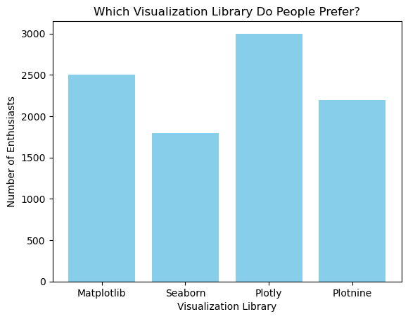
Similarly, you can create a horizontal bar plot using the plt.barh() function. For this, I'll use a light-green color for the bars.
# Horizontal Bar Plot
plt.barh(library, chosen_by, color='lightgreen')
plt.xlabel('Visualization Library')
plt.ylabel('Number of Enthusiasts')
plt.title('Which Visualization Library Do People Prefer?')
plt.show()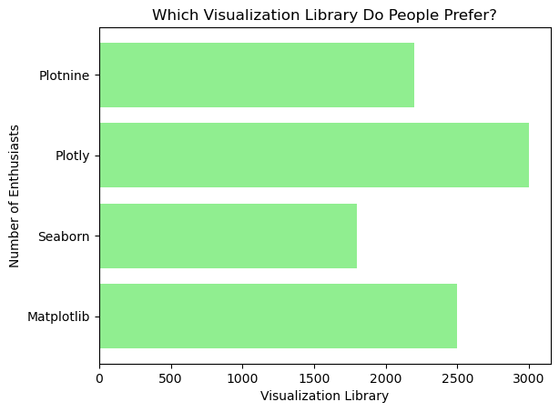
Advanced customizations
Matplotlib allows for a wide range of customizations, such as adding annotations and customizing axis labels, titles, and legends. For example, you can add annotations to each bar by using the plt.text() function, which places the text at the specified coordinates.
plt.bar(library, chosen_by, color='skyblue')
plt.xlabel('Visualization Library')
plt.ylabel('Number of Enthusiasts')
plt.title('Which Visualization Library Do People Prefer?')

# Adding annotations
for i, value in enumerate(chosen_by):
    plt.text(i, value + 5, str(value), ha='center')
plt.show()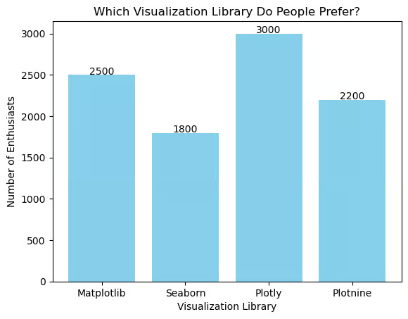
In the code above, plt.text() is used to display the number of enthusiasts above each bar. The enumerate() function provides the index and value of each bar, so the text is correctly positioned.
Grouped and stacked bar plots
To create grouped and stacked bar plots with Matplotlib, you can use additional parameters to represent multiple categories, like different regions or demographics. Suppose you have data on the popularity of visualization libraries across different regions. For grouped bar plots, you define separate datasets for each region and use bar_width to control the spacing and alignment of the bars, placing each group side by side for easy comparison.
import numpy as np

# Define library names
library = ['Matplotlib', 'Seaborn', 'Plotly', 'Plotnine']

# Number of Enthusiasts for different regions
enthusiasts_north = [2000, 1500, 2500, 2000]
enthusiasts_south = [1500, 1300, 2000, 1800]
bar_width = 0.35
x = np.arange(len(library))

# Grouped Bar Plot
plt.bar(x - bar_width/2, enthusiasts_north, bar_width, label='North Region', color='skyblue')
plt.bar(x + bar_width/2, enthusiasts_south, bar_width, label='South Region', color='lightgreen')

# Adding labels and title
plt.xlabel('Visualization Library')
plt.ylabel('Number of Enthusiasts')
plt.title('Regional Preferences for Visualization Libraries (Grouped)')
plt.xticks(x, library)
plt.legend(title='Regions')
plt.show()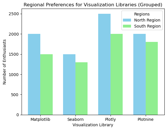
In this example, the x = np.arange(len(library)) line creates an array of positions for the bars. The plt.bar() function is used twice to create the bars for each region, and the plt.xticks() function sets the labels on the x-axis. The plt.legend() function displays a legend to differentiate the regions.
For a stacked bar plot, you can use the bottom parameter to stack one dataset on top of another. Here’s how you can visualize the number of enthusiasts friom different regions stacked for each library.
# Define library names
library = ['Matplotlib', 'Seaborn', 'Plotly', 'Plotnine']

# Number of Enthusiasts for different regions
enthusiasts_north = [2000, 1500, 2500, 2000]
enthusiasts_south = [1500, 1300, 2000, 1800]
x = np.arange(len(library))

# Stacked Bar Plot
plt.bar(x, enthusiasts_north, label='North Region', color='skyblue')
plt.bar(x, enthusiasts_south, bottom=enthusiasts_north, label='South Region', color='lightcoral')

# Adding labels and title
plt.xlabel('Visualization Library')
plt.ylabel('Number of Enthusiasts')
plt.title('Regional Preferences for Visualization Libraries (Stacked)')
plt.legend()
plt.show()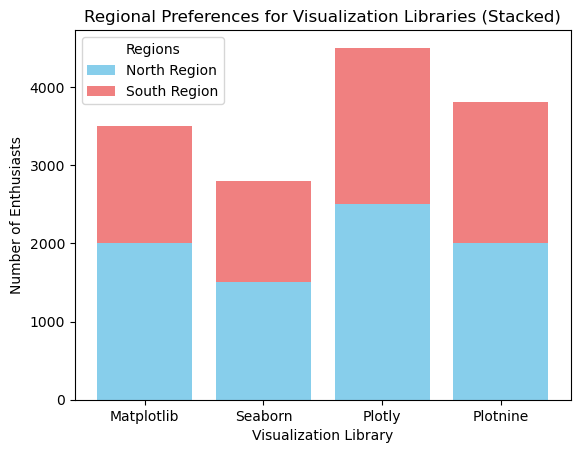
In this stacked bar plot, enthusiasts_south represents the data for enthusiasts in the South region, while enthusiasts_north is used as the base data for the North region. The plt.bra() function is called once to create the bars for the North region, then again to stack the bars for the South region on top.
You can check our course on Introduction to Data Visualization with Matplotlib for a more extensive explanation on how to use the Matplotlib Python library. There is also our Matplotlib Cheat Sheet, which breaks down the process into six basic steps.
Creating bar plots with Seaborn
Seaborn is a visualization library built on top of Matplotlib that simplifies the creation of very nice-looking bar plots.
Basic bar plots
Seaborn’s barplot() function makes it easy to create basic bar plots with minimal code. First, import the Seaborn library and create a dictionary.
import seaborn as sns
data = {'Library': library, 'Chosen by': chosen_by}
Then, use the sns.barplot() function to create the bar plot, specifying the x and y variables and the data source. Here, I'm using the viridis color palette.
sns.barplot(x='Library', y='Chosen by', data=data, palette='viridis')
plt.title('Which Visualization Library Do People Prefer?')
plt.xlabel('Visualization Library')
plt.ylabel('Number of Enthusiasts')
plt.show()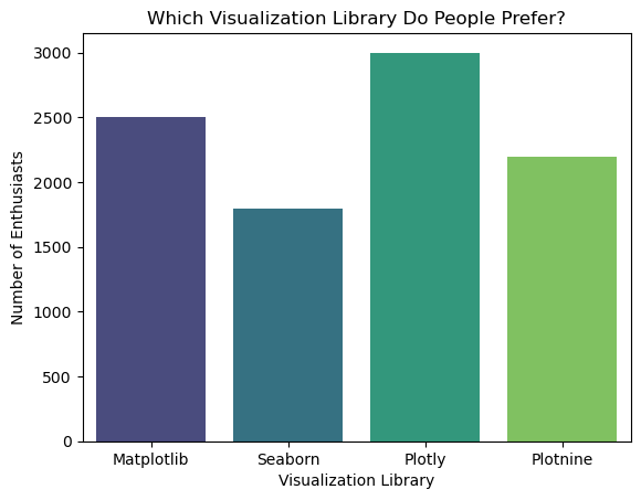
You can decide not to add a value for palette and you will get a uniform color in your chart or, better still, assign a color to the bar plot. In this case, I will be using a hexcode:
sns.barplot(x='Library', y='Chosen by', data=data, color=’#5EB1FF’)
plt.title('Which Visualization Library Do People Prefer?')
plt.xlabel('Visualization Library')
plt.ylabel('Number of Enthusiasts')
plt.show()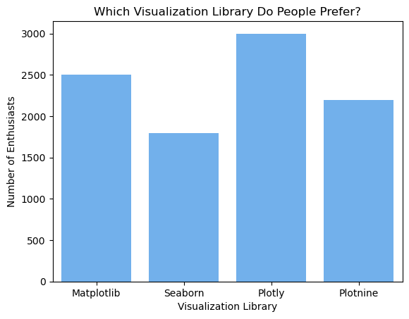
Advanced customization
Seaborn also, of course, allows for extensive customization options, including colors and annotations. For instance, you can add annotations to the bar plot similarly to how you did it in Matplotlib.
# Customized Bar Plot
sns.barplot(x='Library', y='Chosen by', data=data, palette='viridis')
plt.xlabel('Visualization Library')
plt.ylabel('Number of Enthusiasts')
plt.title('Which Visualization Library Do People Prefer?')

# Adding annotations
for i, value in enumerate(chosen_by):
    plt.text(i, value + 5, str(value), ha='center')
plt.show()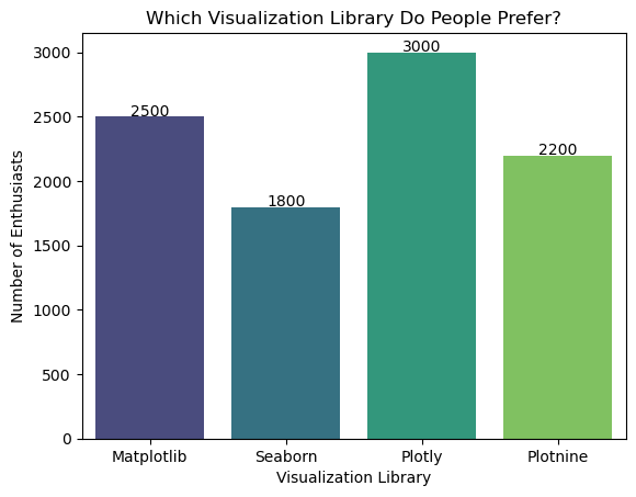
In this example, the palette='viridis' parameter changes the color palette of the bars, and the plt.text() function adds annotations to each bar.
You can check out our Introduction to Data Visualization with Seaborn course for much more detail. To make your Seaborn bar chart look especially nice, use our Seaborn Color Palette: Quick Guide to Picking Colors for some good ideas.
Creating bar plots with Plotly
Next up is Plotly, which is a library known for creating interactive and dynamic visualizations, including bar plots.
Basic bar plots
Creating a basic bar plot with Plotly involves using the graph_objects module. We can import the necessary module and create a bar plot using a sky blue color for the bars.
import plotly.graph_objects as go
fig = go.Figure(go.Bar(x=library, y=chosen_by, marker_color='skyblue'))
fig.update_layout(title='Which Visualization Library Do People Prefer?', xaxis_title='Visualization Library', yaxis_title='Number of Enthusiasts')
fig.show()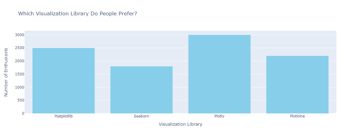
Advanced customization
Plotly provides ways to enhance the interactivity and appearance of bar plots. For example, you can add annotations to the bars using the fig.add_annotation() function.
fig = go.Figure(go.Bar(x=library, y=chosen_by, marker_color='skyblue'))
fig.update_layout(title='Which Visualization Library Do People Prefer?', xaxis_title='Visualization Library', yaxis_title='Number of Enthusiasts')

# Adding annotations
for i, value in enumerate(chosen_by):
    fig.add_annotation(x=library[i], y=value, text=str(value), showarrow=False, yshift=10)
fig.show()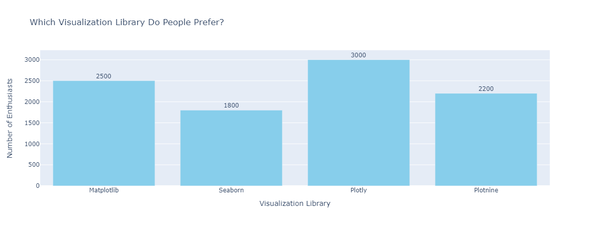
Dynamic and interactive bar plots
Plotly can create dynamic bar plots that update in real-time, making them ideal for dashboards. Using Plotly Express, a high-level interface for Plotly, you can create interactive bar plots with minimal code.
import plotly.express as px

# Using a sample dataset from Plotly
df = px.data.gapminder().query("year == 2007")
fig = px.bar(df, x='continent', y='pop', color='continent', hover_name='country', title='Population by Continent in 2007')
fig.show()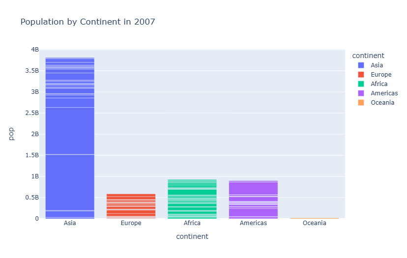
In this example, the px.data.gapminder() function loads a sample dataset from Plotly. The px.bar() function creates an interactive bar plot with the specified x and y variables, color, hover name, and title. We have a detailed course here at DataCammp if you want to see more: Introduction to Data Visualization with Plotly.
Creating bar plots with Plotnine
Plotnine is an implementation of the grammar of graphics in Python, inspired by ggplot2 in R. It allows for a declarative way of creating complex plots by combining different plot elements.
Basic bar plots
To get started with Plotnine, import the necessary libraries and create a DataFrame. Then, define a ggplot object, add a geom_bar layer, and specify the aesthetics.
from plotnine import ggplot, aes, geom_bar, labs

import pandas as pd
# Number of preferences for different libraries
data = pd.DataFrame({'Library': ['Matplotlib', 'Seaborn', 'Plotly', 'Plotnine'],
                     'Chosen by': [2500, 1800, 3000, 2200]})

# Basic Bar Plot
ggplot(data, aes(x='Library', y='Chosen by')) + geom_bar(stat='identity', fill='skyblue') + labs(title='Which Visualization Library Do People Prefer?', x='Visualization Library', y='Number of Enthusiasts')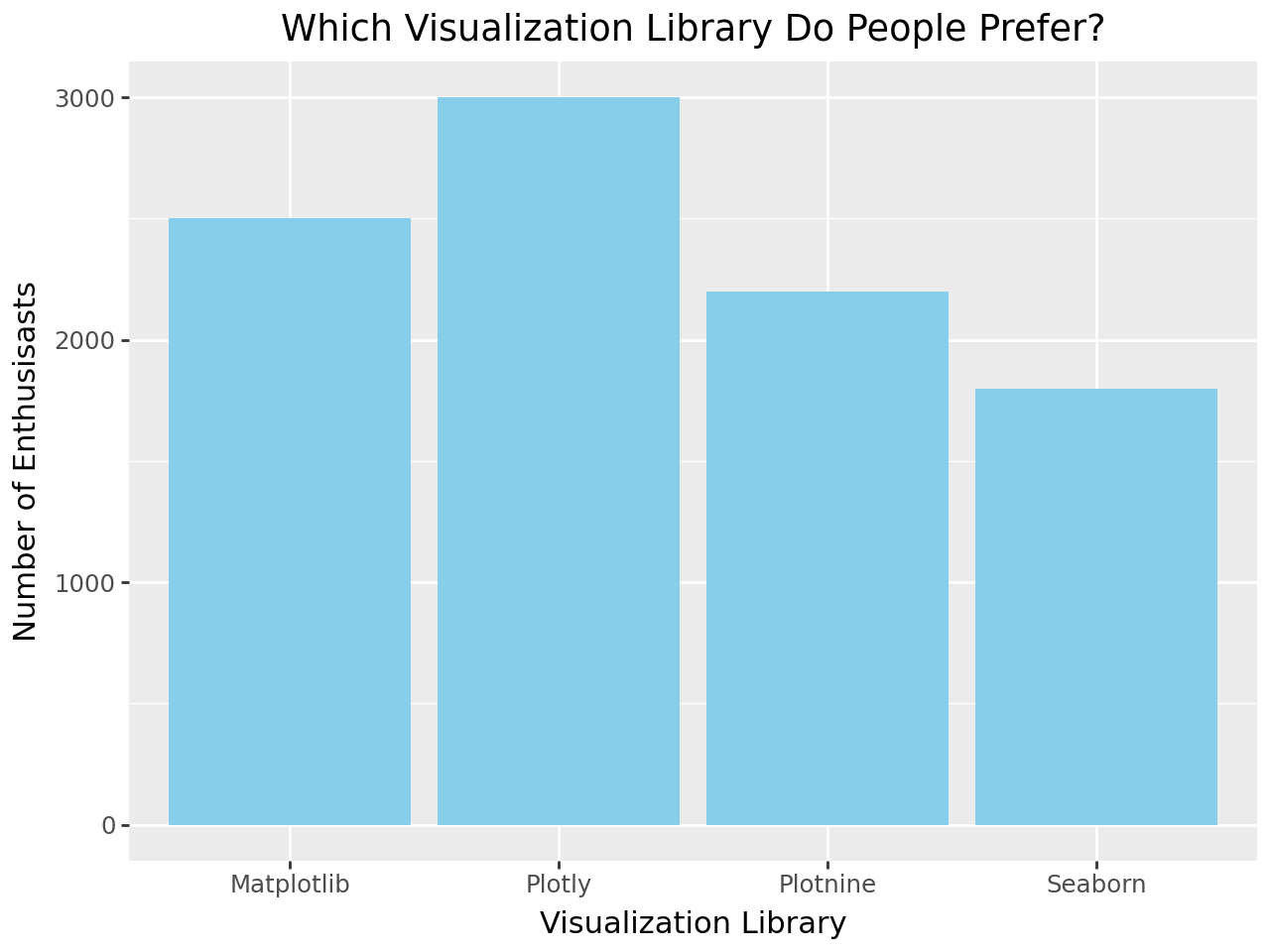
In this example, aes(x='Library', y='Chosen by') sets up the x and y aesthetics for the plot. The geom_bar(stat='identity', fill='skyblue') part creates a bar plot with a sky blue fill color.
Advanced customization
You can customize using Plotnine's layered approach. You can add annotations, axis labels, titles, and legends.
from plotnine import ggplot, aes, geom_bar, geom_text, labs
# Creating our Pandas DataFrame
data = pd.DataFrame({'Library': ['Matplotlib', 'Seaborn', 'Plotly', 'Plotnine'],
                     'Chosen by': [2500, 1800, 3000, 2200]})

# Basic Bar Plot with labels
(ggplot(data, aes(x='Library', y='Chosen by'))
 + geom_bar(stat='identity', fill='skyblue')
 + geom_text(aes(label='Chosen by'), va='bottom', size=10, nudge_y=5)  # Adds labels on top of bars
 + labs(title='Which Visualization Library Do People Prefer?', x='Visualization Library', y='Number of Enthusiasts'))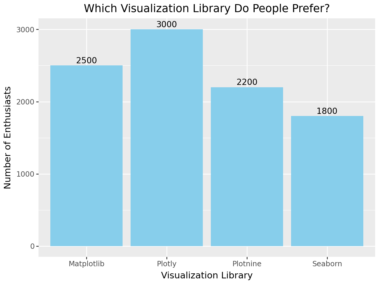
Grouped and stacked bar plots
Plotnine also supports grouped and stacked bar plots. For grouped bar plots, you need to first define a categorical variable for grouping.
# Number of preferences for different libraries in different regions
data = pd.DataFrame({'Library': ['Matplotlib', 'Plotly', 'Plotnine', 'Seaborn'] * 2,
                     'Chosen by': [2000, 1500, 2500, 2000, 1500, 1300, 2000, 1800],
                     'Region': ['North', 'North', 'North', 'North', 'South', 'South', 'South', 'South']})

# Grouped Bar Plot
(ggplot(data, aes(x='Library', y='Chosen by', fill='Region'))
 + geom_bar(stat='identity', position='dodge')
 + labs(title='Regional Preferences for Visualization Libraries (Grouped)', x='Visualization Library', y='Number of Enthusiasts'))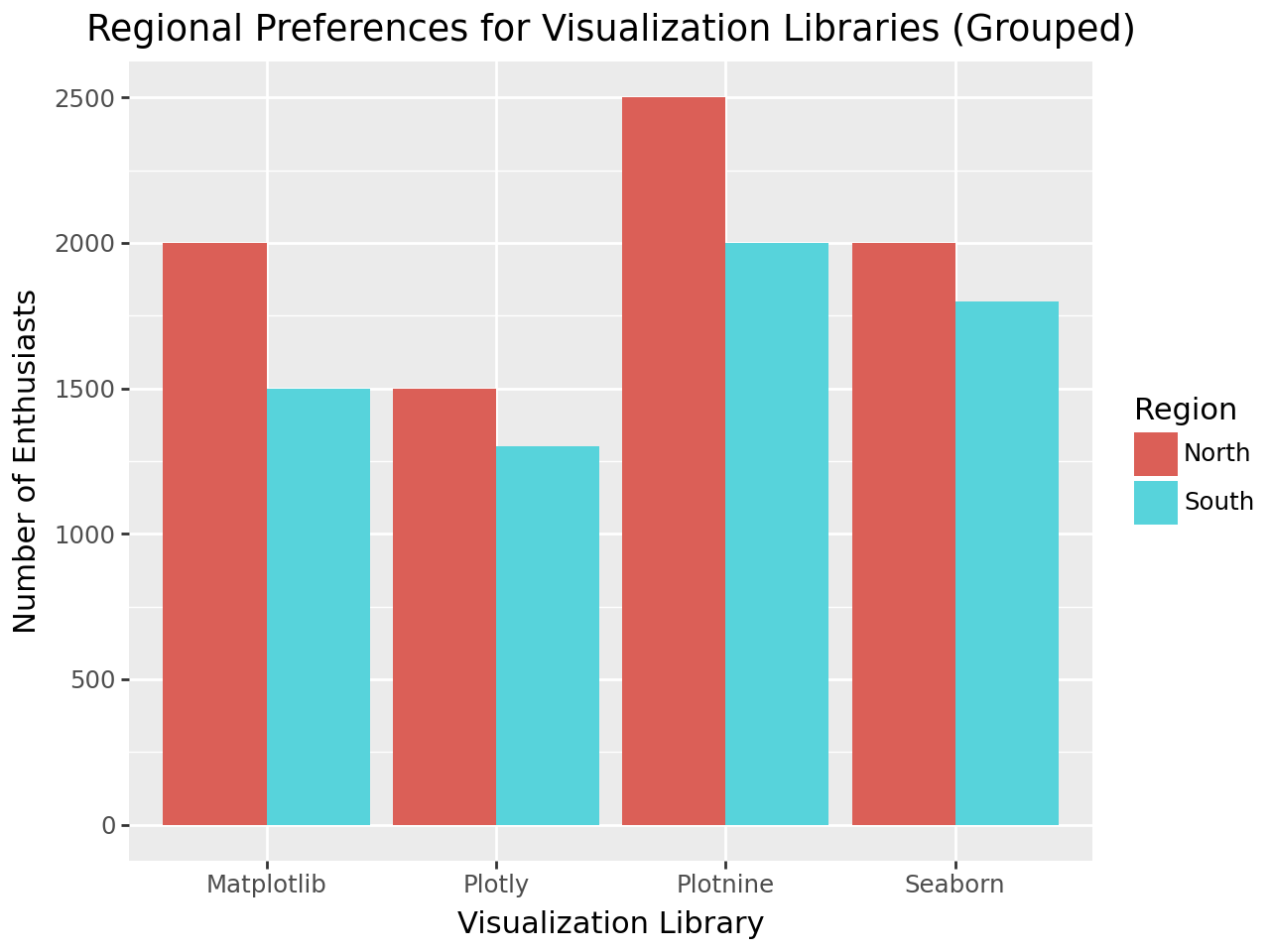
For stacked bar plots, you can use position = 'stack'.
# Stacked Bar Plot
(ggplot(data, aes(x='Library', y='Chosen by', fill='Region'))
 + geom_bar(stat='identity', position='stack')
 + labs(title='Regional Preferences for Visualization Libraries (Stacked)', x='Visualization Library', y='Number of Enthusiasts'))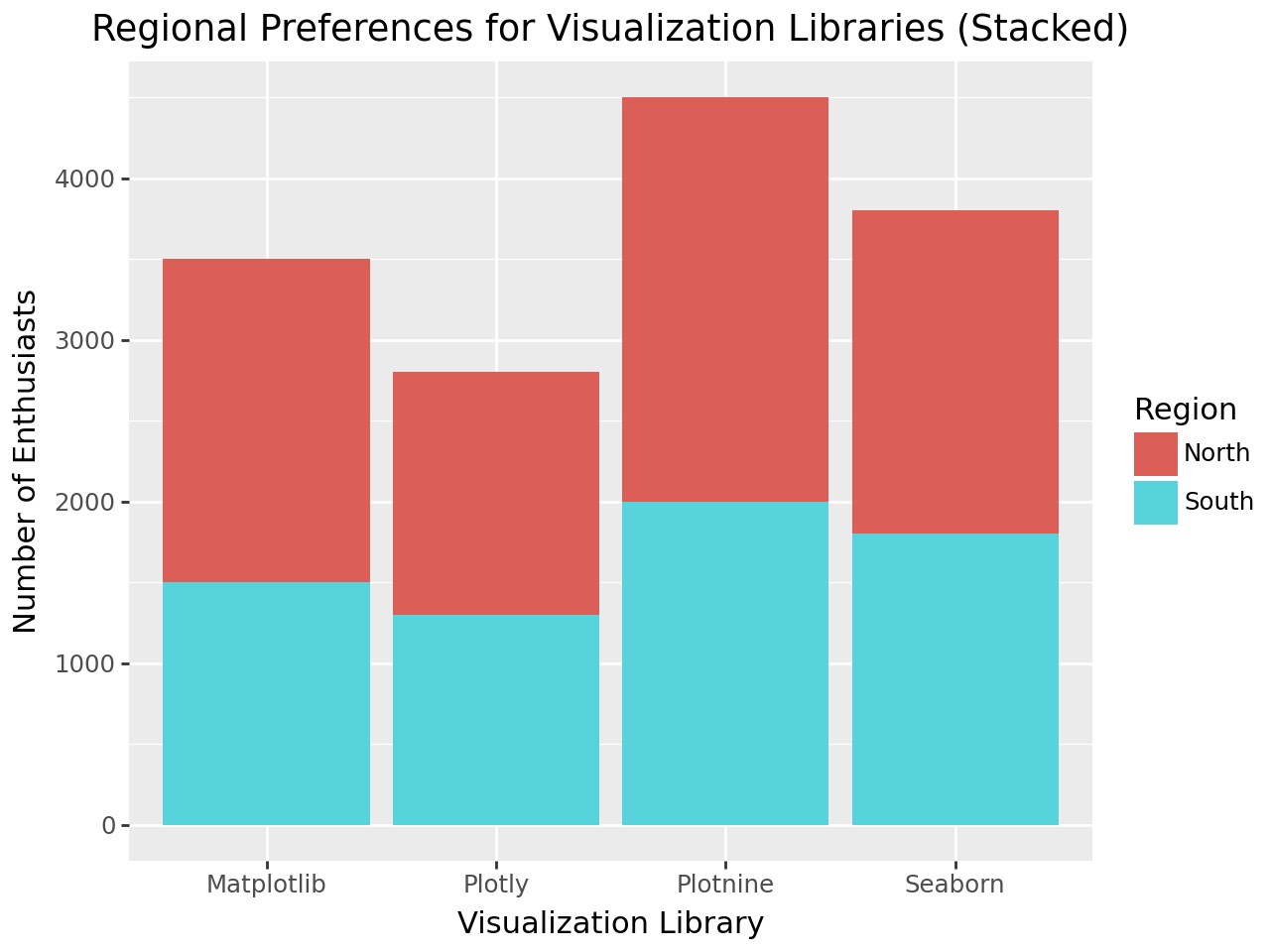
Notice how in these examples, position = 'dodge' creates grouped bars, while position = 'stack' stacks the bars.
Creating bar plots with Pandas
Last but not least is Pandas. Pandas provides a convenient way to create bar plots directly from DataFrames, so it's a quick and easy option for basic plots.
Basic bar plots
To create a bar plot in Pandas, you can use the plot.bar() function on a DataFrame.
import pandas as pd
data = pd.DataFrame({'Library': ['Matplotlib', 'Seaborn', 'Plotly', 'Plotnine'],
                     'Chosen by': [2500, 1800, 3000, 2200]})
Then, create a bar plot using plot.bar().
# Basic Bar Plot
data.plot.bar(x='Library', y='Chosen by', color='skyblue', title='Which Visualization Library Do People Prefer?')
plt.xlabel('Visualization Library')
plt.ylabel('Number of Enthusiasts')
plt.show()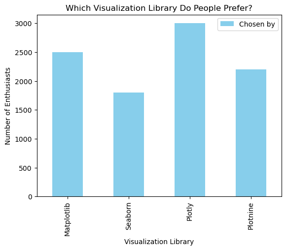
Advanced customization
Pandas allows for customization of bar plots through additional parameters and integration with Matplotlib.
# Customized Bar Plot
ax = data.plot.bar(x='Library', y='Chosen by', color='skyblue', title='Which Visualization Library Do People Prefer?')
ax.set_xlabel('Visualization Library')
ax.set_ylabel('Number of Enthusiasts')

# Adding annotations
for i in ax.containers:
    ax.bar_label(i, label_type='edge')
plt.show()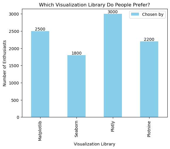
In this example, ax.bar_label(i, label_type='edge') adds annotations to the bars, displaying the number on top of each bar.
Grouped and stacked bar plots
Creating grouped and stacked bar plots in Pandas is straightforward. For grouped bar plots, you need to pivot the DataFrame to have separate columns for each group.
# Number of preferences for different libraries in different regions
data = pd.DataFrame({'Library': ['Matplotlib', 'Seaborn', 'Plotly', 'Plotnine'],
                     'North Region': [2000, 1500, 2500, 2000],
                     'South Region': [1500, 1300, 2000, 1800]})

# Grouped Bar Plot
data.plot.bar(x='Library', y=['North Region', 'South Region'], title='Regional Preferences for Visualization Libraries (Grouped)')
plt.xlabel('Visualization Library')
plt.ylabel('Number of Enthusiasts')
plt.show()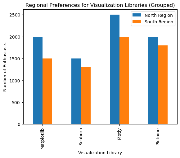
For stacked bar plots, use stacked=True.
# Stacked Bar Plot
data.plot.bar(x='Library', y=['North Region', 'South Region'], stacked=True, title='Regional Preferences for Visualization Libraries (Stacked)')
plt.xlabel('Visualization Library')
plt.ylabel('Number of Enthusiasts')
plt.show()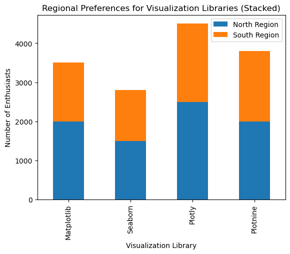
Best Practices for Designing Effective Python Bar Plots
Creating bar plots is straightforward, but designing effective and insightful bar plots requires attention to detail. The following guidelines will help you create bar plots that effectively communicate your data’s story.
- Avoiding Common Mistakes: When designing bar plots, avoid overloading with information to keep them clear and effective. Stick with the essential stuff to prevent clutter. Use consistent scaling across axes. Make sure the axis starts at zero to avoid misleading viewers with exaggerated differences.
- Choosing Colors and Highlights: Select colors that add meaning to your data, such as red for negative values or green for positive ones. Maintain a consistent color scheme across related plots to help the reader follow the narrative. Use color to draw attention to important insights.
- Ordering Bars for Better Clarity: Organize bars logically based on the data context, like chronologically for time-based data, or in descending/ascending order to emphasize trends. Group related bars together and use color or spacing to separate groups.
Conclusion
Mastering the creation and customization of bar plots is an essential skill for any data professional. By following the guidelines and best practices outlined in this article, you can create clear, informative, and visually appealing bar plots that effectively communicate your data insights. This will enable you to present your data more effectively and make better-informed decisions.
If you want to keep practicing your Python data visualization abilities , look into our Intro to Python for Data Science course, which provides a starting point for beginners, or else look into our Python Programming skill track offers a comprehensive learning path for mastering Python.
Experienced data professional and writer who is passionate about empowering aspiring experts in the data space.
Python Bar Plot FAQs
What is a Python bar plot, and why is it useful?
A bar plot represents categorical data with rectangular bars, where the length or height corresponds to the category’s value. It’s useful for comparing categories, visualizing distributions, and spotting trends or outliers.
How do I choose between a vertical and horizontal Python bar plot?
You can use a vertical bar plot for short or easily readable labels, while you choose a horizontal bar plot for longer labels or many categories to avoid clutter.
How do I customize the colors of the bars in my plot?
You can customize the bar colors to make your plot more visually appealing or to match a specific color scheme. In Matplotlib, use the color parameter:
plt.bar(categories, values, color=['red', 'green', 'blue'])
plt.show()
How can I use Python to sort the bars in my bar plot?
Sorting the bars can help highlight the most or least significant categories. You can sort your data before plotting:
data = {'Category': ['A', 'B', 'C'], 'Value': [4, 7, 1]}
df = pd.DataFrame(data).sort_values(by='Value', ascending=False)
plt.bar(df['Category'], df['Value'])
plt.show()
Can I create interactive Python bar plots with Plotly?
Yes, Plotly allows you to create interactive bar plots. Here’s an example using Plotly Express:
import plotly.express as px
data = {'Category': ['A', 'B', 'C'], 'Value': [4, 7, 1]}
fig = px.bar(data, x='Category', y='Value', title='Interactive Bar Plot')
fig.show()
