
Track
Power BI Fundamentals
17 hr
Let’s explore in more detail the differences between dashboards and reports in Power BI:
Both dashboards and reports in Power BI are tools designed to visualize and communicate data effectively. They are customizable and allow for a wide range of visualization options, such as charts, graphs, and tables. Additionally, both can connect to a variety of data sources, facilitating data integration for comprehensive analysis.
In our Data Analyst in Power BI career track, you’ll learn how to master both reports and dashboards, as well as how to import, clean, manipulate, and visualize in Power BI.
As we’ve mentioned already, there are several ways in which reports and dashboards in Power BI differ:
To illustrate the differences between Power BI Dashboards and Reports, let's take
a look at some practical examples:
Imagine you are a retail manager who wants to monitor the overall health of your business. Your dashboard might include visualizations showing sales revenue, profit margin, inventory levels, and customer footfall. These KPIs would provide an at-a-glance, real-time view of business performance. Suppose there's a sudden drop in sales revenue; with a well-crafted dashboard, you can immediately spot this and start investigating.
You can see more examples in our article on Power BI Dashboard examples.
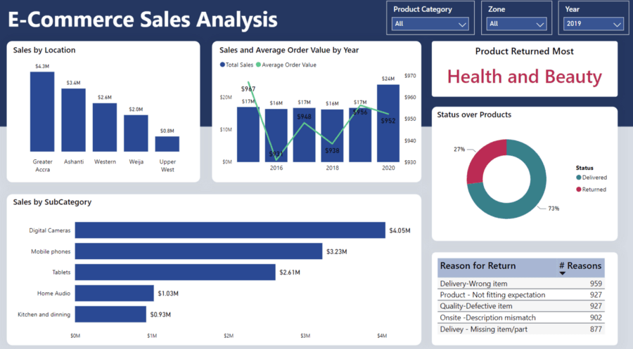
A Power BI Dashboard example
Now let's consider a situation where you want to analyze the impact of a recent promotional campaign on sales. For this, you would turn to a Power BI report. The report could include multiple pages, each showing sales data from different angles - by product, by region, and over time. With interactive elements like drill-through and filtering, you can examine the sales of a particular product in a specific region, and even check how the sales trend changed before, during, and after the promotional period.
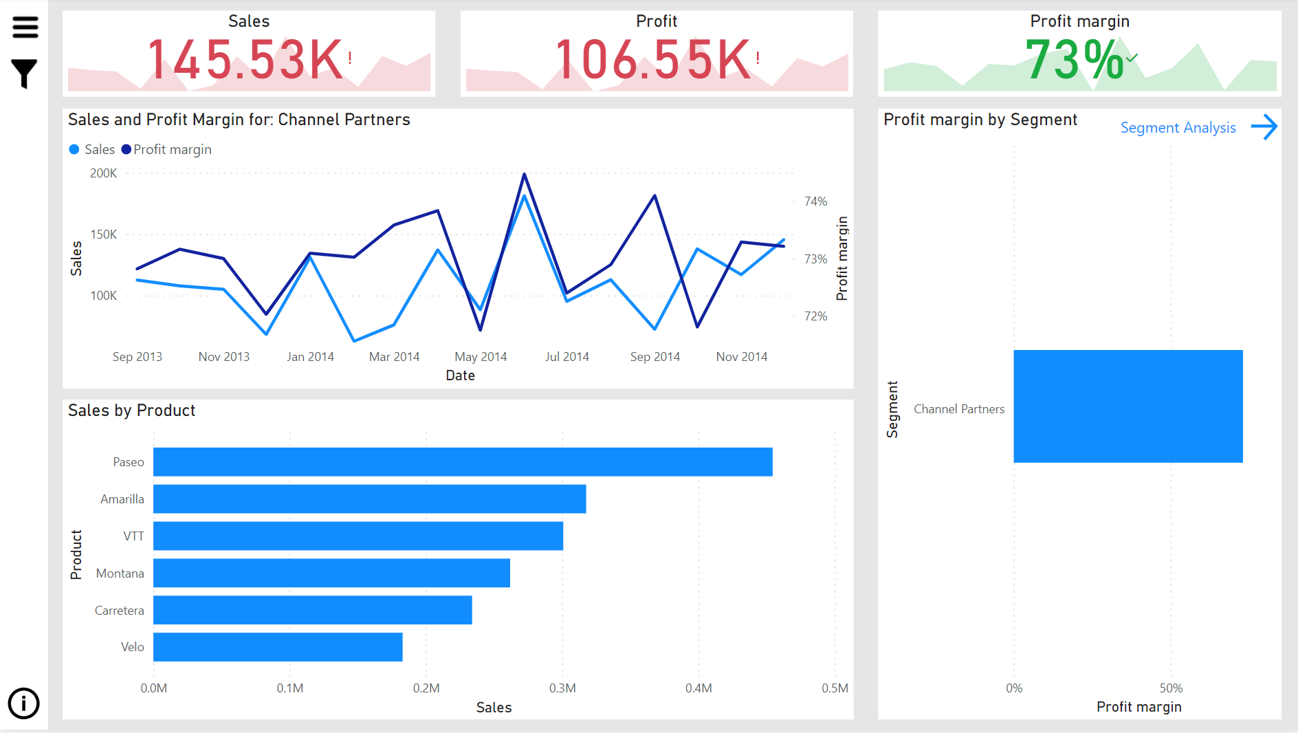
Power BI Report example
Remember, the primary purpose of a dashboard is to provide a real-time consolidated view of business performance, ideal for quick insights and monitoring. On the other hand, reports are designed for detailed, interactive analysis, enabling you to explore data in-depth and answer complex business questions. By considering your data needs and the questions you want to answer, you can determine whether to use a dashboard or report for your analysis.
In summary, Power BI dashboards are focused on providing a consolidated view of key metrics, facilitating real-time monitoring and quick insights.
On the other hand, Power BI reports offer comprehensive, interactive analysis capabilities, allowing users to explore data in-depth, perform complex calculations, and customize visualizations.
Understanding the differences between dashboards and reports is crucial for leveraging the full potential of Power BI in analyzing and communicating data effectively within your organization.
To get started building Power BI reports and dashboards, check out our Power BI Fundamentals skill track, where you’ll learn how to clean, analyze, and visualize your data.
Master the world's most popular business intelligence tool.
Get Started Learning Power BI Today!
Track
Course
Course
blog
Kurtis Pykes
10 min
blog
Kenneth Leung
7 min
blog
Gus Frazer
15 min
Tutorial
DataCamp Team
Tutorial
Kafaru Simileoluwa
code-along
Iason Prassides