
Introduction to Power BI Dashboards
Power BI offers interactive and dynamic features required for creating interactive dashboards. These dashboards, which are simply a collection of visuals, can be built with a deep level of interactivity and are accessible in various formats to consumers. Since they are usually a single page, Power BI dashboards need to be well-designed highlights of an entire story.
It is also important to note that Power BI dashboards are quite different from Power BI reports. For example:
- Power BI reports are available on Power BI Desktop and Power BI service, while Power BI dashboards can only be found on Power BI service.
- Reports can be multi-paged, while dashboards are single-paged highlights.
This tutorial introduces an end-to-end process of features available in the Power BI service for building interactive dashboards. Although they are a single page and may seem to restrict the depth of insights, dashboards are excellent ways of ensuring that only the most important metrics in the organization are captured.
This seemingly restrictive nature ensures that deep consideration is given to the different visualizations (referred to as tiles) to be captured. These visualizations or tiles can come from multiple reports using different datasets, on-premise or on-cloud, which deliver a highly interactive analytics solution.
Now, let us explore the steps involved in building a Power BI dashboard.
Master Power BI From Scratch
Building a Power BI Dashboard
Getting started with Power BI service
As mentioned earlier, dashboards are available only on the Power BI service. Therefore, before we begin, we will need a corporate email for access. Visit app.powerbi.com to register your corporate email, or if you are a student or have an existing work or business email, you can also use that to sign up. After signing in, a home page is displayed.
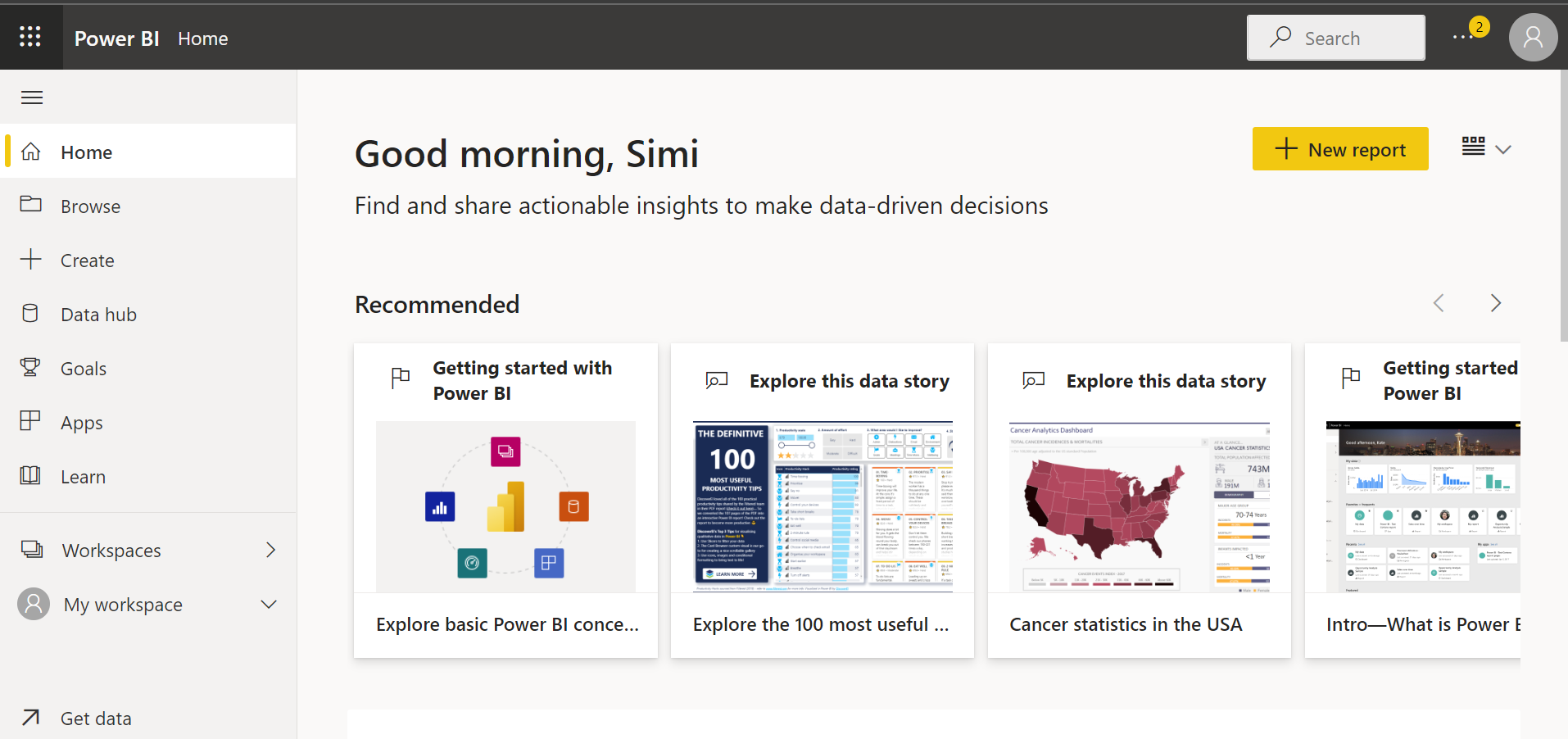
Getting started with Power BI. Image by Author
Importing data
The first step in building a Power BI dashboard is to import the dataset that will be used to build the report. You can connect to a variety of data sources, including Excel worksheets, databases, the web, and cloud services.
On the homepage of the Power BI service, you can click on the ‘Get Data’ button found at the bottom right of your window.
A new ‘Get Data’ window will come up, and we should be able to preview some of the major data sources available for building our dashboard.
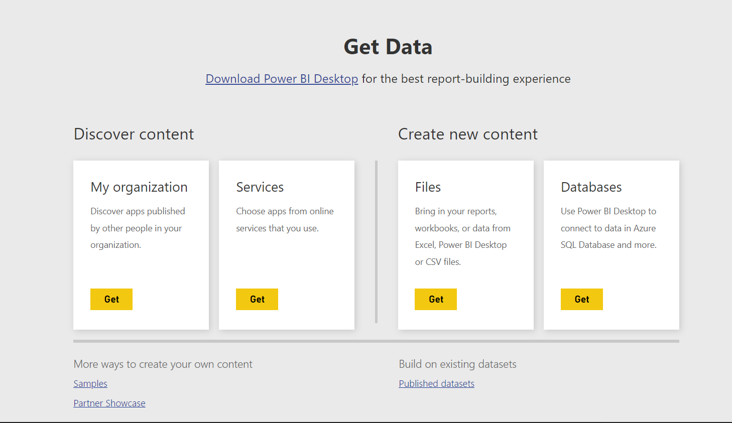
Power BI Get Data screen. Image by Author
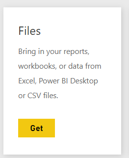
- Our file type is an Excel workbook. Next, we will click on the ‘Get’ button in the ‘Files’ section.
Power BI Get Files. Image by Author
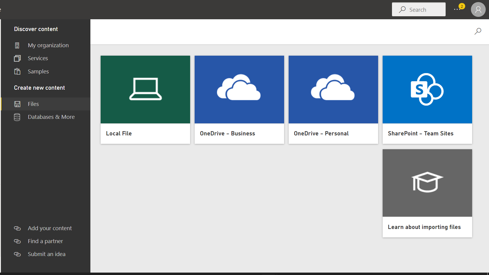
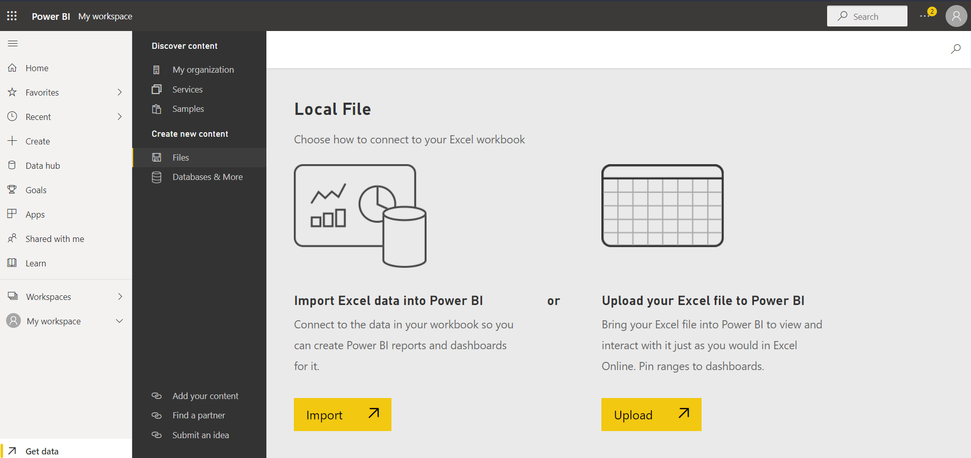
- Choose the ‘Local File’ option from the list of options on the next page and upload the Excel file.
Power BI File Options. Image by Author
- Note: If we are importing an Excel workbook, we will have an extra window as shown below. Select the ‘Import’ option. A ‘Success!’ pop-up will then appear.
Power BI Import Local File. Image by Author
- The Superstore dataset upload (downloadable here) should be visible on the workspace page. If not, reload your browser page.
- You can also make use of other datasets provided by DataCamp.
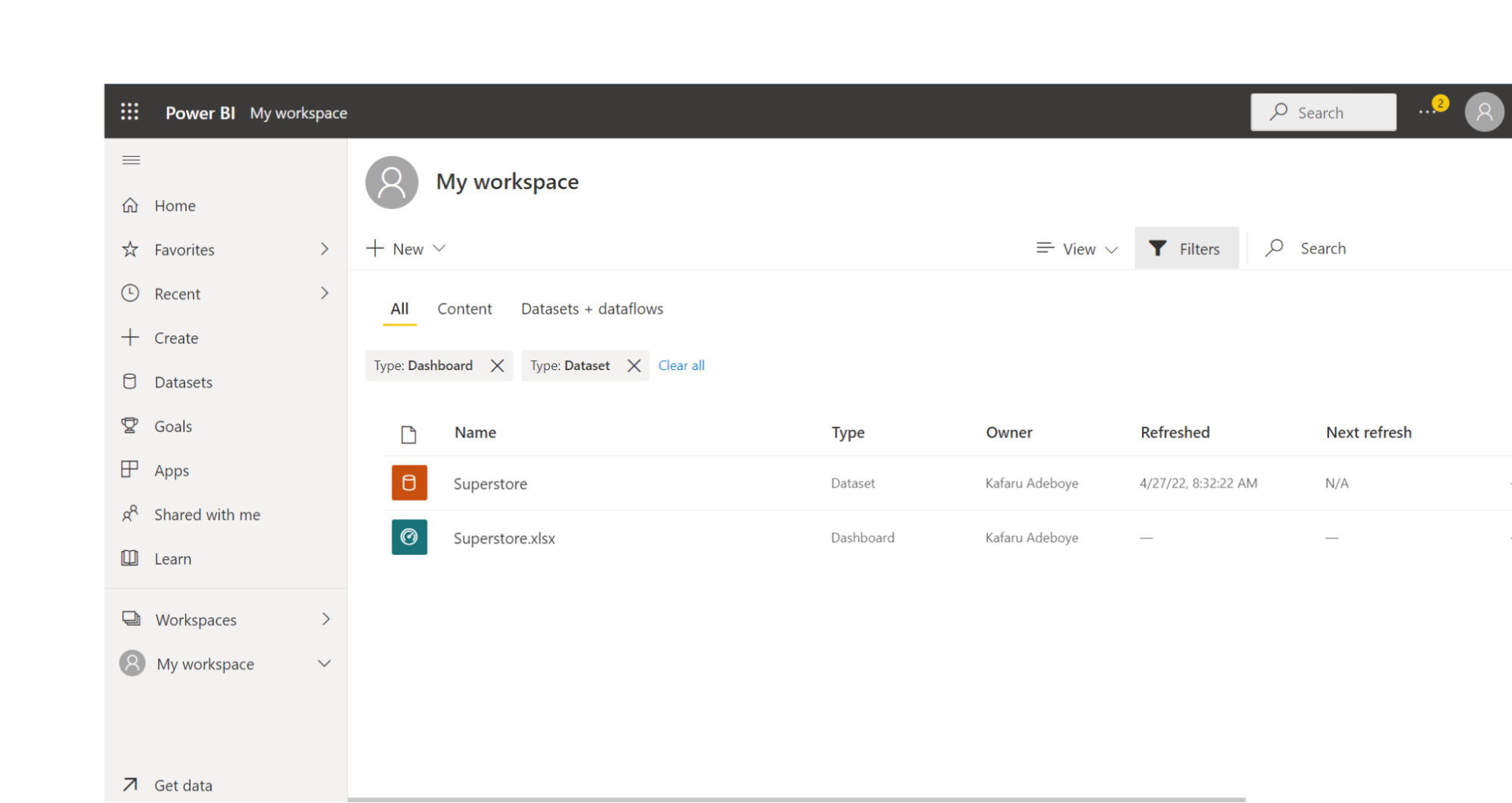
Power BI Workspace. Image by Author
Opening a report from the uploaded data
Notice that from the workspace image, there are two file types of the same name. One is the dataset and the other is the dashboard.
Click on the Superstore.xlsx dashboard. On the blank canvas that pops up, click on the dataset name ‘Superstore.xlsx’.
Finally, a Reporting canvas will appear, similar to the view on Power BI Desktop.
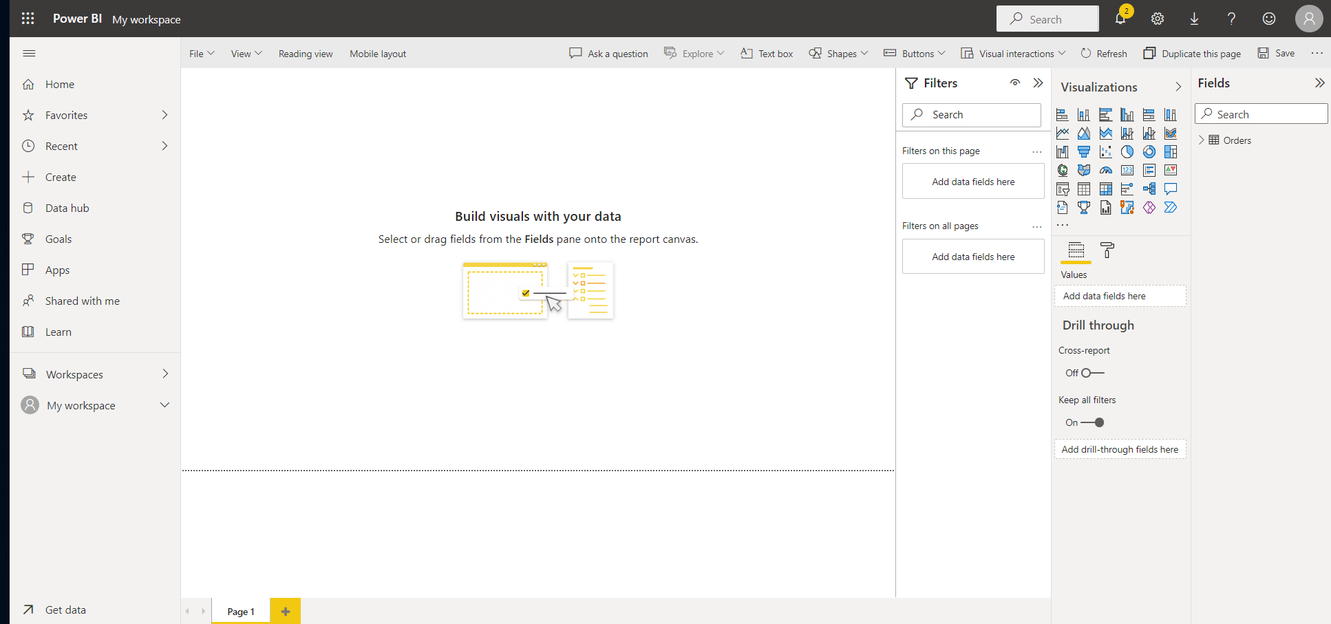
Power BI Reporting Canvas. Image by Author
Creating a tile and ‘Pin to a Dashboard’
Power BI report service, just like the desktop version, includes a variety of page formatting options, including visuals, shapes, and images, that can help your report stand out. One of the most efficient ways to identify and communicate insights is to use Power BI to create visuals. You can begin creating your visuals after you have decided on the data that will form the basis of your report, and designed the layout of this report.
However, before you start working on your data visualization, you must first decide what insights you want to garner, and then develop and personalize visualizations to display the data in an engaging and informative manner.
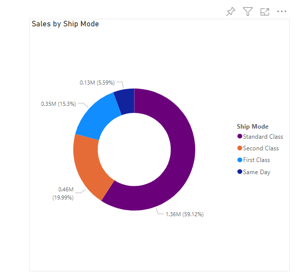
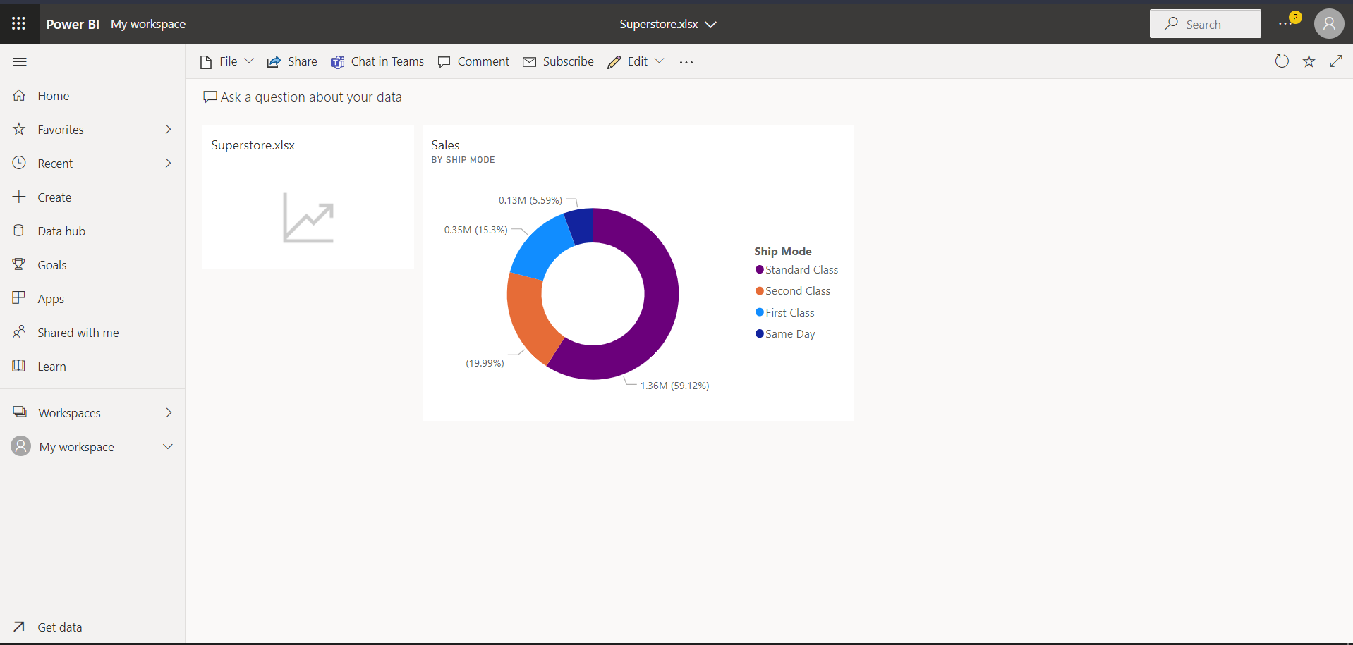
You can work on how to visualize these insights after you have identified them in order to bring value to your audience. We will create a simple donut chart that shows the ‘Sales across the Shipmode’.
- Select the donut chart option from the visualization pane.
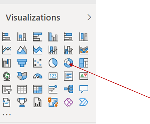
Power BI Visualization Pane. Image by Author
- Drop the Sales in the Values field and Ship Mode to the legend.
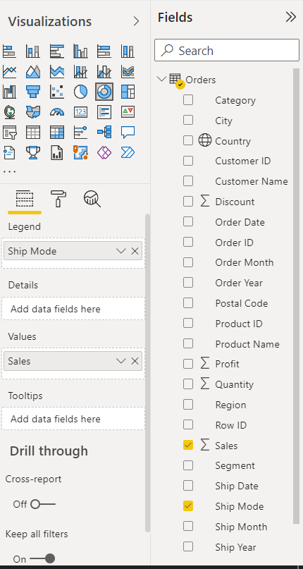
Power BI Values Field. Image by Author
- We now have a donut chart.
Power BI Donut Chart. Image by Author
- Save the report by clicking on the ‘Reading view’ option on the ribbon at the top.

- Give the report a name. In this case, we will call it ‘Superstore’.
Power BI offers access to a number of visuals relevant to building your dashboards. A discourse on this topic can be found in the Data Visualization in Power BI Course | DataCamp.
Pinning a single visual to a dashboard
- Now that we have created a tile, we can pin this to a dashboard.
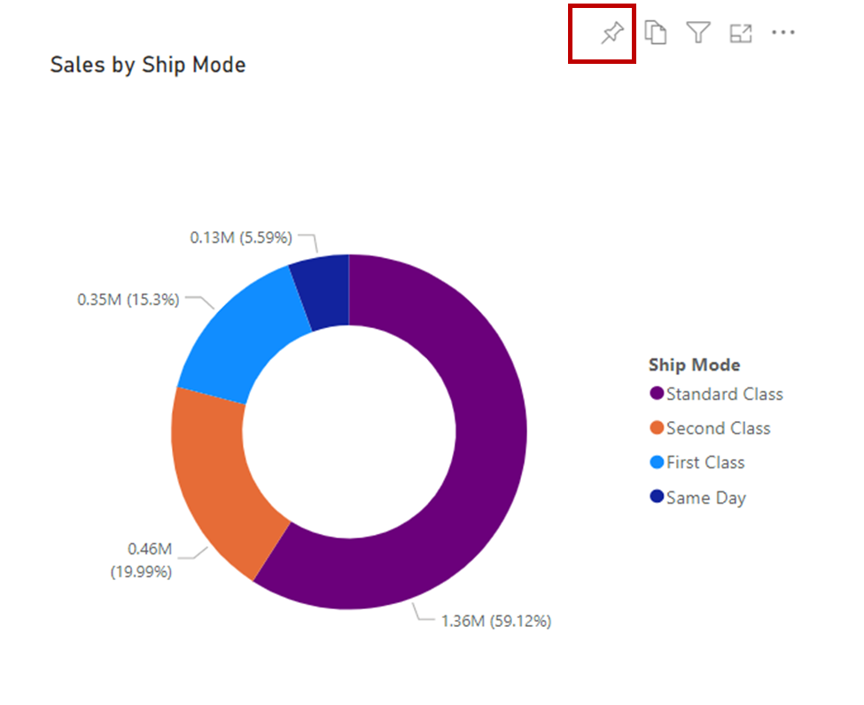
Power BI Pin Icon. Image by Author
- Hover over the recently created donut chart and click on the pin icon that appears.
- A ‘Pin to dashboard’ window will appear. You can pin to an existing dashboard that we created while importing the dataset or create a new one. In our case, we will pin to the existing one and then click on the ‘Pin’ button.
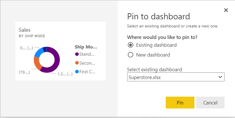
Power BI Pin to Dashboard. Image by Author
- A pop-up will appear on the top right. Click on ‘Go to dashboard’.
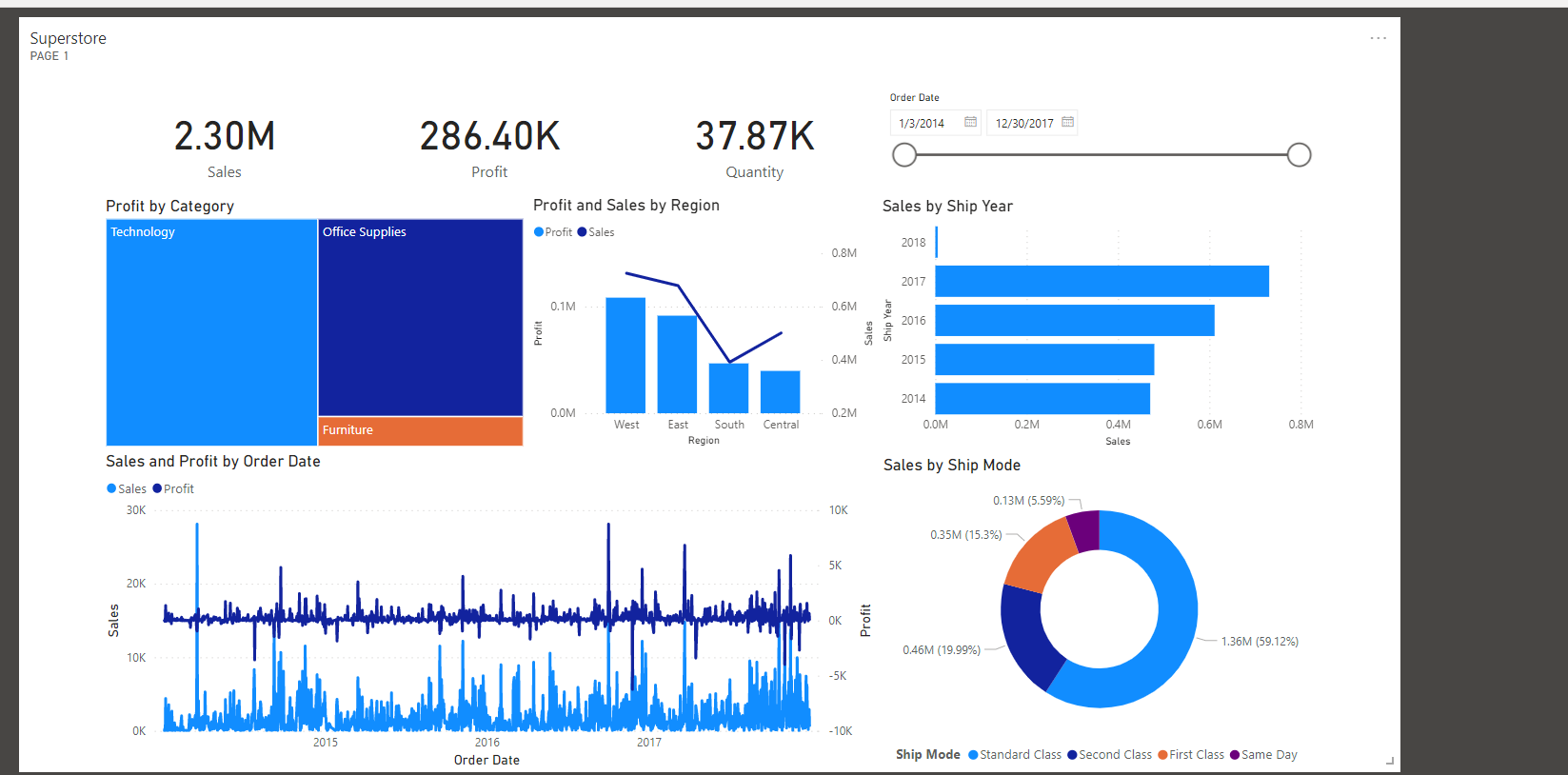
- We will be taken to a new window, the Superstore Dashboard.
Power BI Superstore Dashboard. Image by Author
Organizing and updating tiles
Positioning of Tiles
You can move the tile around on your dashboard to a convenient position just by holding a left click on the tile and moving it.
Tile Size
You can increase or decrease your tile size by dragging the little arrow at the bottom right of the tile.
Other Tile Options:
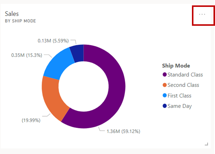
By clicking on the kebab (...) menu on the tile, more options are shown around ‘Tile settings’.
Power BI kebab menu. Image by Author
Power BI tile options. Image by Author
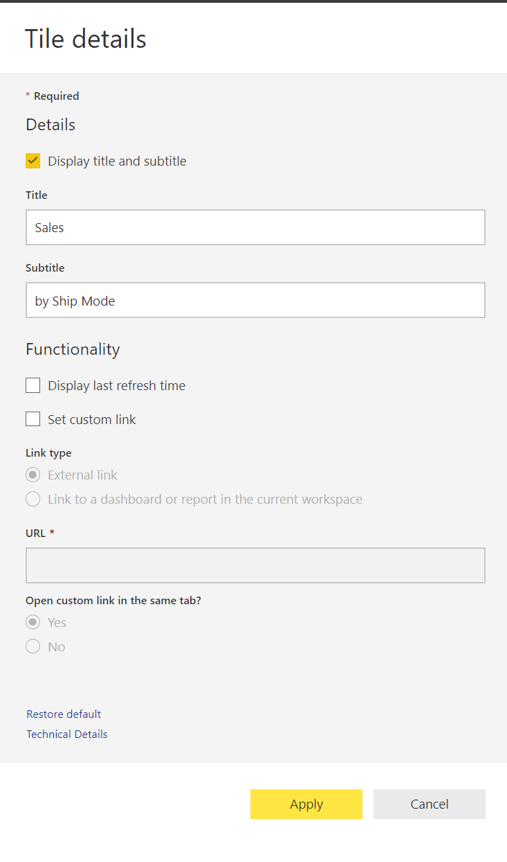
Edit Details
- From the option above, we can click on ‘Edit details’.
Power BI Tile Details. Image by Author
- We can make certain edits, such as changing the tile title and displaying the last refresh time showing when a certain tile was last updated. A custom link can also be associated with your tile.
Pin an Entire Report to a Power BI Dashboard
- We will first need to create more visuals for our Superstore Report. You can download the sample report used here.
- Go back to ‘My workspace’. Open the Superstore report type.
- Click on the Edit button.
- Add some more Power BI Visuals.
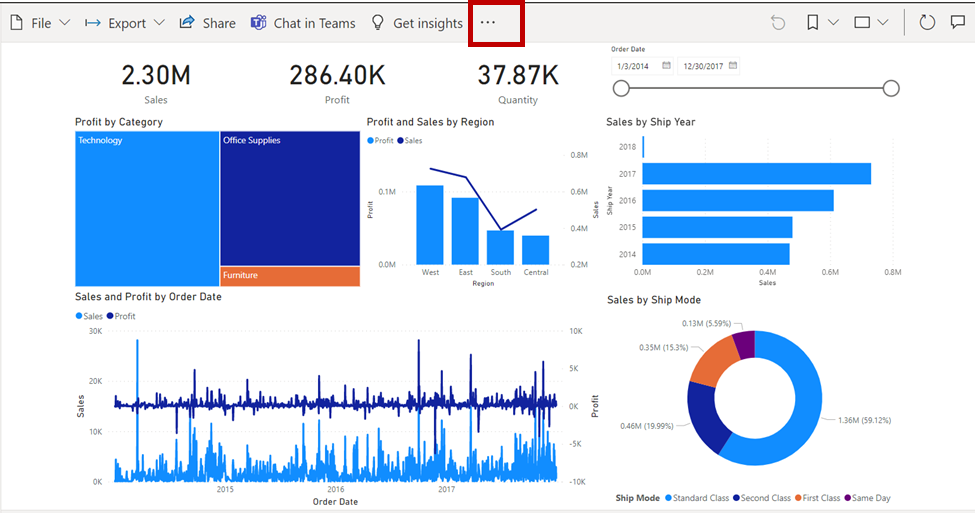
- Select the option (...) at the top of the report view.
For more in-depth information, check out this tutorial on creating Power BI reports or consider signing up for DataCamp's Reports in Power BI Course.
Power BI Dashboard Report. Image by Author
- Choose the ‘Pin to a dashboard’ option.
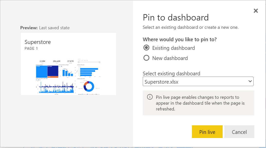
Power BI Pin Live option. Image by Author
- Click the ‘Pin live’ option. Then select the ‘Go to dashboard’ option.Note: when pinning at a report level, any changes that happen to the report will also be taken into effect on the dashboard.
- You should now see your report page pinned to a dashboard.
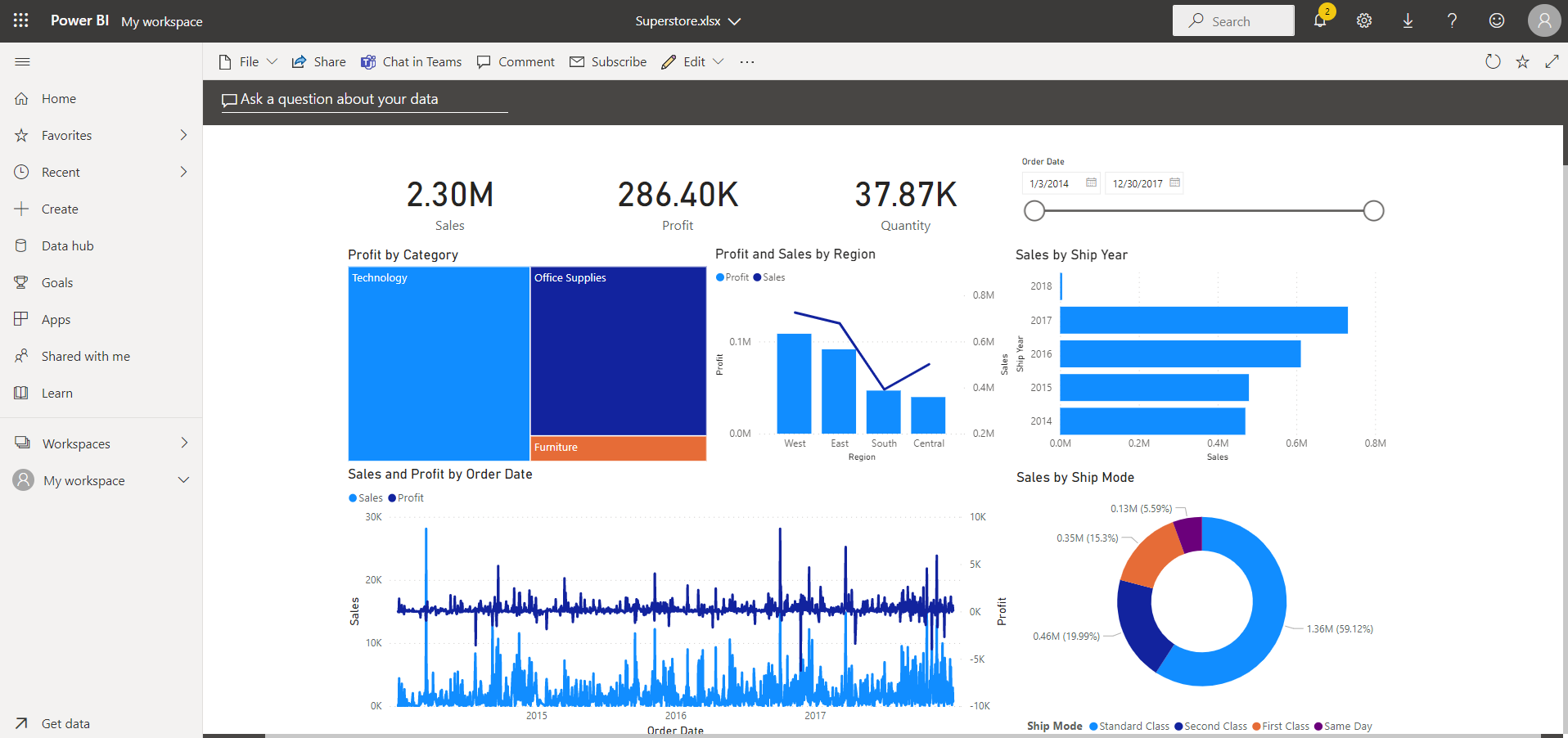
Power BI Dashboard. Image by Author
Changing Dashboard Themes
Every Power BI dashboard has a default theme that can be changed to suit the dashboard's target audience. To change the theme of a dashboard, edit the option of your dashboard view.
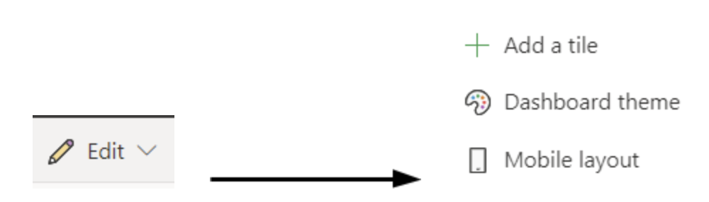
- Clicking on the ‘Dashboard theme’, a theming window will pop up on the left-hand side of the dashboard page.
- By switching to the dark color, notice how the background of the dashboard changes.
Power BI Dashboard with dark background. Image by Author
Using custom themes
We can either choose from a few available themes or make our own ‘custom’ theme. In changing the drop-down from the window above to custom, we see some customizable options. This will give us more control over our dashboard’s aesthetics. If you want to add a background image, we recommend that your image have a resolution of at least 1920x1080. To use an image as a background, upload the image to a public website, copy the URL, and paste it into the Image URL field.
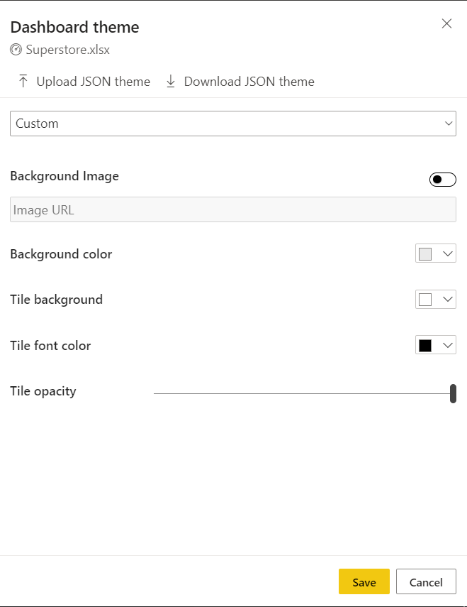
Power BI Dashboard theme. Image by Author
A few things to note with themes:
- If you pin a tile to a dashboard, the tile (a single visual) will retain the theme for the dashboard.
- Reports created in the Power BI service will retain their themes, even when you pin them to a dashboard. In the image above, notice that only the overall background changes.
- There is a report-level tile theming option, but it only appears when you create a report in the Power BI Desktop, add a report theme there, and then publish it to the Power BI service.
Additional Dashboard Features and Tile Settings
There are a few other features you can make use of with Power BI dashboards:
- Adding Images, Shapes, and Textboxes: Clicking on the Edit button on the dashboard, choose ‘Add a tile’. You can include images in the form of a company logo, text boxes for title blocks, comments, etc.
- Share a Power BI Dashboard: At the top of our dashboard page, we can share the dashboard with other members of our organization.
- Collaboration with Comments: When we build dashboards like this, it is important to get feedback and collaborate with either team members or major consumers of this report. The comments option provides a mini forum for conversations around the dashboard elements.
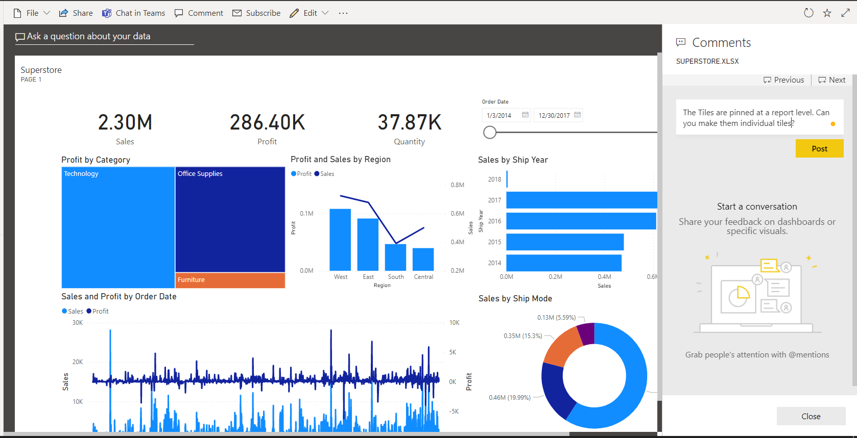
Power BI comments. Image by Author
- Expand and Collapse a Dashboard Screen: We can switch to a full-screen display mode using the expand button on the top right window. All the ribbons at the top will disappear and you will have a full screen showing the dashboard.
Dashboard Layouts and Settings
There are two points that need to be thoroughly considered when building a Power BI dashboard. As mentioned earlier, Power BI dashboards are single-paged and should therefore contain important information and be actionable enough for stakeholders to drive decision making and understandable.
Common mistakes to avoid when building Power BI dashboards
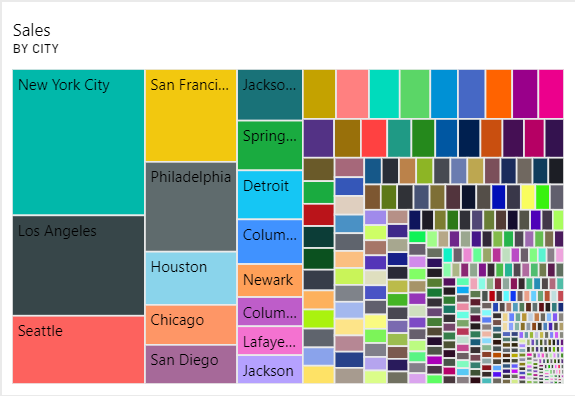
Power BI inappropriate visual selection example. Image by Author
- Don't choose an inappropriate visual for your dataset: A visual (or tile) like the one above is not actionable. While it is difficult to visualize so much information, a bar chart would do a much better job. Bar charts, line charts, scatter plots, area charts, pie charts, and other visuals are available in the Power BI service. When building Power BI tiles for your dashboards, it is critical to match data insight with the most appropriate visual. The following are some of the most common visuals and their applications:
- Line chart: The line chart is best used to visualize changes in numeric variables over time.
- Bar and column charts: The bar and column charts are best suited for categorical data to reveal the relationship between categorical and numerical variables. The column and bar chart are often used interchangeably.
- Scatter plot: The scatter plot is used for visualizing the relationship between two numerical variables.
- Tables: The table visual can be used to display numerical data by categories in a tabular format
- Pie Chart: Pie chart is often used to illustrate the contribution of different values on the whole. It can be used interchangeably with the donut chart. However, it is not advisable to use a pie or donut chart when you have too many categories.
- Ensure proper and clear labeling: Make sure all x and y labels of each plot are visible.
- Be consistent with colors.
- Avoid too many slicers: Dashboards are single-paged, and you must consider the importance of every tile you add to your dashboard. Too many slicers will become redundant and take up valuable space.
You can take a deep dive into designing reports and dashboards with this course on User-oriented Design in Power BI Course | DataCamp.
General dashboard settings
You can make basic changes with regards to:
- A dashboard’s name
- The inclusion of a dashboard on a Power BI Home page
- Turning on/off comment blocks.
To access these settings, click on the file option ‘Settings’. You will get a dashboard settings window where you can make any of these changes.
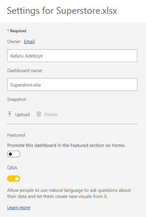
Power BI Dashboard settings window. Image by Author
Workspace Access
Power BI workspaces are used to collaborate and share content with colleagues. There is a workspace level access control that allows you to add colleagues to a workspace to collaborate on dashboards, reports, datasets, and other items available in the workspace environment.
How to create a workspace
- Click on the ‘Workspaces’ option and then choose the ‘Create a workspace’ option.
- Assign a unique name to the workspace and a description.
- We can preview all workspaces available by clicking on ‘Workspaces’ again. This should show a list of all workspaces you are privy to.
Workspace roles
For each workspace, there is an ‘Access’ option. These access levels, more specifically called ‘Roles’, let workspace owners manage the level of freedom and access a user has in a Power BI workspace environment.
There are four possible roles available:
- Admin
- Contributors
- Members
- Viewers
Giving access to Power BI dashboards
If you want team members to actively collaborate with you in a workspace, you can add them as either admin, members, or contributors. However, view-only users should be added as viewers. Here is an exhaustive list of functions available for each role.
Subscriptions
Email Subscription is a feature available to Power BI Pro license users that allows you to subscribe to dashboards or reports in Power BI service which are important for decision making. With this functionality, subscribers to a dashboard will receive regular screenshots of the dashboard page in their email inbox.
The subscription settings allow dashboard builders to decide on the frequency of these emails.
Requirements to subscribe
To subscribe to a Power BI dashboard, each subscriber needs to either have a:
- Power BI Pro license of Premium Per User License (PPU) or
- A Premium Capacity Workspace.
Subscribing to a Dashboard
- At the top of the Power BI dashboard page, click on the ‘Subscribe’ button.
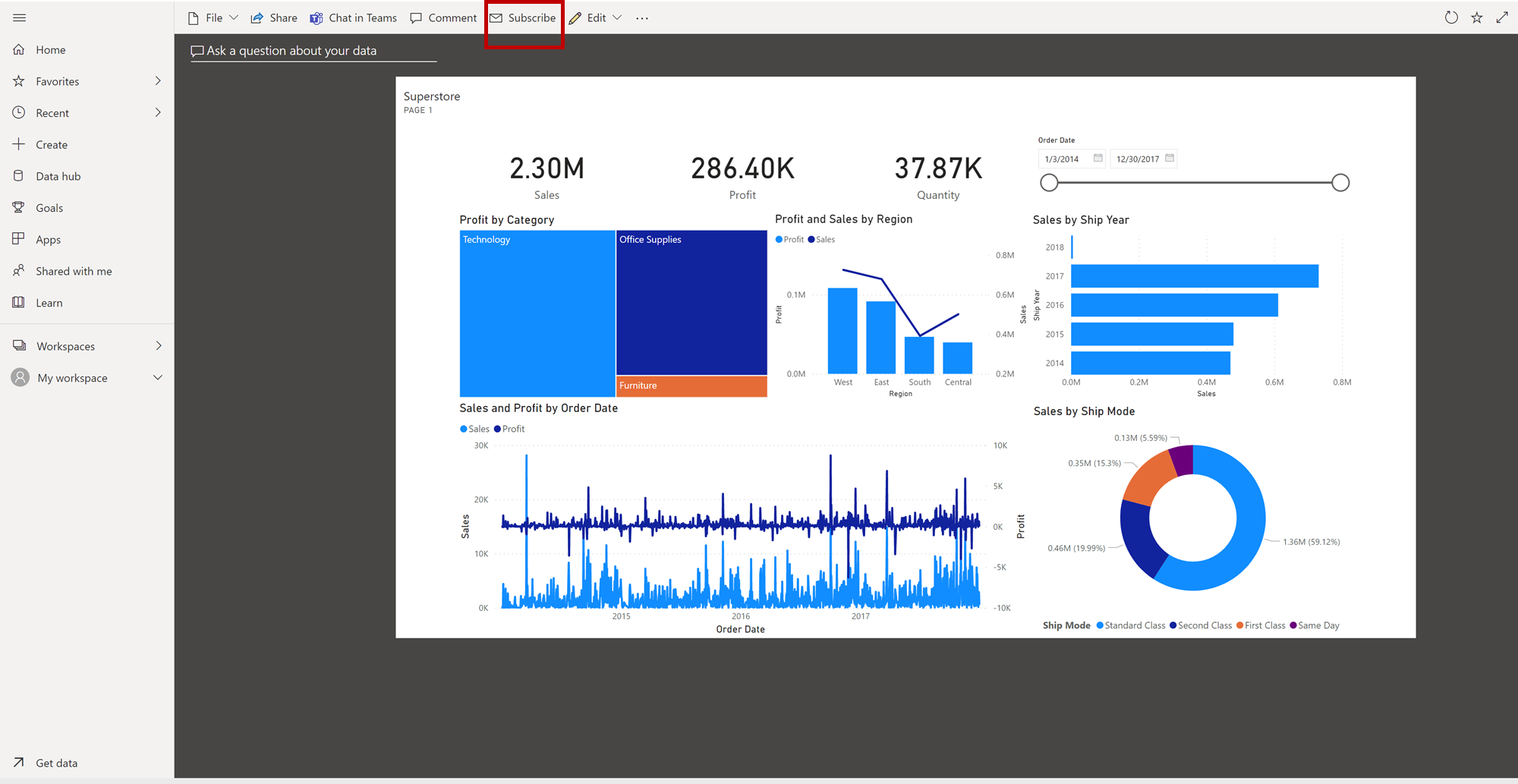 Power BI Dashboard subscription. Image by Author
 - Click on the ‘Add new subscription’ option.
- A more detailed window appears where we can select the email addresses of users to add to this subscription.
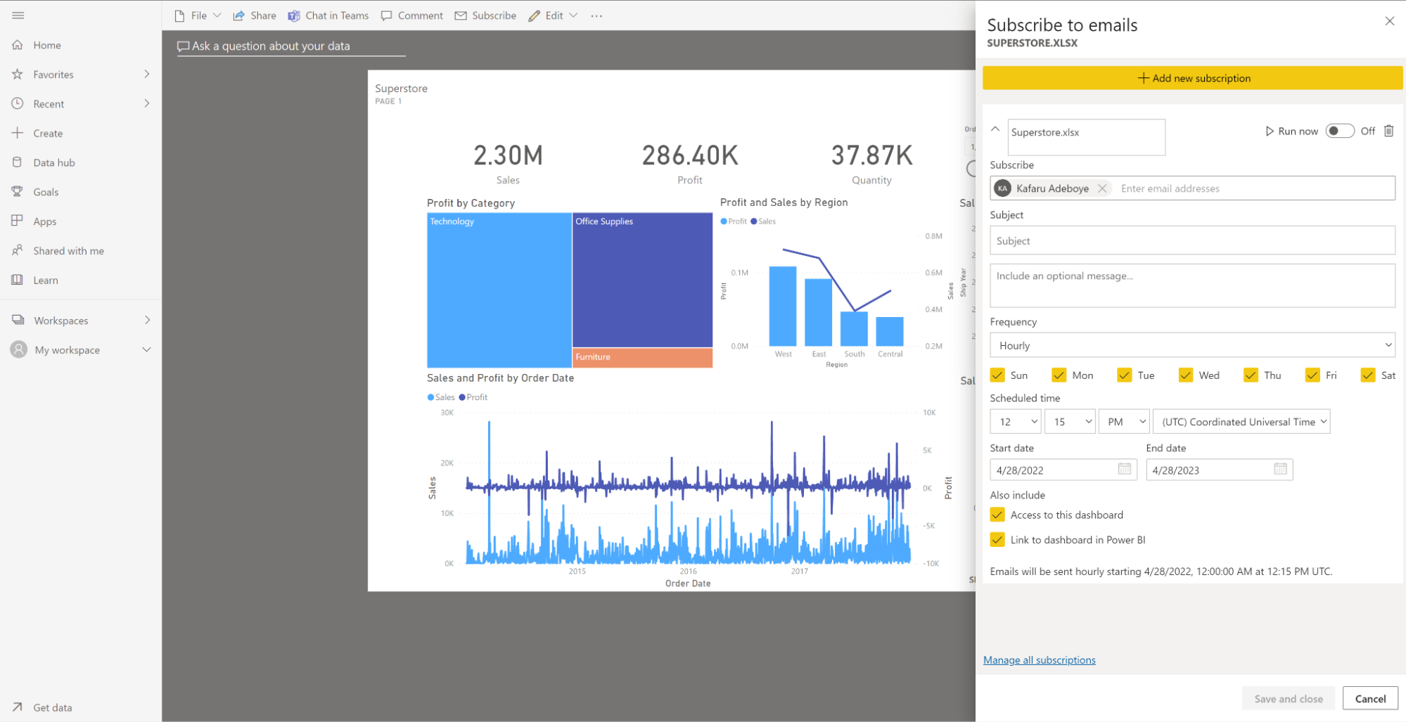 Power BI Dashboard subscribe to emails. Image by Author
Other details you can include in the email being sent out are as follows:
- Subscription Group Name: This is a unique name assigned to all subscribers in that email group.
- Frequency: How often this email containing the dashboard will be sent out.
- Scheduled time: Exact time of day that the dashboard will be emailed out to users.
- Startdate and Enddate: When should the email start going out to subscribers and when should it stop.
We can also disable a subscription from running. This is particularly useful when there is a need to pause sending out the emails but still want to retain the subscription. We can do this by toggling the button.
An immediate test run can be done using the ‘Run now’ button, but only after saving that subscription group.
Once saved, the subscription group should appear under the subscribe window.
Conclusion
We have seen how to build a Power BI dashboard, and the different functionalities available. They can be very powerful business analytics support solutions when carefully curated. The ease with which these dashboards can be accessed and shared will ensure that every relevant stakeholder, who relies on insights to make decisions, has access to them in real-time. DataCamp offers a beginner course on Introduction to Power BI Course | DataCamp which can get you started on becoming a Power BI expert or you can check out this Introductory Power BI Tutorial.
Become a Power BI Data Analyst
Master the world's most popular business intelligence tool.