Course
Introduction to Power BI
4 hr
793.3K
It's now easier than ever to design reports and dashboards thanks to a huge variety of BI platforms. However, many of these fail to live up to their purpose and provide true business value.
Fortunately, there are some good design guidelines that you can follow to ensure that your reports are useful and able to convey key business insights to those who use them. In particular, a well-designed report should be able to:
Note that the terms ‘report’ and ‘dashboard’ are often used interchangeably in the Business Intelligence space. In Power BI, a ‘dashboard’ is specifically built and used from existing reports only in the Power BI service, while a ‘report’ is typically built using Power BI Desktop. The design principles in this article can be applied to both reports and dashboards; however, we will focus on their application in designing reports in Power BI Desktop. If you are new to Power BI, you might also want to check out this introductory tutorial.
There are many aspects to report design which can also vary depending on the capabilities of the platform used to build those reports.
However, no matter what platform you are using or what industry you are in, there are a few main elements of report design that apply to all:
These guidelines will help you to build engaging, useful, and valuable reports. Each guideline below should be implemented while also keeping the aforementioned main elements of report design in mind.
We will discuss the following design guidelines:
Power BI has around 200+ visualization options to choose from, including the custom visuals that are available through AppSource. The number of options available makes it even more challenging to choose the appropriate chart.
Usually, data types will inform the chart selection process and narrow down the best visuals to use for that data type. So, it is useful to consider the purpose of the information you want to include in the report. Ask yourself what action or decision a particular visual should inform.
There are a handful of visuals that I use most often in my reports. If I ever find myself struggling to choose a particular visual, I usually go back to the basics and start with the simplest chart to convey the information and ignore all other choices for the time being.
These are my most-used visuals:
See this reference for a complete list of all visualizations available in Power BI and the best way they can be used.
There is a limited amount of space available on the canvas when designing a report in Power BI. For this reason, it is important to ensure you are making the most of the space available without adding unnecessary or useless clutter.
We are trained to read from left to right and top to bottom. Consequently, when someone first opens a report, their eye will naturally start at the top left corner, unless something immediately pulls their attention somewhere else. This natural human tendency informs us where visuals should be placed in a report – starting at the top and continuing in a logical flow with increasing amounts of detail towards the bottom.
According to the 5-second rule, the most high-value, high-impact information should be conveyed within 5 seconds of opening the report. Therefore, this information should be positioned along the top of the report where the user will naturally see it first. Avoid placing images, icons, or text in this area unless they contain information that is relevant to the user and the report.
Design the rest of the report page with a logical flow in mind:
It is important to give the user some context for the information they are viewing in the report. This context can easily be conveyed by using comparisons across time or categories.
For example, if a card in the report states that revenue for the year is $1 million, then context can be added to this by comparing it to last year’s revenue or to the budget. A simple way of adding this context is with color indicating if revenue is above or below budget.
Alternatively, a single measure can be used to quickly highlight the comparison between two numbers: for example, using a percentage change in revenue for this year compared to last year. In this way, using a single number can answer at least two questions at once: is revenue higher than last year and if so, then by how much. Imagine the time lost if a user has to manually calculate the difference between these numbers or if the comparison was not given at all.
There are many ways to ‘beautify’ a report – from color and pictures to fancy fonts. However, these elements of formatting and decoration should only be used insofar as they are useful or convey some meaning. This also applies to gridlines in a chart or even borders around the chart area.
One of the most powerful formatting options is color. You can make comparisons and use conditional color formatting to make a piece of information stand out. If it is ‘bad’ information, the user will immediately know where potential issues are that could require action.
However, choose colors wisely – keep it simple and be consistent! Follow these rules when it comes to using color in your report:
The last element of formatting concerns fonts and number formats:
The flexibility of Power BI means that you can design a beautiful report that is also very valuable. Using a few simple features you can cut out a lot of noise and keep the canvas free to show only the most important visuals.
Many of the below features can be implemented by making use of the bookmarks feature in Power BI. You can do a lot with bookmarks and I highly recommend learning more about them.
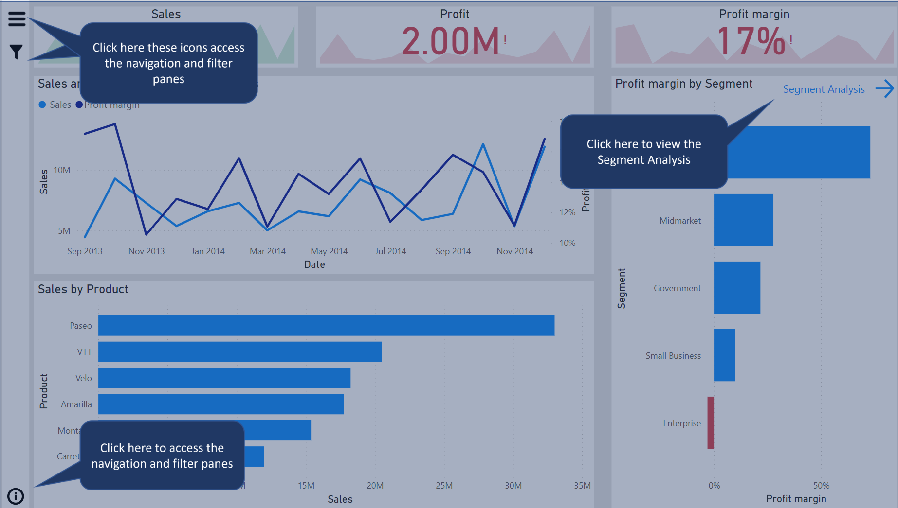
Traditionally, navigation is carried out by selecting the page views along the bottom of the report. However, by designing your own custom page navigator you can build it in a way that matches the theme and branding of your report. There are many different ways to create your own navigation panel, and some people have been truly creative with it.
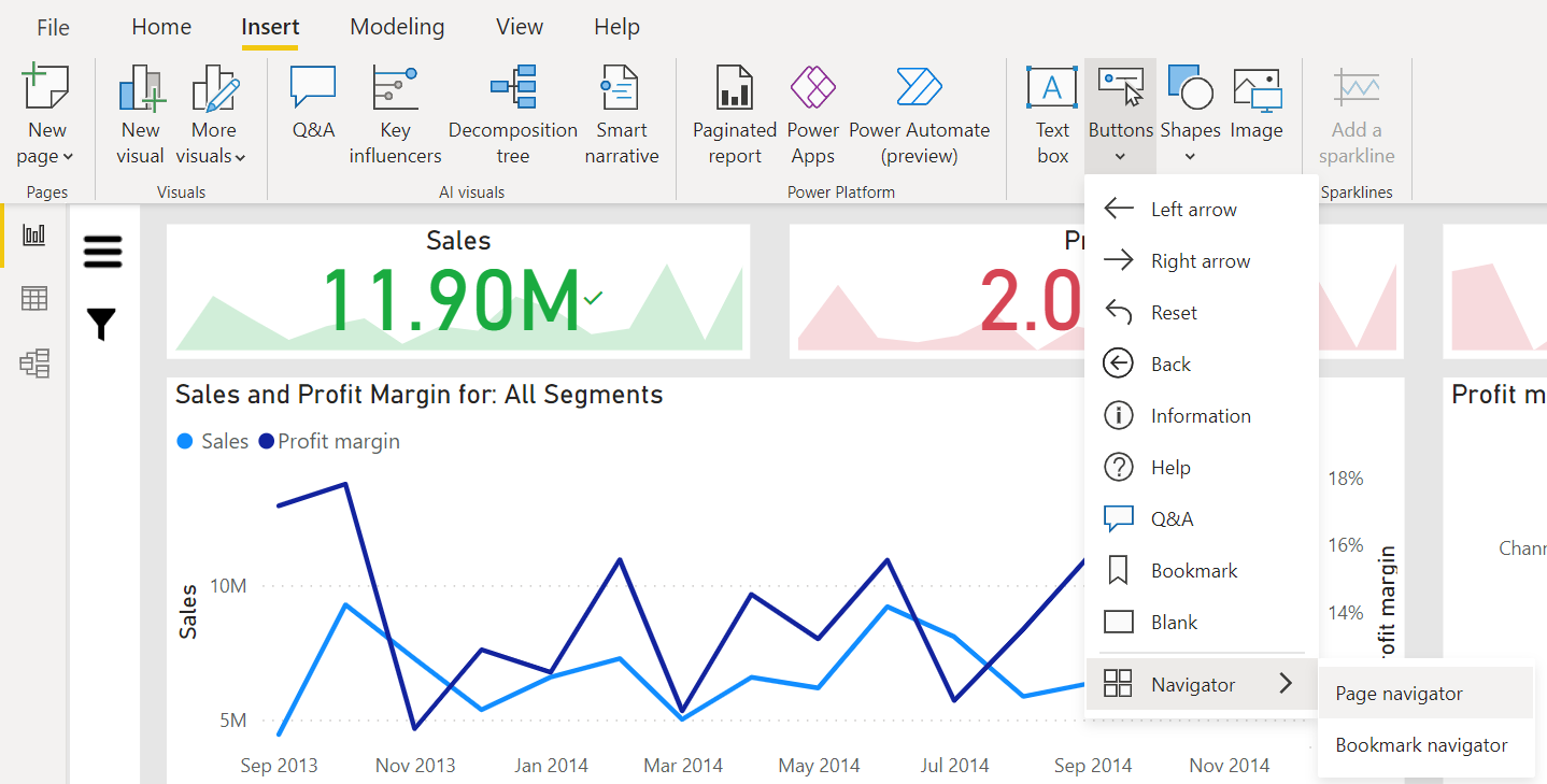
The easiest way to add a page navigator is to select the ‘Page navigator’ option under the ‘Buttons’ menu option in the ribbon. This feature in Power BI allows the navigation panel to automatically update whenever a new page is added to the report.
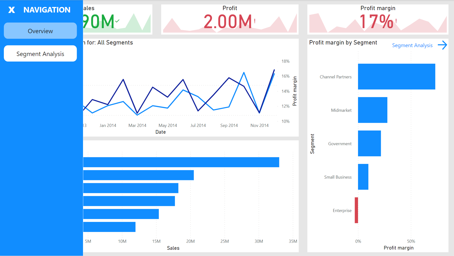
In the screenshot below, you can see a simple navigation panel that expands when you select the menu icon. This report contains only two pages.
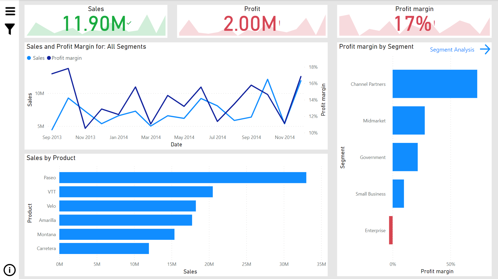
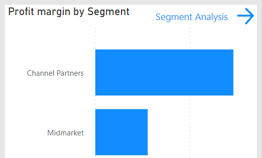
Another way to navigate your report is to create contextual navigation buttons in specific locations on the page. For example, in the screenshot below we have created a button that takes you to the Segment Analysis page; and this button is located in the top right corner of the Profit Margin by Segment chart. With this option, the user can quickly navigate directly from this chart to a page that elaborates on specific information given in the chart. .
This navigation method is a good way to add additional, detailed pages which might otherwise be overlooked, and which keep the navigation panel from being over-cluttered by too many pages.
Similar to the navigation panel above, a custom filter panel can be created that pops out when the filter button is clicked. I like this panel in particular as slicers can take up a lot of space on the canvas and do not offer any value on their own.
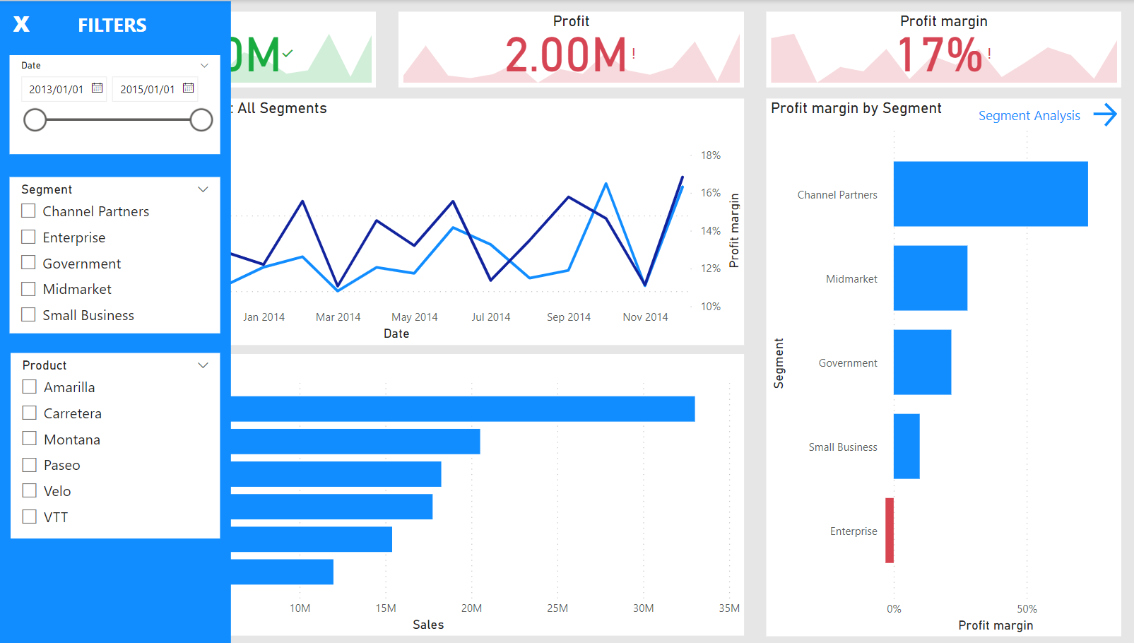
An information overlay is an excellent way of helping a user to understand the elements of your report from right within Power BI. Before learning about this little hack, I would create a PowerPoint presentation with screenshots of the report in much the same way as shown in this overlay.
With this hack, you can save yourself and your user a lot of time in learning about a new report or refreshing their memory about an old report.
Just like the other two panels discussed above, this information overlay appears when the user clicks the small info button at the bottom left of the report.
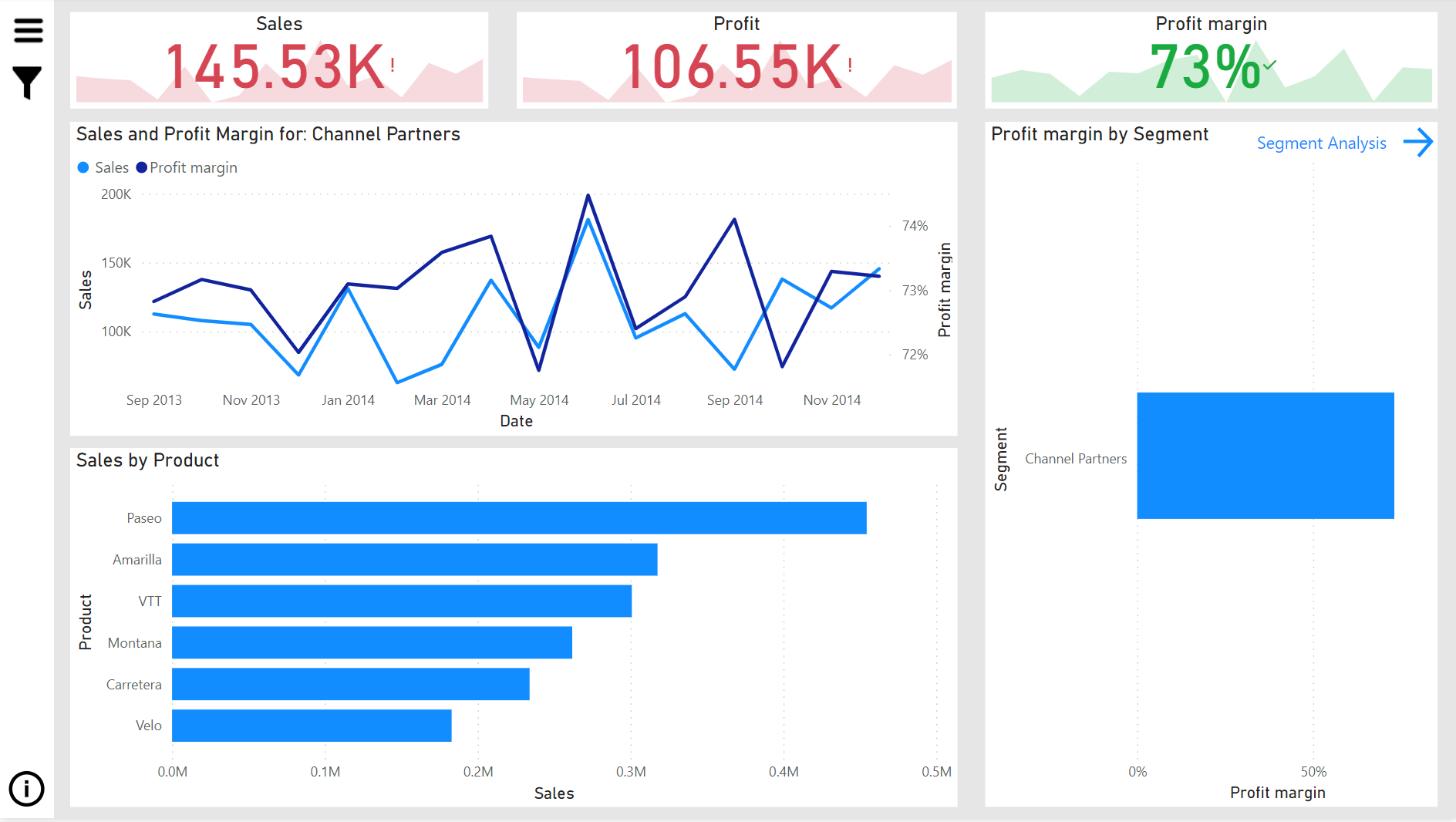
Dynamic titles allow you to show information about the current filter in the title of a chart.
A dynamic title is obtained by using a measure. The measure for the title in the following image looks like this:
Segment Title = “Sales and Profit Margin for: “ & SELECTEDVALUE(‘Segments’[Segment], “All Segments”)
The key function in this formula is SELECTEDVALUE and its purpose is to return either the value that is selected (in a slicer or filter) or “All Segments” when no selection is made.
In the image below, we have filtered the report to show only the Channel Partners segment; and this filter has dynamically changed the title for the line chart to reflect the selection.
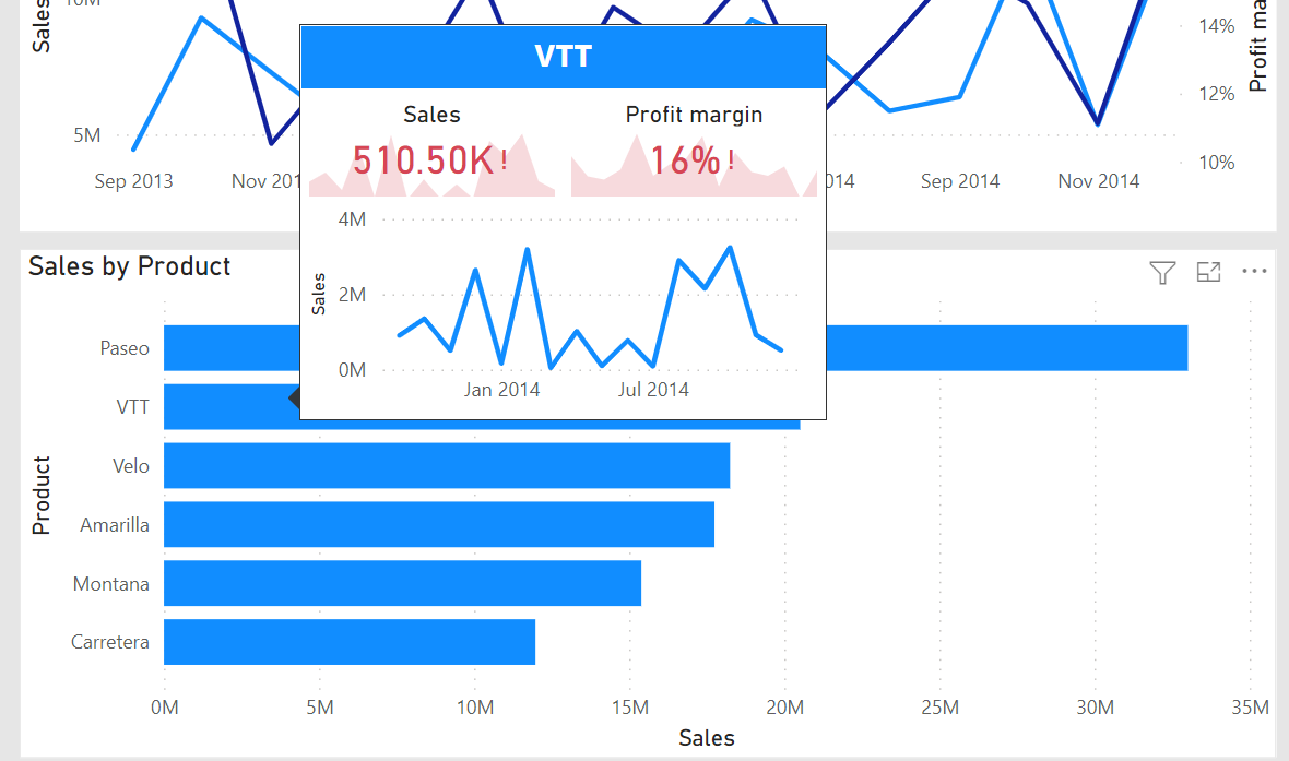
Every chart has tooltips that display the exact value when you hover over an element in the chart. However, you can actually use a report page as a tooltip! In the image below, you can see that while hovering over the VTT product, a tooltip appears that is in fact a page from the report with some visuals relating to this product.
Once you've incorporated the features covered in this tutorial, you'll be well on your way to becoming a proficient Power BI user. In our next tutorial, we'll discuss how you can build on these Power BI skills with some advanced features to enrich your data visualization toolbox. Additionally, check out DataCamp's Power BI course offerings; or, if you're keen to start your journey to Power BI mastery today, you can enroll in the Power BI Fundamentals Skill Track.
Master the world's most popular business intelligence tool.
Power BI Courses
Course
Course
Course
Tutorial
DataCamp Team
Tutorial
Joleen Bothma
Tutorial
Parul Pandey
code-along
Maarten Van den Broeck
code-along
Iason Prassides
code-along
Nick Switzer