Course
Data Visualization in Google Sheets
4 hr
45.8K
Data visualization is often associated with business meetings and shiny boardrooms, but its origins were very different. While pinpointing a sole inventor or source of data visualization is difficult, one of its pioneers was a woman who is widely renowned in the UK as the founder of modern nursing: Florence Nightingale.
The idea that a hospital should be clean and hygienic might seem like a given from a 21st-century perspective. However, in the Victorian era, before reforms were implemented thanks to the work of various doctors and nurses, such as Nightingale herself, the opposite was the case. In October 1854 Nightingale was sent to Istanbul as a military nurse. Ending up in the military hospital here was its own kind of death sentence: beds had filthy sheets, often unchanged and unwashed between different occupants, and soldiers who arrived in full hospitals would have to share the equally filthy floors with the resident rats. As a result, these hospitals claimed 10 times more lives than the battlefields. All this was considered normal at the time: many influential politicians and officers, including England’s Chief Medical Officer, believed that deaths caused by contagious diseases were unavoidable and that there existed no link between poor hygiene and these deaths.
Nightingale was convinced that improving the quality of care would reduce these deaths and famously set to work on tending to the soldiers, becoming known as “The Lady with the Lamp.” Her caring nature continues to go down in history, but one less well-known aspect of this story is the improved bookkeeping Nightingale instituted. Nightingale had had a passion for statistics since she was a child, and when she found that the hospital had been losing track of its soldiers’ deaths, she tasked specific individuals with record-keeping. This would prove invaluable upon her return to England.
Nightingale sought to push for widespread reforms to healthcare, feeling that her accomplishments in Turkey had not done enough. As is the norm in stories of change, she would have to face skeptics—such as the Chief Medical Officer—and she knew this herself.
Data she collected during the war and charts she produced afterward were her weapons. She understood that the intended audience of civil servants and the public would have an easier time making sense of visualizations as opposed to tables of data:
“Printed tables and all-in double columns, I do not think anyone will read. None but scientific men ever look in the Appendix of a Report. And this is for the vulgar* public.”
Florence Nightingale
*In Nightingale’s era, the word vulgar would have been understood to mean ordinary.
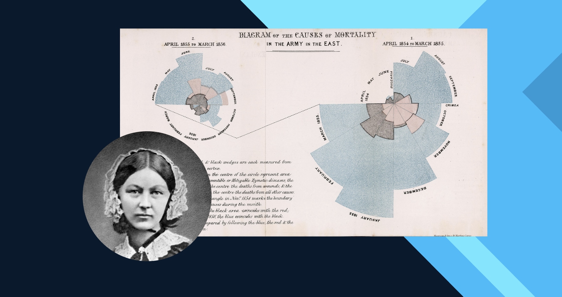
Her most famous visualization was one she produced early on: a rose chart of deaths in the British Army in Crimea and their causes. It demonstrated, through the color scheme and patterns, that a reduction in hospital deaths would lead to thousands of lives saved. The collection and process of visualizing the underlying data was also a revelation to Nightingale: soldiers’ deaths had fallen sharply after the government sent out a sanitation committee in March 1855, which had cleaned up the hospital’s drinking water and ventilation. In her subsequent publications, she would place heavy importance on improving hygiene.
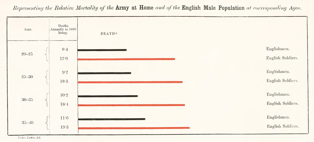
Already an iconic figure during the war, Nightingale’s work proved hugely popular among readers, from ordinary citizens to Queen Victoria herself. This was one of the first instances in which data visualization was used to persuade policymakers of the need for social reforms. As a result of these efforts, hygiene within the army’s hospitals improved dramatically. By the end of the 19th century, their average mortality rates had fallen to half of those in civilian hospitals, where beforehand it had been consistently higher. Nightingale would go on to use her influence and passion for data to drive healthcare reforms across the world and in a variety of settings, from maternity wards in India to doctors’ tents in the American Civil War.
This was one of the earliest instances in which data visualization was used to persuade policymakers of the need for societal reforms.
Data Visualization Courses
Course
Course
Course
blog
DataCamp Team
5 min
blog
Richie Cotton
10 min
blog
Amberle McKee
13 min
blog
DataCamp Team
5 min
blog
Richie Cotton
8 min
cheat-sheet
Richie Cotton