Data storytelling is the structured approach for communicating data insights using narrative elements and exploratory visuals. Those who desire to turn data into insights and decisions stand to benefit from mastering the art of telling data stories.
As opposed to presenting statistics, data stories are more engaging, memorable, and persuasive. In a study that tested two versions of a brochure for the Save the Children charity organization, donors given the infographic version donated about 50% less than those given the story-based version. In a separate study, researchers found that people are less skeptical when told a story but are more nitpicky when presented with statistics alone.
Data stories are made with three crucial ingredients—data, visual, and narrative. To tell a good data story, one needs to select the correct data, use a narrative structure that guides the flow of the data story, and illustrate the data story with compelling visuals.
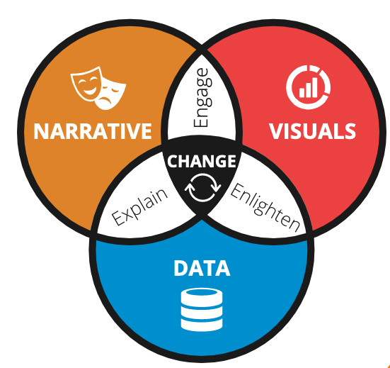 Figure 1: Narrative, visuals and data are data stories that drive changes
The Case Study of Semmelweis
History is fraught with cautionary tales of poor data visualizations that fail to drive actions in ways that data stories can. In his book, Effective Data Storytelling: How to Drive Change with Data, Narrative, and Visuals, Brent Dykes quoted the story of Dr. Ignaz Semmelweis as one such incident.
Having discovered that hand-washing could save lives, Semmelweis failed to convince the skeptical medical community of his findings. In hindsight, data storytelling principles could have helped him deliver his insights better and save thousands of lives as a result.
Dubbed the “father of hand hygiene”, Semmelweis was a Hungarian physician. In 1844, Semmelweis worked as an assistant at an obstetrics clinic where many women suffered childbed fever – a fever caused by an infection post-delivery.
During his stint at the clinic, Semmelweis was intrigued by a peculiar trend. The mortality rates of clinics operated by physicians and medical students had significantly higher mortality rates from childbed fever (9.9%) as compared to those by midwives (3.9%) (Figure 2). Unlike the physicians and medical students, midwives did not perform any autopsies before delivery procedures. This led him to conclude that materials from the dead bodies increased the risk of death in these women.
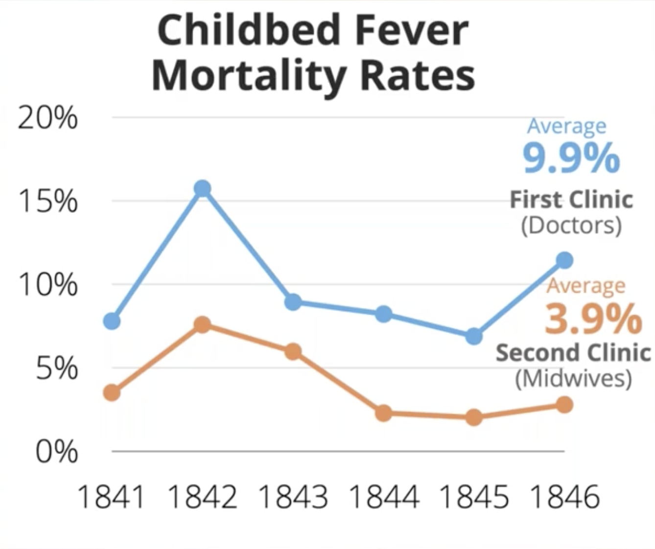 Figure 2. Clinics operated by doctors who did not wash their hands caused more deaths.
Knowing this, he proposed the practice of washing one’s hand which resulted in dramatically lower death rates. Yet, such findings did not help him convince his supervisor, Professor Klein, of his theory.
Semmelweis would spend the rest of his life as a strong proponent of hand-washing to no avail. In 1861, Semmelweis published his work The Etiology, Concept, and Prophylaxis of Childbed Fever to the medical community which responded critically against his doctrine. In 1865, Semmelweis died at a mental hospital, long before the germ theory was widely accepted.
 Figure 3. The Etiology, Concept, and Prophylaxis of Childbed Fever have hundreds of pages and no charts
Why did he fail to convince the community?
Brent used this case study to demonstrate that the three components of data storytelling – data, narrative, and visuals – are indispensable in driving change through data stories. In this case study, Semmelweis’ data fell on deaf ears as they were neither accompanied by a compelling narrative structure nor illustrated with visuals. As a result, Semmelweis’s data failed to convince his audience though they were accurate, valuable, and actionable.
In retrospect, Semmelweis could have conveyed his message more convincingly with data stories. Here is an example by Brent Dykes of a line chart that combines data, narrative, and visuals to tell a compelling data story.
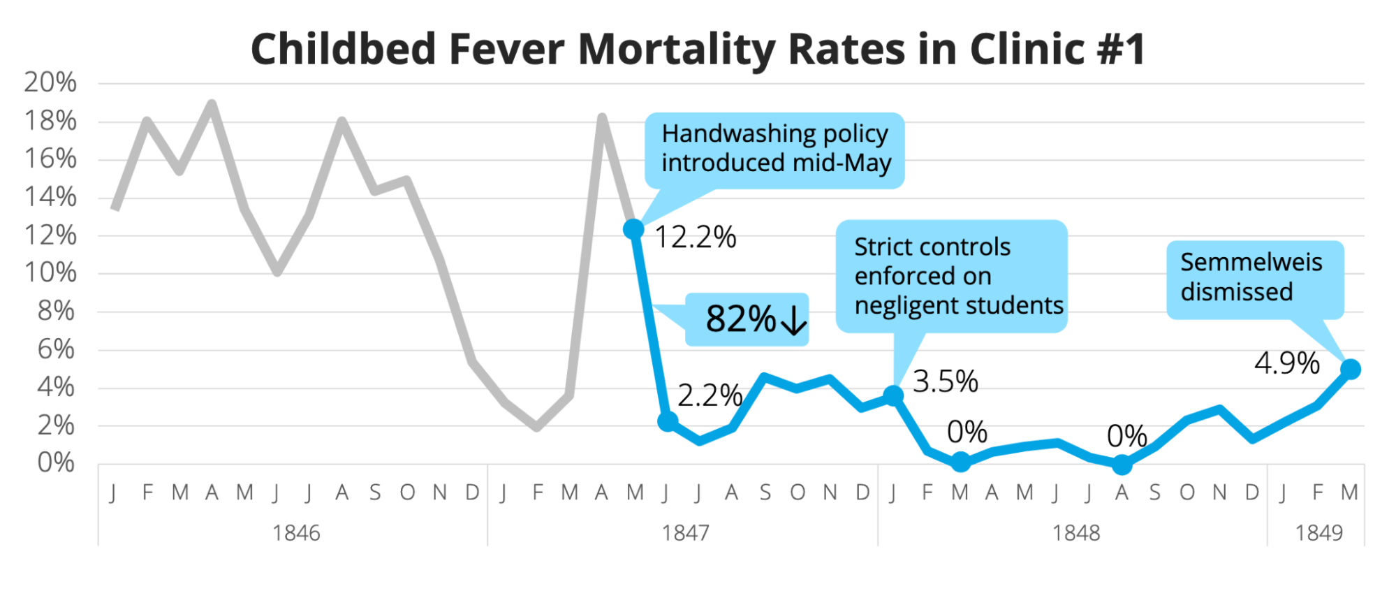 Figure 4. A data story by Dykes that better illustrates Semmelweis’ point.
Semmelweis’ approach directly contrasted with that of Dr. John Snow, a U.K. physician who studied the 1854 Broad Street Cholera outbreak and hypothesized that germ-contaminated water caused cholera. Having Demonstrated that death rates in the vicinity of a water pump are high, Snow was able to persuade the local council into disabling the pump.
 FIgure 5: John Snow’s data visualization
Conclusion
Unlike Semmelweis, data storytellers today have access to a wealth of tools for creating engaging data stories, ranging from business intelligence tools like Tableau to programming languages like python. It is only wise for modern data practitioners to master the art and science of data storytelling for driving actions.