Lattice Graphs in R
It supports various types of plots such as scatter plots, line plots, bar plots, and histograms, among others.
The typical format is
graph_type(formula, data=)where graph_type is selected from the listed below. formula specifies the variable(s) to display and any conditioning variables . For example ~x|A means display numeric variable x for each level of factor A. y~x | A*B means display the relationship between numeric variables y and x separately for every combination of factor A and B levels. ~x means display numeric variable x alone.
| graph_type | description | formula examples |
| barchart | bar chart | x |
| bwplot | boxplot | x |
| cloud | 3D scatterplot | z~x*y |
| contourplot | 3D contour plot | z~x*y |
| densityplot | kernal density plot | ~x |
| dotplot | dotplot | ~x |
| histogram | histogram | ~x |
| levelplot | 3D level plot | z~y*x |
| parallel | parallel coordinates plot | data frame |
| splom | scatterplot matrix | data frame |
| stripplot | strip plots | A |
| xyplot | scatterplot | y~x |
| wireframe | 3D wireframe graph | z~y*x |
Here are some examples. They use the car data (mileage, weight, number of gears, number of cylinders, etc.) from the mtcars data frame.
# Lattice Examples
library(lattice)
attach(mtcars)

# create factors with value labels
gear.f<-factor(gear,levels=c(3,4,5),
  labels=c("3gears","4gears","5gears"))
cyl.f <-factor(cyl,levels=c(4,6,8),
  labels=c("4cyl","6cyl","8cyl"))

# kernel density plot
densityplot(~mpg,
  main="Density Plot",
  xlab="Miles per Gallon")

# kernel density plots by factor level
densityplot(~mpg|cyl.f,
  main="Density Plot by Number of Cylinders",
  xlab="Miles per Gallon")

# kernel density plots by factor level (alternate layout)
densityplot(~mpg|cyl.f,
   main="Density Plot by Numer of Cylinders",
   xlab="Miles per Gallon",
   layout=c(1,3))

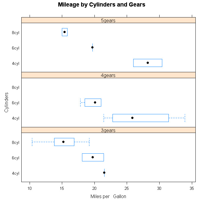
# boxplots for each combination of two factors
bwplot(cyl.f~mpg|gear.f,
   ylab="Cylinders", xlab="Miles per Gallon",
   main="Mileage by Cylinders and Gears",
   layout=(c(1,3))

# scatterplots for each combination of two factors
xyplot(mpg~wt|cyl.f*gear.f,
   main="Scatterplots by Cylinders and Gears",
   ylab="Miles per Gallon", xlab="Car Weight")

# 3d scatterplot by factor level
cloud(mpg~wt*qsec|cyl.f,
   main="3D Scatterplot by Cylinders")

# dotplot for each combination of two factors
dotplot(cyl.f~mpg|gear.f,
   main="Dotplot Plot by Number of Gears and Cylinders",
   xlab="Miles Per Gallon")

# scatterplot matrix
splom(mtcars[c(1,3,4,5,6)],
   main="MTCARS Data")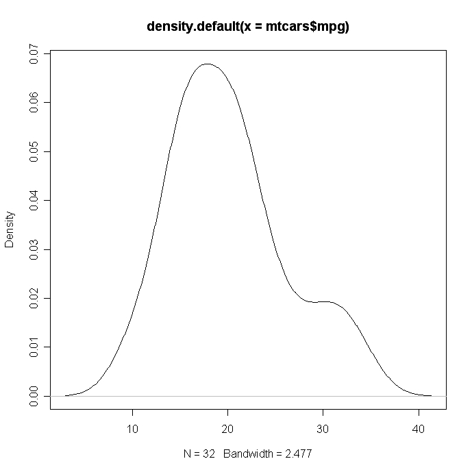
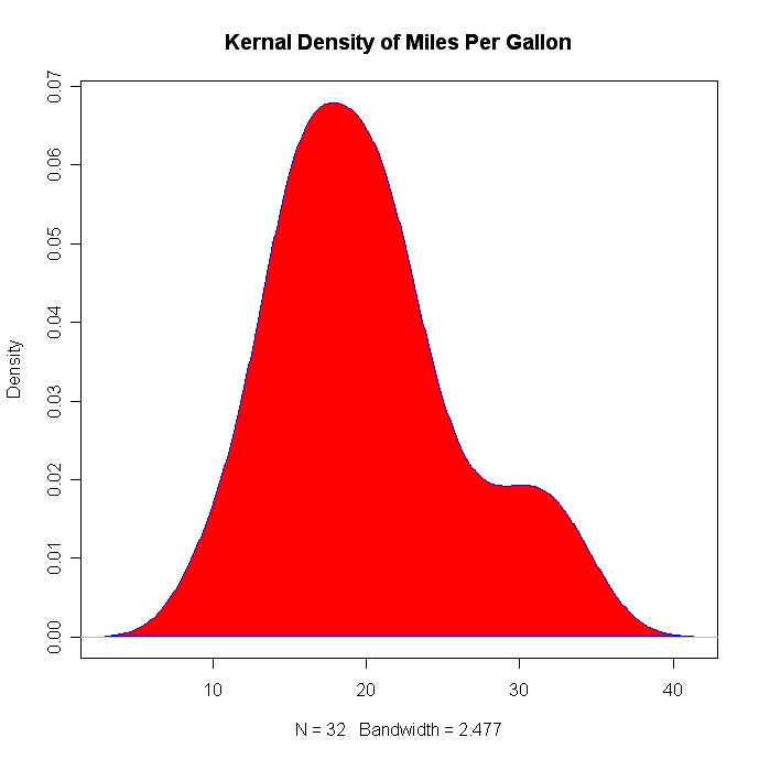
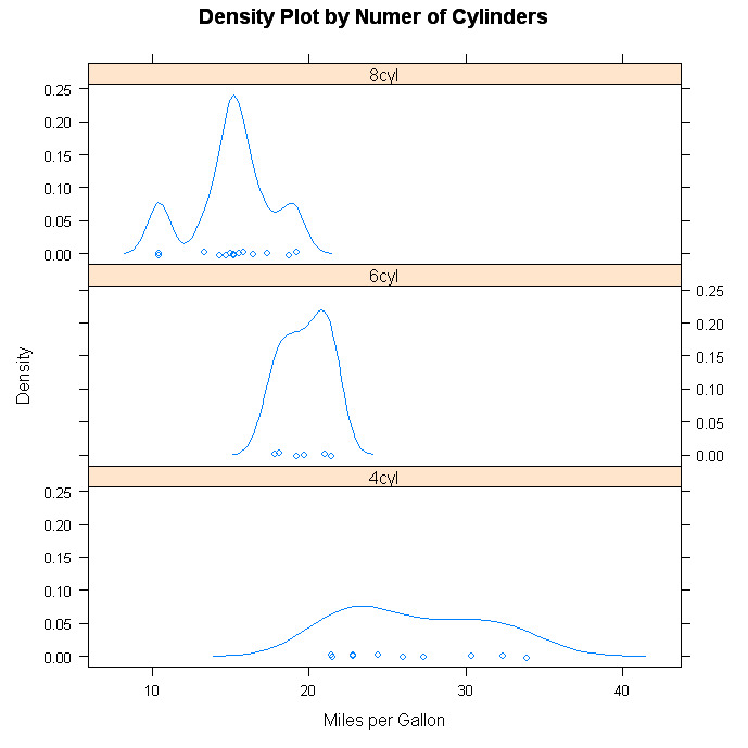
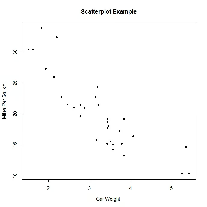
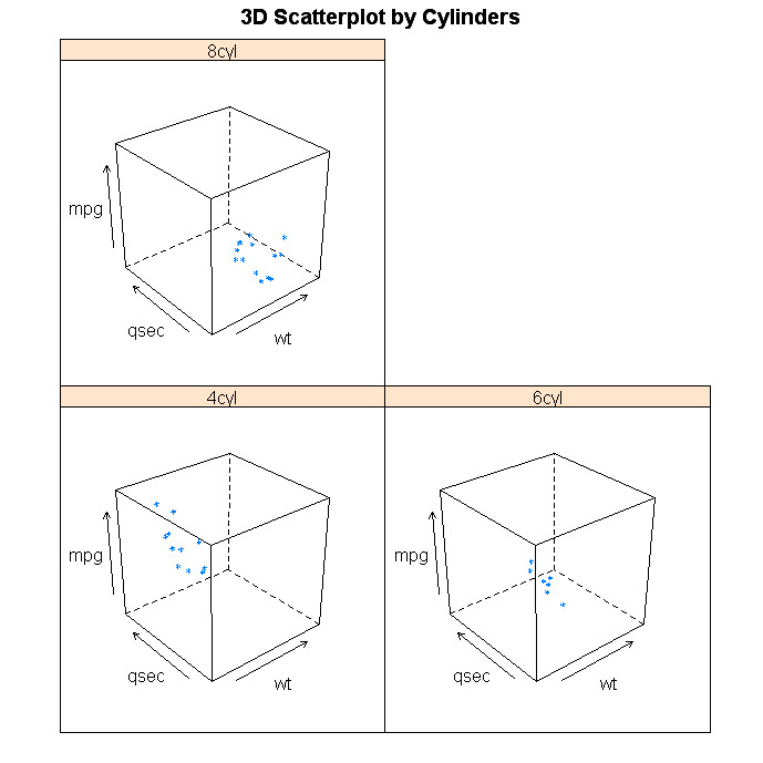
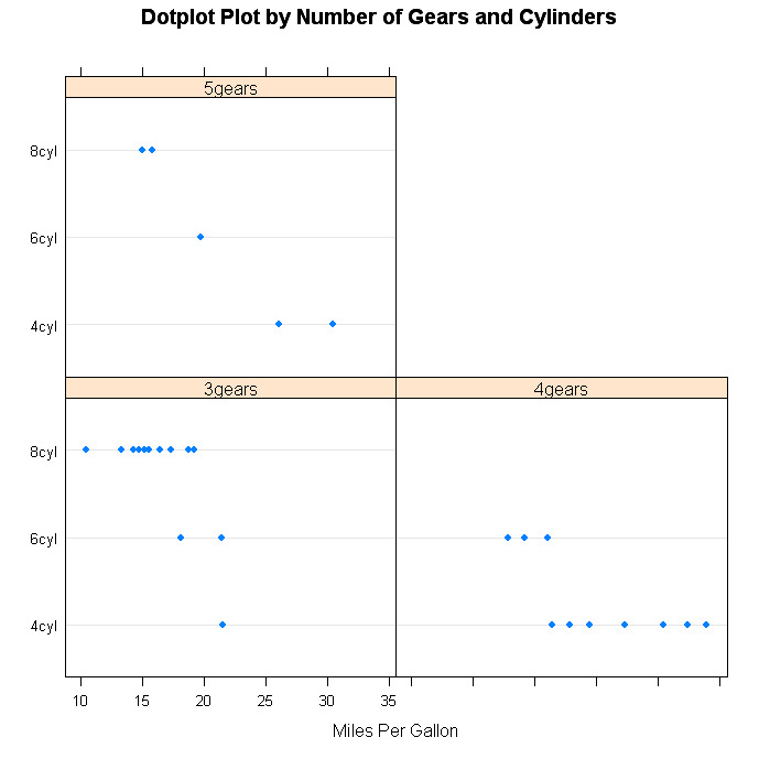
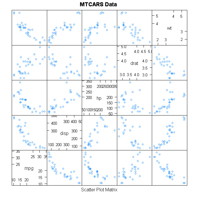
Note, as in graph 1, that you specifying a conditioning variable is optional. The difference between graphs 2 & 3 is the use of the layout option to contol the placement of panels.
Customizing Lattice Graphs
Unlike base R graphs, lattice graphs are not effected by many of the options set in the par( ) function. To view the options that can be changed, look at help(xyplot). It is frequently easiest to set these options within the high level plotting functions described above. Additionally, you can write functions that modify the rendering of panels. Here is an example.
# Customized Lattice Example
library(lattice)
panel.smoother <- function(x, y) {
  panel.xyplot(x, y) # show points
  panel.loess(x, y)  # show smoothed line
}
attach(mtcars)
hp <- cut(hp,3) # divide horse power into three bands
xyplot(mpg~wt|hp, scales=list(cex=.8, col="red"),
   panel=panel.smoother,
   xlab="Weight", ylab="Miles per Gallon",
   main="MGP vs Weight by Horse Power")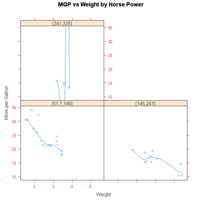
Going Further
Lattice graphics are a comprehensive graphical system in their own right. Deepanyan Sarkar's book Lattice: Multivariate Data Visualization with R</a > is the definitive reference. Additionally, see the Trellis User's Guide</a >. Dr. Ihaka has created a wonderful set of slides</a > on the subject. An excellent early consideration of trellis graphs can be found in W.S. Cleveland's classic book Visualizing Data</a >.
To Practice
Try this course on Multivariate Probability Distributions in R</a >.