Graphs in R

One of the main reasons data analysts turn to R is for its strong graphic capabilities. R offers a rich set of built-in functions and packages for creating various types of graphs. Graphs are a powerful tool for data visualization, enabling complex data patterns, trends, and relationships to be more comprehensible. With R, users can create simple charts such as pie, bar, and line graphs to more sophisticated plots like scatter plots, box plots, heat maps, and histograms. It supports high-level graphics including generic plotting system, grid graphics, and lattice graphics. The 'ggplot2' package, a part of the tidyverse, has revolutionized the way R users create high-quality and complex plots due to its layering concept, which allows for a step-by-step, intuitive build-up of a plot.
Using graphs in R often begins with data cleaning and preparation, followed by defining the type of graph, customizing the plot's aesthetics such as colors, scales, and theme, and finally rendering the plot. R's graphing capabilities are not only versatile but also highly customizable, providing control over nearly every graphical parameter. This is especially true with 'ggplot2', which offers a coherent system for describing and building graphs. Despite the learning curve associated with it, mastering graphing in R can help data scientists, statisticians, and researchers effectively communicate their findings and insights, making it a powerful tool in the field of data science and analytics.
Creating a Graph provides an overview of creating and saving graphs in R.
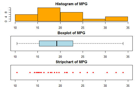
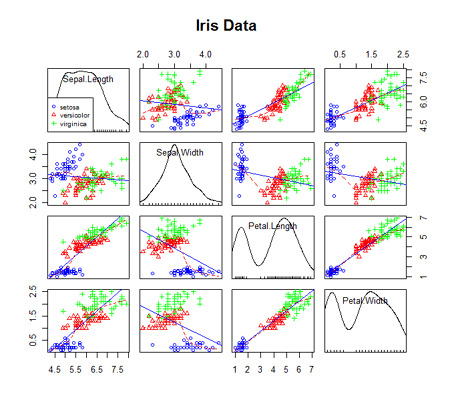
The remainder of the section describes how to create basic graph types. These include density plots (histograms and kernel density plots), dot plots, bar charts (simple, stacked, grouped), line charts, pie charts (simple, annotated, 3D), boxplots (simple, notched, violin plots, bagplots) and Scatterplots (simple, with fit lines, scatterplot matrices, high density plots, and 3D plots).
Advanced Graphs

This section describes how to customize your graphs. It also covers more statistically sophisticated graphs. This is one of the many places that R really shines.
Customization
Graphical parameters describes how to change a graph's symbols, fonts, colors, and lines. Axes and text describe how to customize a graph's axes, add reference lines, text annotations and a legend. Combining plots describes how to organize multiple plots into a single graph.
Advanced Graph Types
The lattice package provides a comprehensive system for visualizing multivariate data, including the ability to create plots conditioned on one or more variables. The ggplot2 package offers a elegant systems for generating univariate and multivariate graphs based on a grammar of graphics. Other graph types include probability plots, mosaic plots, and correlograms. Finally methods of interacting with graphs (e.g. linking multiple graphs with color brushing, or interactive rotation in real-time) are provided.
Going Further
To practice the basics of plotting in R interactively, try this course from DataCamp.
Try the first chapter of this interactive course on data visualization with ggplot2.