Curso
Introducción a la visualización de datos con ggplot2
4 h
188.2K
La visualización de datos es, para mí, la mejor forma de presentar informes descriptivos y analíticos sobre un conjunto de datos. Soy de los que disfrutan con la visualización: puedes contar toda la historia en una sola pantalla —aunque esto también depende de la complejidad de los datos—. Si estás leyendo este tutorial, seguramente ya conoces el paquete Ggplot2 de R, con el que se pueden crear gráficos fantásticos para el análisis, aunque a veces se queda corto en interactividad.
Volviendo a Highcharter: es un wrapper de R para la librería JavaScript Highcharts y sus módulos.
Las principales características de este paquete son:
Vamos al grano y creemos algunas visualizaciones con Highcharter siguiendo las funciones mencionadas:
hchart es una función genérica que recibe un objeto y devuelve un objeto de highcharter. Hay funciones cuyo comportamiento se parece a las del paquete ggplot2, por ejemplo:
qplot de ggplot2.geom_S de ggplot2.aes de ggplot2.Elijamos un dataset. Voy a usar el dataset de Pokemon que también viene en el paquete Highcharter. Echa un vistazo rápido:
glimpse(pokemon)## Observations: 718
## Variables: 20
## $ id <dbl> 1, 2, 3, 4, 5, 6, 7, 8, 9, 10, 11, 12, 13, 14,...
## $ pokemon <chr> "bulbasaur", "ivysaur", "venusaur", "charmande...
## $ species_id <int> 1, 2, 3, 4, 5, 6, 7, 8, 9, 10, 11, 12, 13, 14,...
## $ height <int> 7, 10, 20, 6, 11, 17, 5, 10, 16, 3, 7, 11, 3, ...
## $ weight <int> 69, 130, 1000, 85, 190, 905, 90, 225, 855, 29,...
## $ base_experience <int> 64, 142, 236, 62, 142, 240, 63, 142, 239, 39, ...
## $ type_1 <chr> "grass", "grass", "grass", "fire", "fire", "fi...
## $ type_2 <chr> "poison", "poison", "poison", NA, NA, "flying"...
## $ attack <int> 49, 62, 82, 52, 64, 84, 48, 63, 83, 30, 20, 45...
## $ defense <int> 49, 63, 83, 43, 58, 78, 65, 80, 100, 35, 55, 5...
## $ hp <int> 45, 60, 80, 39, 58, 78, 44, 59, 79, 45, 50, 60...
## $ special_attack <int> 65, 80, 100, 60, 80, 109, 50, 65, 85, 20, 25, ...
## $ special_defense <int> 65, 80, 100, 50, 65, 85, 64, 80, 105, 20, 25, ...
## $ speed <int> 45, 60, 80, 65, 80, 100, 43, 58, 78, 45, 30, 7...
## $ color_1 <chr> "#78C850", "#78C850", "#78C850", "#F08030", "#...
## $ color_2 <chr> "#A040A0", "#A040A0", "#A040A0", NA, NA, "#A89...
## $ color_f <chr> "#81A763", "#81A763", "#81A763", "#F08030", "#...
## $ egg_group_1 <chr> "monster", "monster", "monster", "monster", "m...
## $ egg_group_2 <chr> "plant", "plant", "plant", "dragon", "dragon",...
## $ url_image <chr> "1.png", "2.png", "3.png", "4.png", "5.png", "...Vamos a representar un gráfico de barras.
pokemon%>%
  count(type_1)%>%
  arrange(n)%>%
  hchart(type = "bar", hcaes(x = type_1, y = n))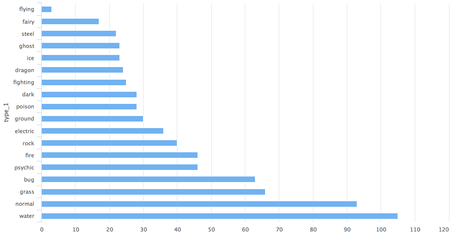
Así obtenemos un gráfico de barras por la categoría type_1 de los pokemon.
Si prefieres un gráfico de columnas, solo tienes que cambiar el parámetro type a column.
pokemon%>%
  count(type_1)%>%
  arrange(n)%>%
  hchart(type = "column", hcaes(x = type_1, y = n))
pokemon%>%
  count(type_1)%>%
  arrange(n)%>%
  hchart(type = "treemap", hcaes(x = type_1, value = n, color = n))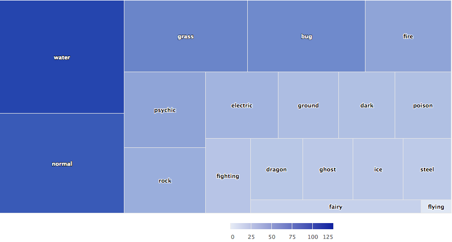
También podemos usar hc_add_series para dibujar gráficos. Sirve para añadir y quitar series de un objeto highchart.

highchart()%>%
  hc_add_series(pokemon, "scatter", hcaes(x = height, y = weight))
La principal diferencia entre las funciones geom_ de ggplot2 y hc_add_series es que aquí necesitamos especificar los datos y las estéticas en cada función, mientras que en ggplot2 puedes definirlos en una capa y añadir más geoms que reutilicen esos datos y estéticas.
Abajo tienes un ejemplo claro con el dataset diamonds del paquete ggplot2.
data(diamonds, package = "ggplot2")

set.seed(123)
data <- sample_n(diamonds, 300)

modlss <- loess(price ~ carat, data = data)
fit <- arrange(augment(modlss), carat)

highchart() %>%
  hc_add_series(data, type = "scatter",
                hcaes(x = carat, y = price, size = depth, group = cut)) %>%
  hc_add_series(fit, type = "line", hcaes(x = carat, y = .fitted),
                name = "Fit", id = "fit") %>%
  hc_add_series(fit, type = "arearange",
                hcaes(x = carat, low = .fitted - 2*.se.fit,
                      high = .fitted + 2*.se.fit),
                linkedTo = "fit")
Como ves en el ejemplo, el gráfico combina tres series: dispersión, línea y rango de área.
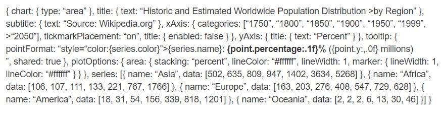
Vamos a replicar un desarrollo en JavaScript de highchart en R usando hc_add_series.
highchart() %>%
  hc_chart(type = "area") %>%
  hc_title(text = "Historic and Estimated Worldwide Population Distribution by Region") %>%
  hc_subtitle(text = "Source: Wikipedia.org") %>%
  hc_xAxis(categories = c("1750", "1800", "1850", "1900", "1950", "1999", "2050"),
           tickmarkPlacement = "on",
           title = list(enabled = FALSE)) %>%
  hc_yAxis(title = list(text = "Percent")) %>%
  hc_tooltip(pointFormat = "<span style=\"color:{series.color}\">{series.name}</span>:
             <b>{point.percentage:.1f}%</b> ({point.y:,.0f} millions)<br/>",
             shared = TRUE) %>%
  hc_plotOptions(area = list(
     stacking = "percent",
     lineColor = "#ffffff",
     lineWidth = 1,
     marker = list(
       lineWidth = 1,
       lineColor = "#ffffff"
       ))
     ) %>%
  hc_add_series(name = "Asia", data = c(502, 635, 809, 947, 1402, 3634, 5268)) %>%
  hc_add_series(name = "Africa", data = c(106, 107, 111, 133, 221, 767, 1766)) %>%
  hc_add_series(name = "Europe", data = c(163, 203, 276, 408, 547, 729, 628)) %>%
  hc_add_series(name = "America", data = c(18, 31, 54, 156, 339, 818, 1201)) %>%
  hc_add_series(name = "Oceania", data = c(2, 2, 2, 6, 13, 30, 46))
Comparando, verás cómo cada bloque de código JavaScript se traduce en funciones de R encadenadas con pipes. Fíjate en argumentos como el pointFormat de hctooltip, que usa el mismo formato que en el código JavaScript; puedes ver los detalles en este enlace.
Highstocks ofrece gráficos para finanzas y series temporales; funciona muy bien con la librería quamtmod y es fácil graficar símbolos para luego añadir más series con hc_add_series.
x <- getSymbols("GOOG", auto.assign = FALSE)

hchart(x)
Como ves en el gráfico, no hace falta añadir más código: hchart se integra con objetos xts de forma muy eficiente y ofrece una vista dinámica de los datos. Puedes usar el zoom para profundizar en segmentos más pequeños y analizarlos mejor.
Probemos ahora con hc_add_series.
y <- getSymbols("AMZN", auto.assign = FALSE)

highchart(type = "stock") %>%
  hc_add_series(x) %>%
  hc_add_series(y, type = "ohlc")
Como puedes comprobar, la visualización gestiona un volumen alto de datos con gran eficiencia.
Prueba los gráficos de tipo stock con distintos objetos xts.
La forma más sencilla de crear un mapa con highcharter es usando la función hcmap. Selecciona una URL de la colección de highmaps y úsala como mapa en hcmap. Se descargará el mapa y se creará un objeto que se pasa como argumento mapdata.
Vamos a dibujar el mapa de India.
hcmap("https://code.highcharts.com/mapdata/countries/in/in-all.js")%>%
  hc_title(text = "India")
Bien, ese es un mapa base. ¿Y si lo convertimos en una coropleta?
Cada mapa descargado de la colección de Highcharts incluye claves para enlazar datos. Hay dos funciones que te ayudan a conocer las regiones codificadas y cómo unir mapa y datos:
mapdata <- get_data_from_map(download_map_data("https://code.highcharts.com/mapdata/countries/in/in-all.js"))

glimpse(mapdata)
## Observations: 34
## Variables: 20
## $ `hc-group` <chr> "admin1", "admin1", "admin1", "admin1", "admin1"...
## $ `hc-middle-x` <dbl> 0.65, 0.59, 0.50, 0.56, 0.46, 0.46, 0.51, 0.59, ...
## $ `hc-middle-y` <dbl> 0.81, 0.63, 0.74, 0.38, 0.64, 0.51, 0.34, 0.41, ...
## $ `hc-key` <chr> "in-py", "in-ld", "in-wb", "in-or", "in-br", "in...
## $ `hc-a2` <chr> "PY", "LD", "WB", "OR", "BR", "SK", "CT", "TN", ...
## $ labelrank <chr> "2", "2", "2", "2", "2", "2", "2", "2", "2", "2"...
## $ hasc <chr> "IN.PY", "IN.LD", "IN.WB", "IN.OR", "IN.BR", "IN...
## $ `alt-name` <chr> "Pondicherry|Puduchcheri|Pondichéry", "Ã\u008dl...
## $ `woe-id` <chr> "20070459", "2345748", "2345761", "2345755", "23...
## $ fips <chr> "IN22", "IN14", "IN28", "IN21", "IN34", "IN29", ...
## $ `postal-code` <chr> "PY", "LD", "WB", "OR", "BR", "SK", "CT", "TN", ...
## $ name <chr> "Puducherry", "Lakshadweep", "West Bengal", "Ori...
## $ country <chr> "India", "India", "India", "India", "India", "In...
## $ `type-en` <chr> "Union Territory", "Union Territory", "State", "...
## $ region <chr> "South", "South", "East", "East", "East", "East"...
## $ longitude <chr> "79.7758", "72.7811", "87.7289", "84.4341", "85....
## $ `woe-name` <chr> "Puducherry", "Lakshadweep", "West Bengal", "Ori...
## $ latitude <chr> "10.9224", "11.2249", "23.0523", "20.625", "25.6...
## $ `woe-label` <chr> "Puducherry, IN, India", "Lakshadweep, IN, India...
## $ type <chr> "Union Territor", "Union Territor", "State", "St...#population state wise
pop = as.data.frame(c(84673556, 1382611, 31169272, 103804637, 1055450, 25540196, 342853, 242911, 18980000, 1457723, 60383628, 25353081, 6864602,
12548926, 32966238, 61130704, 33387677, 64429, 72597565, 112372972, 2721756, 2964007, 1091014, 1980602, 41947358, 1244464,
27704236, 68621012, 607688, 72138958, 3671032, 207281477, 10116752,91347736))
state= mapdata%>%
select(`hc-a2`)%>%
arrange(`hc-a2`)
State_pop = as.data.frame(c(state, pop))
names(State_pop)= c("State", "Population")
hcmap("https://code.highcharts.com/mapdata/countries/in/in-all.js", data = State_pop, value = "Population",
joinBy = c("hc-a2", "State"), name = "Fake data",
dataLabels = list(enabled = TRUE, format = '{point.name}'),
borderColor = "#FAFAFA", borderWidth = 0.1,
tooltip = list(valueDecimals = 0))
Experimenta con hc_add_series en mapas y coropletas. Para más detalles y ejemplos, visita este recurso.
Ahora probemos algunos plugins que ofrece highcharter: agrupaciones, drill-downs, descarga, impresión de datos y temas muy chulos.
Vamos a agrupar datos del dataset mpg. Para visualizar mejor, creamos una lista que categoriza por fabricante.
data(mpg, package = "ggplot2")

mpgg <- mpg %>%
  filter(class %in% c("suv", "compact", "midsize")) %>%
  group_by(class, manufacturer) %>%
  summarize(count = n())

categories_grouped <- mpgg %>%
  group_by(name = class) %>%
  do(categories = .$manufacturer) %>%
  list_parse()

highchart() %>%
  hc_xAxis(categories = categories_grouped) %>%
  hc_add_series(data = mpgg, type = "bar", hcaes(y = count, color = manufacturer),
                showInLegend = FALSE)
Vamos a crear un gráfico con drill-down a otro gráfico para analizar mejor. Si dominas las listas en R, entenderás el código al detalle.
df <- data_frame(
  name = c("Animals", "Fruits", "Cars"),
  y = c(5, 2, 4),
  drilldown = tolower(name)
)


ds <- list_parse(df)
names(ds) <- NULL


hc <- highchart() %>%
  hc_chart(type = "column") %>%
  hc_title(text = "Basic drilldown") %>%
  hc_xAxis(type = "category") %>%
  hc_legend(enabled = FALSE) %>%
  hc_plotOptions(
    series = list(
      boderWidth = 0,
      dataLabels = list(enabled = TRUE)
    )
  ) %>%
  hc_add_series(
    name = "Things",
    colorByPoint = TRUE,
    data = ds
  )

dfan <- data_frame(
  name = c("Cats", "Dogs", "Cows", "Sheep", "Pigs"),
  value = c(4, 3, 1, 2, 1)
)

dffru <- data_frame(
  name = c("Apple", "Organes"),
  value = c(4, 2)
)

dfcar <- data_frame(
  name = c("Toyota", "Opel", "Volkswage"),
  value = c(4, 2, 2)
)

second_el_to_numeric <- function(ls){

  map(ls, function(x){
    x[[2]] <- as.numeric(x[[2]])
    x
  })

}

dsan <- second_el_to_numeric(list_parse2(dfan))

dsfru <- second_el_to_numeric(list_parse2(dffru))

dscar <- second_el_to_numeric(list_parse2(dfcar))

hc %>%
  hc_drilldown(
    allowPointDrilldown = TRUE,
    series = list(
      list(
        id = "animals",
        data = dsan
      ),
      list(
        id = "fruits",
        data = dsfru
      ),
      list(
        id = "cars",
        data = dscar
      )
    )
  )
Apliquemos ahora drill-down en otros gráficos.
tm <- pokemon %>%
  mutate(type_2 = ifelse(is.na(type_2), paste("only", type_1), type_2),
         type_1 = type_1) %>%
  group_by(type_1, type_2) %>%
  summarise(n = n()) %>%
  ungroup() %>%
  treemap::treemap(index = c("type_1", "type_2"),
                   vSize = "n", vColor = "type_1")
tm$tm <- tm$tm %>%
  tbl_df() %>%
  left_join(pokemon %>% select(type_1, type_2, color_f) %>% distinct(), by = c("type_1", "type_2")) %>%
  left_join(pokemon %>% select(type_1, color_1) %>% distinct(), by = c("type_1")) %>%
  mutate(type_1 = paste0("Main ", type_1),
         color = ifelse(is.na(color_f), color_1, color_f))

highchart() %>%
  hc_add_series_treemap(tm, allowDrillToNode = TRUE,
                        layoutAlgorithm = "squarified")
Añadamos ahora la funcionalidad de exportación.
pokemon%>%
count(type_1)%>%
arrange(n)%>%
hchart(type = "bar", hcaes(x = type_1, y = n, color = type_1))%>%
hc_exporting(enabled = TRUE) Por último, apliquemos algunos temas.
pokemon%>%
count(type_1)%>%
arrange(n)%>%
hchart(type = "bar", hcaes(x = type_1, y = n, color = type_1))%>%
hc_exporting(enabled = TRUE)%>%
hc_add_theme(hc_theme_chalk())
Puedes aprender mucho más aquí; es una referencia completa de Highcharter. También comparto uno de mis gráficos favoritos creado con un dataset meteorológico: usamos el argumento polar; al ponerlo en TRUE cambia por completo la narrativa del gráfico.
data("weather")

x <- c("Min", "Mean", "Max")
y <- sprintf("{point.%s}", c("min_temperaturec", "mean_temperaturec", "max_temperaturec"))
tltip <- tooltip_table(x, y)

hchart(weather, type = "columnrange",
       hcaes(x = date, low = min_temperaturec, high = max_temperaturec,
             color = mean_temperaturec)) %>%
  hc_chart(polar = TRUE) %>%
  hc_yAxis( max = 30, min = -10, labels = list(format = "{value} C"),
            showFirstLabel = FALSE) %>%
  hc_xAxis(
    title = list(text = ""), gridLineWidth = 0.5,
    labels = list(format = "{value: %b}")) %>%
  hc_tooltip(useHTML = TRUE, pointFormat = tltip,
             headerFormat = as.character(tags$small("{point.x:%d %B, %Y}")))
Si quieres seguir aprendiendo sobre visualización de datos en R, haz el curso Data Visualization with ggplot2 (Part 1) de DataCamp y echa un vistazo a nuestro R Formula Tutorial.
Sigue aprendiendo sobre R y visualización de datos
Curso
Curso
Curso
blog
Elena Kosourova
14 min
Tutorial
Kevin Babitz
15 min
Tutorial
Łukasz Deryło
10 min
Tutorial
Kevin Babitz
10 min
Tutorial
Abid Ali Awan
10 min
Tutorial
Zoumana Keita
12 min