Course
Interactive Data Visualization with plotly in R
4 hr
14.5K
I think data visualization is the best technique to show any descriptive and analytics reporting on a chunk of data. I am a type of person who loves data visualization. You can display the whole story in a single screen well that also depends on the data complexity. If you are reading this tutorial, then I think you must be aware of the Ggplot2 package in R which is used to generate some awesome charts for analysis but somehow lacks dynamic properties.
Coming Back to Highcharter, So it is an R wrapper of HighCharts javascript library and its module.
The main features of this package are:
Let's get down to the business and create some visualization with Highcharter following the features mentioned above:
hchart is a generic function which takes an object and returns a highcharter object. There are functions whose behavior are similar to the functions of the ggplot2 package like:
qplot.geom_S.aes.Let's choose a dataset. I am going to take Pokemon dataset also provided in Highcharter package. Have a glimpse of the dataset.
glimpse(pokemon)## Observations: 718
## Variables: 20
## $ id <dbl> 1, 2, 3, 4, 5, 6, 7, 8, 9, 10, 11, 12, 13, 14,...
## $ pokemon <chr> "bulbasaur", "ivysaur", "venusaur", "charmande...
## $ species_id <int> 1, 2, 3, 4, 5, 6, 7, 8, 9, 10, 11, 12, 13, 14,...
## $ height <int> 7, 10, 20, 6, 11, 17, 5, 10, 16, 3, 7, 11, 3, ...
## $ weight <int> 69, 130, 1000, 85, 190, 905, 90, 225, 855, 29,...
## $ base_experience <int> 64, 142, 236, 62, 142, 240, 63, 142, 239, 39, ...
## $ type_1 <chr> "grass", "grass", "grass", "fire", "fire", "fi...
## $ type_2 <chr> "poison", "poison", "poison", NA, NA, "flying"...
## $ attack <int> 49, 62, 82, 52, 64, 84, 48, 63, 83, 30, 20, 45...
## $ defense <int> 49, 63, 83, 43, 58, 78, 65, 80, 100, 35, 55, 5...
## $ hp <int> 45, 60, 80, 39, 58, 78, 44, 59, 79, 45, 50, 60...
## $ special_attack <int> 65, 80, 100, 60, 80, 109, 50, 65, 85, 20, 25, ...
## $ special_defense <int> 65, 80, 100, 50, 65, 85, 64, 80, 105, 20, 25, ...
## $ speed <int> 45, 60, 80, 65, 80, 100, 43, 58, 78, 45, 30, 7...
## $ color_1 <chr> "#78C850", "#78C850", "#78C850", "#F08030", "#...
## $ color_2 <chr> "#A040A0", "#A040A0", "#A040A0", NA, NA, "#A89...
## $ color_f <chr> "#81A763", "#81A763", "#81A763", "#F08030", "#...
## $ egg_group_1 <chr> "monster", "monster", "monster", "monster", "m...
## $ egg_group_2 <chr> "plant", "plant", "plant", "dragon", "dragon",...
## $ url_image <chr> "1.png", "2.png", "3.png", "4.png", "5.png", "...Let's plot a bar chart.
pokemon%>%
  count(type_1)%>%
  arrange(n)%>%
  hchart(type = "bar", hcaes(x = type_1, y = n))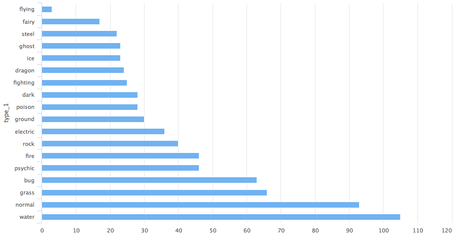
So you got a bar chart concerning the type 1 category of the pokemon.
Suppose you want a column chart instead then the only variable that you need to change is the type to the column.
pokemon%>%
  count(type_1)%>%
  arrange(n)%>%
  hchart(type = "column", hcaes(x = type_1, y = n))
pokemon%>%
  count(type_1)%>%
  arrange(n)%>%
  hchart(type = "treemap", hcaes(x = type_1, value = n, color = n))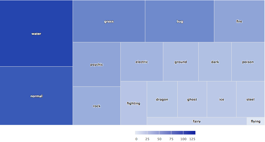
We can also use hc_add_series to plot the chart. It is used for adding and removing series from highchart object.

highchart()%>%
  hc_add_series(pokemon, "scatter", hcaes(x = height, y = weight))
The main difference in ggplot2's geom_ functions and hc_add_series is that we need to add data and aesthetics explicitly in every function while in ggplot2 one can add data and aesthetics in a layer and then can further add more geoms which can work on same data and aesthetics.
An accurate example is given below using the diamond dataset in the ggplot2 package.
data(diamonds, package = "ggplot2")

set.seed(123)
data <- sample_n(diamonds, 300)

modlss <- loess(price ~ carat, data = data)
fit <- arrange(augment(modlss), carat)

highchart() %>%
  hc_add_series(data, type = "scatter",
                hcaes(x = carat, y = price, size = depth, group = cut)) %>%
  hc_add_series(fit, type = "line", hcaes(x = carat, y = .fitted),
                name = "Fit", id = "fit") %>%
  hc_add_series(fit, type = "arearange",
                hcaes(x = carat, low = .fitted - 2*.se.fit,
                      high = .fitted + 2*.se.fit),
                linkedTo = "fit")
As given in the example the graph is plotted using three series comprising Scatterplot, line, and Area-range.
Let's replicate a highchart's javascript development into R using hc_add_series.
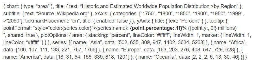
highchart() %>%
  hc_chart(type = "area") %>%
  hc_title(text = "Historic and Estimated Worldwide Population Distribution by Region") %>%
  hc_subtitle(text = "Source: Wikipedia.org") %>%
  hc_xAxis(categories = c("1750", "1800", "1850", "1900", "1950", "1999", "2050"),
           tickmarkPlacement = "on",
           title = list(enabled = FALSE)) %>%
  hc_yAxis(title = list(text = "Percent")) %>%
  hc_tooltip(pointFormat = "<span style=\"color:{series.color}\">{series.name}</span>:
             <b>{point.percentage:.1f}%</b> ({point.y:,.0f} millions)<br/>",
             shared = TRUE) %>%
  hc_plotOptions(area = list(
     stacking = "percent",
     lineColor = "#ffffff",
     lineWidth = 1,
     marker = list(
       lineWidth = 1,
       lineColor = "#ffffff"
       ))
     ) %>%
  hc_add_series(name = "Asia", data = c(502, 635, 809, 947, 1402, 3634, 5268)) %>%
  hc_add_series(name = "Africa", data = c(106, 107, 111, 133, 221, 767, 1766)) %>%
  hc_add_series(name = "Europe", data = c(163, 203, 276, 408, 547, 729, 628)) %>%
  hc_add_series(name = "America", data = c(18, 31, 54, 156, 339, 818, 1201)) %>%
  hc_add_series(name = "Oceania", data = c(2, 2, 2, 6, 13, 30, 46))
While comparing, you can see each of the blocks of javascript code converted into R functions pipelined to each other. We can look at few arguments like hctooltip's pointFormat in the format used as same in Javascript code you can look into details in this.
Highstocks are charts for Financial and time series analysis, it works well with the quamtmod library, and it's easy to chart symbols, and then you can add more series using hc_add_series.
x <- getSymbols("GOOG", auto.assign = FALSE)

hchart(x)
As in the chart, we don't need to add additional code, hchart accommodated with xts object very efficiently providing a dynamic snapshot of the data. You can use the zoom functionality to drill down the data in smaller chunks for better analysis.
Let's use hc_add_series.
y <- getSymbols("AMZN", auto.assign = FALSE)

highchart(type = "stock") %>%
  hc_add_series(x) %>%
  hc_add_series(y, type = "ohlc")
As you can see, the visualization is adjusting the large volume of data very efficiently.
Do try the stock with different xts objects.
The easiest way to chart a map with highcharter is using an hcmap function. Select a URL from the highmaps collection and use the URL as a map in hcmap function. This will download the map and create an object using the info as a mapdata argument.
Let's plot India's map.
hcmap("https://code.highcharts.com/mapdata/countries/in/in-all.js")%>%
  hc_title(text = "India")
Well, that's a plain map what about converting it into choropleths.
Every map data downloaded from highcharts map collection have keys to join data. There are 2 functions to help to know what are the regions coded to know how to join the map and data:
mapdata <- get_data_from_map(download_map_data("https://code.highcharts.com/mapdata/countries/in/in-all.js"))

glimpse(mapdata)
## Observations: 34
## Variables: 20
## $ `hc-group` <chr> "admin1", "admin1", "admin1", "admin1", "admin1"...
## $ `hc-middle-x` <dbl> 0.65, 0.59, 0.50, 0.56, 0.46, 0.46, 0.51, 0.59, ...
## $ `hc-middle-y` <dbl> 0.81, 0.63, 0.74, 0.38, 0.64, 0.51, 0.34, 0.41, ...
## $ `hc-key` <chr> "in-py", "in-ld", "in-wb", "in-or", "in-br", "in...
## $ `hc-a2` <chr> "PY", "LD", "WB", "OR", "BR", "SK", "CT", "TN", ...
## $ labelrank <chr> "2", "2", "2", "2", "2", "2", "2", "2", "2", "2"...
## $ hasc <chr> "IN.PY", "IN.LD", "IN.WB", "IN.OR", "IN.BR", "IN...
## $ `alt-name` <chr> "Pondicherry|Puduchcheri|Pondichéry", "Ã\u008dl...
## $ `woe-id` <chr> "20070459", "2345748", "2345761", "2345755", "23...
## $ fips <chr> "IN22", "IN14", "IN28", "IN21", "IN34", "IN29", ...
## $ `postal-code` <chr> "PY", "LD", "WB", "OR", "BR", "SK", "CT", "TN", ...
## $ name <chr> "Puducherry", "Lakshadweep", "West Bengal", "Ori...
## $ country <chr> "India", "India", "India", "India", "India", "In...
## $ `type-en` <chr> "Union Territory", "Union Territory", "State", "...
## $ region <chr> "South", "South", "East", "East", "East", "East"...
## $ longitude <chr> "79.7758", "72.7811", "87.7289", "84.4341", "85....
## $ `woe-name` <chr> "Puducherry", "Lakshadweep", "West Bengal", "Ori...
## $ latitude <chr> "10.9224", "11.2249", "23.0523", "20.625", "25.6...
## $ `woe-label` <chr> "Puducherry, IN, India", "Lakshadweep, IN, India...
## $ type <chr> "Union Territor", "Union Territor", "State", "St...#population state wise
pop = as.data.frame(c(84673556, 1382611, 31169272, 103804637, 1055450, 25540196, 342853, 242911, 18980000, 1457723, 60383628, 25353081, 6864602,
12548926, 32966238, 61130704, 33387677, 64429, 72597565, 112372972, 2721756, 2964007, 1091014, 1980602, 41947358, 1244464,
27704236, 68621012, 607688, 72138958, 3671032, 207281477, 10116752,91347736))
state= mapdata%>%
select(`hc-a2`)%>%
arrange(`hc-a2`)
State_pop = as.data.frame(c(state, pop))
names(State_pop)= c("State", "Population")
hcmap("https://code.highcharts.com/mapdata/countries/in/in-all.js", data = State_pop, value = "Population",
joinBy = c("hc-a2", "State"), name = "Fake data",
dataLabels = list(enabled = TRUE, format = '{point.name}'),
borderColor = "#FAFAFA", borderWidth = 0.1,
tooltip = list(valueDecimals = 0))
Do some experiments with hc_add_series in the maps and choropleths. For some details and examples visit here.
Now let's try some plugins provided by highcharter like grouping, drill-downs, downloading, printing data, and some awesome themes.
Let's group data of mpg dataset, here for better visualization we created a list which categories data according to the manufacturer.
data(mpg, package = "ggplot2")

mpgg <- mpg %>%
  filter(class %in% c("suv", "compact", "midsize")) %>%
  group_by(class, manufacturer) %>%
  summarize(count = n())

categories_grouped <- mpgg %>%
  group_by(name = class) %>%
  do(categories = .$manufacturer) %>%
  list_parse()

highchart() %>%
  hc_xAxis(categories = categories_grouped) %>%
  hc_add_series(data = mpgg, type = "bar", hcaes(y = count, color = manufacturer),
                showInLegend = FALSE)
Let's create a chart which drills down to another chart for better analysis. You can understand the code more efficiently if you understand lists in R.
df <- data_frame(
  name = c("Animals", "Fruits", "Cars"),
  y = c(5, 2, 4),
  drilldown = tolower(name)
)


ds <- list_parse(df)
names(ds) <- NULL


hc <- highchart() %>%
  hc_chart(type = "column") %>%
  hc_title(text = "Basic drilldown") %>%
  hc_xAxis(type = "category") %>%
  hc_legend(enabled = FALSE) %>%
  hc_plotOptions(
    series = list(
      boderWidth = 0,
      dataLabels = list(enabled = TRUE)
    )
  ) %>%
  hc_add_series(
    name = "Things",
    colorByPoint = TRUE,
    data = ds
  )

dfan <- data_frame(
  name = c("Cats", "Dogs", "Cows", "Sheep", "Pigs"),
  value = c(4, 3, 1, 2, 1)
)

dffru <- data_frame(
  name = c("Apple", "Organes"),
  value = c(4, 2)
)

dfcar <- data_frame(
  name = c("Toyota", "Opel", "Volkswage"),
  value = c(4, 2, 2)
)

second_el_to_numeric <- function(ls){

  map(ls, function(x){
    x[[2]] <- as.numeric(x[[2]])
    x
  })

}

dsan <- second_el_to_numeric(list_parse2(dfan))

dsfru <- second_el_to_numeric(list_parse2(dffru))

dscar <- second_el_to_numeric(list_parse2(dfcar))

hc %>%
  hc_drilldown(
    allowPointDrilldown = TRUE,
    series = list(
      list(
        id = "animals",
        data = dsan
      ),
      list(
        id = "fruits",
        data = dsfru
      ),
      list(
        id = "cars",
        data = dscar
      )
    )
  )
Let's apply Drill down on other charts.
tm <- pokemon %>%
  mutate(type_2 = ifelse(is.na(type_2), paste("only", type_1), type_2),
         type_1 = type_1) %>%
  group_by(type_1, type_2) %>%
  summarise(n = n()) %>%
  ungroup() %>%
  treemap::treemap(index = c("type_1", "type_2"),
                   vSize = "n", vColor = "type_1")
tm$tm <- tm$tm %>%
  tbl_df() %>%
  left_join(pokemon %>% select(type_1, type_2, color_f) %>% distinct(), by = c("type_1", "type_2")) %>%
  left_join(pokemon %>% select(type_1, color_1) %>% distinct(), by = c("type_1")) %>%
  mutate(type_1 = paste0("Main ", type_1),
         color = ifelse(is.na(color_f), color_1, color_f))

highchart() %>%
  hc_add_series_treemap(tm, allowDrillToNode = TRUE,
                        layoutAlgorithm = "squarified")
Let's add the functionality of exporting data.
pokemon%>%
  count(type_1)%>%
  arrange(n)%>%
  hchart(type = "bar", hcaes(x = type_1, y = n, color = type_1))%>%
  hc_exporting(enabled = TRUE)
At last, we add some themes.
pokemon%>%
  count(type_1)%>%
  arrange(n)%>%
  hchart(type = "bar", hcaes(x = type_1, y = n, color = type_1))%>%
  hc_exporting(enabled = TRUE)%>%
hc_add_theme(hc_theme_chalk())
You can learn a lot from here, Its a complete library for Highcharter. I am also sharing one of my favorite graph created on weather dataset, here one of the interesting argument polar is used by setting the argument to TRUE the whole story is transformed.
data("weather")

x <- c("Min", "Mean", "Max")
y <- sprintf("{point.%s}", c("min_temperaturec", "mean_temperaturec", "max_temperaturec"))
tltip <- tooltip_table(x, y)

hchart(weather, type = "columnrange",
       hcaes(x = date, low = min_temperaturec, high = max_temperaturec,
             color = mean_temperaturec)) %>%
  hc_chart(polar = TRUE) %>%
  hc_yAxis( max = 30, min = -10, labels = list(format = "{value} C"),
            showFirstLabel = FALSE) %>%
  hc_xAxis(
    title = list(text = ""), gridLineWidth = 0.5,
    labels = list(format = "{value: %b}")) %>%
  hc_tooltip(useHTML = TRUE, pointFormat = tltip,
             headerFormat = as.character(tags$small("{point.x:%d %B, %Y}")))
If you would like to learn more about Data Visualization in R, take DataCamp's Data Visualization with ggplot2 (Part 1) course and check out our R Formula Tutorial.
Learn more about R and Data Visualization
Course
Course
Course
Tutorial
Kevin Babitz
Tutorial
DataCamp Team
Tutorial
Carlos Zelada
Tutorial
Hugo Bowne-Anderson
code-along
Richie Cotton
