Bokeh distinguishes itself from other Python visualization libraries such as Matplotlib or Seaborn in the fact that it is an interactive visualization library that is ideal for anyone who would like to quickly and easily create interactive plots, dashboards, and data applications.
Bokeh is also known for enabling high-performance visual presentation of large data sets in modern web browsers.
For data scientists, Bokeh is the ideal tool to build statistical charts quickly and easily; But there are also other advantages, such as the various output options and the fact that you can embed your visualizations in applications. And let's not forget that the wide variety of visualization customization options makes this Python library an indispensable tool for your data science toolbox.
As you might know, DataCamp recently launched the Interactive Data Visualization with Bokeh course together with Bryan Van de Ven, Bokeh core contributor.
Now, DataCamp has created a Bokeh cheat sheet for those who have already taken the course and that still want a handy one-page reference or for those who need an extra push to get started.
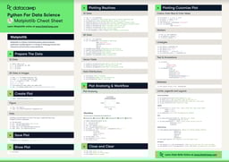
In short, you'll see that this cheat sheet not only presents you with the five steps that you can go through to make beautiful plots but will also introduce you to the basics of statistical charts.
Have this cheat sheet at your fingertips
Download PDFIn no time, this Bokeh cheat sheet will make you familiar with how you can prepare your data, create a new plot, add renderers for your data with custom visualizations, output your plot and save or show it. And the creation of basic statistical charts will hold no secrets for you any longer.
Boost your Python data visualizations now with the help of Bokeh! :)
PS. Check out our Interactive Data Visualization with Bokeh course or visit the Bokeh documentation website. Also, don't miss our Pandas cheat sheet or the Python cheat sheet for data science.
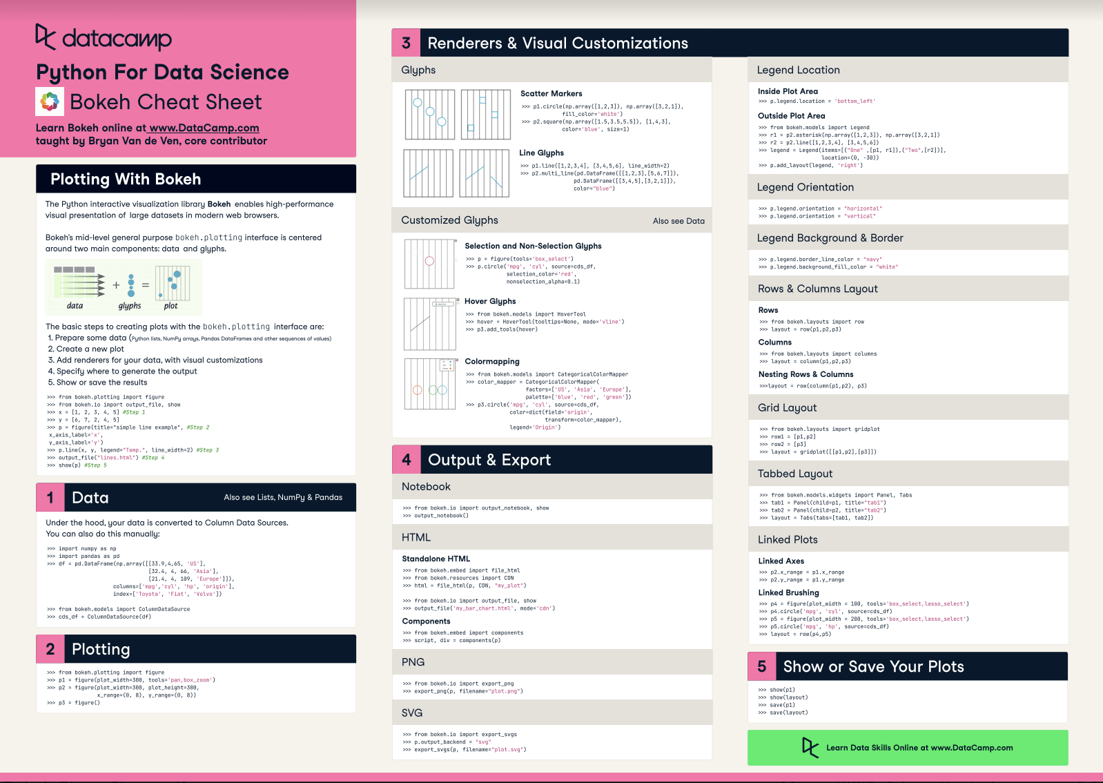
Plotting With Bokeh
The Python interactive visualization library Bokeh enables high-performance visual presentation of large datasets in modern web browsers.
Bokeh's mid-level general-purpose bokeh. plotting interface is centered around two main components: data and glyphs.
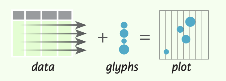
The basic steps to creating plots with the bokeh. plotting interface are:
- Prepare some data (Python lists, NumPy arrays, Pandas DataFrames and other sequences of values)
- Create a new plot
- Add renderers for your data, with visual customizations
- Specify where to generate the output
- Show or save the results
>>> from bokeh.plotting import figure
>>> from bokeh.io import output_file, show
>>> x = [1, 2, 3, 4, 5] #Step 1
>>> y = [6, 7, 2, 4, 5]
>>> p = figure(title="simple line example", #Step 2
x_axis_label='x',
y_axis_label='y')
>>> p.line(x, y, legend="Temp.", line_width=2) #Step 3
>>> output_file("lines.html") #Step 4
>>> show(p) #Step 5
1. Data
Under the hood, your data is converted to Column Data Sources. You can also do this manually:
>>> import numpy as np
>>> import pandas as pd
>>> df = pd.OataFrame(np.array([[33.9,4,65, 'US'], [32.4, 4, 66, 'Asia'], [21.4, 4, 109, 'Europe']]),
                     columns= ['mpg', 'cyl',   'hp',   'origin'],
                      index=['Toyota', 'Fiat', 'Volvo'])


>>> from bokeh.models import ColumnOataSource
>>> cds_df = ColumnOataSource(df)
2. Plotting
>>> from bokeh.plotting import figure
>>>p1= figure(plot_width=300, tools='pan,box_zoom')
>>> p2 = figure(plot_width=300, plot_height=300,
x_range=(0, 8), y_range=(0, 8))
>>> p3 = figure()
3. Renderers & Visual Customizations
Glyphs
Scatter Markers 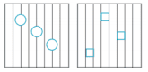
>>> p1.circle(np.array([1,2,3]), np.array([3,2,1]), fill_color='white')
>>> p2.square(np.array([1.5,3.5,5.5]), [1,4,3],
color='blue', size=1)
Line Glyphs
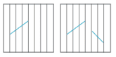
>>> pl.line([1,2,3,4], [3,4,5,6], line_width=2)
>>> p2.multi_line(pd.DataFrame([[1,2,3],[5,6,7]]),
pd.DataFrame([[3,4,5],[3,2,1]]),
color="blue")
Customized Glyphs
Selection and Non-Selection Glyphs

>>> p = figure(tools='box_select')
>>> p. circle ('mpg', 'cyl', source=cds_df,
selection_color='red',
nonselection_alpha=0.1)
Hover Glyphs

>>> from bokeh.models import HoverTool
>>>hover= HoverTool(tooltips=None, mode='vline')
>>> p3.add_tools(hover)
Color Mapping

>>> from bokeh.models import CategoricalColorMapper
>>> color_mapper = CategoricalColorMapper(
             factors= ['US', 'Asia', 'Europe'],
             palette= ['blue', 'red', 'green'])
>>>  p3. circle ('mpg', 'cyl', source=cds_df,
            color=dict(field='origin',
                 transform=color_mapper), legend='Origin')
4. Output & Export
Notebook
>>> from bokeh.io import output_notebook, show
>>> output_notebook()
HTML
Standalone HTML
>>> from bokeh.embed import file_html
>>> from bokeh.resources import CON
>>> html = file_html(p, CON, "my_plot")

>>> from  bokeh.io  import  output_file,  show
>>> output_file('my_bar_chart.html',  mode='cdn')
Components
>>> from bokeh.embed import components
>>> script, div= components(p)
PNG
>>> from bokeh.io import export_png
>>> export_png(p, filename="plot.png")
SVG
>>> from bokeh.io import export_svgs
>>> p. output_backend = "svg"
>>> export_svgs(p,filename="plot.svg")
Legend Location
Inside Plot Area
>>> p.legend.location = 'bottom left'
Outside Plot Area
>>> from bokeh.models import Legend
>>> r1 = p2.asterisk(np.array([1,2,3]), np.array([3,2,1])
>>> r2 = p2.line([1,2,3,4], [3,4,5,6])
>>> legend = Legend(items=[("One" ,[p1, r1]),("Two",[r2])], location=(0, -30))
>>> p.add_layout(legend, 'right')
Legend Background & Border
>>> p.legend. border_line_color = "navy"
>>> p.legend.background_fill_color = "white"
Legend Orientation
>>> p.legend.orientation = "horizontal"
>>> p.legend.orientation = "vertical"
Rows & Columns Layout
Rows
>>> from bokeh.layouts import row
>>>layout= row(p1,p2,p3)
Columns
>>> from bokeh.layouts import columns
>>>layout= column(p1,p2,p3)
Nesting Rows & Columns
>>>layout= row(column(p1,p2), p3)
Grid Layout
>>> from bokeh.layouts import gridplot
>>> rowl = [p1,p2]
>>> row2 = [p3]
>>> layout = gridplot([[p1, p2],[p3]])
Tabbed Layout
>>> from bokeh.models.widgets import Panel, Tabs
>>> tab1 = Panel(child=p1, title="tab1")
>>> tab2 = Panel(child=p2, title="tab2")
>>> layout = Tabs(tabs=[tab1, tab2])
Linked Plots
Linked Axes
Linked Axes
>>> p2.x_range = p1.x_range
>>> p2.y_range = p1.y_range
Linked Brushing
>>> p4 = figure(plot_width = 100, tools='box_select,lasso_select')
>>> p4.circle('mpg', 'cyl' , source=cds_df)
>>> p5 = figure(plot_width = 200, tools='box_select,lasso_select')
>>> p5.circle('mpg', 'hp', source=cds df)
>>>layout= row(p4,p5)
5. Show or Save Your Plots
>>> show(p1)
>>> show(layout)
>>> save(p1)
If you are interested in learning more, check out DataCamp’s Interactive Data Visualization with Bokeh course!