Course
What is TabPy
TabPy is a framework that enables Tableau to execute Python code. It allows users to run Python scripts within Tableau’s calculated field or deploy functions on the TabPy server using Python API.
TabPy is a powerful tool that comes with various configurations and utilities. You can integrate it with the Tableau visualization, and whenever the parameters are changed, the Python script will automatically run to provide you dynamic visualization experience.
Why TabPy?
Even though Tableau provides rich functionality to create, manipulate, and clean data fields, we are limited to simple statistical functionalities. To unlock advanced statistics such as machine learning, we will integrate powerful Python libraries with Tableau.
Learn various statistical techniques in Tableau by taking an interactive DataCamp course.
In this tutorial, we will learn to set up a TabPy server and work on a simple machine learning project. We will use the K Means algorithm to divide AirBnB Amsterdam listings into various clusters.
Setting Up TabPy
Setting up a TabPy server is simple. You can install TabPy using `pip` in the terminal or `!pip` in Jupyter Notebook. It will automatically install server and client API for Python.
pip install tabpyTo run the server, we will type `tabpy` in the terminal. It will take a few seconds to see that the server is running locally on the 9004 port.
tabpyOutput
... Password file is not specified: Authentication is not enabled
... Call context logging is disabled
... Initializing TabPy...
... Initializing TabPy Server...
... Done initializing TabPy.
... Setting max request size to 104857600 bytes
... Initializing models...
... Web service listening on port 9004
TabPy Server Configuration
You can configure your TabPy server using the config file and the command below.
tabpy --config=path/to/my/config/file.confYou can configure:
- HTTP vs HTTPS connection
- User Management
- Logging
TabPy provides you the freedom to customize the server based on the company policy of security and quality assurance. You can check out the sample config file and learn how to set up a server with particular requirements.
Deploying TabPy to Heroku
If you are using Tableau Cloud or Tableau Server, you will need to deploy a TabPy server to a cloud or web hosting platform. You can achieve it by using a Docker file or directly deploying the server on Heroku.
To run the remote server on Heroku:
- Login in to your Heroku account via a browser, and If you don't have an account, sign up for free.
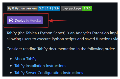
- Go to the TabPy repository on GitHub and click on the "Deploy to Heroku" button in the Readme.
- Follow the instructions. Write the server name and select the server location.
- Setup environment variables username and password.
Your server is deployed hassle-free. You can connect Tableau with the URL and port number.
Connecting to TabPy
Make sure your TabPy server is running locally or remotely before connecting it with Tableau.
To connect the server, we have to click on the Help menu and select Settings and Performance > Manage Analytics Extension Connection. It will prompt a new window with various connection types: TabPy, Einstein Discovery, RServe, and Analytics Extension API.
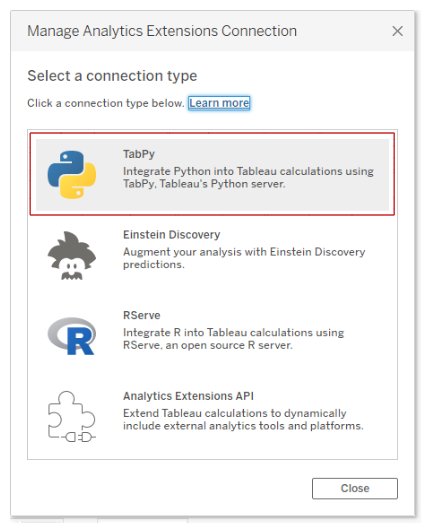
We will select the TabPy option, which will prompt another window asking us to add Hostname, Port, Username, and Password. We will ignore the username and password option as we haven't set it up.
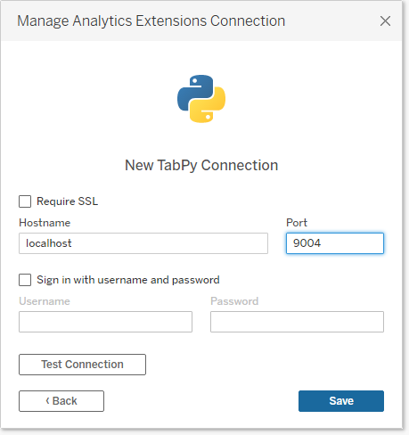
In the next step, we will add Hostname as “localhost” and Port to “9004” and press on Test Connection. After passing the test, we will save the connection configuration.
Using Python With Tableau Calculations
To run a Python script in a calculated field, you need one of these script functions based on your output:
- SCRIPT_BOOL
- SCRIPT_INT
- SCRIPT_REAL
- SCRIPT_STR
If your function returns boolean values, use the SCRIPT_BOOL function. You can always get integers and then convert them into other types using native functions.
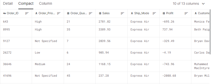
In this section, we will be using a store sales dataset from Kaggle. The Sales and Profit data field calculates the Pearson correlation coefficient.
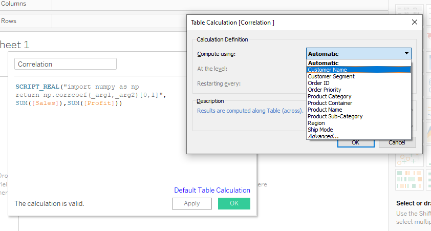
The SCRIPT_REAL requires two parts. The first is Python script in double inverted commas and the second part is aggregated arguments.
We will use the Numpy Python package to calculate a correlation between Sales and Profit arguments. We cannot add arguments directly. Instead, we use placeholders such as “_arg1” and “_arg2”. For example, SUM([Profit]) is second in the order, and it is linked to “_arg2”.
We are simply extracting a correlation coefficient from the np.corrcoef matrix to return a single column.
SCRIPT_REAL("import numpy as np
return np.corrcoef(_arg1,_arg2)[0,1]",
SUM([Sales]),SUM([Profit]))
After adding the script into the “Correlation” calculate field, click on the apply button. It will run the script and return values corresponding to the Customer Name.
Before pressing the OK button, click on the text “Default Table Calculation” and change the option from Automatic to Customer Name.
To visualize a scatter plot of product category and customer segmentation:
- Drag and drop Product Category and Sales data field to Columns shelf.
- Then, drag and drop the Customer Segment and Profit data field to the Rows shelf.
- Drag and drop the Customer Name to Detail button in the Marks section.
- Finally, drag and drop the newly created calculated field Correlation to Label button in the Marks section.
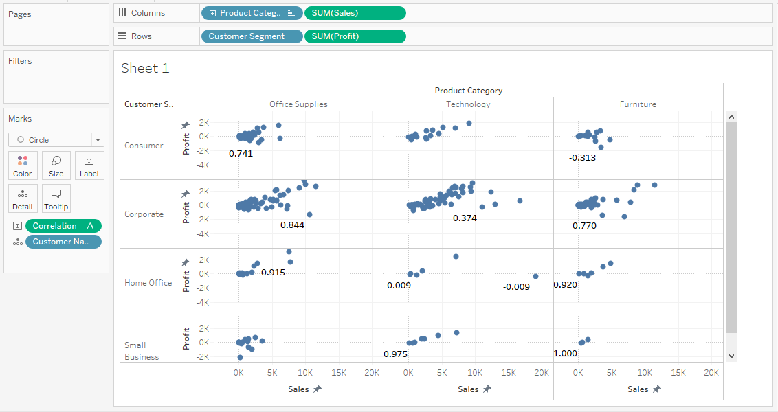
The graph above shows the correlation coefficient of customers based on the product category and customer segment. There is a high correlation between the Furniture category and Small Business customers.
Clustering Python Script in Tableau
In this section, we will use the Airbnb Amsterdam dataset to create clusters using K-means clustering algorithm and scikit-learn machine learning framework.
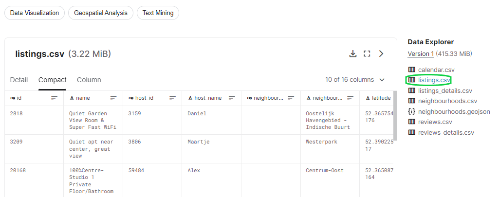
Before we jump into TabPy scripting, we need to analyze and understand the dataset on Jupyter Notebook.
Project Initialization
We will be using pandas for data ingestion and cleaning, matplotlib and seaborn for data visualization, and scikit-learn for processing data and clustering algorithms.
First, we will import the required Python packages and ingest the “listing.csv” file. Then, we will explore missing values using .isna().sum().
mport pandas as pd

import matplotlib.pyplot as plt
import seaborn as sns

from sklearn.preprocessing import LabelEncoder
from sklearn.cluster import KMeans


df = pd.read_csv("listings.csv")
df.isna().sum()
As we can observe, there are several missing files in neighbourhood_group, last_review, and reviews_per_month. Instead of imputing or dropping these columns, we will not include them in training our model.
id                                    0
name                                 38
host_id                               0
host_name                             4
neighbourhood_group               20030
neighbourhood                         0
latitude                              0
longitude                             0
room_type                             0
price                                 0
minimum_nights                        0
number_of_reviews                     0
last_review                        2406
reviews_per_month                  2406
calculated_host_listings_count        0
availability_365                      0
dtype: int64
Processing the Data
We will create an X dataframe that will contain essential features for training. These features have no missing values, unique IDs, or high correlation. For example, we will not include id, name, host_id, host_name, latitude, and longitude.
We have categorical columns, and to convert them into numerical, we will use LabelEncoder(). To apply them to multiple categorical columns, we will use the Pandas .apply() function.
X = df[['neighbourhood',
        'room_type',
        'price',
        'minimum_nights',
        'number_of_reviews',
        'availability_365',
        'calculated_host_listings_count']]
LE = LabelEncoder()
cat = ['neighbourhood','room_type']

X[cat] = X[cat].apply(LE.fit_transform)
X.head()
As we can see, the final dataframe has seven columns with numerical values.
Searching for K Means Cluster Elbow
The Elbow method is used to determine the optimal number of clusters in a particular data set. We will use n_clusters and .inertia_ to display line graphs with elbow-like patterns. Inertia is the sum of squared distance samples to the closest cluster center.
The code below will run from 1 to 9 and append inertia values to the clusters array. Then, we will use this information to plot a line graph of clusters v/s inertia.
clusters = []

for i in range(1, 10):
    km = KMeans(n_clusters=i).fit(X)
    clusters.append(km.inertia_)

fig, ax = plt.subplots(figsize=(12, 8))
sns.lineplot(x=list(range(1, 10)), y=clusters, ax=ax)
ax.set_title('Searching for Elbow')
ax.set_xlabel('Clusters')
ax.set_ylabel('Inertia');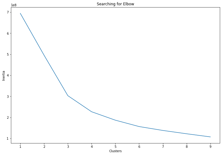
The graph shows that the first arch is on 3 and the second arch is on 4. We will include both of these clusters in the Tableau visual analysis.
You can learn more about K Mean clustering in Python with scikit-learn by following our tutorial.
Creating N-Cluster Parameter
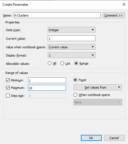
To avoid adding the number of cluster values manually into the code, we will create a parameter with a range of 1 to 10.
We can create parameters by right-clicking in the Data section and selecting the Create Parameter option. Change the Data type to Integer, Current value to 1, and click on Range to add Minimum 1 and Maximum 10 values.
Python Script in Calculated Field
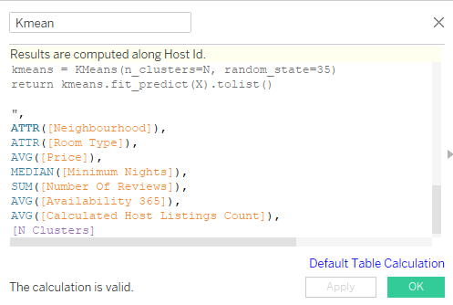
Now we will transfer the code from the Jupyter Notebook to Tableau calculated field. The tableau calculated field does not require loading a data set. We already have a required data field, and we will use them using SCRIPT_INT arguments.
- We will convert argument one and two to numerical type using LabelEncoder.
- Get all the arguments and give them appropriate variable names.
- We will stack all the input arguments except N into columns.
- Define a model with “N” number of clusters. We can change this variable using the N Clusters parameter.
- Finally, training and predicting the clusters using features.
- Return the output as a list of integers.
The second part of the script is aggregate data fields and a parameter.
You can review the code below to understand the relation between arguments and data fields.
SCRIPT_INT("from sklearn.preprocessing import LabelEncoder
from sklearn.cluster import KMeans

LE = LabelEncoder()

neighbourhood = LE.fit_transform(_arg1)
room_type = LE.fit_transform(_arg2)

price = _arg3
minimum_nights = _arg4
number_of_reviews = _arg5
availability_365 = _arg6
calculated_host_listings_count = _arg7

N = _arg8[0]

X = np.column_stack(
    [
        neighbourhood,
        room_type,
        price,
        minimum_nights,
        number_of_reviews,
        availability_365,
        calculated_host_listings_count,
    ]
)

kmeans = KMeans(n_clusters=N, random_state=35)
return kmeans.fit_predict(X).tolist()

",
ATTR([Neighbourhood]),
ATTR([Room Type]),
AVG([Price]),
MEDIAN([Minimum Nights]),
SUM([Number Of Reviews]),
AVG([Availability 365]),
AVG([Calculated Host Listings Count]),
[N Clusters]
)
Create a new calculated field (Kmean) and copy and paste the above code. Make sure your results are computed along with Host Id. You can modify it by clicking on Default Table Calculation blue text.
Data Visualization
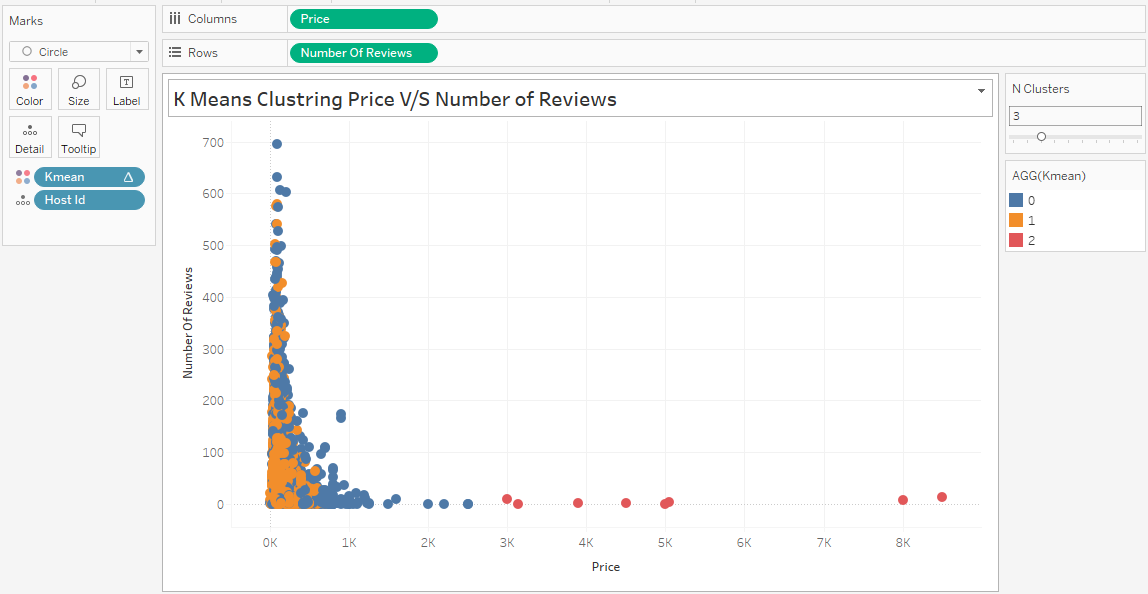
To create the visualization below, we have to follow a series of steps.
- Drag and drop the Price data field to Columns shelf and Number of Reviews to Rows shelf.
- Go to the Analysis menu on the top and uncheck Aggregate Measures.
- Drag and drop Host Id data field to Detail in Marks section, and Kmean calculated field to Color.
- Change Kmean calculated field to Discrete by right-clicking and accessing the option.
- Right-click on N Clusters in the Parameters section and select Show Parameters to display the slider on right.
- Adjust the N Clusters slider to 3 or 4 to see the results in real-time.
In the next part, we will create multiple visualization sheets by changing data fields and the number of clusters.
- Price v/s Availability: we can see four clusters. Based on this information, we can create a recommendation system for Airbnb or any hotel business.
- Review v/s Availability: we can only see two large clusters even though the N Clusters is 3.
- Listings v/s Price: we can see red, blue, and green clusters. The yellow in the corner is surrounded by green and blues.

Learn more about advanced analytics and visualization by taking our Analyzing Data in Tableau course. It will help you understand data preparation, exploration, mapping analysis, groups, sets, and parameters.
If you enjoyed the clustering tutorial, try converting the data points onto a map. Just drag and drop Latitude and Longitude to the Columns and Rows shelf.
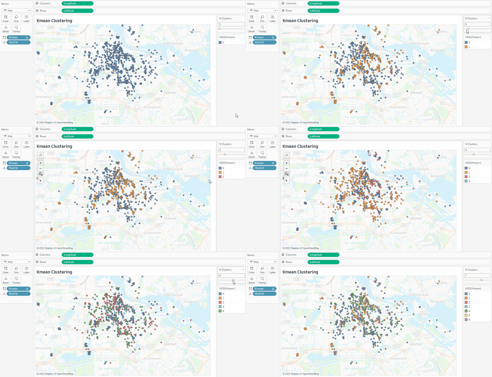
You can also create clusters without TabPy by following our Cluster Analysis in the Tableau tutorial.
Conclusion
By integrating TabPy, you will open the door to endless possibilities to automate and improve your current data analytics setup. We can also use it to integrate deep learning models into an analytics dashboard, perform complex statistical tasks, and implement continuous integration and development.
TabPy integration comes with multiple restrictions, such as single output. These restrictions will only affect individuals who are Data scientists or Machine Learning Engineers.
In this post, we have learned about TabPy (Python server for Tableau) and how to use it to create K mean clusters. Creating clusters is important for the e-commerce, travel, and entertainment industry to understand customers' behavior. We have used the K Means cluster, but you use other algorithms to get better results.
Here is the list of top clustering algorithms:
- Affinity Propagation
- Agglomerative Hierarchical Clustering
- BIRCH (Balanced Iterative Reducing and Clustering using Hierarchies)
- DBSCAN (Density-Based Spatial Clustering of Applications with Noise)
- Gaussian Mixture Models (GMM)
- Mean Shift Clustering
If you are new to Tableau and want to learn all about data visualization and statistical computation, take the Tableau Fundamentals skill track.
In the second part of this tutorial series, we explore complex Python scripts using TabPy. We will learn to deploy the Facebook Prophet forecast model on the TabPy server and create dynamic time series visualization.

