Course
Data can be complex, tedious, and sometimes it can be a difficult task to uncover patterns. Consider a situation where you have some sales data belonging to your company. You wanted to discover a pattern in terms of the spending capacity of the consumers. If you could uncover distinct groups or associations in the data, you could target the different groups accordingly to get maximum sales. The basic idea behind this intuition is called clustering and Tableau has an inherent feature which can automatically cluster similar data points based on certain attributes. Let us explore this functionality of Tableau and see how we can apply the clustering to a real-world data set.
K Means Clustering
Clustering, also known as cluster analysis is an Unsupervised machine learning algorithm that tends to group together similar items, based on a similarity metric.
Tableau uses the K Means clustering algorithm under the hood. K-Means is one of the clustering techniques that split the data into K number of clusters and falls under centroid-based clustering. In K means clustering, for a given number of clusters k, the algorithm splits the dataset into k clusters where every cluster has a centroid which is calculated as the mean value of all the points in that cluster. The data points are then clustered based on their distances from the centroids.
Here are two great tutorials on DataCamp that deal with the concept of clustering in detail:
If you want to learn more about Clustering in Machine Learning, take DataCamp’s Unsupervised Learning in Python or Clustering Methods with SciPy course.
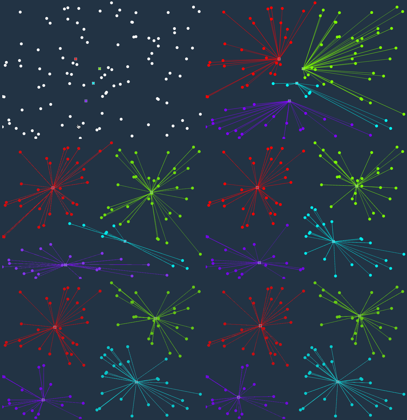
The figure below visualizes the K -Means algorithm for a better understanding. Initially, we randomly define 4 centroid points. The K means algorithm then assigns each data point to its nearest cluster (cross). The centroid shifts to a new position as the mean value of all data points change, and the entire process is repeated until we observe no further change in the position of the centroids.
The Criterion for Clustering in Tableau
After having some idea about the clustering methodology, let’s now understand how clustering is accomplished in Tableau. Tableau uses the Calinski-Harabasz criterion to assess cluster quality. Here is the mathematical interpretation of the Calinski-Harabasz criterion:
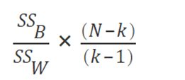
"where SSB is the overall between-cluster variance, SSW is the overall within-cluster variance, k is the number of clusters, and N is the number of observations" (Source).
This ratio gives a value which determines the cohesiveness of the clusters. So the higher this value, clusters are more closely associated having low within-cluster distance and high between-cluster distance.
Pre-requisites
This article assumes some familiarity with Tableau. In case you are a complete beginner, it is suggested that you go through the following article on DataCamp which serve as an excellent primer.
Data Visualisation with Tableau
Tableau Environment
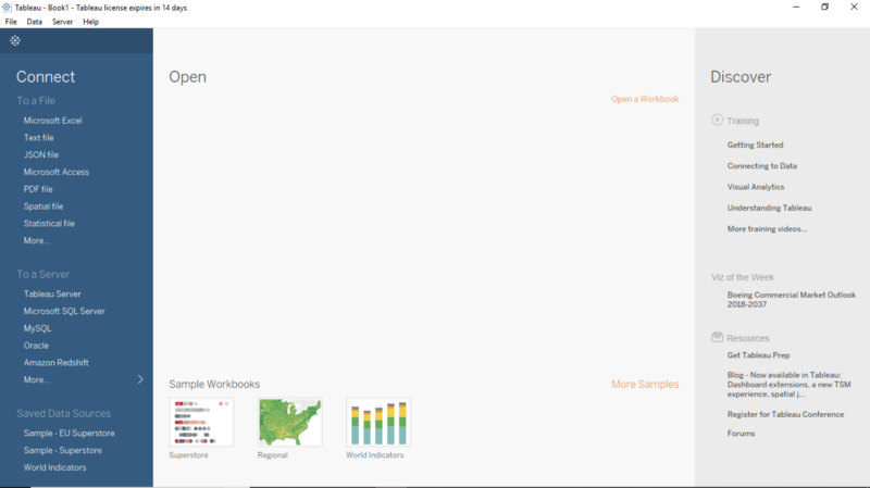
In this tutorial, we will be working with Tableau Public, which is an absolutely free offering from Tableau. Download the Tableau Public edition from the official website. Follow the installation instructions, and if the following screen appears on clicking the Tableau Icon, you are good to go.
Connecting to the Dataset
The dataset that we will be using in this article is called the World Economic Indicators dataset. This dataset includes some of the important indicators driving the economy such as Life expectancy, ease of doing business, population, etc., of the various countries. It has been obtained from the United Nations. The dataset can be accessed from here.
- Download the dataset on to your systems.
- Import the data into your Tableau workspace from the computer. Use the Data Interpreter, present under Sheets Tab, to rectify and realign the data.
Formatting the Data Source
Proceed to the worksheet and have a glance over the Measures and Dimensions Tab. There are a lot of features under the Measures tab, which can be clubbed together under a single category. This will also help to better represent all of the data fields.
- Select Business Tax Rate, Days to Start Business, Ease of Business, Hours to do Tax and Lending Interest > Create Folder.
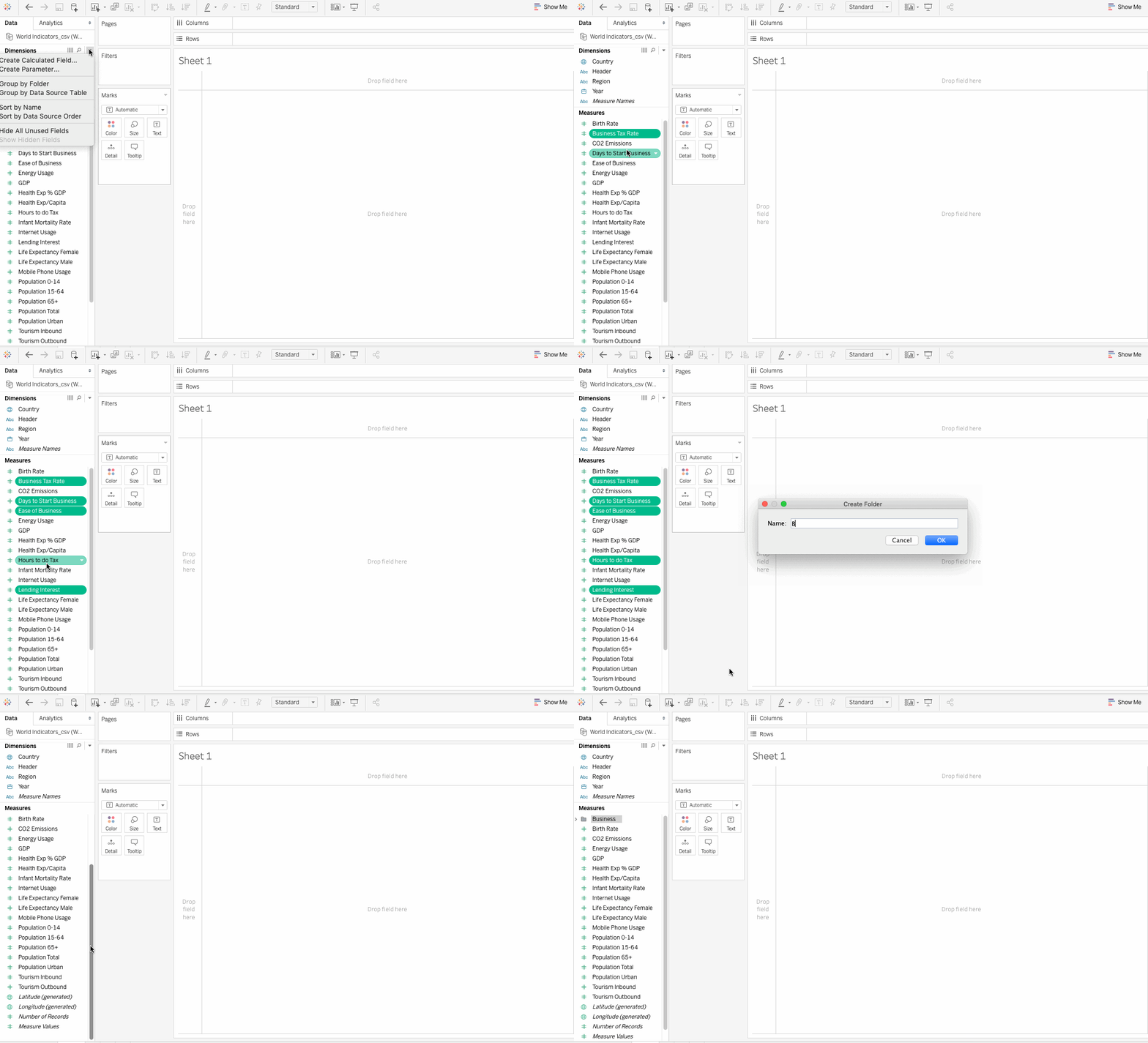
- Name the folder as Business, and now all the above field are included in this particular folder.
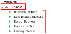
- Similarly, create folders for Development, Health, and Population. Also, add the following fields, respectively. This is how the Measures Tab looks like after the formatting:
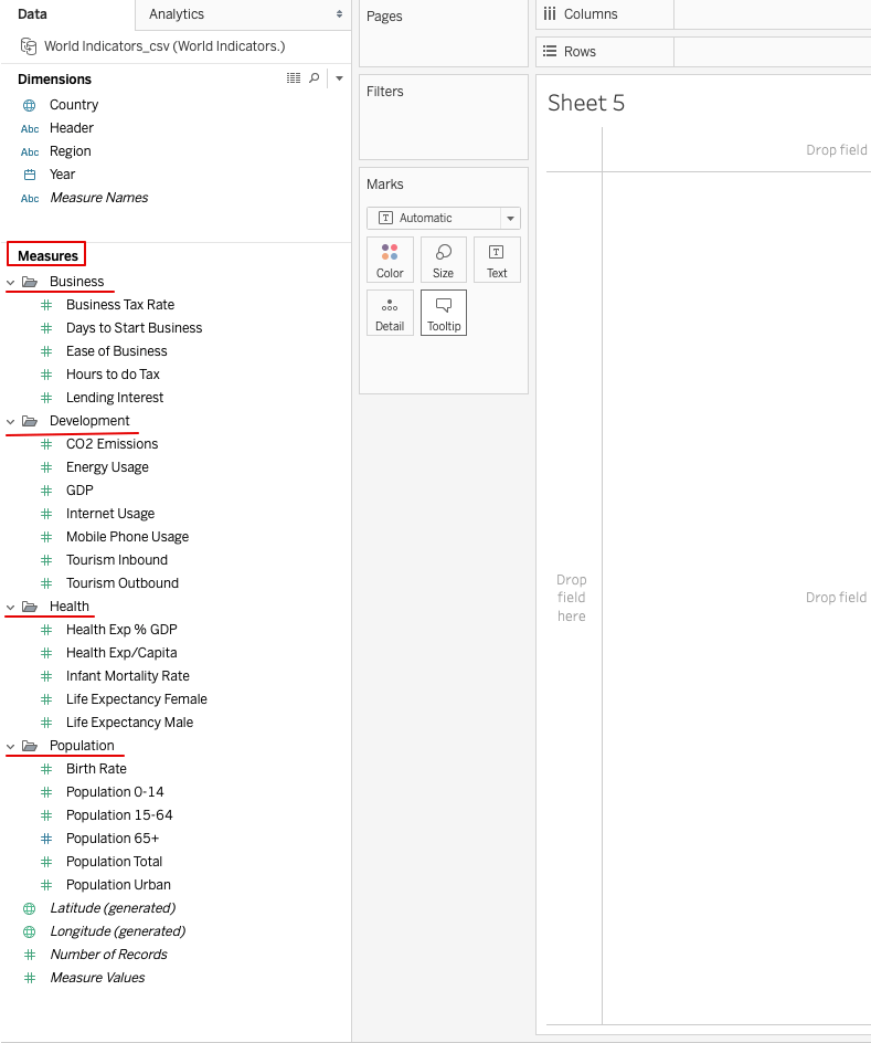
Creating Clusters from World Economic Indicators Data
Clustering helps to uncover the patterns in the dataset. Let’s suppose that you are an analyst with some Tourism company. Due to the increase in life expectancy around the world, there has been a surge in senior tourism. Older people now are more active and are more interested in traveling and seeing the world. Your company is trying to cash in on this phenomenon, and your work is to use the World Indicators sample data to identify the countries where there are enough of the right kind of customers. Clustering is a tool that can help us in identifying such type of countries.
Identifying countries with a high success rate for senior tourism
Let’s now go through the various steps to perform cluster analysis on the data.
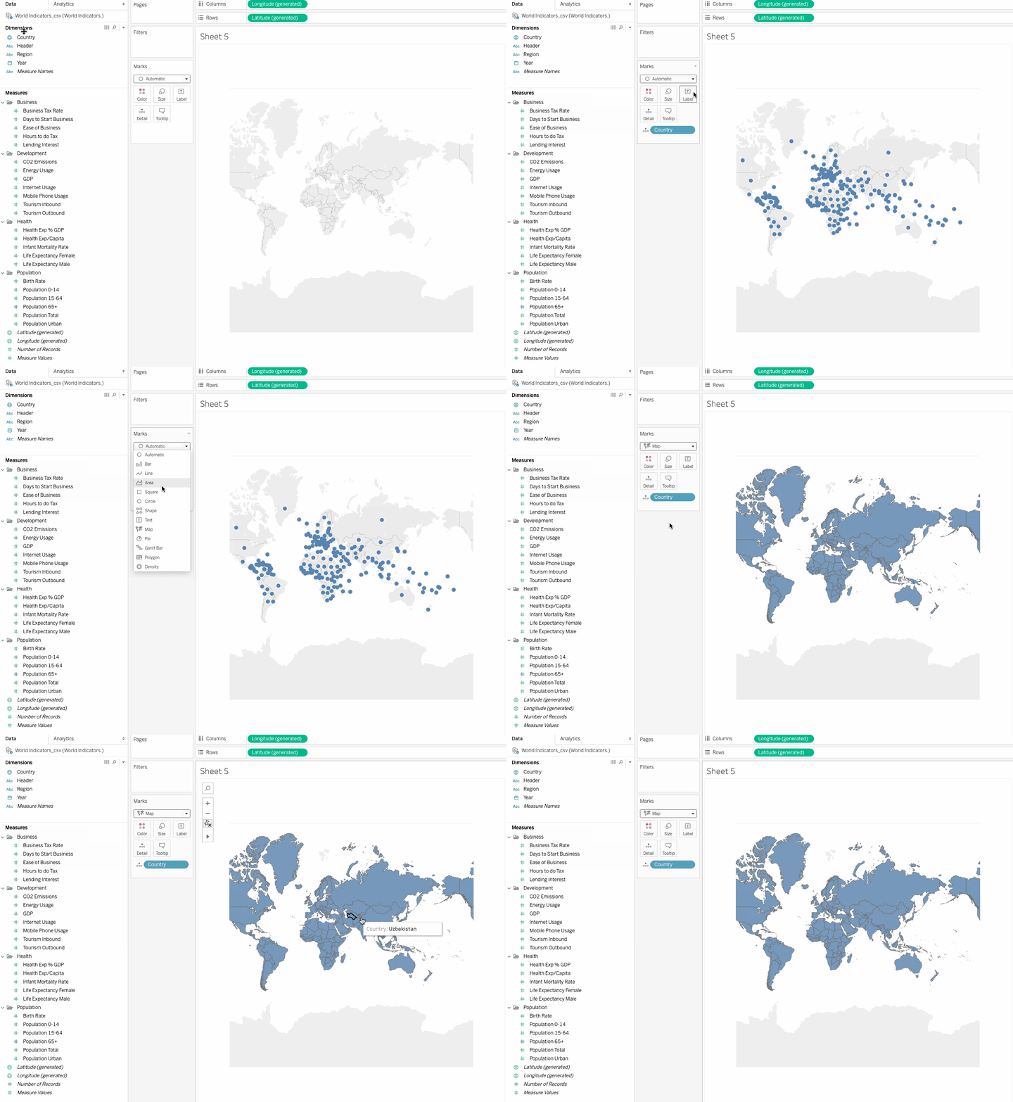
- Double click
Countryin the Dimensions under Data pane. Tableau creates a map view with a filled circle representing each country. Change the mark type to Map, on the Marks card,
Identifying the variables for clustering
The next step in clustering is to identify the variables that will be used in the clustering algorithm. In Tableau, the variables are akin to the fields. There is not a single answer to the best variables that will give ideal clusters, but you can experiment with a number of variables to see what gives the desired results. In our case, let’s work with the following fields:
- Population Urban
Urban population is a good indicator of the population density in a country. Higher the density, more business opportunities become available.
- Population 65+
Population greater than 65 signifies senior citizens, which is also our target segment.
- Life Expectancy Female and Life Expectancy Male
Countries with a higher life expectancy signify that people there tend to live longer and will be more interested in traveling.
- Tourism Per Capita
This field doesn’t exist and can be created as a calculated field, using Tourism Outbound and Population Total fields as follows:
Tourism Per Capita = SUM([Tourism Outbound])/SUM([Population Total])
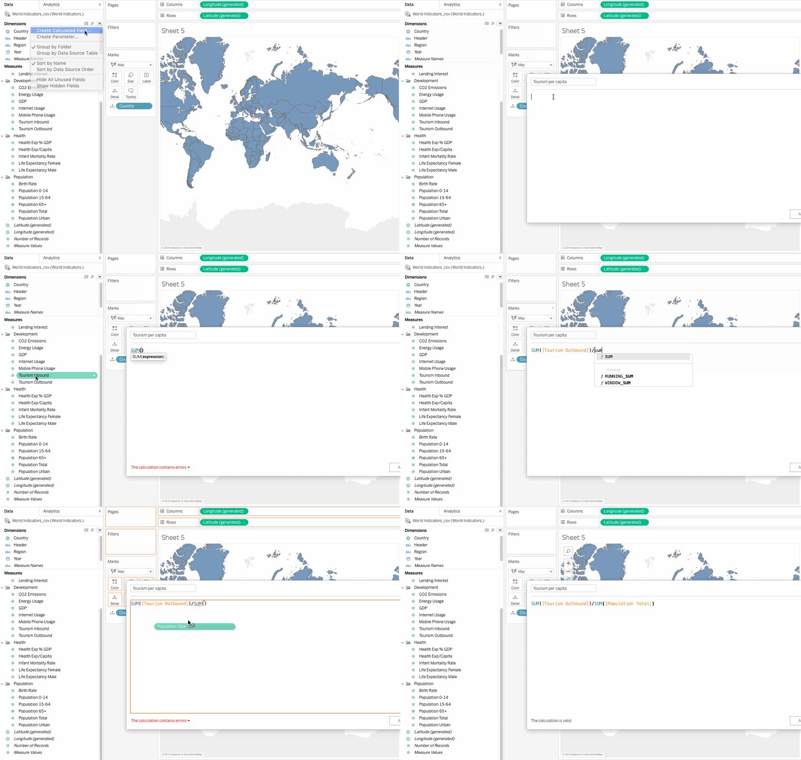
Tourism Outbound represents the money (in US dollars) that people of a country spend annually on international travel. To get the average value, we will need to divide this field by the population of each country.
Adding selected field to the view
Before moving ahead, we need to change the default aggregation from SUM to AVERAGE. Tableau makes it possible to aggregate measures or dimensions, though aggregating measures is more common. Whenever we add a measure to the view, an aggregation is applied to that measure by default. The type of aggregation that needs to be applied depends on the context of the view.
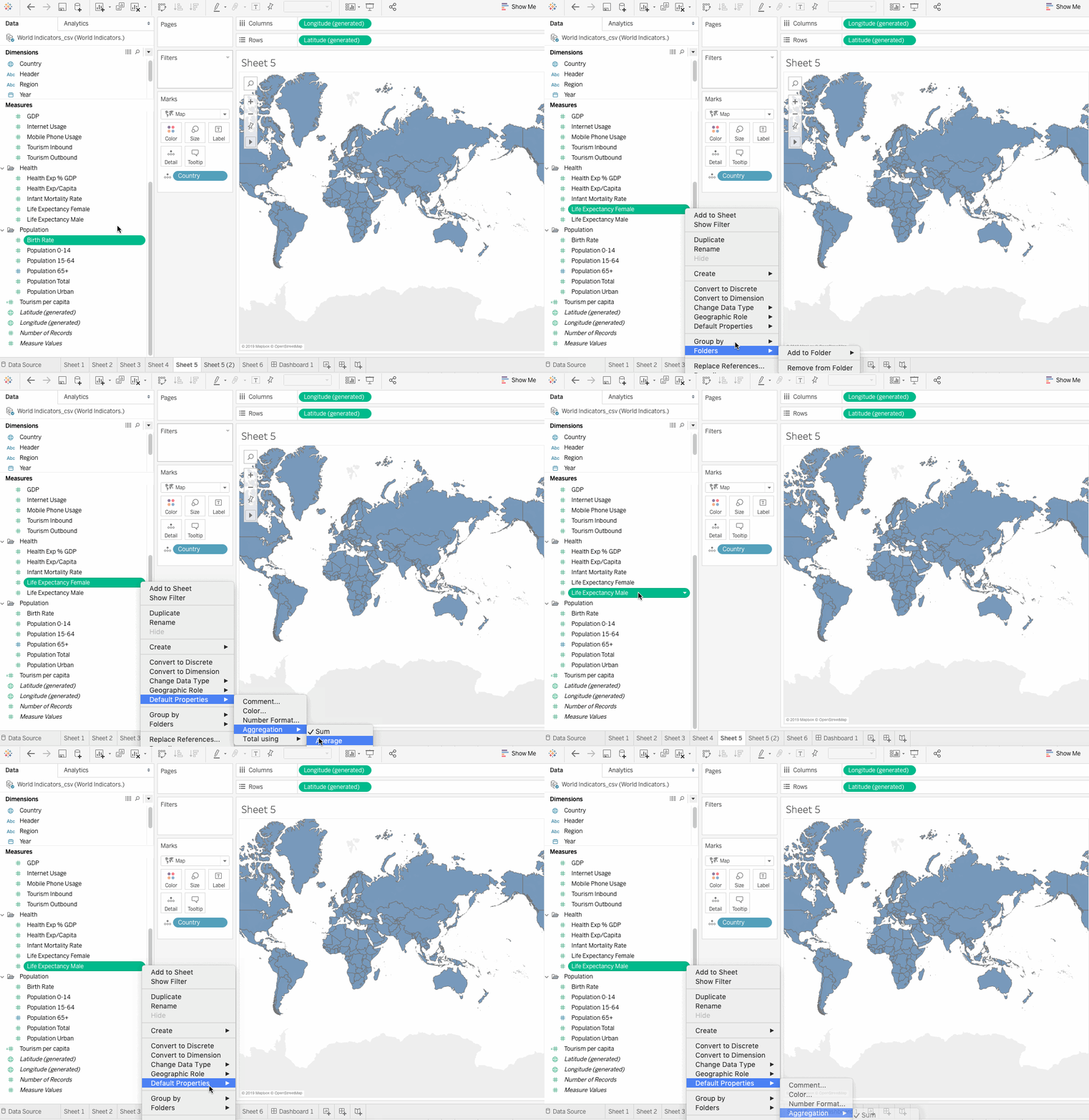
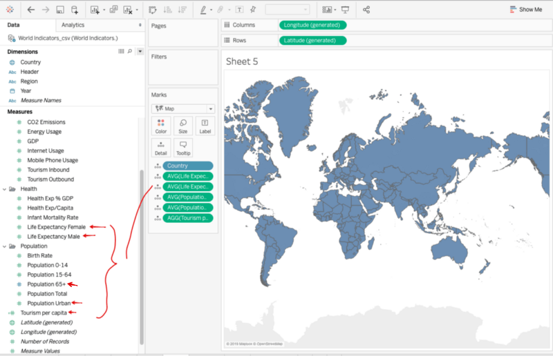
Change the Aggregation for all of the selected fields and then drag them on to the Detail on the Marks card as follows:
Clustering
Clustering in Tableau is a simple drag and drop process. The following steps outline the clustering process:
- Click on the
AnalyticsPane and dragClusteronto the view, and the data is clustered by Tableau automatically.
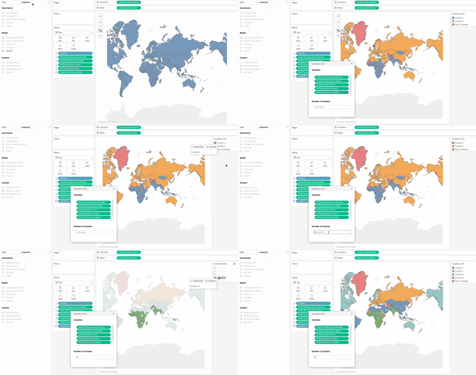
- Although Tableau can automatically decide the number of clusters to create, we can also control the number of clusters and what variables are used to compute the cluster. Simply drag a field in the box to include it in clustering algorithm or drag it out to exclude it.
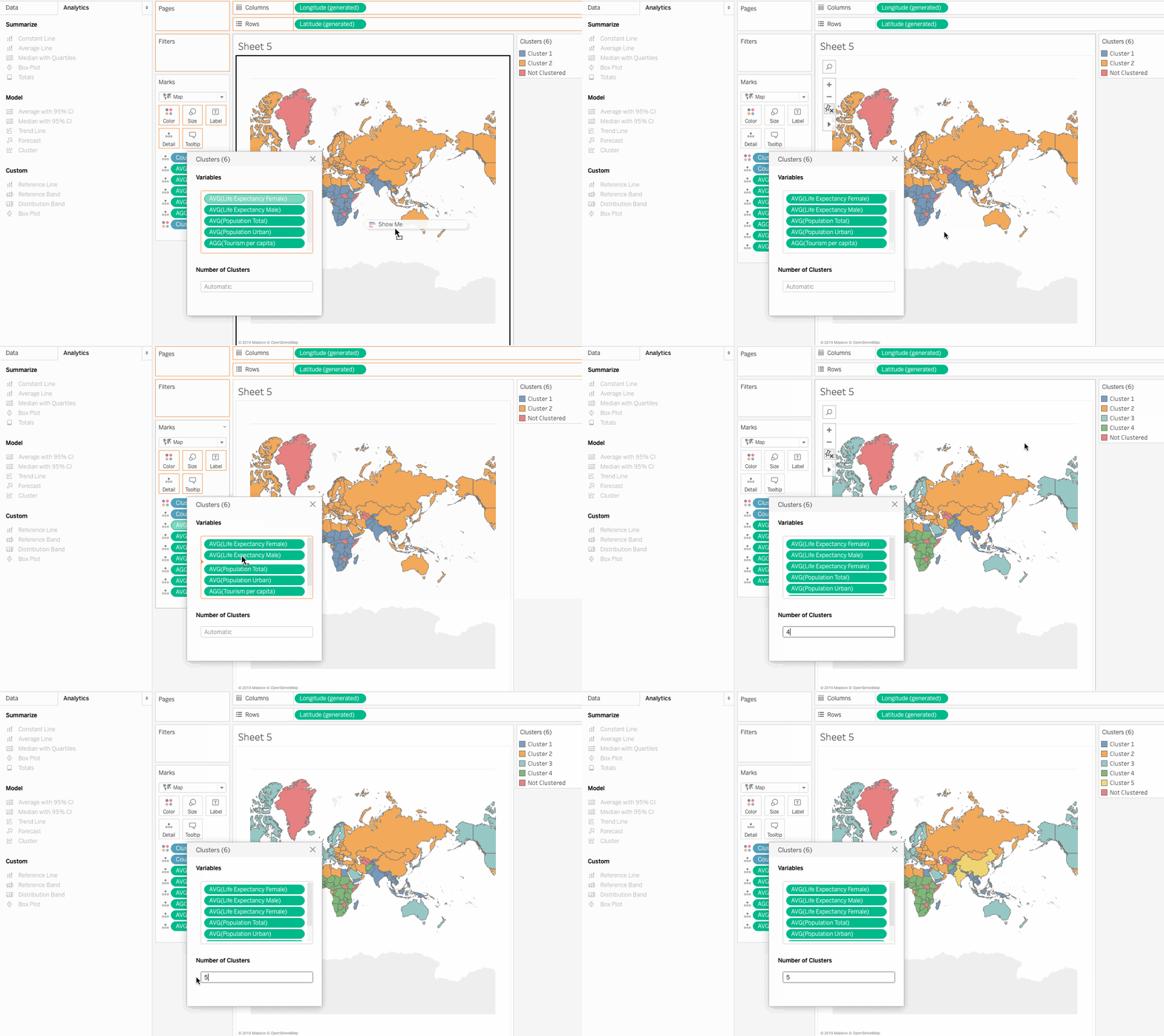
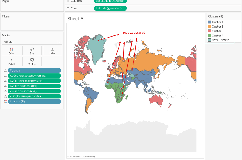
- We shall go with 4 clusters and the default variables for better analysis. Note, some countries did not fall in any cluster and have been marked as not clustered.
- The cluster is created as a new pill and can be seen on the color shelf. Drag this pill on to the Data Pane to be saved as a group.
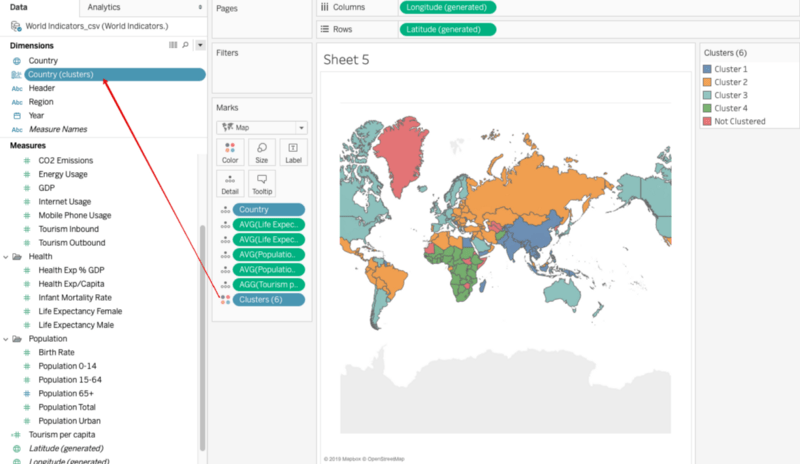
So here we have clustered the countries in relation to the chosen measures. But how do we make sense out of these results, and how can we make business decisions based on the clusters? The next section addresses these concerns.
Describing Clusters
Click on the Clusters field in the Marks card and click on the Describe Clusters option.
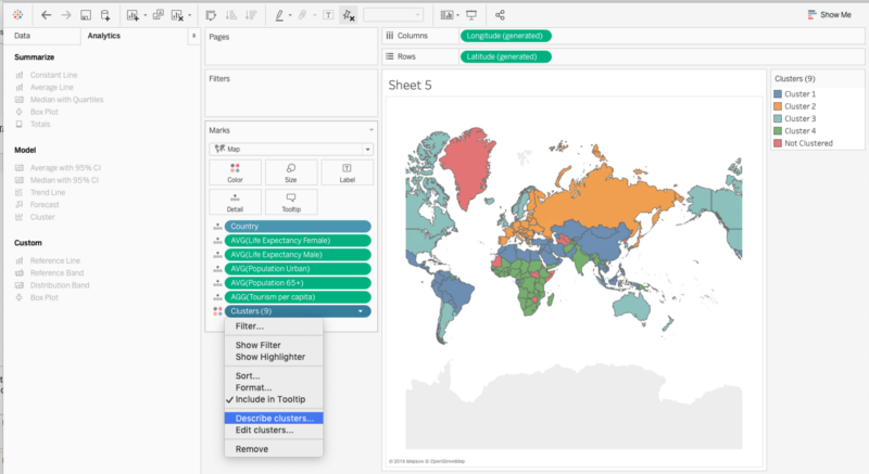
This displays a document which contains a detailed description of the clusters. There are two tabs in the document:
Summary
This gives a summary of the results and the average values of each variable for every cluster.

From the above results, we can infer that Cluster 3 has:
- Highest Life Expectancy for both males and females
- Highest Total Tourism Per capita
- Highest urban population
This means it has a wealthy urban population with a larger life expectancy and hence does seem to be a good market for Senior Tourism Industry. Let us see which countries are included in this cluster.
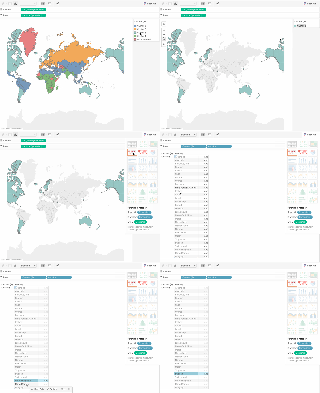
Models
The models tab displays the various statistical value for the average value of all the variables/fields and shows their statistical significance.

Thus as an analyst, you can present this list to the Sales Team so that they can focus on these prospective clients. Clustering has provided us with great insight. From here, you can experiment with different fields, set a threshold for population or Income, etc. There are many ways to cluster the data, but the basic principle stays the same.
Conclusion
In this article, we learned how to perform a cluster analysis of a given dataset in Tableau with a simple drag and drop mechanism. Clustering is a valuable tool and when coupled with Tableau, gives the power of a statistical analysis technique in the hands of analysts. See our Tableau hub for everything you need to master Tableau.
References

