Course
Tableau is an industry leader in data visualization. Not only does it provide many great pre-set visualizations, but if you master it, you can extend its functionality in many different directions, including by creating new visualizations that aren’t part of the standard library.
In this article, we will look closely at how to make a donut chart in Tableau. After reading this article, consider enrolling in our Tableau Fundamentals skill track to learn more about what Tableau has to offer.
What is a Tableau Donut Chart?
A donut chart is similar to a Tableau pie chart, but with the notable feature that it has a hole in the middle, so it looks like a donut. This subtle change is more interesting than it seems. In my opinion, donut charts prove to be a little bit of a better option because leaving the center open changes how we see the slices.
The problem with a pie chart is that, instead of just looking at the angles, we also focus on the lengths of the slices, which can be more confusing or give a contradictory impression. And according to studied basic data visualization principles, differences between lengths tend to be perceived more accurately than differences between angles. So while both charts help us see relative composition by encoding the underlying numerical data as angles of a complete circle, the donut chart adds clarity by shifting our attention from the angles to the lengths of the slices.
When to Use a Tableau Donut Chart
Let’s consider, as a set of rules, the conditions under which a donut chart would be insightful:
- Use donut charts with percentages only.
- Percentages in a donut chart must add up to 100%.
- Percentages in a donut chart must be positive.
- Limit the slices in pie charts to 2-3 slices max (more slices tend to be crowded and confusing).
- Do not use 3D donut charts (they become even more confusing).
- Always start the first slice at a zero-degree angle (at a 12 O’clock position).
- Always sort the categories (slices) according to their importance in a clockwise order.
- Now, let’s move on to the hands-on part!
Steps to Create a Donut Chart in Tableau
Tableau does not have a donut chart from which to choose directly. Instead, we need to do a little trick to create our own donut chart. The trick mainly consists of creating a pie chart and then placing a smaller white circle over the center of the pie. So, let’s import our data and see how that works!
Import data into Tableau
For this tutorial, we will use “Hollywood's Most Profitable Stories” dataset, available as a CSV file, in Tableau’s sample datasets page. Download the file onto your device.

Downloading Hollywood's Most Profitable Stories dataset. GIF by Author.
Then, we will import the dataset. Since this is a CSV file, we will use the “Text file” connector in Tableau Public (or Desktop) opening page.
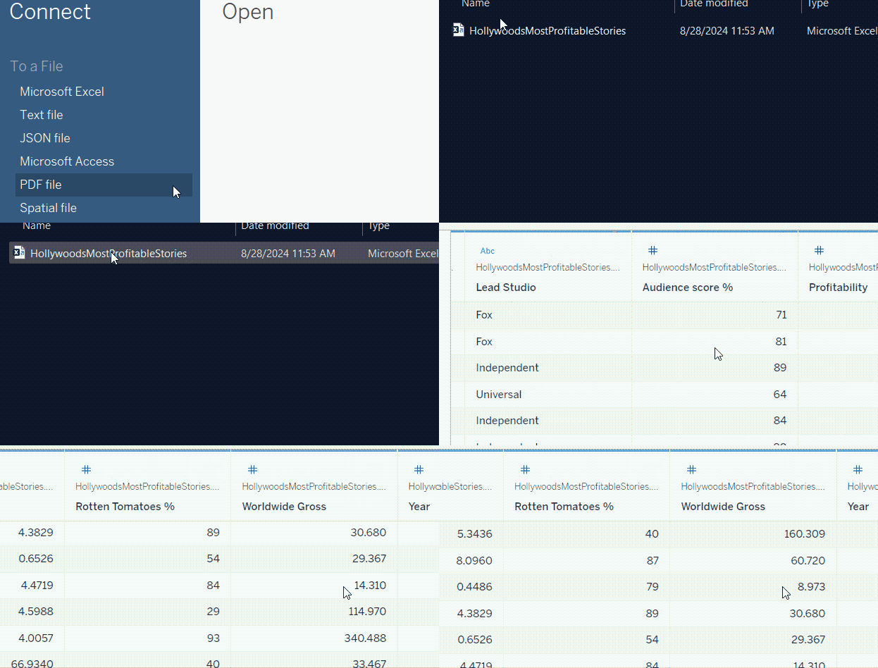
Importing the dataset into Tableau. GIF by Author.
After importing the dataset, pay special attention to the Genre, Worldwide Gross, and Year columns, as these are the ones that we are going to work with. Worldwide Gross shows the yearly profit that each movie generates all over the globe.
Create a pie chart
Suppose that we are interested in visualizing the percentage of profit that each movie genre generated. This is a perfect part-to-whole case where donut charts are useful.
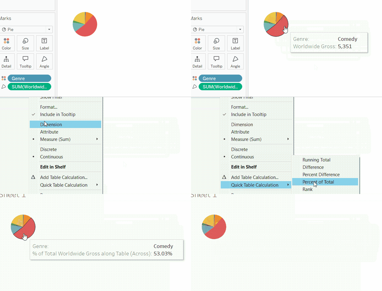
As we said, to create a donut chart in Tableau, we first need to create a pie chart. We can do so through the following steps:
- First of all, change the Marks type from Automatic to Pie.
- Drag the Genre field onto the Color card.
- Drag the Worldwide Gross field onto the Angle card (only available if you have changed the Marks type to Pie).
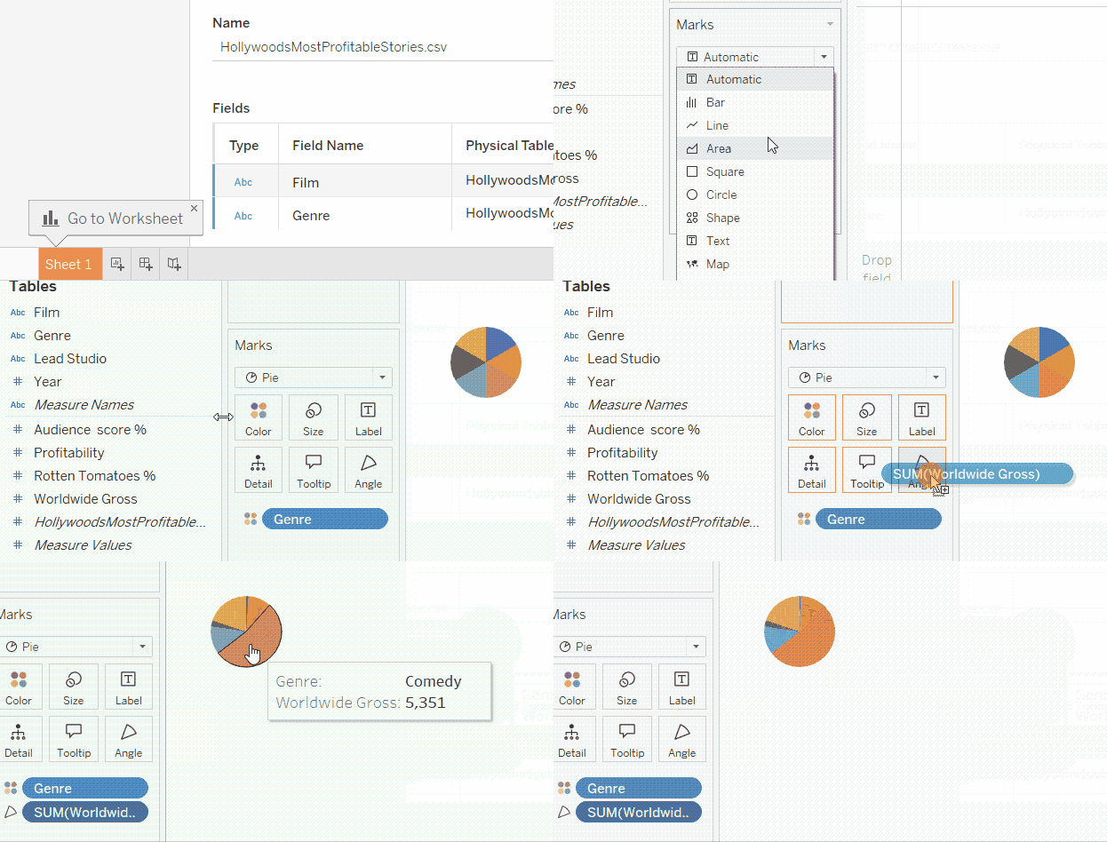
How to create a pie chart in Tableau. GIF by Author.
If you hover over the pie chart slices, you will see Worldwide Gross shown as a number. We will edit this later, but for now, let’s turn this number into a percentage. We can do so by:
- Right-clicking on the Worldwide Gross field in the Angle card.
- Go to Quick Table Calculation.
- Choose Percent of Total.
Showing percentages in a pie chart tooltip. GIF by Author.
Converting pie chart to donut chart
Now, the fun part! Let’s do the trick that will turn our pie chart into a donut. The idea here is to create a circle below the pie, place it over the pie chart at the center, and then reduce the circle size so it would appear as a hole in the middle.
So, how can we create another circle below the pie chart? Remember that everything in Tableau mainly depends on vertical and horizontal axes. We need to create two identical vertical axes, one for the pie and one for the middle circle, and then combine them into one.
To create a vertical axis, we need to place a variable on the Rows shelf; to create two identical vertical axes, we need to place that same variable twice on the same shelf.
You might be wondering which variable we should use. The most straightforward answer is to create a dummy variable with a value of zero. To do this:
-
Click on the small downward arrow in the part of the left-side pane next to the search bar.
-
Choose Create Calculated Field….
-
In the calculated field text box, write
0. Let’s name this asDonut Middle Circle. -
Click OK.
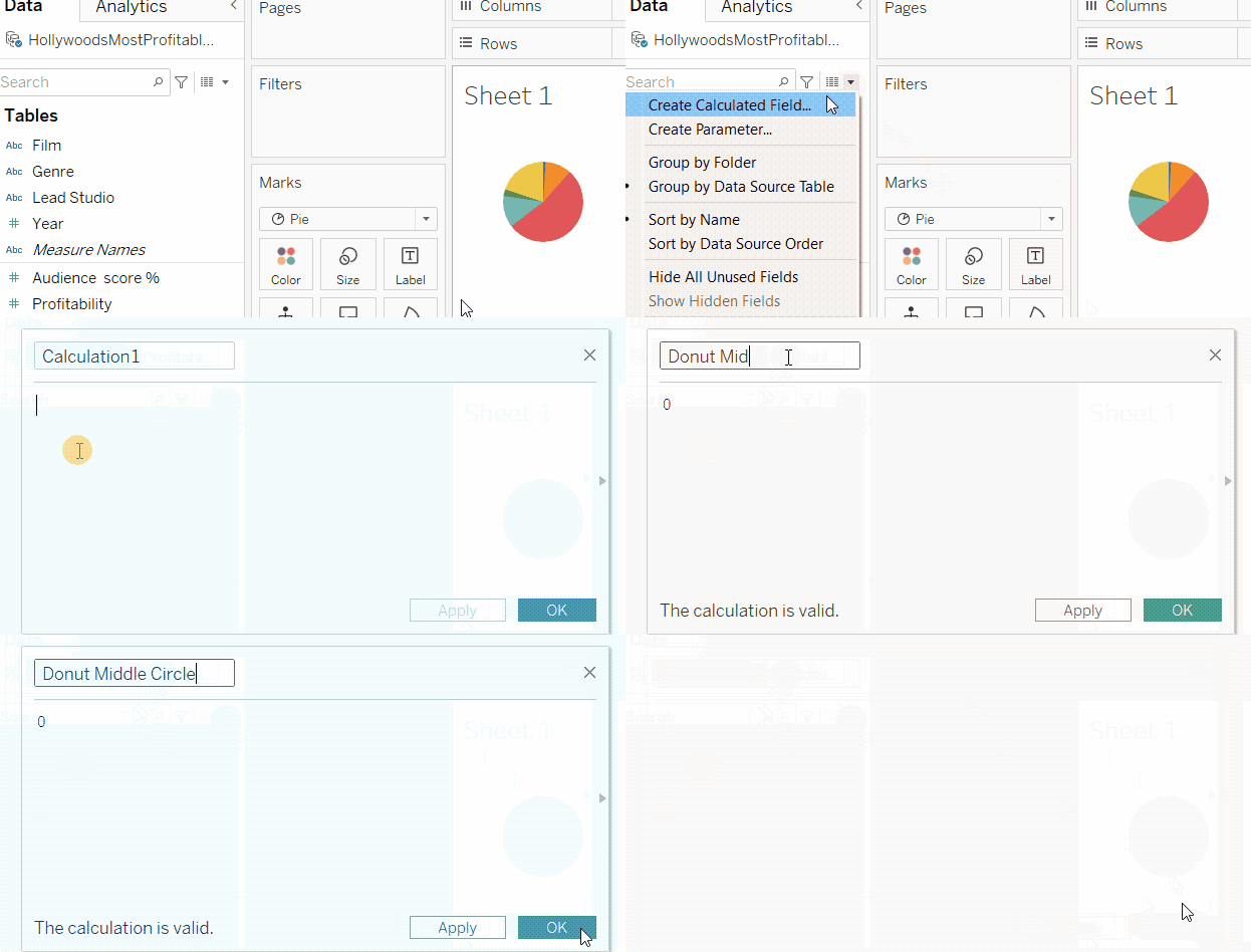
Creating dummy variable for the donut chart. GIF by Author.
For our next steps:
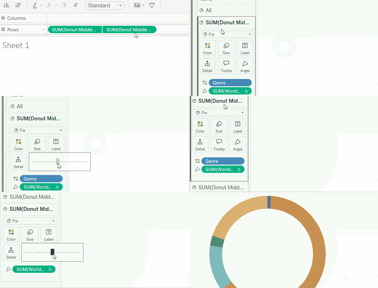
- Drag and drop the Donut Middle Circle variable twice onto the Rows shelf. You will see that we now have two pie charts.
- Right-click on the second Donut Middle Circle variable on the Rows shelf, and choose Dual Axis. Notice that the second pie chart has overridden the first.
- In the Marks box, you will notice that you now have two Marks options in addition to the first All one. Click on the last Marks option.
- Take out the Genre from the category. Notice that the overlaying pie has turned into a solid-colored circle.
- Reduce the size of the overlaying circle by clicking on the Size mark and make it smaller.
- In order for it to be like a hole, change the color of the circle to white, the background color in this case.
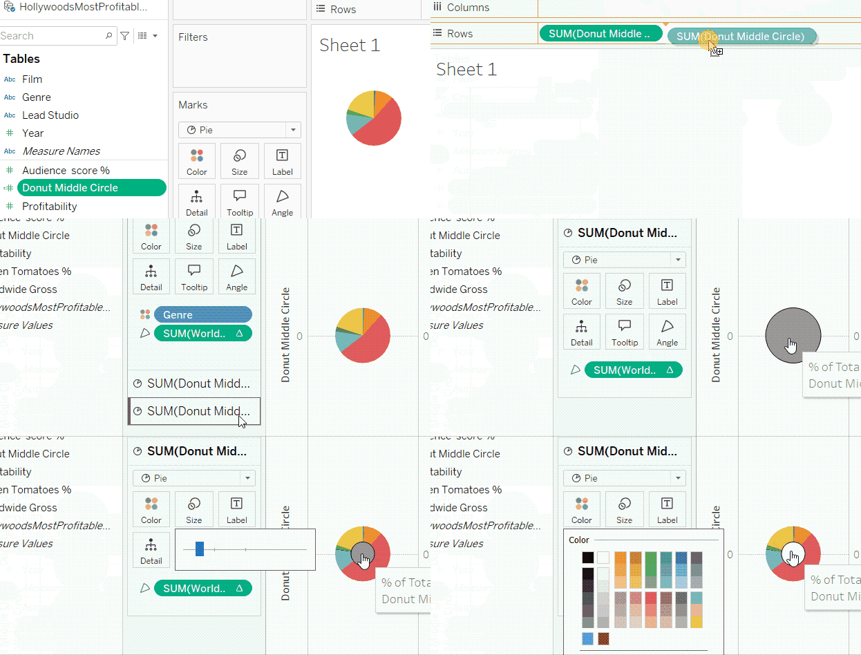
Converting the pie chart into a donut chart. GIF by Author.
And there you have your donut chart! What is left is a matter of formatting to bury the trails of our trick, that is to hide the axes and take out the zero line and the horizontal and vertical borders around the donut. To do so:
- First, right-click on either of the two axes headers.
- Click on Show Header to uncheck it.
- Right-click anywhere in the view.
- Choose Format.
- In the Format pane on the left side, go to Lines.
- Under the Sheet tab, set the Zero Lines to None.
- Go to Borders.
- Under the Sheet tab, set the Row Divider and the Column Divider panes to None.
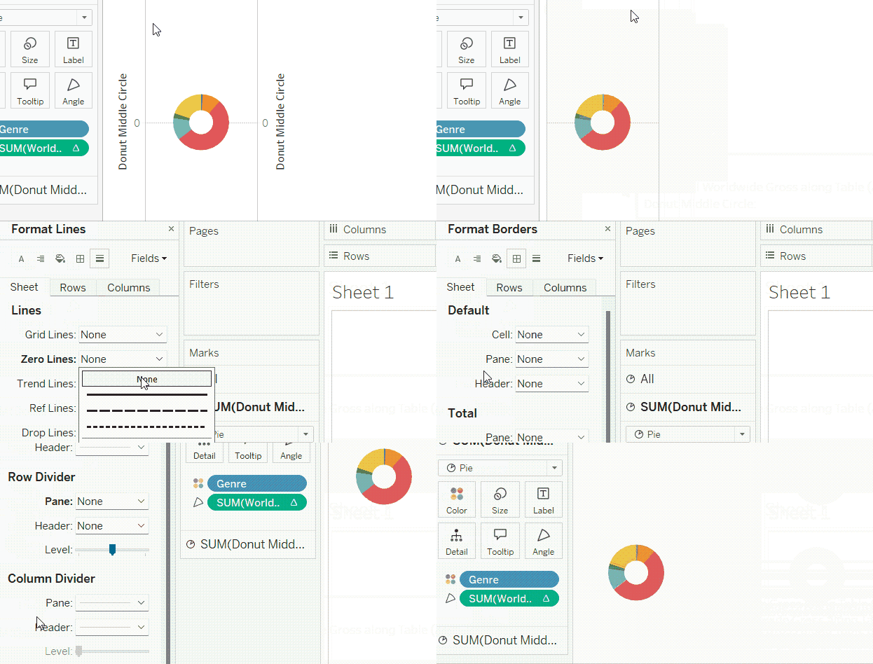
Converting the pie chart into a donut chart with formatting. GIF by Author.
How to Customize the Tableau Donut Chart
We have successfully created our donut chart. The next step is to make sure it looks nice.
Adjusting size
You may have noticed that, by default, the donut chart is pretty small. This is because our donut chart view is set to Standard view, meaning that its size will always be the same, even when our dashboard has a lot of space.
I don't think the Standard view is the best with donut charts. We want our donut chart to fill the entire space it has. So, we will change the Standard to Entire View. We then adjust the Size card and using the slider. As a final note, since we have two Marks cards, one for the underlying pie and one for the superimposed circle, we will have to repeat these steps for both.
- Click on the Size card.
- Drag the slider to the right and see how the pie or the white circle gets larger.
Adjusting the donut chart size through the Size card. GIF by Author.
Adjusting colors
Like in any chart in Tableau, we can change the colors of the chart through the Color card. In order to make our coloring purposeful, let’s assume we are mainly concerned with highlighting the share of profit that the comedy genre generates. In this case, we will give the “Comedy” slice a highlighting color and the other slices a muted grey color.
- Click on the first Marks card to control the underlying pie.
- Click on the Color card.
- Choose Edit Colors….
- Double-click on Comedy and choose a distinctive color.
- Click OK.
- Repeat the previous two steps with the other genres, giving them all the same degree of grey.
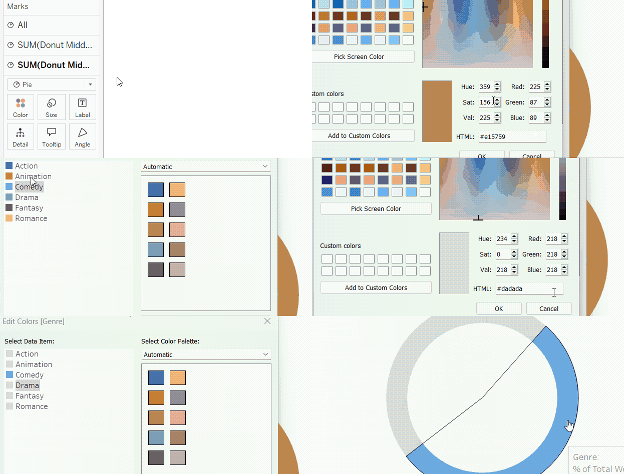
Adjusting donut chart colors. GIF by Author.
Adjusting slices order
Now, we have Corporate as the highlighted slice, but it is not sorted first in a clockwise order, as we advised at the beginning of the tutorial. So, what we need now is to modify the sorting of the segments. To do so:
- Click on the first Marks card for the underlying pie.
- Right-click on the Genre field in the Color card.
- Choose Sort….
- In the Sort window, choose Sort By to be Manual.
- Click once on Comedy and click on the upward arrow with a hat to Move to top.
- Exit the Sort window.
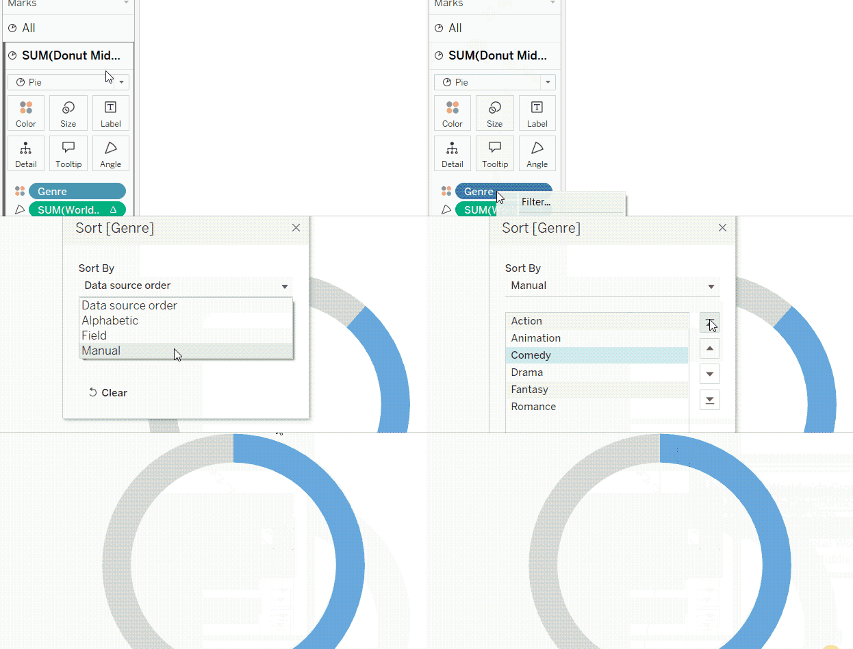
Adjusting donut chart slices order. GIF by Author.
Modifying tooltip
So far, the tooltip that shows up when we hover over any part of our donut chart is not very viewer-friendly. We have two tooltips that show up. The first is when we hover over the actual slices coming from the base pie, and the other is when we hover over the middle circle.
Since we want the middle circle to be a hole, we won't need it to have a tooltip at all. To turn off the middle circle’s tooltip:
- Click on the second Marks card to control the overlying circle.
- Click on Tooltip.
- In the Edit Tooltip text window, simply delete the text.
- Click OK.
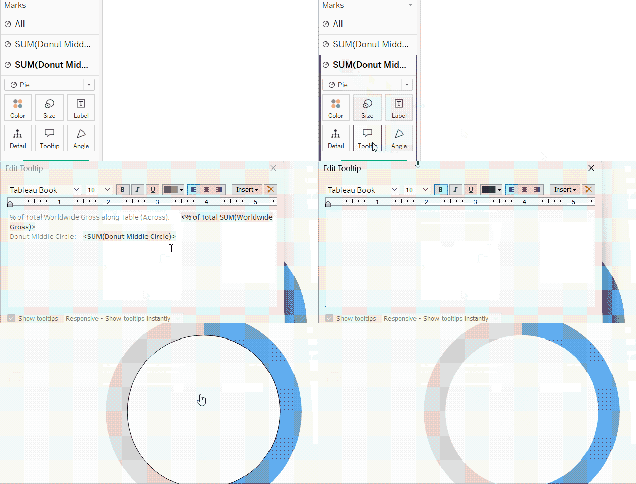
Turning off the donut chart’s middle circle’s tooltip. GIF by Author.
As for the tooltip that is applied to the slices, we can make several adjustments to make it more readable and polished. First, we can reduce the number of the profit percentage decimal places:
- Click on the Marks card of the underlying pie.
- Right-click on the Worldwide Gross field in the Angle card.
- Choose Format….
- In the formatting pane on the left side, go to Pane tab.
- Change the format of the Numbers in the Default section to Percentage, and decrease the decimal places to zero.
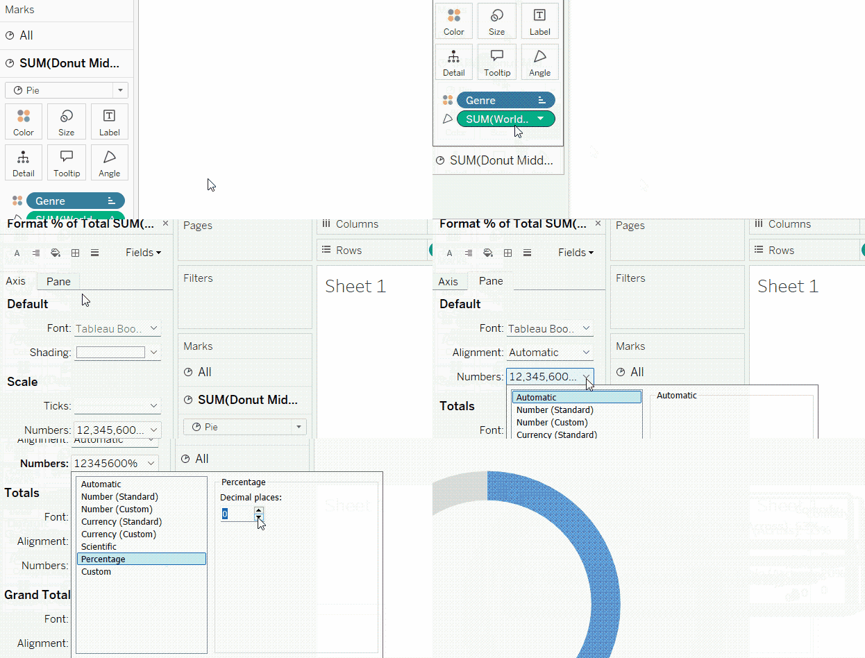
Formatting percentages in the tooltip. GIF by Author.
Second, we can also add the Worldwide Gross as the total number for reference. Then, we will format it as currency:
- Click on the Marks card of the underlying pie.
- Drag the Worldwide Gross field once again but drop it into the Tooltip card this time.
- Right-click on the Worldwide Gross tab of the tooltip that you just placed.
- Choose Format….
- In the formatting pane on the left side, go to Pane tab.
- Change the format of the Numbers in the Default section to Currency (Custom), and decrease the decimal places to zero.
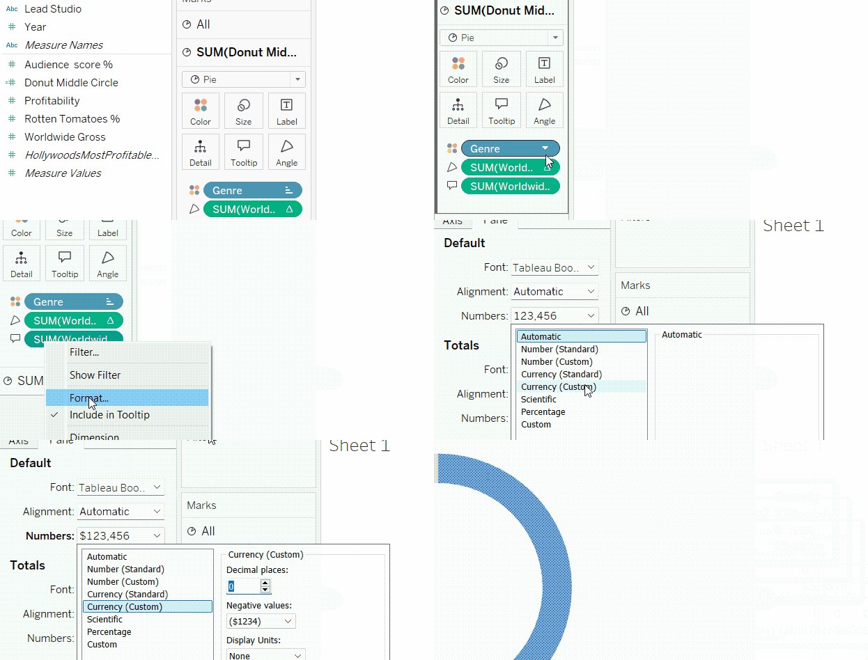
Adding total profit in currency to the tooltip. GIF by Author.
Finally, we can rewrite and format the tooltip, by:
- Clicking on the Tooltip mark of the underlying pie Marks card.
- Writing the text that we want to show up in the tooltip. You can insert the variables in the text through the Insert button in the upper part of the Tooltip window.
- Let’s highlight the genre name and its share of profit by making them bold and in a distinctive color.
- Click OK.
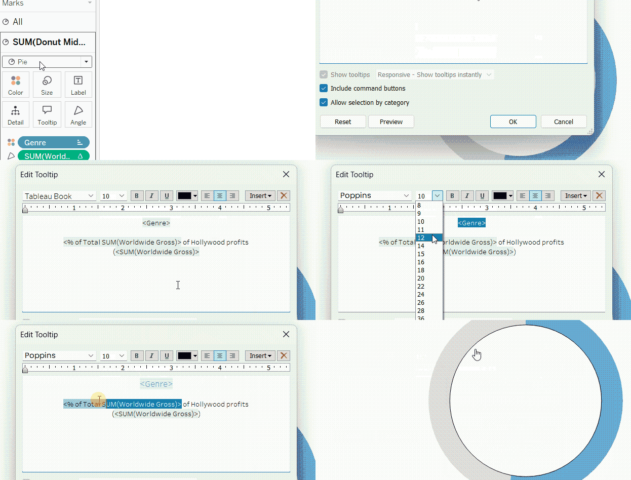
Editing the tooltip. GIF by Author.
Showing and adjusting labels
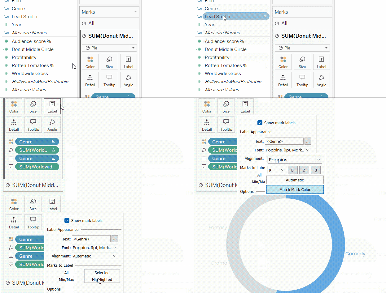
We can also show labels on the slices of the donut chart. Let’s assume we want to show the name of the genre in a proper font type and a relevant color:
- Click on the Marks card of the underlying pie chart.
- Drag the Genre field onto the Label card.
- Click on the Label card.
- Change the font type and color. You can also select Match Mark Color to make the label match its slice color.
- In the Marks to Label section, make sure All is chosen.
Showing and formatting labels on donut charts. GIF by Author.
Advanced Customizations to Further Enhance the Tableau Donut Chart
In addition to the usual formatting done above, we can do further customizations in Tableau to enhance our donut charts.
Grouping “Others” category
One of the tricks that can be handy with donut charts is to group the categories or slices, other than the one in focus, under one Others slice. This can be especially useful if we have too many categories, resulting in too many slices in the donut chart.
In our example, we can combine the categories other than Comedy in one Others category. This will make our donut chart have two slices instead of six, one for Comedy and one for Others.
- Right-click on the Genre field in the left side pane.
- Go to Create and then Group….
- In the Create Group window, select all genres other than Comedy, and then click on Group button.
- Name the newly created group as Others.
- Click OK.
- In the Marks card of the underlying pie, drag the newly created Genre (group) from the left side pane onto the Color and the Label cards.
- Take out the Genre from the Label card.
- Now, you would need to re-adjust the coloring of the slices and to introduce the new Genre (group) variable in the tooltip like what we did before.
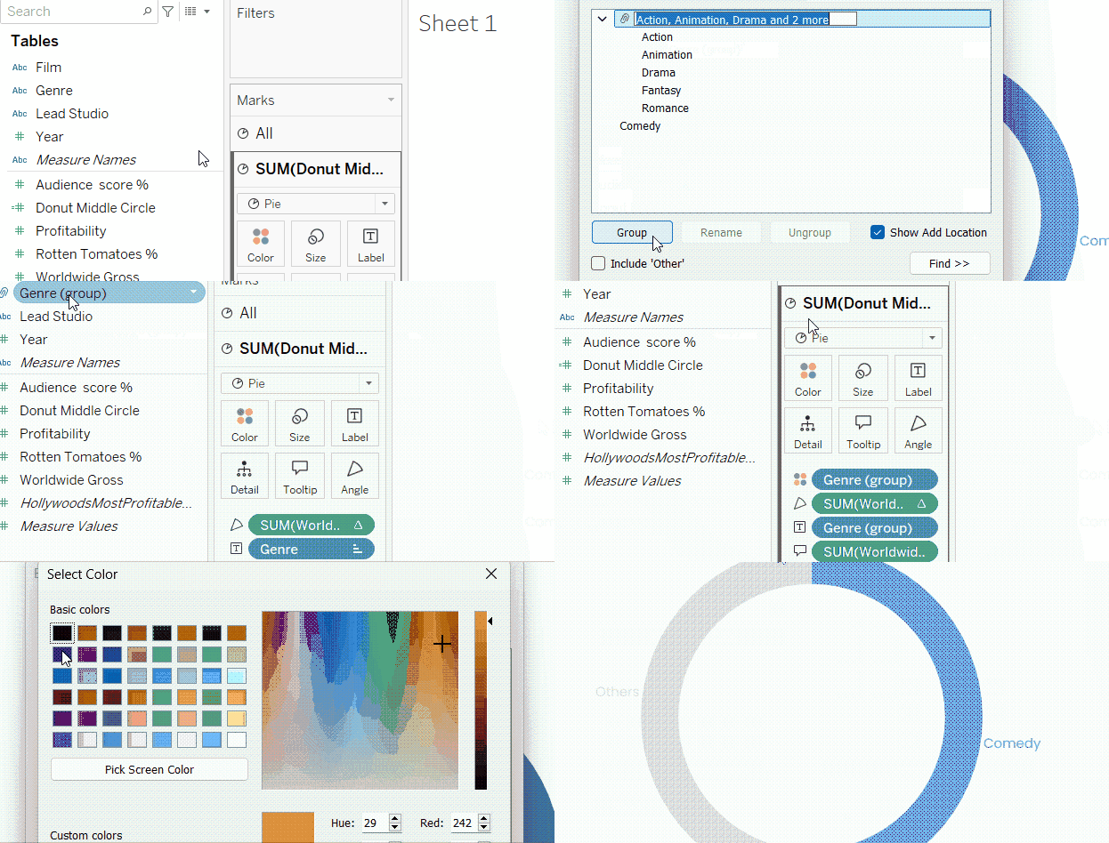
Creating and visualizing the “Others” group. GIF by Author.
Adding a center text
One of the advantages of donut charts is that they provide a space for text at the center, which can be used for different purposes. Here, I will show how to add a label for the overlaying white circle.
First, we can use this circle to show the total profit of all genres just as a test. To do so, simply drag the Worldwide Gross field to Label in the Marks card of the white circle.
But we will not do that. Instead, we will take an extra step to show the profit of only the Comedy genre. To do so, we will need to create a calculated field that gives as its output the sum of comedy profits only.
You can follow the same steps of creating a calculated field mentioned earlier in this tutorial. For the field’s formula, we will write a formula that checks if the genre is comedy and sums up its profits. Let’s call this field Comedy Profit:
SUM(IF [Genre] = 'Comedy'
    THEN [Worldwide Gross]
    END)
Then:
- Place the new Comedy Profit field onto the Label of the white circle’s Marks card.
- Edit the label to also include the word Comedy, and do the proper text formatting.
-
Format the Comedy Profit field number as currency, decreasing the decimal places and adding an
msuffix, like what we did before. - Take out the labels of the slices.
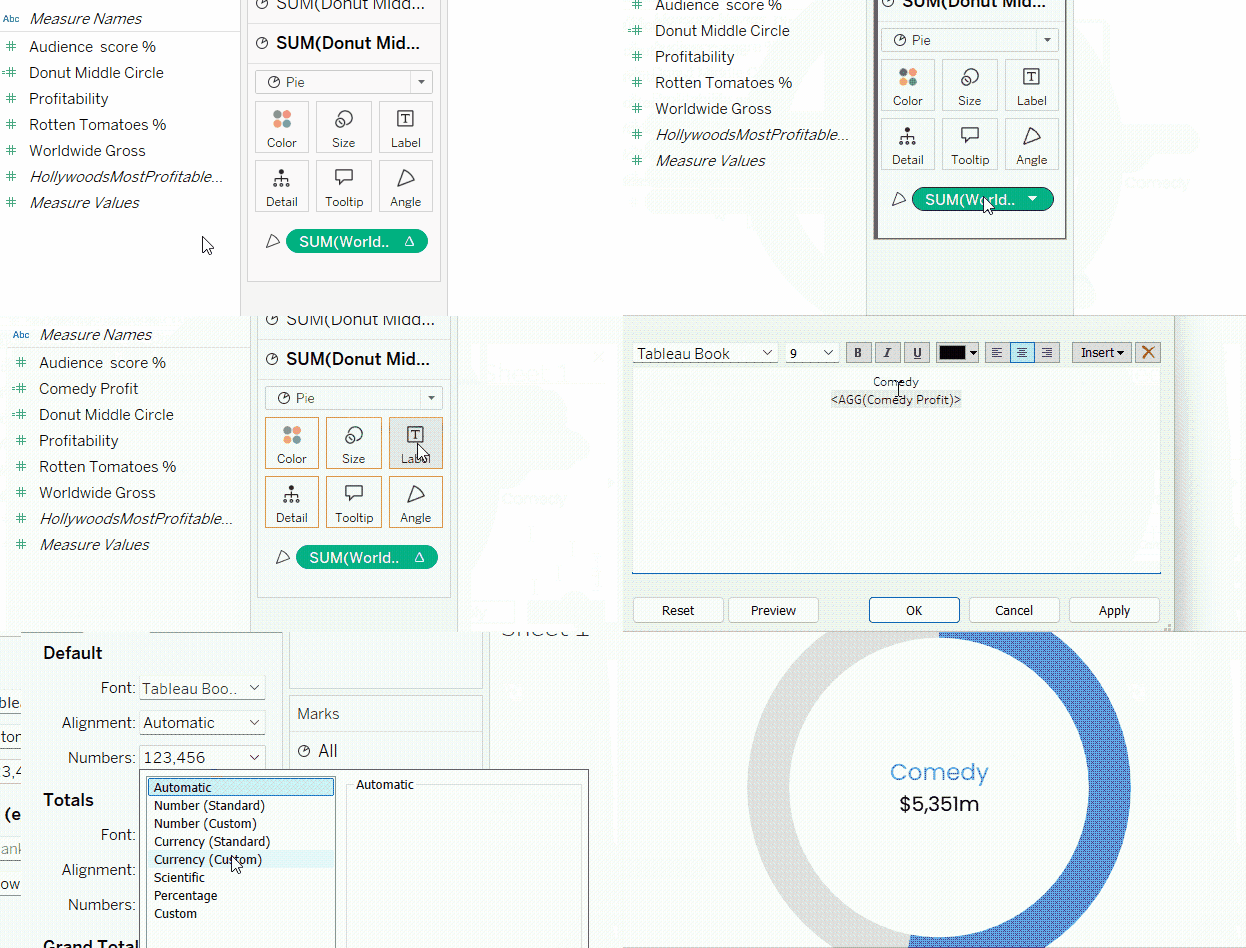
Adding a central text to donut charts. GIF by Author.
Applying filters and looping pages
Like any other view in Tableau, we can apply filters on donut charts. Suppose, in our case, we want to filter the genre profits according to the year. First, we will need to change the data type of the Year field to String, and then:
- Drag and drop the Year field in the Filters box.
- Choose a year, and click OK.
- To show the filter control, right click on the Year field in the Filters box, and click Show Filter.
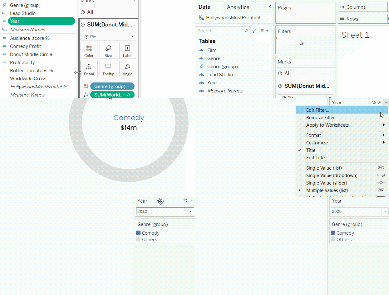
Adding filters to donut charts. GIF by Author.
Alternatively, we can also place the Year in Pages box to be able to flip between the years and see how the profit from comedy movies changed over the years.
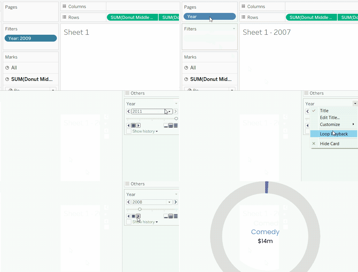
Adding “Pages” to donut charts. GIF by Author.
The resulting animated donut chart would look like this:
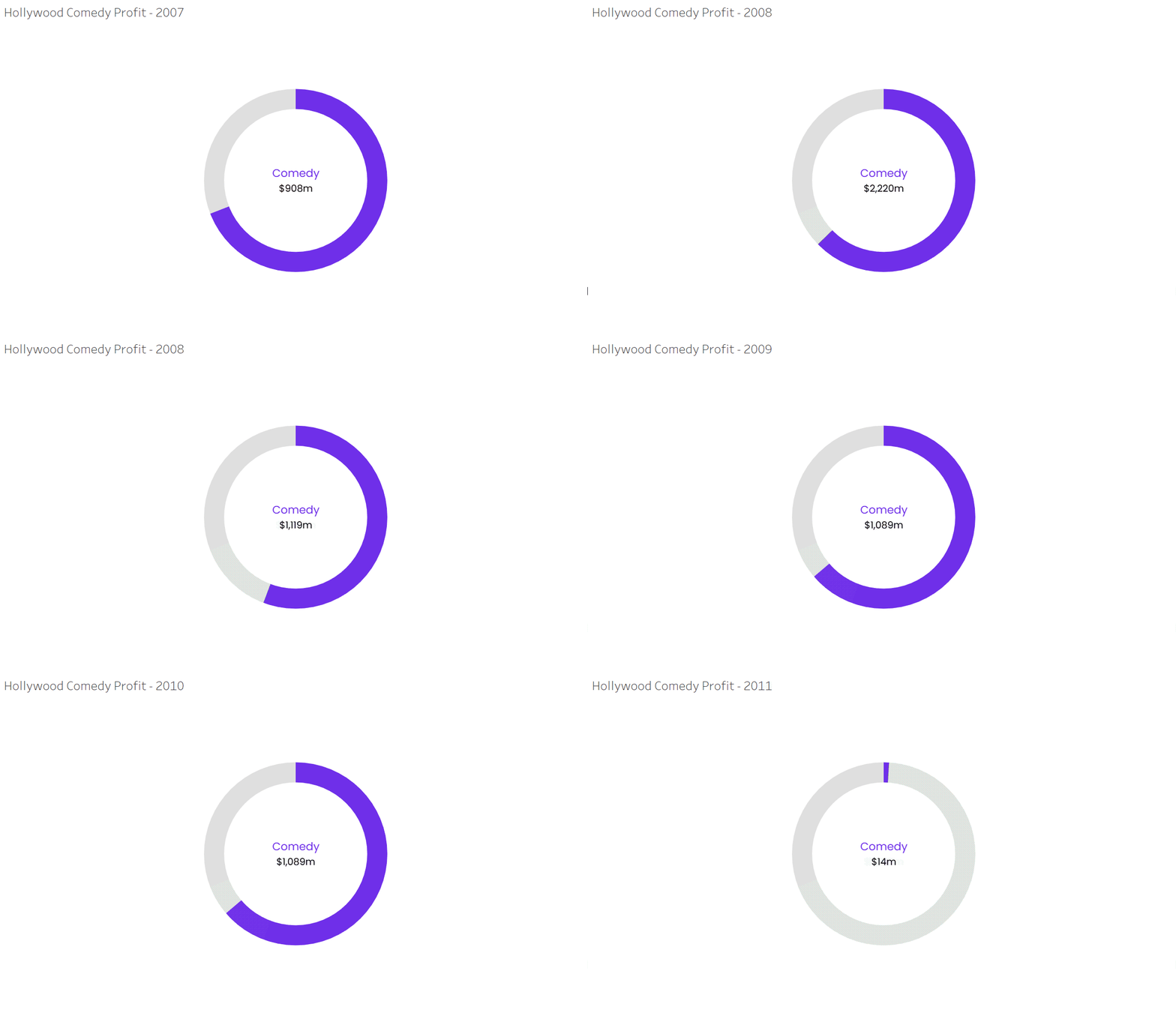
Animated donut chart. GIF by Author.
Resources and Further Learning
In this tutorial, we saw how to create an informative and engaging donut chart in Tableau. All we needed to do was to create a pie chart first, and then do a trick to place a smaller white circle over the center of the pie. In addition to this, we also saq how to apply different formatting and customizations to make a donut chart look right.
DataCamp offers many tutorials on Tableau, like this one on how to create a waterfall chart in Tableau. It also offers a wide range of courses on Tableau, organized into a Tableau Fundamentals and Data Analyst in Tableau skill track and career track. Make sure to check them out!
Master Tableau From Scratch
Accelerate your career with Tableau—no experience required.

Islam is a data consultant at The KPI Institute. With a journalism background, Islam has diverse interests, including writing, philosophy, media, technology, and culture.
