Course
Tableau is a powerful visual analytics tool that enables us to create a wide range of visualizations, from the most complex to the simplest, like pie charts. And in all cases, Tableau enables us to enhance and customize our visualizations to make the best use of them.
Before we move forward, try taking our Tableau Fundamentals skill track. Learn the essentials of Tableau and create beautiful visualizations (including pie charts) with Tableau’s easy-to-master drag-and-drop functionality.
Master Tableau From Scratch
Accelerate your career with Tableau—no experience required.
When and How to Use a Tableau Pie Chart
Pie charts are probably the most famous type of charts, as they are easy to create, and commonly used everywhere, from business reports to press and social media posts.
First, we should say that pie charts have gained a bit of a bad reputation among data professionals. You might have even seen a meme or two about their misuse. For this reason, some data analysts resolve never to use them because they don’t want to look like amateurs. But for me, pie charts can still be a proper visualization option if, and only if, they are created for the purpose they serve.
Pie charts are good at visualizing composition, showing how much of the whole each part represents. They excel at visualizing composition by visually encoding numerical values in angles of slices within a circle, which is also why they are bad at other purposes, like comparisons. It's a subtle but important difference: Pie charts are not good for comparisons because angles are not visually perceived as precisely as other visual encoders, like lengths.
We can draw the following conditions for creating useful pie charts:
- Use pie charts with percentages only.
- Percentages in a pie chart must be positive and add up to 100%.
- Limit the slices in pie charts to 2-3 slices max (more slices tend to be crowded and confusing).
- Do not use 3D pie charts (they become even more confusing). Also, don't use exploding slices (This protrusion detaches the slice’s angle from the overall circle center, which hinders the pie chart’s sole purpose of visualizing part to whole.)
- Do not use multiple pie charts (because it would shift the focus to comparing the multiple pies, a thing that pie charts are not good at).
- Always start the first slice at a zero-degree angle (12 O’clock position) and sort the categories (slices) according to their importance in a clockwise order.
With that said, now let’s create our clean pie charts in Tableau!
Steps to Create a Pie Chart in Tableau
Follow these simple steps to create a Tableau pie chart, starting with importing your data.
Import data into Tableau
First, download the Superstore Sales dataset, which is available in Tableau’s sample datasets repository.

Downloading Superstore Sales data. GIF by Author.
Then, we will import the file into Tableau through the Microsoft Excel connector and choose the "Orders" sheet to work with.
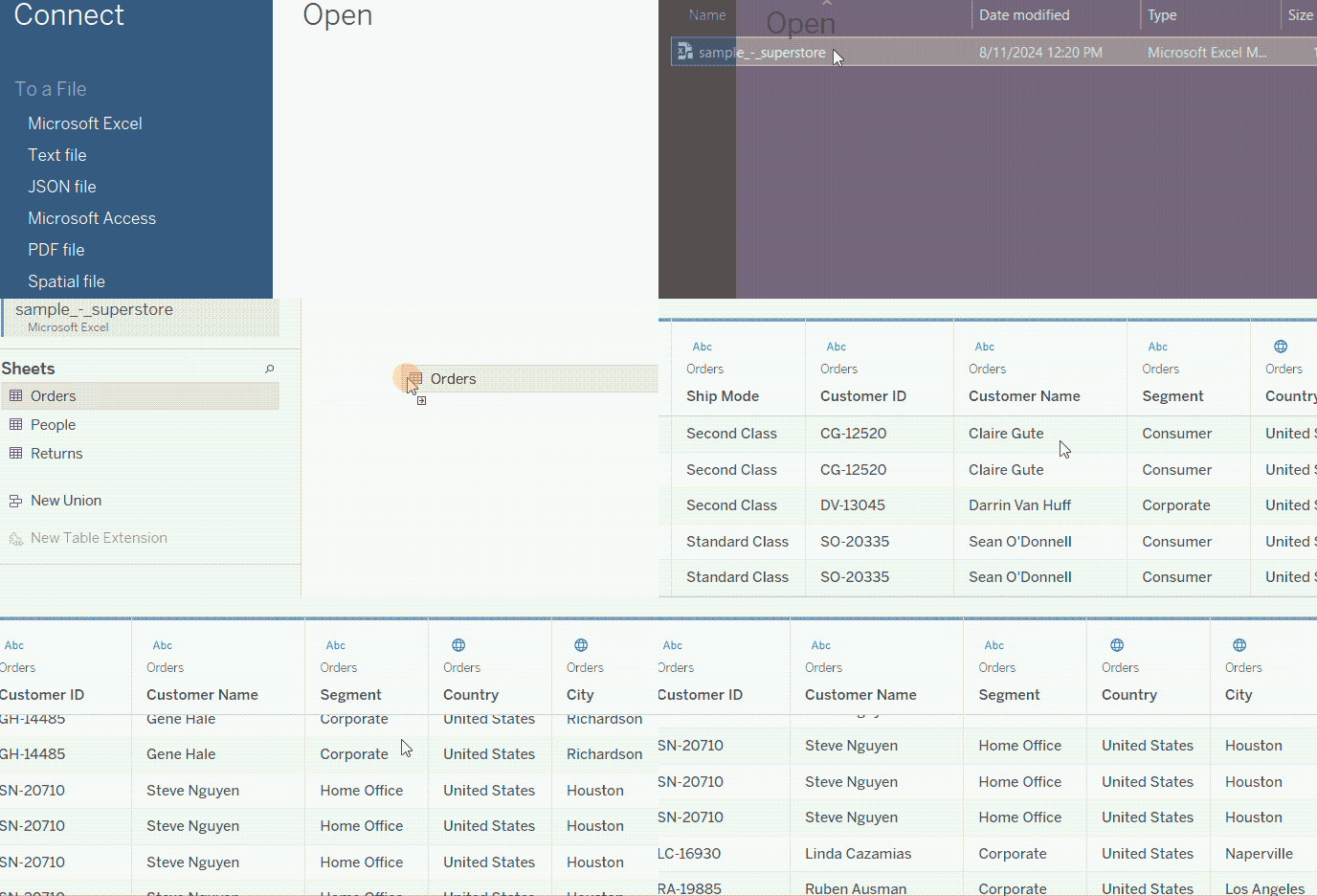
Importing data into Tableau. GIF by Author.
Give a special look to the Segment column, as this is the main one that we will be working with.
Create a Tableau pie chart
Let’s say we want to visualize the percentage of profit that each clientele segment generates. This is a perfect part-to-whole case for creating a pie chart. We can do so through the following steps:
- First of all, change the Marks type from Automatic to Pie.
- Drag the Segment field onto the Color card.
- Drag the Profit field onto the Angle card. (This is only available if you have changed the Marks type to Pie).
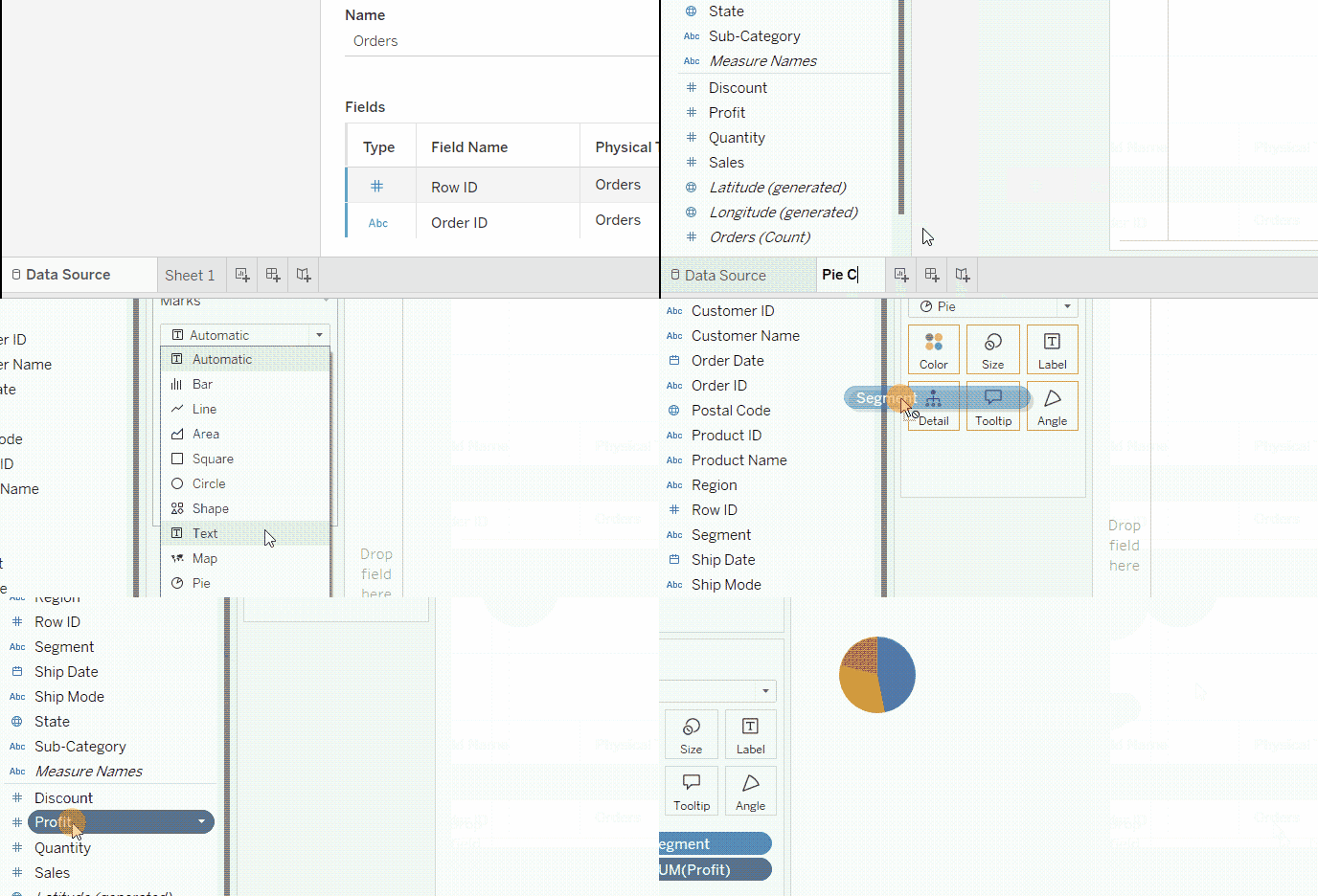
Creating a Tableau pie chart. GIF by Author.
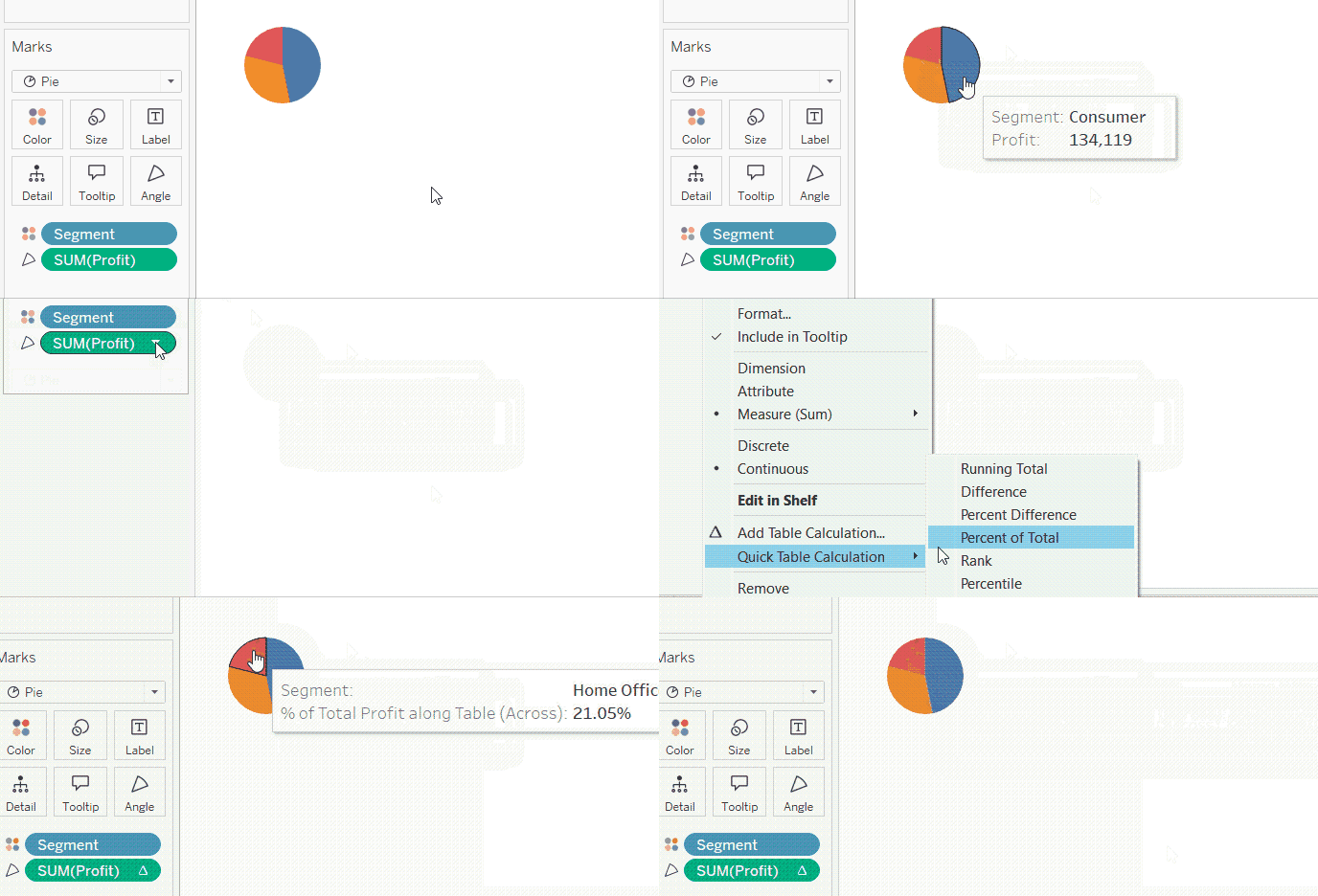
If you hover over the pie chart slices, you will see the tooltip has the segment name and the profit in total number. We will edit this tooltip later, but for now, let’s turn this number into a percentage. We can do so by:
- Right-clicking on the Profit field in the Angle card.
- Go to Quick Table Calculation.
- Choose Percent of Total.
Showing percentages in the Tableau pie chart tooltip. GIF by Author.
How to Customize the Tableau Pie Chart
The pie chart that we created needs a lot of formatting, so let’s see how to do this.
Adjusting size
To start with, you might be wondering why our pie chart is so small. This is because our pie chart view is by default set to Standard, meaning that its size will be the same, even when we place it on a dashboard, whatever the space that we give for.
While it can be useful with other types of charts, Standard view is not really useful with pie charts. We want our pie chart to fill the entire space it has. So, we will change Standard to Entire View.
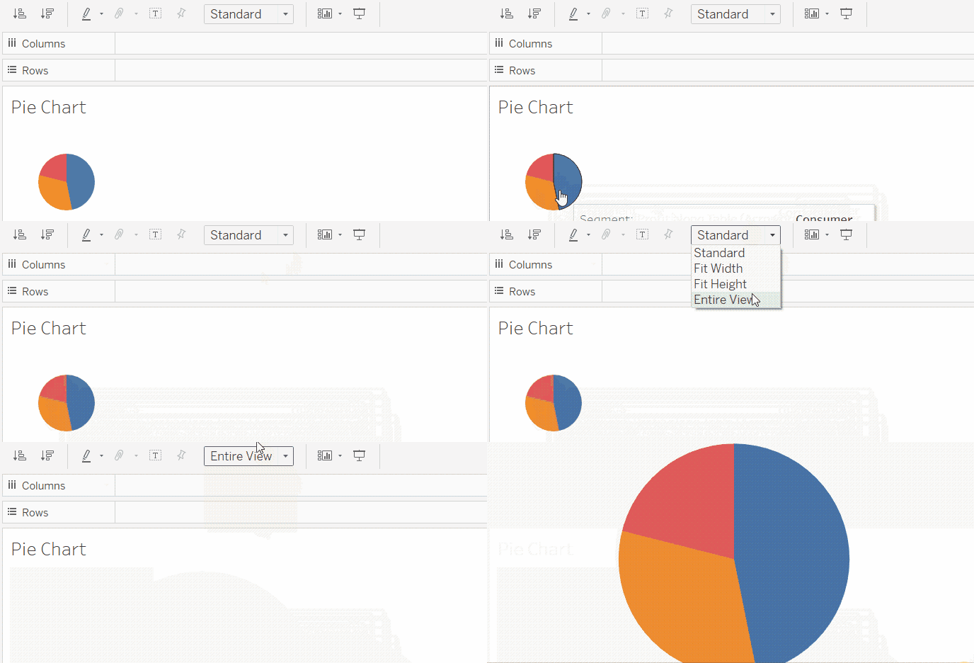
Showing the Tableau pie chart on Entire View. GIF by Author.
Even after filling up the entire view, we might still see that the pie chart is not enlarged enough. In this case, we can always control the Size card. To do this:
- Click on the Size card.
- Drag the slider to the right and see how the pie chart gets larger.
If you drag the Size slider all the way to the right, you will see that the pie chart turns into a square. That’s because the pie chart gets larger than the view. So, we will drag the slider only to the second tick mark, which is the recommended enlargement set by Tableau.
Adjusting the Tableau pie chart size through the Size card. GIF by Author.
Adjusting colors
Like in any chart in Tableau, we can change the colors of the chart through the Color card.
But in order to make our coloring purposeful, let’s assume we are mainly concerned with highlighting the contribution of the corporate segment to the total profit. In this case, we will give the Corporate slice a highlighting color and the other slices a muted grey color. To do so:
- Click on the Color card.
- Choose Edit Colors….
- Double click on Corporate and choose a distinctive color.
- Click OK.
- Double click on Consumer and choose grey.
- Click OK.
- Double click on Home Office and choose grey again.
- Click OK twice.
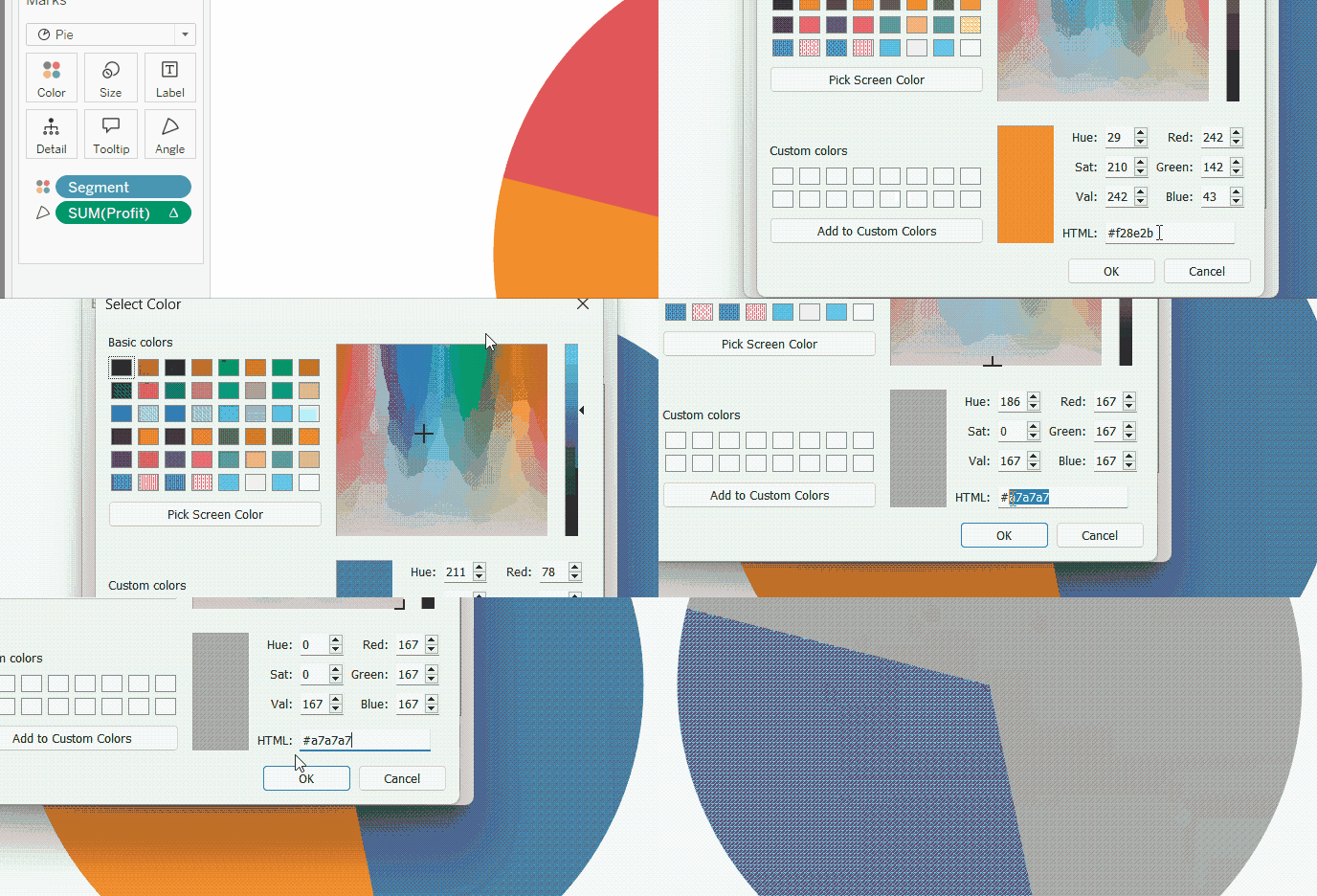
Adjusting Tableau pie chart colors. GIF by Author.
Adjusting slice order
Now, we have Corporate as the highlighted slice, but it is not sorted first in a clockwise order, as we advised at the beginning of the tutorial. So, what we need now is to modify the sorting of the segments. To do so:
- Right-click on the Segment field in the Color card.
- Choose Sort…
- In the Sort window, choose Sort By to be Manual.
- Click once on Corporate and click on the upward arrow with a hat, which is labeled as Move to top.
- Exit the Sort window.
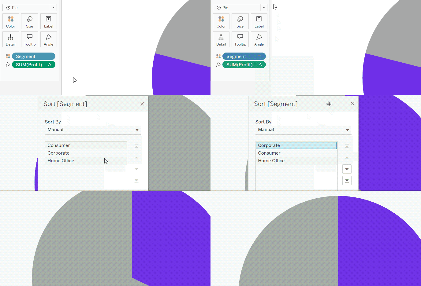
Adjusting Tableau pie chart slices order. GIF by Author.
Modifying tooltip
So far, the tooltip that shows up when we hover over any segment in our pie chart is not very viewer friendly. We can make several adjustments to make it more readable and polished.
First, we can reduce decimal places. To do so:
- Right-click on the Profit field in the Angle card.
- Choose Format…
- In the formatting pane on the left side, go to Pane tab.
- Change the format of the Numbers in the Default section to Percentage, and decrease the decimal places to zero.
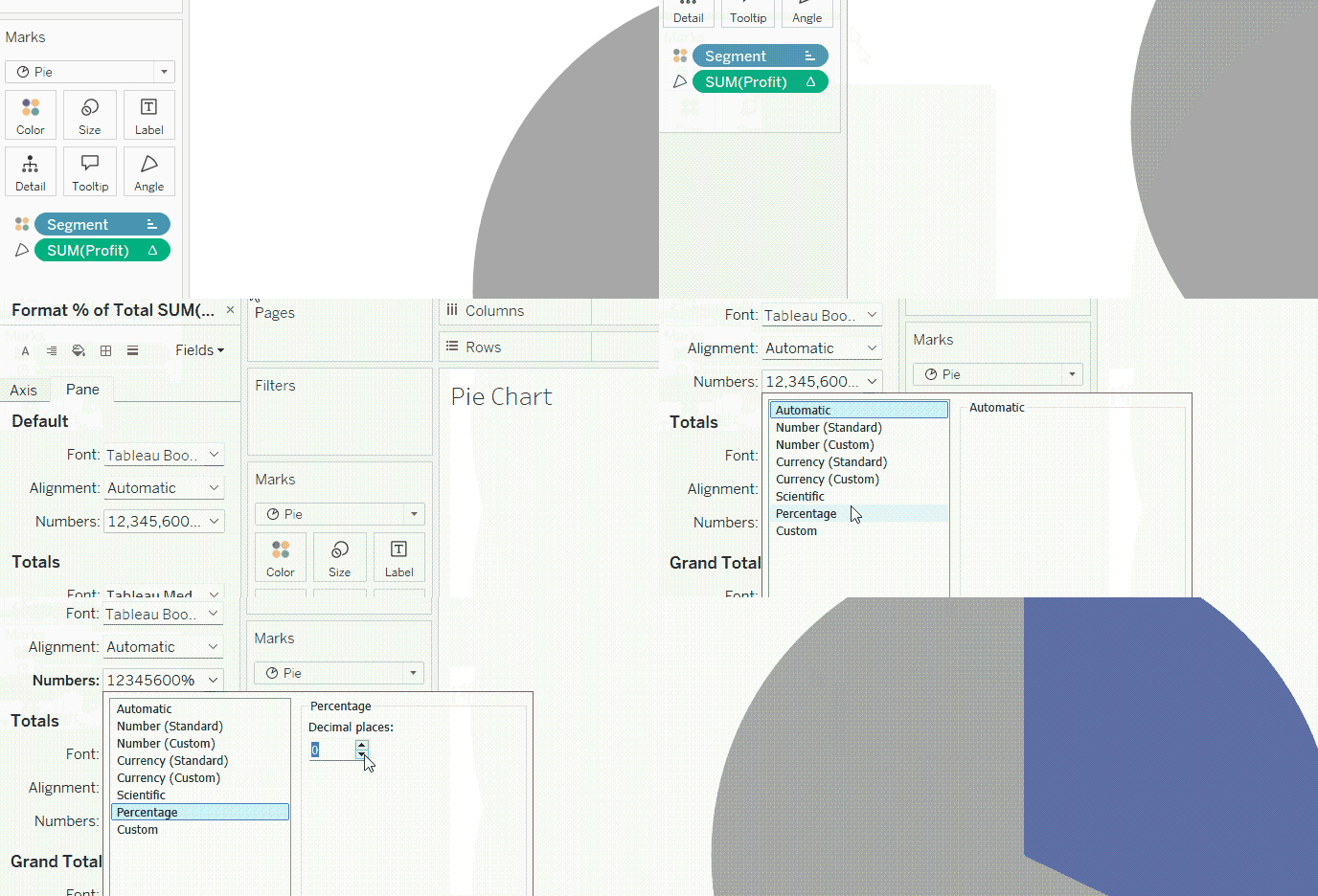
Formatting percentages in the Tableau pie chart tooltip. GIF by Author.
Second, we can also add a total number for reference in addition to the percentage. Then, we will format it as currency. To do so:
- Drag the Profit field once again, but drop it into the Tooltip card this time.
- Right-click on it.
- Choose Format…
- In the formatting pane on the left side, go to Pane tab.
- Change the format of the Numbers in the Default section to Currency (Custom), and decrease the decimal places to zero.
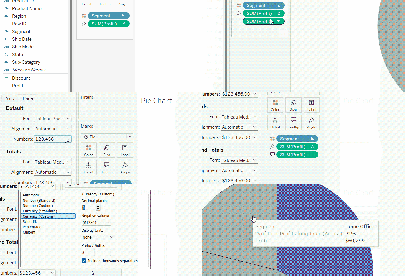
Adding total profit as currency to the Tableau pie chart tooltip. GIF by Author.
Finally, we can rewrite and format the tooltip by:
- Clicking on the Tooltip card.
- Writing the text that we want to show up in the tooltip. You can insert the variables in the text through the Insert button in the upper part of the Tooltip window.
- Highlight the changes by making them bold and in a new color.
- Click OK.

Editing the Tableau pie chart tooltip. GIF by Author.
Showing and adjusting labels
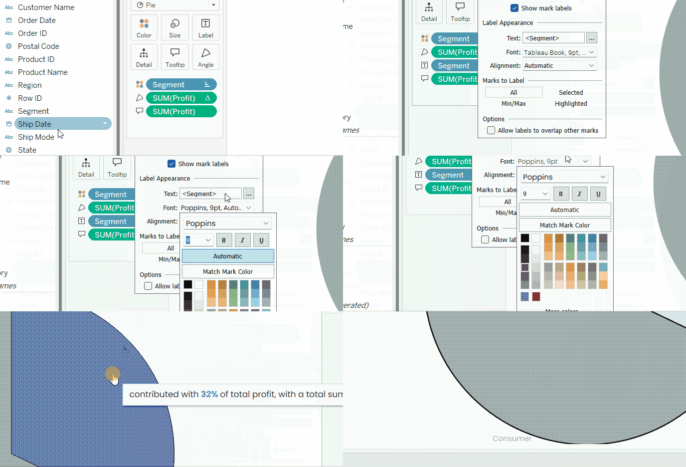
Let’s assume we want to show the name of the segment in a proper font type, but only when the viewer clicks on the respective slice. To do so:
- Drag the Segment field onto the Label card.
- Click on the Label card.
- Change the font type and color. You can also select Match Mark Color to make the label match its slice color.
- In the Marks to Label section, choose Selected instead of All.
Showing and formatting labels on the Tableau pie chart. GIF by Author.
Advanced Customizations to Further Enhance the Tableau Pie Chart
In addition to the usual formatting done above, we can do further customizations in Tableau to enhance our pie charts.
Grouping slices together into an Others category
One of the tricks that can be handy with pie charts is to group the categories or slices under one Others slice. This can be especially useful if we have too many categories, resulting in too many slices in the pie chart.
In our example, we can combine the categories other than Corporate, which is our focus, in one Others category. This will transform our pie chart to have two slices instead of three, one for Corporate and one for Others. To do so:
- Right-click on the Segment field in the left side pane.
- Go to Create and then Group…
- In the Create Group window, select both Home Office and Consumer, and then click on Group button.
- Name the newly created group as Others.
- Click OK.
- Now drag the newly created Segment (group) from the left side pane onto the Color and the Label cards.
- Take out the Segment from the Label card.
- Now, you would need to re-adjust the coloring of the slices and introduce the new Segment (group) variable in the tooltip, as we did before.
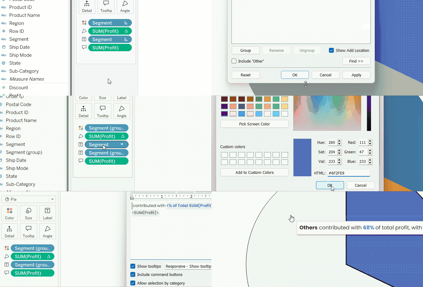
Creating and visualizing the Others group. GIF by Author.
Applying filters and looping pages
Like any other view in Tableau, we can apply filters on pie charts. Suppose, in our case, we want to filter the data shown by our pie chart according to region. To do so, we can:
- Drag and drop the Region field in the Filters box.
- Choose a region, and click OK.
- To show the filter control, right-click on the Region field in the Filters box, and click Show Filter.
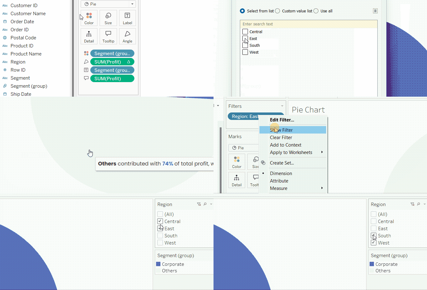
Adding filters to the Tableau pie chart. GIF by Author.
Alternatively, we can also place the region in the Pages box to be able to flip between the different regions, or even click play to let it loop between the regions automatically.
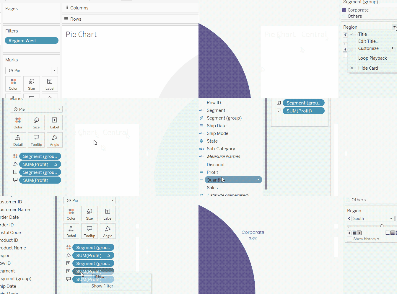
Adding pages to the Tableau pie chart. GIF by Author.
The resulting animated pie chart would look like this:
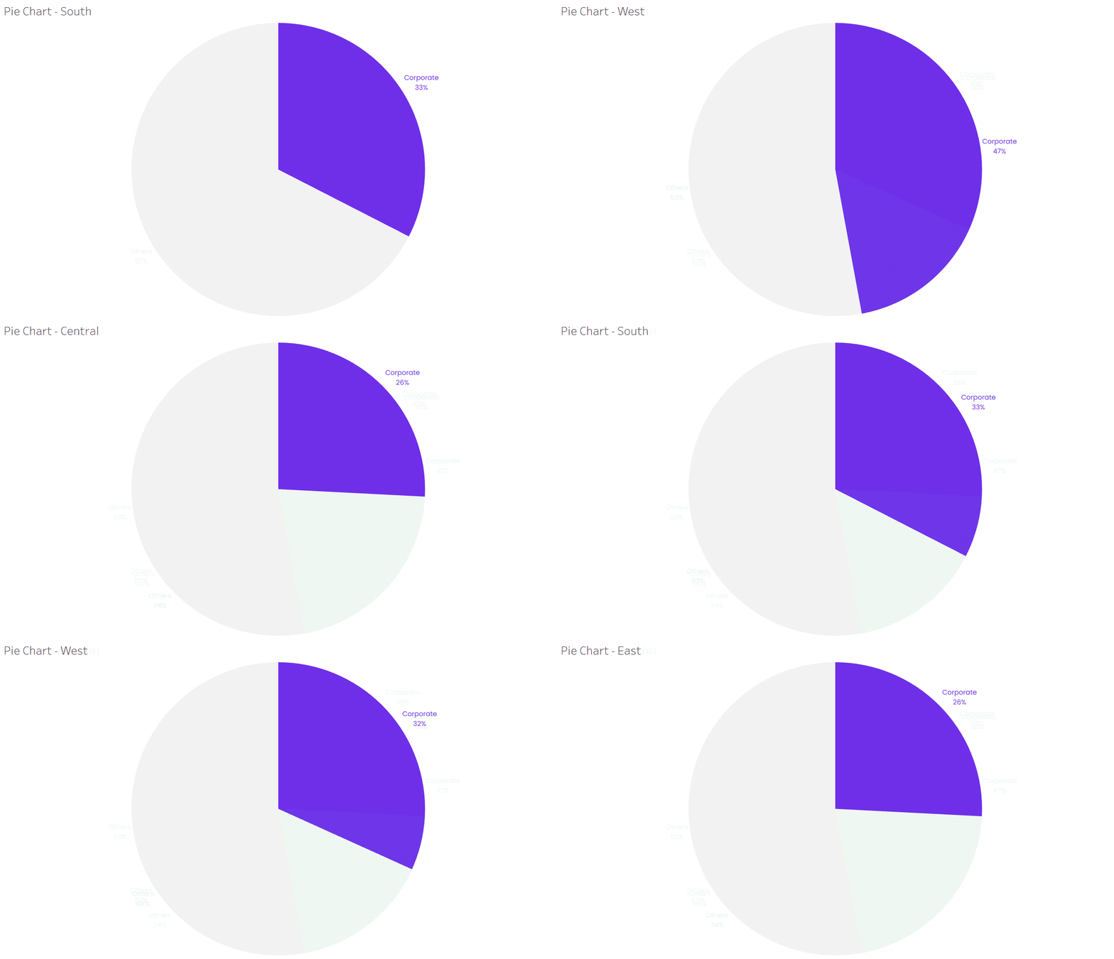
Animated Tableau pie chart. GIF by Author.
Resources and Further Learning
In this tutorial, we saw how to create an informative and engaging pie chart in Tableau. The trick was to change the Mark type to Pie, provide a field for the pie Colors, and another for the pie Angles, and let Tableau do the magic! In addition to this, we also saw how to do different formatting and customizations to make a pie chart really stand out.
DataCamp offers many tutorials on Tableau. Check out How to Create a Waterfall Chart in Tableau to learn about waterfall charts, which is another great way to help visual patterns and tell an interesting story. DataCamp also offers a wide range of courses on Tableau, organized into different tracks, such as our Tableau Fundamentals skill track and Data Analyst in Tableau career track. Make sure to check them out!
Become a Tableau Data Analyst

Islam is a data consultant at The KPI Institute. With a journalism background, Islam has diverse interests, including writing, philosophy, media, technology, and culture.
Frequently Asked Questions
What are Tableau pie charts good for?
Tableau pie charts are good for visualizing composition of part to whole. They are not good for comparisons or other visualization purposes.
What are the required field types to create a pie chart in Tableau?
To create a pie chart in Tableau, you need to use at least one categorical and one numerical variables.
How can I make pie charts bigger in Tableau?
You can increase the size of the pie chart by displaying it on Entire View or by increasing its size through the Size card.
How can I make an interactive pie chart in Tableau?
You can make interactive pie charts by using filter controls, or by connecting a pie chart to other visualizations in a dashboard with actions.
How can I make an animated pie chart in Tableau?
You can an animated pie chart in Tableau through the use of Pages feature.
