Master Power BI From Scratch
The Analytics Pane for Visuals in Power BI
Some visuals in Power BI Desktop have the option to add dynamic reference lines through the use of the Analytics pane. It is worth noting that not all options are available for all visuals, and some visuals, such as combination charts like the line and clustered column chart, have no options available in the Analytics pane.
The types of dynamic lines you can add to visuals are:
- Constant line (as well as options for separate x-axis and y-axis constant lines)
- Max line
- Min line
- Average line
- Median line
- Percentile line
- Symmetry shading
- Trend line
- Forecasts
These dynamic lines are especially useful for adding context to your visuals, which can help the user to extract useful insights faster. For example, suppose you have a clustered bar chart showing sales by country. By adding an average line, you can quickly determine which country is performing above or below average; this can then inform further decision-making.
I have found the average and trend lines to be the most useful. Let us go over how to add these to your charts below.
Adding an Average Line to Charts in Power BI
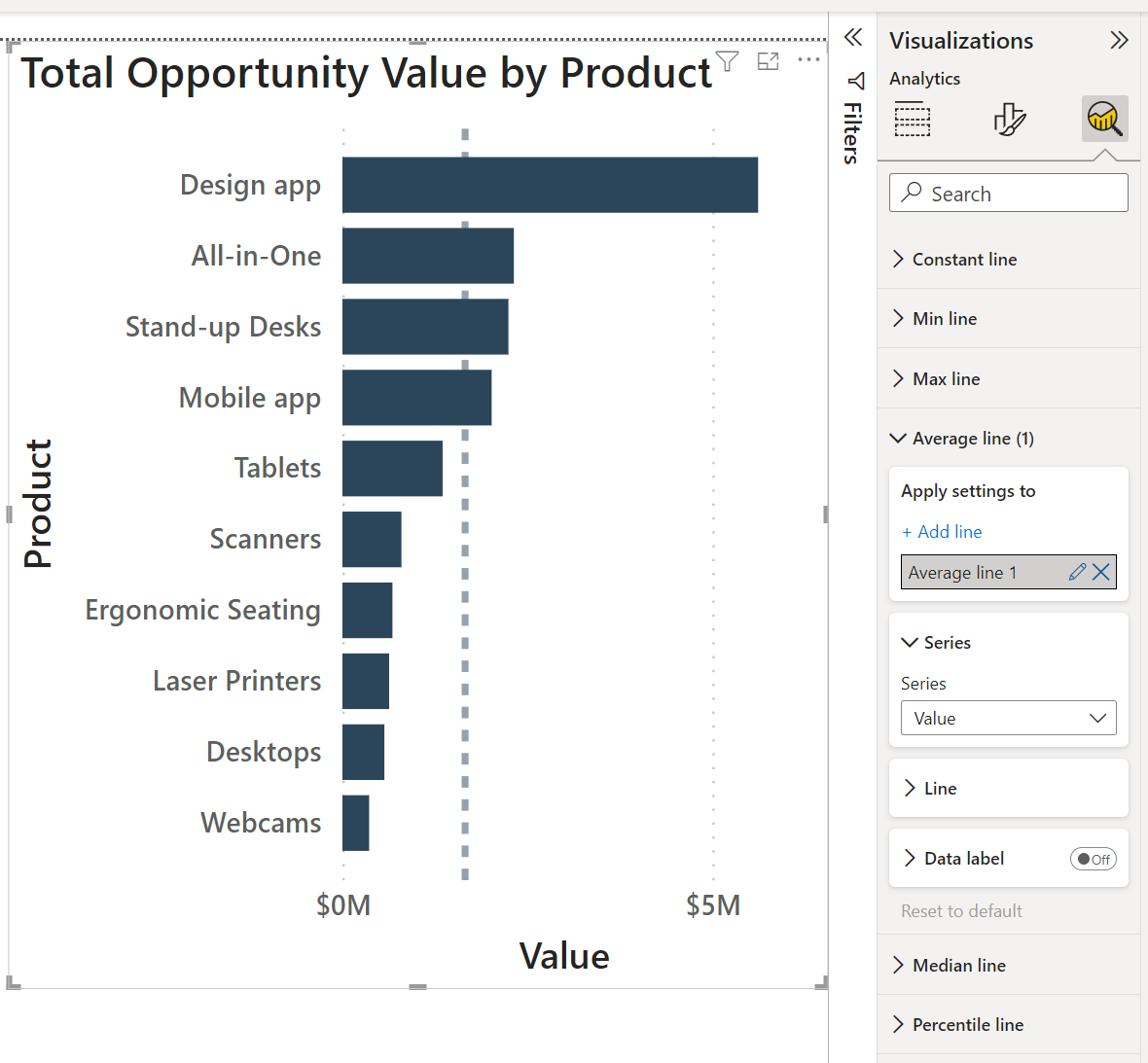
In this example, we will be adding an average line to a clustered bar chart showing the total opportunity value by-product. First, select the ‘Analytics’ icon; then, under ‘Average line’ click ‘Add line’. You can customize the look of the line if you like, or leave it as is.
In the chart below, we can see that the products from Tablets to Webcams are all performing below average. A company could decide to drop some of the worst performing products, or they could intensify their marketing efforts to try to increase sales. Adding an average line to charts makes it easier to identify where these kinds of decisions need to be made.
Adding a Trend Line to Charts in Power BI
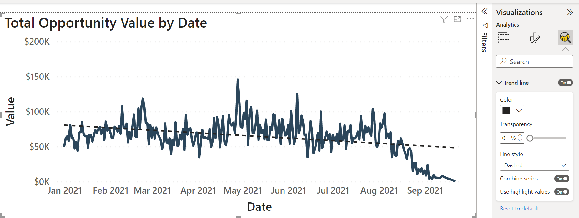
In this example, we will be adding a trend line to a line chart showing the total opportunity value over time. First, select the ‘Analytics’ icon. If you have a compatible time-series chart, you will be given the option to add a trend line. As with the average line, you can customize the look of the trend line with a few simple options such as color and line style.
In the example below, we can see that sales over time are following a downward trend. This trend line is helpful for forecasting over short periods of time. If you know the approximate trend your data is following, you will be in a better position to estimate possible future values. Without this information, your eyes tend to focus only on the intense fluctuation in sales on a daily basis without being able to draw a meaningful conclusion.
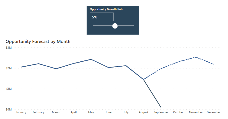
Using What-If Parameters in Power BI Visuals
The what-if parameter feature in Power BI allows you to create custom ‘what-if’ scenarios ideal for forecasting. For example, a company may observe a 10% growth in sales year after year. However, what if they would like to forecast a range of different growth rates for the coming months or year and observe how this may affect the KPI’s in their Power BI report? To do this quickly and easily, they can use what-if parameters.
In this tutorial, we will be adding a what-if parameter that allows us to dynamically adjust the growth rate for our opportunity value forecast. We will visualize the effect in a line chart showing actual values and 3 months of forecasted opportunity values.
To add a what-if parameter, select the Modeling tab from the ribbon and then select ‘New Parameter’. This will bring up a dialogue box where we can enter the name of the parameter (Opportunity Growth Rate), the data type (decimal), and then the values we would like the parameter to have (from -1 to 1 in increments of 0.01). Enter the default value as 0 as this is the value that the parameter will take when no value is selected by the user.
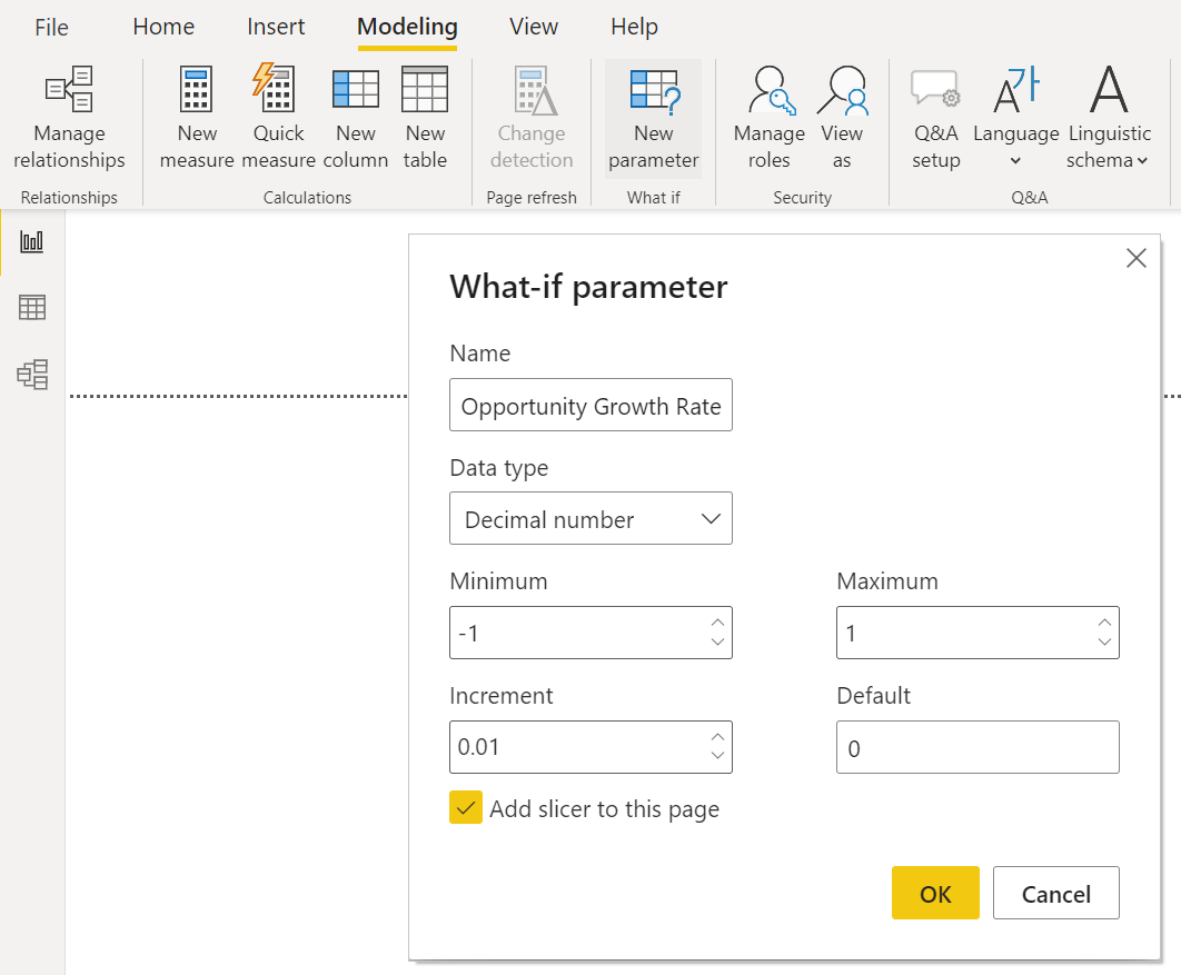
Next, it is important to check the option to add a slicer to the page since we will need this to be able to dynamically adjust our forecast growth rate.
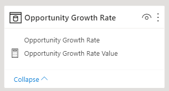
In essence, this what-if parameter will create a table with a column for all the individual values that were specified in the range. It will also create a measure that returns the selected value from that table. We will use this measure in our calculations for the forecasted opportunity value.
To see how this forecast works for future months, create a date table containing the current date range in the data as well as the dates for as many months into the future as you need. The forecasted time period that we will be using in this example is 3 months.
To calculate the forecasted sales, we need to create a measure with the following DAX formula:
Opportunity Forecast =
IF( MAX ( 'Opportunity Calendar'[Date] ) > DATE(2021, 09, 21), CALCULATE ( SUM ( Opportunities[Value] ), DATEADD ( 'Opportunity Calendar'[Date], -1, YEAR ) ) * ( 1+'Opportunity Growth Rate'[Opportunity Growth Rate Value] ), SUM ( Opportunities[Value] ) )
This DAX formula will return the forecasted opportunity value (increased by the opportunity growth rate from our what-if parameter) if the dates fall above the latest date in our dataset (21 Sep 2021); otherwise, it will simply return the actual opportunity value. If you were applying this DAX formula to present-day data, you would need to replace the portion containing DATE(2021, 09, 21) with the function TODAY().
Lastly, we can add the actual opportunity value and this opportunity forecast measure to a line chart so that these two lines overlap each other. Change the format of the forecast line to a dashed line in order to see where the forecast starts. Now, we can dynamically adjust the growth rate from the slicer to change the forecast.
AI-Driven Features
Power BI has taken giant steps toward incorporating more AI-driven features into the platform. This makes it easier and faster to uncover insights in our data even without specialized data science training.
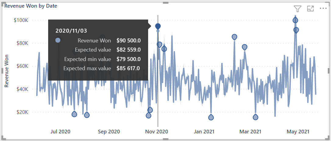
Anomaly Detection
Anomaly detection is useful for quickly identifying potential issues or highlights by adding dynamic markers. However, it only works with time-series line charts. The idea is that the algorithm will determine the expected value for a given date; and then, based on a confidence interval, the actual value will either be regarded as an anomaly or not.
In the example below, anomaly detection was used on a revenue chart over time. For the selected date, the actual revenue is R90k while the expected revenue is R82k with a range of R79k - R85k. Therefore, this is considered to be an anomaly.
Key Influencers
Key influencers is a visualization option that shows how likely a particular metric is to occur based on the features you specify.
In the example below, an opportunity is 2.76 times more likely to have the status ‘Won’ if there is an increase in the discount of 0.02. This result is illustrated in the scatterplot to the right side of the visual.
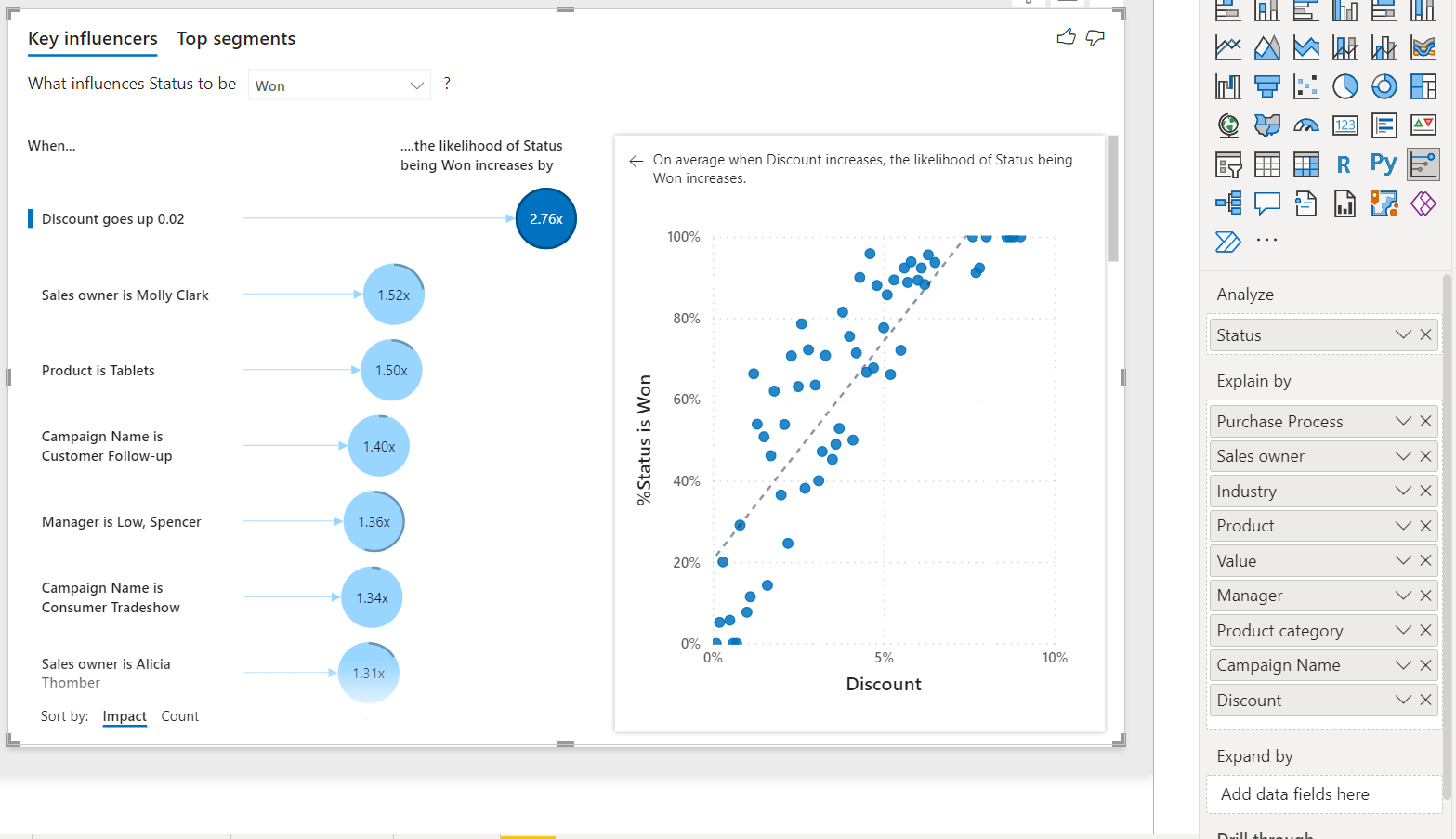
The key influencers visual is very helpful for comparing the effect of multiple features against each other. This leads to faster insights into what feature is the most important contributor to a metric and could require further exploration.
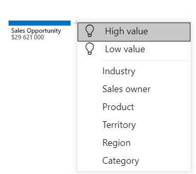
Decomposition Trees
The decomposition tree is a visualization option that allows you to arrange features in a hierarchy and show the breakdown of a metric at each level in that hierarchy.
For example, the image below begins with the Sales Opportunity metric which is broken down into categories, products and then regions. In this way, you can see how sales is distributed across the elements of each level and which element is currently contributing the most towards sales.
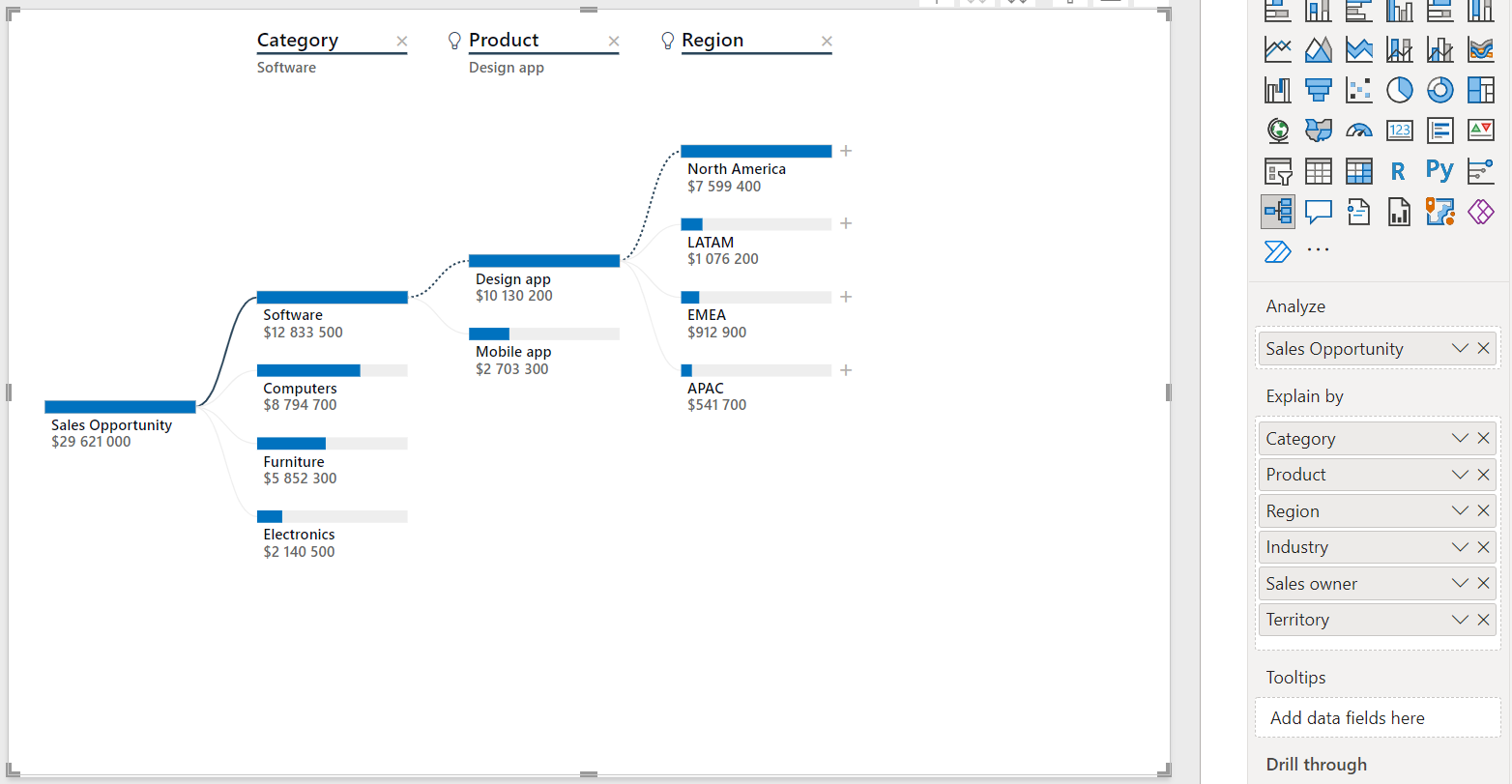
If you are not sure what the best breakdown for your metric is, you can use an option in the formatting for this visual called ‘AI splits’. If you enable this option, you can let Power BI choose the best feature to add based on whether it generates the highest or lowest value compared to the others.
The chart above was generated by selecting ‘High value’ for each level in the hierarchy.
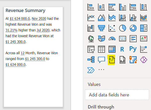
Smart Narratives
Smart Narratives is a visualization option that creates a text box containing a written narrative of the key observation in the data. You can easily edit and format the text to add, remove, or highlight the most important parts for your users.
This feature is very useful for quickly adding key insights about your data to presentations or reports. The ability to customize these narratives means that you can tailor them towards the audience to which you are delivering the presentation.
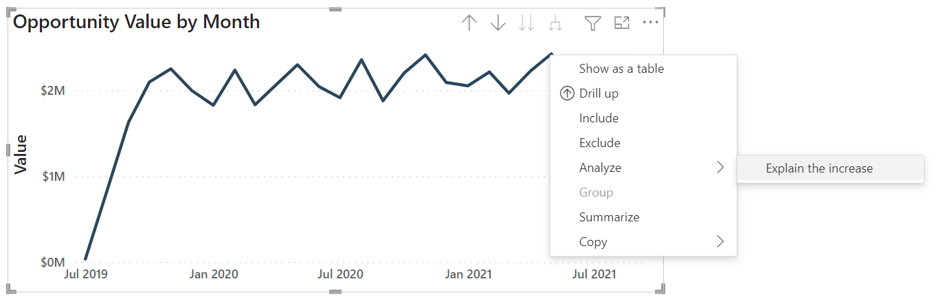
Context-Specific Insights
These insights vary depending on the chart or the variations in your data. The types of insights you can generate are:
- Explain the increase
- Explain the decrease
- Find where the distribution is different (typically for the bar and column charts that compare categories).
In the example below, we have right-clicked on a point that is slightly higher than the rest; and the option ‘Explain the increase’ appears in the Analyze section.
Selecting this option gives a detailed analysis of many of the features in the dataset that could describe the possible reasons for this increase. The charts shown are typically waterfall charts, but you can also choose from a selection of other visualization types, such as scatterplots, column charts, and line charts. If any of the charts catch your eye and you want to add them to your report, you can simply click the plus icon at the top right-hand side of the chart.
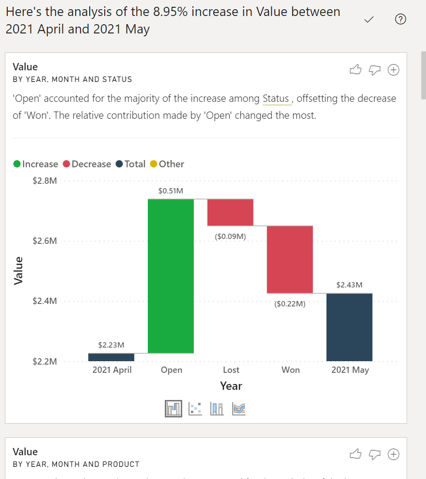
These contextual insights are very valuable when you want to generate fast insights. I have often used this feature to find points for further investigation and analysis into a sudden change in the data. This expedites my data exploration process because I do not need to start from scratch.
Conclusion
Using the tools in this tutorial, you'll be able to produce dynamic, powerhouse analytical reports. Adding advanced Power BI skills to your arsenal will not only make you a more effective data scientist, but it can also unlock a broader array of career possibilities as Power BI is one of the most sought-after business intelligence skills in the job market. If you'd like to do a deeper dive into Power BI, you can check our Power BI courses or our career-boosting Power BI Skill Track.
Become a Power BI Data Analyst
Master the world's most popular business intelligence tool.