Track
Python Programming Fundamentals
16 hr
Data visualization transforms complex information into clear, actionable insights. Seaborn barplots excel at presenting categorical data through elegant, statistical graphics. The library combines the flexibility of Matplotlib with the power of pandas, making it ideal for both quick analyses and publication-ready visualizations.
Seaborn barplots offer essential features for data analysis - from basic comparisons to advanced statistical representations. They handle common tasks like comparing sales metrics across regions, analyzing survey responses, and visualizing experiment results.
The library's intuitive syntax and built-in statistical functions make it valuable for both beginners and experienced data practitioners.
In this article, we will look at Seaborn barplot basics, creating basic plots with code examples, enhancing plots through customization, implementing advanced features, and exploring practical applications.
To learn more about data visualization with Seaborn, check out our Introduction to Data Visualization with Seaborn course.
Before we go into barplots, let’s look at some fundamentals of Seaborn, its advantages for bar plots, and how to set up the coding environment.
Seaborn is a Python statistical data visualization library built on top of Matplotlib. It specializes in creating informative and attractive statistical graphics with minimal code. The library integrates closely with pandas DataFrames, making it particularly effective for data analysis workflows.
It provides a high-level interface to draw attractive plots while handling many styling details automatically.
The library excels at three key aspects:
For example, while Matplotlib requires multiple lines of code to create a basic statistical visualization, Seaborn can accomplish the same task with a single function call.
For bar plots specifically, Seaborn adds powerful features like automatic mean calculation, confidence intervals, and advanced categorical variable handling - capabilities that would require significant extra code in plain Matplotlib.
Barplots present categorical data through vertical or horizontal bars, where the length represents a numeric value. This makes them ideal for comparing values across different groups or categories. In data analysis, bar plots help visualize survey results, market shares, performance metrics, and sales distributions.
Key advantages include:
To start creating barplots with Seaborn, we'll need to set up our Python environment. Here's how to get started:
First, let's install the required packages as shown below:
pip install seaborn pandas numpyNow we have all our visualization tools ready to use. Let's import the libraries we'll need, as shown below:
# For creating statistical visualizations
import seaborn as sns

# For data manipulation and analysis
import pandas as pd

# For numerical operations
import numpy as np
We can make our plots look better with some style settings, as follows:
# Clean white style
sns.set_style("white")
The white style removes gridlines and will make the plots look good on most screens. In the next sections, we will look at creating barplots and enhancing them.
A barplot is perfect for visualizing relationships between categorical and numerical variables. It shows point estimates (like mean or median) and the uncertainty around those estimates through error bars. Let’s take a look at the basic syntax of seaborn barplot.
The sns.barplot() function in Seaborn provides a straightforward way to create statistical bar plots. The basic structure of the .barplot() function looks like as shown below:
sns.barplot(
    data=None,      # Your DataFrame
    x=None,         # Category variable
    y=None,         # Numeric variable
    estimator='mean',  # Statistical function to estimate
    errorbar=('ci', 95),  # Error bars type and level
    orient=None     # "v" for vertical, "h" for horizontal
)
These parameters give us control over what data we display and how we display it. The data parameter takes your DataFrame, while x and y specify which columns to use for the categories and values. The estimator lets you choose what statistical function to apply (mean by default), and errorbar controls how uncertainty is displayed. You can also switch between vertical and horizontal orientations using the orient parameter.
Now, let's take a look at how to create effective barplots using Seaborn's built-in tips dataset, which contains information about restaurant bills and tips.
We will look at the tipping behavior across different days of the week using the tips dataset. This dataset contains information about restaurant bills, including the day of the week, total bill amount, tip amount, and other variables.
# Import required libraries and load dataset
import seaborn as sns
tips = sns.load_dataset("tips")
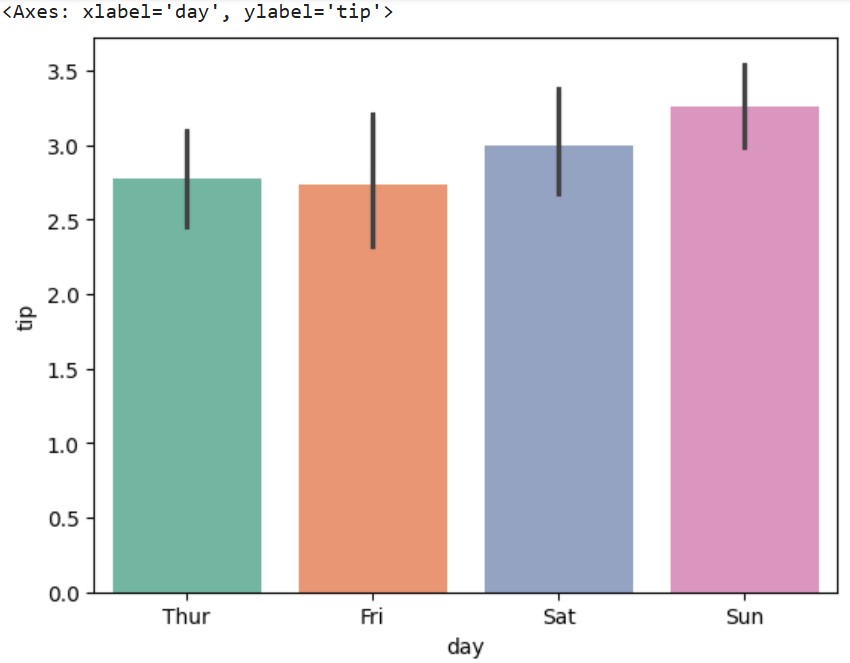
# Create a basic barplot showing average tips by day
sns.barplot(data=tips, x="day", y="tip")Output:
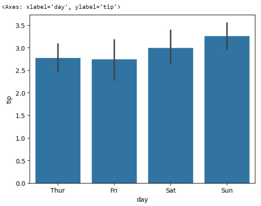
Our code created the above visualization where each bar represents the average tip amount for a different day of the week. The height of each bar shows the mean tip value, while the black lines (error bars) indicate the 95% confidence interval - giving us insight into both the typical tip amount and how much it varies.
We can also examine tipping patterns across different meal times:
# Create a barplot showing average tips by time of day
sns.barplot(data=tips, x="time", y="tip")
Output:
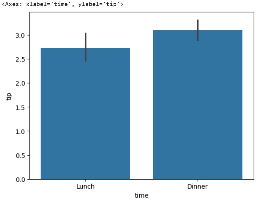
This plot reveals the difference in tipping behavior between lunch and dinner service. Each bar's height represents the average tip amount for that time of day, with error bars showing the variability in tipping behavior. This kind of visualization makes it easy to spot patterns and compare groups at a glance.
These basic barplots provide a foundation for more complex visualizations. In the next section, we'll see how to enhance these plots with colors, groupings, and other customizations to create more informative and visually appealing visualizations.
Adding visual enhancements to our barplots can help make our data more engaging and easier to understand. Let's see the different ways to customize barplots using the tips dataset.
Seaborn offers several ways to add color to your barplots, making them more visually appealing and informative. We can use a single color for all bars or create color-coded groups,
The color parameter sets a single color for all bars, while the palette lets you specify a color scheme when your data has multiple groups. Seaborn comes with many built-in color palettes that work well for different types of data.
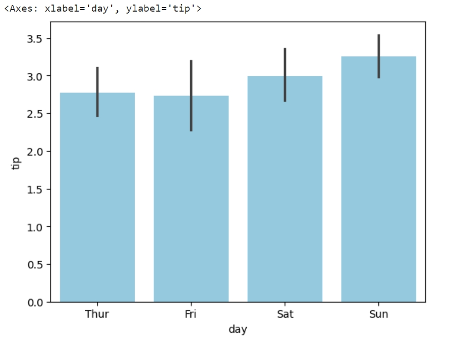
We can create a simple barplot with a single color using the color parameter as shown below:
# Load the tips dataset if you haven't already
import seaborn as sns
tips = sns.load_dataset("tips")

# Single color barplot
sns.barplot(data=tips, x="day", y="tip", color="skyblue")Output:
We can create a barplot with multiple colors using the palette parameter as shown below:
# Load the tips dataset if you haven't already
import seaborn as sns
tips = sns.load_dataset("tips")

# Using a different color palette
sns.barplot(data=tips, x="day", y="tip", palette="Set2")Output:
One of the most powerful features of Seaborn barplots is the ability to show relationships between multiple variables using the hue parameter. This creates grouped bars that make comparisons easier.
Let’s compare the tips across both days and meal times using the hue parameter as shown below:
# Load the tips dataset if you haven't already
import seaborn as sns
tips = sns.load_dataset("tips")

# Create a grouped barplot showing tips by day and time
sns.barplot(
    data=tips,
    x="day",
    y="tip",
    hue="time"
)Output:
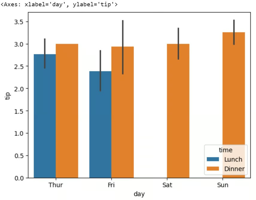
The above plot shows two bars - one for lunch and one for dinner. This grouping helps us see not just how tips vary by day, but also how they differ between meal times.
Stacked barplots are excellent for showing the composition of different categories. While Seaborn doesn't have a direct stacked barplot function, we can combine it with matplotlib to create effective stacked visualizations.
This approach leverages Seaborn's statistical functionality while using matplotlib's stacking capabilities. As an example, in the tips datatset, let's see how tips are distributed between smokers and non-smokers across different days.
Let's start by importing the necessary libraries for our visualization:
# Import required libraries
import seaborn as sns
import matplotlib.pyplot as plt
import numpy as np
Now we'll load our dataset containing restaurant tips information:
# Load the tips dataset
tips = sns.load_dataset("tips")
We'll create a figure with appropriate dimensions for our visualization:
# Create figure and axis
plt.figure(figsize=(10, 4))
Next, we'll calculate the average tips for smokers and non-smokers across different days:
# Calculate values for stacking
# Filter smokers, group by day and get mean tips
smoker_means = tips[tips['smoker']=='Yes'].groupby('day')['tip'].mean()

# Filter non-smokers, group by day and get mean tips
non_smoker_means = tips[tips['smoker']=='No'].groupby('day')['tip'].mean()
Next, we'll set up the basic parameters for our stacked bars as shown below:
# Plot the stacked bars using matplotlib
days = smoker_means.index
width = 0.8
Now, we'll create the bottom layer of our stacked bars for non-smokers:
# Create bottom bars (non-smokers)
plt.bar(days, non_smoker_means, width, label='Non-smoker', color=sns.color_palette()[0])
We'll add the top layer for smokers' tips:
# Create top bars (smokers)
plt.bar(days, smoker_means, width, bottom=non_smoker_means,
        label='Smoker', color=sns.color_palette()[1])
Let's set a clean style without gridlines using seaborn styling:
# Add Seaborn styling
sns.set_style("white")
Finally, we'll display our completed stacked barplot:
# Show the plot
plt.show()Output:
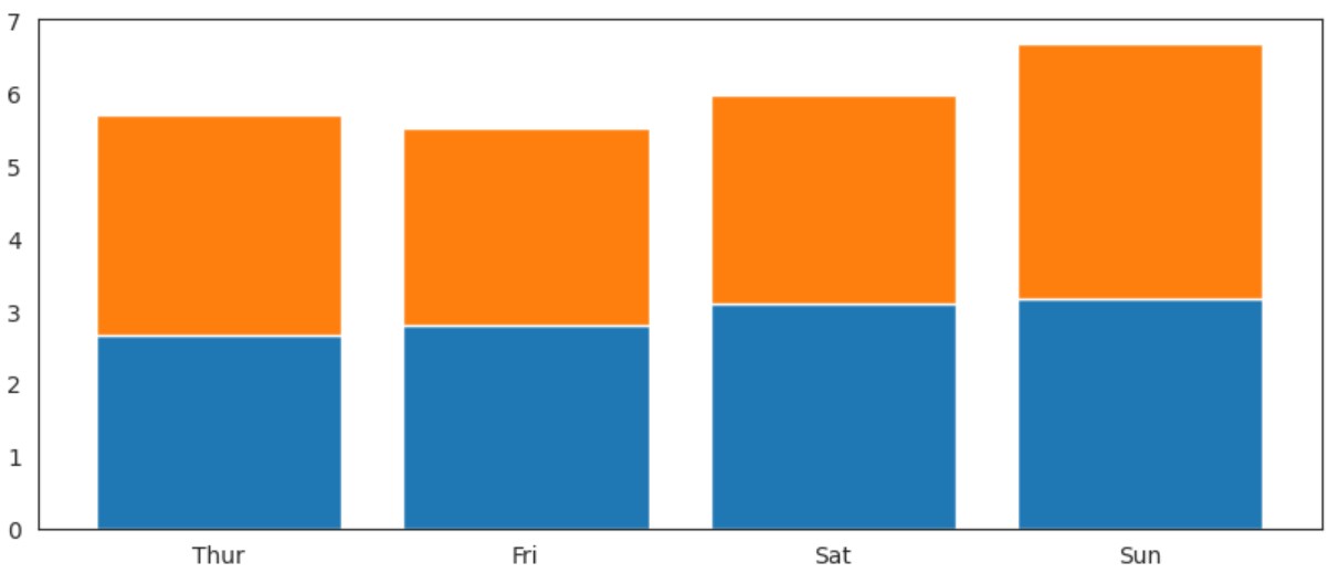
The resulting plot shows the average tips from smokers stacked on top of non-smokers' tips for each day, making it easy to compare both total tips and the contribution from each group.
This workaround allows us to:
Now that we've covered the basics and customizations let's look at some advanced features that can make our barplots more informative and professional. We’ll continue using the tips dataset to demonstrate these advanced techniques.
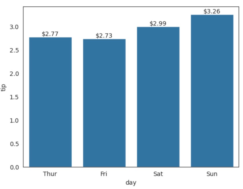
Adding value labels to bars can make your visualizations more precise and informative. Let's create a barplot that shows the exact tip values above each bar.
First, let's import our libraries and get our data ready:
# Import required libraries
import seaborn as sns
import matplotlib.pyplot as plt

# Load and prepare the tips dataset
tips = sns.load_dataset("tips")
Create our barplot with statistical values:
# Create the basic barplot
ax = sns.barplot(data=tips, x="day", y="tip”, errorbar=None)    # Create barplot and store the axes object for annotations
Next, we’ll add value labels to the top of each bar, as shown below:
# Get the height of each bar
bars = ax.containers[0]                           # Get the bar container object
heights = [bar.get_height() for bar in bars]      # Extract height of each bar

# Add text annotations on top of each bar
for bar, height in zip(bars, heights):            # Loop through bars and heights together
    ax.text(
        bar.get_x() + bar.get_width()/2.,        # X position (center of bar)
        height,                                   # Y position (top of bar)
        f'${height:.2f}',                        # Text (format as currency)
        ha='center',                             # Horizontal alignment
        va='bottom'                              # Vertical alignment
)Output:
When creating barplots, adjusting the axes helps make your data more readable and impactful. Let's see how to customize axis limits, labels, and ticks using Seaborn's functions.
First, we'll import our library and load the dataset we need for our visualization:
# Import required libraries
import seaborn as sns

# Load and prepare the tips dataset
tips = sns.load_dataset("tips")
We can create a barplot with custom labels and order of days. The order parameter lets us specify exactly how we want our days arranged on the x-axis:
# Create barplot with axis labels
ax = sns.barplot(
    data=tips,
    x="day",
    y="tip",
    order=['Thur', 'Sat', ‘Fri', 'Sun']     # Set custom order for days
)
To make our plot more informative, we can add descriptive labels for both axes using the set method:
# Set descriptive axis labels
ax.set(
    xlabel='Day of Week',
    ylabel='Average Tip ($)'
)
To fine-tune our visualization, we can set specific limits and tick marks. The ylim parameter controls the range of the y-axis, while xticks and yticks let us define exactly where we want our tick marks to appear:
# Customize axis limits and ticks
ax.set(
    ylim=(0, 5),                            # Set y-axis range from 0 to 5
    xticks=range(4),                        # Set x-axis tick positions
    yticks=[0, 1, 2, 3, 4, 5]              # Set specific y-axis tick values
)
To incorporate all these changes in the graph, we need to run them at once and not one by one. The entire code is shown below:
# Import required libraries
import seaborn as sns

# Load and prepare the tips dataset
tips = sns.load_dataset("tips")

# Create barplot with axis labels
ax = sns.barplot(
   data=tips,
   x="day",
   y="tip",
   order=['Thur', 'Sat', 'Fri', 'Sun']     # Set custom order for days
)

# Set descriptive axis labels
ax.set(
   xlabel='Day of Week',
   ylabel='Average Tip ($)'
)

# Customize axis limits and ticks
ax.set(
   ylim=(0, 5),                            # Set y-axis range from 0 to 5
   xticks=range(4),                        # Set x-axis tick positions
   yticks=[0, 1, 2, 3, 4, 5]              # Set specific y-axis tick values
)
Output:
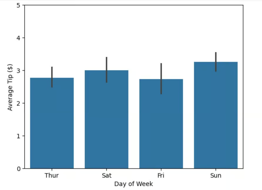
The resulting plot shows tips by day with clear labels, appropriate scales, and well-organized tick marks, making it easy to read and interpret the data.
Error bars help visualize the uncertainty or variability in your data. Seaborn offers several options for adding error bars to your barplots, including confidence intervals and standard deviation.
First, we'll import our library and load the dataset we need for our visualization:
# Import required libraries
import seaborn as sns
# Load and prepare the tips dataset
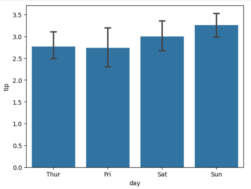
tips = sns.load_dataset("tips")By default, Seaborn shows 95% confidence intervals. We can modify this using the 'errorbar' parameter to show different types of statistical estimates:
# Create barplot with confidence intervals
ax = sns.barplot(
    data=tips,
    x="day",
    y="tip",
    errorbar="ci",                          # Show confidence interval
    capsize=0.1                            # Add small caps to error bars
)
Output:
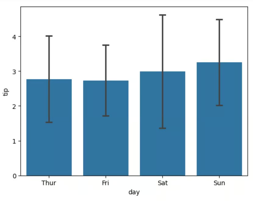
We can also show standard deviation instead of confidence intervals, which helps visualize the spread of our data:
# Switch to standard deviation
ax = sns.barplot(
    data=tips,
    x="day",
    y="tip",
    errorbar="sd",                          # Show standard deviation
    capsize=0.1                            # Add small caps to error bars
)
Output:
Sometimes, we might want to remove error bars completely for a cleaner look:
# Create barplot without error bars
ax = sns.barplot(
    data=tips,
    x="day",
    y="tip",
    errorbar=None                           # Remove error bars
)
Output:
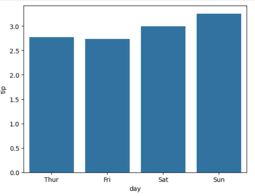
The resulting plots show how different error bar types can help us understand the variability in our tip data across different days of the week.
Barplots are versatile tools in data visualization, particularly useful when you need to compare values across different categories or analyze multiple variables simultaneously. Let's look at two common applications where Seaborn barplots excel.
Seaborn barplots excel at revealing patterns in categorical data, particularly when analyzing metrics across different groups. By showing both the central tendency and uncertainty, barplots help identify significant differences between categories.
This makes them ideal for analyzing customer behavior, product performance, or survey responses where you need to compare values across distinct groups.
When our analysis involves multiple factors, Seaborn's barplots can highlight complex relationships in our data. Using features like grouping (hue) or stacking helps compare different variables simultaneously, making it easier to spot patterns and interactions between different aspects of our data.
Seaborn barplots strike the right balance between simplicity and statistical insight. The library's intuitive syntax combined with robust statistical features makes it an essential tool for data visualization. From basic category comparisons to advanced grouped visualizations, barplots help uncover and communicate data patterns effectively.
Ready to level up your data visualization skills? Here's what to explore next:
Want to take your Seaborn skills to the next level? Enroll in the Intermediate Data Visualization with Seaborn course.
Top DataCamp Courses
Track
Course
Course
Tutorial
Elena Kosourova
Tutorial
Samuel Shaibu
Tutorial
Joleen Bothma
Tutorial
Moez Ali
Tutorial
Austin Chia
Tutorial
Austin Chia