Course
Introduction to Data Visualization with Matplotlib
4 hr
230.9K
Have you ever wondered how to better represent distributions of numeric data in Python? Well, your best choice would be to learn how to use boxplots! Boxplots are a great way to visualize distribution comparisons between multiple groups.
In this tutorial, we'll cover what boxplots are, the different ways to create them in Python, and some common beginner mistakes.
Boxplots, also known as box-and-whisker plots, are a standard way of displaying data distribution based on a five-number summary: minimum, first quartile (Q1), median, third quartile (Q3), and maximum.
Boxplots are particularly useful for identifying outliers and understanding the spread and skewness of the data. They are also used when comparing multiple groups or visualizing the distribution of a single variable.
A typical boxplot comes with several components as part of its anatomy:
These components combine to give the boxplot statistical meaning and allow easy visual comparisons between different data groups.
Python is an advanced tool that can help us create boxplots. In the following sections, we will review different methods for doing that.
Now that we have a basic understanding of boxplots let's see how to create them using Python. Multiple libraries in Python, such as Matplotlib, Seaborn, and Plotly, support the creation of boxplots.
To create boxplots in Python, one must first install the necessary libraries. The primary libraries needed are Matplotlib, Seaborn, and Plotly.
Here's the code to install them:
pip install matplotlib
pip install seaborn
pip install plotly==5.22.0After installation, the next step is to import these libraries into your Python environment.
Make sure also to load the necessary datasets that you will be using for your boxplots, if any.
#imports Matplotlib library and assigns shorthand 'plt'
import matplotlib.pyplot as plt
#imports Seaborn library and assigns shorthand 'sns'
import seaborn as sns
#imports Plotly library and assigns shorthand 'px'
import plotly.express as pxThanks to Python's versatility, creating a simple boxplot requires minimal code. Let's start with the most common library, Matplotlib.
To create a boxplot using Matplotlib, import the necessary libraries:
import matplotlib.pyplot as plt
import numpy as np
Next, let's prepare a simple dataset:
# Generates some random dataset
np.random.seed(10)
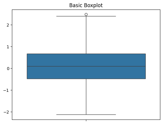
data = np.random.normal(0, 1, 100)Lastly, let's create the actual boxplot and print it out:
# Creates a boxplot
plt.boxplot(data) plt.title('Basic Boxplot') plt.show()
Here are the results: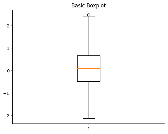
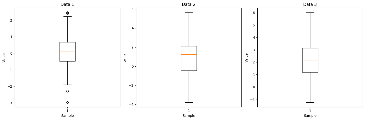
If you want to create separate boxplots in different subplots, you can use the subplot function. This lets you create multiple boxplots side by side in a single image.
Here's the full code example:
import matplotlib.pyplot as plt
import numpy as np
# Generates multiple datasets
data1 = np.random.normal(0, 1, 100)
data2 = np.random.normal(1, 2, 100)
data3 = np.random.normal(2, 1.5, 100)
# Creates subplots
fig, axs = plt.subplots(1, 3, figsize=(15, 5))
# Plots Boxplot for Data 1
axs[0].boxplot(data1)
axs[0].set_title('Data 1')
axs[0].set_xlabel('Sample')
axs[0].set_ylabel('Value')
# Plots Boxplot for Data 2
axs[1].boxplot(data2)
axs[1].set_title('Data 2')
axs[1].set_xlabel('Sample')
axs[1].set_ylabel('Value')
# Plots Boxplot for Data 3
axs[2].boxplot(data3)
axs[2].set_title('Data 3')
axs[2].set_xlabel('Sample')
axs[2].set_ylabel('Value')
# Adjusts layout
plt.tight_layout()
plt.show()
This is the resulting plot:
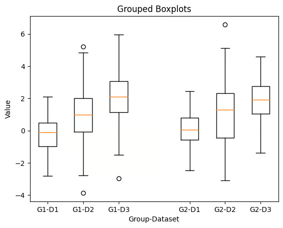
However, these subplots do not share the same axis and are unsuitable for side-by-side comparisons across categories. For multiple boxplots with the same axis, you’ll need to create grouped boxplots.
Grouped boxplots are especially useful for comparing distributions across multiple categories. They allow a more nuanced understanding of the data. These comparisons can reveal differences that are not immediately obvious from other charts.
Each group is presented side-by-side within the same chart, making it easier to highlight variations, trends, and outliers across different subcategories.
Here's how to create a grouped subplot:
# Generates grouped data
data_group1 = [np.random.normal(0, 1, 100), np.random.normal(1, 2, 100), np.random.normal(2, 1.5, 100)]
data_group2 = [np.random.normal(0, 1, 100), np.random.normal(1, 2, 100), np.random.normal(2, 1.5, 100)]
# Combines two data groups into a dataset
data = data_group1 + data_group2
# Creates grouped boxplots
plt.boxplot(data, positions=[1, 2, 3, 5, 6, 7], labels=['G1-D1', 'G1-D2', 'G1-D3', 'G2-D1', 'G2-D2', 'G2-D3'])
plt.title('Grouped Boxplots')
plt.xlabel('Group-Dataset')
plt.ylabel('Value')
plt.show()
This is the grouped boxplot produced by the above code:
You can use advanced customization in Matplotlib to enhance your data visualizations.
Techniques such as adding means, adding standard deviation, creating grouped boxplots, and using horizontal boxplots can provide better insights into the distribution of your data.
Customizing boxplots in Python also allows you to tailor visuals to your project's specifications.
Here are some ways to customize boxplots using the Matplotlib library:
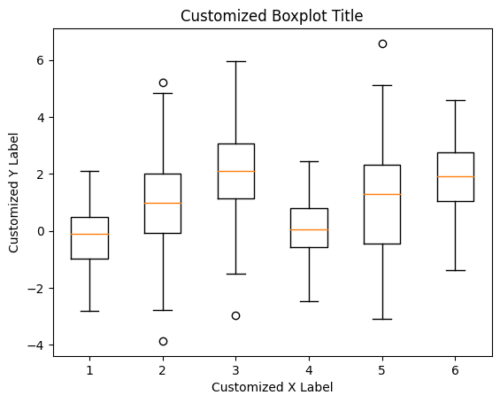
Titles and labels will make your plots more easily understandable to viewers, who can quickly discern the data comparison. Adding these is straightforward and can be done using Matplotlib's functions.
To add labels to a Matplotlib boxplot:
plt.boxplot(data)
# Adds title
plt.title('Customized Boxplot Title')
# Adds x axis label
plt.xlabel('Customized X Label')
# Adds y axis label
plt.ylabel('Customized Y Label')
plt.show()
This will create a labeled boxplot like the image below:
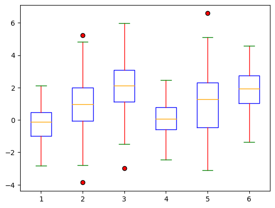
Customizing the colors and styles of boxplots in Python allows for a visually appealing and clear presentation of data. They will also help you effectively emphasize specific data points or comparisons to your stakeholders.
You can change the colors of the boxes, whiskers, caps, medians, and fliers using the boxprops, whiskerprops, capprops, medianprops, and flierprops parameters.
Here's the code example:
plt.boxplot(data, boxprops=dict(color='blue'), whiskerprops=dict(color='red'), capprops=dict(color='green'), medianprops=dict(color='orange'), flierprops=dict(markerfacecolor='red', marker='o'))
plt.show()
This will create different colors for your boxplot components based on your set parameters:
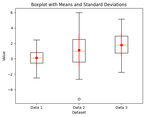
Add the mean and standard deviation to the boxplot to provide more statistical information.
# Creates dataset
data1 = np.random.normal(0, 1, 100)
data2 = np.random.normal(1, 2, 100)
data3 = np.random.normal(2, 1.5, 100)
# Calculates the mean and standard deviations
mean = [np.mean(d) for d in data]
std_devs = [np.std(d) for d in data]
# Creates a boxplot
plt.boxplot(data, labels=['Data 1', 'Data 2', 'Data 3'])
# Adds mean as red dots
for i in range(len(mean)):
   plt.plot(i + 1, mean[i], 'ro')
# Adds standard deviations as error bars
for i in range(len(std_devs)):
   plt.errorbar(i + 1, mean[i], yerr=std_devs[i], fmt='o', color='red')
# Plots graph
plt.title('Boxplot with Means and Standard Deviations')
plt.xlabel('Dataset')
plt.ylabel('Value')
plt.show()
Here's the resulting plot:
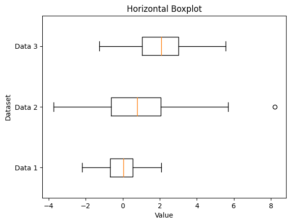
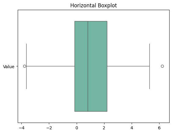
Horizontal boxplots can make data visualization more readable, especially when dealing with long category names.
This can be done simply using the vert argument parameter of the boxplot function in Matplotlib.
# Creates horizontal boxplot
plt.boxplot(data,
            labels=['Data 1', 'Data 2', 'Data 3'],
            vert=False)
# Plots graph
plt.title('Horizontal Boxplot')
plt.xlabel('Value')
plt.ylabel('Dataset')
plt.show()
This is the resulting plot from running the above code:
Our Introduction to Data Visualization with Matplotlib course should also help you better understand how to create data visualizations beyond boxplots.
If you need to consult this information in the future, here’s a cheat sheet summary for plotting in Matplotlib:
Seaborn, built on top of Matplotlib, simplifies the creation of aesthetically pleasing boxplots with minimal code. Its straightforward syntax makes it accessible for all skill levels, and its integration with other libraries allows maximum data analysis flexibility.
Here's a step-by-step guide to creating a basic boxplot using Seaborn. As before, start by importing the necessary libraries.
# Imports necessary libraries
import seaborn as sns
import matplotlib.pyplot as plt
import numpy as np
Next, let's prepare a simple dataset:
# Generates a random dataset
np.random.seed(10)
data = np.random.normal(0, 1, 100)
Lastly, let's create the actual boxplot and print it out:
# Creates a basic boxplot
sns.boxplot(data=data)
# Adds title to the boxplot
plt.title('Basic Boxplot')
plt.show()
This is the resulting plot:
You can customize your Seaborn plot using the hue, orient, and palette parameters.
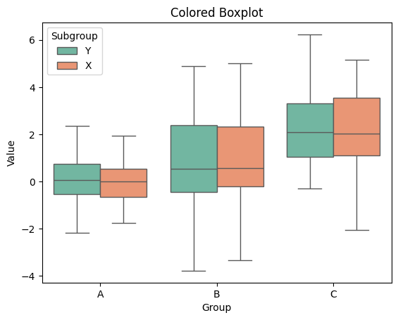
Let’s see how to add colors to your boxplot based on categories, use the hue parameter:
# Generate multiple datasets
data = {
    'Group': ['A']*100 + ['B']*100 + ['C']*100,
    'Value': np.concatenate([np.random.normal(0, 1, 100),
                             np.random.normal(1, 2, 100),
                             np.random.normal(2, 1.5, 100)])
}
df = pd.DataFrame(data)
# Create additional grouping data
df['Subgroup'] = np.random.choice(['X', 'Y'], size=300)
# Plots graph
sns.boxplot(x='Group', y='Value', data=df, hue='Subgroup', palette='Set2')
plt.title('Colored Boxplot')
plt.show()
Here’s the modified boxplot:
To align your boxplot in a specific orientation, use the orient parameter. For vertical orientation, the orient parameter should be set to 'v'. For horizontal orientation, it should be set to 'h'.
Here's the code for a horizontal boxplot:
# Plots horizontal boxplot
sns.boxplot(data=df, orient='h', palette='Set2')
plt.title('Colored Boxplot')
plt.show()
The above code will create a boxplot like this:
To add individual data points to the boxplot, you can use a swarm plot using the swarmplot function:
# Plots boxplot
sns.boxplot(x='Group', y='Value', data=df)
# Overlays swarm plot over boxplot
sns.swarmplot(x='Group', y='Value', data=df, color='black', alpha=0.5)
plt.title('Boxplot with Swarmplot')
plt.show()
The above code will create a boxplot like this:
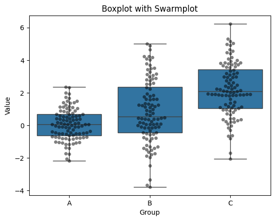
A swarm plot like this can help provide more insight into the distribution of your data. It complements the statistical information of a boxplot to give your viewers a comprehensive picture of your data.
Check out our Introduction to Data Visualization with Seaborn course for more ways to implement data visualizations in Seaborn.
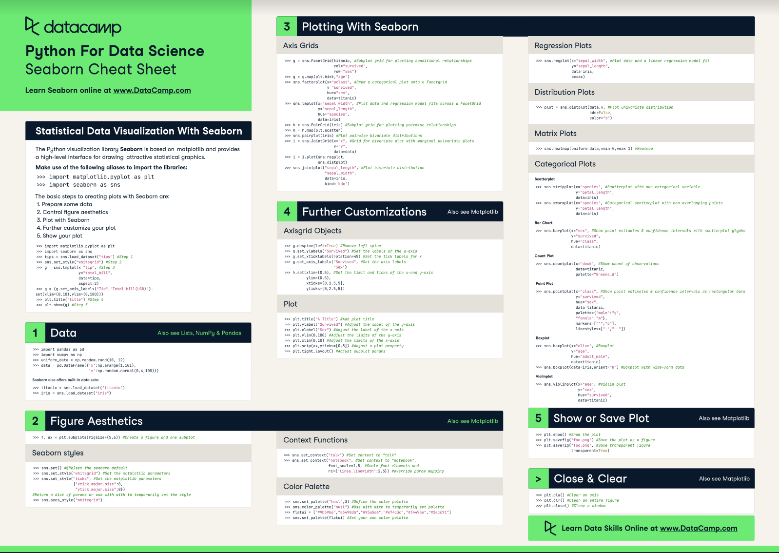
If you’d like to consult this information in the future, here’s a cheat sheet for plotting in Seaborn:
The interpretation of a boxplot depends on the context and specific research question it addresses.
However, some general guidelines can help understand the data distribution shown through the boxplot. These include:
Even though Python makes it straightforward to create visually appealing boxplots based on your datasets, a few aspects should be considered to avoid misleading or incorrect visualizations.
When creating a Python boxplot, practitioners often overlook the importance of data preprocessing, leading to misleading results.
All data visualizations require some form of cleaning before plotting. Boxplots are no exception and may display missing values as outliers, which might skew the results.
Additionally, users sometimes fail to scale the data appropriately, which can result in a skewed boxplot that misrepresents the dataset's true characteristics. Scaling ensures that features contribute equally to the analysis.
Lastly, analysts might neglect to examine and address outliers thoroughly before plotting. Improper handling of outliers can skew the interpretation, making it crucial to distinguish genuine outliers from errors or anomalies in data collection.
Try using this cheat sheet when building data visualizations:
Boxplots are a valuable tool for visualizing data distributions and comparing them across categories.
In Python, you can use Matplotlib, Seaborn, or Plotly to create boxplots quickly without much coding. DataCamp has comprehensive courses for each one of these tools:
How about exploring more about data visualization using Python? Then the Data Visualization with Python skill track would greatly help you!
Learn more about Python and data visualization with these courses!
Course
Course
Course
cheat-sheet
Karlijn Willems
Tutorial
Moez Ali
Tutorial
Elena Kosourova
Tutorial
Samuel Shaibu
Tutorial
Kevin Babitz
code-along
Justin Saddlemyer