Course
We are surrounded by tons of data, and Data Analysis forms a vital step of every business today. Every decision we take, every insight we present, should be backed by data. To make sense of the data we need to analyze it and communicate it in a way that it makes sense to anybody who sees it. Only then clear decisions will be taken
Data Analysis
Data analysis is an amalgamation of unearthing insights from data and then presenting those insights in the form of clever and clear visualizations. These insights then become the source of decisions and thus are critical for the organizations, and it’s people.
The analysis could be simple or complex using statistical and mathematical operations, and a lot of tools are employed today to achieve the same. In this tutorial, we are going to discuss one of the most commonly used analysis tools in the business community today: The spreadsheets.
Spreadsheets
A spreadsheet is an interactive computer application for analysis and storage of data in tabular form. The data is entered in cells of a table where each cell may contain either numeric or text data, or the results of formulas that automatically calculate and display a value based on the contents of other cells. The most commonly used spreadsheets today are Microsoft Excel, Google Sheets, Numbers by Apple, Apache OpenOffice Calc, WPS, etc. In this tutorial, however, we will be working with Microsoft’s Excel. Working with other spreadsheets should also be relatively the same.
Objective
Excel is one of the analytics tool widely used in the industry and the de-facto for some of us when it comes to performing various financial, mathematical, and statistical operations. Tableau, on the other hand, is also a data analytics and a BI tool. The focus of this article is not to compare the two but to use both in conjunction to bring out the best. A lot of people with great backgrounds in excel find it particularly hard to switch to a new tool for analysis. Through this article, I will aim to show how simple it is to replicate some of the most common functions of Excel in Tableau, thereby taking the analysis to the next level with flexible and responsive analytics.
Pre-requisites
This article assumes some familiarity with Tableau, its properties and how it is used to do the analysis. Since this article will be focused on Spreadsheets and Tableau, it is suggested to go through the following article which serves as an excellent introduction to Tableau: Data Visualisation with Tableau
1. Tableau
Overview
Tableau Software is an American computer software company headquartered in Seattle, WA, USA. It generates interactive data visualization products which are focused on BI. The main products offered by tableau are:
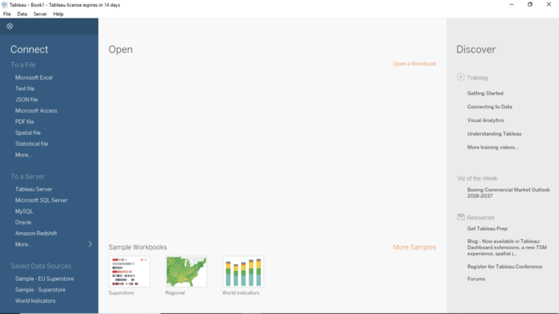
Installation
Depending upon the choice of product, download the software on to the computer. If the following screen appears on clicking the Tableau Icon, you are good to go.
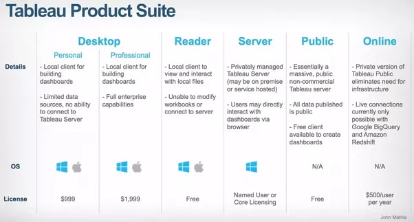
Tableau Desktop, Tableau Public, and Tableau Online, all offer Data Visual Creation and choice depends upon the type of work. In this tutorial, we will be working with Tableau Desktop.
2. Connecting to Excel Data
Data
The data being used in this article pertains to a fictitious airlines company. It shows the number of resolved incidents per Employee per month. There are further two tabs in the excel workbook, but we are only interested in the Resolved Incidents tab.
The first step is to connect the data in Excel format to Tableau. An excel file is connected in the form of .xls or .xlsx files.
Steps
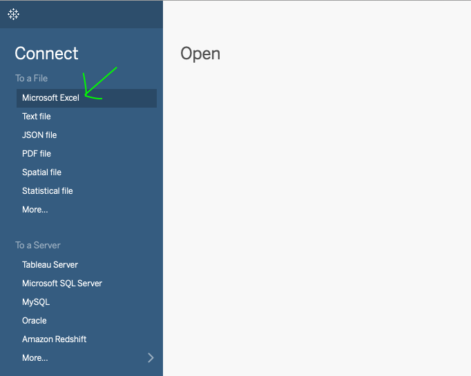
- Under the
Connecttab, clickExcelto import the data into the tableau workspace.
- Under the
Sheetstab, all the sheets in the workbook will become visible. Choose the one which you intend to analyze, i.e. Resolved Incidents.
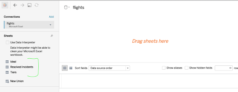
- Double click on the selected sheet, and it opens like a spreadsheet.
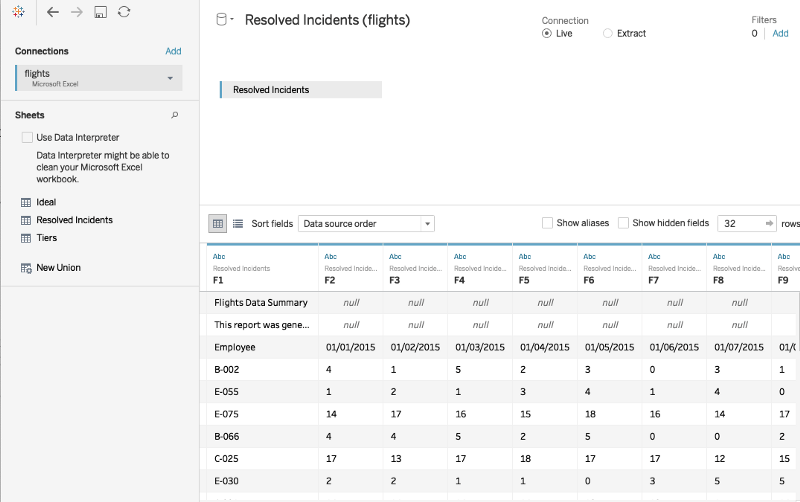
Using Data Interpreter to clean the data
Though the entire data has been transported into the Tableau workspace, it appears that the data is not in the correct format. Data Interpreter is here to help.
- Under the sheets tab, click on the
Data Interpreteroption and the data gets formatted nicely. - To understand how the formatting takes place, click on the
Review the resultstab. This opens an Excel sheet just like the one below clearly explaining how Tableau has done the formatting of the rows and columns. If we click the tab we used, we see which fields are being used as headers, in red, and which are considered data, in green.

Note that Tableau never messes with your original Excel data. Instead, it always creates a copy to work on.
Connecting Additional Data
It is also possible to get more data into the existing data source. This can be achieved by clicking the Add next to the Connections and selecting another excel file. All the files now appear in the view.

3. Reshaping Data to get Insights
We have the data now but merely looking at it will not get us anywhere. The real capabilities of Tableau can only be exploited once we analyze it.
Pivot Tables
If you come from an Excel background, Pivot will be the feature that you must have used a lot of times to aggregate data. Pivot is an advantageous feature in Excel and enables one to extract the significance from a large data set. Tableau also makes it very easy to Pivot the data. This feature merges information from multiple columns and rows into new columns.
Steps
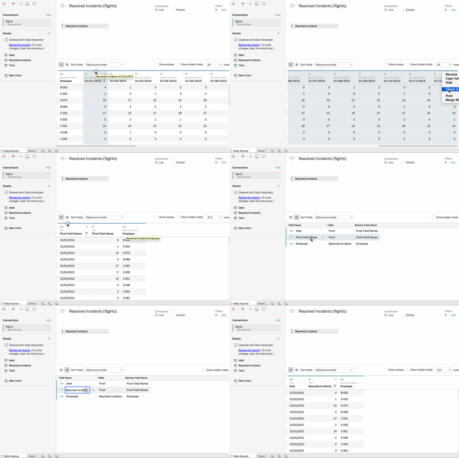
- Select all the columns which we are required to be aggregated. In this case, we want to combine the
Datescolumns. - Next, right-click on the last column and select
Pivot. - The pivot feature merges the information from the original columns and rows into two new columns called Pivot field names and Pivot field values. The “Pivot field values ” is the Aggregated “Resolved Incidents” while the “Pivot field Names” corresponds to the date column. Double click to rename them as
Resolved IncidentsandDate
Metadata Grid
If we click the icon which has been highlighted below, we are brought to the metadata grid.
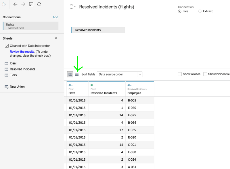
This can be a pretty useful view, especially when we have a large number of fields to view. For now, let’s go back to the standard view.
Split
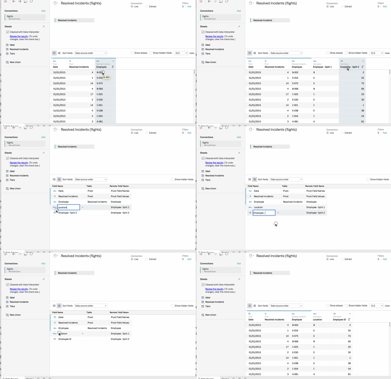
We observe that the Employee column is actually composed of two attributes, i.e. a location code like A, B, C, D or E which is then followed by Employee ID. We can split this column based on the position of the hyphen.
Steps
- Right-click to open the menu and select
split. - Use the Metadata Grid view and rename the split fields.
- The first split should be a
location, and the next one should be theEmployee ID. - Also, we see that there is an
Abcin front of the Date column meaning that Tableau assumes the Date column to be a string. We can easily change this by clicking on theAbcand selectingdateas thedata type. - This completes the initial formatting, and we can move on to
Sheet 1to begin our analysis.
Custom Split
Text to Columns in Excel can be used to separate data which is present in a single column into multiple columns. Custom Split also works on the same principle and uses a delimiter to split numerous items in a single column into multiple columns.
Steps
- In the worksheet, place
Employee ID in the rowsandResolved Incidentsto Columns. Sort the graph.
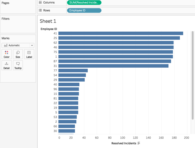
- On sorting the obtained graph, we observe that there is a clear distinction between the two groups of employees. There is a group whose rate of incident resolution is high (above 100), and for others, the rate of resolution is low(less than 50). This second group falls in Tier 2 whose information lies in another excel file called Tiers.
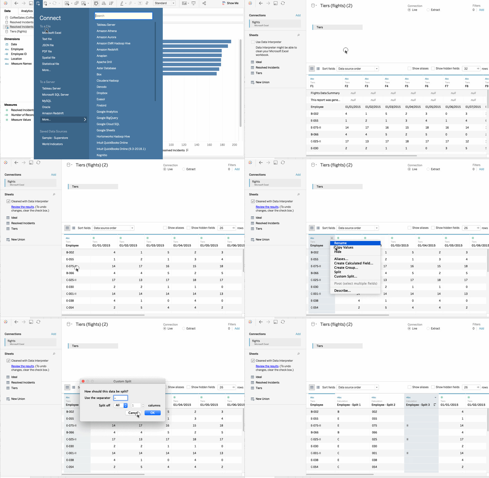
- Add another data source to that same excel file. We see there’s a tab called Tiers. This report is essentially the same as the first report except that it has an II attached to the end of an employee ID if they’re in Tier II.
- Since all rows do not have this ending, a standard split won’t work. In such a case we will use a Custom Split. Simply right-click and select
Custom Split.Next, choose hyphen as a delimiter mandate that we want to break off all columns. Tableau splits the 3rd column with the tier II indicator.
4. Data Blending
Data Blending in Tableau is analogous to V-LOOKUP in Excel, but Tableau makes it so very powerful and easy. VLOOKUP is used when we have two data sources, and we are trying to figure out the matchup between the two. Let’s see how we can achieve results similar to Excel here.
This time we will be using the coffee sales data for the demonstration. There are two data sources. While one contains the coffee consumption data, the other contains coffee sales data.
Steps
- Import the
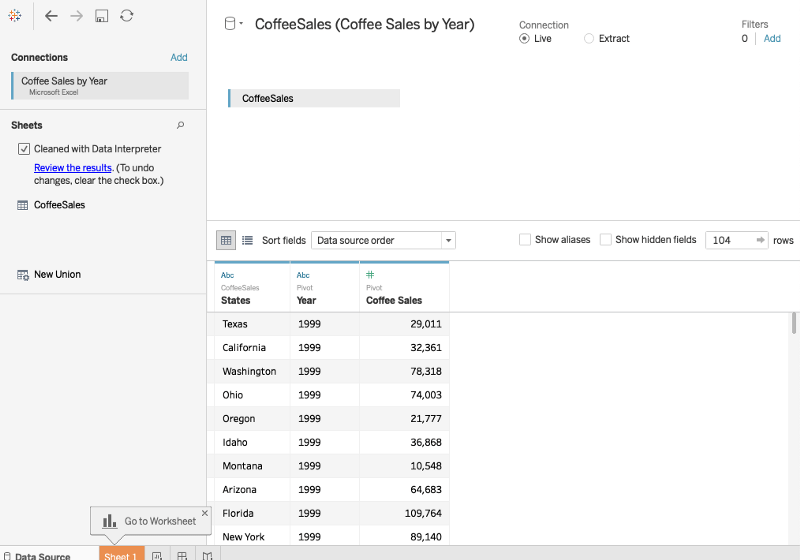
Coffee Salesdata in Tableau and use Data Interpreter to clean the data. Use Pivot to combine all theYearandCoffee Salescolumns.
- In a new worksheet, drag
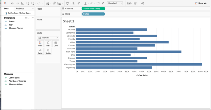
Coffee Salesto Columns andStatesto the Rows. We will get a view which is as shown below. This gives us an idea of Coffee sales in each state.
- Now, let’s say, along with the sales we would also like to know the consumption of coffee in each of the given states. For this, we would first be requiring the data of Coffee consumption for all the states. Let’s import the required excel sheet called
Coffee Consumption.
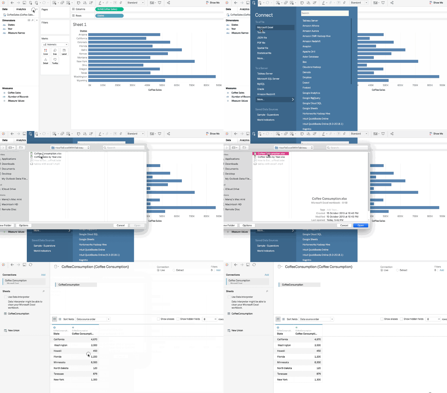
- Drag the
Coffee Consumptionon to the worksheet. Instantly we get an error asking us to create a relationship between the two data sources.
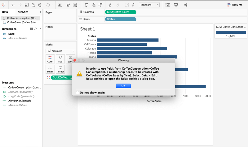
This is precisely what happens in V-LOOKUP where we need to specify the column which is common in both the sheets. On the same lines, during data blending, we have to have two fields which have a relationship with each other. So we navigate to Data > Edit Relationships and provide a matching column in both the sheets which here is the States column.
To be able to show you the blending more clearly, instead of the bar graph let’s use numbers.
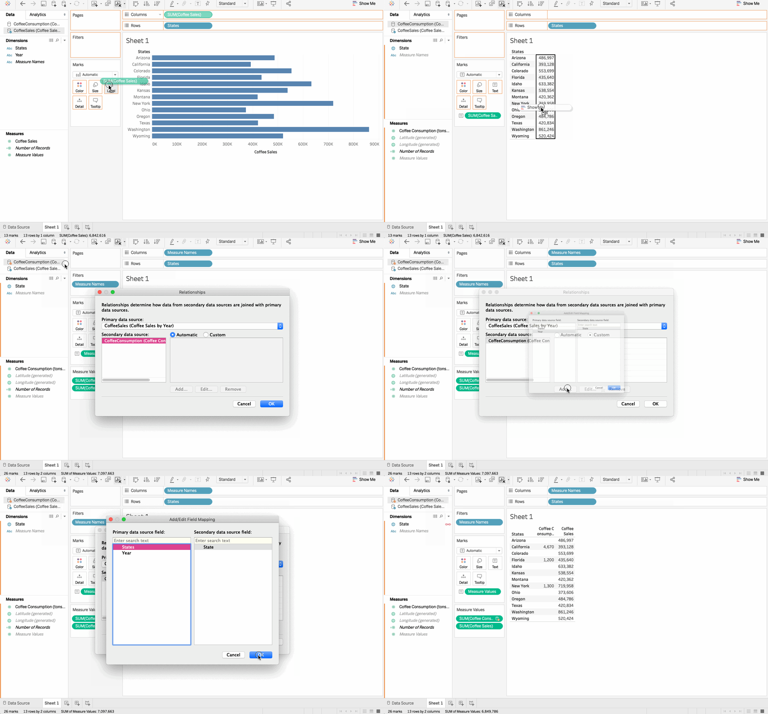
Now we notice a little blend symbol pops up next to the State.
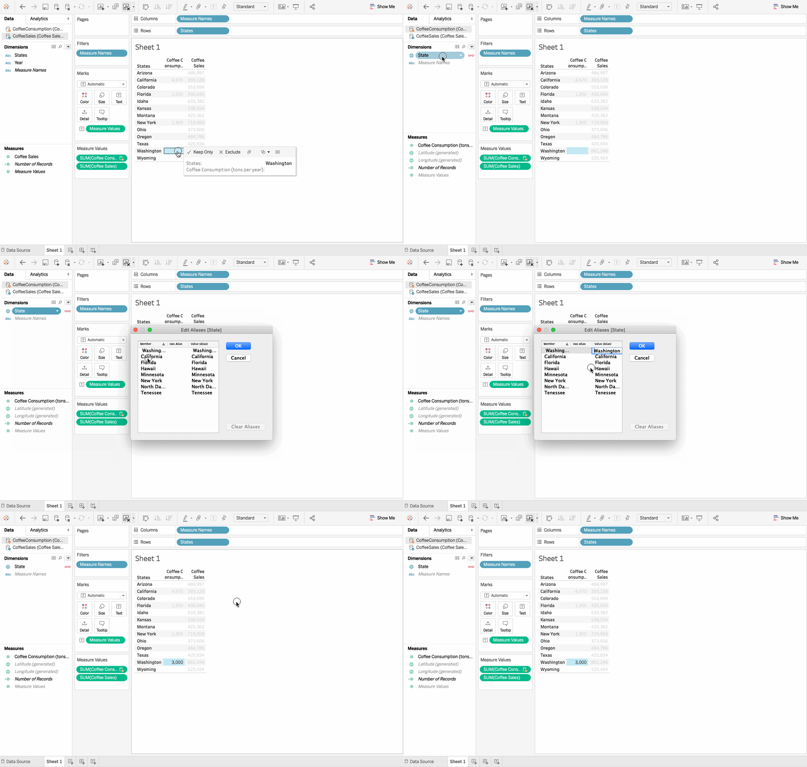
- But something is still not right. There are no consumption values next to Washington even though that data is available in the corresponding excel sheet.
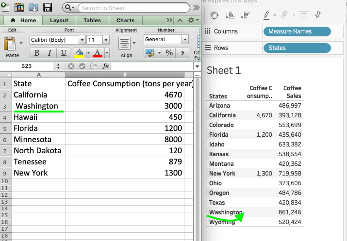
- This is because Washington in the excel sheet is preceded by a blank space unlike in Tableau. This space creates a problem as Tableau sees them as two different string objects. Now, if such a problem would have arisen in Excel, we would have to go back and correct the spelling in the sheet itself. But in Tableau, we need not go to the source but can easily make corrections in the Worksheet by using the
Aliasesoption.
5. Exporting crosstab data from Tableau to Excel
This is a pretty interesting feature of Tableau which allows us to copy and paste data very easily from Tableau to Excel and vice versa.

6. Calculations in Tableau
Calculated Fields
Calculated Fields in Tableau reminds us of the Formulas in Excel. Calculations in Tableau are very straightforward and allow us to manipulate the data in a variety of ways.
The functions in Tableau fall under four major categories:
- Number
- String
- Date
- Others
Dataset
We shall be working with a sample data set names Superstore dataset, that comes pre-loaded with Tableau. It contains information about products, sales, profits, etc. Our aim as Data Analysts is to analyze the data and find critical areas of improvement within this fictitious company.
Steps
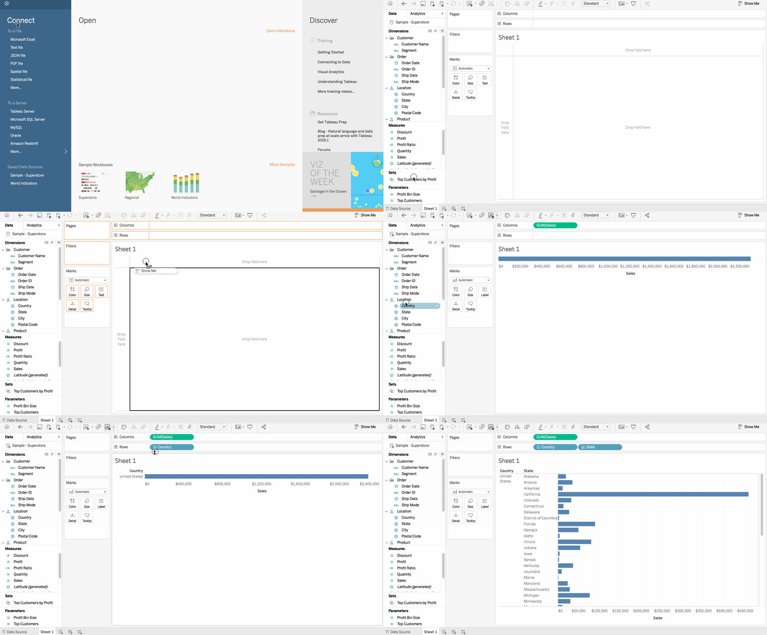
- Import the dataset and drag the
Profitto the columns andLocationon to the Rows. From theLocationenable the Country and State by clicking on the+icon.
-
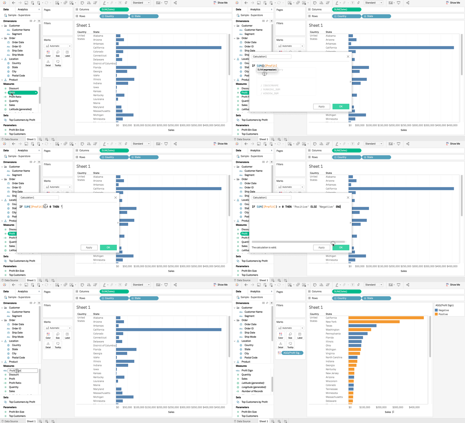
Creating a calculated field can be achieved by right-clicking in the data window and selecting
Create Calculated Field. We then need to define a formula to create a calculated field. Let’s perform a simple calculation on theProfitfield and name it asProfit Sign.IF SUM([Profit]) > 0 THEN “positive” ELSE “negative” END
-
The calculated field gets a little equal sign in front of it signifying that this field has been calculated and wasn’t present in the original field.
- Now, if we bring this calculated field to color, we obtain colored bars for profit.
Ad-Hoc Calculations
Ad-Hoc calculations can be initiated in the worksheet itself by typing in the shell. For Instance, if we want to calculate Sales — Profit as a temporary field, we can proceed as follows:
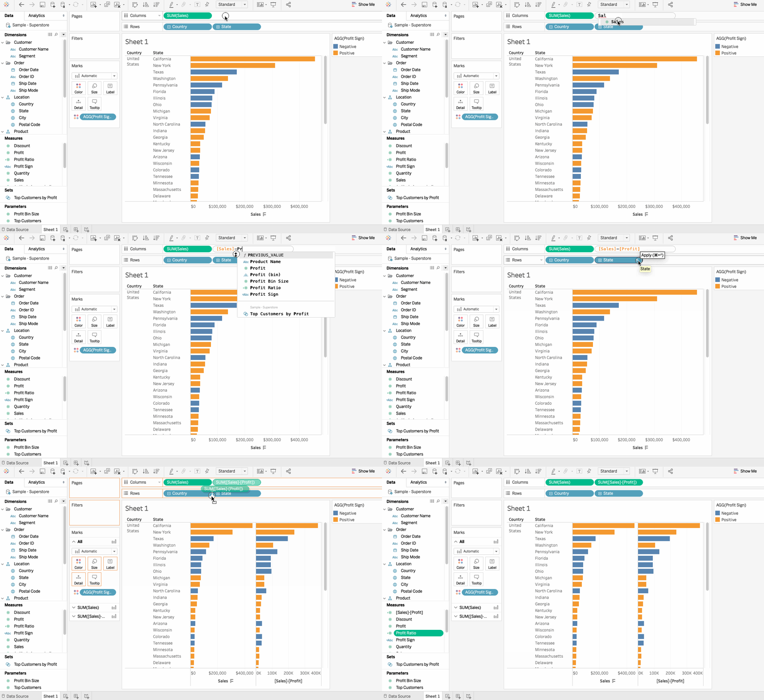
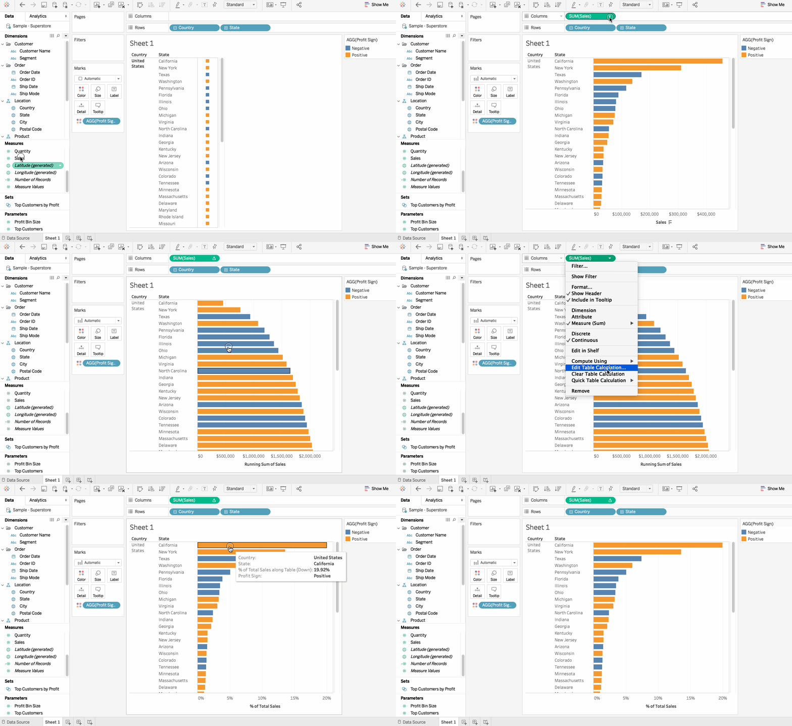
Table Calculations
A Table Calculation is a secondary calculation which means it is performed on top of a returned result. An example might be calculating Total of Sales. We can identify whether a calculation is a Table calculation if it has a triangle mark in front of it. One can either use the table calculation functions in the calculation editor or use Quick Table calculations which are a set of pre-defined, commonly used computations.
7. Conclusion
Using Excel and Tableau together takes the data analysis to the next level. The static spreadsheets can be utilized for advanced exploration, insights, and interactivity. Spreadsheets are pretty useful tools and when leveraged with the expertise of Tableau can help to make the analysis more powerful and insightful.
If you would like to learn more in spreadsheets, take DataCamp's Data Analysis with Spreadsheets course.