Course
Data Visualization in Google Sheets
4 hr
45.8K
Welcome to part ten of our month-long data demystified series. As part of Data Literacy Month, this series will clarify key concepts from the world of data, answer the questions you may be too afraid to ask and have fun along the way. If you want to start at the beginning, read our first entry in the series: What is a Dataset?

This week, we’ll cover common data visualizations and how to interpret them. Data visualization is often called the gateway drug into data science; this blog post will look at data visualizations that capture distributions and how to interpret them.
A key use case of data visualization is capturing the distribution of a variable. Capturing distributions allows you to understand critical statistical properties of the data you’re visualizing and help audiences make educated data-driven decisions on key outcomes. Before diving in, here are some key pointers to keep in mind when visualizing distributions:
The four visualizations below help us capture these pointers.
A histogram is a graph showing a numerical variable's distribution with bars. It is a convenient way to illustrate the major features of the distribution, especially when the data set is large. Key examples where histograms shine are capturing the salary distribution of employees in a company or the blood sugar levels of a cohort of patients.
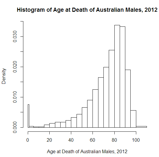
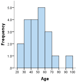
A histogram depicting the age of death for Australian Males in 2022 (Source: Oosterbaan)
To build a histogram, the numerical data is first divided into several ranges or bins, and the frequency of occurrence of each range is counted. The horizontal axis shows the range, while the vertical axis represents the frequency or percentage of occurrences of a range. Histograms immediately showcase how a variable's distribution is skewed or where it peaks. Here are examples from our Data Visualization for Everyone course.
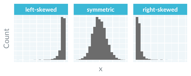
A histogram can be symmetric, left-skewed, or right-skewed. (Source: DataCamp)
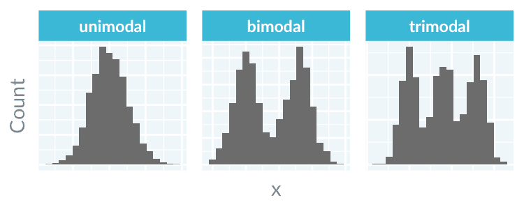
A histogram can have multiple modes (Source: DataCamp)
While histograms and bar charts bear resemblances, they serve distinct functions and thus are not to be confused. Here are the key differences.
|
Histogram |
Bar chart |
|
|
Functional difference |
To display the distribution of a numerical variable. |
To compare values across categories. |
|
Visual difference |
There is no space between each bar. |
There is usually a space between bars. Also, |
Just like a histogram, a density plot represents the distribution of a numerical variable. Unlike a histogram, a density plot uses a smooth line instead of bars. The horizontal axis of a density plot is the numerical variable, while the vertical axis is the probability density function. The probability that the variable lies between a range is the area under the graph.
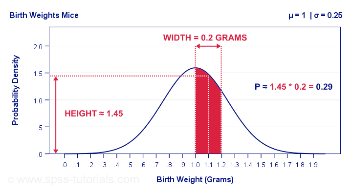
The probability that a mouse has a birth weight of between 1.0 to 1.2 grams is the area under the density plot (Source: SPSS)
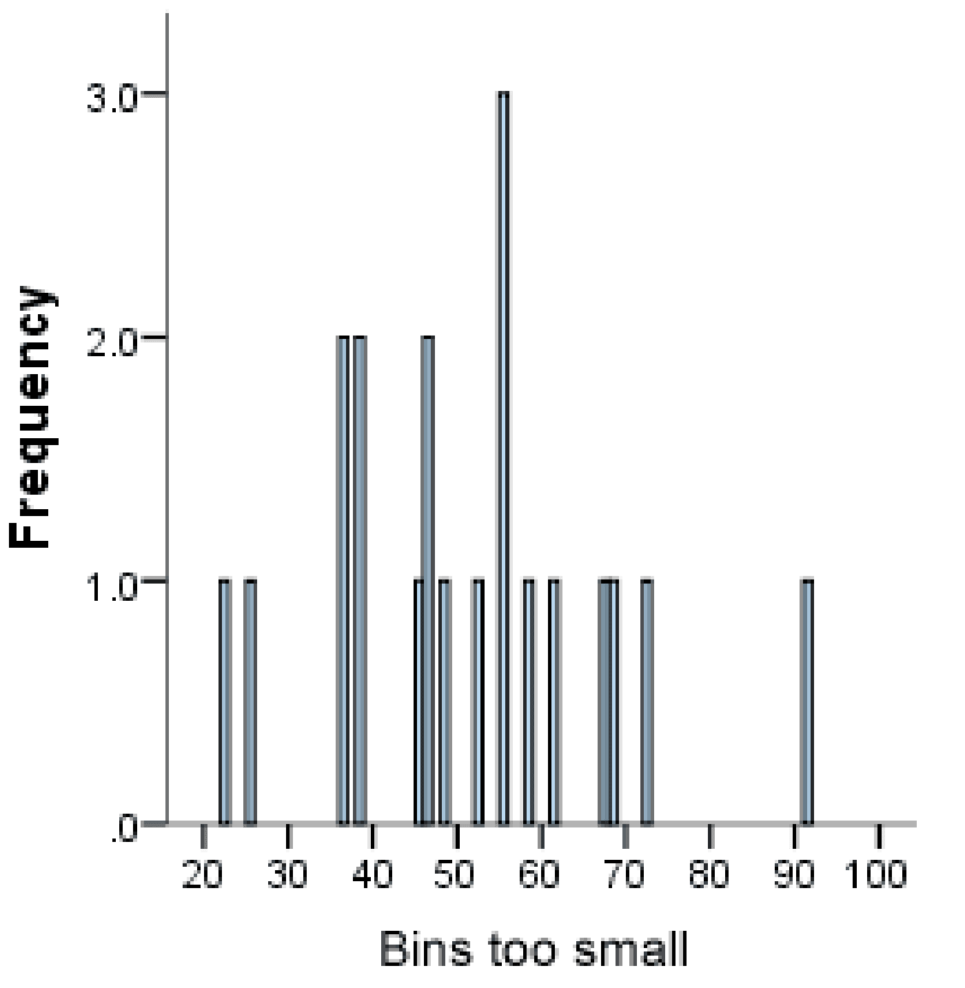
A density plot can show the distribution shape more effectively than a histogram. A histogram with too small or large of a bin count might hide the actual shape of the underlying distribution. In contrast, a density plot does not require binning and displays smooth distribution curves.
 |
 |
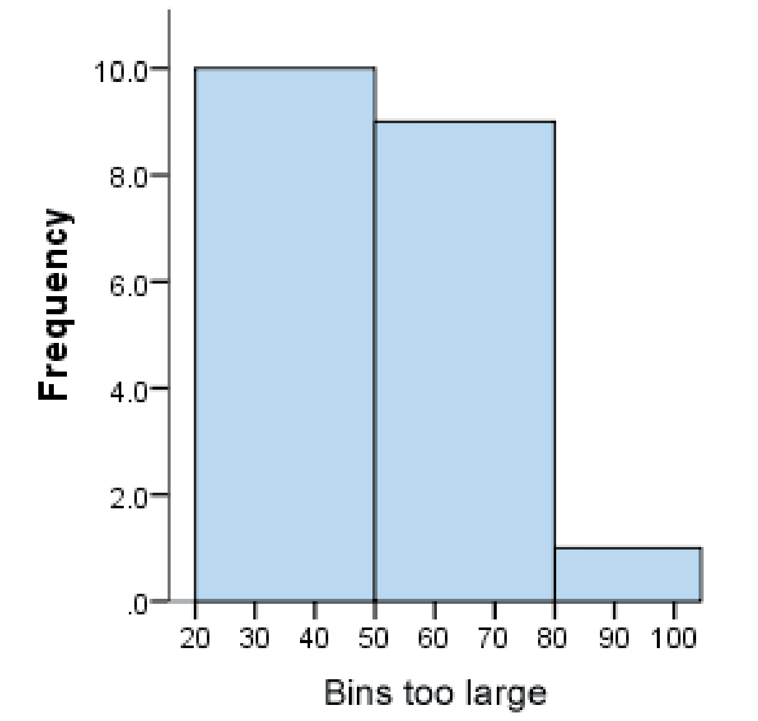 |
The choice of bin count in a histogram is crucial. (Source: Laerd Statistics)
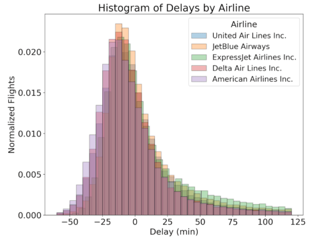
A density plot is also better at comparing multiple distributions than a histogram.
 |
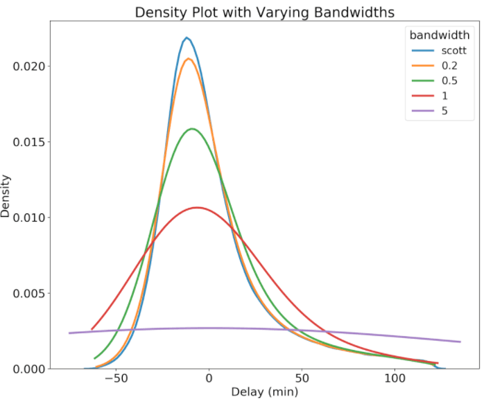 |
Comparing distributions with density plots vs histograms (Source: Koehrsen Will)
Histograms are well-suited for displaying the overall distribution of the data, but box plots are excellent at summarizing a distribution.
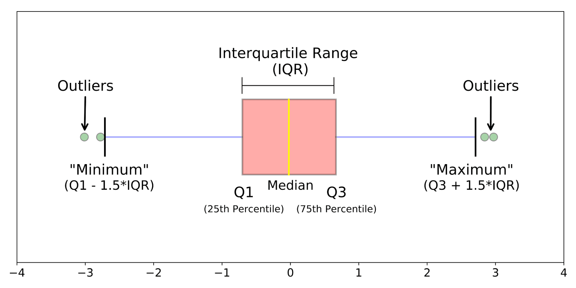
The anatomy of a box plot (Source: Galarnyk)
Visualizing data with a box plot reveals the following:
A violin plot is a hybrid between a box plot and a density plot.
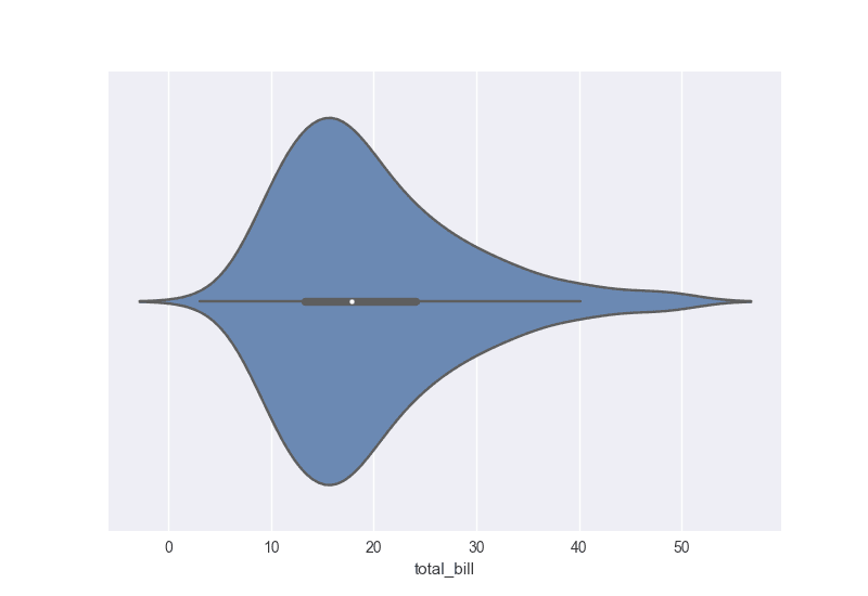
A violin plot showing the distribution of total bill (Source: DataCamp)
Like in a density plot, a violin plot displays a density distribution. Like in a box plot, a violin plot also shows summary statistics. Violin plots are an effective tool for simultaneously displaying and summarizing the distribution of a numerical variable.
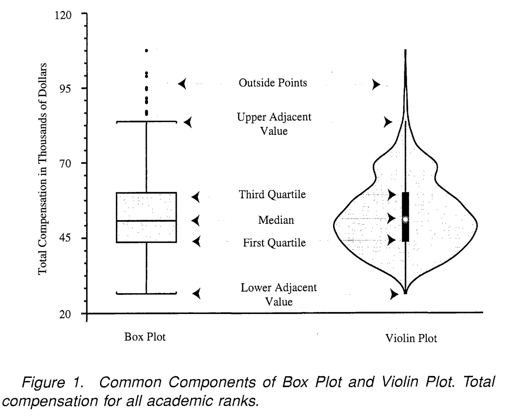
The anatomy of a violin plot (Source: Hintze and Nelson)
We hope you enjoyed this short introduction to data visualization. In the next series entry, we’ll look at how AI is covered in the news and how to grow a healthy skepticism around the latest advancements in the field. To start your data learning journey today, check out the following resources.
Data Visualization Courses
Course
Course
Course
blog
Richie Cotton
10 min
blog
Richie Cotton
5 min
blog
Richie Cotton
6 min
blog
Richie Cotton
5 min
blog
Richie Cotton
4 min
cheat-sheet
Richie Cotton