When DataLab first launched, we worked hard to ensure that it was the best possible experience for performing data science and data analytics work. This meant building a fast, lightweight editor, enabling real-time collaboration, and producing professional read-only reports.
At the same time, we relied on third-party tools for performing our internal analyses. Product metrics such as the number of users using DataLab and time spent on the platform were tracked using other tools. We realized that if we wanted to be serious about DataLab as a tool for professional work, we would need to use it ourselves.
This article will dive into how we conducted internal analytics in the past and how we transitioned to DataLab. It will also cover the advantages and learnings we gained from the transition.
Our pre-DataLab analytics
Before DataLab, our primary tool for internal analytics on the product was Metabase. Metabase is a business intelligence tool connected to a data lake containing information on DataLab content and activity. With Metabase, we could quickly run SQL queries, generate reports, and even create dynamic dashboards.
Metabase was used widely across the team. We used it to monitor how engaged users were with different types of content, how much time our users spent in Workspace, and how many users were interacting with DataLab on a daily, weekly, and monthly basis.
Using DataLab for our analytics at this point was not that common. It only happened when we bumped into the limits of SQL or Metabase’s no-code visualization capabilities. In these instances, we would export the raw data, manually add it to a new workbook and then continue the analysis in Python. However, this process was cumbersome and made updating data a pain.
Why we transitioned to DataLab
As DataLab has grown, the questions we want to answer about our users and their time on DataLab have become increasingly complex. As convenient as Metabase can be, many of our questions have required the additional tools provided by Python and R.
We also knew that if we wanted to provide the best possible user experience, we would need to use it ourselves, a practice called “dogfooding”. Indeed, what better way to understand the limitations and frustrations of DataLab than to use it ourselves?
For these two reasons, we set the goal to transition the bulk of our analytics from Metabase to DataLab beginning in the summer of 2022.
The transition
The transition began when we launched SQL cells inside of DataLab. Now, we were able to query the same data we accessed in Metabase, but with the query results instantly transformed into a Python or R DataFrame (depending on what tool we are using). We could easily switch between querying our database and analyzing the results with the tools of our choice. Within weeks, we migrated most of our existing queries from Metabase into DataLab.
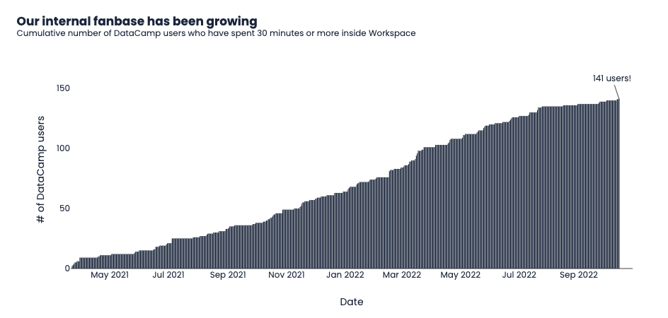
As of the time of writing, we have 141 different DataCamp users who have spent 30 minutes or more inside of DataLab. As can be seen, by the chart, this has been a steady progress!
We are continually recruiting new DataCampers into DataLab!
The advantages of switching to DataLab
Since switching to DataLab, we have found several key advantages in our day-to-day work:
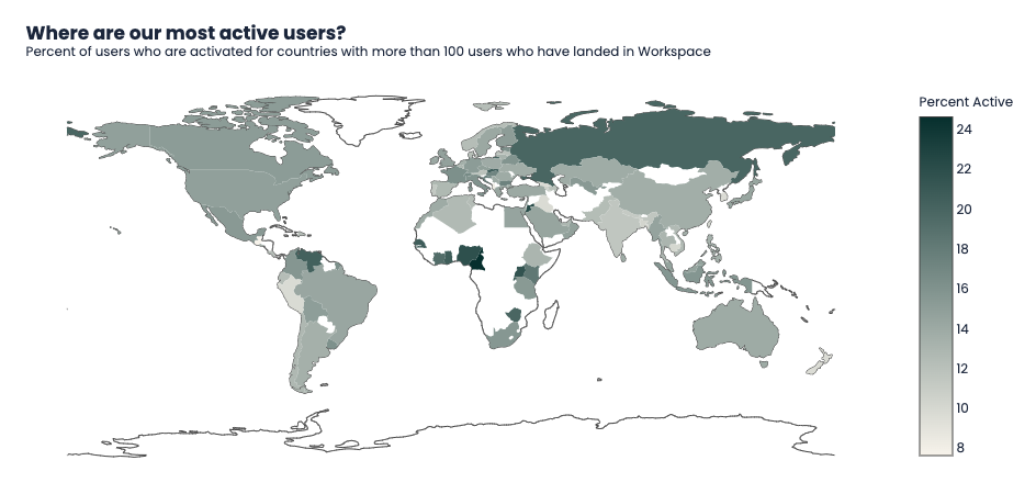
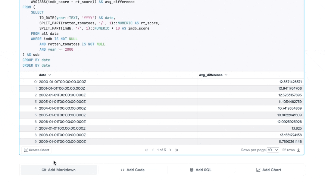
- Fully customizable visualizations: While Metabase offers many visualizations and customizable attributes, the possibilities are not endless. With DataLab, the results of our SQL queries are returned as DataFrames. This means we can use Python libraries such as Plotly to create charts with annotations, custom themes, and unique plot types.
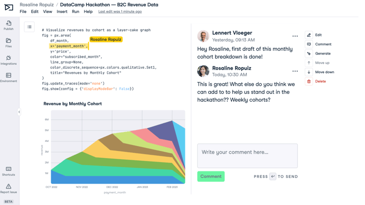
An example of one of the visualizations we have created inside DataLab by accessing our internal data.
- Advanced analytics: By combining SQL with Python or R, we can instantly analyze our data with techniques not possible in SQL. This has allowed us to do things such as segmenting our users and training classification models to predict how users are working inside of DataLab.
- Descriptive reporting: A dashboard is excellent for users familiar with the product. However, a dashboard can be challenging to interpret for newcomers or people outside of the team. With DataLab, we can embed written summaries throughout our reports that can be read later by relevant stakeholders.
- Shareable and social publications: The ability to share a link to a published workbook has been incredibly valuable. Published analyses have ended up in the hands of our CEO and other executives, who then add feedback in the form of comments and questions. Combined with the descriptive nature of published workbooks, management could read through analytics work at their leisure without an in-person briefing.
- No code charts: Most DataCampers have SQL skills, but not everyone is as comfortable in Python or R. Chart cells enable less technical users to communicate their insights using high-quality visualizations without writing a line of code.
Our no-code chart cells in action!
What we’ve learned so far
As of mid-October, DataCampers have put a cumulative 4132 hours inside DataLab! We have now migrated all central reporting related to quarterly targets and product usage to DataLab. Below are a summary of our key learnings and how these have impacted DataLab as a product:
- Speed is critical: It's annoying to wait longer than expected for your workbook to load, code to execute, or query to return results. The experience should be at least as fast and ideally faster than working in a locally running Jupyter Notebook. Our team has made considerable strides in reducing notebook and publication loading times. They have also worked to ensure that code execution is comparable to a local notebook.
- Not everyone wants to see the code: In the past, our publications would contain large cells full of complicated SQL queries and dense Python code. While this was useful for colleagues to review the technical aspects of a report, it often got in the way of the true insights of a report. You could hide cells and publications by switching to the JupyterLab editor in DataLab, but this wasn’t reflected in the DataCamp Notebook editor. Knowing this, we have released a way to effortlessly hide code and SQL cells in your workbooks effortlessly. This allows you to ensure a beautiful read-only report you can share with any stakeholder. Our users love it.
- Re-running notebooks can be frustrating: For much of our tracking, we rely heavily upon daily updates to the number of users, activity levels, and feature adoption. Unlike a dynamic dashboard that refreshes when new data is available, workbooks must be re-run every time. Based on our own experiences, we are planning to support workbook execution scheduling. This will ensure that reports always contain the latest insights.
These learnings don't include the many minor tweaks we have made to the editor since we switched to DataLab. The user interface, dashboard, and features such as chart cells are undergoing continuous improvement, driven by feedback from users, both internal and external.
Going forward
While the process of using our own product has revealed many ways in which we can improve, we know that is only half the story. In combination with feedback we’ve received internally, our team has been hard at work interviewing DataLab users. These interviews complement our findings and help us catch what we may miss through internal testing.
We also launched a user survey in late September as part of our biweekly newsletter. This survey allowed us to collect quantitative information from our users. These results are helping us identify high-priority initiatives for DataLab and understand how our product is used. And, of course, the survey data was analyzed and visualized with DataLab!
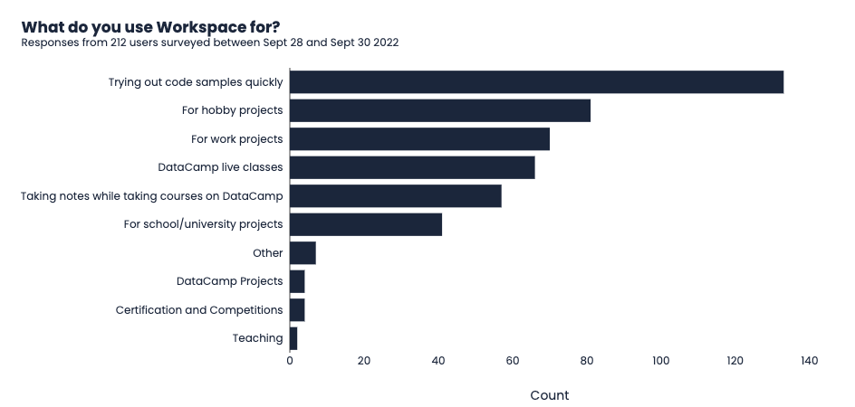
The primary reason our users reported using DataLab was to try out code samples quickly. How do you use DataLab?
In the coming months, we plan to move even further towards a DataLab-exclusive analytics environment. This transition becomes easier with each new feature and improvement our engineering team makes to the product.
If you’re interested in using DataLab for your own internal data analytics and data science needs, you can read more about it here. Or better yet, jump into an empty Python or R workbooks and get coding now!