
Kurs
Generalisierte lineare Modelle in R
4 Std.
21.7K
Fitting a straight line to data that curves is never a good idea.
Linear regression assumes the relationship between your predictors and the target is a straight line. Unfortunately, most real-world relationships aren't. Think of the relationship between income and spending or time and growth - they bend, go flat, bend again, and shift direction in ways that can’t be represented with a single slope.
Spline regression handles this by letting the relationship bend where it needs to, without fitting some wild unconstrained curve. The idea is to fit multiple smooth polynomial segments across the predictor range and combine them at specific points.
In this article, you'll learn the core concepts behind spline regression, how knots control flexibility, the main spline types, and how to apply them in practice.
Before you learn about splines, read our tutorial that will teach you everything you need to know about simple linear regression.
Spline regression is a regression technique that models nonlinear relationships using piecewise polynomial functions joined together at specific points called knots.
So, instead of making one equation to describe the entire relationship, spline regression breaks the predictor range into smaller pieces and fits a separate polynomial on each piece. These pieces meet at the knots, and constraints make sure the transitions are smooth.
The end result is somewhere between two extremes. It's more flexible than linear regression, which can only make a single straight line through your data. And it's more structured than fully unconstrained nonlinear models like deep neural networks or kernel methods, which can fit almost anything but tell you very little about what they've fit.
Splines show up so often in applied statistics for this reason.
Real data almost never follows a straight line.
Linear regression is the default starting point for modeling relationships, but it has a strong assumption: the effect of a predictor on the outcome stays constant across the range. When the actual relationship curves or changes direction, a straight line will underfit it. You get errors at the extremes and a model that can’t follow the pattern.
The fix is to use a more flexible model. High-degree polynomial regression is one option - you add x^2, x^3, x^4 terms until the curve bends enough to match your data. But polynomials become unstable at the edges of the data as they swing up or down where you have few data points. That behavior is called Runge's phenomenon, and it makes high-degree polynomials risky for prediction.
Spline regression is between these two extremes.
You get local flexibility where the data bends, without the global instability of a single high-degree polynomial. Each segment is a low-degree polynomial (usually cubic) so no single part can behave unexpectedly. And because the segments are joined smoothly at the knots, the overall curve still looks like one continuous function.
So, in a nutshell, a spline offers enough flexibility to follow complex patterns and enough structure to stay behave at extremes.
Spline regression always follows a simple three-step workflow.
These constraints are what give splines the look of a single, smooth curve that bends locally but flows continuously across the entire predictor range. Visually, you can't tell where one polynomial ends and the next begins.
The knots, the polynomial degree, and the continuity constraints together define the spline. If you change any of them, you get a different kind of spline with different properties - which is exactly what the next sections cover.
Knots are the points along the predictor axis where one polynomial segment ends and the next one begins.
You can think of them as the joints of the spline. If you place a knot at x = 5, the model fits one polynomial for values below 5 and a different polynomial for values above 5. The two polynomials meet at the knot, and the continuity constraints make sure they are smoothly connected. If you add more knots, you get more segments, which means the curve can bend in more places.
This is why knots are the main lever for controlling how flexible the model is.
The number of knots determines how many separate polynomial pieces make up the spline. The location of the knots determines where the curve is allowed to change shape. A spline with two knots can only bend in a few places. A spline with twenty knots can follow almost every data point.
So picking the right number and placement of knots is the main decision in spline regression.
If you place too few knots, the spline doesn’t have enough segments to follow the actual pattern in the data. The curve stays too rigid. It behaves almost like a low-degree polynomial - flexible in a general way, but unable to capture local changes.
Imagine fitting a spline with one knot to data that has three distinct phases: a rising trend, a plateau, and a drop. With only one knot, the spline has just two segments to work with. It can capture the rise and one of the other phases, but not all three. You end up with the same problem as linear regression - errors where the spline can't match the shape of the data.
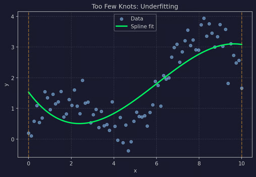
Too few knots example
Too few knots leads to underfitting. The model is too smooth to be useful.
The opposite problem is just as bad. If you place too many knots, the spline has so many segments that it starts fitting the noise in the data instead of the actual pattern. The curve wiggles between every observation and chases random variation instead of the underlying trend.
A spline with twenty knots on a dataset of fifty points will look more like a connect-the-dots drawing than a model. It’ll fit the training data almost perfectly, but predictions on new data will be unreliable. Small changes in the input lead to large, unpredictable changes in the output.
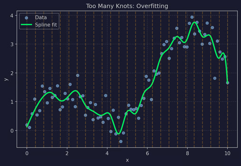
Too many knots example
Too many knots leads to overfitting. The model is too flexible to generalize.
You want enough knots to get the real bends in the data, but not so many that the model starts memorizing noise. The following sections will go into how to make that call in practice.
Splines come in a few different flavors, and the choice mostly comes down to what kind of polynomial you use in each segment and what constraints you put on the curve.
Linear splines are the simplest version. Each segment is a straight line, and the segments connect at the knots.
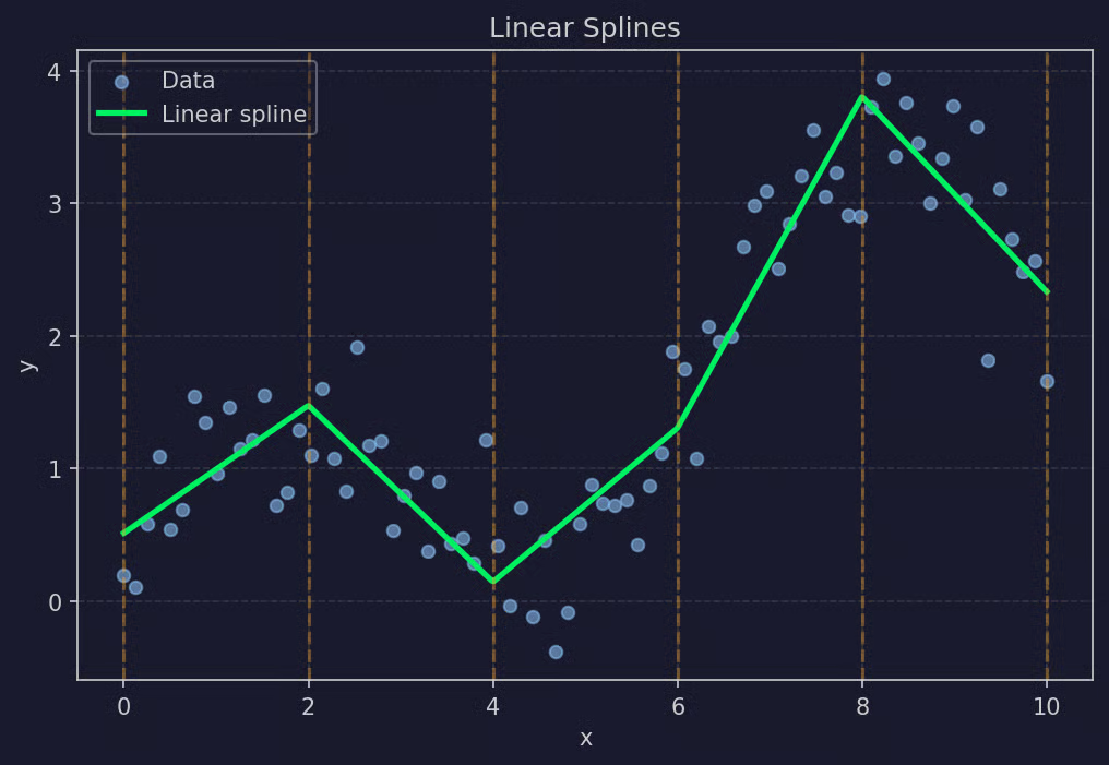
Linear splines example
The continuity constraint is loose here, as the values from both sides must match at the knot, but the slopes can change. The result looks like a series of connected line segments with corners at each knot. It's flexible enough to handle simple bends, but the curve sometimes isn't smooth.
Linear splines work well when you only care about getting the broad trends and don't mind the visual sharpness. They're also the easiest to interpret since each segment is just a line with its own slope.
Cubic splines are the default choice in most applications. Each segment is a cubic polynomial (degree 3), and the continuity constraints are stricter than for linear splines.
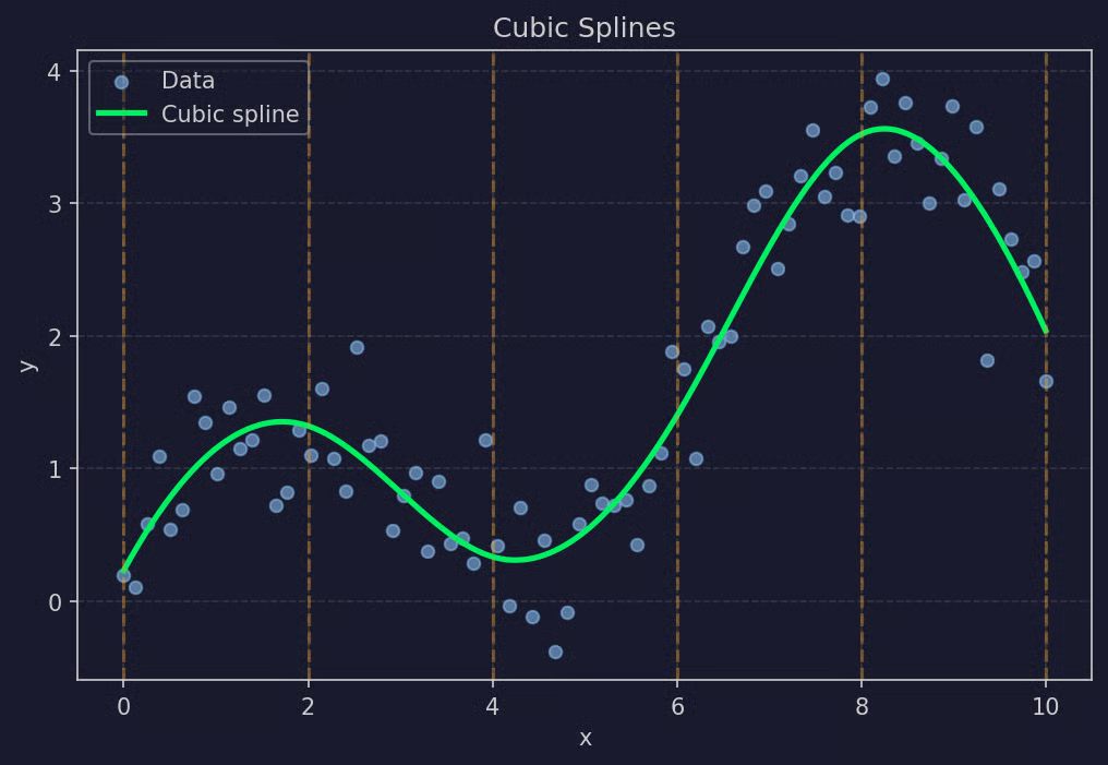
Cubic splines example
At every knot, three conditions must be true: the values match, the first derivatives match, and the second derivatives match. This means there are no jumps, no corners, and no sudden changes in curvature. The curve flows through the knots without any visual tell of where the transitions happen.
Cubic is the lowest polynomial degree that allows for smooth curvature changes. That's why it’s so popular. Higher degrees rarely add useful flexibility and just make the model harder to control.
Natural cubic splines are a variation that adds extra constraints at the boundaries of the data.
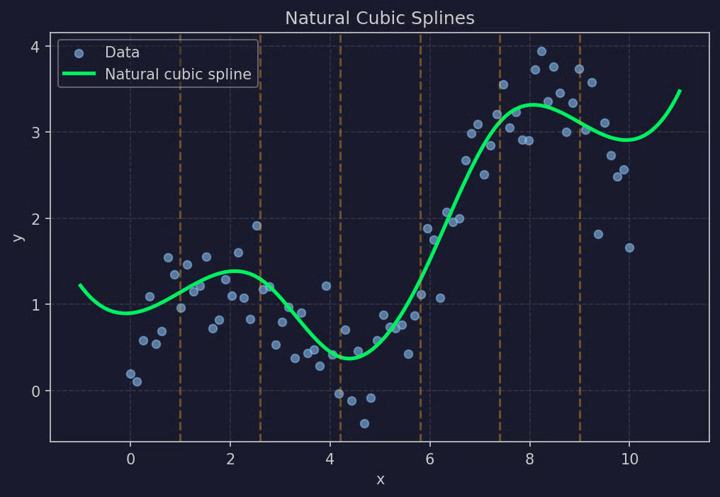
Natural cubic splines example
The problem with regular cubic splines is that they can behave strangely at the edges, especially where you have few data points. The leftmost and rightmost segments are still cubic polynomials, and cubic polynomials can swing up or down quickly when extrapolating.
Natural cubic splines go around this by forcing the second derivative to be zero at both boundary knots. In practice, this means the curve becomes linear beyond the outermost knots. The extrapolation behavior is much more stable, which makes natural cubic splines a better choice when you care about predictions near the edges of the data.
B-splines (short for basis splines) are a different way of constructing splines. Instead of directly defining each polynomial segment, B-splines build the spline as a weighted sum of basis functions.
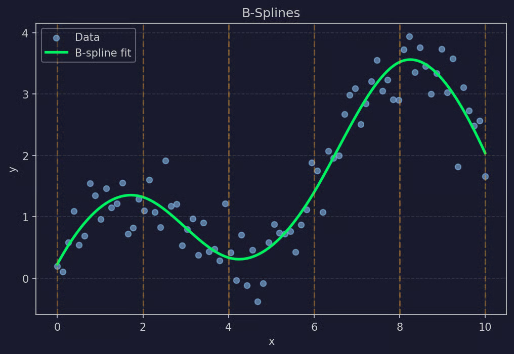
B-splines example
Each basis function is itself a small spline that's nonzero only in a limited region. The full spline is the sum of these basis functions, each multiplied by a coefficient that the regression estimates.
B-splines are numerically stable and easy to extend. Most modern spline implementations in Python and R use B-spline representations, even when the user-facing interface looks like a regular spline. If you've ever called bs() in R or used SplineTransformer in scikit-learn, you've used B-splines.
Both polynomial regression and spline regression handle nonlinear relationships, but they take very different approaches. The difference comes down to how the curve is built.
Polynomial regression fits a single global polynomial across the entire predictor range. You pick a degree (2, 3, 5, 10), and the model finds one set of coefficients that minimizes error across all the data. The curve has one equation, and that equation describes the relationship everywhere.
This sounds clean, but has a problem. A single polynomial has to balance the fit across the entire range, so what happens in one region affects what happens in every other region. If you increase the degree to handle a sharp bend in the middle of the data, you’ll see the curve start swinging at the edges. This is the Runge's phenomenon I mentioned earlier - high-degree polynomials become unstable near the boundaries of the data.
The other issue is that polynomial regression has no concept of locality. A spike at x = 5 can change the shape of the fit at x = 50, because every observation contributes to the same global equation.
Spline regression splits the predictor range into segments and fits a low-degree polynomial in each segment. The polynomials are connected smoothly at the knots, but each one is independent in the sense that its shape is driven mostly by the data in its own region.
This gives you local flexibility. A region with a sharp bend gets a more curved polynomial. A region with a flat trend gets a near-flat one. And because each segment is low-degree (usually cubic), no single part can behave strangely at extremes. You get a smoother, more stable fit, especially near the edges of the data.
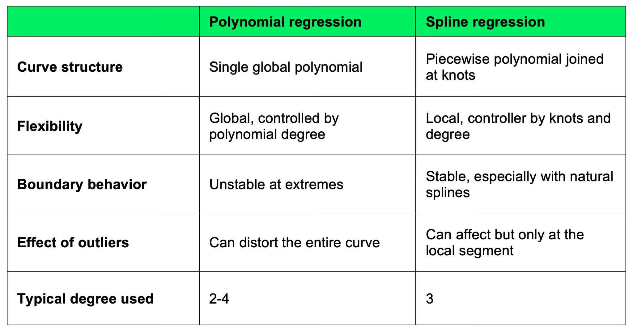
Polynomial versus spline regression
So if your relationship is mildly nonlinear and you’re fine with a global fit, polynomial regression can work. If you have a more complex pattern or care about predictions near the boundaries, splines are the safer choice.
Knot selection is the part of spline regression that matters the most. Too few knots leads to underfit, and too many cause overfit. And where you place them changes which patterns the model can capture.
There are a few approaches, and most of the time you’ll combine a couple of them.
The tradeoff is the same one you see in every regression problem: flexibility versus complexity. More knots mean more flexibility, which lets the model follow finer patterns but also lets it chase noise. Fewer knots mean a more stable, more interpretable model that might miss actual patterns.
Start with 3-5 knots placed at quantiles, then check the residuals. If you see systematic patterns the spline isn’t catching, add a knot in that region. If the fit looks wiggly, remove one. Cross-validation is worth using when you need to defend the choice or when the model is going into production.
Spline regression shows up wherever someone needs to model a smooth nonlinear effect without committing to a specific functional form. Here are a couple of common areas:
In all of these cases, splines give you flexibility where you need it, without forcing you to guess the functional form of the relationship. That makes them a good fit for exploratory modeling and a solid choice for production models when interpretability matters.
Python has three common ways to fit spline regression: scikit-learn for an ML-style pipeline, patsy for formula-based model specification, and statsmodels for statistical inference. I’ll now go through each.
scikit-learn gives you SplineTransformer, which converts a numeric feature into a set of B-spline basis functions. You then feed those features into any linear regression model.
import numpy as np
from sklearn.linear_model import LinearRegression
from sklearn.preprocessing import SplineTransformer
from sklearn.pipeline import make_pipeline

# Data
np.random.seed(42)
x = np.linspace(0, 10, 100).reshape(-1, 1)
y = np.sin(x).ravel() + 0.3 * x.ravel() + np.random.normal(0, 0.3, 100)

# Spline features + linear regression pipeline
model = make_pipeline(
    SplineTransformer(n_knots=5, degree=3),
    LinearRegression()
)
model.fit(x, y)
y_pred = model.predict(x)

print("R^2 score:", model.score(x, y))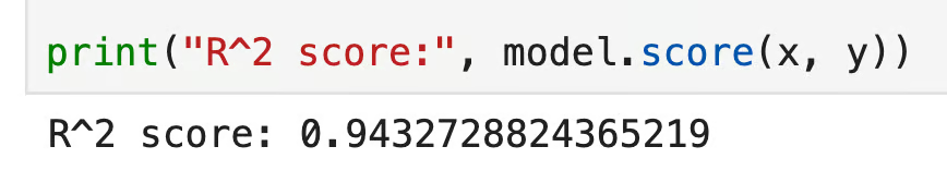
scikit-learn R2 score
The SplineTransformer creates the spline basis with 5 knots and cubic polynomials. Then, LinearRegression finds the coefficients for each basis function. You can swap in any sklearn regressor here - ridge, lasso, anything that fits a linear model on the transformed features.
This approach fits the sklearn workflows, but you don’t get statistical output like standard errors or p-values. For that, you’ll want patsy or statsmodels.
patsy is a formula-based interface for building design matrices. It’s the closest thing Python has to R’s model formulas, and it’s the standard way to construct spline features for use with statsmodels.
import numpy as np
import pandas as pd
from patsy import dmatrix
import statsmodels.api as sm

np.random.seed(42)
x = np.linspace(0, 10, 100)
y = np.sin(x) + 0.3 * x + np.random.normal(0, 0.3, 100)
df = pd.DataFrame({"x": x, "y": y})

# B-spline basis using patsy
spline_basis = dmatrix("bs(x, df=6, degree=3)", data=df, return_type="dataframe")

# Fit with statsmodels OLS
model = sm.OLS(df["y"], spline_basis).fit()
print(model.summary())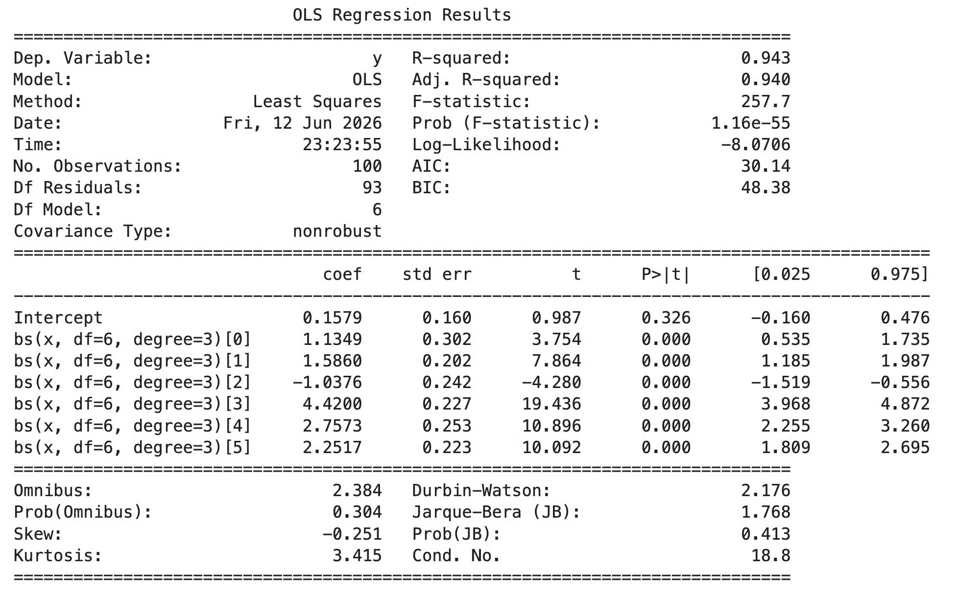
patsy model summary
The bs() function inside the formula tells patsy to build a B-spline basis with 6 degrees of freedom and degree 3 (cubic). patsy returns the design matrix, which goes directly into sm.OLS(). The df parameter controls the number of spline basis functions - higher values give you more flexibility, similar to adding more knots.
If you want natural splines, just change bs() for ns():
spline_basis = dmatrix("ns(x, df=6)", data=df, return_type="dataframe")statsmodels also has a formula API that integrates with patsy. This is the cleanest version when you want a one-line spline regression with full statistical output.
import statsmodels.formula.api as smf

model = smf.ols("y ~ bs(x, df=7, degree=3)", data=df).fit()
print(model.summary())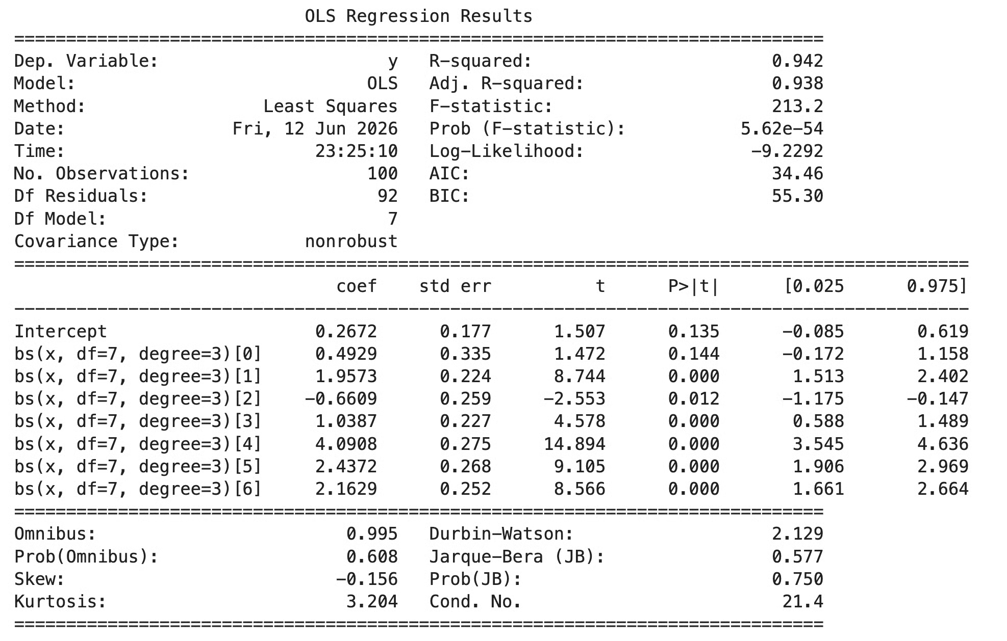
statsmodels model summary
The summary() output gives you coefficients for each spline basis function, standard errors, p-values, and the usual fit statistics. The coefficients themselves aren’t directly interpretable, as each one corresponds to a basis function, not to a real-world quantity. You interpret the fit by plotting predictions across the predictor range.
For most statistical workflows, the statsmodels formula API is the most convenient choice. Use scikit-learn when splines are part of a larger ML pipeline.
R has the best built-in support for splines of any of the major languages. The splines package comes with base R, and its two main functions - bs() and ns() - work directly inside any regression formula.
The bs() function creates a B-spline basis. The ns() function creates a natural cubic spline basis. Both produce a matrix of spline features that R’s formula system inserts into the model automatically.
# Data
set.seed(42)
x <- seq(0, 10, length.out = 100)
y <- sin(x) + 0.3 * x + rnorm(100, sd = 0.3)
df <- data.frame(x = x, y = y)

# Cubic B-spline with 6 degrees of freedom
library(splines)
model <- lm(y ~ bs(x, df = 6, degree = 3), data = df)
summary(model)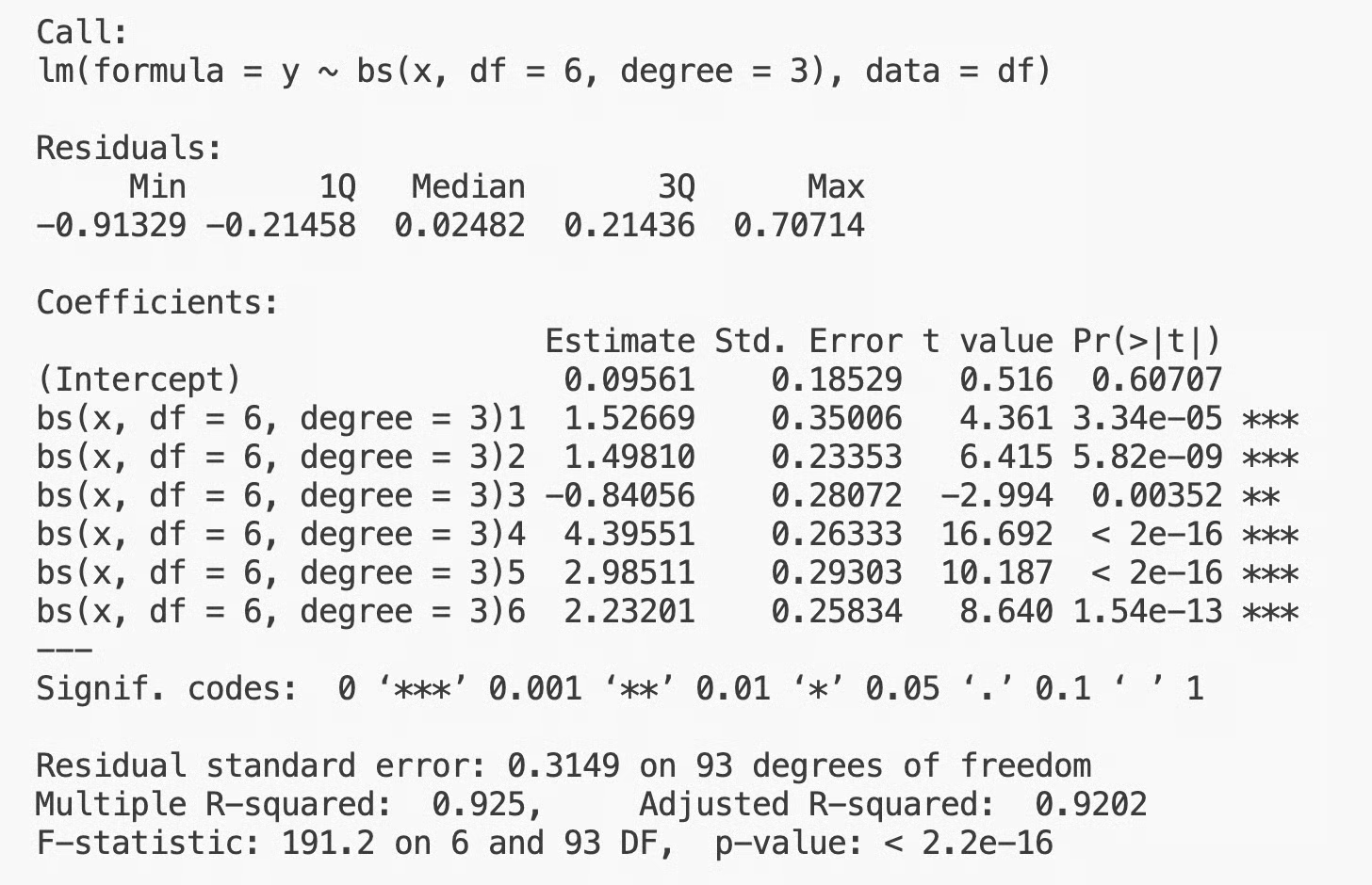
bs() output in R
The formula y ~ bs(x, df = 6, degree = 3) tells R to replace x with a B-spline basis of degree 3 and 6 degrees of freedom. R handles the rest - it builds the basis matrix, fits the linear model, and produces a standard lm object with all the usual diagnostics.
You can pass knot positions directly if you want full control:
model <- lm(y ~ bs(x, knots = c(2, 5, 8), degree = 3), data = df)This places knots at x = 2, x = 5, and x = 8 instead of letting R pick them for you.
For natural cubic splines (the kind with linear behavior beyond the boundaries), use ns():
model_natural <- lm(y ~ ns(x, df = 6), data = df)
summary(model_natural)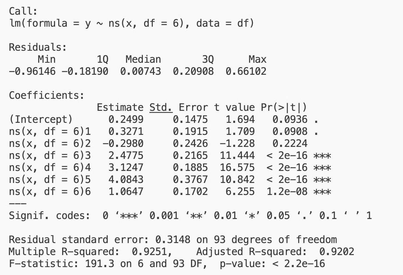
ns() output in R
The syntax is the same, but the boundary behavior is different. Natural splines are usually the safer choice when you care about predictions or interpretation near the edges of the data.
The coefficients in the summary() output correspond to the spline basis functions, not to interpretable quantities. To see what the model actually learned, predict across a grid of x values and plot the result:
x_grid <- data.frame(x = seq(0, 10, length.out = 200))
preds <- predict(model, newdata = x_grid)
plot(df$x, df$y)
lines(x_grid$x, preds, col = "green", lwd = 2)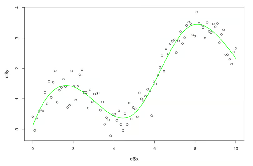
Output interpretation in R
This is the standard pattern in R, in which you fit the spline, predict on a smooth grid, and overlay the curve on the data. R also lets you use spline terms alongside other predictors in the same formula:
model_multi <- lm(y ~ ns(x, df = 6) + other_var, data = df)This fits a nonlinear effect for x and a linear effect for other_var in the same model. That flexibility is why splines are so widely used in R-based statistical workflows.
Here’s a couple of advantages of splines when compared to more popular machine learning models:
Like most models, splines come with a couple tradeoffs that you have to know about:
Let me now go over a couple of mistakes newcomers make with spline regression:
Splines aren’t the only way to model nonlinear relationships, but they are useful if you care about interpretability. Here’s how they compare to the most common alternatives.
Polynomial regression uses a single global equation. It’s simpler to specify but less stable, especially at the boundaries. Splines beat polynomials on flexibility and stability when the relationship has more than one bend. Polynomials are easier to interpret only at very low degrees (2 or 3). Past that, splines become both more reliable and more interpretable.
GAMs are essentially splines done at scale. A GAM lets you fit a spline for each predictor independently and additively combine them. You can think of spline regression as a single-variable GAM, and a GAM as a sum of splines across multiple variables.
GAMs handle multiple nonlinear predictors more cleanly than fitting splines manually for each one. They also include smoothing penalties that choose the right amount of flexibility, which removes some of the knot-selection work. If you’re working with multiple predictors and a couple of them need nonlinear treatment, GAMs are usually the better option.
Decision trees take a completely different approach. Instead of fitting a smooth curve, they split the predictor space into rectangular regions and predict a constant value in each region. The result is a step function.
Trees are more flexible than splines in some ways - they can model interactions and abrupt changes. But the fitted function isn’t smooth or continuous. It also doesn’t generalize as well in regions with sparse data. Splines are better you care about smoothness and stable extrapolation. Trees are better when you care about modeling sharp boundaries or interactions across many variables.
Splines are everywhere in applied statistics. They show up in clinical research, economic analysis, environmental science, time series modeling, and any field where someone needs to model a smooth nonlinear effect without going with a black-box model.
The reason is the balance they offer - enough flexibility to handle messy data, but enough structure to stay interpretable and stable.
They’re also foundational for more advanced methods. Generalized Additive Models are built directly on splines, smoothing splines extend the idea with built-in regularization, and many modern nonlinear regression techniques use spline bases. If you want to understand any of these methods, you have to understand splines first.
So splines matter because they’re practical and because they’re the building block for a lot of what comes next. They’re not the most powerful model, but they’re one of the most reliable - and that’s often what matters.
Spline regression models nonlinear relationships by combining piecewise polynomials at points called knots. That’s the idea, and the rest is variations on it.
Knots and smoothness are the two ideas you need to wrap your head around. Everything else (spline types, basis representations, implementation in R and Python) is just different ways of working with those two concepts.
Try a few spline types on your own data. Compare cubic, natural cubic, and B-splines. Shift the knots and see what happens. Just experiment because the visual nature of the fit makes it easy to see what each choice does.
If you want to dive deeper into math behind splines and many other algorithms, enroll in our Machine Learning Scientist in Python track. It has everything you need to get job-ready in 2026.
Learn with DataCamp
Kurs
Kurs
Kurs
Tutorial
Dario Radečić
Tutorial
Samuel Shaibu
Tutorial
Vinod Chugani
Tutorial
Zoumana Keita
Tutorial
Mark Pedigo
Tutorial
DataCamp Team