Course
Intermediate Google Sheets
4 hr
57.2K
Note: If you would like to learn about pivot tables in spreadsheets, please feel free to check out this tutorial.
Even though graphs do not need any introduction, but to put it simply, graphs are a graphical representation of various points of a domain. Graphs help you view and analyze your data in a more realistic and simplified way. Graphs, Plots, and Charts can all be used interchangeably since they all mean more or less the same.
A graph can tell you a lot about your data and makes it easy to understand much like A picture is worth a thousand words!
There are many different kinds of graphs, but to name a few:
A spreadsheet is an excellent tool for analyzing and understanding your data whether it is calculating simple numerical statistics, summary statistics, filtering your data based on a condition or sorting the data and various other intuition that you could possibly extract from the dataset using spreadsheets as shown in this tutorial.
One of the use cases of spreadsheets is to generate quick graphical views of the data also known as Data Visualization.
Data visualization can be done in two ways:
In today's tutorial, you will be using Google Spreadsheets.
Google spreadsheets allow a way of graphing, and apart from that it even allows you for a small degree of interactivity in the created graphs (and you can embed them to your websites in multiple ways). You will learn how you can do that later in the tutorial.
However, graphing in google spreadsheets is quite picky on how the data has to be laid out to produce the graphs you require; essentially, the data has to be right next to each other to create a graph (this is different from the way LibreOffice or Excel implement their charts).
Next, let's quickly understand the data you will be using in today's tutorial!
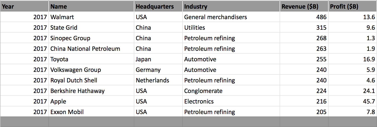
You will start with a dataset that is well organized into a row and column format. This particular dataset shows the top 10 companies in the Fortune Global 500 in 2017 which is based on highest gross revenues column.
You will learn how to create graphs from this dataset and work with the google spreadsheet chart editor, which will allow you to understand and analyze the data much better, and also learn some neat tricks and tips on using graphs in google spreadsheets!
Note: Please make sure you have a valid Gmail account, once you have an account all you need to do is click on this link and create a new blank spreadsheet.
The data is available here.
So, without any further ado, let's learn about Graphs in Google Spreadsheets!
Let us start by clicking on an empty cell as shown below and click on the insert chart tab. Since you have selected an empty cell, this will open a graph/chart window with no data in it and also a chart editor.
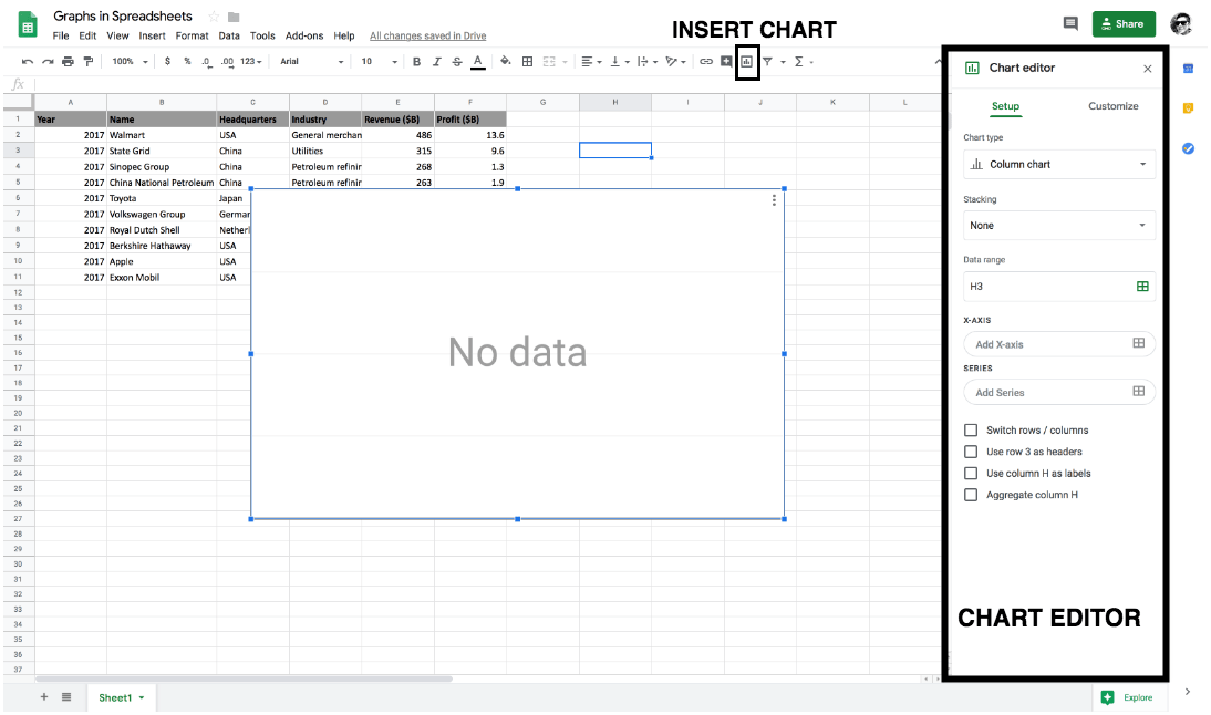
Chart Editor is the heart of creating graphs in google spreadsheets since most of the functionalities are comprised within the chart editor.
Chart Editor has two main components to it namely setup and customize.
Let's first understand some functions in the setup of the chart editor:
Chart type consists of mainly graphs and charts like Line, Area, Pie, Column, Bar, Scatter, Map, etc. which can be used based on the type of visualization you would like to plot. From the above figure, you can see that by default column chart is selected.What is a Column Chart?
Column Chart is a vertical Bar Chart. A column chart lets you compare one or more categories of a dataset over some time.
Data range is the critical component for plotting a graph or a chart since it takes in the information of the columns that you would like to visualize.So now let's quickly click on the data range tab and select a valid data range. You will now be plotting your first graph in google spreadsheet.
You will select all the rows of the name (B) and the revenue (E) column ranging from 1 - 11 as shown below.
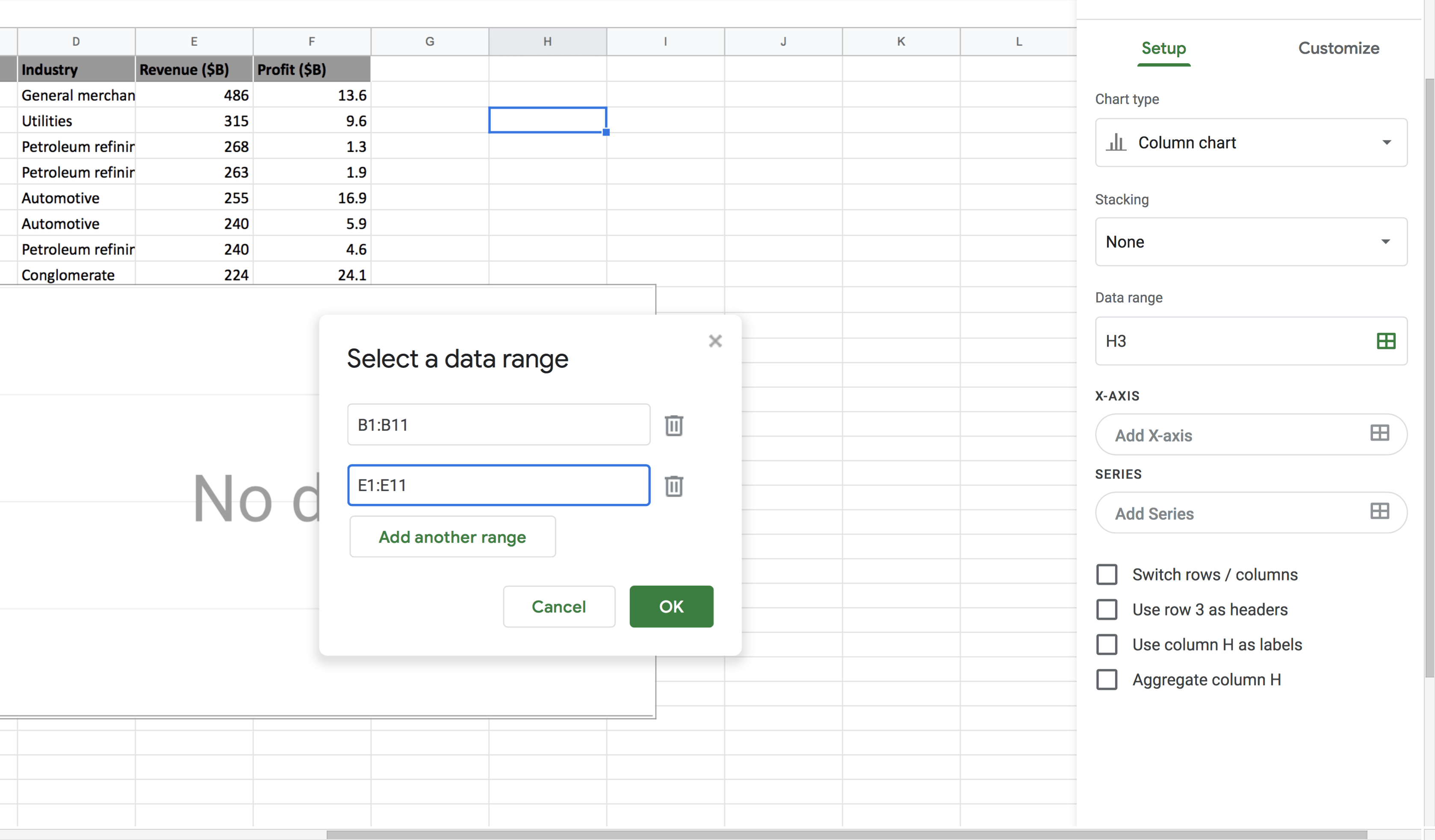
Once a valid data range is selected you should be able to visualize your first graph in google spreadsheet!
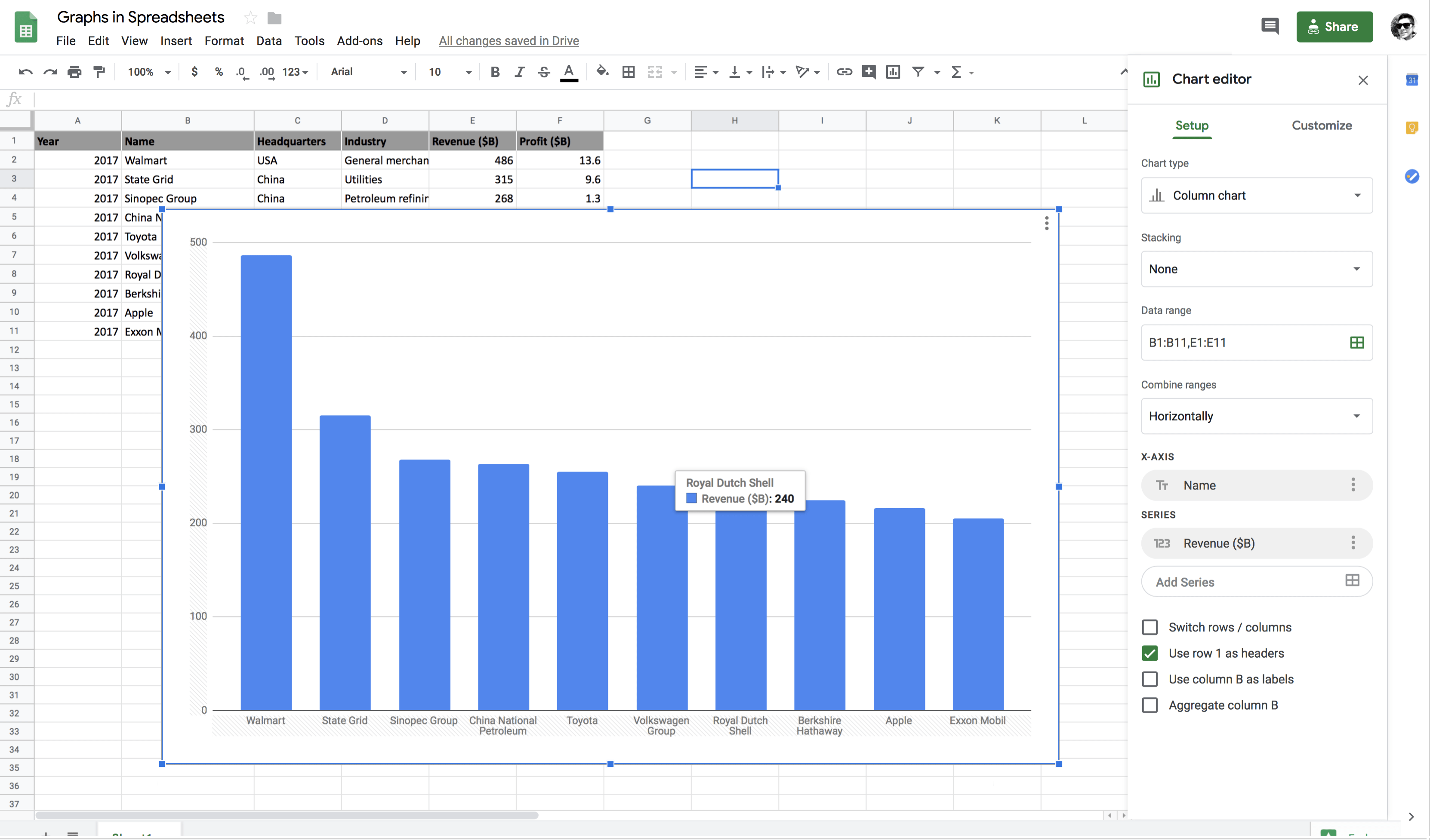
Voila! Wasn't that so simple?
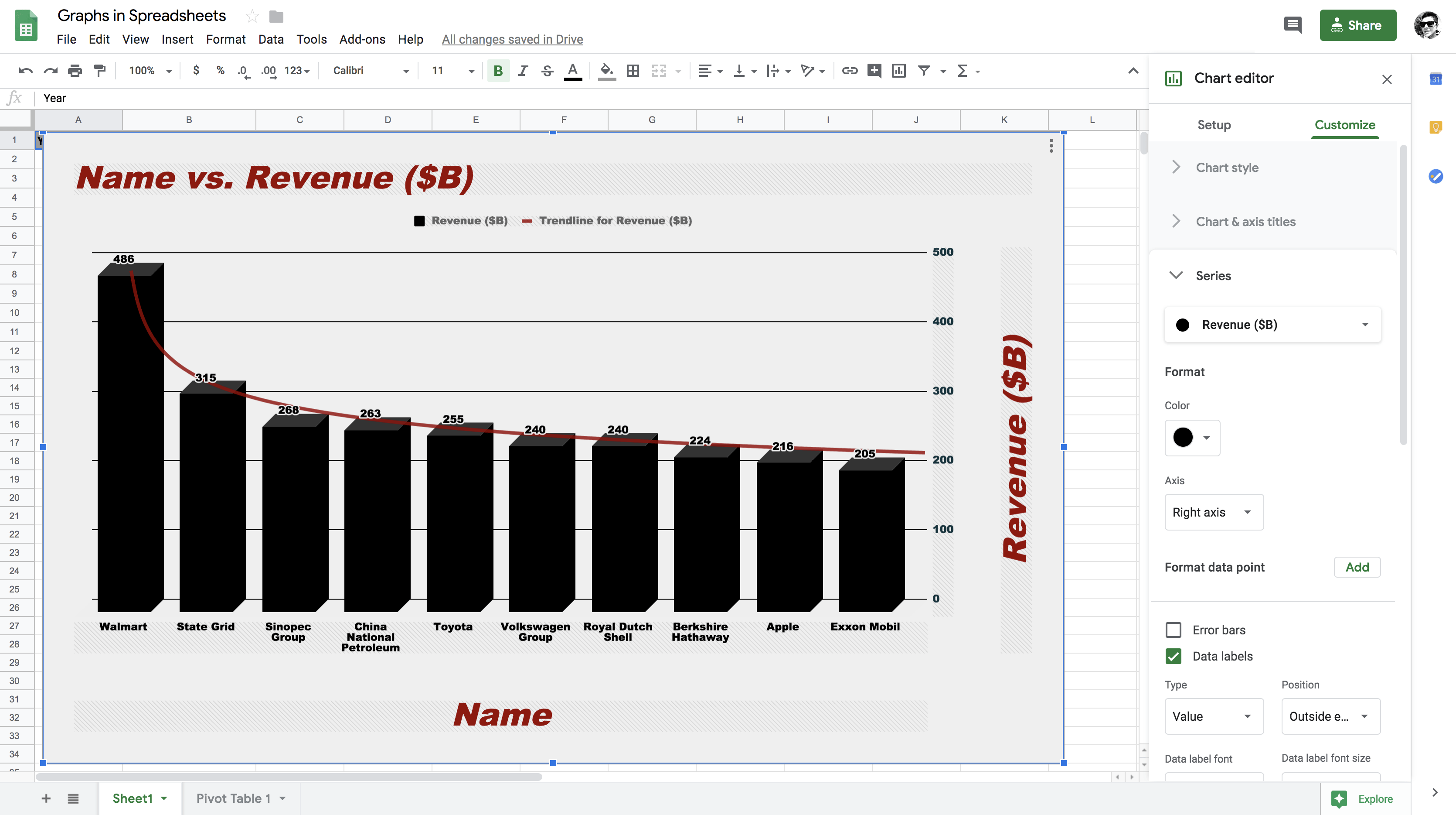
As you can see from the above figure that Walmart has the maximum revenue and Exxon Mobil has the minimum revenue. As shown in the figure Royal Dutch Shell has a revenue of $240B. Similarly, you can hover over any of the companies to get the exact revenue value.
Pie Chart: - Pie Chart: A pie chart is a circular statistical graph, which is divided into slices to illustrate numerical proportion. In a pie chart, the arc length of each slice is proportional to the quantity it represents.
Let's plot a pie chart between the name and revenue column. All you need to do is click on the chart type drop-down menu and select pie.
It will show a percentage for each company name.
However, the percentage over which value? - The answer is straightforward all it does is, it sums up the revenue column values and calculates the share of each company name based on the total value.
For example, The sum of revenue equals 2712, and the revenue of Walmart is 486. Hence, Walmart accounts for 17.9% of the total revenue.
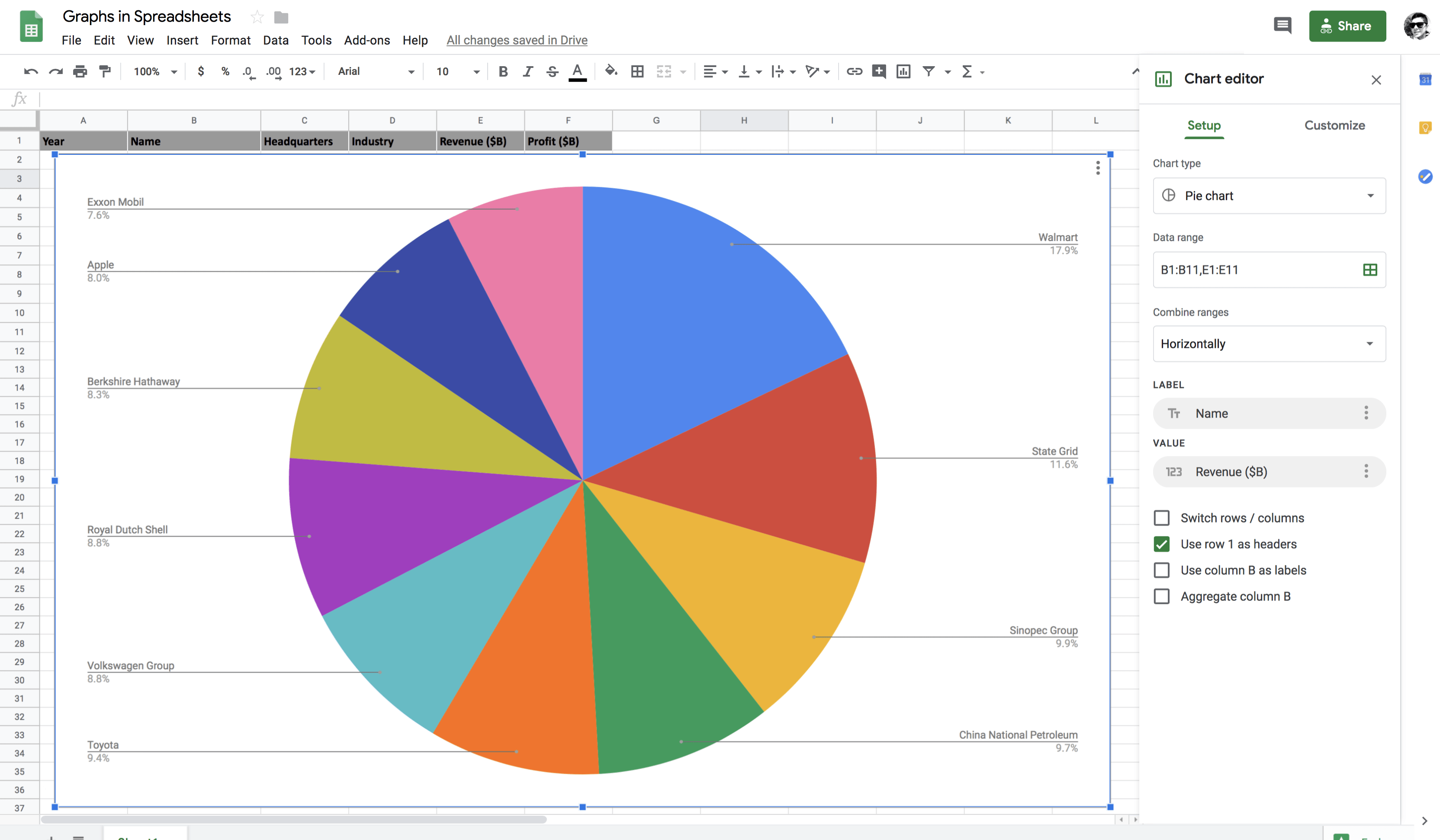
Chart Style provides you with few functionalities like set the background color, font style, maximize the area of the graph, 3D appearance, etc.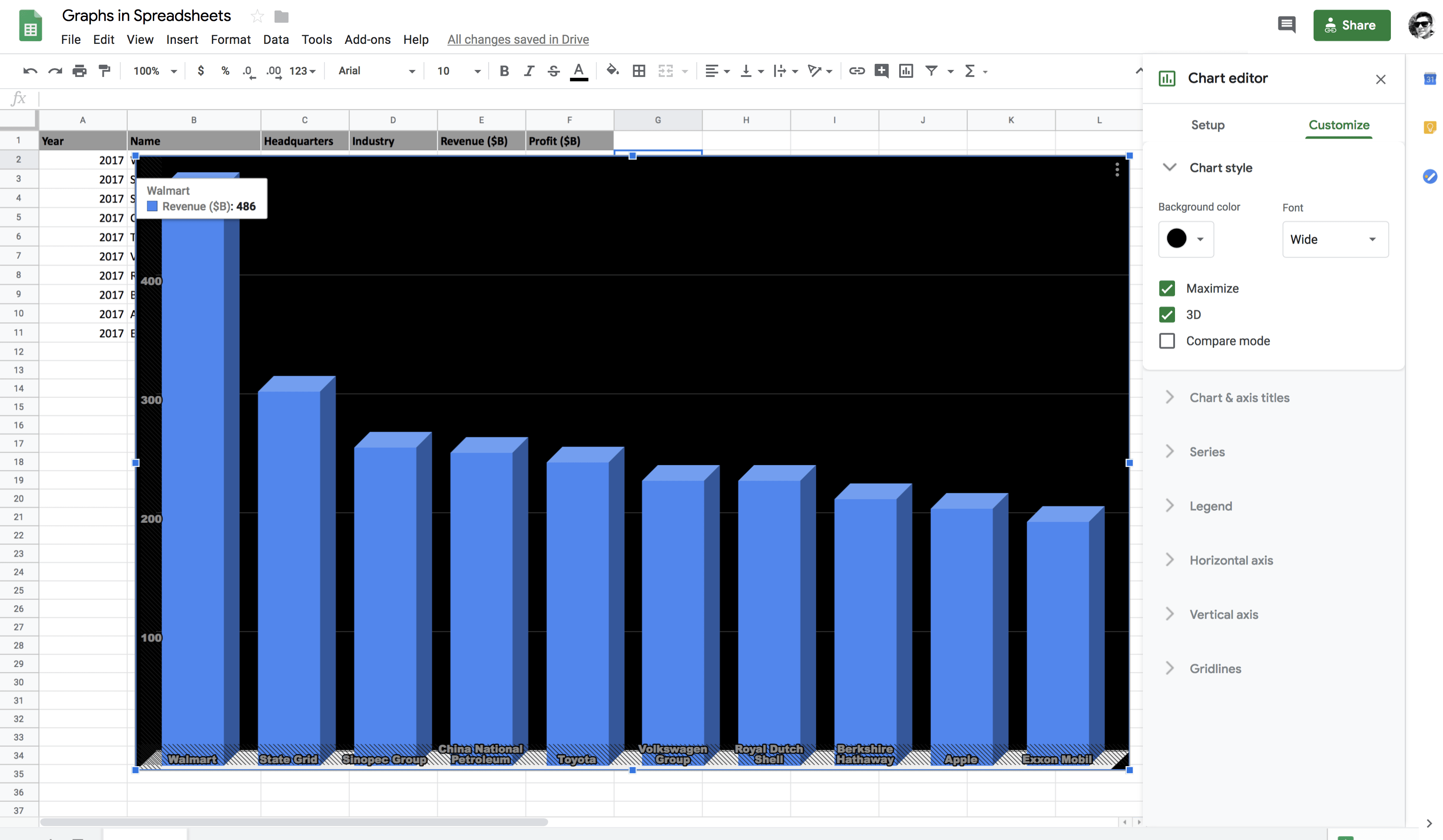
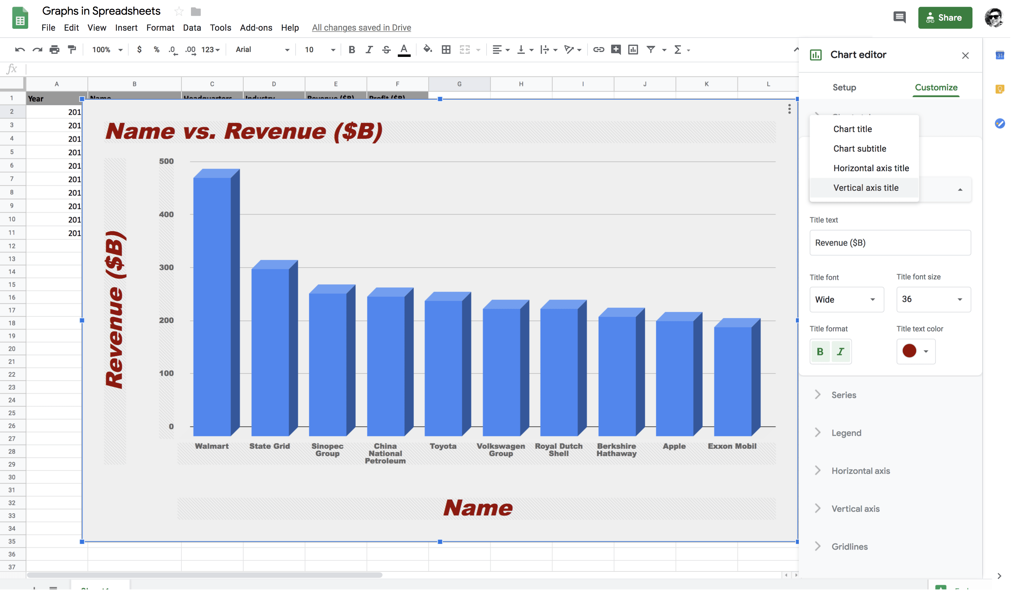
Chart and axis title: In this section, you can set the chart title, chart subtitle, horizontal (x-axis) and vertical (y-axis) title. To set the x-axis and y-axis titles, you will disable maximize in the chart style, and only then it will be visible to you.Note: A two-dimensional graph like a column chart has two axes. The line along the bottom is called the horizontal or x-axis, and the line up the side is called the vertical or y-axis.
The point at which x-axis and y-axis intersect is called the origin.
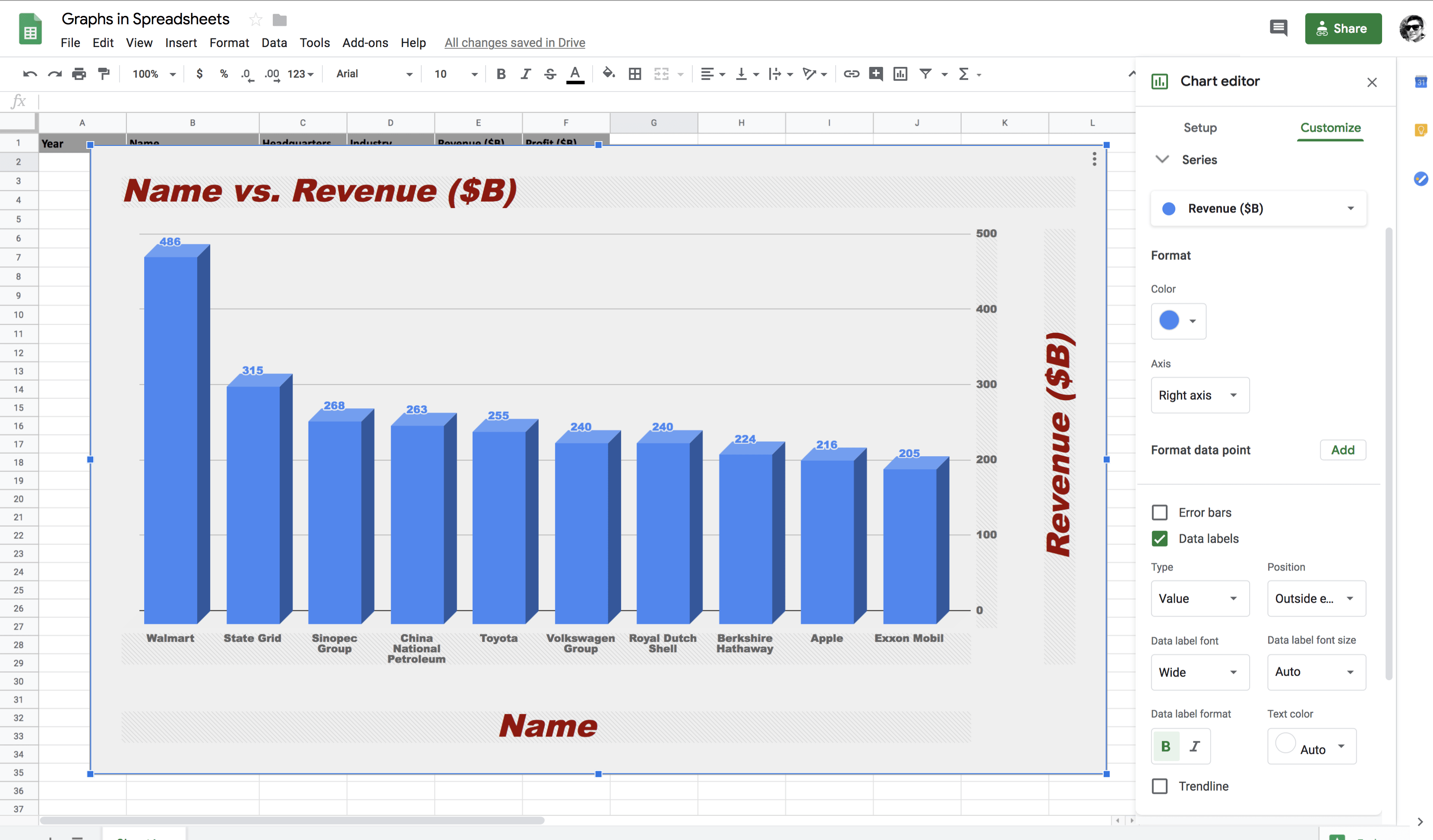
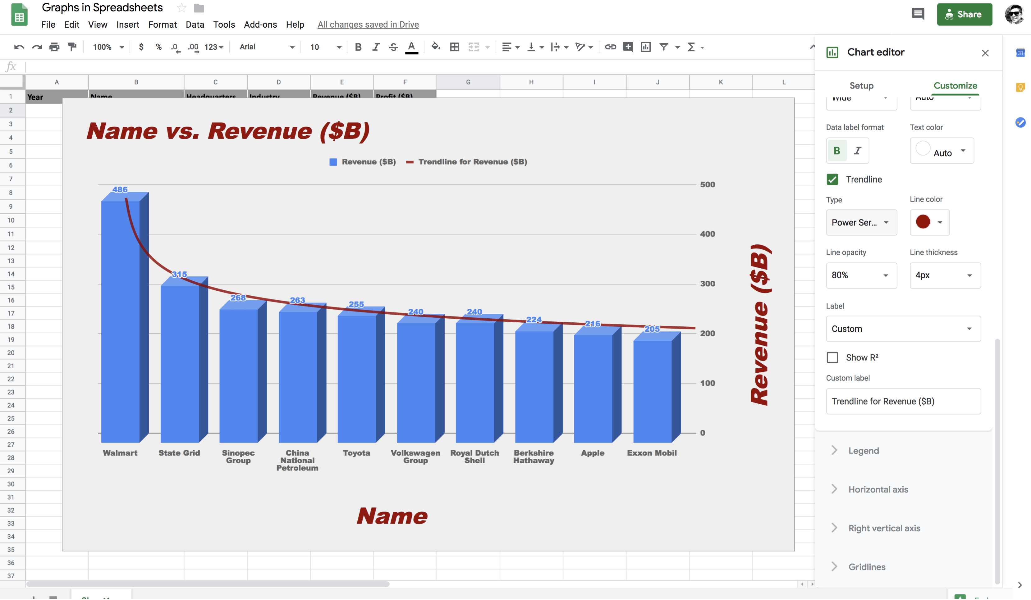
Series: It provides you lot of functionality like shifting the vertical axis from left to right axis, error bars, data labels, and trendline.
In the below figure, you can observe that the revenue label has been shifted to the right axis. After selecting the right axis option, you will then select the right vertical axis option in chart and axis title to view the label on the right axis.
Next, you will select Data labels which will then allow you to view the revenue values for each company without hovering over it and you can change the position, font style and font size of the data labels accordingly.
Series also provides a functionality called Trendline that indicates the slope (or trend) in a particular data series and is also known as a line of best fit for the given dataset. Trend lines can be useful for predicting future values based on the current data trend.
In google spreadsheets, six different kinds of trend your data can follow are Linear, Exponential, Polynomial, Logarithmic, Power Series and Moving Averages.
In the below figure, you can observe that power series best fits given the data distribution.
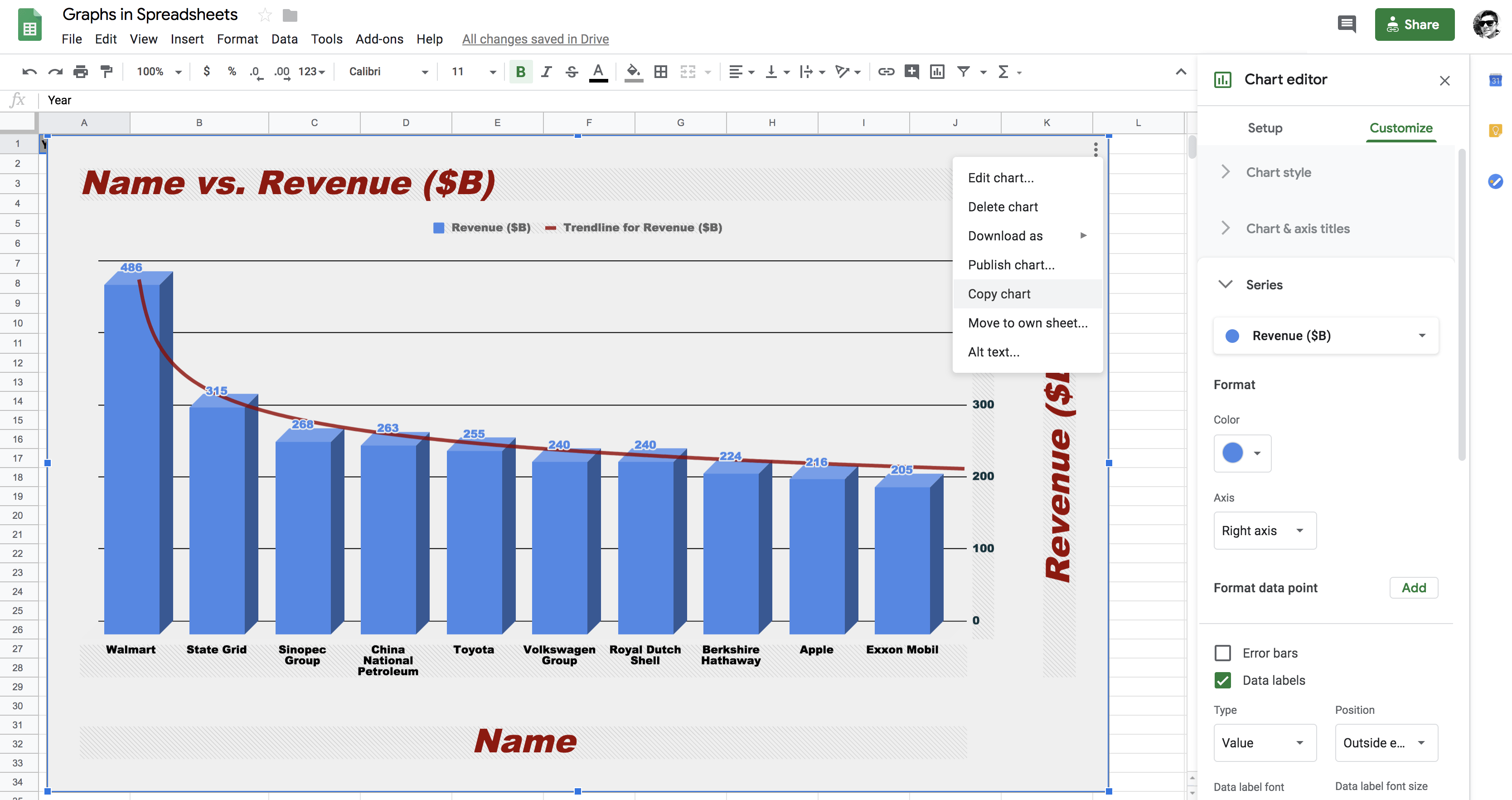
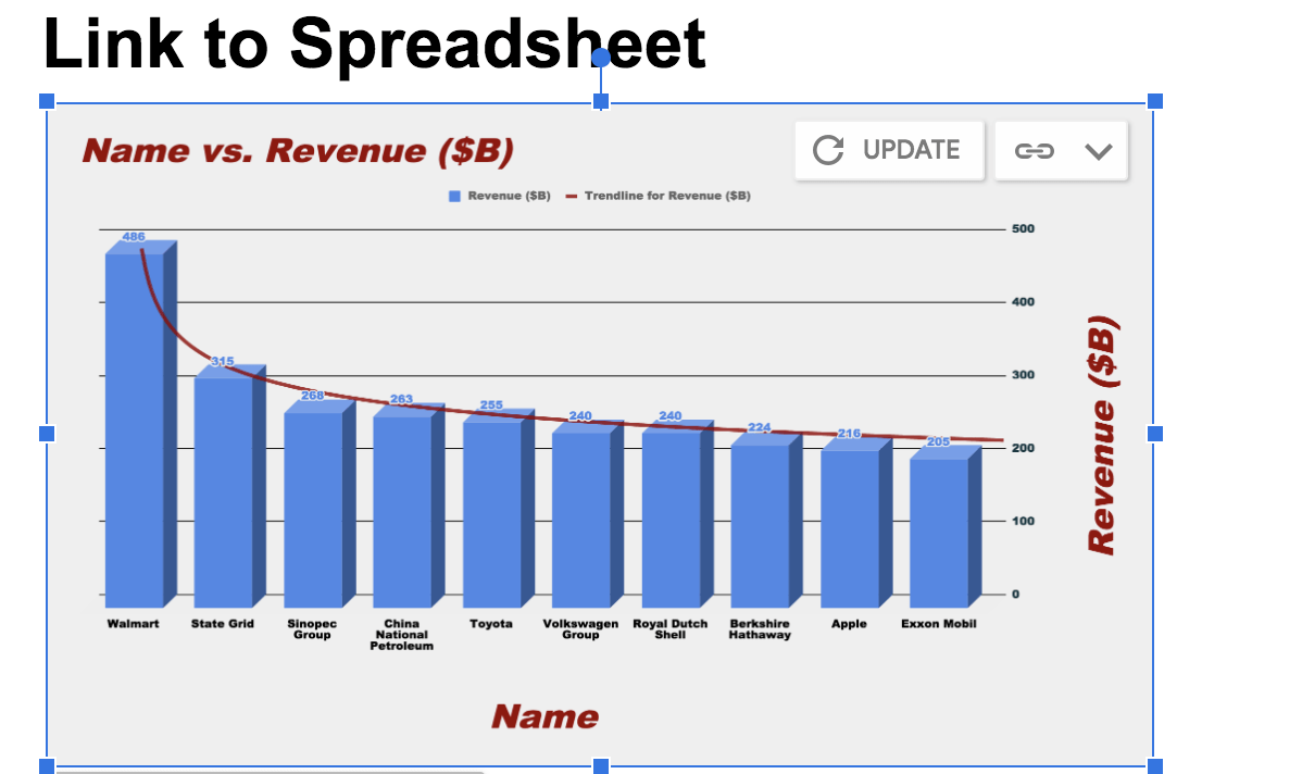
Graph from the spreadsheets can be copied to google docs in multiple ways namely linked and unlinked. Let's first see how you can copy the graph from the spreadsheet.
As shown below, all you have to do is select the graph and click on the three dots on the top right of the graph and in the drop-down menu select copy chart, and it's that simple!
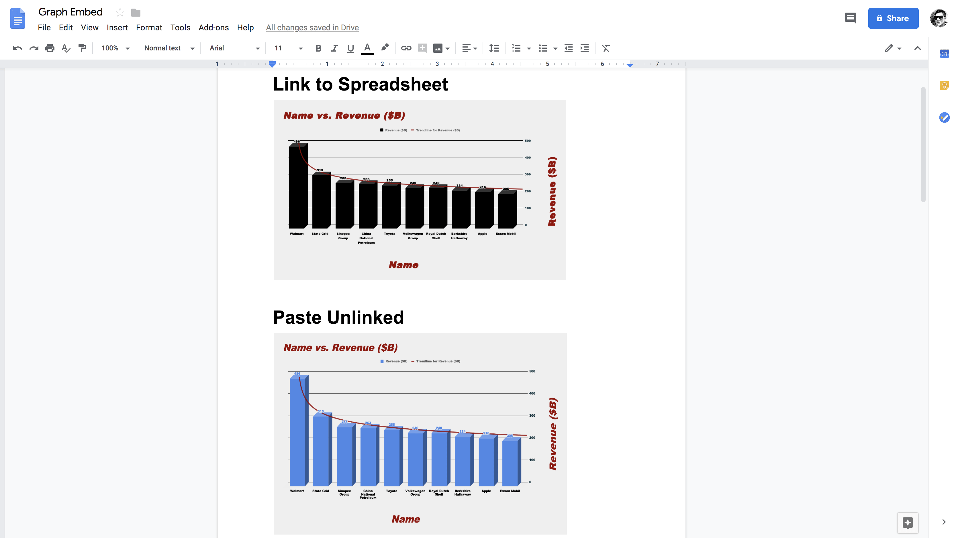
Now, let's quickly open an empty google doc and find out how you can paste the graph in two ways.
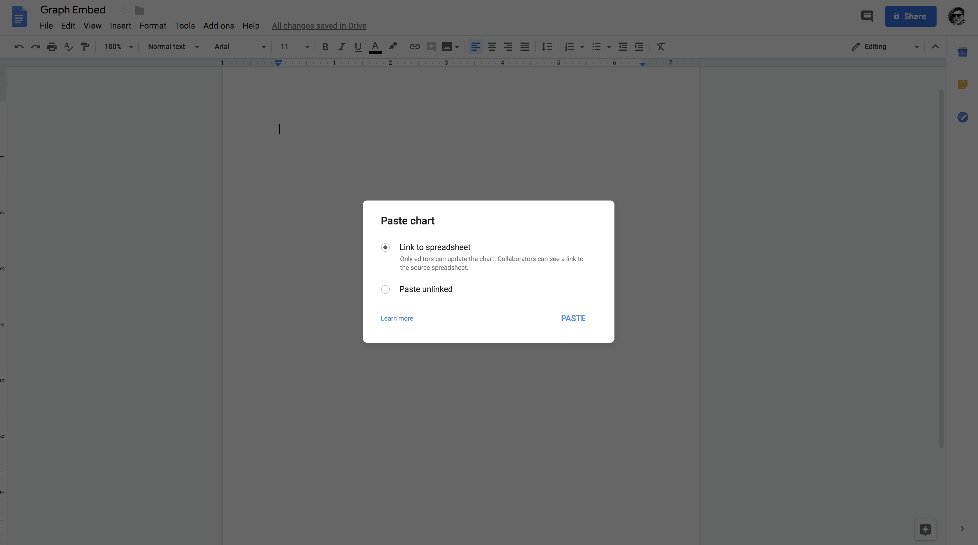
You will paste the chart in both ways to google docs.
Link to Spreadsheet option will allow you to update the graph in google docs if you apply some changes in the graph on the google spreadsheet, whereas, the paste unlink option will provide no such privilege to you!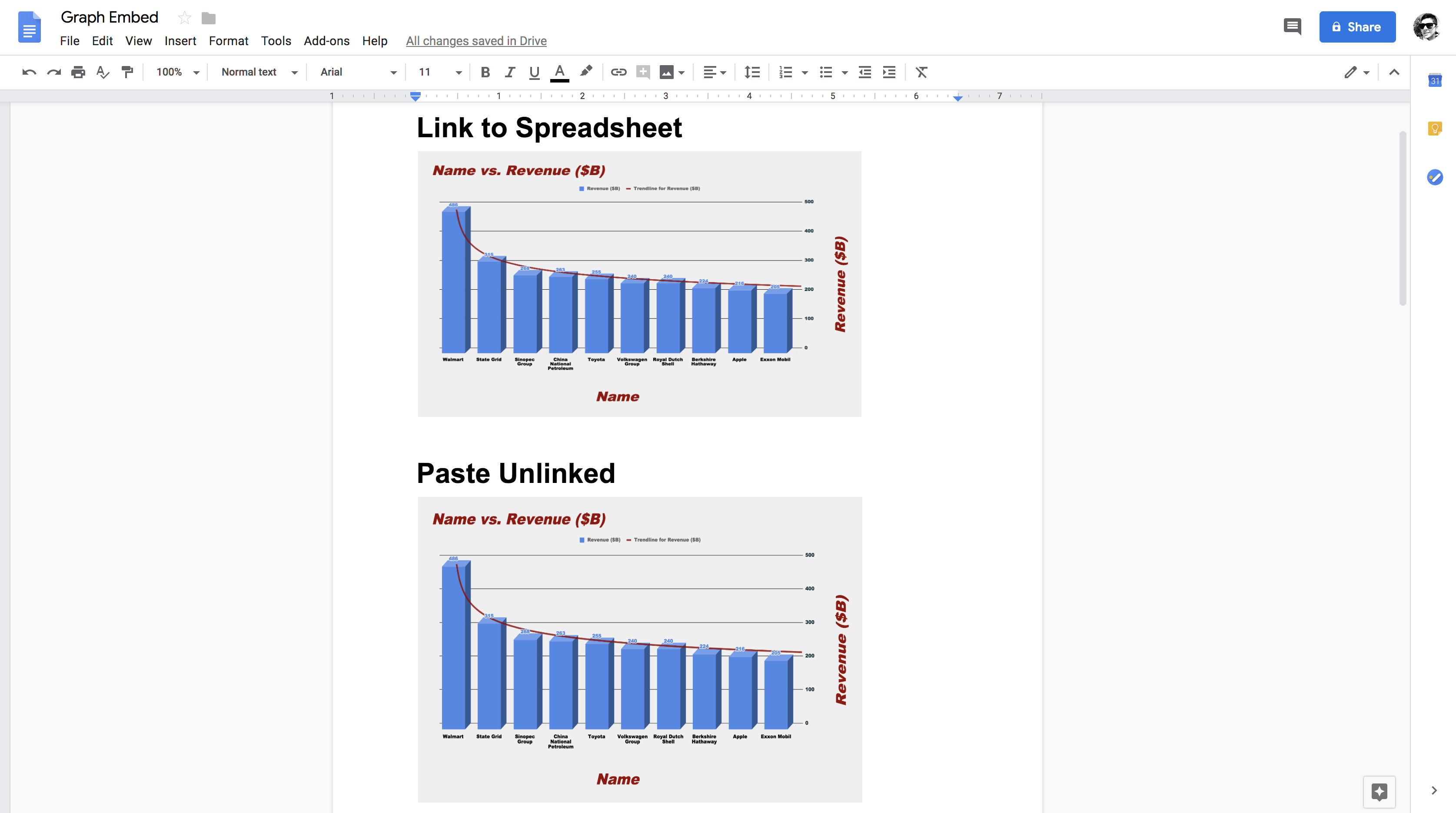
So, let's quickly do a minor tweak in the graph on the google spreadsheet and find out whether you will be able to update the graph in google docs.
So as you can see the color of revenue columns are now changed to black from blue. Let's see if you can update the graph in google docs.
So as you can observe from the above figure that since you did some changes in the original graph in google spreadsheets, you now have an option to update the graph in google docs. Let's quickly select the update button and find the outcome!
Awesome! So as you can observe the graph that was pasted to google docs with link to spreadsheet condition was updated successfully to the original graph in google spreadsheets.
Finally, let's create a graph of a Pivot Table!
Note: For those of you who do not know Pivot Tables can check out this tutorial which covers all significant aspects of a pivot table.
Also, note that the next section of this tutorial assumes that you already know how to create and work with a pivot table!
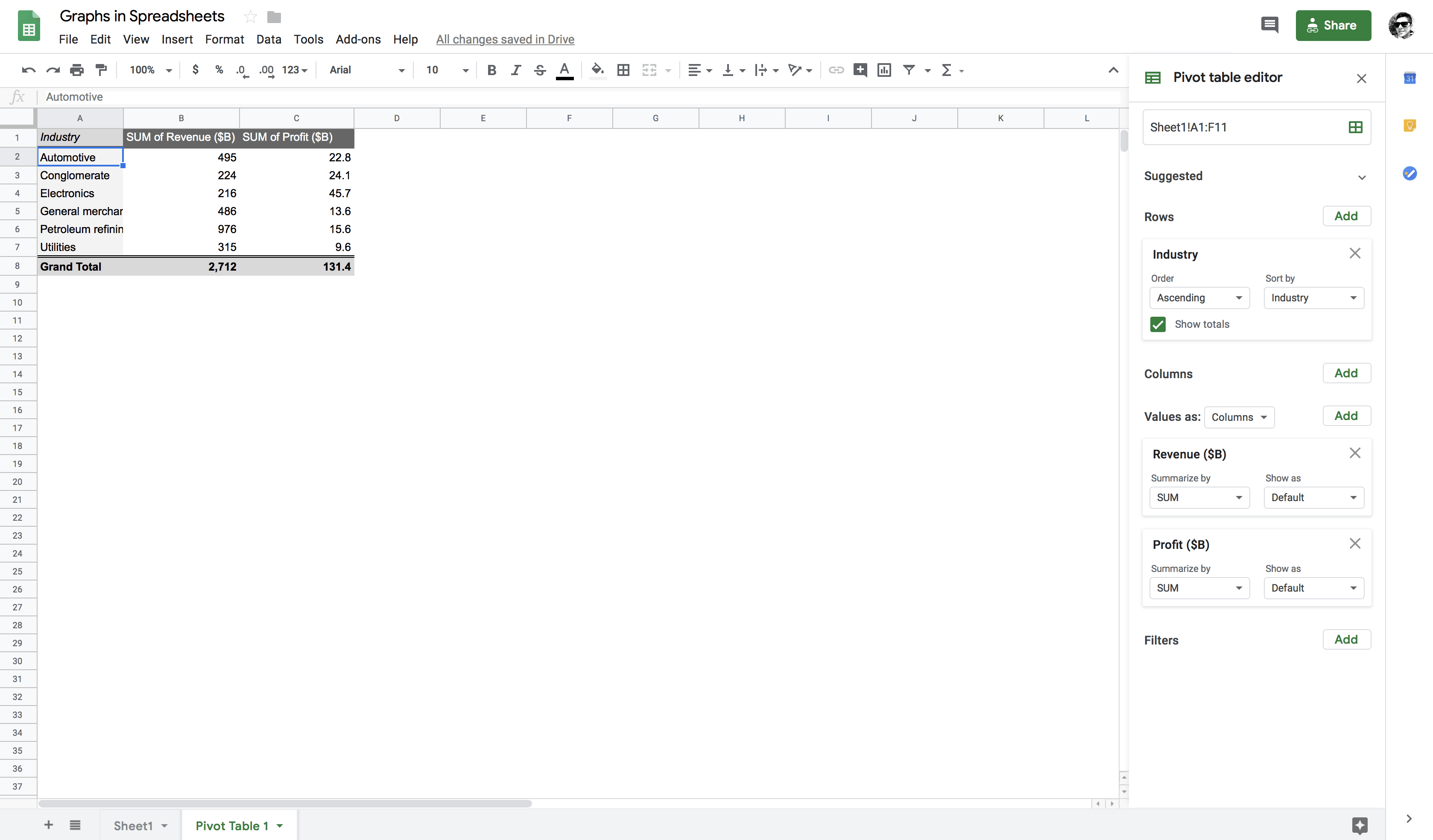
Let's create a pivot table in which the rows contain industry and columns contain the sum of revenues and profit. By doing so, you will observe that the industries that appear twice in the dataset, for example, automotive will be clubbed and their respective values will be summed to one.
Now, let's quickly create a combo chart out of this pivot table and gather some insights about the industries.
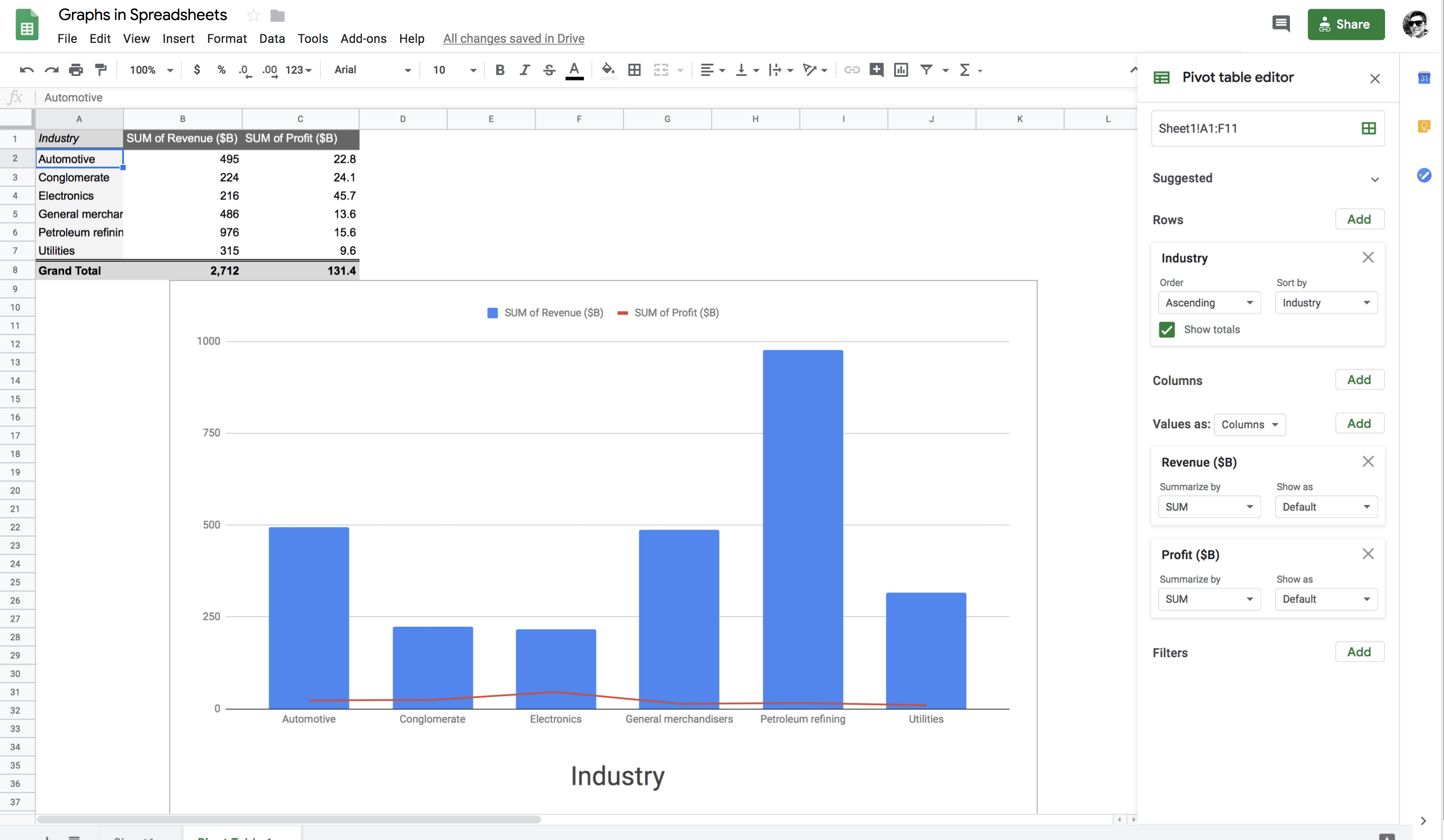
From the above figure, it is quite clear that the Petroleum refining industry had the maximum revenue whereas the Electronics industry had the maximum profit in the Year 2017.
Wow! Isn't that amazing, how refreshing and straightforward working with Google Spreadsheets is? You can gather so many insights from your data without even a single line of code.
First of all, congratulations on finishing the tutorial.
There are multiple options to create graphs, and Google spreadsheets happen to be one of them. Google spreadsheets are one of the best tools to analyze your data, and everything resides on Google Drive and no local memory storage needed. Of course, there are other ways of working with graphs like writing a Python or an R script but which option you should choose depends on your skill set, and it is also a trade-off between what you want to accomplish and how fast you want to achieve this.
However, if you are not much familiar with Python, R or any other programming language, this tutorial is the one you might want to keep handy.
We encourage you to go and check out any additional information that you can possibly find on the Internet related to this tutorial. This way, you will gradually be immersed into the field of data visualization, start getting fluent and gain more in-depth knowledge about it.
Please feel free to ask any questions related to this tutorial in the comments section below.
If you would like to learn about creating visualizations in spreadsheets, take DataCamp's Data Visualization in Spreadsheets course.
Spreadsheets Courses
Course
Course
Tutorial
Parul Pandey
Tutorial
Jess Ahmet
Tutorial
Ryan Sheehy
Tutorial
Avinash Navlani
Tutorial
Avinash Navlani
code-along
Agata Bak-Geerinck