Course
Histograms are commonly used in data analysis to represent the distribution of a data set graphically. It allows us to visualize how data is spread across different values, helping uncover patterns, trends, and anomalies.
This article introduces frequency histograms and helps you create one step-by-step. We will also learn about different types of histograms, some popular technologies for creating them, common mistakes to avoid, and best practices to follow.
What is a Frequency Histogram?
A frequency histogram is a graphical representation of the distribution of a data set. A histogram is constructed from a series of bins, essentially intervals that cover the range of the data. Each bin has a frequency, the count of data points within that interval. The bins are plotted on the horizontal axis, while the frequencies are plotted on the vertical axis, resulting in a bar chart-like representation. The height of each bar corresponds to the frequency of data points in that bin.
Histograms are common because they serve several critical purposes in data analysis:
- Summarizing Large Data Sets: When dealing with large volumes of data, histograms provide a clear and concise summary, allowing us to quickly grasp the overall distribution without getting lost in individual data points.
- Detecting Outliers: Histograms visualize data distribution and make it easier to spot outliers—data points that deviate significantly from the rest of the data. These outliers can indicate errors, anomalies, or significant phenomena worth further investigation.
- Understanding Data Distribution Patterns: Histograms help identify patterns such as skewness (asymmetry of the data distribution), modality (the number of peaks in the distribution), and spread (the range of data). This understanding is crucial for statistical modeling, as it informs the choice of models and assumptions.
- Comparative Analysis: Histograms are also useful for comparing different data sets. By plotting histograms side by side, we can visually compare their distributions, revealing similarities and differences that may not be apparent from raw data alone.
Since we’ve understood frequency histograms and their purpose in data analytics, let’s learn how to create one using an example.
How to Create a Frequency Histogram
Consider a scenario where you, as a data analyst, are tasked with analyzing the daily sales data for a retail store over the past month.
Your goal is to understand the distribution of daily sales to identify patterns, assess performance, and provide insights to help with inventory management and sales strategies. As part of the analysis, you’ve decided a histogram can help derive insights.
Here are the steps you could follow to create your frequency histogram:
Step 1: Collect your dataset
Let’s say you connected with your organization’s data team and retrieved the data from your organization’s sales databases. You have organized the data in a tabular format as below:
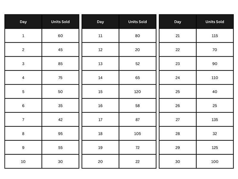 Sales dataset. Image by Author.
Step 2: Determine the bins
Next, choose appropriate bins based on the range and distribution of the data.
After analyzing the data, you realize the smallest value is 20, the largest is 135, and you have 30 observations. Using the square root rule (we will learn more on this topic later), √30 ≈ 5.5, you could use six bins. We must divide the range of 115 into six bins, leading to a bin width of approximately 19 units.
For simplicity, let’s use bins of width 20 units:
- 20–39
- 40–59
- 60–79
- 80–99
- 100–119
- 120–139
Step 3: Calculate frequencies in each bin
Let’s count the number of observations within each interval and tabulate them as shown below:
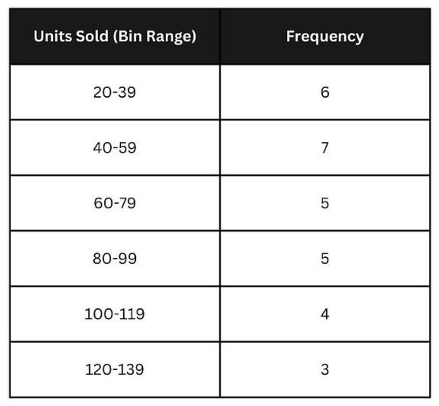
Calculating frequencies in each bin. Image by Author.
Step 4: Plot the histogram
Draw a horizontal line (x-axis) for the bins and a vertical line (y-axis) for the frequencies. For each bin, draw a bar whose height corresponds to the frequency.
Your histogram should look something like this:
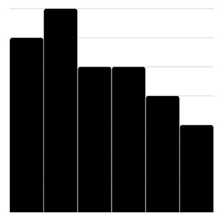 Plotting the histogram. Image by Author.
Step 5: Label and format
Label the x-axis “Units Sold” and the y-axis “Frequency.” Add a title such as “Histogram of Daily Sales Data.” Ensure the bars are evenly spaced and distinct for clear visualization.
The completed diagram should look like this:
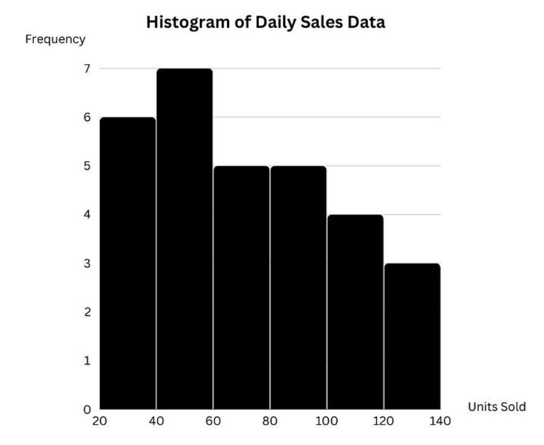
Labeling and formatting the histogram. Image by Author.
That’s it! You’ve created the frequency histogram for your analysis.
Different Kinds of Frequency Histograms
There are different kinds of frequency histograms, each offering slight variations in how the data is represented.
- Frequency Histogram: A traditional frequency histogram displays the absolute frequencies of data points within specified bins. As we saw above, it helps understand the distribution and concentration of data points and is also the most commonly used type of histogram.
- Relative Frequency Histogram: A relative frequency histogram displays the relative frequencies (proportions) of data points within specified bins instead of showing the absolute count of data points in each bin. This type of histogram is particularly useful for comparing different data sets because it normalizes the data, making it easier to compare distributions with different total counts.
- Cumulative Frequency Histogram: A cumulative frequency histogram shows the cumulative totals, helping to understand how frequencies accumulate over the data range. It is useful for identifying percentiles and understanding the cumulative impact.
These histogram variations allow you to uncover different insights depending on the scenarios you encounter in your analytical projects; hence, knowing these types exist can be helpful.
Technologies That Are Good for Creating Frequency Histograms
Though we learned to create histograms manually above, you can do so with various tools and technologies, each with different features and capabilities.
Here are some popular technologies for creating histograms:
- Microsoft Excel or Google Sheets: Microsoft Excel is a widely-used spreadsheet application with built-in charting tools. Google Sheets is a cloud-based spreadsheet application with charting capabilities similar to Excel. Both tools are commonly used in analytical projects and offer the feature of creating histograms. You can learn to create histograms from our Visualizing Data in Excel tutorial.
- PowerBI: PowerBI is a business intelligence tool that enables users to visualize data and share insights across their organization. Histograms are among its suite of visualization features. The Exploratory Data Analysis with PowerBI course can help you learn to create histograms interactively and perform other analytics tasks.
- Python: Python, a popular programming language, offers multiple visualization packages, such as matplotlib, seaborn, plotly, and many more, which can create histograms. The Introduction to Data Science in Python course dives deep into creating a histogram (and other visualizations) in a hands-on manner.
- R: R is another popular data science programming language that is well-suited for creating histograms due to its advanced data analysis capabilities and extensive visualization libraries, such as ggplot2. This six-step tutorial in R will teach you how to create histograms.
- Tableau: Tableau is another BI software that helps users transform raw data into interactive, shareable dashboards and can be used to create histograms. The Analyzing Data in Tableau course covers the detailed process of creating histograms.
Of course, this list is not exhaustive, and plenty of other online tools are available to create histograms. Feel free to use them and adopt the tool that best suits the needs of your analytical project.
Common Mistakes and Best Practices
Since histograms are perceived as one of the basic analytical diagrams, we never formally learn them, often leading to mistakes in creating them. Here are some common mistakes and the best practices to avoid them:
1. Choosing bin width (and the number of bins)
Choosing inappropriate bin widths can significantly impact the histogram’s appearance and accuracy.
Too-wide bins can oversimplify the data by grouping too many data points together, masking important patterns and variations within the data. This makes it difficult to see finer details and nuances in the distribution.
On the other hand, narrow bins mean that each bin covers a very small range of data values, which can result in many bins with very few data points in each. This level of detail might be unnecessary and overwhelm the viewer with too much information, making it challenging to discover any meaningful patterns or trends in the data.
Inconsistent bin sizes will lead to misleading visualization and make it harder to interpret the histograms.
Best practices
First, ensure all bins in your histogram have the same width. This consistency allows for a straightforward comparison of frequencies across different intervals.
Several guidelines can help determine the appropriate bin width (and the number of bins):
- Square Root Rule: This rule suggests using the square root of the number of data points as the number of bins. For example, if you have 100 data points, you would use √100 = 10 bins. This method provides a simple and generally effective way to decide on bin widths.
- Sturges’s Formula: This formula calculates the number of bins while considering the number of data points. This method is particularly useful for larger data sets, providing a balance between too few and too many bins.
 Sturges’s rule. Source: Wikipedia
In practice, the best bin width is found through iterative adjustment. Start with a guideline-based bin width and then adjust up or down while evaluating the resulting histogram for clarity and informativeness.
2. Labeling and scaling
A common mistake is to focus only on the diagram and not so much on the labels and the scales.
Viewers may not understand what the histogram represents if the axes are labeled incorrectly or inadequately.
When comparing multiple histograms, inconsistent scaling on the y-axis can distort the comparison. Suppose one histogram uses a y-axis scale from 0 to 100 and another uses 0 to 50; the heights of the bars will not be directly comparable. This inconsistency can mislead viewers into thinking some significant differences or similarities are not actually present.
Inconsistent scaling within a single histogram can also misrepresent the data. If the y-axis starts at a number other than zero or uses irregular intervals, it can exaggerate or minimize the apparent differences between bin frequencies, leading to incorrect conclusions about the data distribution.
Best practices
Always label the x-axis and y-axis clearly and accurately. Specify what each axis represents and include units of measurement if applicable. Include a descriptive title that provides context for the histogram.
Use a consistent scale for the y-axis, especially when comparing multiple histograms. This ensures that the height of the bars accurately reflects the frequency or relative frequency and allows for meaningful comparisons. Ensure the y-axis starts at zero to provide a true representation of the data distribution. If starting at zero is impractical, clearly indicate the starting point and use consistent intervals.
3. Handling outliers
Outliers are data points that fall significantly outside the main cluster of data, affecting the shape of the data distribution. A common mistake is to simply exclude and ignore the outliers.
Excluding them can hide the true nature of the distribution, such as the presence of a long tail or asymmetry (skewness). A dataset with a few extremely high values might show a skewed distribution if outliers are included, but it will appear more symmetric if they are removed.
Outliers can sometimes represent significant phenomena or important insights. For instance, in sales data, an outlier could represent an unusually large purchase that might indicate a successful marketing campaign or a bulk order. Ignoring such points can overlook valuable information.
Best practices
Include outliers in the histogram to present a complete view of the data distribution. Ensure the y-axis scale accommodates these outliers without overly compressing the main data.
If outliers are excluded for specific reasons (e.g., errors, irrelevant extreme values), explain clearly in the accompanying text or legend. This ensures transparency and helps viewers understand the rationale behind their exclusion.
Following these best practices ensures that your histogram communicates the intended insights to viewers and helps you with downstream data analytics in analytics projects.
Conclusion
This article introduced you to frequency histograms, different kinds, and their importance in data analytics. After manually creating histograms, we listed a few popular tools and technologies you can use to create histograms. We also learned some common mistakes to avoid and the best practices to follow.
We encourage you to put your skills to the test and create and interpret histograms from multiple datasets to gain proficiency. Practicing analytics tasks and analyzing the results can help you become proficient in data analytics.
Happy learning!

As a senior data scientist, I design, develop, and deploy large-scale machine-learning solutions to help businesses make better data-driven decisions. As a data science writer, I share learnings, career advice, and in-depth hands-on tutorials.
Frequently Asked Questions
How do I determine the appropriate number of bins for my histogram?
The appropriate number of bins can be determined using guidelines such as the square root rule or Sturges's formula. Adjust the number of bins based on the specific context and data set to ensure the histogram is neither too simplified nor too complex.
Why should I use consistent bin widths in my histogram?
Consistent bin widths are crucial because they ensure a uniform and accurate depiction of the data distribution. Inconsistent bin widths can distort the representation, making it difficult to compare frequencies across bins and potentially leading to incorrect interpretations of the data.
What is the difference between a frequency histogram and a relative frequency histogram?
A frequency histogram shows the absolute count of data points in each bin, while a relative frequency histogram displays the proportion of data points relative to the total number of data points. Relative frequency histograms are useful for comparing different data sets by normalizing the frequencies, making it easier to compare distributions with different total counts.
How do I handle outliers in my histogram?
Including outliers in your histogram provides a complete view of the data distribution. If outliers are excluded, it can lead to a misunderstanding of the data's true range and variability. If you choose to exclude outliers for specific reasons, provide a clear explanation and rationale for their exclusion to ensure transparency and completeness in data representation.
