Course
Interactive Data Visualization with plotly in R
4 hr
14.5K
Plotly is one of the most powerful and popular Python libraries for creating interactive graphs. While creating basic charts with Plotly is straightforward, truly impactful data visualizations often require additional elements that guide the viewer's attention and provide important context. This is where Plotly shapes become invaluable.
Shapes are graphical elements like rectangles, lines, and circles that you can draw on top of your Plotly figures to annotate, highlight, and add crucial context. They are the key to elevating a standard plot into a rich, insightful, and publication quality visualization.
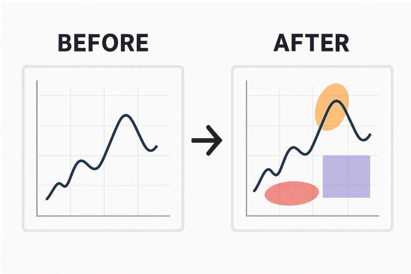
Image by Author
In this article, we’ll look at everything you need to know about plotly shapes, from basic implementation to advanced customization techniques. For those new to Plotly, getting comfortable with its high-level interface is a great first step, and this Introduction to Data Visualization with Plotly in Python course can help you master the fundamentals before going into deeper customizations like shapes.
Plotly shapes are vector graphics drawn on a figure to provide additional context or highlight specific areas. These annotations are important for building graphs that are not only visually appealing but also rich in information.
In data visualization, clarity is important. While charts like scatter plots or bar graphs present the data, shapes help tell the story behind the data. They serve two primary functions:
If you want a quick glance at the most common data visualizations, when to use them, and their most common use-cases, check out our Data Visualization cheat sheet.
Plotly supports several geometric shape types that can be added to a figure's layout. Each is defined by its type and specific coordinate parameters.
Here's a brief look at the primary shapes:
type: 'rect'): Defined by two opposing corners (x0, y0) and (x1, y1). Rectangles are perfect for shading regions of interest or highlighting a specific window of data.type: 'line'): Defined by a start point (x0, y0) and an end point (x1, y1). Lines are excellent for creating trendlines, thresholds, or reference marks.type: 'circle'): Defined by a center (x0, y0) and a radius. Circles are ideal for emphasizing individual data points or small clusters. Note that creating a circle often involves setting an equal aspect ratio for the axes (fig.update_layout(yaxis_scaleanchor="x")) to prevent it from looking like an oval.type: 'path'): Defined by an SVG path string. Paths allow you to draw complex, freeform shapes, including polygons. You provide a sequence of commands (like M for move, L for line to, Z for close path) to draw any shape you need. This is the most versatile option for creating custom geometric annotations.Understanding these basic types is the first step toward mastering visual annotations in your Plotly figures.
Implementing plotly shapes in your visualizations involves understanding two primary approaches: the add_shape() method for individual shapes and the update_layout() approach for multiple shapes. Both methods offer unique advantages depending on your specific use case and workflow preferences. Let’s see how to add shapes using the add_shape() method.
The primary method for adding a single shape to a Plotly figure is fig.add_shape(). The add_shape() method is a function of the plotly.graph_objects.Figure object. You first create your base figure (e.g., a scatter plot or line chart) and then call this method to layer the shape on top.
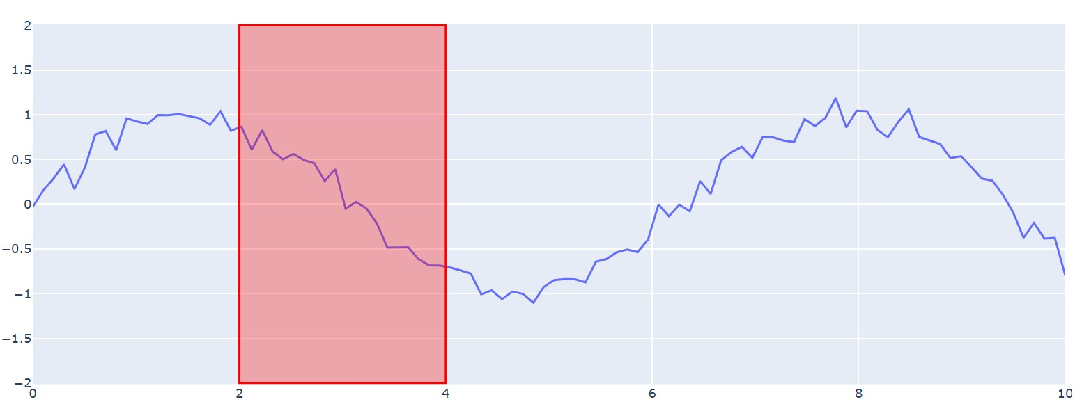
This is particularly useful when you need to programmatically add shapes based on certain conditions or data values. Let's look at a basic example where we highlight a specific region on a time-series plot.
import plotly.graph_objects as go
import numpy as np

# Create sample data
x = np.linspace(0, 10, 100)
y = np.sin(x) + np.random.normal(0, 0.1, 100)

# Create base figure
fig = go.Figure()
fig.add_trace(go.Scatter(x=x, y=y, mode='lines', name='Signal'))

# Add a shape using add_shape method
fig.add_shape(
    type="rect",           # Shape type
    x0=2, x1=4,           # X coordinates
    y0=-2, y1=2,          # Y coordinates
    fillcolor="rgba(255, 0, 0, 0.3)",  # Fill color with transparency
    line=dict(color="red", width=2)     # Border styling
)

fig.show()Output:
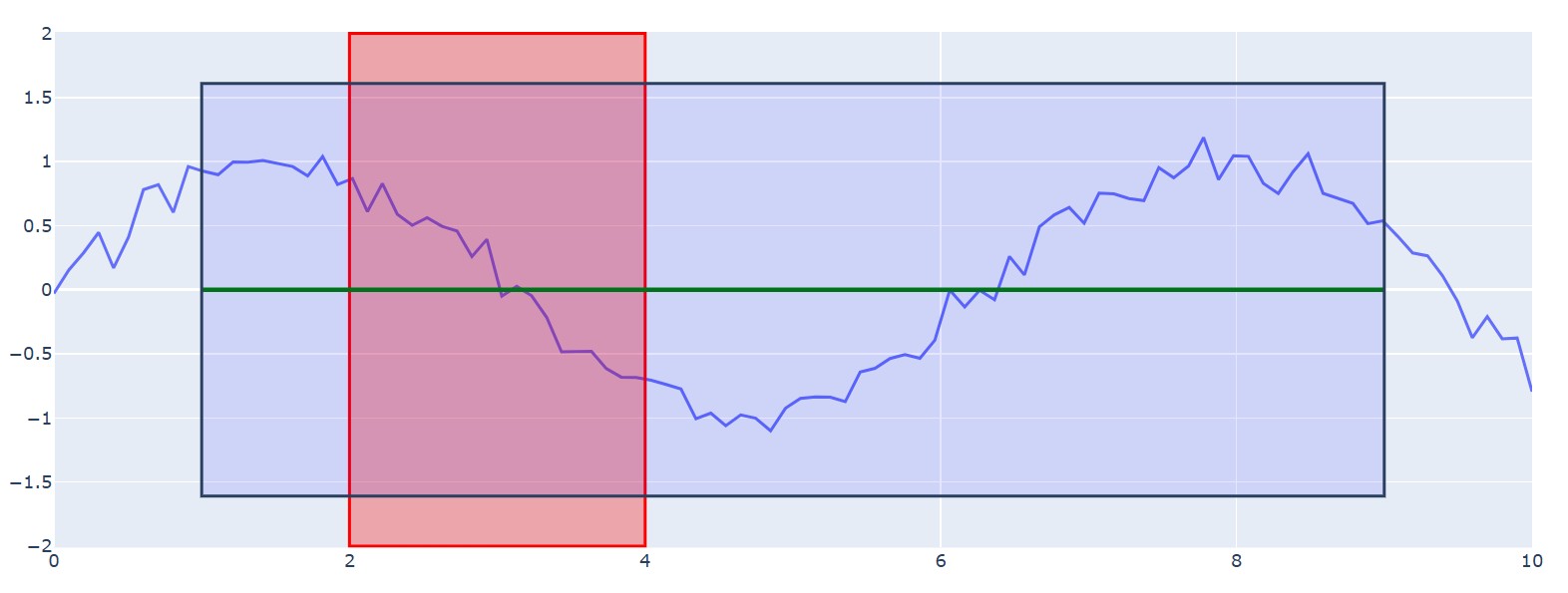
The plotly add_shape() functionality becomes particularly powerful when you understand the coordinate system. Shapes can reference different coordinate systems using the xref and yref parameters.They specify the coordinate frame: use 'x'/'y' to interpret values in data units, or 'paper' to use the normalized plot area where 0 – 1 spans the full width/height from left-bottom to right-top. Let’s modify the above graph using these parameters as shown below:
# Shape referenced to data coordinates (default)
fig.add_shape(type="line", x0=1, x1=9, y0=0, y1=0,
              line=dict(color="green", width=3))

# Shape referenced to paper coordinates (0-1 scale)
fig.add_shape(type="rect", xref="paper", yref="paper",
              x0=0.1, x1=0.9, y0=0.1, y1=0.9,
fillcolor="rgba(0, 0, 255, 0.1)")Output:
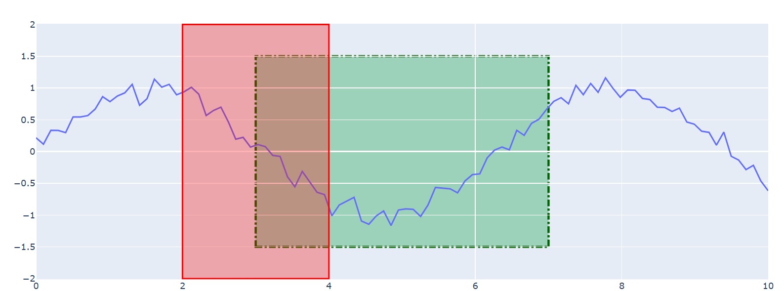
Rectangles and lines are the most commonly used shapes for annotation. Plotly provides extensive customization options to control their appearance. For a quick reference on common Plotly syntax, the Plotly Express Cheat Sheet is an invaluable resource. Let’s look at how to customize these shapes.
Rectangles are defined by two points (x0,y0 and x1, y1). You can style the fill and the border separately.
# Advanced rectangle customization
fig.add_shape(
    type="rect",
    x0=3, x1=7,
    y0=-1.5, y1=1.5,
    # Fill properties
    fillcolor="rgba(50, 171, 96, 0.4)",
    # Line properties
    line=dict(
        color="darkgreen",
        width=3,
        dash="dashdot"  # Options: solid, dot, dash, longdash, dashdot
    ),
    # Layer control
    layer="below"  # Options: above, below
)
Output:
Lines can be added using the specialized ‘add_hline’ and ‘add_vline’ methods for horizontal and vertical lines that span the entire plot, or through the general ‘add_shape’ method for more precise control. Let’s look at an example:
# Horizontal threshold lines
fig.add_hline(y=1.0, line_dash="dash", line_color="red",
              annotation_text="Upper Threshold")
fig.add_hline(y=-1.0, line_dash="dash", line_color="red",
              annotation_text="Lower Threshold")

# Custom diagonal line
fig.add_shape(
    type="line",
    x0=0, x1=10,
    y0=-2, y1=2,
    line=dict(
        color="purple",
        width=4,
        dash="longdashdot"
    )
)
Output:
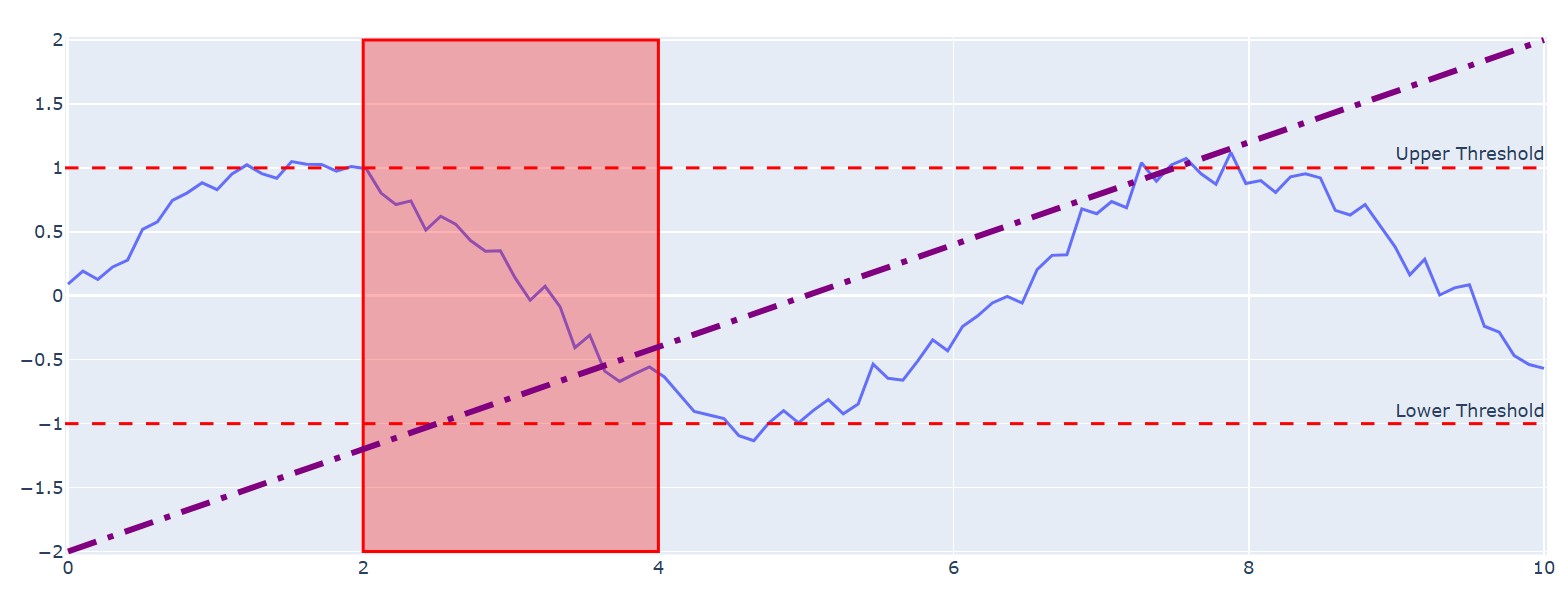
These examples demonstrate how easily you can add and style fundamental Plotly shapes to make your graphs more informative.
Beyond adding basic shapes, Plotly offers powerful tools for managing multiple shapes and controlling their visual hierarchy. These advanced features are essential for creating complex, layered, and dynamic visualizations. Let’s look at some ways to configure and customize the graphs.
While the add_shape() method is perfect for adding shapes one by one, update_layout() method is a more efficient way to manage a collection of shapes, especially when they are generated programmatically. Instead of calling a function for each shape, you can pass a list of shape dictionaries directly to the shapes argument within update_layout().
Let’s see an example of using this method:
import plotly.graph_objects as go
import numpy as np

# Sample scatter plot data
x_data = np.linspace(0, 10, 50)
y_data = np.sin(x_data) + np.random.normal(0, 0.1, 50)

fig = go.Figure(data=go.Scatter(x=x_data, y=y_data, mode='markers', name='Data Points'))

# Define a list of shapes to add
shapes_to_add = [
    # A rectangle highlighting a peak area
    dict(
        type="rect",
        x0=1, x1=2.5, y0=0.8, y1=1.2,
        fillcolor="rgba(255, 165, 0, 0.4)",
        line_width=0
    ),
    # A vertical line marking an event
    dict(
        type="line",
        x0=7.5, x1=7.5, y0=0, y1=1,
        yref="paper", # Span the full plot height
        line=dict(color="red", width=2, dash="dot")
    )
]

# Add all shapes at once using update_layout
fig.update_layout(
    shapes=shapes_to_add
)

fig.show()
Output:
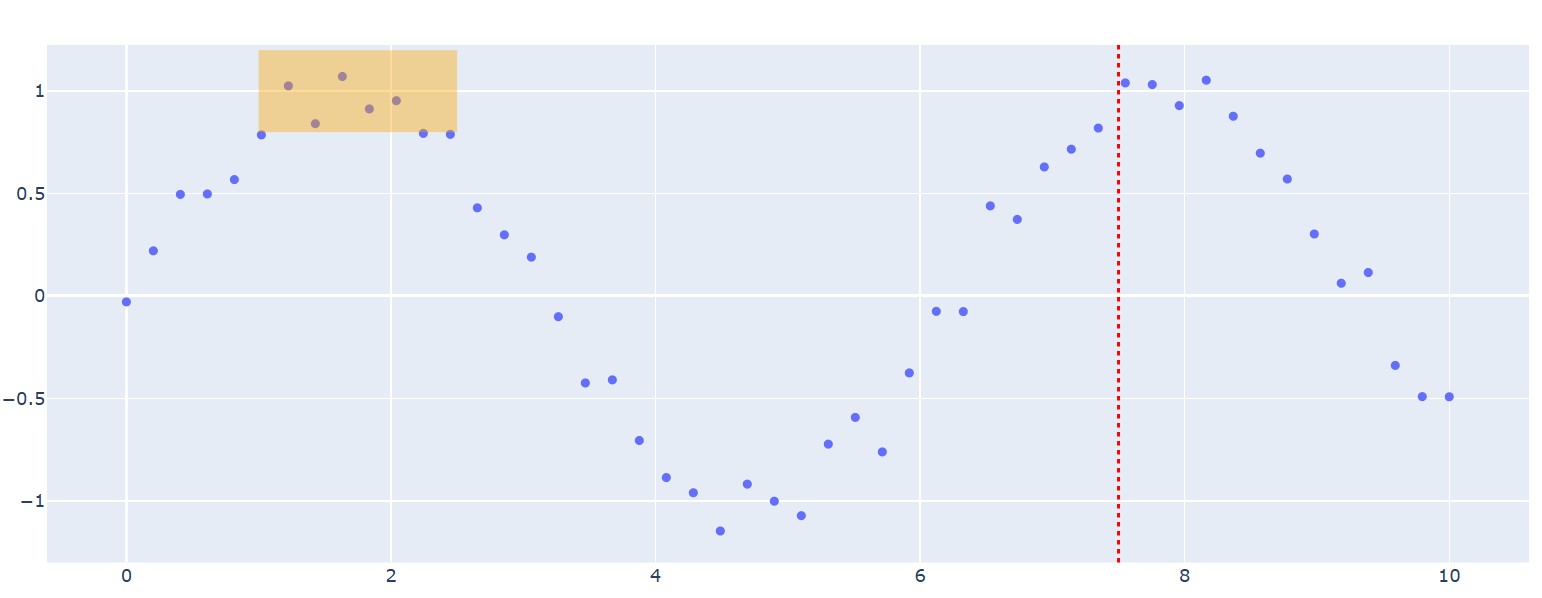
This method is particularly powerful for dynamic applications, such as a Dash dashboard where the shapes need to change based on user input. You can generate a new list of shape objects and update the layout in a single, clean operation. This approach keeps your code organized and is generally more performant for adding a large number of shapes at once.
When you add shapes to a plot, it's important to control whether they appear on top of or behind your data. Plotly manages this through the layer property. While it's not a granular z-index like in CSS, it provides essential control over the visual stacking.
The layer property can be set to one of two values:
'above': The shape is drawn on top of data traces. This is the default setting and is useful for annotations that must be clearly visible.'below': The shape is drawn underneath data traces and gridlines. This is ideal for background shading or highlighting regions without obscuring the data points themselves.The order of shapes within the shapes list also matters: shapes defined later in the list will be drawn on top of those defined earlier (within the same layer).
Here is an example demonstrating the effect of layering:
import plotly.graph_objects as go

fig = go.Figure(data=go.Scatter(x=[1, 2, 3, 4, 5], y=[5, 3, 4, 2, 6], mode='markers', marker_size=20, name='Data'))

# Add a shape BELOW the data points
fig.add_shape(
    type="rect",
    x0=2.5, y0=2.5, x1=4.5, y1=4.5,
    fillcolor="LightPink",
    opacity=0.8,
    layer="below", # Key parameter
    line_width=0
)

# Add a shape ABOVE the data points
fig.add_shape(
    type="circle",
    x0=0.5, y0=4.5, x1=1.5, y1=5.5,
    fillcolor="LightSeaGreen",
    opacity=0.6,
    layer="above", # Key parameter
    line_width=0
)

fig.update_layout(
    xaxis=dict(showgrid=False), # Turn off gridlines to see effect clearly
    yaxis=dict(showgrid=False)
)

fig.show()
Output:
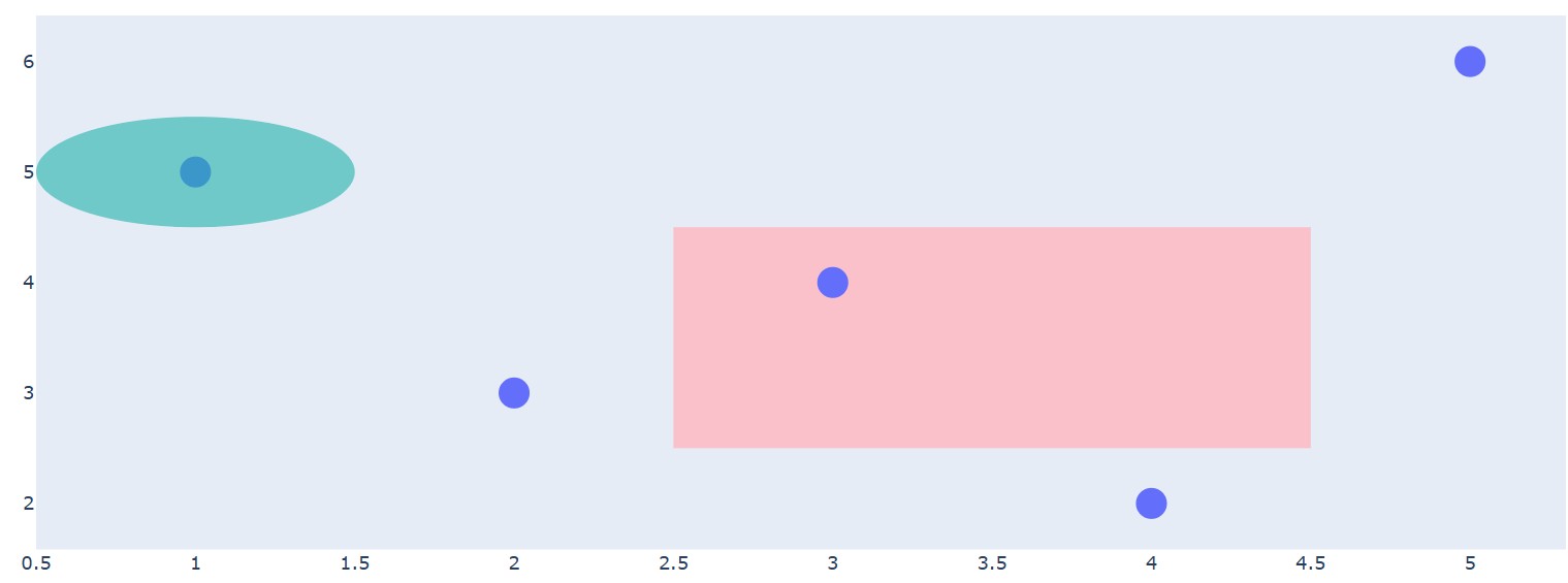
As you can see, the pink rectangle sits behind the markers, while the green circle overlays the data point.
Mastering these layout and layering techniques is a key part of creating more advanced and interactive data visualizations with Plotly. For those working in R, similar concepts apply, as explored in Intermediate Interactive Data Visualization with Plotly in R.
One of Plotly's most powerful features is its interactivity. You can make Plotly shapes editable, allowing users to drag, resize, and rotate them directly on the plot. This feature is enabled by setting editable=True within the shape's definition. Let’s see an example of how to do it:
import plotly.graph_objects as go
import numpy as np

# Create a scatter plot
fig = go.Figure(go.Scatter(
    x=np.random.rand(100),
    y=np.random.rand(100),
    mode='markers'
))

# Add a draggable rectangle
fig.add_shape(
    type="rect",
    x0=0.2, y0=0.2, x1=0.5, y1=0.5,
    line=dict(color="RoyalBlue", width=2),
    fillcolor="LightSkyBlue",
    opacity=0.5,
    editable=True # This makes the shape interactive
)

fig.update_layout(
    xaxis=dict(range=[0, 1]),
    yaxis=dict(range=[0, 1]),
    # The 'newshape' button in the modebar allows drawing new shapes
    # The config dictionary enables editing of existing shapes
    dragmode='select'
)

# To enable editing, the modebar must be visible (default) which you will see when hovering over the graph with the mouse.

# and the plot's config can ensure editing tools are available.
fig.show(config={'edits': {'shapePosition': True}})Output:
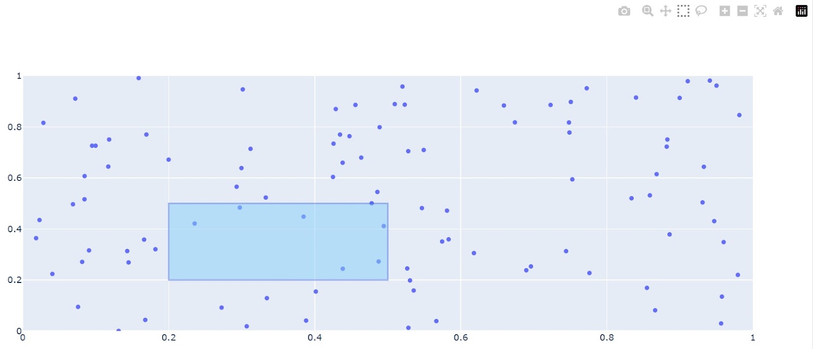
Interactive shapes are incredibly useful for exploratory data analysis. For instance, a user could drag a rectangle over different time periods to see corresponding summary statistics updated in real-time in a Dash app. Or, they could resize a circle to select a different cluster of points for further investigation.
While powerful, be mindful that heavy use of editable shapes can have performance implications in complex web applications. However, for creating truly dynamic and user-driven tools, they are indispensable.
Exploring interactivity is an important part of modern data visualization, a topic well-covered in courses like Interactive Data Visualization with Plotly in R, which shares many principles with its Python counterpart.
While Plotly's built-in shapes are versatile, sometimes you need to create highly complex or custom geometries. By integrating with specialized libraries like Shapely, you can define sophisticated polygons and add them to your visualizations as custom Plotly shapes.
Shapely is a powerful Python library for the manipulation and analysis of planar geometric objects. It is the go-to tool for computational geometry, often used in geospatial analysis. You can use it to create intricate shapes like a union of two overlapping circles or a polygon with a hole in it, and then visualize them in Plotly.
The process involves two main steps:
type: 'path'.An SVG path string is a mini-language for drawing. It uses commands like M (moveto) to set a starting point, L (lineto) to draw a line to a new point, and Z to close the path by drawing a line back to the start.
Let's see how to create a polygon with a cutout and add it to a Plotly figure.
import plotly.graph_objects as go
from shapely.geometry import Polygon

# 1. Create a complex shape using Shapely
# An outer rectangle
outer_coords = [(1, 1), (1, 5), (8, 5), (8, 1)]
# An inner rectangle (this will be the "hole")
inner_coords = [(3, 2), (3, 4), (6, 4), (6, 2)]

# Define the polygon with a hole
polygon_with_hole = Polygon(outer_coords, [inner_coords])

# 2. Extract coordinates and build the SVG path string
# The exterior path
exterior_x, exterior_y = polygon_with_hole.exterior.xy
path = f"M {exterior_x[0]} {exterior_y[0]}"
for x, y in zip(exterior_x[1:], exterior_y[1:]):
    path += f" L {x} {y}"
path += " Z" # Close the exterior path

# The interior path (the hole)
interior_x, interior_y = polygon_with_hole.interiors[0].xy
path += f" M {interior_x[0]} {interior_y[0]}"
for x, y in zip(interior_x[1:], interior_y[1:]):
    path += f" L {x} {y}"
path += " Z" # Close the interior path

# Create a figure
fig = go.Figure()

# Add the complex shape to the figure
fig.add_shape(
    type="path",
    path=path,
    fillcolor="LightSeaGreen",
    opacity=0.7,
    line_color="DarkSlateGray"
)

# You can add data to see how the shape interacts with it
fig.add_trace(go.Scatter(
    x=[2, 7, 4.5],
    y=[3, 3, 1.5],
    mode='markers',
    marker=dict(size=15, color='DarkRed')
))

# Use scaleanchor to ensure the shape's aspect ratio is preserved
fig.update_yaxes(scaleanchor="x", scaleratio=1)
fig.show()Output:
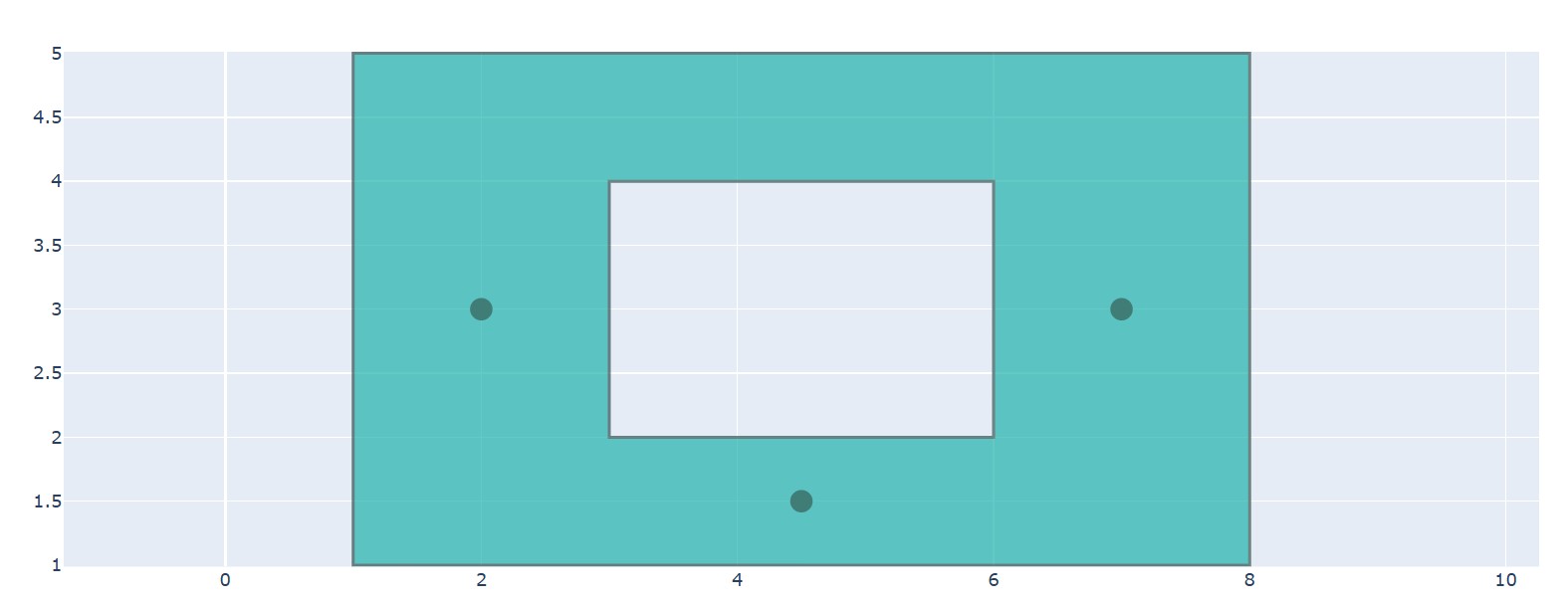
This technique is invaluable for geospatial applications, such as plotting custom sales territories, or in scientific contexts where you might need to highlight irregular areas of interest.
Understanding how different types of data plots are created and how they can be enhanced with such tools is a fundamental skill for any data practitioner. You can learn more about different plot types in this guide on how to create them in Python.
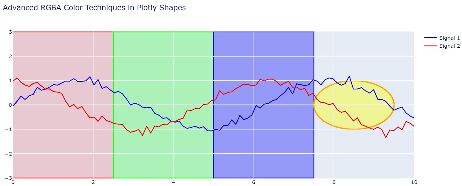
The default appearance of Plotly shapes is functional, but customizing their style is important for creating a polished and professional-looking visualization. Thoughtful use of color, opacity, and fills can significantly improve readability and aesthetic appeal.
Plotly gives you fine-grained control over the appearance of shapes, allowing you to match them to your plot's color scheme and design language.
For precise control over color and transparency, using the RGBA (Red, Green, Blue, Alpha) color specification is highly recommended. The a (alpha) channel controls the opacity, with a value of 1 being fully opaque and 0 being fully transparent.
This is essential for creating non-obtrusive highlights, where the shape adds context without completely hiding the data underneath. You can provide RGBA values as a string like 'rgba(255, 99, 71, 0.5)'. Let’s see an example:
import plotly.graph_objects as go
import numpy as np

# Create sample data for styling demonstration
x = np.linspace(0, 10, 100)
y1 = np.sin(x) + np.random.normal(0, 0.1, 100)
y2 = np.cos(x) + np.random.normal(0, 0.1, 100)

fig = go.Figure()
fig.add_trace(go.Scatter(x=x, y=y1, name='Signal 1', line=dict(color='blue')))
fig.add_trace(go.Scatter(x=x, y=y2, name='Signal 2', line=dict(color='red')))

# RGBA Color Technique 1: Graduated opacity for depth
opacity_levels = [0.15, 0.25, 0.35]
colors = ['255,0,0', '0,255,0', '0,0,255']

for i, (opacity, color) in enumerate(zip(opacity_levels, colors)):
    fig.add_shape(
        type="rect",
        x0=i*2.5, x1=(i+1)*2.5,
        y0=-3, y1=3,
        fillcolor=f"rgba({color},{opacity})",
        line=dict(color=f"rgb({color})", width=2),
        layer="below"
    )

# RGBA Technique 2: Color blending for overlapping regions
fig.add_shape(
    type="circle",
    x0=7.5, x1=9.5,
    y0=-1, y1=1,
    fillcolor="rgba(255, 255, 0, 0.4)",  # Semi-transparent yellow
    line=dict(color="orange", width=3),
    layer="below"
)

fig.update_layout(
    title="Advanced RGBA Color Techniques in Plotly Shapes",
    showlegend=True
)
fig.show()Output:
While Plotly doesn't natively support pattern fills, data practitioners can simulate complex fill patterns using creative techniques. For example, we can create patterns in the plot using a function as shown below:
def create_pattern_fill_simulation(fig, x0, x1, y0, y1, pattern_type='diagonal'):
    """Simulate pattern fills using multiple overlapping shapes"""

    if pattern_type == 'diagonal':
        # Create diagonal line pattern
        line_spacing = 0.2
        line_width = 1

        # Calculate diagonal lines
        range_x = x1 - x0
        range_y = y1 - y0
        num_lines = int((range_x + range_y) / line_spacing)

        for i in range(num_lines):
            offset = i * line_spacing

            # Calculate line endpoints for diagonal pattern
            start_x = max(x0, x0 + offset - range_y)
            start_y = max(y0, y1 - offset)
            end_x = min(x1, x0 + offset)
            end_y = min(y1, y1 - offset + range_x)

            fig.add_shape(
                type="line",
                x0=start_x, x1=end_x,
                y0=start_y, y1=end_y,
                line=dict(color="rgba(0, 0, 0, 0.3)", width=line_width),
                layer="above"
            )

    elif pattern_type == 'crosshatch':
        # Create crosshatch pattern
        spacing = 0.3

        # Vertical lines
        x_lines = np.arange(x0, x1, spacing)
        for x_line in x_lines:
            fig.add_shape(
                type="line",
                x0=x_line, x1=x_line,
                y0=y0, y1=y1,
                line=dict(color="rgba(100, 100, 100, 0.4)", width=1),
                layer="above"
            )

        # Horizontal lines
        y_lines = np.arange(y0, y1, spacing)
        for y_line in y_lines:
            fig.add_shape(
                type="line",
                x0=x0, x1=x1,
                y0=y_line, y1=y_line,
                line=dict(color="rgba(100, 100, 100, 0.4)", width=1),
                layer="above"
            )

    return fig

# Demonstration of pattern fill simulation
pattern_fig = go.Figure()
pattern_fig.add_trace(go.Scatter(x=[1, 2, 3, 4, 5], y=[2, 4, 3, 5, 1],
                                mode='lines+markers', name='Data'))

# Add base rectangle
pattern_fig.add_shape(
    type="rect",
    x0=1.5, x1=3.5,
    y0=1, y1=5,
    fillcolor="rgba(200, 200, 255, 0.3)",
    line=dict(color="blue", width=2),
    layer="below"
)

# Apply pattern fill simulation
pattern_fig = create_pattern_fill_simulation(pattern_fig, 1.5, 3.5, 1, 5, 'diagonal')
pattern_fig.show()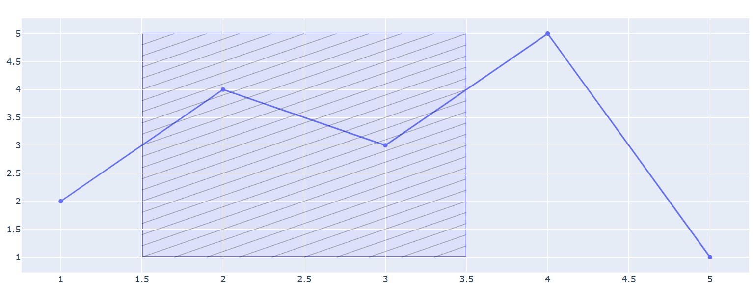
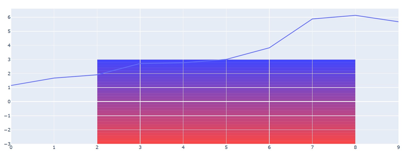
Creating gradient-like effects requires strategic layering of multiple shapes with varying opacity. We can create using the same strategy we used to create the patterns, as shown below:
def create_gradient_effect(fig, x0, x1, y0, y1, start_color, end_color, num_bands=20):
    """Simulate gradient fill using multiple rectangular bands"""

    # Parse RGB values from color strings
    def parse_rgb(color_str):
        if color_str.startswith('rgb('):
            values = color_str[4:-1].split(',')
            return [int(v.strip()) for v in values]
        return [0, 0, 0]  # Default to black if parsing fails

    start_rgb = parse_rgb(start_color) if isinstance(start_color, str) else start_color
    end_rgb = parse_rgb(end_color) if isinstance(end_color, str) else end_color

    band_height = (y1 - y0) / num_bands

    for i in range(num_bands):
        # Calculate interpolated color
        ratio = i / (num_bands - 1)
        r = int(start_rgb[0] + (end_rgb[0] - start_rgb[0]) * ratio)
        g = int(start_rgb[1] + (end_rgb[1] - start_rgb[1]) * ratio)
        b = int(start_rgb[2] + (end_rgb[2] - start_rgb[2]) * ratio)

        # Calculate band position
        band_y0 = y0 + i * band_height
        band_y1 = band_y0 + band_height

        fig.add_shape(
            type="rect",
            x0=x0, x1=x1,
            y0=band_y0, y1=band_y1,
            fillcolor=f"rgba({r}, {g}, {b}, 0.7)",
            line=dict(width=0),  # No border for seamless gradient
            layer="below"
        )

    return fig

# Apply gradient effect
gradient_fig = go.Figure()
gradient_fig.add_trace(go.Scatter(x=list(range(10)),
                                 y=np.random.randn(10).cumsum(),
                                 mode='lines', name='Time Series'))

gradient_fig = create_gradient_effect(
    gradient_fig, 2, 8, -3, 3,
    [255, 0, 0], [0, 0, 255],  # Red to blue gradient
    num_bands=30
)
gradient_fig.show()Output:
While adding Plotly shapes is generally straightforward, you may encounter issues with alignment or performance, especially in complex plots. Understanding these common pitfalls and how to address them will save you significant time and effort.
One of the most frequent challenges is getting shapes to appear exactly where you want them. A line meant to span the entire plot width might fall short, or a rectangle might not align with the gridlines as expected. These problems almost always stem from incorrect coordinate referencing.
Plotly uses two coordinate systems for placing shapes:
xref: 'x', yref: 'y'): This is the default. The shape's position is tied to the values on the x- and y-axes. For example, x0=50 places the point at the 50 mark on the x-axis.xref: 'paper', yref: 'paper'): The position is relative to the plotting area itself, where 0 is the beginning (left/bottom edge) and 1 is the end (right/top edge). This system is independent of the data values or axis ranges.The problem: You want to draw a horizontal line across the entire plot at y=10. If you define it with x0 and x1 using data coordinates, it will only span the current axis range. If the user zooms or pans, the line will not extend to the new edges.
The solution: To make a shape span the full width or height of the plotting area, use 'paper' coordinates for the axis you want to span.
import plotly.graph_objects as go

fig = go.Figure(data=go.Scatter(x=[0, 10], y=[0, 20]))

# Incorrect: Vertical line that might not span the full height if the user zooms out.
# This line is drawn from y=0 to y=20 in DATA units.
fig.add_shape(
    type="line",
    x0=5, y0=0, x1=5, y1=20,
    line=dict(color="Red", width=2, dash="dash"),
    name="Incorrect Line" # Name for legend
)

# Correct: Vertical line that ALWAYS spans the full plot height.
# It is drawn from the bottom edge (0) to the top edge (1) of the PLOT area.
fig.add_shape(
    type="line",
    x0=8, y0=0, x1=8, y1=1,
    yref="paper", # The key to spanning the full height
    line=dict(color="Green", width=3),
    name="Correct Line"
)

fig.update_layout(title_text="Correctly Spanning the Plot Area")
fig.show()Output:
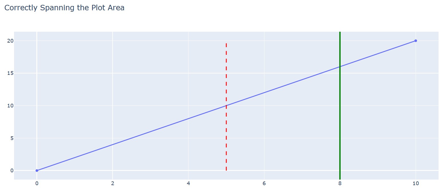
Always double-check your xref and yref properties to ensure your shapes behave as expected during user interaction, like zooming and panning.
If you add a handful of shapes to a plot, the performance impact is negligible. However, adding hundreds or thousands of shapes can significantly slow down rendering and interactivity. Each shape is an individual SVG (Scalable Vector Graphics) element added to the web page's DOM. A large number of DOM elements will strain the browser.
Here are strategies for optimizing performance:
go.Heatmap, could represent the same information more efficiently as a single trace instead of thousands of shape objects.update_layout for bulk additions: As mentioned earlier, adding a list of shapes via fig.update_layout(shapes=...) is more performant than calling fig.add_shape() in a loop.go.Scattergl) for your main data. This offloads the data rendering to the GPU, freeing up the CPU to handle the SVG shapes more smoothly. This is useful when you have a massive number of data points and a moderate number of shapes.For most use cases, the key is to be mindful of the number of unique shape elements you are creating. Before adding thousands of Plotly shapes in a loop, pause and consider if a more performant visualization strategy exists.
Mastering Plotly shapes transforms your graphs from simple data representations into compelling, context-rich stories. We've looked at drawing basic lines and rectangles to layering complex, interactive geometries.
By applying these techniques, you can guide your audience’s focus, highlight critical insights, and build more intuitive visualizations that communicate with clarity and impact.
Ready to apply these skills? Start building more powerful visualizations today by exploring the Introduction to Data Visualization with Plotly in Python course and put your knowledge to the test.
Top DataCamp Courses
Course
Course
Course
Tutorial
Kevin Babitz
Tutorial
Bekhruz Tuychiev
Tutorial
Elena Kosourova
Tutorial
Samuel Shaibu
code-along
Justin Saddlemyer
code-along
Filip Schouwenaars