
Course
Data Modeling in Power BI
3 hr
94.7K
When building a Power BI dashboard, you want to present information effectively without overwhelming your audience.
This is what tooltips are all about. They allow you to provide additional context about a data point when a user hovers or clicks on a visual.
In this article, you will learn about Power BI tooltips, their features, and how to create, customize, and optimize them to enhance user experience in your reports.
Power BI tooltips are small popups that appear whenever a data point is hovered over a report visual. They display additional information about a particular data point, enhancing the understanding of the visualized data.
The primary purpose of tooltips is to provide contextual information that enriches the visual experience without cluttering the main visual. They can also be navigation aids, helping users interpret data more effectively.
Tooltips in Power BI also clarify complex calculations or relationships that are not immediately apparent from the visual itself. For example, hovering over a KPI visual might display how the metric was derived.
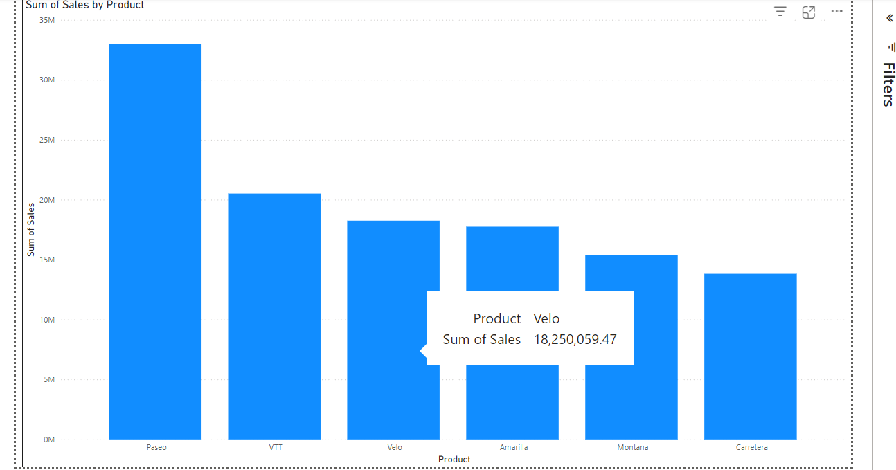
An automatically generated Power BI tooltip. Image by Author.
Tooltips in Power BI are customizable, allowing you to display whatever information to users. Here are some of the key features of Power BI tooltips.
There are various types of tooltips you can have in a Power BI report:
Default Tooltips usually display basic information and the basic info might not align with the audience's specific needs and the report’s specific objectives, which is why creating customized tooltips is often a very good idea.
Before proceeding, ensure you have loaded the sample data provided by Power BI. To do so, open a blank report and click the Use sample data button.
 Load the sample data provided by Power BI. Image by Author.
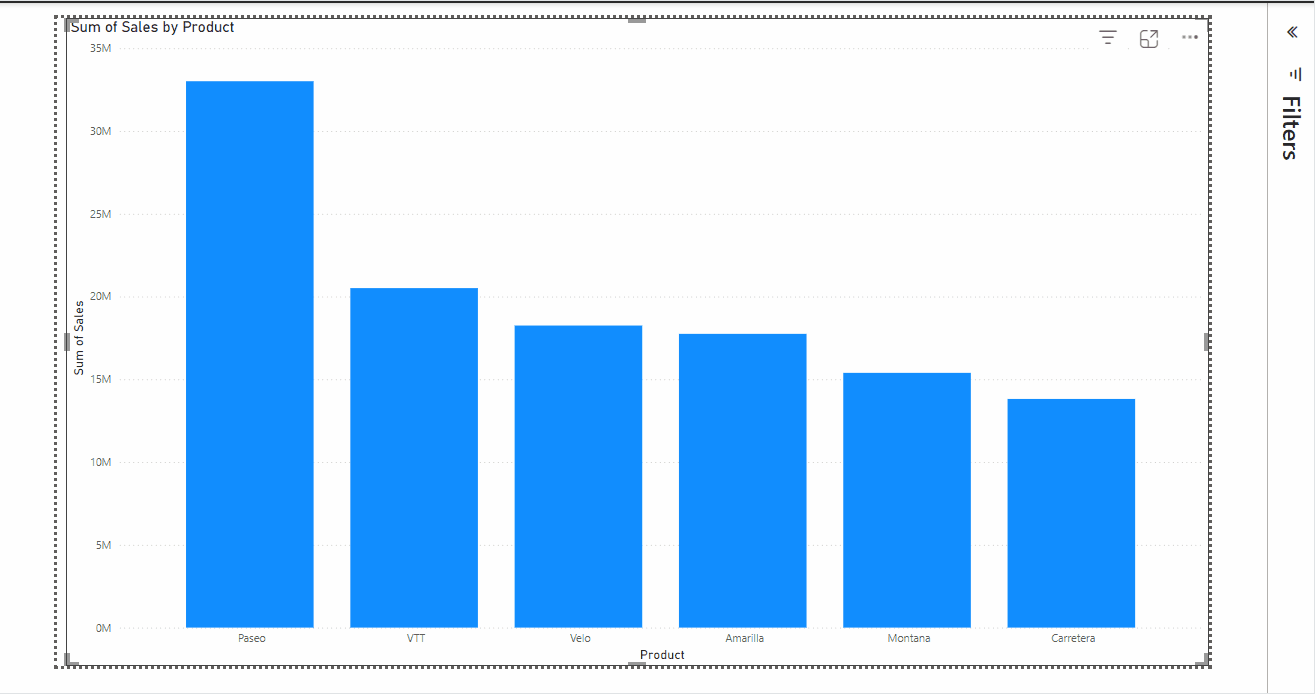
Let’s create a column chart showing total sales by product to apply the tooltip. Go to the Visualizations pane and select the Stacked column chart. Then, drag the Product and Sales fields into the X-axis and Y-axis fields of the visual, respectively.
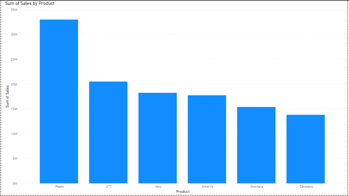
Column chart showing total sales by products. Image by Author.
To create a custom tooltip, you need to create a new page by clicking the + button at the bottom of the report canvas. Then under the Visualizations pane, click the Format page icon and select the Tooltip option under the Canvas settings.
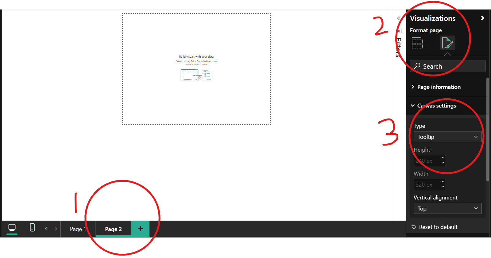
Create a tooltip page. Image by Author.
Tooltips are meant to be simple and visible since they are popups that appear when a data point is hovered. You should keep this in mind when creating tooltip visuals.
Since the tooltip canvas is small, you can ensure that the visuals are accurately represented by going to the View tab, clicking Page View, and setting the page to size by clicking the Actual size button.
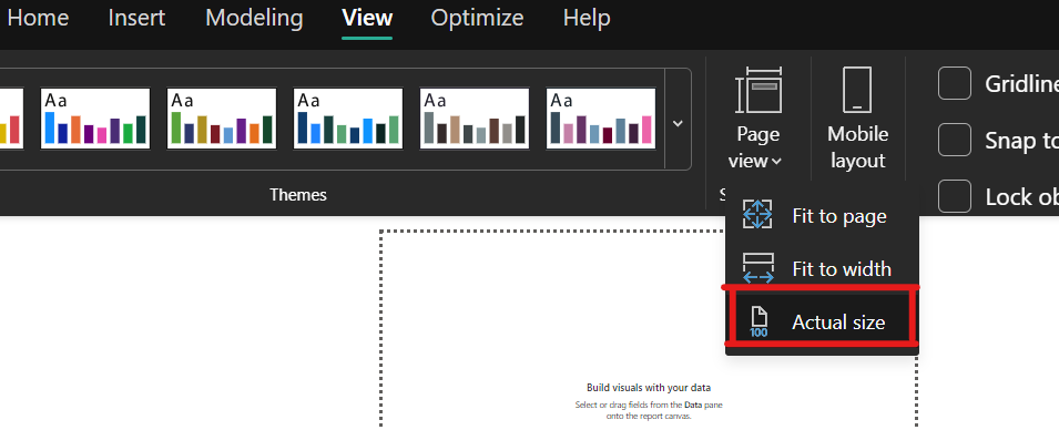
Set to actual size. Image by Author.
Before configuring the tooltip fields, we need to rename the tooltip page. Go to the Format Page under the Visualizations pane.
Under the Page information card, rename the tooltip page to Tooltip 1, and turn on the Allow use as tooltip slider to configure the tooltip page.
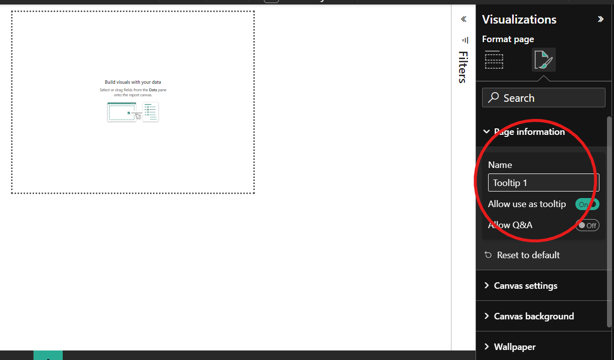
Rename the tooltip page. Image by Author.
Once the slider is turned on, drag the data fields of interest, the Product and Sales fields, into the Tooltips fields bucket of the Visualizations pane. Once done, this tooltip will replace any default tooltip set by Power BI.
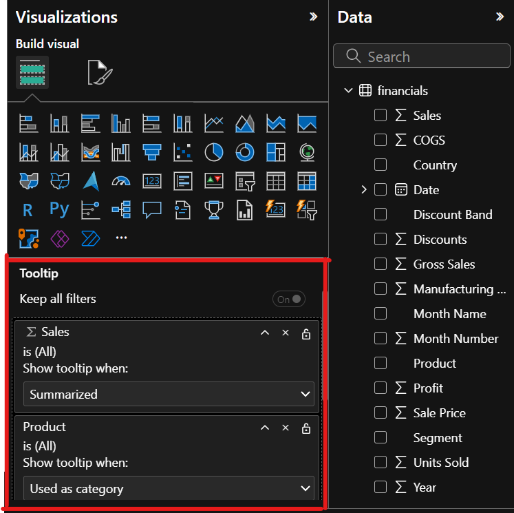
Configure the tooltip. Image by Author.
Since we already have a column chart showing the total sales by product, let’s customize the tooltip content by adding two cards showing the total profit made from the product and the number of units sold. We would also add a table showing the amount of sales made from various segments.
Make your visuals simple and not complex to ensure users can see all the information. On your tooltip page, create two card visuals and drag the Profit and Units Sold fields into each card. Then, create a table and drag the Segment and Sales fields into the Columns field.
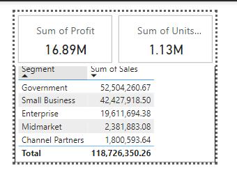
Add contents to the Power BI tooltip. Image by Author.
When you hover over the columns of the column chart visual on the report page, the tooltip should display as shown below.
Power BI tooltip in action on the column visual. Image by Author.
Aside from automatically assigning data values to a Power BI tooltip, you can manually set a tooltip on a report page visual.
To assign a tooltip to a visual, go to Format visual under the Visualizations pane, click on the Tooltips card under the General tab, and select the tooltip you want displayed.
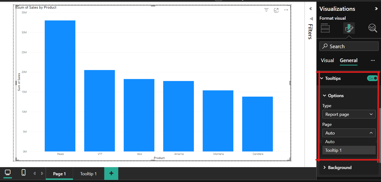
Manually configure the tooltip on a visual. Image by Author.
Manually setting up a tooltip comes in handy if multiple fields in a visual have associated tooltips and the default selection does not align with the information you want to display.
For example, in the column chart visual showing sales by product, if the product field has a tooltip showing profit and unit sold and the total sales has a tooltip showing metrics like growth percentage, Power BI might default to showing the product tooltip when a data point is hovered. However, if this is not the tooltip you want displayed, you can use the steps described above to set the tooltip to show the growth percentage manually.
The tooltip we created displays the total profit made from each product. What if we are interested in the average and not the total?
You can change this by selecting the visual, going to the Data field under the Visualizations pane, clicking the drop-down menu in the Profit field, and changing the quick measure to Average.
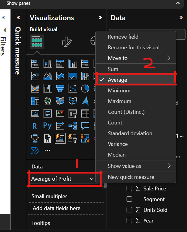
Change a tooltip quick measure. Image by Author.
Earlier, we talked about model visual tooltips. This type of tooltip comes in handy when you have a detailed report you want embedded in each data point of a visual.
For example, another report shows a deeper analysis of the profit made from each product. To create modern visual tooltips that support drill actions;
Apply modern visual tooltips to the report. Image by Author.
To see the effect of this setting, turn off the tooltip slider on the Power BI tooltip page, save your report, and restart the Power BI Desktop.
When you open the report and hover over each column of the visual, you should see the drillthrough options, which will show all available tooltips. When you click on Tooltip 1, that particular report or tooltip page will open up.
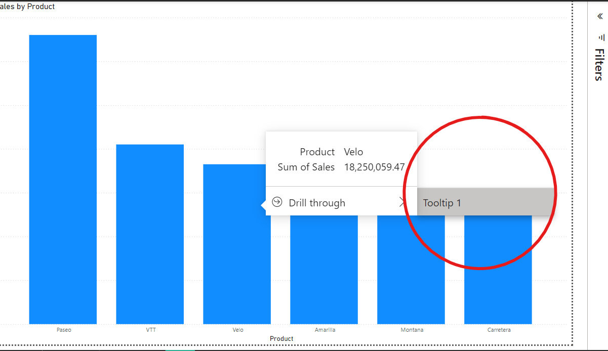
Power BI tooltip drill through. Image by Author.
Here are some tips and pitfalls to avoid when creating custom Power BI tooltips.
When creating reports, one might feel overwhelmed to overload the report with information. But one needs to keep the report focused and straightforward. If you have additional information you want to include, you can include all these in your tooltips, but keep in mind that they also should be concise and relevant.
What you have learned today should help improve the user experience of your Power BI reports. Here are some of our great Power BI courses to help you with your reports:
Master the world's most popular business intelligence tool.
Learn Power BI with DataCamp
Course
Course
Course
blog
Kenneth Leung
7 min
Tutorial
Joleen Bothma
Tutorial
DataCamp Team
Tutorial
Joleen Bothma
Tutorial
Joleen Bothma
code-along
Maarten Van den Broeck