Course
Data Modeling in Power BI
3 hr
85.1K
As a Data Scientist, being able to provide businesses with a clear and concise visualization can help them grab key information about their data for quick and efficient decision-making.
Different types of visualizations exist to communicate different messages. For instance, histograms are used to measure the distribution of numerical data, scatterplots for analyzing relationships between variables, and pivot tables for summarizing key statistics in a single table, just to name a few using tools like Power BI, Tableau, etc.
This data visualization in Power BI course can upskill you in building insightful visualizations through built-in and customized charts and conditional formatting with Power BI.
This conceptual blog aims to cover another type of data visualization called heatmaps. We will first build your understanding of what heatmaps are before highlighting their benefits. Then, we will cover hands-on practice to help you understand how they work using Power BI. Finally, we will examine some things to be aware of when using Power BI heatmaps.
Heatmaps were originally introduced by Cormac Kinney to graphically represent real-time financial information. They are used in data visualization to measure the intensity of given business values, encoded using different colors.
The following image is an example of the heatmap, shared by NASA on July 13th, 2022. It shows the surface air temperatures for many countries in the world. The hottest the area is, the darkest the color. Investly, the coldest, the color is more driven towards blue. Such information can be easily understood at a glance.
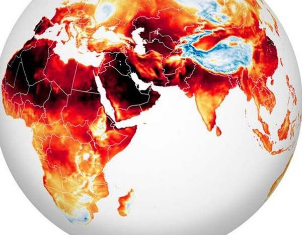
Source: NASA heatwave map reveals an alarming rise in temperatures globally
Data Scientists can use them to turn companies' information into easy-to-understand visualizations to help them make actionable smart decisions.
Using heatmaps can provide a significant intuitive level of visual representation of information at different levels. It is one of the most powerful approaches to business intelligence. Also, many businesses are using it for the following reasons:
When designing a tool, like a website, we have an expectation of the end use. However, the end-users might not have the right understanding of the design concept, which can lead them to have a different interaction with the tool. In such a situation, a heatmap visualization can be used to have a better understanding of the users' behavior by tracking the main pages getting more interest, and the areas (clickable and non-clickable) that are being clicked the most.
After having a better understanding of the users’ behavior, businesses can design and set up their tools in a way that people can find the right information at the right location. Doing so can lead to generating more traffic and consequently create more business values.
Heatmap visualizations can provide an in-depth visual understanding of how users interact with your business website, and can be a good alternative to tools like google analytics which are not always intuitive and might be even sometimes overwhelming.
Heatmaps are my go-to approach when performing correlation analysis. Instead of dealing with numerical values in the correlation matrix, heatmaps can be used to get a quick visual representation of the relationship between multiple variables for training your Machine Learning models.
Heatmaps provide a wide range of possibilities in different domains because of their ability to generate a simple visual representation of the data. Below are five different types and their applications.
These types of heatmaps are used by organizations whose activity is internet-driven, such as media services, SaaS companies, eCommerce companies, etc. They use heatmap visualizations to monitor and understand users’ behavior on their platforms, to discover insights for better decision making. Some of the web heatmaps are:
Mainly used by earth scientists, a geographical heatmap displays data on a real map and assigns high and low density to some geographical areas. An illustration of this case is the NASA example shown previously.
These heatmap visualizations have been successful with the rise of Artificial Intelligence. They can be used for instance in modern vehicles to monitor the visual actions of drivers in order to increase road safety by trying to minimize their cognitive distractions.
Heatmaps can be used by financial market specialists to quickly assess the performance of companies and the continuous fluctuation of the market values of assets, products, etc.
Many sports coaches and managers use heatmaps nowadays not only to monitor their players' performance but also to study the rival team players to create winning strategies.
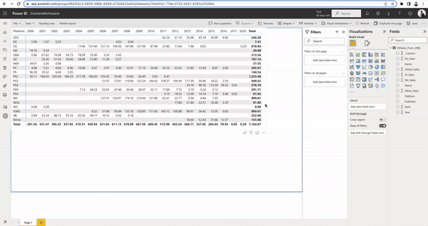
Now that you have a general understanding of what heatmaps are and some examples of visualizations, this section will provide you with the skills to create your own table heatmap of the sales of video games. The table will show for each platform, its global sales per year, from 2006 to 2020.
The data being used is available at Datacamp workspace, a collaborative cloud-based environment with built-in datasets. If you’re intrigued to learn more about Power BI, check out our Power BI fundamentals track.
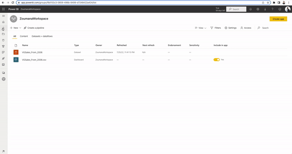
From the left column panel, select the workspaces tab to upload your data. Create one if you do not have one yet.
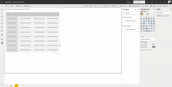
Before building the heatmap table visualization, we need to create a two-by-two matrix from our data. This can be done as follows from the plus sign on the left column.
Choose your data and your matrix template
This corresponds to choosing the data you want to build the heatmap table from.
Create matrix from data: we need to select the row, column, and values we want to display. In our case:
click your matrix > expand data on the right > this will show all the columns in your data.
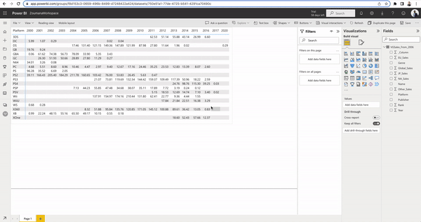
Let’s remove the Total row and column because keeping them can be too much information. from the Visualizations tab:
Building the heatmap table visualization consists of two main steps: (1) encoding the background of each sales value with colors using a color range, and (2) using the same color range for the values font.
(1) Global_Sales from Values > Conditional Formatting > Background color
The color is whiter when we have lower values of global sales. On the other hand, it is redder for higher values.
(2) Global_Sales from Values > Conditional Formatting > Font color
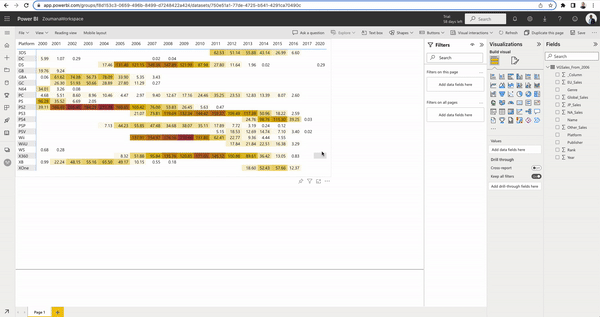
Congratulations! you have created your heatmap table visualization using PowerBI.
It is important to keep in mind the following key points when building heatmaps using Power BI:
This conceptual blog has provided a complete overview of what heatmaps are, and their benefits to businesses in different domains. Also, you have learned how to create your own heatmap visualization using Power BI.
If you are interested in getting more Data Science skills, the following courses might be a great next move.
You can also check out our Power BI cheat sheet as a quick reference guide.
Master the world's most popular business intelligence tool.
Courses for PowerBi
Course
Course
Course
Tutorial
DataCamp Team
Tutorial
Parul Pandey
Tutorial
Joleen Bothma
Tutorial
Kafaru Simileoluwa
code-along
Nick Switzer
code-along
Iason Prassides