Course
Our goal as data analysts is to arrange the insights of our data in such a way that everybody who sees them is able to understand their implications and act on them accordingly.
Power BI is a cloud-based business analytics service from Microsoft that enables anyone to visualize and analyze data, with better speed and efficiency. It is a powerful as well as a flexible BI tool for connecting with and analyzing a wide variety of data. Many businesses even consider it indispensable for data-science-related work. Power BI’s ease of use comes from the fact that it has a drag-and-drop interface. This feature helps to perform tasks like sorting, comparing, and analyzing, very easily and fast. Power BI is also compatible with multiple sources, including Excel, SQL Server, and cloud-based data repositories, which makes it an excellent choice for Data Scientists.
1. Overview of Power BI
Overview
Power BI gives the ability to analyze and explore data on-premise as well as in the cloud. Power BI provides the ability to collaborate and share customized dashboards and interactive reports across colleagues and organizations, easily and securely.

Power BI Overview. Source: Microsoft
Power BI’s components
Power BI consists of various components which are available in the market separately and can be used exclusively.
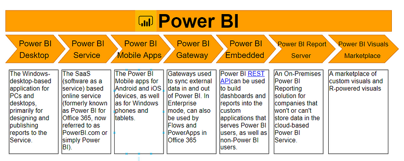
Power BI Components. Source: Wikipedia
Choosing which component to work with depends mainly on the project or a team. We, however, will be working with Power BI desktop since this is a component primarily used for Business reports generation and desktop creation. Also, all the other works typically begin with Power BI desktop, where the report creation takes place.
Introduction to Power BI
For a great hands-on introduction on how to navigate the Power BI platform, take DataCamp's course, Introduction to Power BI.

2. Advantages of using Power BI
Power BI provides certain benefits which make it superior to the existing analytical tools:
- Provides a cloud-based as well as a desktop interface.
- Provides capabilities like data warehousing, data discovery and interactive dashboards.
- Ability to load custom visualizations, and
- Easily scalable across the entire organization.
3. Power BI Desktop
Power BI is a free application that can be downloaded and installed on the system. It can be connected to multiple data sources. Usually, an analysis work begins in Power BI Desktop where report creation takes place. The report is then published to Power BI service from where it can be shared to the Power BI Mobile apps so that people can view the reports even on mobiles.
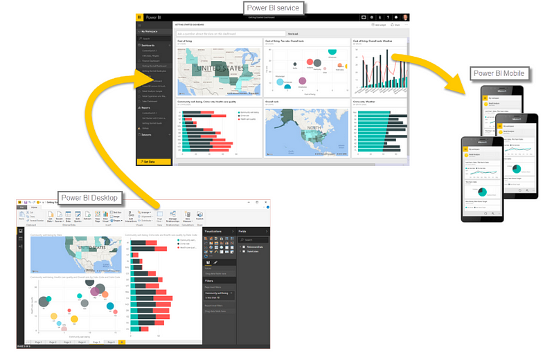
Power BI Desktop. Source: Microsoft
Installation
Power BI only runs on Windows Machines. Mac users could spin up a Windows VM in Azure and load Power BI onto that or use Turbo.net, which can stream Power BI to the Mac directly from the cloud.
Power BI can be used in two ways:
- As an app from the Microsoft store and just sign in to get started. This is the online version of the tool.
- Download the software locally and then install it. Make sure you read all the installation instructions.
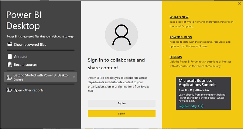
Depending upon the choice of product, download the software on to the computer. After accepting the license agreement, verify the installation by clicking the Power BI Icon/App. If the following screen appears, you are good to go.
4. Getting Started
Let us now get an idea about working with Power BI Desktop. In this section, we shall explore it a bit to get accustomed to its interface.
Power BI Workspace
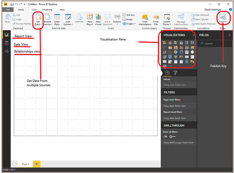
The image below highlights the major components of the workspace of Power BI.
Basic views
-
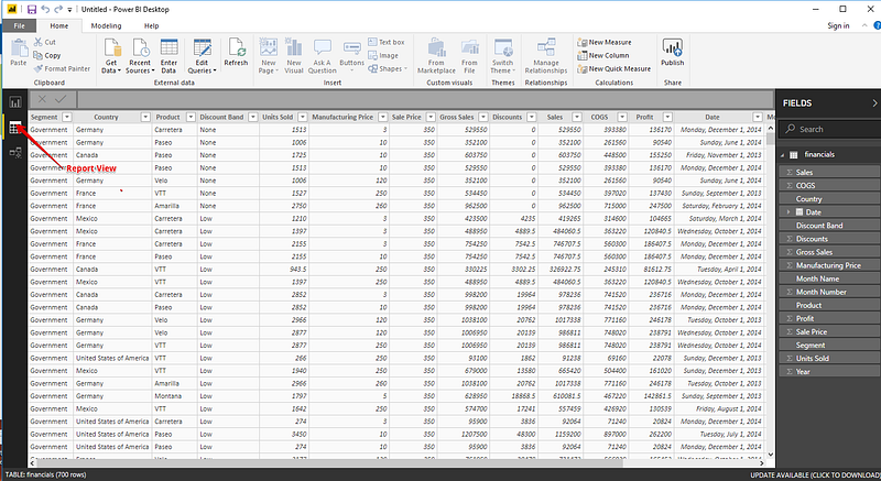
Report View: This is the main view where the Dashboard is created.
-
Data View: The data view gives a preview of the entire data.
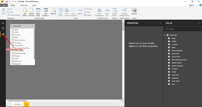
- Relationship View: The relationship view displays the relationship between various objects.
Connecting to a data source
Power BI can be connected to several data sources. The Get Data icon displays all the possible available options from where data can be imported into Power BI.
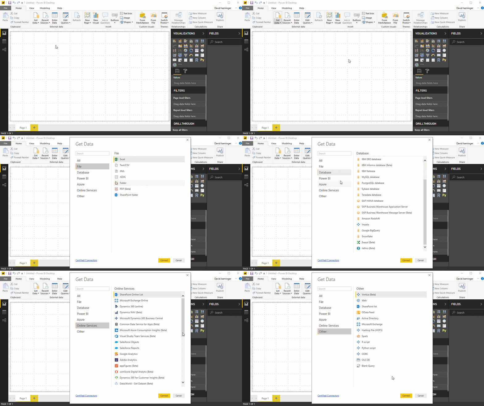
Let’s look at a few of the most commonly used data sources:
Excel data
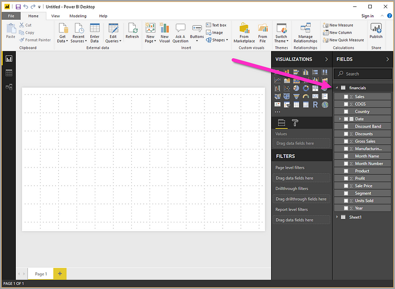
Let’s connect to an Excel data source. The workbooks consist of some fake financial data. Download the file from here. Power BI Desktop loads the workbook and reads its contents, and shows you the data in the file using the Navigator window.
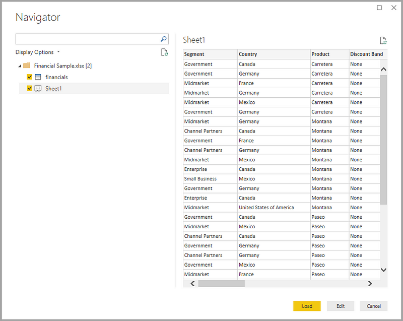
Once loaded, the data can be viewed in the Fields pane.
Web
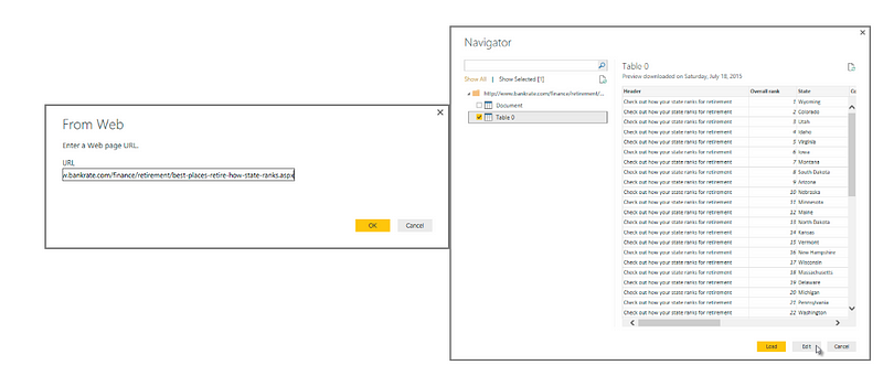
You can also use the data from the web. Here is a dataset which presents the best and the worst states for retirement in the U.S.
link: https://www.bankrate.com/retirement/best-and-worst-states-for-retirement/
Simply select Web as an option in Get Data and enter the name of the url.
Try experimenting with other data sources too.
5. Transforming Data
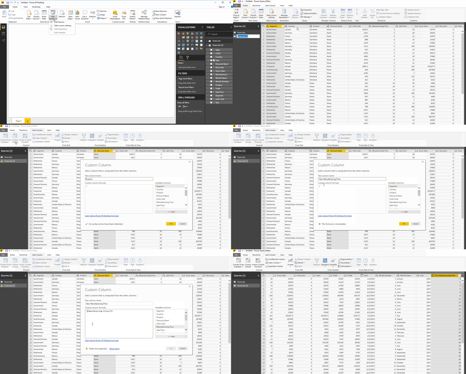
After the data has been loaded, it becomes visible under the Fields Tab. From here, we can modify our datasets with the help of Query Editor. Query editor can be used for modifying datasets irrespective of their data source. We can do manipulations like renaming a dataset, removing a single or multiple columns, etc. in the query editor. The Query Editor can be accessed by clicking the Edit Queries button on the Home Ribbon.
Creating a custom column
Using the same Financial data, that we used above, let’s shape data to meet our needs. Let’s create a custom column called New Manufacturing Price, which is equal to:
([manufacturing Price])*3
Changing column data types
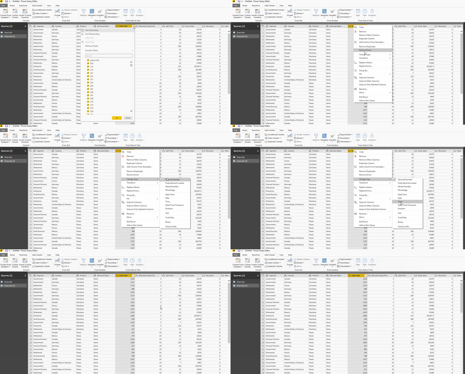
The data types of the columns can also be changed easily. The Units Sold column has a floating point data type which can be adjusted to a whole number.
Removing columns
Removing columns is also easy. Simply select the column to be selected and choose the Remove Columns option, as shown in the following figure. Let’s get rid of the Discount column as it is adding no value to our dataset.
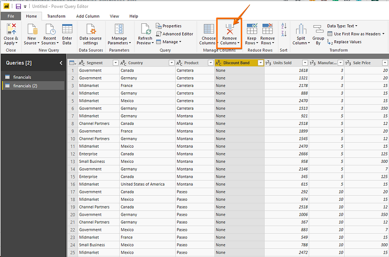
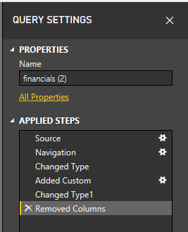
Similarly, there are other multitudes of functions that can be carried out like removing and adding rows, transpose, pivot and split which can be easily achieved through the query editor. Note that all the steps that you undertake to transform your data also appears in the Query Settings panel.
6. Reports
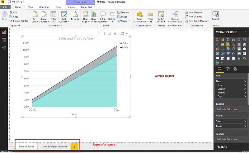
Reports are a collection of visualizations that can be created on one or more pages. These visualizations are usually related to one another.
7. Dashboard
A dashboard is a collection of several views, enabling one to compare a variety of data simultaneously. Whereas the report can encompass various pages, a Dashboard is a single page interface.
Creating a dashboard
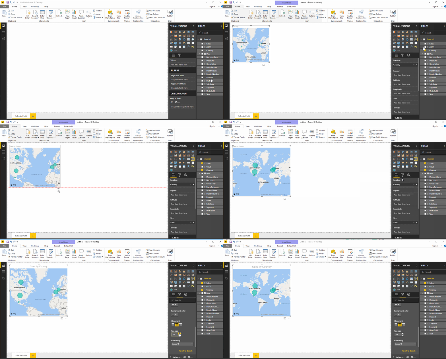
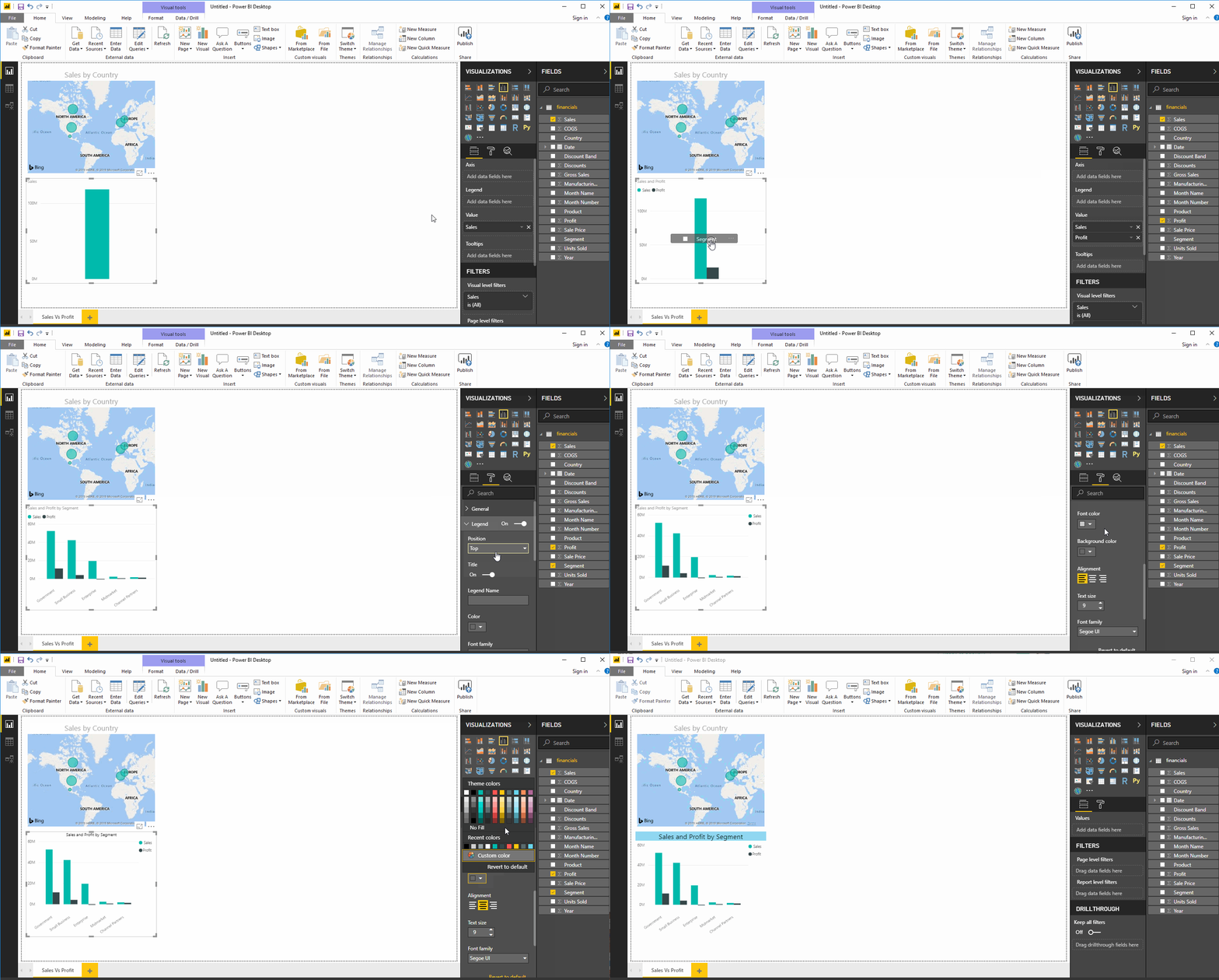
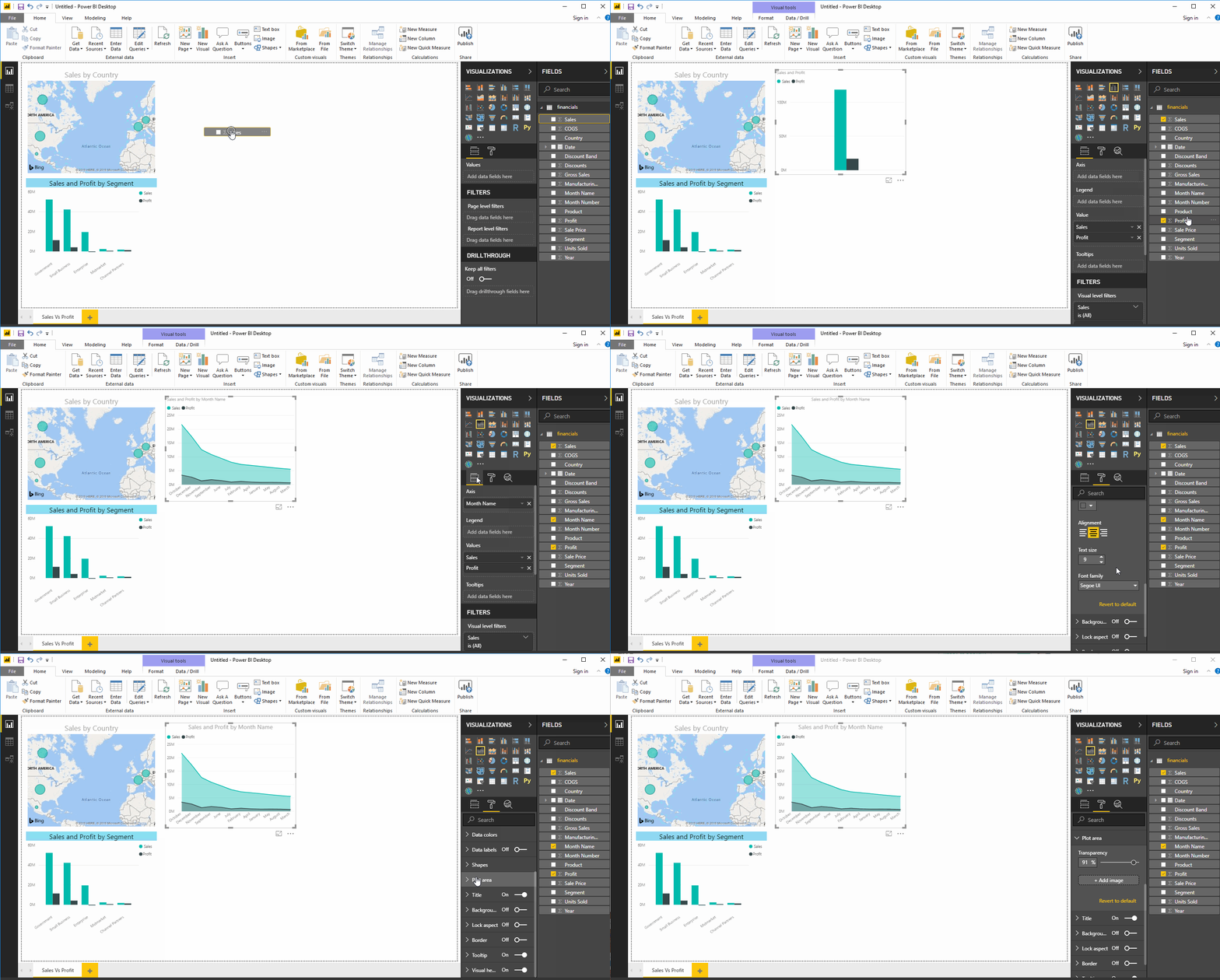
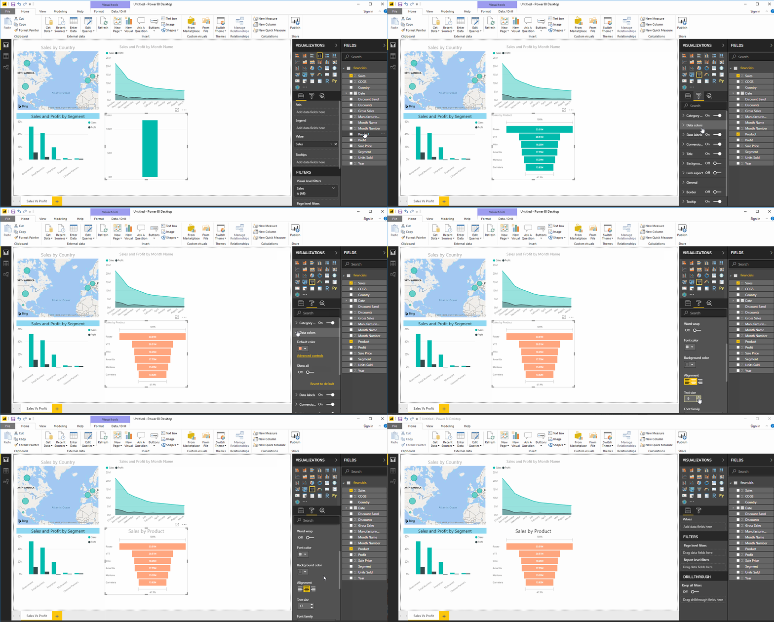
Once we have the dataset ready with all the manipulations done, we can proceed for the Dashboard creation process. A Power BI dashboard, also known as canvas, consists of many visualizations on a single page which helps to tell a story. These visualizations called tiles are pinned to the dashboard from the reports.
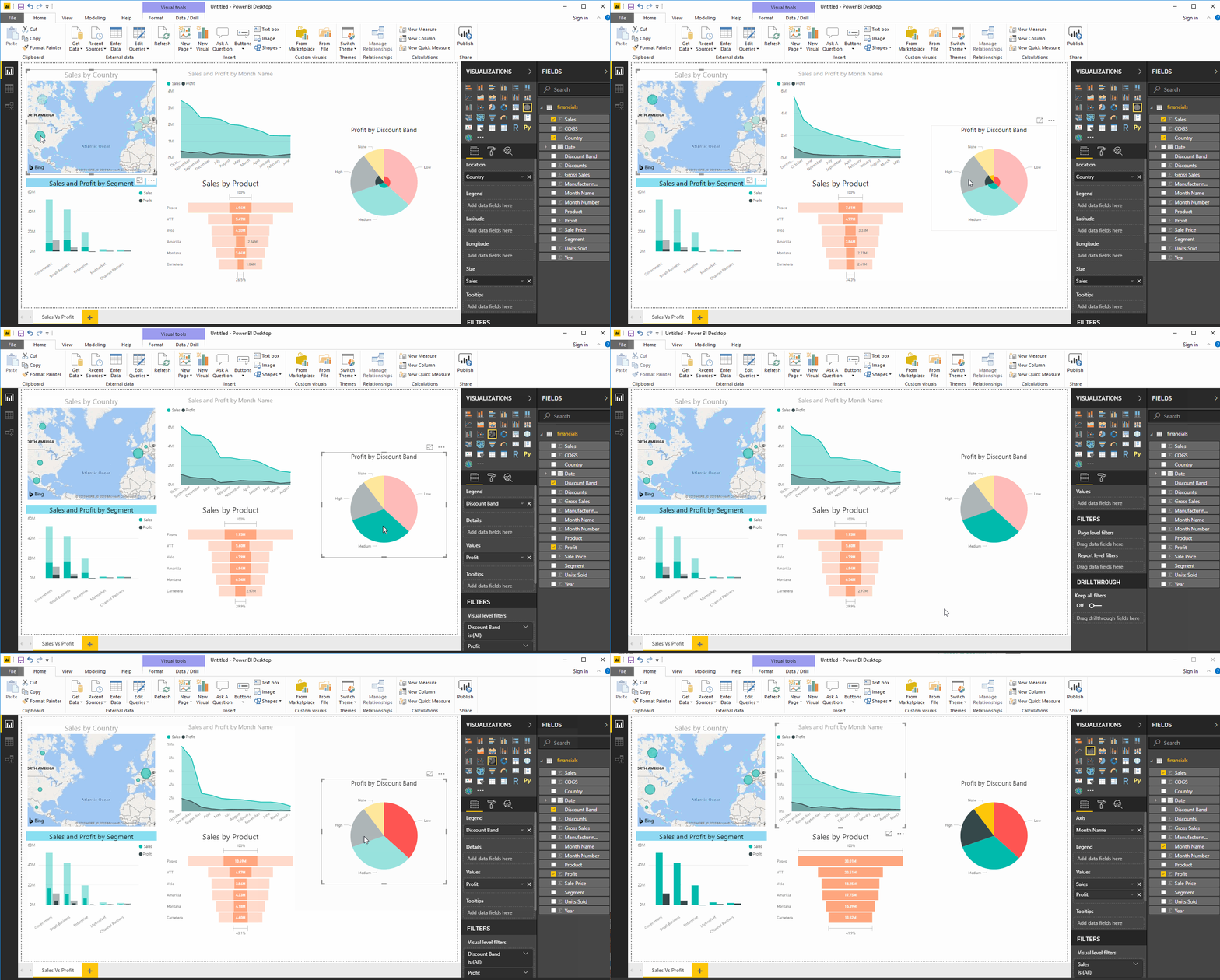
Let’s now try to understand what insights we can get using superstore data set:-
- Sales by Country
- Sales and Profit by Segment
- Sales & Profit by Month
- Sales by Product
- Profit by Discount Band
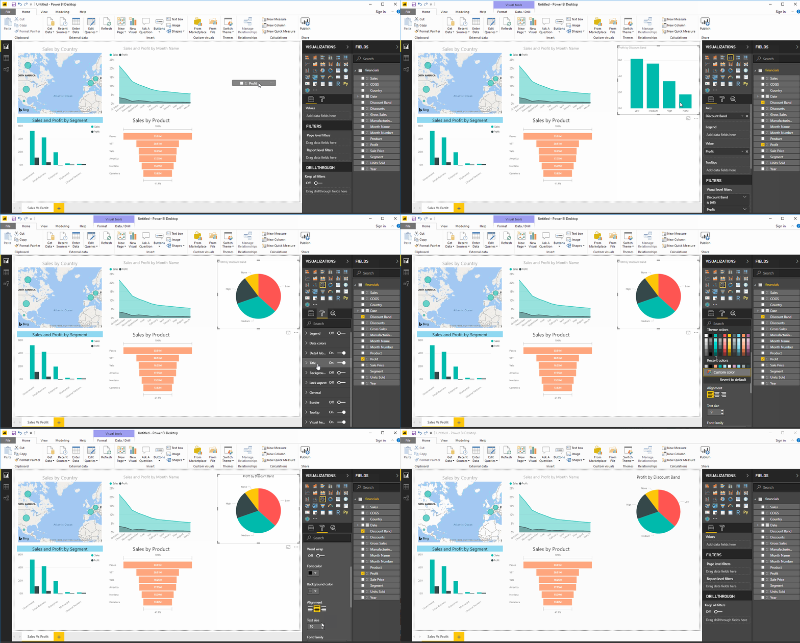
The Dashboard created is interactive which means a change in one tile affects the other.
8. Power BI’s integration with R & Python
Apart from the various visualization advantages that Power BI offers, it also has an amazing out of the box connection capabilities. Power BI can easily integrate with languages like Python, R, and even with DBMS like SQL. This offers increased advantages in terms of functionalities and comes in handy for Data Scientists who are used to working in Python or R. They can directly import the R and Python scripts in the workspace and take advantage of its visualizations which are far more superior than that of these languages.
In this section we shall learn how to work with Python and R scripts in R. For learning about SQL’s integration with Power BI, check out our SQL with Power BI tutorial.
Power BI & R
R is a popular statistical language used to perform sophisticated analysis and predictive analytics, such as linear and nonlinear modeling, statistical tests, time-series analysis, classification, clustering, etc. Using Power BI in conjunction with R gives the users access to a rich, ever-expanding collection of statistical analysis and data mining libraries to help them gain deeper insights from their data.
Pre-requisites
Make sure you have the following installed and running on your local systems:
- R
- A separate R integrated development environment (IDE) like R Studio.
It is also important to note that:
- Only data frames are imported
- Any R script that runs for more than 30 min gets automatically timed out.
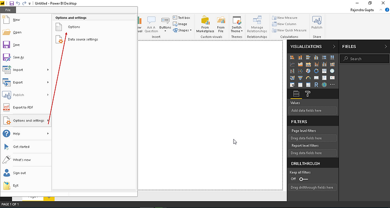
Verify that R and R studio are installed on your system. Launch the Power BI and go to Options and Settings -> Options
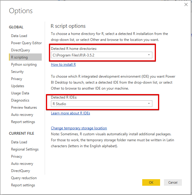
Under Options, go to the R Scripting tab and make sure you can see the correct R version.
Using R Scripts within Power BI
Working with R Scripts in Power BI is an excellent resource on this topic. Below is an overview from the same source.
1. R scripts for importing data
There may be times when you don’t want to import an entire dataset but a portion of it. You can write an R script to only select specific columns or rows from the entire dataset to be loaded into Power BI.
For this demonstration, we will be working with the well known Iris dataset that is included with the CRAN distribution.
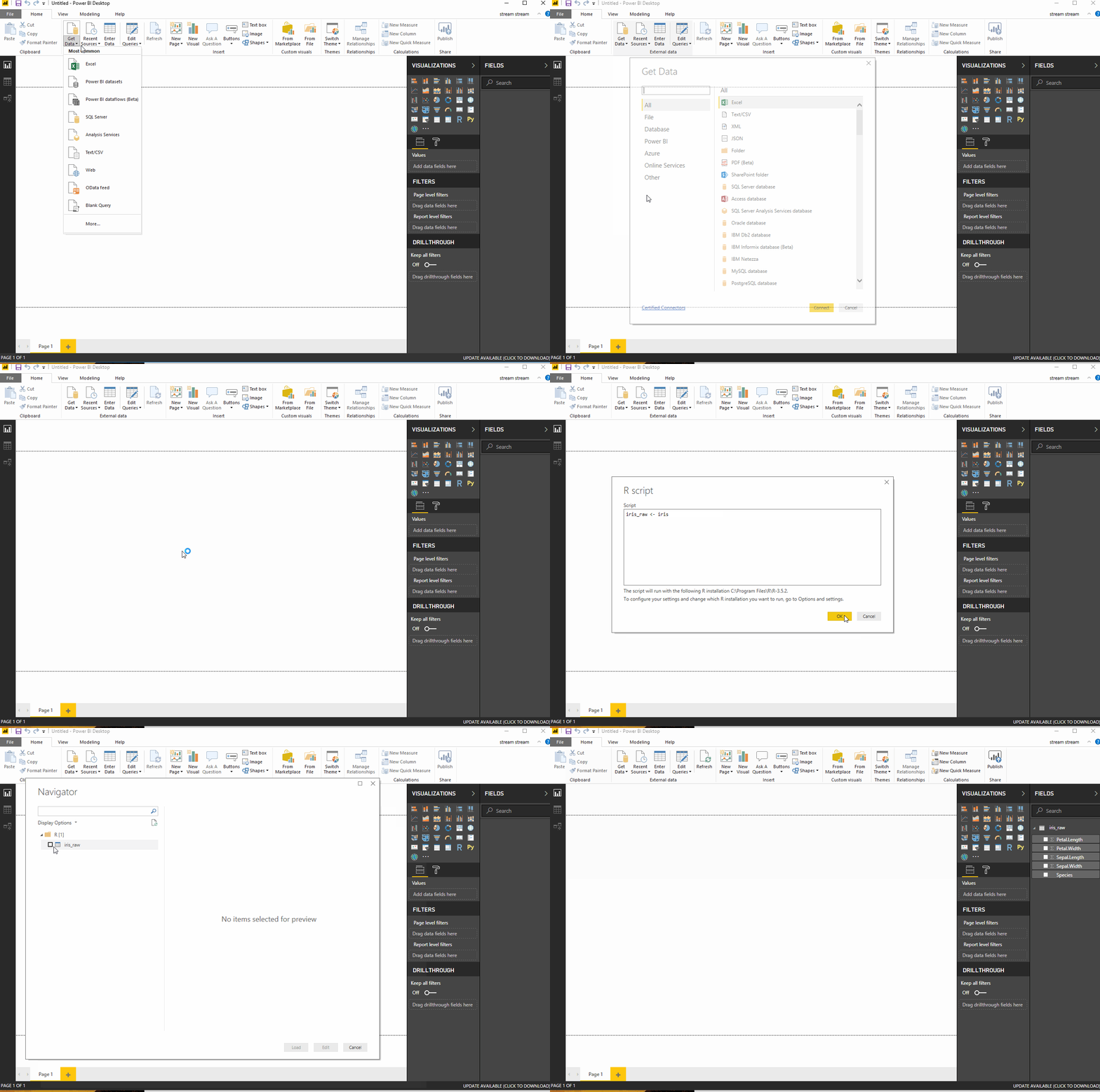
Datasets can also be imported from files. Here is an example which shows how to load a CSV file into the workspace with the following script. Download the file from here.
iris_csv <- read.csv(file="C:/Users/Parul/Desktop/Iris", header=TRUE, sep=",")
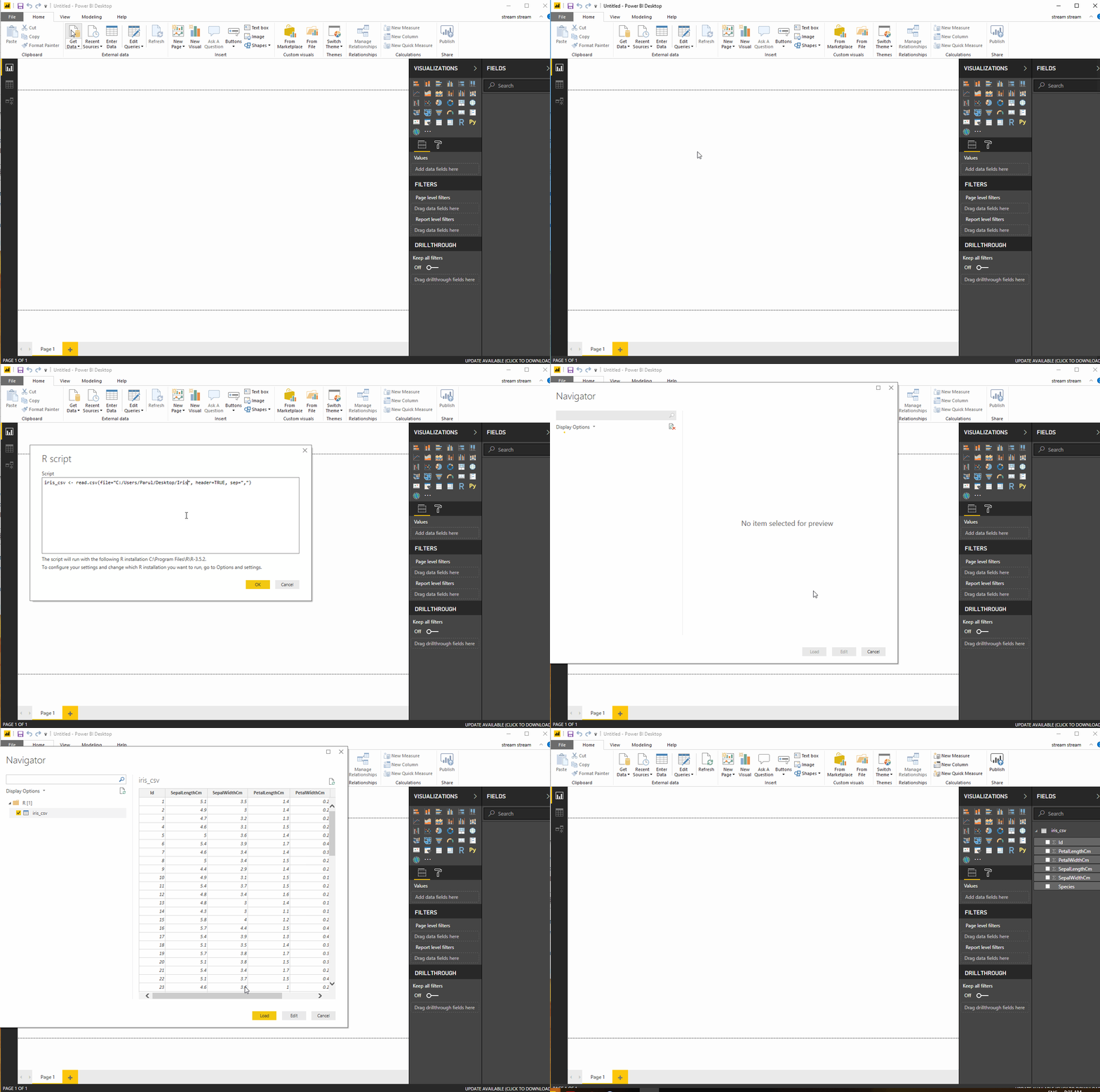
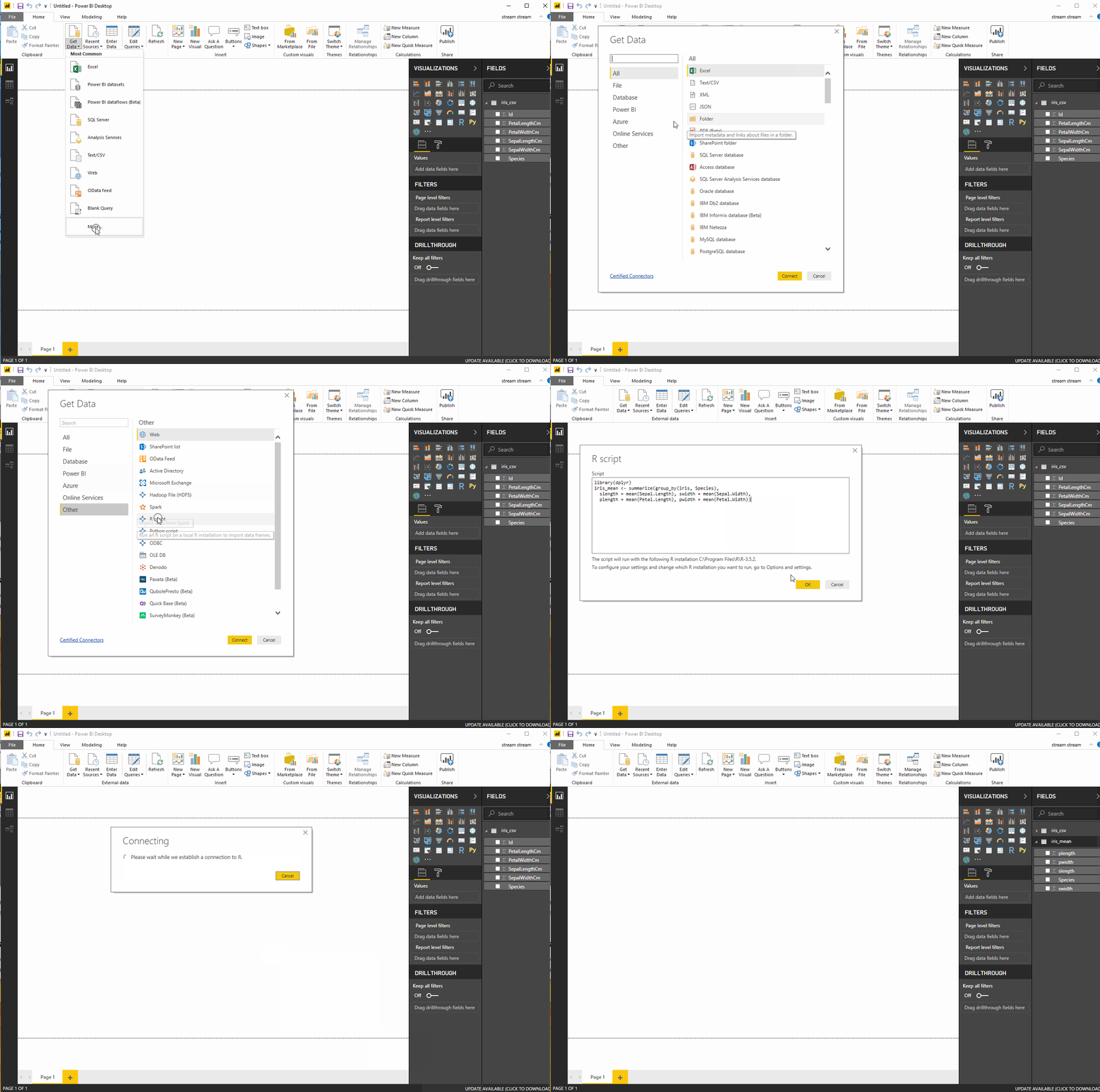
Merely importing data with an R script doesn’t serve much of a purpose. The actual use is when we can manipulate data while importing. The following script uses the summarize and group_by functions available in the dplyr R package to group and aggregate the data before importing it:
Launch R Studio and install the following packages:
install.packages("dplyr")
install.packages("data.table")
install.packages("ggplot2")
Now, use the following R script to import the Iris data. We will get a new dataset called iris_mean which contains the mean for each of the four measures, grouped according to the values in the Species column (Source: Power BI Introduction).
library(dplyr)

iris_mean <- summarize(group_by(iris, Species),
slength = mean(Sepal.Length), swidth = mean(Sepal.Width),
plength = mean(Petal.Length), pwidth = mean(Petal.Width))
2. R scripts for transforming data
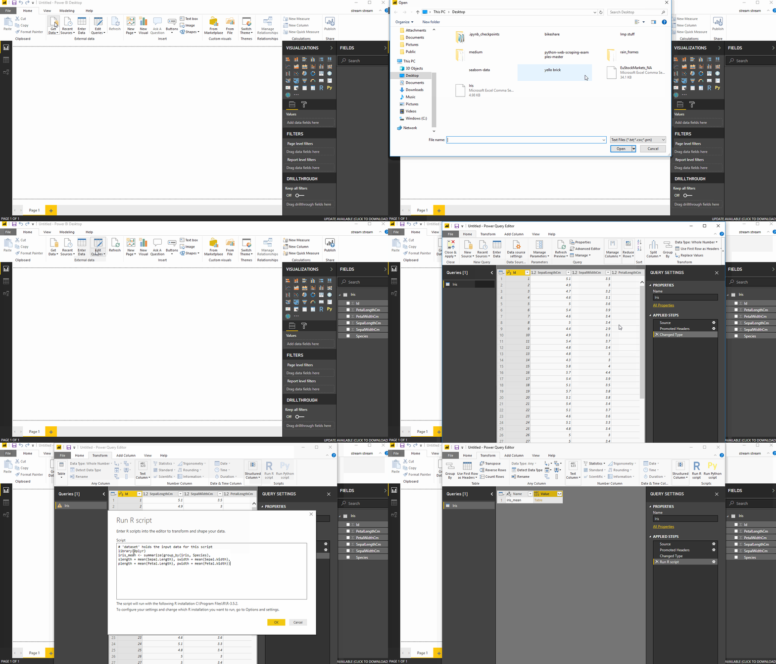
R scripts come in handy when we want to manipulate data that is already imported into the workspace. Let’s say we want to apply the summarize and groupby functions after the entire data has been imported. This can be achieved by running R Script in the Query Editor as follows:
3. R scripts for creating visualizations
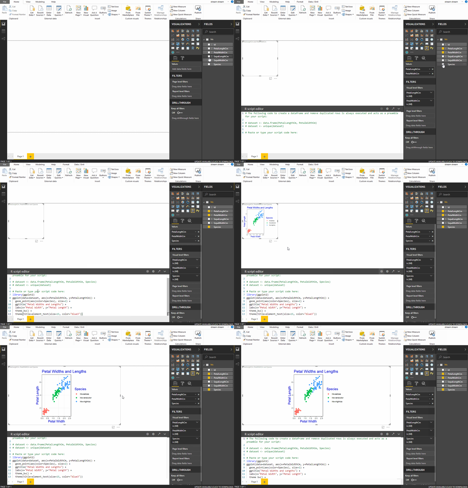
With the help of R scripts, you can create visualizations in Power BI. Simply type in the script and load in the necessary libraries, and you get visualizations similar to the ones in any R IDE. Let’s go through the steps:
- Import the Iris dataset into the workspace.
- Click on the ‘
R script Visual’ in the visualization Tab, and a placeholder R visual image appears on the canvas and a script editor at the bottom. - Select the fields that you want to include in the script. Let’s select
PetalLengthCm ,PetalWidthCmandSpecies. The selected fields appear under theValuesTab, and pre-populated R script appears in the R editor. - The script creates a dataframe named
datasetwith the selected columns. You can now write your script here or make changes in the existing one. Let’s paste the following code which imports the ggplot library and creates a scatter plot.
      library(ggplot2)
      ggplot(data=dataset, aes(x=PetalWidthCm, y=PetalLengthCm)) +
        geom_point(aes(color=Species), size=2) +
        ggtitle("Petal Widths and Lengths") +
        labs(x="Petal Width", y="Petal Length") +
        theme_bw() +
        theme(title=element_text(size=15, color="blue3"))
Power BI & Python
Python is a widely used general-purpose programming language, and a large number of Python libraries are available to perform statistical analysis, predictive modeling using machine learning algorithms.
Microsoft recently made it possible to integrate Python scripts within Power BI which enables running Python scripts and obtaining Python visuals within Power BI. Let’s look at the steps needed to do the same. But before that there are few pre-requisites:
- Make sure that Python is up and running on your local systems.
- All required packages and libraries should also be loaded such as pandas, matplotlib, etc.
- Currently, only pandas dataframe are supported.
- Any Python script that runs for more than 30 min gets automatically timed out.
- Python needs to be enabled before we can use it. Launch the Power BI and go to
Options and Settings -> Options

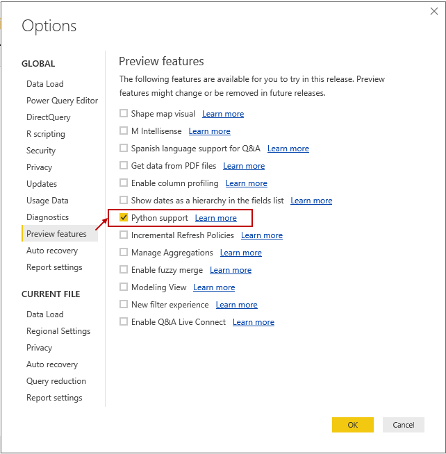
Under Options, go to the Preview Features Tab and enable ‘Python Support’.
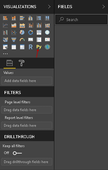
Restart Power BI and you get the Python icon both in visualization as well as in the Transform tab.
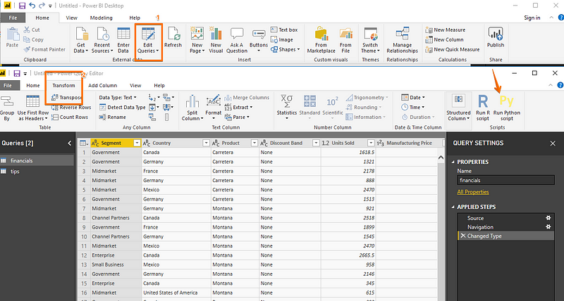
There are multiple ways of running Python Scripts in Power BI.
1. Running Python scripts exclusively
Steps:
- To run your Python Script, select
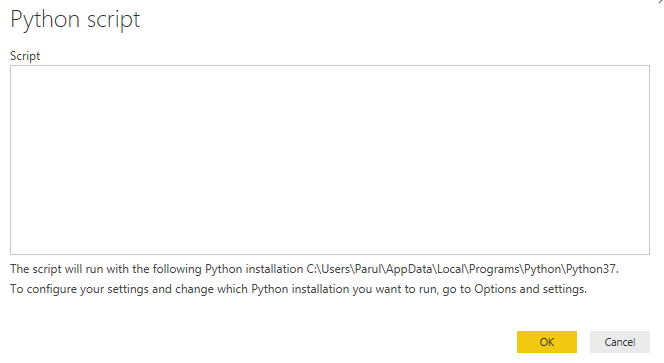
Get Data > More>Other > Python scriptas shown below.
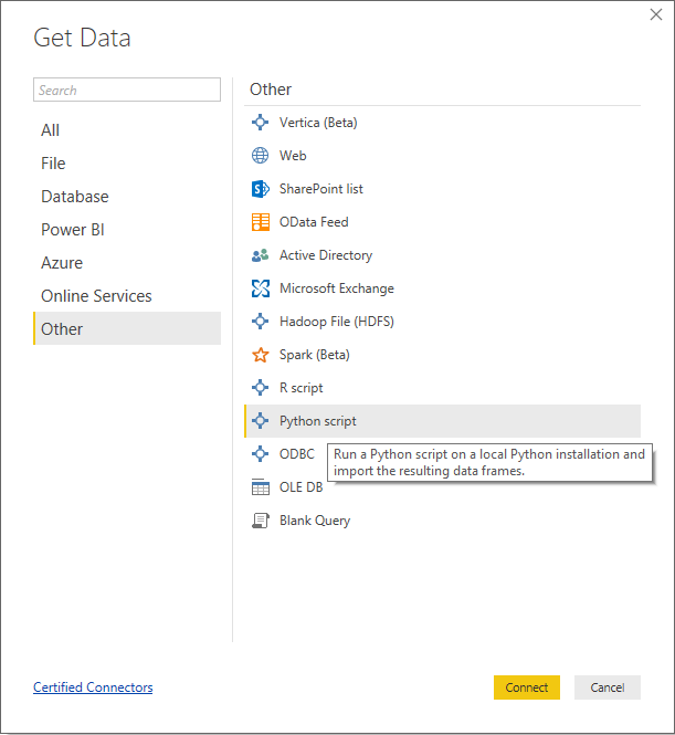
Now, simply paste your Python script here in the window that opens. Select OK to run the script which and then imports the resulting datasets into the Power BI Desktop workspace.
2. Creating visualizations using Python
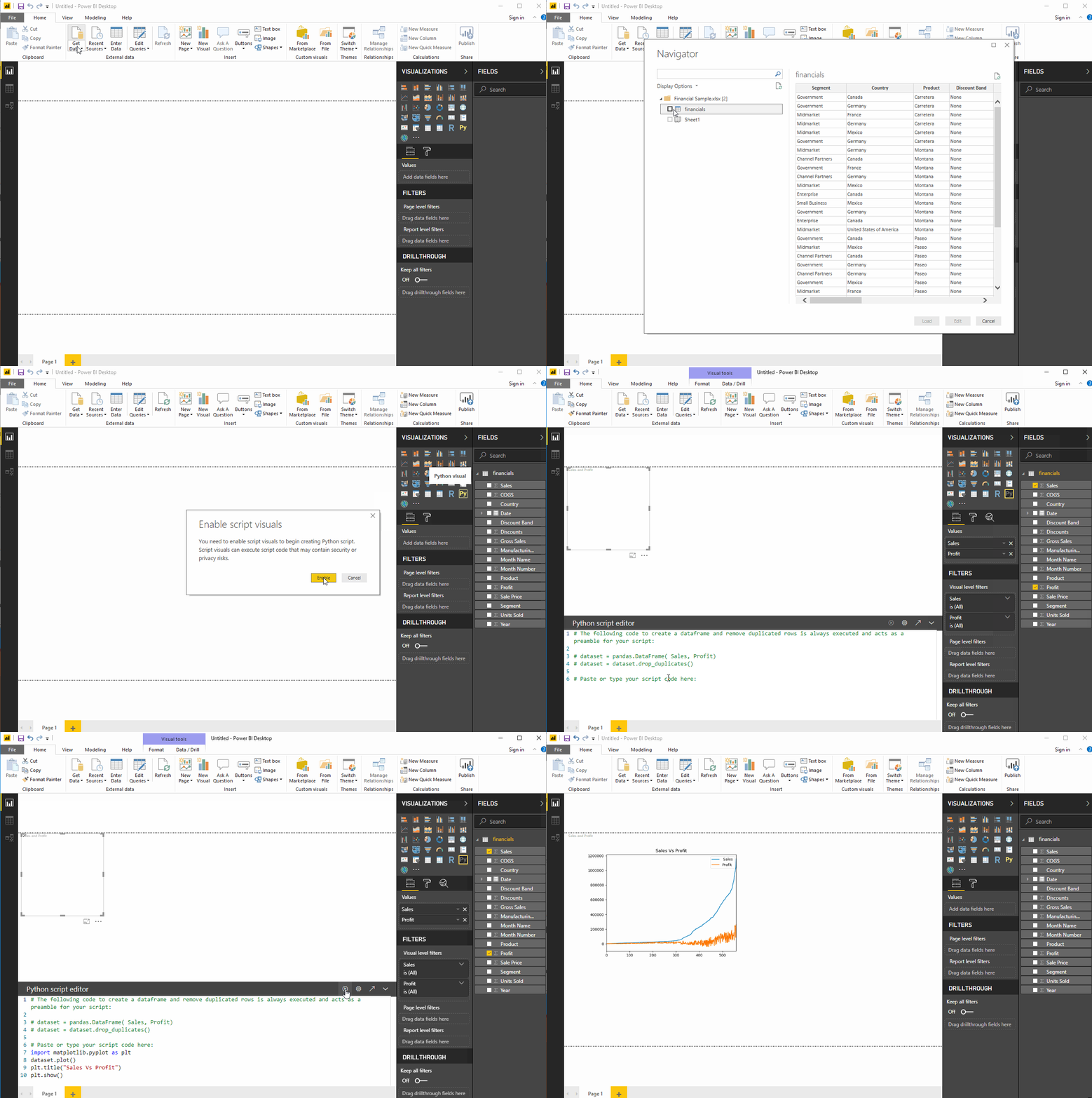
- Import the dataset into the workspace. Going with the same Financial dataset, which pertains to Financials of a hypothetical company.
- Click on the ‘
Python Visuals’ in the visualization Tab and a placeholder Python visual image appears on the canvas and a Python script editor at the bottom. - Select the fields that you want to include in the script. Let’s select
SalesandProfit. The selected fields appear under theValuesTab, and the scripts also appears in the Python script editor. - The script creates a pandas dataframe named
datasetwith the selected columns. You can now write your script here or make changes in the existing one. Let’s paste the following code which imports matplotlib and creates a plot.import matplotlib.pyplot as plt dataset.plot() plt.title("Sales Vs Profit") plt.show() - Run the script and the visualization appears on the canvas. The visualization appears as it would in any Python IDLE.
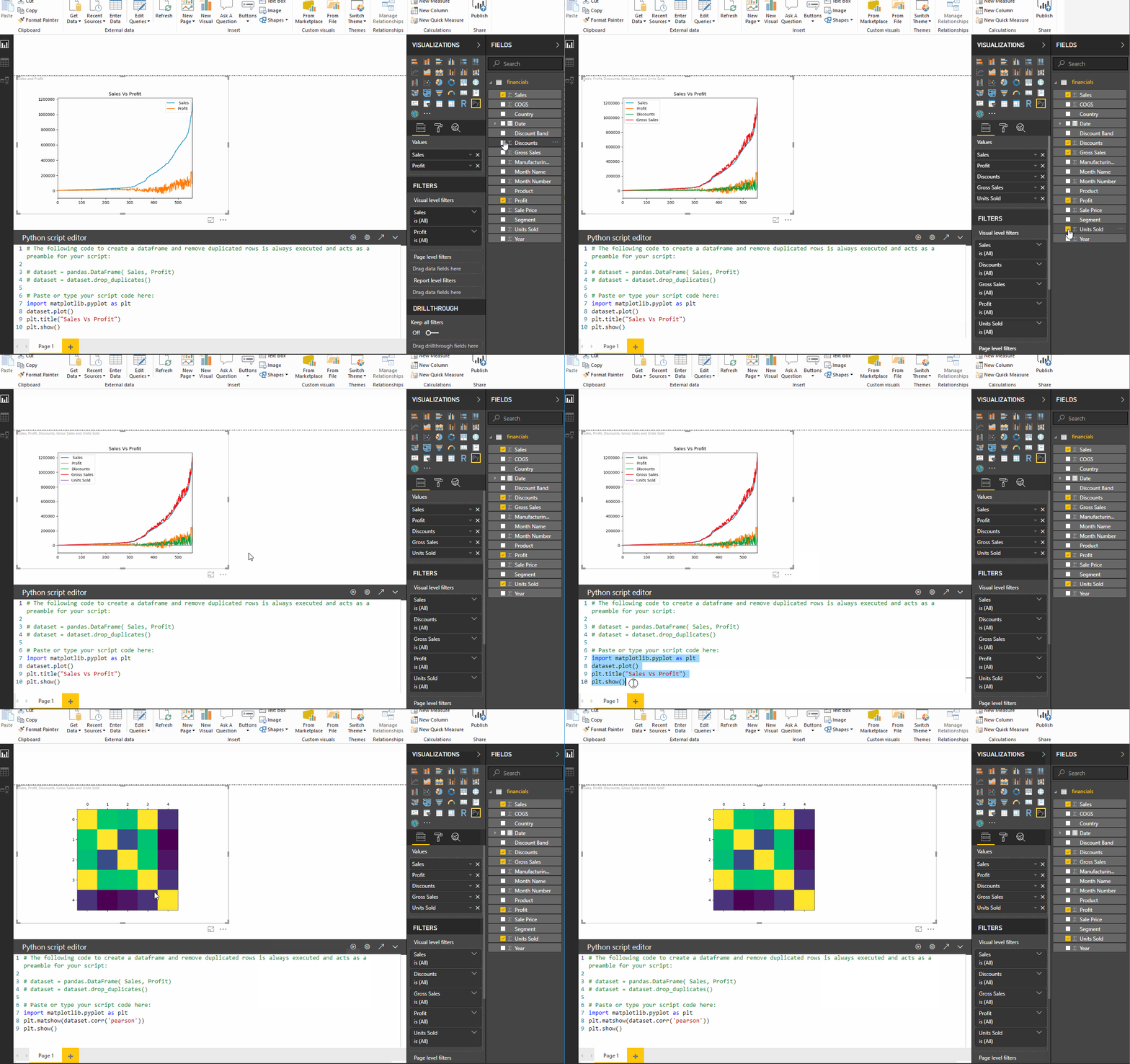
- Next, let’s create a correlation plot. Select
Discounts, gross Sales,andUnits soldin addition to the previous fields and replace the script with this new script:import matplotlib.pyplot as plt plt.matshow(dataset.corr('pearson')) plt.show()
-
We can also import other libraries. Let’s import Seaborn library but make sure it is installed on your system. The dataset is called the ‘Tips’ dataset which usually comes pre-loaded with seaborn. Download the dataset from here and load it into the workspace. Then paste the following code into the script editor, and you will get the seaborn plots.
import matplotlib.pyplot as plt
import seaborn as sns
sns.set(style="darkgrid")

sns.relplot(x="total_bill", y="tip", data=dataset)
sns.relplot(x="total_bill", y="tip", hue="smoker", data=dataset);
sns.relplot(x="total_bill", y="tip", hue="smoker",col="time", data=dataset);

plt.show()
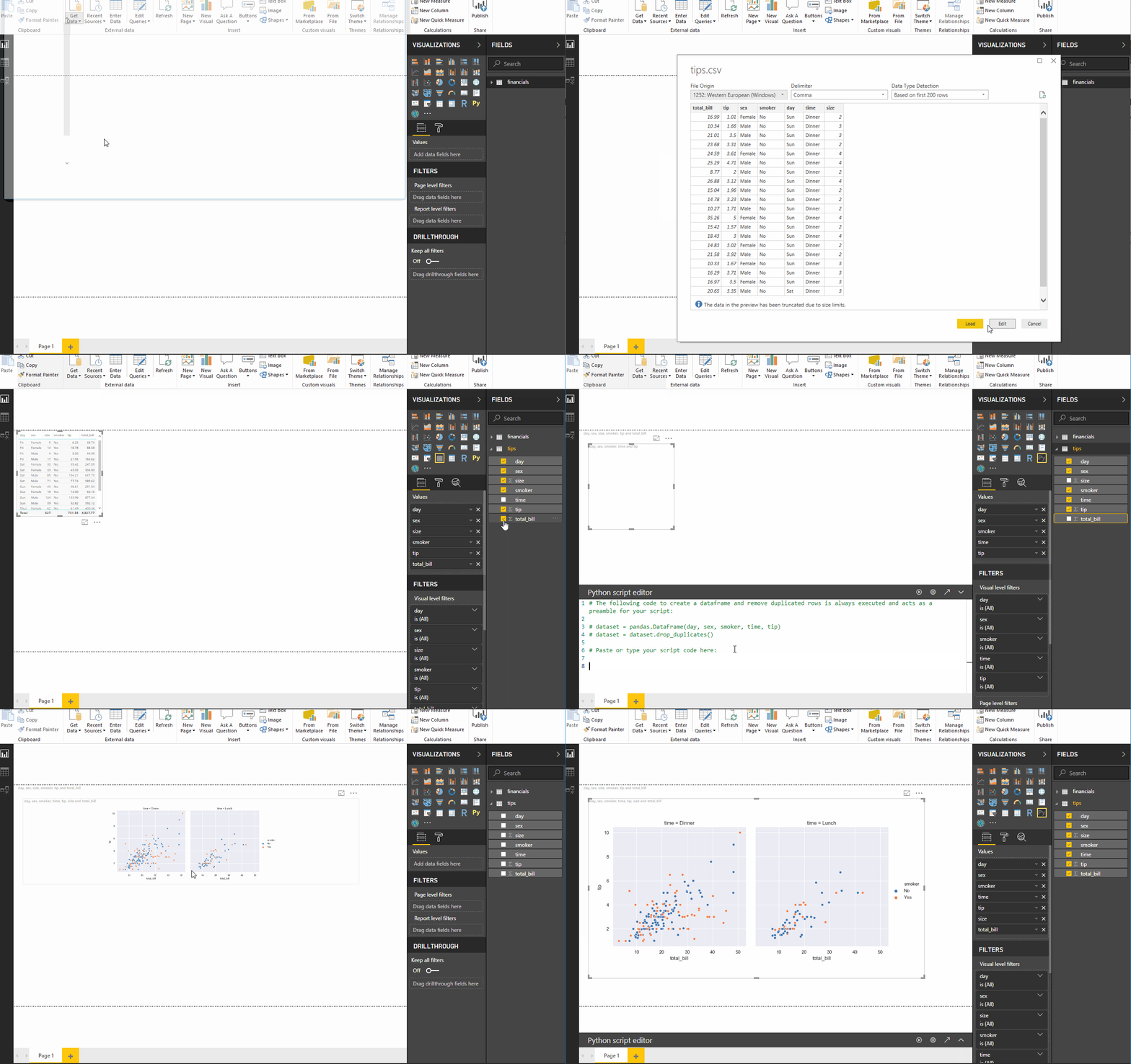
The Dashboard with all the Python visualizations will finally appear like this.
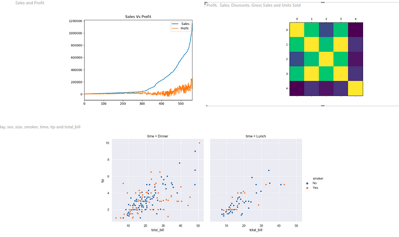
Python Dashboard
9. Saving and Publishing
Saving and exporting files
You can save your files as Power BI templates. The visualizations can also be exported as PDF files.
Publishing
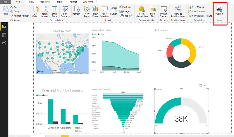
Data is only useful when it can be shared among people or organization. The generated dashboard or reports can also be shared by publishing it to the Power BI Service. We can then use the Power BI Apps to view or interact with the Dashboards/Reports.
10. Conclusion
That’s all we need to know to create a good visualization in Power BI although, one might find doing a lot more revising in each stage than we did here. So with experimentation and practice, Power BI becomes a lot more familiar and will unleash amazing features to help us analyze and present data.
Become a Power BI Data Analyst
Master the world's most popular business intelligence tool.
