
Course
Understanding Data Visualization
2 hr
255.8K
Looking at raw data can be like trying to make sense of a photo by examining just a few pixels at a time. Graphing your data allows you to zoom out and see the whole picture at a glance. Visualizations also provide an easy marketing tool to showcase your data to stakeholders. They help people see patterns, relationships, and insights at a glance. It’s one of the fastest ways to make data meaningful.
In this guide, we’ll walk through common chart types and when to use each one. We'll explore what separates a good visualization from a misleading one and look at several iconic examples that shaped the field. By the end, you’ll have a better idea of how to create and evaluate data visualizations that tell a clear, honest story.
If you’re starting from scratch, Introduction to Data Visualization with Julia provides a beginner-friendly way to learn the basics of plotting and data storytelling.
Data visualizations can be categorized by the number of variables involved. Are you taking a close look at the distribution of only one variable? Are you trying to describe the relationship between two? Or are you interested in the interactions among several? Let's look at each of these scenarios and the chart options we have for each of them.
To help you keep all these chart types straight, I recommend this handy Data Visualization Cheat Sheet. It provides a quick reference so you can see which chart works best for different types of data. You should also check out Data Visualization Techniques for Every Use-Case.
Let’s start with the simplest case: you have only one variable that you’re interested in. Univariate visualizations allow you to focus on a single variable. They help you understand its distribution, frequency, or composition at a glance. Let's take a look at some of the most common types.
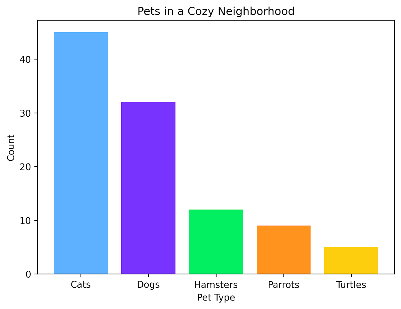
A bar chart compares different categories of information. Each category is its own bar, and the count for that category is shown as the height of the bar.
Sometimes, you may see bar charts on their side, with the bars extending horizontally instead of vertically. In my experience, these horizontal bar charts are the most useful when you are comparing many categories and the bars are ordered from the longest at the top to the shortest at the bottom. For just a few categories, I prefer vertical bar charts.
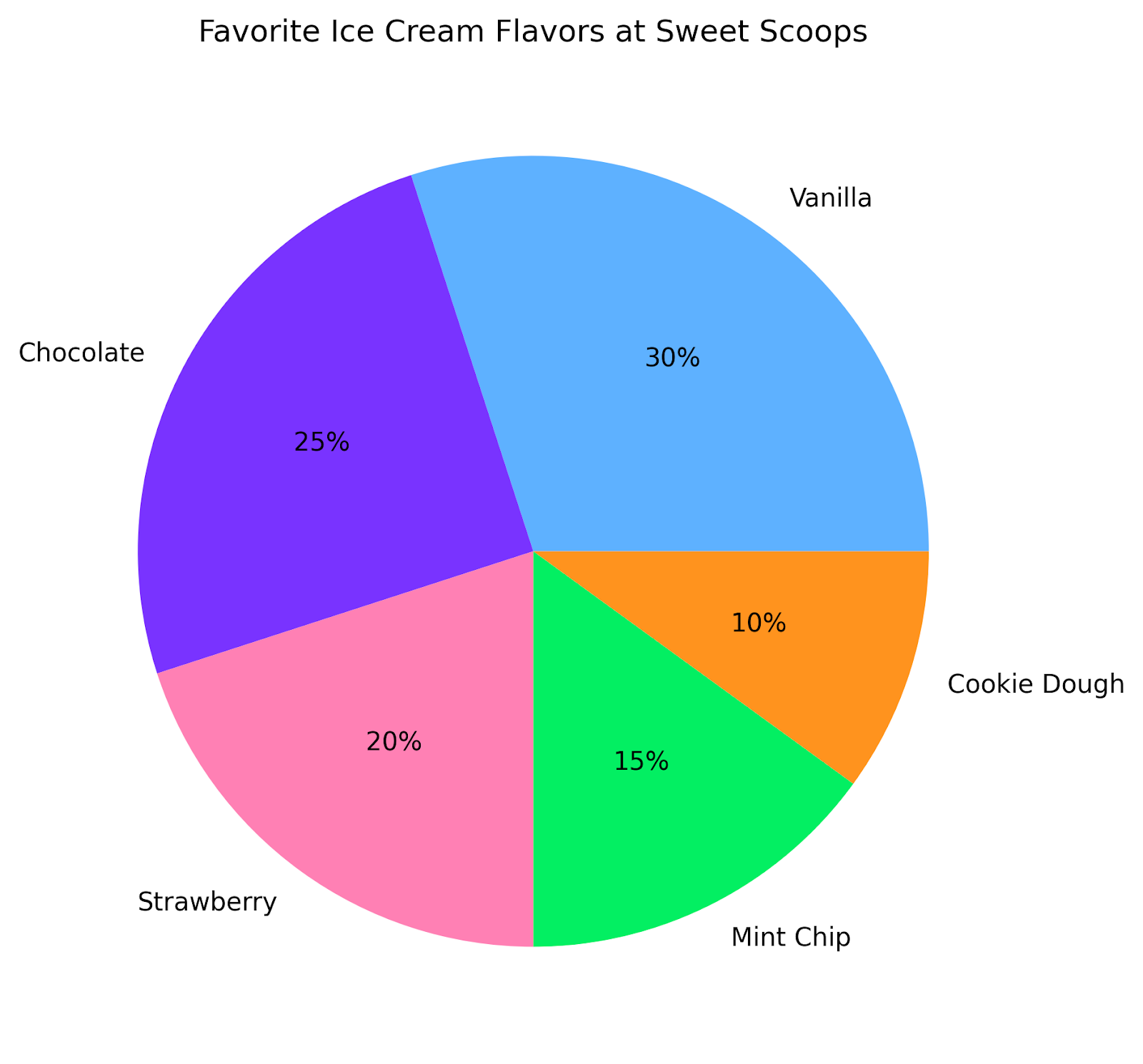
A pie chart displays proportions of a whole as slices of a circle. The choice of whether to use pie charts is often a source of consternation among data people. It is generally more challenging for our brains to interpret portions of a circle than to estimate portions of a rectangle.
Consider the number of sibling fights that have occurred over whether or not two pieces of apple pie are the same size. Still, pie charts are a popular chart type, in part because the circular shape can help to break up the look of otherwise uniformly rectangular dashboards.
When choosing to use a pie chart, first, only use pie charts when you have just a few categories to compare. If you include too many categories, it becomes overwhelming and difficult to read. Second, add the actual percentage to each slice. This ensures that even if the reader has difficulty comparing the relative slices, they can still interpret the graph.
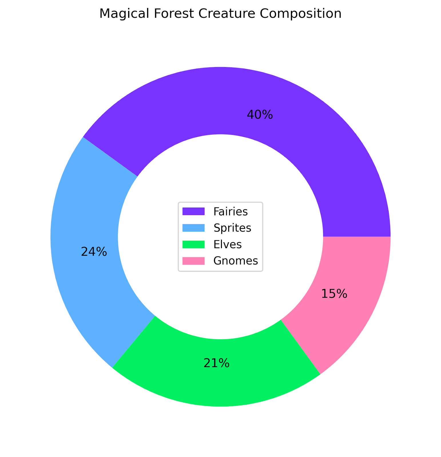
The donut chart is a close relative of the pie chart. As such, the same precautions apply: only use when comparing a few categories, and display the numerical proportions on the chart to aid in interpretation.
One practical benefit of donut charts is that it provides room for a central label. This may save space in your dashboard if it’s beginning to get a bit crowded. It is also visually appealing and can add an extra flair that pie charts lack.
A histogram is useful for visualizing the shape of a distribution. It works by grouping numeric values into bins and plotting the number of values that fall into each bin. This can be a useful way to see the most abundant values and to spot outliers.
Although this might look like a bar chart, it’s different in one key metric: the x-axis is a continuous variable, not a discrete one.
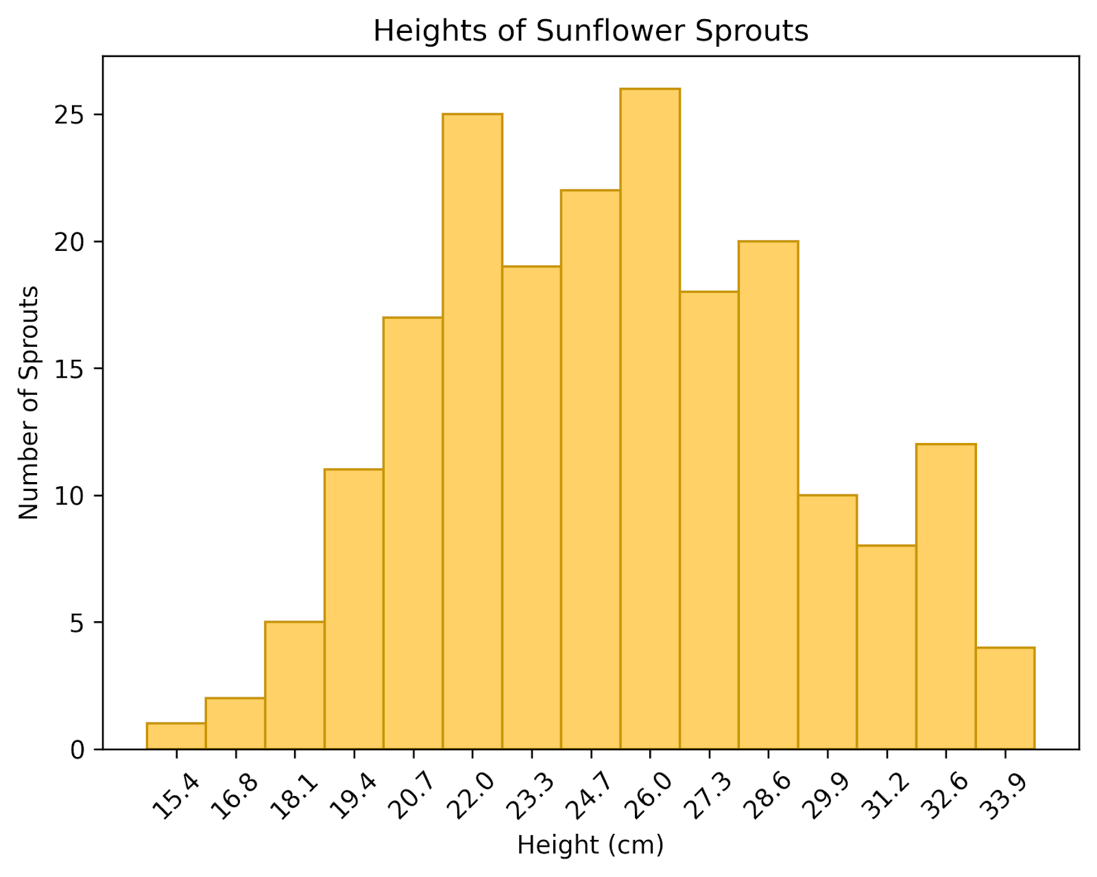
Here we have a histogram of the heights of sunflower sprouts in a garden. We can see that most of our sprouts are between 22cm and 28cm. A few are as short as 15cm, and some are almost 34cm.
A density plot can be thought of as a smoothed histogram displayed as a continuous curve. This can provide a more polished picture of the underlying distribution. It’s important to note that the y-axis does not actually show counts, but rather the density, which reflects how concentrated the data are around a given value. The total area under the curve always equals 1.
This plot is useful for looking at the shape of a distribution, rather than its absolute values. By plotting multiple distributions on the same plot, you can also compare distributions to each other. To avoid cluttering, I recommend limiting the number of distributions to 3 or fewer. It’s also best to make each line its own color or shade, to avoid confusion, particularly with distributions that are close together.
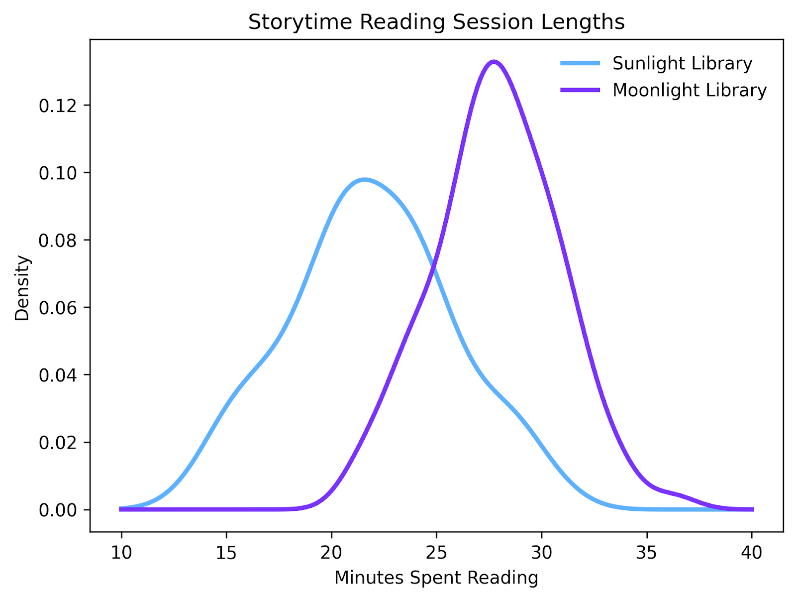
Here we've plotted the time spent reading, per visit, at two different libraries. By plotting the densities of both distributions together, we can see that visitors come to the Moonlight Library, they tend to spend a longer time reading than when they visit the Sunlight Library.
If you want to compare multiple distributions to each other, you might consider using a box plot. A box plot summarizes distributions using their medians, quartiles, and any outliers. These are incredibly useful graphs that can display a lot of information very quickly. They essentially convey the entire scope of multiple datasets compared with each other, at a glance.
As a general rule, if the boxes of two distributions do not overlap, they may be significantly different from each other. Whereas if they do overlap, they likely are not significantly different. Of course, a statistical test like a T-Test is necessary to know for sure, but a box plot can give a quick visual clue about which distributions to compare against each other.
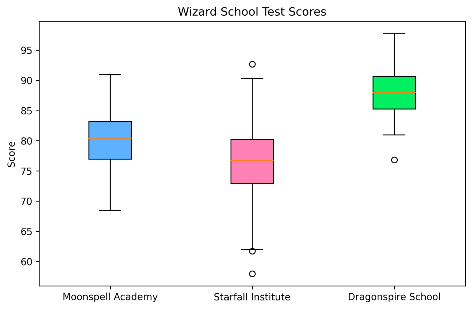
In this box plot, we’ve displayed the distribution of test scores at three wizarding schools. At a glance, we can see which schools have higher average test scores compared to their competitors. It’s also easy to see which schools may have exceptional students or students who are falling behind their peers by looking at their outliers. This simple graph conveys a lot of useful information very quickly.
Thus far, we’ve only considered graphs that show one variable. But what if you want to show the relationship between two variables? Bivariate charts are just what you’re looking for. They’re useful for spotting trends, patterns, and correlations.
A scatter plot might be the most ubiquitous plot of all. They are a simple way of visualizing the positions of each of your data points along two numeric axes. It’s ideal for spotting relationships, clusters, and outliers.
Scatter plots can be used for showing correlations as well as causal relationships. If you are showing a causal relationship, the convention is for the independent variable to be on the x-axis and the dependent variable to be on the y-axis. This convention indicates to the viewer the direction in which the causal relationship exists. Additionally, if you do have a causal relationship, you should display the statistic used to determine causality, along with the p-value.
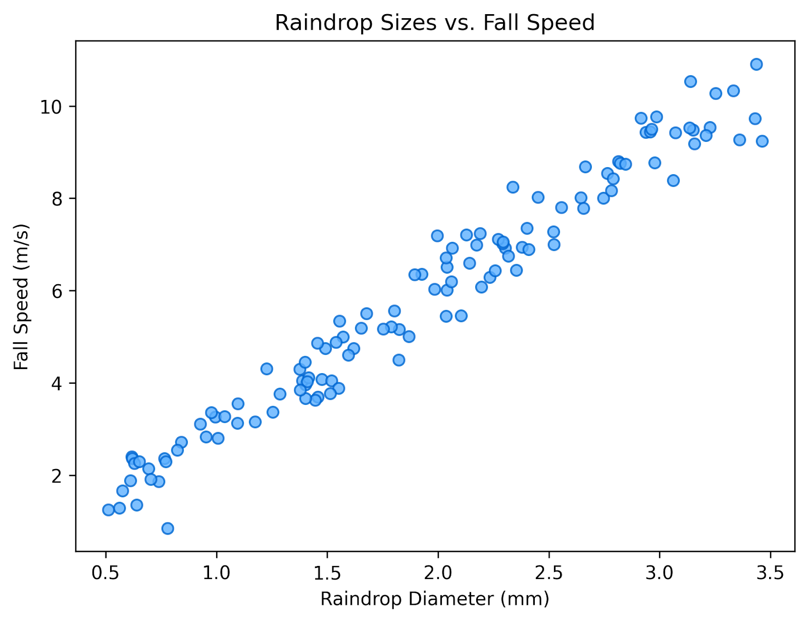
In this scatterplot, we’ve plotted the relationship between the size of each raindrop and the speed with which it falls. There is a clear positive relationship between these two variables, showing that raindrops tend to fall faster when they are larger.
Importantly, this graph is showing a correlation, and does not, on its own, indicate causality. So we cannot look at this graph and say that a larger raindrop falls faster because it is larger. To make that claim, we would need additional information, such as a statistical test or an experiment, and we would need to indicate that extra information on the chart.
A line chart is a relative of the scatter plot. However, the independent variable is usually time, and each data point is connected to the data points directly adjacent to it. It's best to use line charts with time-series data, where you want to highlight trends or changes over time.
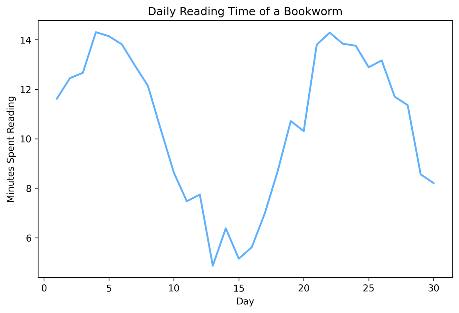
Here we've used a line chart to plot how much time we've spent reading every day for a month. This allows us to quickly see when our reading motivation took a hit and when we got back into the swing of things. If we continued this for multiple months, we might start to see a pattern develop.
For more examples of how to highlight trends and changes over time, check out Data Visualizations that Capture Trends.
An area chart is very similar to a line chart, but the space beneath the line is filled in. This can make it easier for the viewer to see cumulative totals or to interpret volumes. Note, however, that, whereas you can plot more than one line plot on the same chart, you should only plot one area plot on each chart. Because the area under the curve is shaded, plotting more than one on the same chart can clutter the area and make it difficult to read.
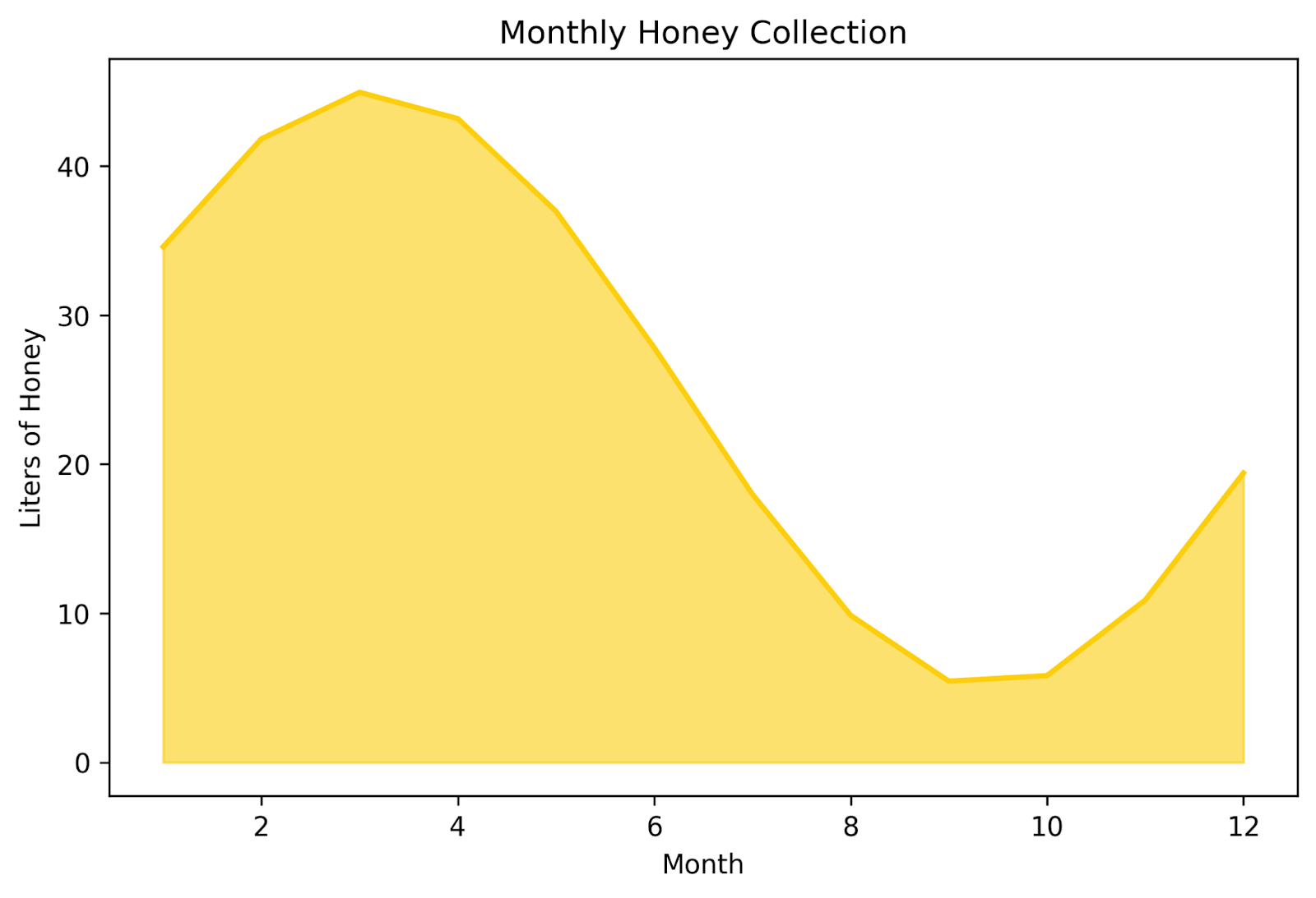
This area chart shows the volume of honey collected throughout the year. Because the area beneath the curve is filled in, it helps the viewer to understand intuitively that we’re talking about volumes.
Two subtypes of bar charts are designed to allow you to compare categories across a second variable.
First, we have grouped bar charts. These highlight differences between different subcategories. The y-axis is read the same as most bar charts. But the x-axis has clusters of bars, often differentiated by color or shade, that show subgroups within each group. These types of charts can convey a lot of information very quickly.
This is best used with only a few subgroups for each group (I’d recommend 2-5, max). Additionally, be aware that these charts can easily start to stretch horizontally if you add too many groups or subgroups, making it pretty space-intensive. If you are designing these charts to be viewed digitally, be aware of how it looks on a mobile screen.
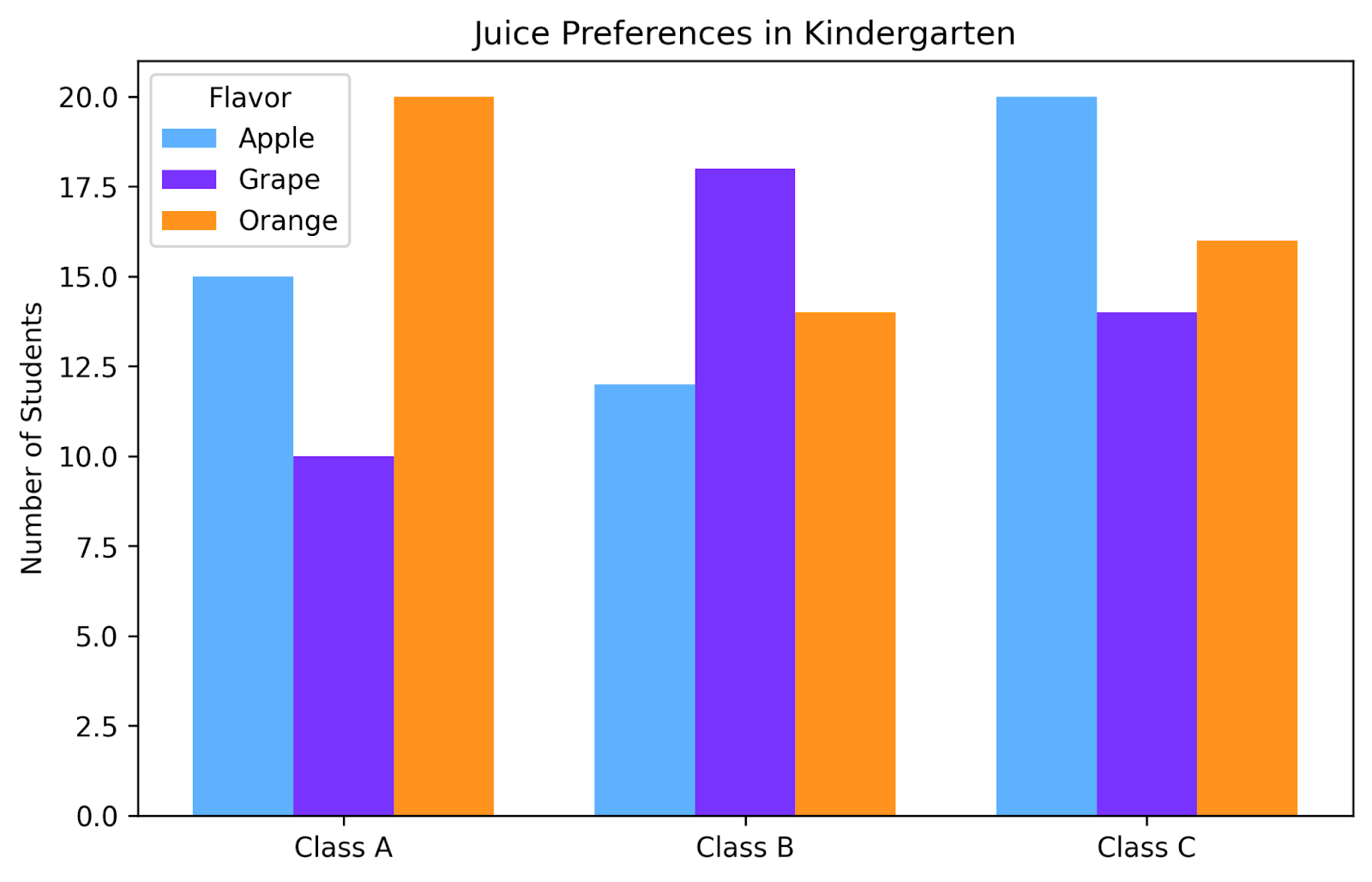
In this grouped bar chart, we’ve plotted the juice preferences for three different kindergarten classes. One glance at this chart is enough to know the best way to divvy up juice boxes to send to each classroom.
Next, we have stacked bar charts. These show part-to-whole relationships over several groups. This is very similar to grouped bar charts in that we can compare nuanced differences between groups.
But this chart has two more advantages over the grouped bar chart. First, it shows you the totals for each category as well. So you can read these like a normal bar chart and see differences in the totals between categories before reading the differences in the subgroupings. Secondly, this chart can be more condensed, providing more information in less space than a grouped bar chart.
The downside is that it can sometimes be challenging to retrieve exact proportions from this graph. Adding data labels with that information can alleviate this problem; just make sure not to make it too crowded.
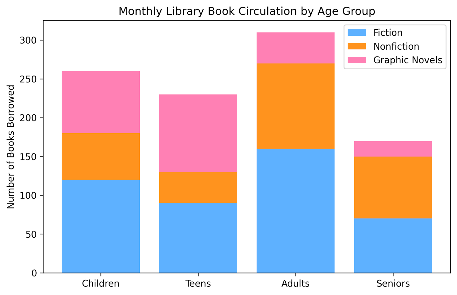
This stacked bar chart displays reading preferences across different ages. Within each age group, we can see the proportion of each genre checked out. By looking across the age groups, we can see both how the proportion of each genre changes as well as how the overall number of books borrowed changes. For example, it’s easy to see that adults borrow the most books overall, and that seniors are a bigger fan of nonfiction than are teens.
A heat map uses color intensity to represent values across a grid. Consider using it for correlations, frequency tables, or any scenario where you think that color will make the patterns easier to see.
An important note to remember for these types of graphs is to choose a color gradient that makes sense. For example, there is no inherent reason to think that red is a bigger number than green. So, choosing a gradient that goes from red to green is likely not the best choice. But there is a reason to intuit that darker colors correlate with larger values. So choosing a light-to-dark gradient within a color may give the viewer a more intuitive sense of what you are plotting.
An exception to this is when plotting literal heat values. Typically, red is associated with hotter temperatures and blue with colder. So if you are plotting heat using a heat map, a gradient from red to blue might make intuitive sense. As always, let your data take the lead in designing your visualization.
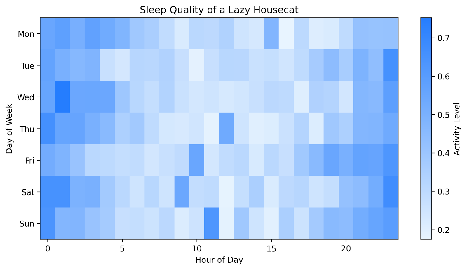
This heatmap shows the activity level of a lazy housecat, hour by hour, for each day in one week. Darker blues show the times when the cat was very active, maybe even running or jumping. The lighter blues show the times when the cat was not very active at all, perhaps even sleeping. The color makes it easy to see that our cat is more active during the night, mostly sleeps during the day, and has a few playtimes during the day (perhaps initiated by her owner).
If you want to try these bivariate charts in a professional analytics platform, Data Visualization in Power BI and Data Visualization in Tableau both show how to create interactive dashboards that highlight patterns and trends clearly.
Sometimes we need to show more complex relationships involving more than two variables. Multivariate charts can help you reveal relationships among three or more variables. They help you explore more complex datasets while still preserving interpretability. Let's explore a few common options.
A bubble chart extends the idea of a scatter plot by encoding a third variable as bubble size. It’s a good choice for ease of reading because most people already know how to interpret scatterplots. Adding a variable encoded as size makes intuitive sense. To maximize this intuition, it’s best practice to have the bubble size correlate with a magnitude.
You can extend this chart to include a fourth variable by encoding color as well. Just make sure you have a descriptive legend and caption to allow your viewer to clearly interpret your chart.
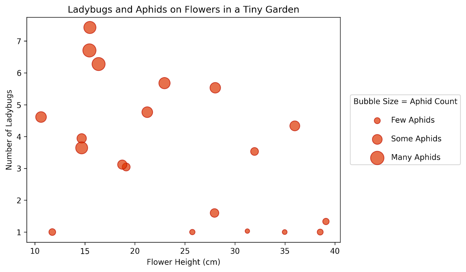
This bubble chart shows the relative abundance of ladybugs and aphids in a garden with different sizes of flowers. Larger bubbles correspond with more aphids. We can see larger bubbles higher up on the graph, indicating that there are more aphids where there are more ladybugs. We also see that there are more bugs on shorter flowers.
You can think of a radar chart like a sort of circular bar chart. Different attributes are arranged on the outside of the circle, and your blob is plotted along each of these axes, starting from the center. It works well for profiles or for comparing several items across the same dimensions. Be careful adding too many overlapping blobs though, as it can get cluttered and hard to read quickly. I also recommend using transparent shading so you can easily see each blob through the others.
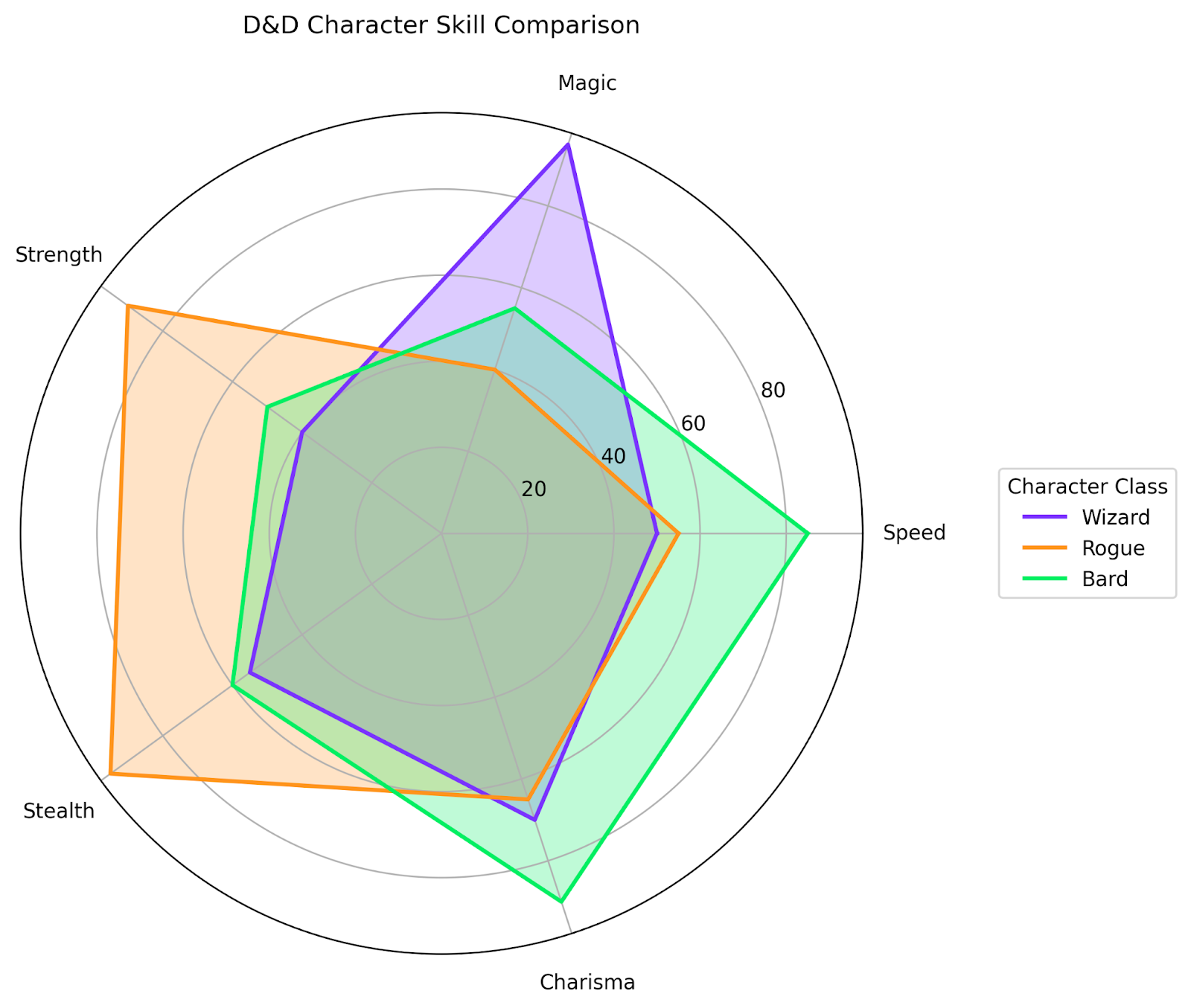
Here we’re comparing three different Dungeons and Dragons character profiles along five skill axes. This is a clean way to show the differences in the abilities of these different characters.
If you unroll a radar chart, you get a parallel coordinate plot. These plots display each variable on its own vertical axis. This is a better option when you need to compare several continuous variables at once, since there are fewer overlapping areas.
You’ll want to think carefully about what your y-axis values should be. If your different attributes all share a common unit, like our character profiles above, then this won’t be an issue. But if your attributes usually have different units, you might need to find a way to make a relative unit comparison for your y-axis, to make the chart more readable. The goal is to compare the different lines to each other, not necessarily to extract exact values for each one.
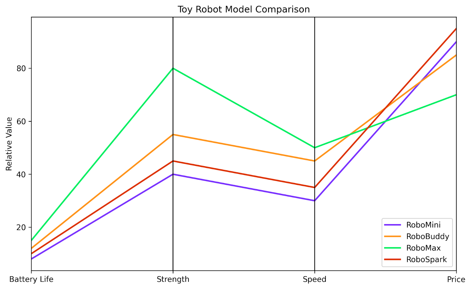
In this plot, we're comparing the relative attributes of different toy robot models. We can easily compare each robot to the others along each of the four characteristics we are interested in. While we can’t extract an exact value for the speed of each robot, we can easily see that the RoboMax is much faster than the RoboMini.
A treemap is a visually appealing way of showing hierarchical information. It divides a rectangle into nested tiles whose sizes vary with the value. Often, different colors add another layer of subdivision. It’s useful to show hierarchical data or part-to-whole relationships within multiple levels.
A word of caution: not everyone knows how to read treemaps, so it’s best to make them as easy to interpret as possible. Make sure there are clear delineations between boxes and distinct colors. I think these charts are especially amenable to legends, labels, and captions.
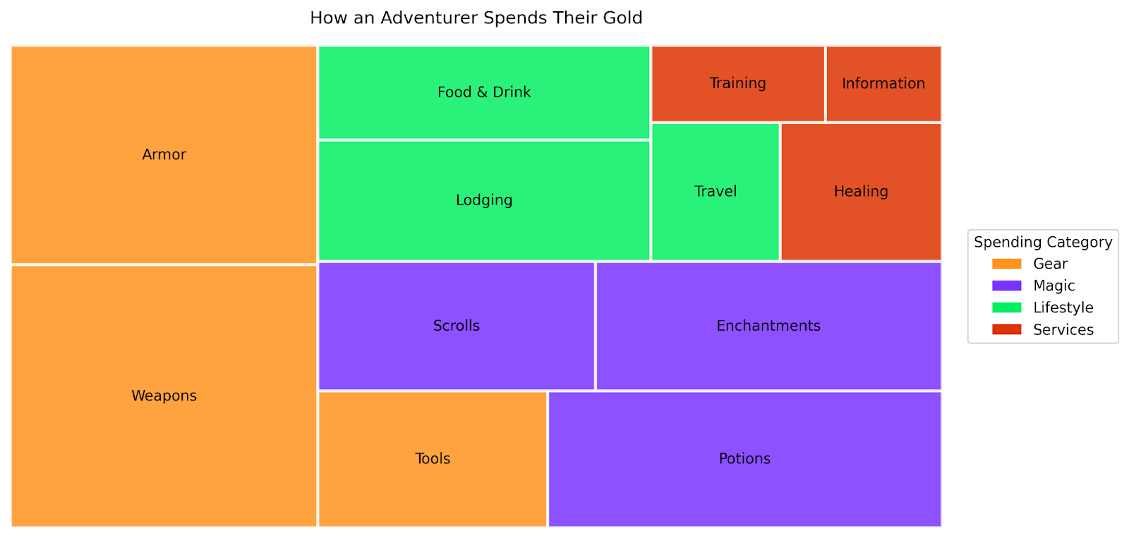
Here we’ve created a treemap that shows where a fictional adventurer spends the gold they’ve collected within different categories. The color indicates the category of spending, while the size of each rectangle shows the relative amount of gold spent.
A Sankey diagram is one of the best ways I’ve seen for visualizing flows. This type of diagram follows the journey of your data from its beginning to each endpoint. The relative thicknesses of the arrows show how much of the original amount ended up going to each destination. This is a great option for visualizing energy flows, customer journeys, or any system with branching paths.
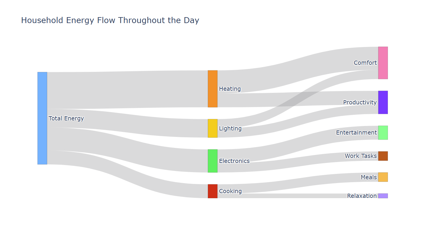
Here we’ve plotted the energy usage in a household and where the energy is being used. We can see that this home uses the most energy for heating and comfort, while cooking and relaxation take up proportionally very little.
A choropleth map is similar to a heat map in that it uses color to relay information. However, it is overlaid onto a geographic map, showing how patterns develop across geographical areas, such as states or counties. You may have seen these maps during the COVID pandemic, showing where cases were spiking. They are also commonly seen after US presidential elections, showing the electoral college results.
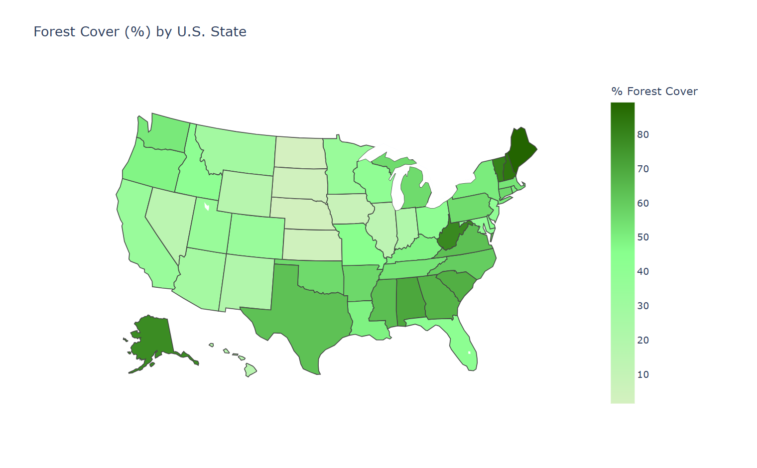
Here we’ve made a very basic choropleth map showing estimated forest cover in each state in the United States. It’s easy to see which states have more forest cover because they are colored a darker shade of green than those with less forest cover.
The difference between helpful and misleading charts usually comes down to design. A good visualization clarifies the data; a bad one distorts it. For a comprehensive look at this, I recommend Edward Tufte’s The Visual Display of Quantitative Information. It is one of the most influential books on visualization and one that anyone who regularly works with data should have in their library.
Your graph should be easy to read at a glance. This means keeping it simple and straightforward, adding data labels when appropriate, and using titles, legends, and axis labels effectively. Tufte talks about this in terms of a data-to-ink ratio.
Your visualizations should also be as accurate as possible. This means watching out for any distortions in scale or proportion. For example, be careful when using breaks in axes, and make sure they are denoted appropriately if you do use them.
For efficiency, you want to make sure that everything on the chart needs to be there. Don't overuse of gridlines. In some graphs, gridlines make it easier to see exact values. However, in many graphs, especially simpler ones, they are chart junk. In the worst cases, they may even obscure data. Other examples of chart junk include unnecessary pictures or extra lines that don't contribute to clarity.
Lastly, consider color use carefully. Understand that colors can convey just as much meaning as numbers. When choosing a gradient, for example, it's usually a good idea to make darker colors correspond to bigger numbers and light colors to smaller ones.
For categorical data, think about the colors commonly associated with that category. It would have been odd if we had chosen to use a green bar to denote orange juice preference.
There are a few common mistakes you should watch out for. The first has to do with scales. It’s important to pay attention to the scale of your axes as well as your chart elements (boxes/bubbles/etc). Importantly, don’t just blindly trust the default plots from whatever program you’re using. Make sure your axes start at zero (with very few exceptions), that your axes are consistent, and that the proportions of your plot elements make sense for your data.
A common problem that I see all the time is using 3D effects in plots. These effects can look cool, but they can also distort the plot in a way that makes it more challenging to read. Save your audience the headache, and stick with 2-dimensional charts for most purposes.
Dual axes are another place where things can get tricky. For the vast majority of cases, if you need two y-axes, you should probably split the data into two plots. In the few, very rare cases where a dual-axis plot makes sense, ensure that it is obvious which data is associated with which axis. My favorite way to do this is with color, eg, the axis on the left is black and corresponds with the black dots, while the axis on the right is red and corresponds with the red dots.
One of the easiest mistakes to fall into is over-cluttering your chart. It’s easy to get excited about telling the complete story of our data, and so we keep adding bars or labels or lines to tell more and more complicated stories. However, doing so can ensure that your viewer takes nothing away from your graph at all. Instead, it’s best to choose one simple story you want your viewer to get from your data and display that as cleanly and elegantly as possible. .
Unfortunately, it’s not uncommon to come across a chart that is manipulated to sell you an agenda. This is common in advertising, politics, and social media. Whenever you see a graph, it’s important to critically evaluate it before taking it at face value.
The first way to critically evaluate a graph is to look at the previous sections of this article and see whether the graph in question follows the best practices we've discussed. If not, the graph might be misleading, even if unintentionally.
Next, consider more insidious intents. Ask yourself these questions:
Not all misleading visualizations have malicious intent. But it's important to recognize the flaws and take the conclusions with a grain of salt.
As you build your own visualizations, remember that design choices also affect who can see your work. To broaden your audience, consider how to make your graphs accessible. For example, you can use colorblind-safe palettes and large, readable fonts to improve the visual readability of your chart. Using meaningful alt text and captions can also improve access for visually impaired viewers.
There are a few visualizations throughout history that have dramatically shaped the field of data visualization. Some have invented brand new graph types; others changed how we understand events, societies, or systems. Let's explore some of the most famous historical charts and how they inspired future graphers.
Our standard chart types didn’t spring from nowhere. Many of the charts we’ve discussed began with William Playfair, a Scottish engineer and political economist working in the late 18th century. In 1786, Playfair published The Commercial and Political Atlas, where he introduced the line graph and bar chart as tools for understanding economic data. A few years later, he introduced the pie chart in The Statistical Breviary.
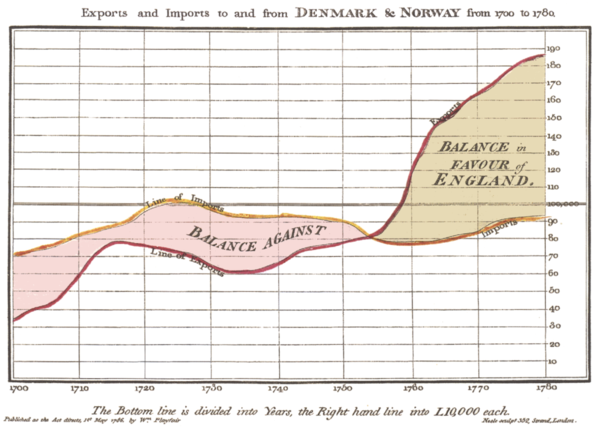
This graph is widely believed to be the first line graph, introduced by William Playfair in 1786. Image sourced from Wikipedia.
At the time, most numerical information was presented in dense tables that were difficult to interpret quickly. Playfair believed that visual forms could make trends and comparisons immediately apparent, even to readers without mathematical training.
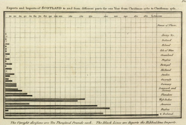
Believed to be the first bar graph, this graph was published in 1786 by William Playfair. Image sourced from Wikipedia.
What made Playfair’s work so influential was not just the invention of new chart types, but his insight into how people perceive information. He mapped numbers to visual properties, allowing viewers to compare values at a glance. His charts were often used to argue political and economic points, such as changes in national debt or trade balances over time.
Playfair’s work laid the foundation for modern statistical graphics and serves as an early reminder that clear visual encodings can fundamentally change how people reason about data.
Possibly the first pie chart, published by William Playfair in 1789. Source: Wikipedia.
In 1812, Napoleon invaded Russia and suffered a devastating defeat. A little over 50 years later, retired civil engineer Charles Minard created this iconic map showing the army’s advance, retreat, and tragic decline in size.
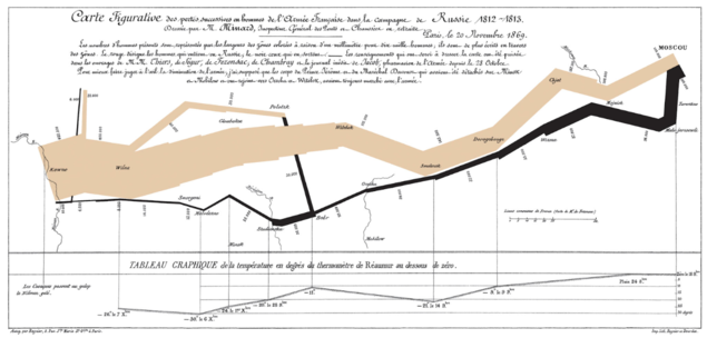
Source: brilliantmaps.
This is an early example of a Sankey diagram, where the width of the band reflects troop numbers. It's overlaid on a map that integrates direction, temperature, geography, and time, telling a compelling story of the invasion. It is an elegant example of turning quantitative data into an emotional narrative and demonstrates how multiple variables can coexist without confusion. It is arguably one of the most recognizable historical charts of all time.
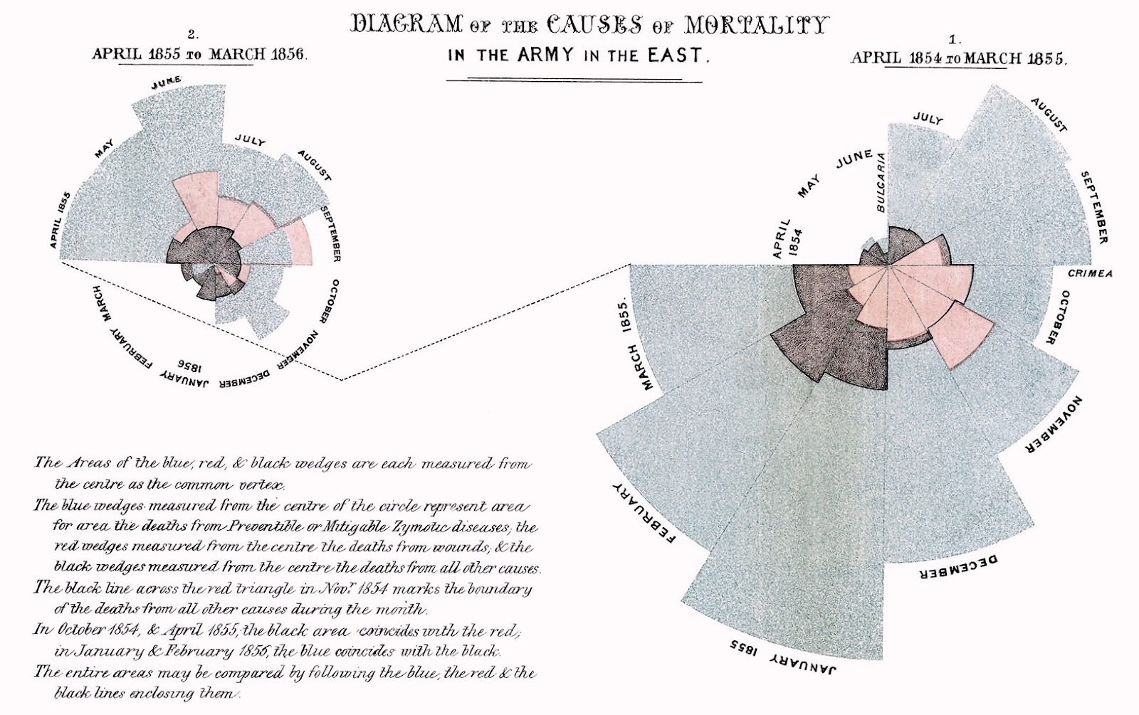
Another famous war chart came from the statistician and founder of modern nursing, Florence Nightingale. She used a polar area chart, also called a rose diagram, to show that more deaths in the Crimean War came from preventable diseases, like cholera and typhus, than from actual battle wounds.
Source: https://www.historyofinformation.com/
Each wedge in the diagram represented a month, and colors differentiated causes of death. Deaths from preventable disease are in blue, those from battle wounds are in red, and all other causes are in black.
In April 1855, a Sanitary Commission arrived to improve sanitation at the military hospital. The result was a dramatic decrease in deaths, which stood out prominently in Nightingale’s chart. This visualization persuaded government officials to implement sanitation improvements in both military and civilian hospitals.
Another public health win was secured with John Snow's map plotting cholera deaths in London. In 1854, London's Soho district suffered a devastating cholera outbreak, killing over 600 people in only a few weeks. Snow plotted cholera deaths on a street map of London, with deaths denoted as bars and water pumps as circles.

Source: londonmuseum.org.
His map revealed clusters of deaths around the Broad Street water pump. After officials removed the handle from that water pump, rendering it unusable, the outbreak subsided. This map helped solve the local outbreak. Today, it serves as a reminder of how choosing the right visualization can affect its impact; for example, a scatterplot would not have found the cause of the outbreak. Snow used the correct visualization to effect change.
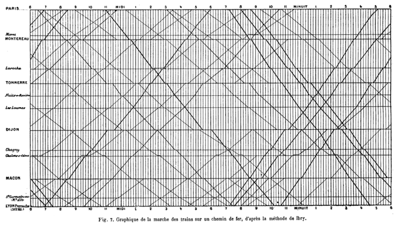
My personal favorite historical chart is this train schedule from 1885. This one graph shows every train traveling from Paris to Lyon: its speed, stops, and when it would pass another train. The time is on the x-axis, and each station is spaced on the y-axis relative to its distance from the others. Each train is depicted as one slanted line. Steeper lines indicate faster trains, and horizontal sections show when the train is in a station.
Source: commons.wikimedia.org
Ordinarily, this information would have been presented as a text-heavy timetable. Instead, this graph combined space and time information in an elegant way that allowed railway managers to prevent scheduling conflicts and even train collisions! It's a reminder of just how much information a well-designed visualization can convey.
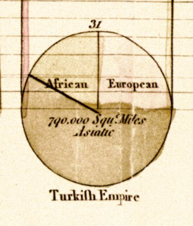
At the turn of the 20th century, sociologist and civil rights activist W.E.B. Du Bois led a team of researchers in creating a series of bold, original charts for the 1900 Paris Exposition. These visualizations documented the social, economic, and educational conditions of black Americans just a generation after emancipation. At a time when racist pseudoscience dominated public discourse, Du Bois used data to directly confront harmful stereotypes.
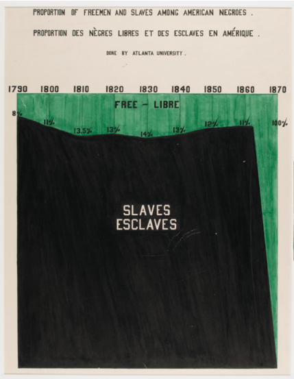
This chart from WEB Du Bois’ Data Portraits dramatically shows how the Emancipation Proclamation changed the lives of African Americans. Image sourced from How W.E.B. Du Bois used data visualization to confront prejudice in the early 20th century.
The charts covered topics like literacy, property ownership, employment, population growth, and migration patterns. Many were hand-drawn and painted, using vivid colors and unconventional layouts. While some of these charts resemble bar graphs or pie charts, others experiment with spirals, radial layouts, and abstract compositions. Rather than sticking with convention, Du Bois prioritized communication and impact.
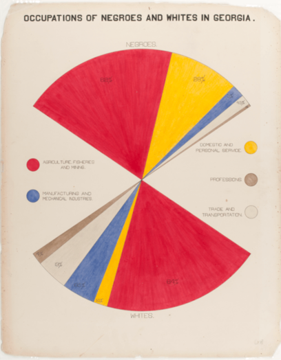
This modified pie chart shows the occupations held by black and white Americans in the early 20th century. Image sourced from How W.E.B. Du Bois used data visualization to confront prejudice in the early 20th century.
Du Bois did not aim for neutrality. The charts were explicitly designed to persuade, to educate, and to assert the humanity and achievements of black Americans through data. In doing so, Du Bois demonstrated that visualization is never just about presenting numbers. It is about framing reality, telling stories, and shaping how societies understand themselves. These charts are now collected in the book W.E.B. Du Bois's data portraits : visualizing Black America : the color line at the turn of the twentieth century.
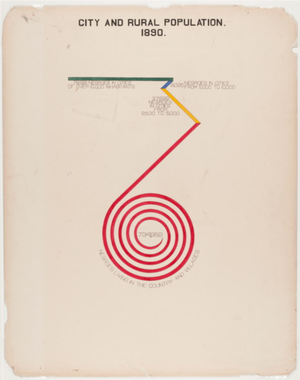
WEB Du Bois was not afraid to experiment with radical chart types to make his point, like this spiral chart showing the population distribution of black Americans in 1890. Image sourced from How W.E.B. Du Bois used data visualization to confront prejudice in the early 20th century.
Visualization isn’t neutral; every choice you make shapes your viewers’ interpretation of the story behind the data. To learn more about how to effectively tell your data’s story, check out our Data Storytelling & Communication Cheat Sheet.
For practical advice on which tools to use, oue overview of 12 of the Best Data Visualization Tools in 2025 is a great resource. And if you’re ready to make these complex charts interactive and web-ready, Interactive Data Visualization with Bokeh walks you through building responsive, browser-friendly visualizations in Python.
Learn data visualization with DataCamp
Course
Course
Course