Data visualization is rapidly becoming an essential skill in data analysis and data science, and good data visualization skills are needed in many industries, such as finance, education, and healthcare. This comes with no surprise: as analysts are dealing with an ever-growing volume of complex and varied data, data visualization provides a set of techniques to make sense of it and effectively communicate insights.
Historically considered a minor topic in data science, today, data visualization is being enriched with many interesting techniques, tools, theories, and contributions from different disciplines, like psychology and neuroscience. If you’re interested in becoming a data visualization wizard, DataCamp has you covered. Check out our data visualization course catalog to access more than 30 data visualization courses taught by leading experts and covering a variety of popular technologies.
This article provides an overview of the state of data visualization. We will focus on the most popular data visualization analyses, techniques, and tools. Keep reading!
The Power of Good Data Visualization
Data visualization involves the use of graphical representations of data, such as graphs, charts, and maps. Visuals allow data scientists to summarize thousands of rows and columns of complex data and put it in an understandable and accessible format. Compared to descriptive statistics or tables, visuals provide a more effective way to analyze data, including identifying patterns, distributions, correlations, and spotting outliers in complex datasets.
By bringing data to life with insightful plots and charts, data visualization is vital in decision-making processes. Whether it’s data analysts breaking down their findings to non-technical stakeholders, data scientists performing A/B tests for marketing purposes, or machine learning engineers explaining potential bias in complex large language models like ChatGPT, data visualization is the key to moving from data insights to decision-making.
Despite the use of data visualization, many thorough and detailed data analyses still end up in the drawer for the simple reason that they didn’t get to captivate the audience, whether decision-makers, stakeholders, or other members of the team.
Thanks to progress in disciplines like neuroscience, today, we know the way a data visualization is depicted can severely affect how people perceive it. The choices you make when designing a graph –for example, the colors, the layout, and the size– can make a big difference. Interested in the theory behind data visualization? Our Understanding Data Visualization course is a great place to get started.
While data visualization has an important role to play when communicating data insights, the recipe for successful communication is more complex. That’s the idea behind data storytelling, an innovative approach that advocates for using visuals, narrative, and data to turn data insights into action. To know more about data storytelling, check out our DataFramed podcast, where we speak with Brent Dykes, Senior Director of Insights & Data Storytelling at Blast Analytics and author of Effective Data Storytelling.
Types of Data Visualization Analysis
Data visualization is used to analyze visually the behavior of the different variables in a dataset, such as a relationship between data points in a variable or the distribution. Depending on the number of variables you want to study at once, you can distinguish three types of data visualization analysis.
- Univariate analysis: Used to summarize the behavior of only one variable at a time.
- Bivariate analysis: Helps to study the relationship between two variables
- Multivariate analysis: Allows data practitioners to analyze more than two variables at once.
Key Data Visualization Techniques
Let’s now examine the most popular data visualization techniques!
Line plots
One of the most used visualizations, line plots are excellent at tracking the evolution of a variable over time. They are normally created by putting a time variable on the x-axis and the variable you want to analyze on the y-axis. For example, the line plot below shows the evolution of the DJIA Stock Price during 2022.
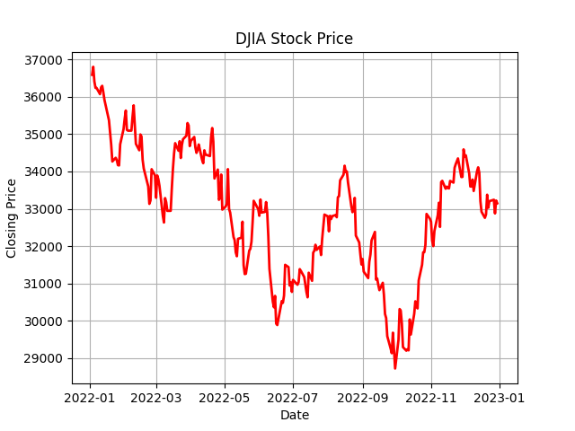
Source. DataCamp
To learn about how to create compelling line plots, check out our Line Plots in MatplotLib with Python Tutorial.
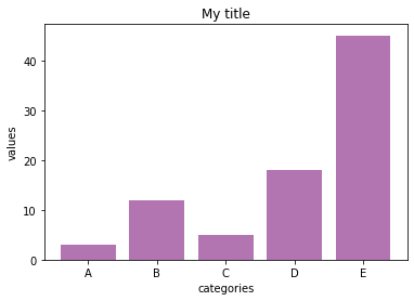
Bar plots
A bar chart ranks data according to the value of multiple categories. It consists of rectangles whose lengths are proportional to the value of each category. Bar charts are prevalent because they are easy to read. Businesses commonly use bar charts to make comparisons, like comparing the market share of different brands or the revenue of different regions. There are multiple types of bar charts, each suited for a different purpose.
There are multiple types of bar charts, each suited for a different purpose, including vertical bar plots, horizontal bar plots, and clustered bar plots.
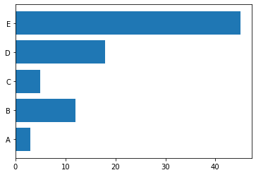
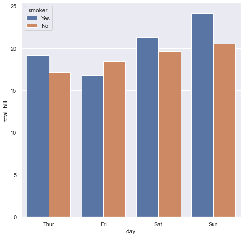
Vertical, horizontal, and clustered bar plots.
Our course, Introduction to Data Science in Python, covers a range of data visualization techniques, including bar plots.
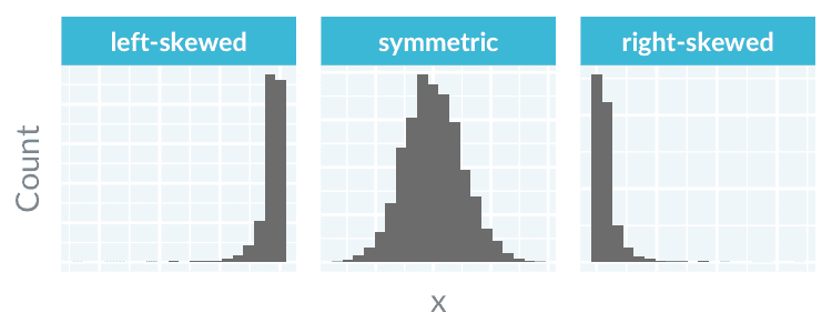
Histograms
Histograms are one of the most popular visualizations to analyze the distribution of data. They show the numerical variable's distribution with bars.
To build a histogram, the numerical data is first divided into several ranges or bins, and the frequency of occurrence of each range is counted. The horizontal axis shows the range, while the vertical axis represents the frequency or percentage of occurrences of a range.
Histograms immediately showcase how a variable's distribution is skewed or where it peaks. Here are examples from our Data Demystified Series on Data Visualizations that Capture Distributions.
Box and whisker plots
Another great plot to summarize the distribution of a variable is boxplots. Boxplots provide an intuitive and compelling way to spot the following elements:
- Median. The middle value of a dataset where 50% of the data is less than the median and 50% of the data is higher than the median.
- The upper quartile. The 75th percentile of a dataset where 75% of the data is less than the upper quartile, and 25% of the data is higher than the upper quartile.
- The lower quartile. The 25th percentile of a dataset where 25% of the data is less than the lower quartile and 75% is higher than the lower quartile.
- The interquartile range. The upper quartile minus the lower quartile
- The upper adjacent value. Or colloquially, the “maximum.” It represents the upper quartile plus 1.5 times the interquartile range.
- The lower adjacent value. Or colloquially, the “minimum." It represents the lower quartile minus 1.5 times the interquartile range.
- Outliers. Any values above the “maximum” or below the “minimum.”
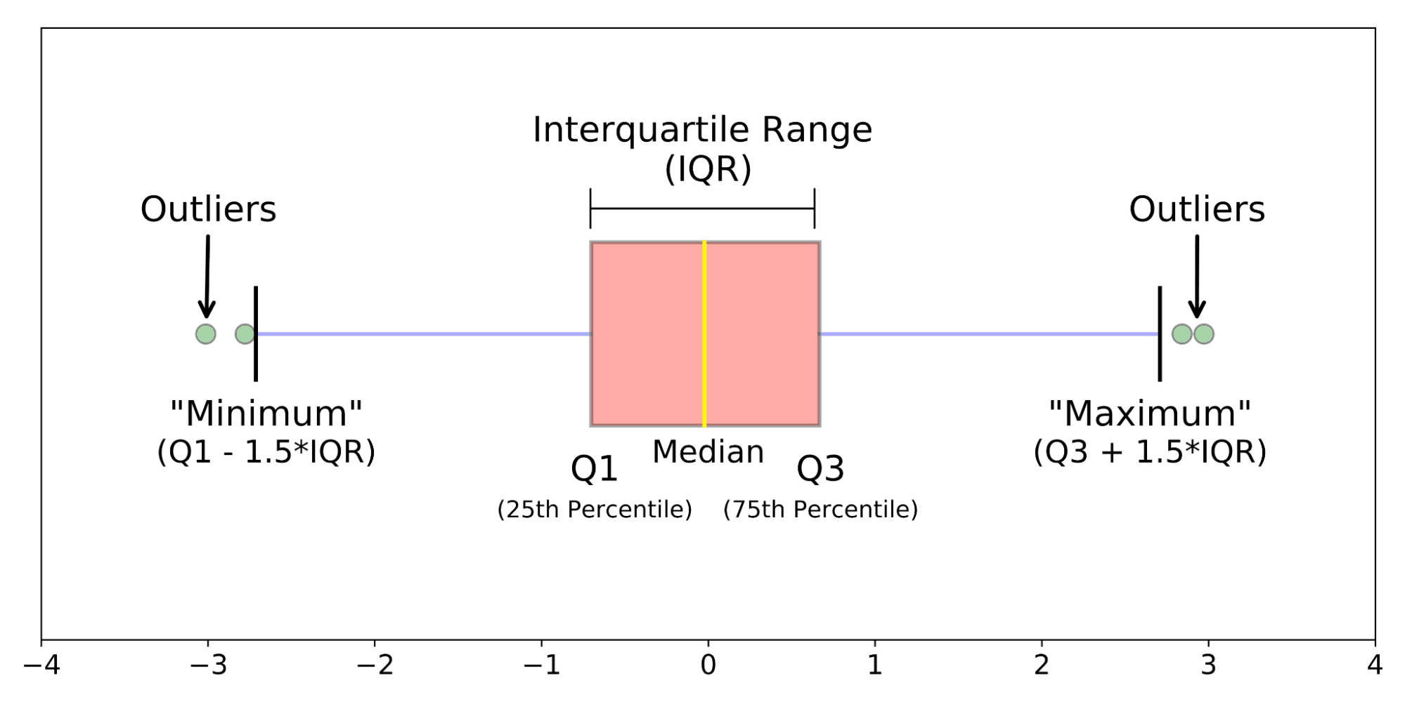
The anatomy of a box plot. Source: Galarnyk
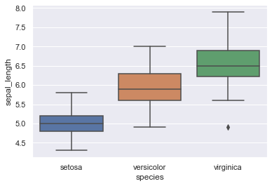
For example, the following seaborn-based boxplot shows the distribution of sepal length in three varieties of iris plants, drawing on the popular iris dataset. Our Python Seaborn Tutorial For Beginners is a perfect resource to discover how to create boxplots and other graphs using Python’s popular visualization package, Seaborn.
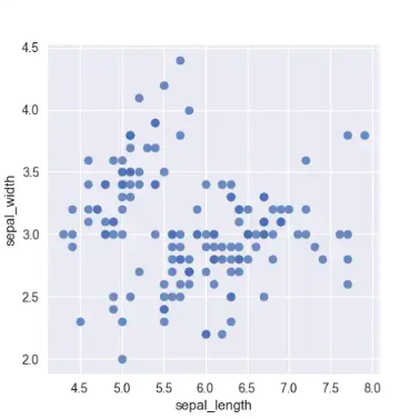
Scatter plots
Scatter plots are used to visualize the relationship between two continuous variables. Each point on the plot represents a single data point, and the position of the point on the x and y-axis represents the values of the two variables. It is often used in data exploration to understand the data and quickly surface potential correlations.
The following example takes again the iris dataset to plot the relationship between sepal width and sepal length.
To have more examples of scatter plots, read our Data Demystified Series on Data Visualizations that Capture Relationships. You can also learn to create a variety of plots, including scatter plots, in our plotting with Matplotlib tutorial.
Bubble plot
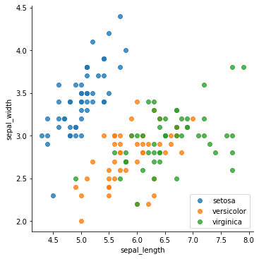
Scatter plots can be easily augmented by adding new elements that represent new variables. For example, if we want to plot the relationship between sepal width and sepal length in the different varieties of iris, we could just add colors to the points, as following:
We could also change the size of the points according to another variable. This is what characterizes the so-called bubble plots. For example, this incredible graph shows the relationship between a country's life expectancy and GDP, adding color to represent the country's region, and size to represent the country's population.
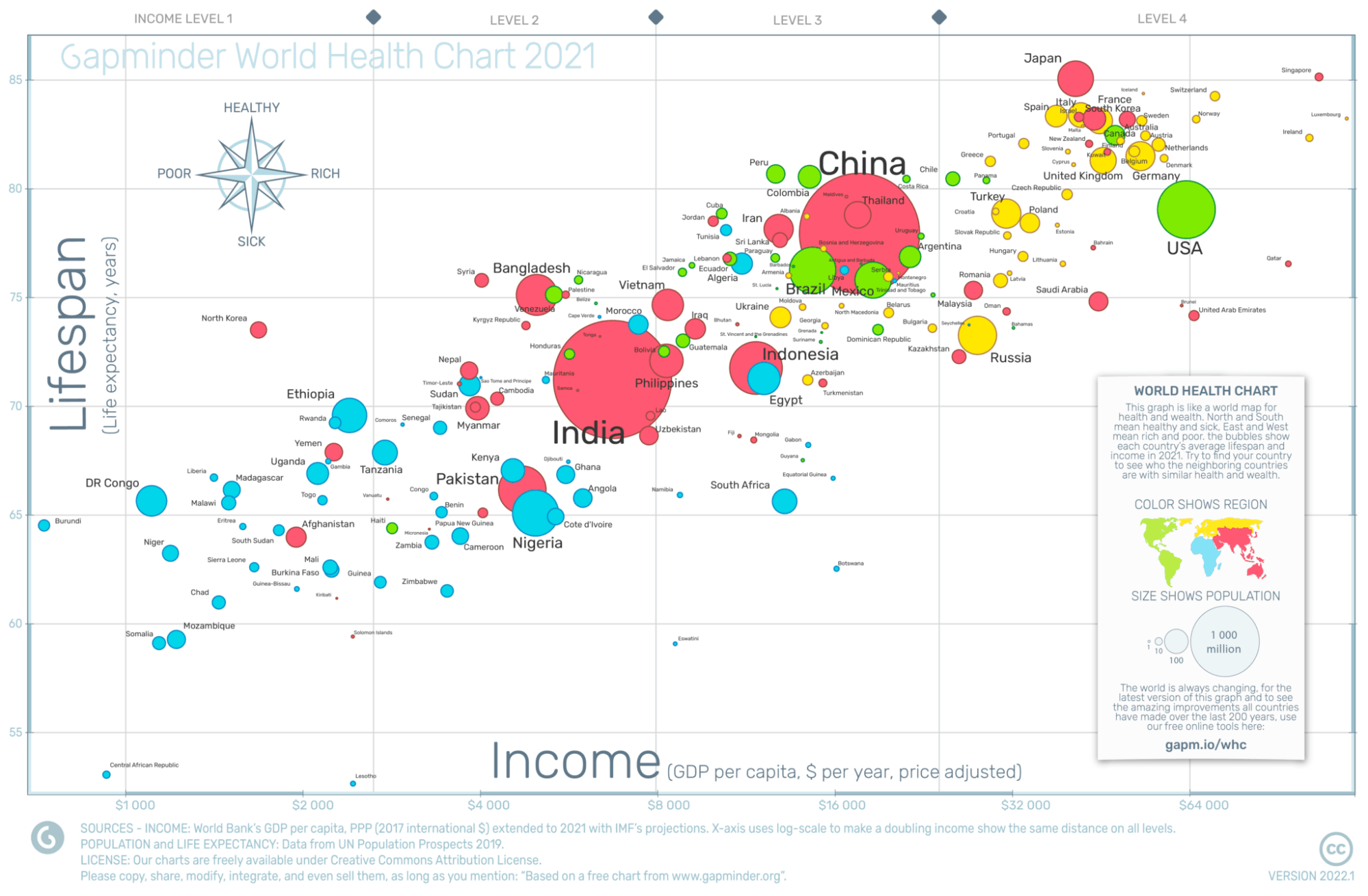
Source. Gapminder
We cover bubble plots and how to create them in our course, Intermediate Interactive Data Visualization with plotly in R.
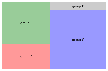
Treemaps
Treemaps are suitable to show part-to-whole relationships in data. They display hierarchical data as a set of rectangles. Each rectangle is a category within a given variable, whereas the area of the rectangle is proportional to the size of that category. Compared to similar visualizations, like pie charts, tree maps are considered more intuitive and preferable.
Below you can find an example.
In our Sentiment Analysis in R course, you’ll learn how to use treemaps to visualize sentiment in groups of documents.
Heatmaps
A heatmap is a common and beautiful matrix plot that can be used to graphically summarize the relationship between two variables. The degree of correlation between two variables is represented by a color code.
For example, this heat extracted from our Intermediate Data Visualization with Seaborn Course analyzes the occupation of the guests of the Daily Show during the 1999-2012 period. As expected, guests from the acting and media industries are the most frequent attendants.
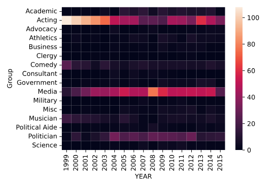
To learn more about how to create a heatmap, you can check out our tutorial that explores how to make one using Power BI.
Word clouds
Word clouds are useful for visualizing common words in a text or data set. They're similar to bar plots but are often more visually appealing. However, at times word clouds can be harder to interpret. World clouds are useful in the following scenarios:
- Quickly identify the most important themes or topics in a large body of text.
- Understand the overall sentiment or tone of a piece of writing.
- Explore patterns or trends in data that contain textual information.
- Communicate the key ideas or concepts in a visually engaging way.
Check out our Generating WordClouds in Python Tutorial to discover how to create your own word cloud.
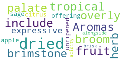
Source. Datacamp
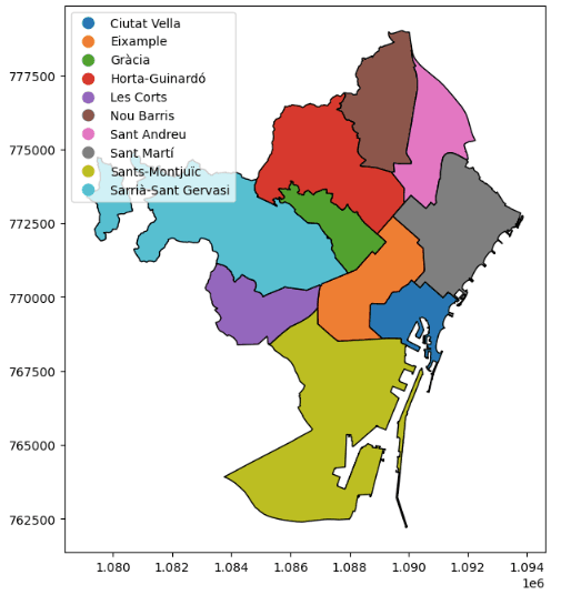
Geospatial maps
A considerable proportion of the data generated every day is inherently spatial. Spatial data –also known sometimes as geospatial data or geographic information– are data for which a specific location is associated with each record.
Every spatial data point can be located on a map using a certain coordinate reference system. For example, the image below, extracted from our GeoPandas Tutorial, shows the different districts of Barcelona.
Geospatial analysis is a rapidly-evolving field within data science. Maps are at the heart of this discipline. Check out our Working with Geospatial Data in Python Course to start drawing maps today!
Network diagrams
Most data is stored in tables. However, this is not the only format available. The so-called graphs are better suited to analyze data that is organized in networks, such as online social networks, like Facebook and Twitter, to transportation networks, like metro lines. Network analytics is the subdomain of data science that uses graphs to study networks.
Network graphs consist of two main components: nodes and edges, also known as relationships. This is an example of a simple network graph.
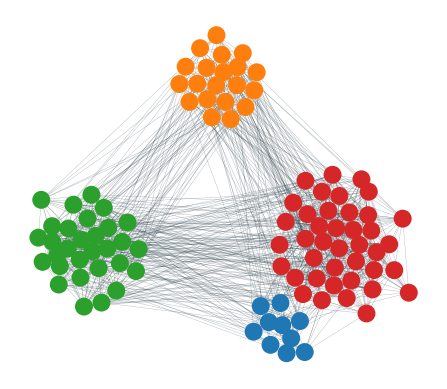
Cool right? The possibilities of network graphs are endless. To get a gentle introduction to this field, we highly recommend our Introduction to Network Analysis in Python Course.
Become an ML Scientist
Master Tableau From Scratch
Accelerate your career with Tableau—no experience required.