In this tutorial, you explore a number of data visualization methods and their underlying statistics. Particularly with regard to identifying trends and relationships between variables in a data frame.
That’s right, you’ll focus on concepts such as correlation and regression! First, you’ll get introduced to correlation in R. Then, you’ll see how you can plot correlation matrices in R, using packages such as ggplot2 and GGally. Lastly, you’ll see what types of correlations exist and how they matter for your further analysis.
If you’re interested in diving deeper into this topic, consider taking DataCamp’s Correlation and Regression course.
Background
In today’s tutorial, you’ll be working with a data set of movies acquired from Kaggle to discover how you can better understand relationships among variables better.
I have lightly cultivated the data so that our analysis is an “apples-to-apples” one by ensuring that things like currency use the same units. Without that step, our statistical analysis of variables like gross, budget, and profit would be misleading. You can access the original data set .
Importing The Data
In order to access the movies data set and put it to use, you can use the read.csv() function to import your data into a data frame and store it in the variable with the stunningly original name movies!
movies <- read.csv(url("http://s3.amazonaws.com/dcwoods2717/movies.csv"))That’s all it takes to get started!
Basic Inspection of Your Data
It’s a good idea, once a data frame has been imported, to get an idea about your data. First, check out the structure of the data that is being examined. Below you can see the results of using this super-simple, helpful function str():
str(movies)## 'data.frame': 2961 obs. of 11 variables:
## $ title : Factor w/ 2907 levels "10 Cloverfield Lane",..: 1560 2143 34 2687 1405 1896 2633 894 1604 665 ...
## $ genre : Factor w/ 17 levels "Action","Adventure",..: 6 12 5 5 5 3 2 8 3 8 ...
## $ director : Factor w/ 1366 levels "Aaron Schneider",..: 474 472 781 828 175 1355 1328 1328 968 747 ...
## $ year : int 1920 1929 1933 1935 1936 1937 1939 1939 1940 1946 ...
## $ duration : int 110 100 89 81 87 83 102 226 88 144 ...
## $ gross : int 3000000 2808000 2300000 3000000 163245 184925485 22202612 198655278 84300000 20400000 ...
## $ budget : int 100000 379000 439000 609000 1500000 2000000 2800000 3977000 2600000 8000000 ...
## $ cast_facebook_likes: int 4 109 995 824 352 229 2509 1862 1178 2037 ...
## $ votes : int 5 4546 7921 13269 143086 133348 291875 215340 90360 6304 ...
## $ reviews : int 2 107 162 164 331 349 746 863 252 119 ...
## $ rating : num 4.8 6.3 7.7 7.8 8.6 7.7 8.1 8.2 7.5 6.9 ...In this particular data frame, you can see from the console that 2961 observations of 11 variables are present.
As a side note, even if each movie was only an hour long, you’d need to watch movies non-stop for over four months to see them all!
The console also lists each variable by name, the class of each variable, and a few instances of each variable. This gives us a pretty good idea of what is in the data frame, the understanding of which is crucial to our analytic endeavors.
Another great function to help us perform a quick, high-level overview of our data frame is summary(). Note the similarities and differences between the output produced by running str().
summary(movies)## title genre
## Home : 3 Comedy :848
## A Nightmare on Elm Street : 2 Action :738
## Across the Universe : 2 Drama :498
## Alice in Wonderland : 2 Adventure:288
## Aloha : 2 Crime :202
## Around the World in 80 Days: 2 Biography:135
## (Other) :2948 (Other) :252
## director year duration
## Steven Spielberg : 23 Min. :1920 Min. : 37.0
## Clint Eastwood : 19 1st Qu.:1999 1st Qu.: 95.0
## Martin Scorsese : 16 Median :2004 Median :106.0
## Tim Burton : 16 Mean :2003 Mean :109.6
## Spike Lee : 15 3rd Qu.:2010 3rd Qu.:119.0
## Steven Soderbergh: 15 Max. :2016 Max. :330.0
## (Other) :2857
## gross budget cast_facebook_likes
## Min. : 703 Min. : 218 Min. : 0
## 1st Qu.: 12276810 1st Qu.: 11000000 1st Qu.: 2241
## Median : 34703228 Median : 26000000 Median : 4604
## Mean : 58090401 Mean : 40619384 Mean : 12394
## 3rd Qu.: 75590286 3rd Qu.: 55000000 3rd Qu.: 16926
## Max. :760505847 Max. :300000000 Max. :656730
##
## votes reviews rating
## Min. : 5 Min. : 2.0 Min. :1.600
## 1st Qu.: 19918 1st Qu.: 199.0 1st Qu.:5.800
## Median : 55749 Median : 364.0 Median :6.500
## Mean : 109308 Mean : 503.3 Mean :6.389
## 3rd Qu.: 133348 3rd Qu.: 631.0 3rd Qu.:7.100
## Max. :1689764 Max. :5312.0 Max. :9.300
## With a single command, you’ve had R return some key statistical information for each variable in our data frame. Now that you know what you’re working with, let’s dive in and explore the data some further!
Feature Engineering: Calculating Profit
In reviewing the variables available to you, it appears that some of the numeric variables can be manipulated to provide new insights into our data frame.
For instance, you’ve got gross and budget variables, so why not use a little subsetting to calculate the profit for each movie?
You can calculate profit by using the formula profit = gross - budget. Try it out in the DataCamp Light chunk below!
Awesome!
You can see that there is quite a collection of money-makers and money-pits in our data frame.
The profit of our movies can probably be used for some interesting analyses down the road, so let’s go ahead and add profit as a new column to our data frame.
Correlation
Now that profit has been added as a new column in our data frame, it’s time to take a closer look at the relationships between the variables of your data set.
Let’s check out how profit fluctuates relative to each movie’s rating.
For this, you can use R’s built in plot and abline functions, where plot will result in a scatter plot and abline will result in a regression line or “line of best fit” due to our inclusion of the linear model argument as you will see below.
Was the output pretty much what you expected?
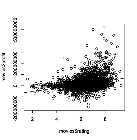
In general, it appears that movies with a higher rating tend to have higher profit. Another way to phrase this statement would be to say that a positive correlation exists between rating and profit, at least in our data frame.
That said, even a cursory glance at the plot reveals that there are plenty of highly rated movies that weren’t exactly blockbusters, and there are a number of very profitable movies that got relatively low ratings.
Correlation does NOT imply causation!
One anecdote to help you understand correlation versus causation is as follows: I run an ice cream stand at the beach. The average number of jaywalkers in the city tends to increase when my ice cream sales do, but is my ice cream causing people to disregard traffic laws, or is some other force in play? My ice cream is admittedly awesome, but the sunshine outside probably has something to do with people wanting ice cream and people not wanting to stand around getting sunburnt at crosswalks. A relationsip (correlation) does exist between my ice cream sales and the number of jay walkers, but you can’t definitively state that it’s a causal relationship.
Keep that line of reasoning in mind as you proceed through this tutorial!
Calculating Correlation in R
So what types of relationships exist between the variables in movies, and how can you evaluate those relationships quantitatively?
The first way is to produce correlations and correlation matrices with cor():
Note that you can also specify the method that you want to indicate which correlation coefficient you want to compute. Be careful, because there are always some assumptions that these correlations work with: the Kendall and Spearman methods only make sense for ordered inputs. This means that you’ll need to order your data before calculating the correlation coefficient.
Additionally, the default method, the Pearson correlation, assumes that your variables are normally distributed, that there is a straight line relationship between each of the variables and that the data is normally distributed about the regression line.
Note also that you can use rcorr(), which is part of the Hmisc package to compute the significance levels for pearson and spearman correlations.
You’ll also see that the correlation matrix is actually a table that shows correlation coefficients between sets of variables. This is already a great first way to get an idea of which relationships exist between the variables fo your data set, but let’s go a bit deeper into this in the next section.
Visually Exploring Correlation: The R Correlation Matrix
In this next exploration, you’ll plot a correlation matrix using the variables available in your movies data frame. This simple plot will enable you to quickly visualize which variables have a negative, positive, weak, or strong correlation to the other variables.
To pull this wizardry off, you’ll be using a nifty package called GGally and a function called ggcorr().
The form of this function call will be ggcorr(df), where df is the name of the data frame you’re calling the function on. The output of this function will be a triangular-shaped, color-coded matrix labelled with our variable names. The correlation coefficient of each variable relative to the other variables can be found by reading across and / or down the matrix, depending on the variable’s location in the matrix.
It may sound confusing, but it’s really simple in practice, so give it a shot in the following code chunk!
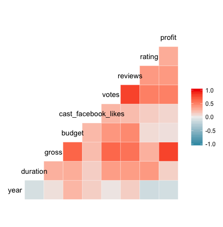
So in the correlation matrix you’ve just created (great job, by the way!), you can go to the row or column associated with a variable, such as year and see its correlation coefficient as indicated by the color of the cell that corresponds with another variable.
In examining year, for example, you can see that there is a weak, positive correlation with budget and a similarly weak, negative correlation with rating.
Correlation coefficients are always between -1 and 1, inclusive. A correlation coefficient of -1 indicates a perfect, negative fit in which y-values decrease at the same rate than x-values increase. A correlation coefficient of 1 indicates a perfect, positive fit in which y-values increase at the same rate that x-values increase.
In most cases, such as your year example above, the correlation coefficient will be somewhere between -1 and 1.
Did you notice anything a bit odd about the variables shown in the correlation matrix?
Not all of the variables in movies are present!
That’s because not all of the variables in movies are numeric. The ggcorr function disregards non-numeric variables automatically, which saves some time by exempting the user from “subsetting-out” such variables prior to creating the matrix.
If you want your correlation matrix to really “pop” (or maybe you’re a little colorblind, like me), there are a few simple tweaks you can make to produce more visually-compelling, data-loaded matrices.
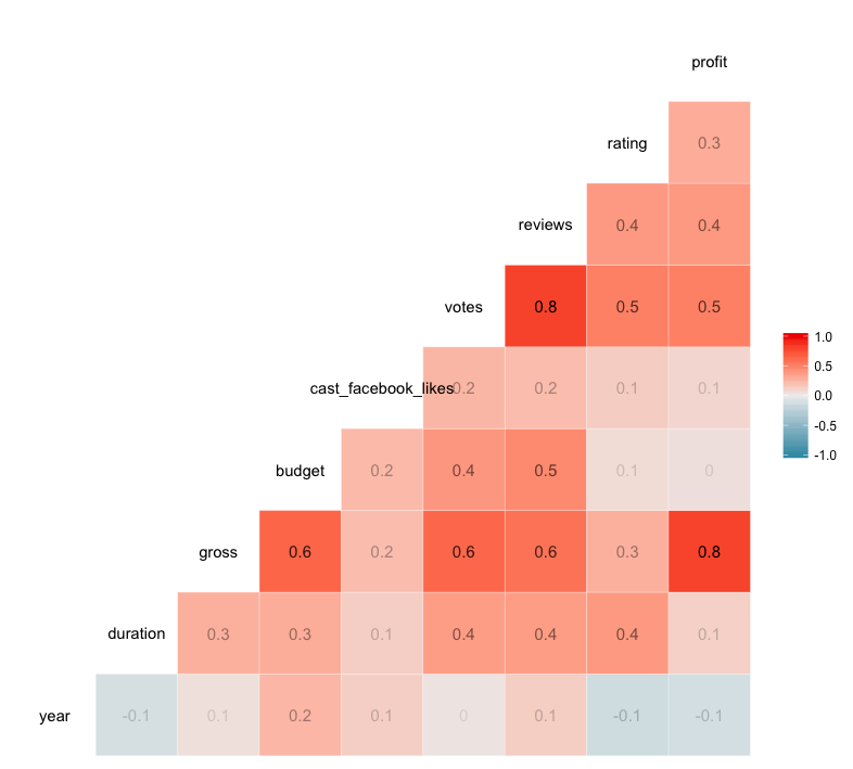
In the code chunk that follows, you’ve included the label argument, which can be set equal to either TRUE or FALSE. The default setting is FALSE, but if you add label = TRUE, the correlation coefficient of each relationship is included in the appropriate cell. This keeps you from guessing the value of each coefficient based off the color scale.
The label_alpha argument allows you to increase or decrease the opacity of each label based on the strength of the correlation coefficient. This is super helpful in quick, visual data analysis.
Don’t take my word for it, try it for yourself!
Now let’s plot a better correlation matrix:
In the plots that follow, you will see that when a plot with a “strong” correlation is created, the slope of its regression line (x/y) is closer to 1/1 or -1/1, while a “weak” correlation’s plot may have a regression line with barely any slope. A slope closer to 1/1 or -1/1 implies that the two variables plotted are closely related.
In the case of our movies data frame, such a regression line can lend powerful insights about the nature of your variables and may indicate an interdependence of those variables.
For instance, in your previous plot of profit over rating, you saw that our regression line had a moderate, positive slope. Taking a look back at your correlation matrix, you see that the correlation coefficient of these two variables is 0.3.
Makes sense, right?
Correlation Types
Let’s now check out additional plots illustrating the different types of correlations that you have seen in the previous section!
Strong Correlation: Plotting Votes Versus Reviews
Lets begin by plotting two variables with a strong, positive correlation.
In looking at our correlation matrix, it seems that votes versus reviews meets your criteria, with a correlation value of 0.8. That means that our slope should be relatively close to 1/1.
You will be implementing the ggplot2 package in this exercise and the exercises that follow. The ggplot2 package is a versatile toolset that can be used to create compelling, data visualizations.
In this case, you’re going to take advantage of the qplot function within the ggplot2 package, which can produce many kinds of plots based on what plot type is passed to the geom (geometry) argument.
In the code chunk that follows, geom has been set to a vector containing two types of geometry, point and smooth, where point results in a scatterplot and smooth generates a trendline. You’ll also notice that method has been set to lm, which means the trendline will be the familiar, straight regression line that was created in our plot of profit over years previously.
In short, you’re about to learn how easy it is to generate killer data visualizations in a flash!
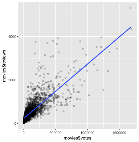
You may have recognized the alpha argument included in the qplot function above. The use of alpha in qplot applies a gradient of opacity to the points in the scatter plot similar to how it changed the opacity of the correlation coefficient labels in ggcorr.
In the configuration you used, total opacity is only achieved when a point is overlapped by 5 other points. Increasing or decreasing the number in the denominator of alpha will affect the number of overlapping points required to change a point’s opacity. One reason to use this aesthetic is that it can help users quickly identify concentrations of data points in their plots, which in turn can bring new insights about our data to light with only a glance.
Go ahead and tinker with the code and see how it works for yourself!
Weak Correlation: Plotting Profit Over Years
Now let’s see what a “weak”, negative correlation looks like by plotting profit versus years. This time, no method has been specified, so our trendline is going to vary according to the data in a curvilinear fashion (a fitted curve), which is the default for this function. You’ll notice that along certain parts of the trendline there is a light gray area that increases or decreases in size according to the confidence interval of the trendline.
If you’re not familiar with the concept of a confidence interval, don’t worry! R will do the work for you, and the concept will be better explained after this exercise.
For now, just fill in the blanks with the necessary code and observe!
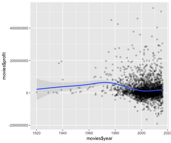
So now that you’ve had a chance to see the confidence interval and smoothing curve in action, what observations can you make?
- First, you see that in the initial portion of the plot,
profitseems to be increasing eachyear. - Second, you notice that the grey area offset from your smoothing curve is initially quite large and the number of data points (or observations) is quite small.
- Third, as the curve moves into a larger concentration of observations, the grey area diminishes and practically hugs the curve, which begins to decline in later
years.
In conclusion, plotting the confidence interval in conjunction with the smoothing curve allows us to see the amount of uncertainty associated with our regression line. That uncertainy increases with fewer observations and decreases with more observations.
This is very helpful in visualizing how the relationship between our variables changes throughout the data frame and reveals how concentrations of observations alter the plotted curve.
The caveat here is that the plot may be a bit misleading, as it’s hard to visually discern whether there is a positive or negative correlation of your variables.
Let’s now plot profit over years in the same way you plotted votes versus reviews: simply replace the “…..” in each argument so that years are plotted and on x-axis and profit is on the y-axis. Make sure to specify which data frame that “data” equals!
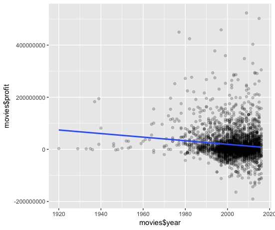
Looking back to your correlation matrix, you see that the correlation coefficient of profit and year is -0.1, which is perhaps more readily visualized in the plot that incorporates a line of best fit than it is in the plot that used a fitted curve.
Tying it all together
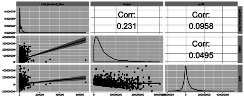
Let’s now take a look at another powerful function available in GGally called ggpairs. This function is great because it allows users to create a matrix that shows the correlation coefficient of multiple variables in conjunction with a scatterplot (including a line of best fit with a confidence interval) and a density plot.
Using this one function, you can effectively combine everything you’ve covered in this tutorial in a concise, readily comprehensible fashion.
In the following code chunk, pick your three favorite variables from the data frame (no subsetting required!), plug them in, and play!
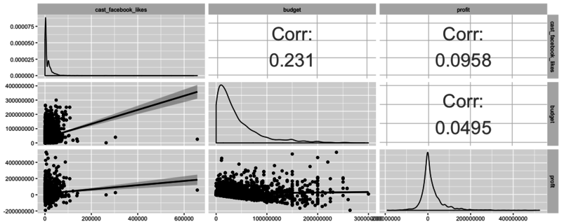
As you may have guessed, there are many scenarios in which one type of plot is ideal - the key is to learn what visualization techniques are available, how to use them, and what the end result means!
Going Forward
You’ve covered a lot of ground in this tutorial, so congratulations for making it through to the end!
I hope you are able to put these concepts to work in your own analytical adventures! These are really the basics of data exploration in R and there’s so much more that you can do to make sure that you get a good feel for your data before you start analyzing and modeling it. Why not take your efforts up a notch and start DataCamp’s Exploratory Data Analysis course?
In the mean time, I encourage you to head on over to Kaggle and find a rich, fascinating data set of your own to explore if you don’t want to continue with the movies data set!