Track
The availability of Excel’s built-in functions and add-ins means that even the most advanced analysis is now possible in Excel. As a beginner data science professional, familiarizing yourself with Excel for various analytics techniques has become crucial.
This tutorial will introduce the statistical concept of correlation, its different types, and its applications. After introducing relevant built-in functions and add-ins, we will take sample data to create, visualize, and interpret the Excel correlation matrix.
What is a Correlation Matrix?
Correlation is a statistical measure that describes the extent to which two or more variables are related to each other. It indicates the strength and direction of a relationship between variables.
When variables are correlated, it means that changes in one variable are associated with changes in another — either positively or negatively:
- Positive correlation: When two variables increase or decrease together, they are positively correlated. For example, height and weight are typically positively correlated; as height increases, weight tends to increase as well.
- Negative correlation: When one variable increases while the other decreases. For instance, the speed at which a vehicle travels and the time it takes to reach a destination; as the speed increases, the time taken decreases.
Correlation coefficients are numerical measures that quantify the strength and direction of this relationship. This degree of correlation can be measured using different statistical tools, with the Pearson correlation coefficient being the most common.
Understanding the Pearson coefficient
The Pearson correlation coefficient, often referred to simply as “Pearson’s r,” is a measure of the linear correlation between two variables 𝑋 and 𝑌. It quantifies the degree to which a relationship between these variables can be described using a straight line.
The Pearson correlation coefficient is calculated as the covariance of the two variables divided by the product of their standard deviations. Mathematically, it’s expressed as:
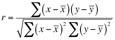
Note that 𝑋‾and 𝑌‾ are the means of the 𝑋 and 𝑌 variables, respectively.
The calculated coefficient’s value will range from -1 to +1, where:
- +1 indicates a perfect positive linear relationship: As one variable increases, the other variable increases in a perfectly linear manner.
- -1 indicates a perfect negative linear relationship: As one variable increases, the other variable decreases in a perfectly linear manner.
- 0 indicates no linear correlation: There is no linear relationship between the variables.
Visually, here’s how the different types of correlations will look like:
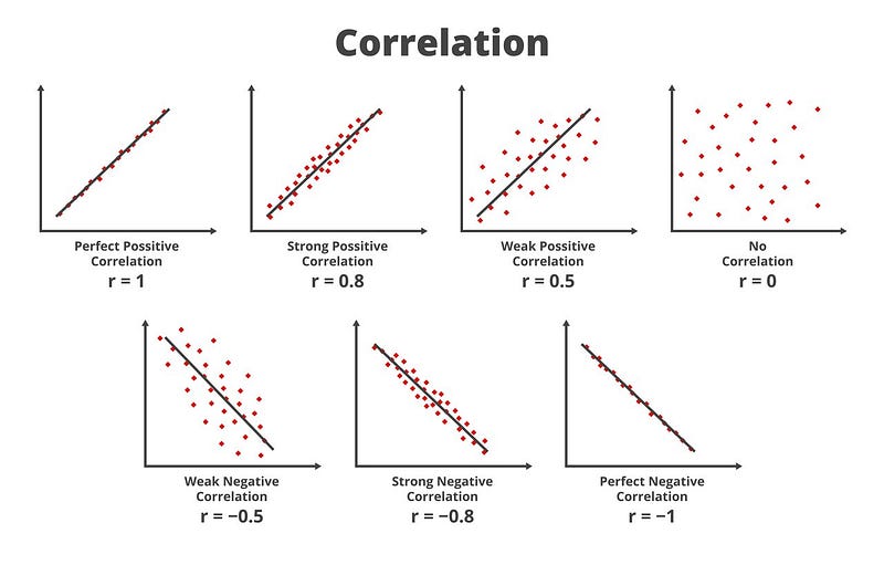 Visual representation of correlations (Source)
Now that we have understood terms such as correlation and correlation coefficients, let’s understand how it all comes together as a correlation matrix.
A correlation matrix is a table that displays the correlation coefficients between multiple variables. Each cell in the matrix represents the correlation between two variables.
This matrix is a useful tool for analyzing the strength and direction of relationships between variables in statistical data analysis. Beyond this obvious use of correlation matrix, it is used for various applications in data science, finance, market research, and more.
Some of these applications are:
- In data science, we use it to select or exclude features (variables) from models based on their relationships. Highly correlated features can cause multicollinearity in regression models, which might skew the results. By identifying these correlations, we reduce redundancy and improve model performance.
- In finance, correlation matrices are used to understand how different assets move in relation to one another. This is crucial for portfolio diversification and risk management, as it helps in selecting assets that are not strongly correlated, thereby potentially reducing risk.
- Businesses use correlation matrices to find relationships between different consumer behaviors, product ratings, and demographic variables. This helps improve the targeting and positioning of products. We will see a similar example later in this tutorial.
Now that we have understood the concept of correlation, its calculations, and its applications, let's dive into its implementation in Excel.
Correlation Matrix: Relevant Functions and Add-ins in Excel
Two tools we’ll be using for calculating correlation matrices in Excel are the CORREL function and the Analysis ToolPak add-in.
CORREL Function
The CORREL function in Excel provides a straightforward method for calculating the Pearson correlation coefficient between two sets of data.
The syntax for the CORREL function is:
CORREL(array1, array2)
where:
- array1: This is the range of cells that contains the first dataset/column.
- array2: This is the range of cells that contains the second dataset/column.
Each array must have the same number of elements. Excel will return the correlation coefficient for these arrays, which ranges from -1 to +1.
Analysis ToolPak
For more comprehensive statistical analysis, including generating a full correlation matrix across several variables, the Analysis ToolPak in Excel can be helpful.
The Analysis Toolpak may not necessarily be enabled in your Excel document. Check if the “Data Analysis” icon is visible in the right corner under the “Data” tab, as shown below.
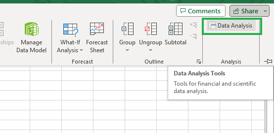
Analysis Toolpak in Excel.
If you can’t see it, don’t worry; follow the steps below, and you can enable the Analysis ToolPak.
- Click on
Filefrom the menu, then selectOptions.

Selecting Options from File Tab.
- In the
ExcelOptionsdialog box, selectAdd-ins.
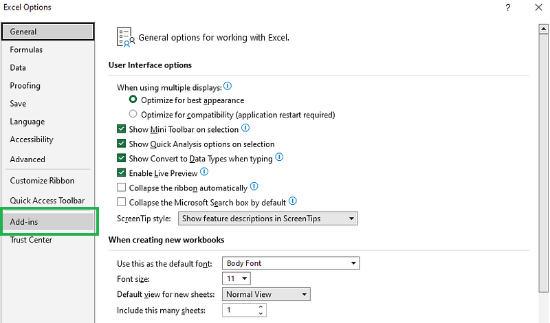
Select Add-ins from the Excel Options dialog box.
- In the
Managebox at the bottom of the view, selectExcelAdd-insand clickGo.
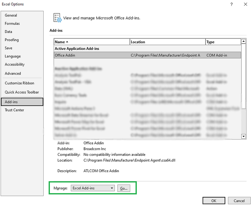
Managing Excel add-ins.
- In the
Add-Insbox, checkAnalysis ToolPakand then clickOK.
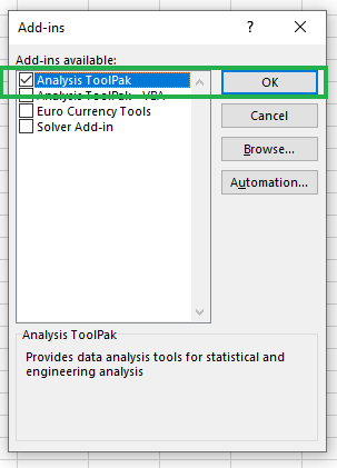
Enabling Analysis Toolpak.
You should be able to see the “Data Analysis” icon under the Data tab, in the Analysis group, if you have followed the instructions and enabled it correctly.
As you’ll see later, Analysis ToolPak makes the process of calculating the correlation matrix much easier and more straightforward.
How to Create a Correlation Matrix in Excel: An Example
Consider a scenario where you’re a data analyst at a leading consumer goods company with multiple stores nationwide. The company has compiled data on sales and customer demographics.
Your objective is to understand the relationships between customer characteristics and their purchasing patterns. This analysis will aim to find products that are commonly purchased together and explore how various demographic factors impact sales trends.
You have decided to use a correlation matrix for the analysis. The following sample data of 10 customers have been given to you in an Excel file:

Sample data from a leading consumer goods company.
The columns are:
- Customer ID: Unique identifier for each customer.
- Age: Age of the customer in years.
- Annual Income (K$): The customer’s annual income in thousands of dollars.
- Frequency of Visits (per month): How often the customer visits the store each month.
- Spend per Visit ($): Average amount of money spent by the customer per store visit.
- Electronics ($) / Clothing ($) / Groceries ($): Amount spent on different product categories per visit.
Correlations manually using CORREL function
Here are the steps to follow to calculate the Pearson correlation coefficient in Excel:
- Step 1: Select the appropriate cell that forms the part of the correlation matrix. Here we select, B16.
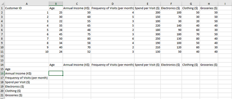
Selecting a cell to calculate the correlation.
- Step 2: Type in the following formula that utilizes the CORREL function. We will calculate the correlation between Age and Annual Income first.
=CORREL(B2:B11,C2:C11)
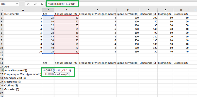
Typing the formula.
- Step 3: Enter the cell and repeat the process for all other combinations of columns.
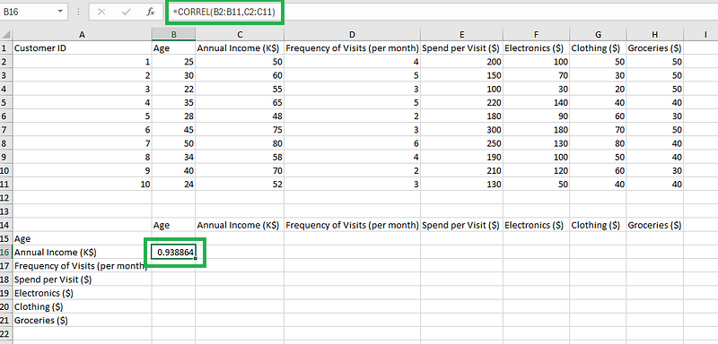
Calculating the correlation.
As you see, calculating the correlation values manually for each combination of columns could become tedious, especially when the number of columns in the data increases.
We also have an option to utilize the OFFSET function to automate the changes in cell ranges to populate the coefficient values in the table.
While it’s important to know that the CORREL function exists and is useful when calculating individual correlations, when considering an entire correlation matrix, the Analysis Toolpak is far easier, and quicker, hence recommended.
Correlation matrix using Analysis Toolpak
Here are the steps you should follow to create the correlation matrix:
- Step 1: Click on the Data Analysis icon under the Data Tab.

Clicking on the Data Analysis icon.
- Step 2: Select the “Correlation” option and click “OK.”
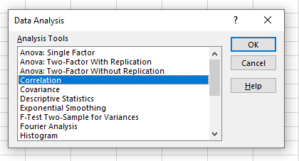
Selecting the correlation option.
- Step 3: Provide the input range, including the Column names. Tick the “Labels in first row” option. For output range, select any cell where you would want to display the results, say $A$14, here. Finally, press OK.
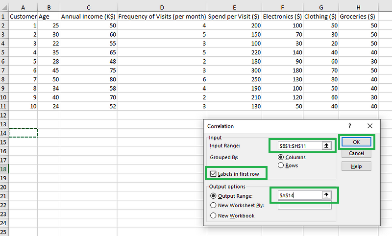
Filling the details for correlations using the Analysis Toolpak add-in.
You should be able to see the correlation matrix as shown below:
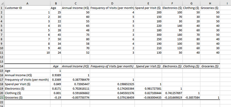
Data with its correlation matrix.
The correlation value for any column with itself is 1, meaning a perfect correlation with itself. The matrix has all the columns present in the row as well, creating all combinations of columns with each other. The upper-right diagonal of the matrix is empty, as it will exactly resemble the lower-left diagonal combinations.
We have successfully created the correlation matrix in Excel. Now, it’s time to understand what those values mean and convert these numbers into insights.
How to Interpret a Correlation Matrix in Excel
While interpreting the correlation matrix we saw above is not too hard, it gets out of hand when the number of columns increases. It’s impossible to go through each combination when the number of columns is high.
We need a mechanism to quickly identify the most significant correlations amidst all possible combinations in the correlation matrix.
Conditional formatting of these cells in a correlation matrix helps interpret the correlation matrix better by directing our focus to the most significant cells (darker shades) in the correlation matrix.
Here are the steps to color-code the correlation matrix in Microsoft Excel:
- Step 1: Highlight the correlation matrix (only the numbers), and click on Conditional formatting under the “Home” tab. Click on “New Rule” as shown below.
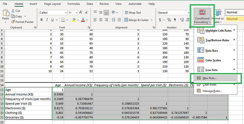
Clicking on the “Conditional Formatting” icon.
- Step 2: After step 1, you should see a dialog box as shown in the diagram below. First, select “Format all cells based on their values” and set the format style to “3-Color Scale.” Three colors are ideal because they can denote positive, negative, and neutral correlations accordingly. Finally, set the Type, Value, and Color as shown in the diagram below.
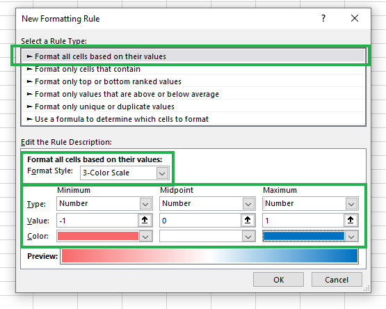
Creating a new conditional formatting rule.
You will see an output as shown below:
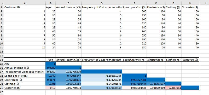
Sample data, with color-coded correlation matrix.
That’s it! We have added colors to better visualize the correlation matrix.
Once we have color-coded the correlation matrix for visual understanding, we can infer the following from the results we have obtained:
- Age is strongly positively correlated with annual income, meaning the older the customers are, the stronger their purchasing power.
- The amount spent on groceries is negatively correlated with all variables except the frequency of visits by customers, which is positively correlated, meaning customers are likely to purchase more groceries when they visit the store more.
- The categories of clothes and electronic devices have a strong positive correlation, so it may be a good idea to keep these two categories of items nearby to increase sales.
- The categories of clothes and groceries have a negative correlation, meaning it’s best not to keep these categories nearby in the physical stores.
The key to interpreting the correlation matrix is to observe the direction and strength of the value in the matrix and backtrack to the columns associated with it.
Notice that in our explanations, we never claimed that older customers get higher annual incomes because of their higher age, or that higher sales of clothes will cause lower sales of groceries. That is because, correlation isn’t causation, a popular misconception.
We can only interpret the existence (or non-existence) of a relationship between two variables, but never that a variable is causing a change in the other variable, through a correlational analysis. To determine a causation relationship, we need to perform specific experiments, and you can learn more about it from our Correlation vs. Causation tutorial.
Final Thoughts
This tutorial introduced the concept of correlation, the Pearson coefficient, its mathematical expression, different types of correlations, and how to identify them based on the direction and strength of the correlation coefficients.
Then, we shifted our focus toward implementation, where we took sample data, created, visualized with conditional formatting, and interpreted the correlation matrix. We also looked at misconceptions when interpreting the correlation matrix.
Your learning doesn’t have to end here! If you’re interested in implementing correlations using other programming languages, the following guides will be of use:
To solidify your related technical knowledge, check out our beginner-friendly Probability and Statistics courses. Alternatively, if you feel confident with the technical concepts but want to improve your practical implementation skills in Excel, you should check out the Excel Fundamentals track.

As a senior data scientist, I design, develop, and deploy large-scale machine-learning solutions to help businesses make better data-driven decisions. As a data science writer, I share learnings, career advice, and in-depth hands-on tutorials.