Motivation
In 2012, Harvard Business Review declared that data scientist was the sexiest job of the 21st century. Since then, the term data scientist has become increasingly popular.
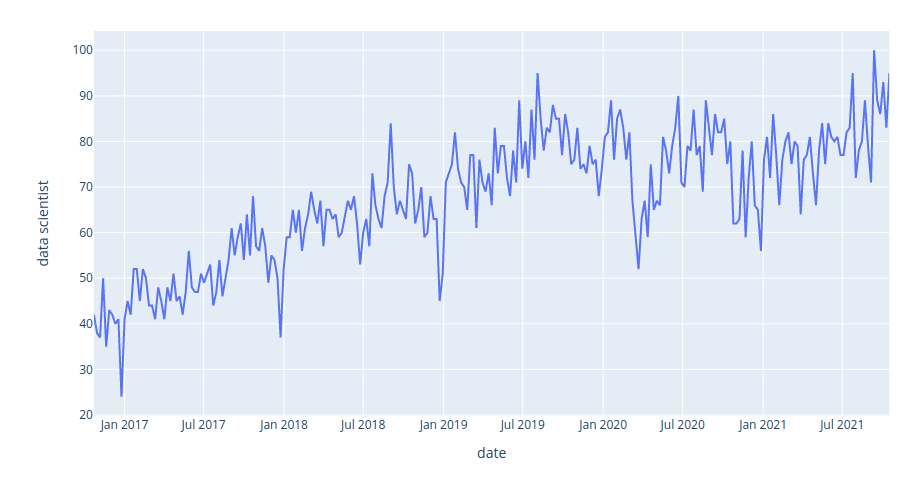
The image above shows the interest in the keyword “data science” on Google Search from 2016 to 2021. We can see that the interest in data science has steadily increased over the last five years.
Not only is data scientist a well-paid role, it also allows you to utilize a variety of skills, extract interesting insights from real-world data, and make an impact on society through your analysis. Thus, it makes sense that it was declared as the sexiest job of the 21st century.
However, before applying for a data science job, it is worth analyzing the characteristics and background of data scientists. Knowing their backgrounds and skills will give you the necessary information to equip yourself with relevant skills to stand out among a pool of candidates.
Some interesting questions to analyze are:
- What skills do most data scientists possess?
- How are these skills different from the skills of other titles such as machine learning engineer, data analyst, and data engineer?
- What are the most popular majors?
- Do you need a master’s or Ph.D. to become a data scientist?
- What are the percentages of men and women in the data science field?
- Where are most data science jobs located?
- How do the popularities of different data-related jobs change over time?
- How do the skills for data scientists change over time?
Get the data
We will use the data of more than 160,000 data scientists, 570,000 data analysts, more than 100,000 data engineers, and more than 19,000 machine learning engineers from all over the world. The datasets are extracted from Diffbot, the world’s largest knowledge graph. Find more instructions on how to use Diffbot here.
To make it easier for you to follow the article, all data used in this article is uploaded to this repository. All of them are free to access and download.
The notebook containing the code of this article can be found here. If you want to get the data directly from Diffbot, you can play with this notebook instead.
Find most popular languages
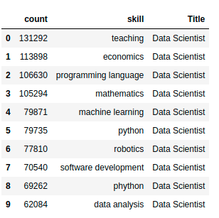
What are the top skills for data scientists, data analysts, data engineers, and machine learning engineers? We can answer this question using the data consisting of the top 100 most popular skills of people who have these job titles.
import pandas as pd
skill_count = pd.read_csv(
"https://media.githubusercontent.com/media/khuyentran1401/dataset/master/data_science_market/all_skills.csv",
    index_col=0,
)

# Show the top 10 rows
skill_count.head(10)
We will use this dataset to analyze the popularity of different programming languages within a certain data-related position. We will visualize the dataset using a bubble matrix created on Observable.
A bubble matrix uses sizes and colors to represent two-dimensional information. The rows represent the job titles and the columns represent the languages. The bigger a bubble is, the more frequently the language is used in a certain job category.
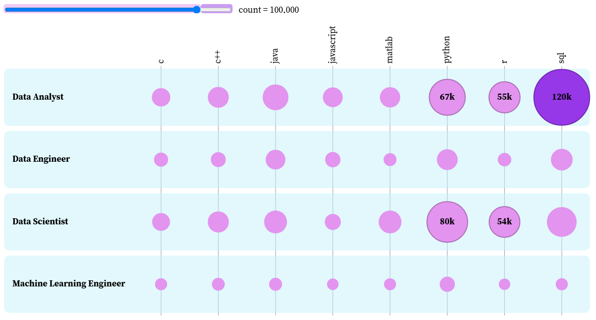
To create the size of the bubbles, we will calculate the ratio between the frequency of a language and the maximum frequency among all languages and positions.
languages = skill_count[
skill_count["skill"].isin(
["python", "r", "sql", "c", "c++", "matlab", "java", "javascript"]
)
]
languages["Ratio to All Skills"] = languages["count"].apply(
lambda c: c / max(skill_count["count"])
)
# View languages used by data analysts
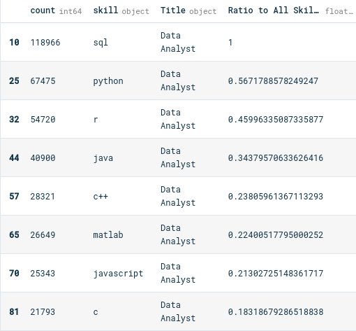
languages[languages["Title"] == "Data Analyst"]
The bubbles are highlighted if they are above a certain number of occurrences. We can use the slider to choose the threshold above which the bubbles are highlighted. For example, if we choose the threshold to be 100,000, only the bubbles with a count above 100,000 are colored dark purple.
Another cool thing we can do with this plot is to sort the bubbles by job titles. Let’s use this feature to find the top skills of each job title.
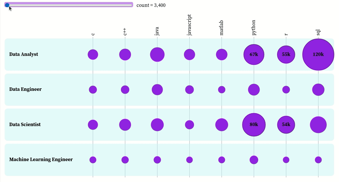
You can interact with the plot here. Based on this plot, we can see that:
- The top three skills of data analysts in descending order are SQL, Python, and R
- The top three skills of data engineers in descending order are SQL, Python, and Java
- The top three skills of data scientists in descending order are Python, R, and SQL
- The top three skills of machine learning engineers in descending order are Python, Java, and C++
Analyze education
The most popular majors
What are the most popular majors of data-related positions? To answer this question, we will download the data that shows the frequency of the top majors of a certain position.
!wget 'majors_df.pkl' 'https://github.com/khuyentran1401/dataset/raw/master/data_science_market/majors_df.pkl'
import pickle
majors_df = pickle.load(open("majors_df.pkl", "rb"))
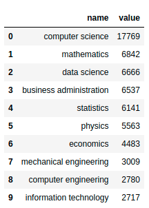
majors_df["data scientist"]
Let’s visualize this dataset to have a better understanding of it. Start with creating a function to visualize the majors of a position.
import plotly.express as px


def plot_majors(title: str, majors_df: dict):
    majors = majors_df[title]
    return px.bar(data_frame=majors, x="name", y="value")
The top majors of data scientists:
plot_majors('data scientist', majors_df)
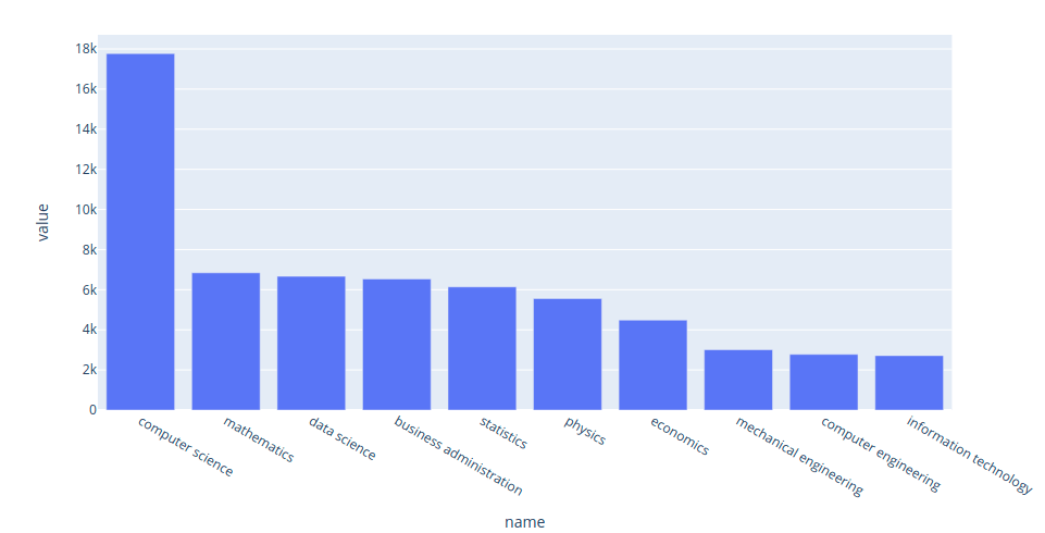
Interact with the plot here. Since many data science positions require knowledge of programming and math, it is not surprising that the top two majors for data scientists are computer science and mathematics.
The top majors of data engineers:
plot_majors('data engineer', majors_df)
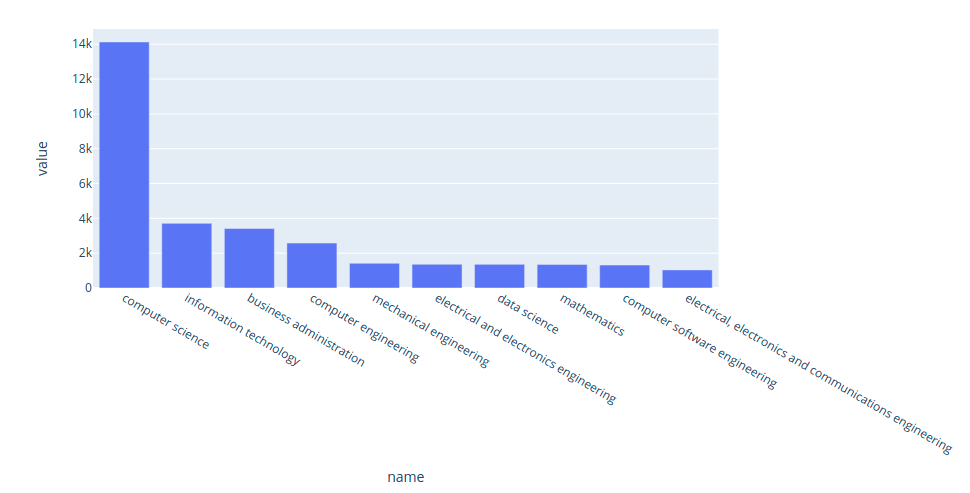
Interact with the plot here. Since data engineers’ work requires the knowledge of different technologies and programming languages, it makes sense to see that the majority of data engineers majored in computer science and information technology instead of mathematics.
The top majors of data analysts:
plot_majors('data analyst', majors_df)
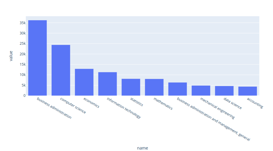
Interact with the plot here. The top three majors of data analysts are business administration, computer science, and economics. This result makes sense since data analysts’ work involves interpreting the data.
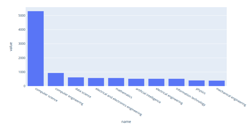
The top majors of machine learning engineers:
plot_majors('machine learning engineer', majors_df)
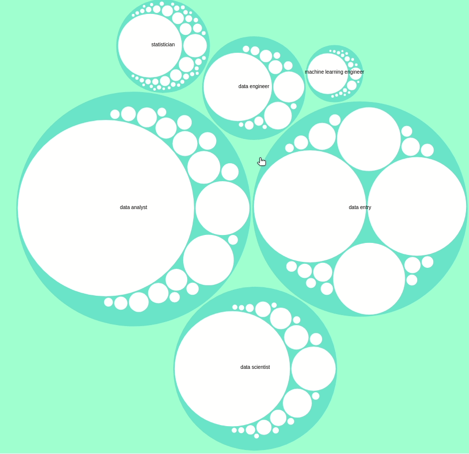
Interact with the plot here. We can also use the circle packing plot to view the difference in the majors of different jobs.
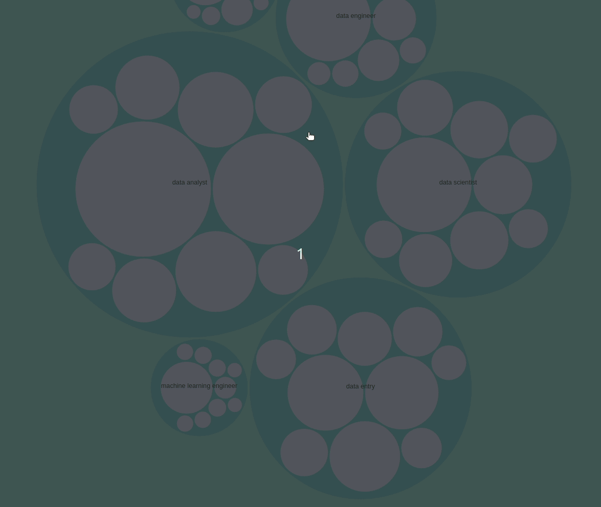
You can interact with the plot above here.
Analyze degrees
You might see a lot of job descriptions for the data scientist positions that require a master’s degree or Ph.D. But how many data scientists actually have a master’s degree or Ph.D.?
Let’s answer that question by downloading the data that shows the count of a degree for a particular position.
degree_df = pd.read_csv(
"https://media.githubusercontent.com/media/khuyentran1401/dataset/master/data_science_market/degrees.csv"
)

degree_df.head(10)
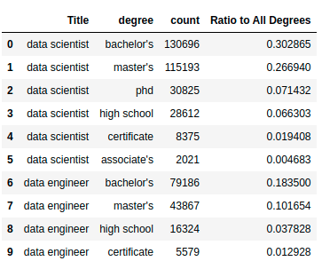
We can see that the degrees include:
- High school
- Associate’s
- Bachelor’s
- Master’s
- Ph.D.
- Certificate
Let’s visualize the data using the bubble matrix.
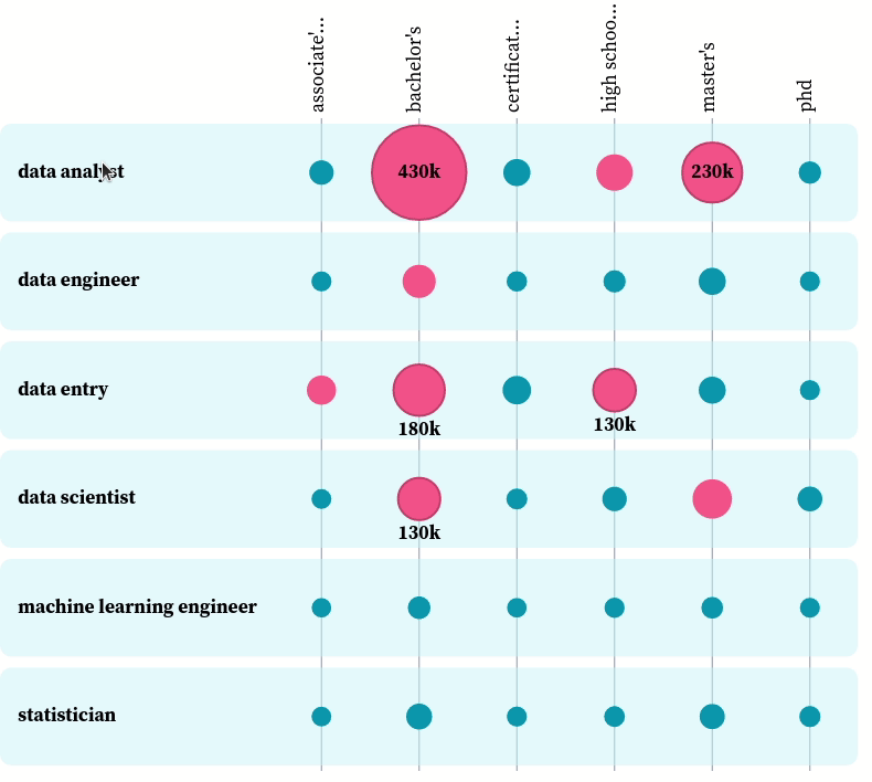
You can play with the plot here. From the plot, we can see the most popular degree among all data-related positions is a bachelor’s degree. That makes sense, since most data-related jobs require at least a bachelor’s degree, and those who have a master’s degree or a Ph.D. also have a bachelor’s degree.
Here is how the data looks when using a grouped bar chart.
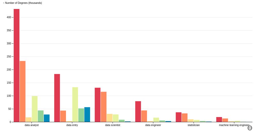
It is worth noting that the number of data analysts who have a bachelor’s degree is almost double the number of data analysts who have a master’s degree. However, the number of data scientists who have a bachelor’s degree is about the same as the number of data scientists who have a master’s degree.
This means that there is a higher percentage of data scientists who pursued a higher degree than the percentage of data analysts who pursued a higher degree after obtaining a bachelor’s degree.
Analyze gender
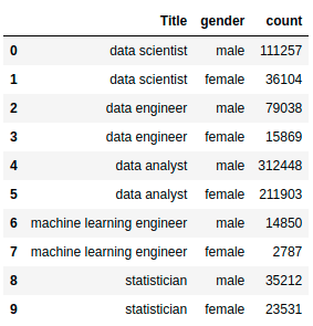
What is the ratio between men and women in data-related roles? Let’s answer that question using the data showing the count of men and women per position.
gender_df = pd.read_csv(
    "https://media.githubusercontent.com/media/khuyentran1401/dataset/master/data_science_market/genders.csv"
)
gender_df.head(10)
Next, we visualize the data using a grouped bar chart.
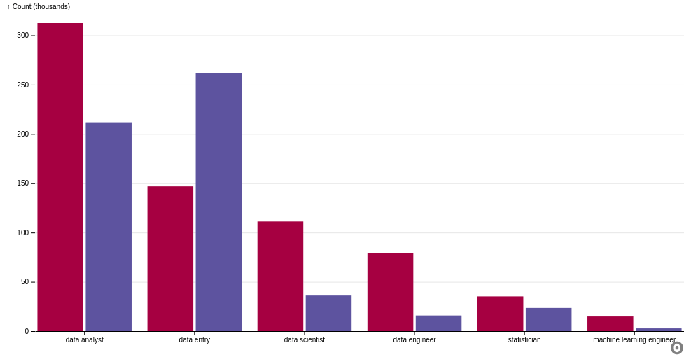
From the plot, we can see that:
- In all data-related jobs except data entry, there are more men than women.
- The number of men is nearly double the number of women in roles such as data analyst and statistician.
- The number of men is more than double the number of women in roles such as data scientist, data engineer, and machine learning engineer.
Analyze locations
The most popular states for data scientists in the U.S.
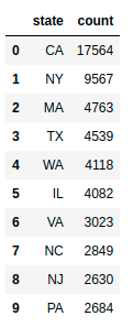
What are the most popular states for data scientists? Let’s start with getting the data showing the number of data scientists per state.
state_jobs = pd.read_csv(
    "https://media.githubusercontent.com/media/khuyentran1401/dataset/master/data_science_market/state_jobs.csv"
)
state_jobs.head(10)
Next, we will plot the data using folium, a Python library to create maps.
state_geo = "https://raw.githubusercontent.com/python-visualization/folium/master/examples/data/us-states.json"

m = folium.Map(location=[48, -102], zoom_start=3)

folium.Choropleth(
    geo_data=state_geo,
    name="choropleth",
    data=state_jobs,
    columns=["state", "count"],
    key_on="feature.id",
    fill_color="YlGn",
    fill_opacity=0.7,
    line_opacity=0.2,
    legend_name="Number of Data Science Jobs",
).add_to(m)

folium.LayerControl().add_to(m)

m
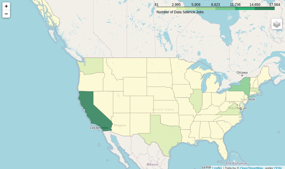
You can interact with the map here. From the map, we can see that the state with the highest number of data scientists is California. The second, third, and fourth highest states are New York, Massachusetts, and Texas, respectively.
The 25 most popular countries in the world for data scientists
What are the top 25 most popular countries for data scientists? Start with downloading and loading the data showing the number of data scientists per country:
!wget 'countries.pkl' 'https://github.com/khuyentran1401/dataset/raw/master/data_science_market/countries.pkl'

countries = pickle.load(open("countries.pkl", "rb"))
Next, we plot the top 25 countries for data scientists:
def plot_top_25_locations(title: str, locations: dict):
    data = locations[title]
    return px.bar(data_frame=data, x="location", y="count")

plot_top_25_locations("data scientist", countries)
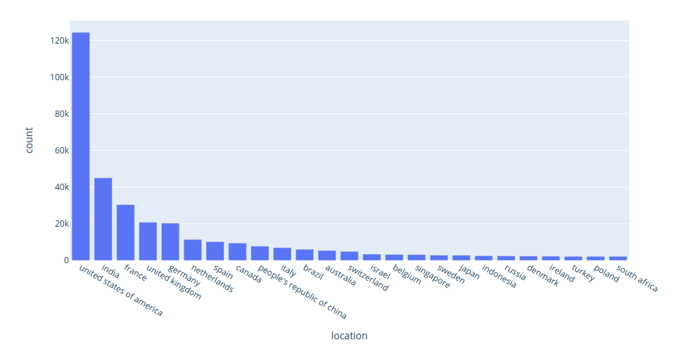
Interact with the plot above here. The five most popular countries for data scientists are:
- United States
- India
- France
- United Kingdom
- Germany
The 25 most popular cities in the world for data scientists
What are the 25 most popular cities for data scientists? We will download the data showing the number of data scientists per city:
!wget 'cities.pkl' 'https://github.com/khuyentran1401/dataset/raw/master/data_science_market/cities.pkl'

cities = pickle.load(open("cities.pkl", "rb"))
The plot of top 25 cities for data scientists:
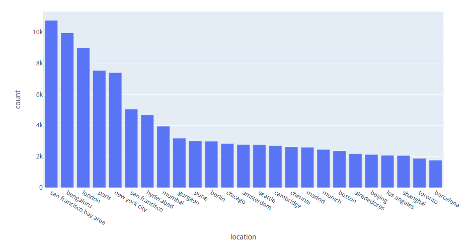
Interact with the plot above here. From the plot above, we can see that the five most popular cities for data scientists are:
- San Francisco
- Bengaluru
- London
- Paris
- New York City
The most popular titles for data scientists
There are a variety of titles related to the role data scientist, such as senior data scientists, junior data scientists, data scientist interns, and others. Wouldn’t it be nice if we could see how popular each of these titles are?
We will start with getting the data consisting of the count of all titles related to data scientist:
!wget "top_titles.pkl" "https://github.com/khuyentran1401/dataset/raw/master/data_science_market/top_titles.pkl"

top_titles = pickle.load(open("top_titles.pkl", "rb"))
top_titles["data scientist"]

The bar graph of the top titles related to data scientist:
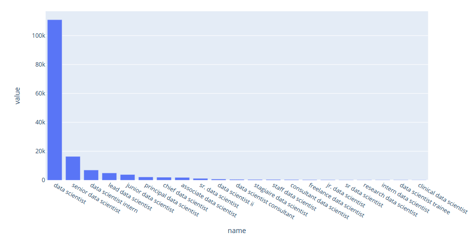
Interact with the plot above here. We can also use the circle packing plot to visualize the varieties in titles of some data-related positions.
You can interact with the plot yourself here.
Analyze industry trends
Keywords
How has the interest in the keyword data scientist on Google Search changed over time? We can get that data using pytrends, then plot the data using Plotly Express:
from pytrends.request import TrendReq


def plot_keyword_trend(title: str):
    pytrends = TrendReq(hl="en-US", tz=360)
    pytrends.build_payload(kw_list=[title])

    df = pytrends.interest_over_time()
    return px.line(data_frame=df, y=title)


plot_keyword_trend("data scientist")
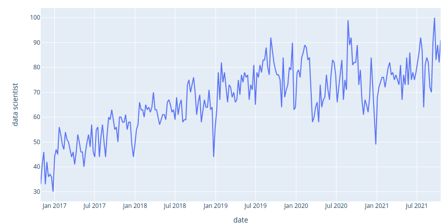
Interact with the plot here. It seems like the interest in the keyword data scientist increases linearly from 2016 to 2021.
The change in numbers of positions over time
How have the numbers of positions changed over time? We can figure that out using the data that shows the change in number of full positions over time.
dates_df = pd.read_csv(
"https://media.githubusercontent.com/media/khuyentran1401/dataset/master/data_science_market/dates.csv",
    index_col=0)
dates_df.head(10)
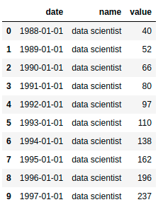
The first row in the data shows that there were 40 data scientists working in 1988. The second row in the data shows that there were 52 data scientists working in 1989.
The line plot of the the data above:
px.line(dates_df, x="date", y="value", color="name")
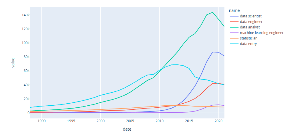
Interact with the plot above here. Some key insights from the plot above:
- The number of statisticians is steady over time.
- Before 2010, data entry is the most popular job among all data-related positions.
- In 2010, data analyst took over data entry.
- In 2013, the roles data scientist, data analyst, and data engineer all overtook statistician, with data scientist growing exponentially while manual data entry became much less important,
- In 2019, the role machine learning engineer finally overtook statistician.
Let’s use the bar chart race to see the change in rankings of different data-related positions:
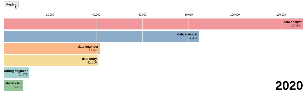
Pretty cool! Through this chart, we can see the exact time when there was a change in ranking. You can visualize the chart yourself here.
The change in number of skills over time
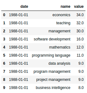
How have the frequencies of the top skills for data scientists changed over time? Let’s observe that using the data showing the number of skills over time.
skills_df = pd.read_csv(
    "https://media.githubusercontent.com/media/khuyentran1401/dataset/master/data_science_market/skills_over_time.csv",
    index_col=0,
)
skills_df.head(10)
Next, we will create a bar chart race using the data above:
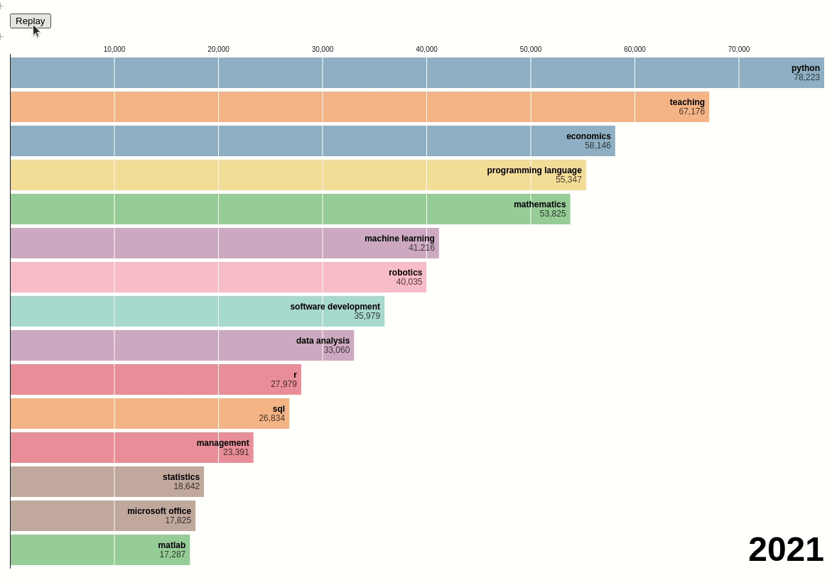
We can see that before 2014, teaching and economics were the two most popular skills among data scientists. However, after 2014, Python surpassed those two skills and became the most popular skill.
Conclusion
Are you ready to demonstrate your professional data science skills? Check out DataCamp’s certification program and career services to land your dream job in data science.