Course
Introduction to R
4 hr
3M
As a data scientist, you will have to analyze the distribution of the features in your dataset. Usually, this is done by using histograms, this is really useful to show the variable range of values, their deviation and where values are concentrated.
This tutorial uses R. If you're not yet familiar with R, I suggest you take our free Introduction to R course on DataCamp.
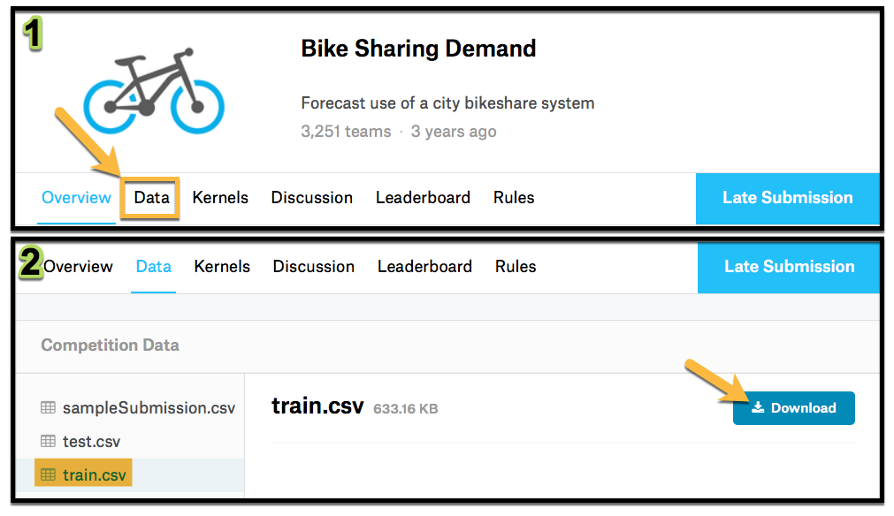
For this tutorial, you are going to use the Bike Sharing Demand Dataset from a kaggle competition.
Follow the link and go to the data tab, then download the train.csv file.
Load the dataset into R.
library(dplyr)
bike<- read.csv("train.csv",
                na.strings = FALSE,
                strip.white = TRUE)
glimpse(bike)| Feature | Description |
|---|---|
| datetime | hourly date + timestamp |
| season | 1 = spring 2 = summer 3 = fall 4 = winter |
| holiday | whether the day is considered a holiday |
| workingday | whether the day is neither a weekend nor holiday |
| weather | 1: Clear, Few clouds, Partly cloudy, Partly cloudy 2: Mist + Cloudy, Mist + Broken clouds, Mist + Few clouds, Mist 3: Light Snow, Light Rain + Thunderstorm + Scattered clouds, Light Rain + Scattered clouds 4: Heavy Rain + Ice Pallets + Thunderstorm + Mist, Snow + Fog |
| temp | temperature in Celsius |
| atemp | "feels like" temperature in Celsius |
| humidity | relative humidity |
| windspeed | wind speed |
| casual | number of non-registered user rentals initiated |
| registered | number of registered user rentals initiated |
| count | number of total rentals |
You are going to analyze the relationship between atemp and humidity by season, so select them from the dataset. Remember to load dplyr package.
bike_data<-
  bike %>%
  dplyr::select(season, atemp, humidity)
head(bike_data)Ok now you are ready to start analyzing the data, start by creating a histogram for each of the features by season. You are going to do this using ggplot2 library so don´t forget to load it.
library(ggplot2)
bike_data %>%
  ggplot( aes(x=humidity) ) +
  geom_histogram(bins=30) +
  facet_wrap(~season,ncol = 2)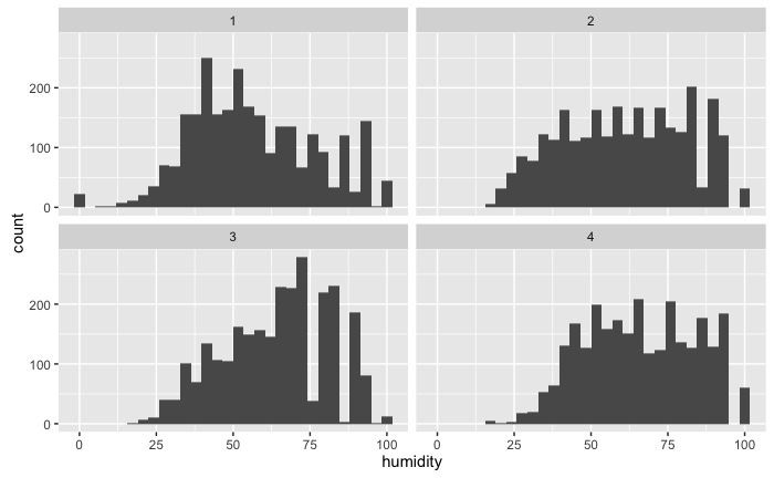
With the histogram, you can see that there is a higher humidity during winter (which is obvious) but you can have a sense of how it is distributed during each season.
Now add the density, a density rug and change the names of the facets, just to have a better-looking visualization.
bike_data %>%
  mutate(season_label = case_when(
    season == 1 ~ "Spring",
    season == 2 ~ "Summer",
    season == 3 ~ "fall",
    season == 4 ~ "winter")) %>%
  ggplot( aes(x=humidity) ) +
  geom_histogram(bins=30,aes(y = ..density..)) +
  geom_rug()+
  geom_density()+
  facet_wrap(~season_label,ncol = 2)+
  ggtitle("Histogram of humidity by season")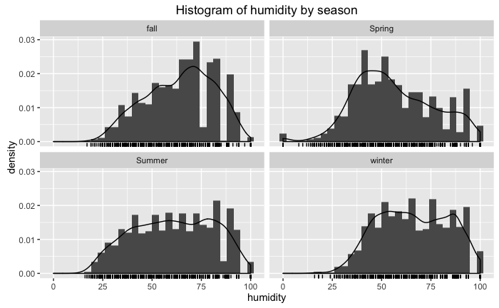
Now, this gives you a better feel of how humidity behaves, do the same with atemp.
Reuse the above code and change the variable to atemp,
bike_data %>%
  mutate(season_label = case_when(
    season == 1 ~ "Spring",
    season == 2 ~ "Summer",
    season == 3 ~ "fall",
    season == 4 ~ "winter")) %>%
  ggplot( aes(x=atemp) ) +
  geom_histogram(bins=30,aes(y = ..density..)) +
  geom_rug()+
  geom_density()+
  facet_wrap(~season_label,ncol = 2)+
  ggtitle("Histogram of atemp by season")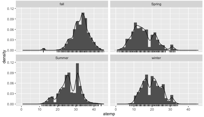
Ok, so far so good, everything is going according to what you would expect for each season. In each graph, you have an approximation of the probability distribution function.
But it is difficult based on this graphs to visualize how the features interact with each other. The first difficulty you encounter is that your histogram needs to be in 3D because you're trying to find the distribution function for the two features.
The goal is to visualize the bivariate distribution, to be able to do this you first need to fit a bivariate distribution to the data. This will be done using the MASS library and the kde2d function. The kde2d function will estimate the bivariate distribution, assuming normality for the random variables. The inputs to this function are as follows,
| input | description |
|---|---|
| x | x coordinate data |
| y | y coordinate data |
| n | number of grid point for each axis |
| lims | limits for x and y |
Now apply it to the dataset filtering for summer,
library(MASS)
bike_data_summer <- bike_data %>% filter(season==1)
bike_density <- kde2d(bike_data_summer$atemp,bike_data_summer$humidity, n=1000)
Note: When loading the MASS library it comes with a
selectfunction, this will have an issue with dplyrselectfunction so to fix this when using the dplyrselectyou need to adddplyr::to it like thisdplyr::select()for it to work correctly.
Now look at the class and the structure of bike_density
class(bike_density)
str(bike_density)
It is a list that has 3 values x, y, and z. The first two have the features values and the third one is a matrix with the value of the pdf. Take a look at the density using the contour function,
contour(bike_density)
text(12.2,92,"1",cex=1.5)
points(12.2,89,col="red",pch=18)
text(10.4,47,"2",cex=1.5)
points(10.4,43,col="red",pch=18)
text(21,45,"3",cex=1.5)
points(21,40,col="red",pch=18)
text(21.6,82,"4",cex=1.5)
points(21.6,78,col="red",pch=18)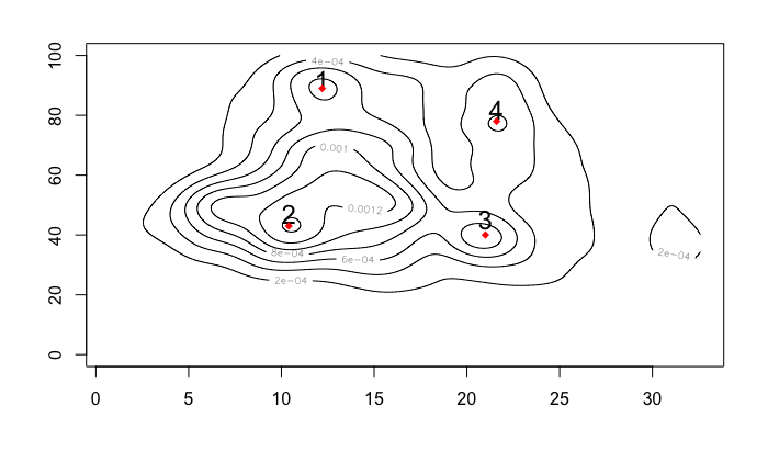
Looking at this you can identify some accumulation points, that could be understood as the most frequent values for the combination of the two features. The values for each point are resumed on the following table,
| point | atemp (°C) | hummidity (%) |
|---|---|---|
| 1 | 12.2 | 89 |
| 2 | 10.4 | 43 |
| 3 | 21 | 43 |
| 4 | 21.6 | 78 |
To create your heatmap you first need to define the color scale you want to use, you can do this using the function colorRampPalette
hm_col_scale<-colorRampPalette(c("black","blue","green","orange","red"))(1000)
hm_col_scale is a vector going from black to red using RGB code in 1000 steps.
Now plot your heat map using the image function, this function is used to plot matrixes.
image(bike_density$z,
      col = hm_col_scale,
      zlim=c(min(bike_density$z), max(bike_density$z)))
text(0.31,0.46,"Most Frequent",col="blue",cex=0.8)
points(0.31,0.45,col="blue",pch=18)
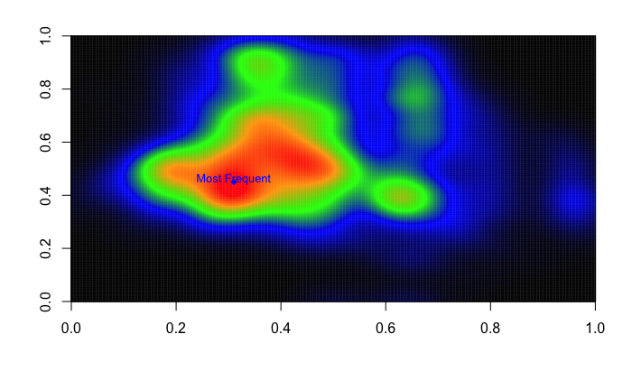
Now, as you can see this has more information than the contour plot because now the colors tell us how high the accumulation point goes. You can see that the most frequent values for humidity and atemp during spring is around the point $(10.4,43)$
Now you know how to create a heat map, it's your turn to create your own. Start by looking at the other season and the relation with the other variables.
Think about how could you use this to gain insight on how many bikes you have to supply for the different values of the variables based on the fact that most frequent points have a higher probability.
If you would like to learn more about generating data visualizations with ggplot, be sure to take a look at our Data Visualization with ggplot2 course.
Learn more about R
Course
Course
Course
blog
David Woods
13 min
Tutorial
Kevin Babitz
Tutorial
DataCamp Team
Tutorial
DataCamp Team
Tutorial
DataCamp Team
code-along
Richie Cotton
