Course
Introduction to Python
4 hr
6.9M
In this tutorial, you will get to know the two packages that are popular to work with geospatial data: geopandas and Shapely. Then you will apply these two packages to read in the geospatial data using Python and plotting the trace of Hurricane Florence from August 30th to September 18th.
Spatial data, Geospatial data, GIS data or geodata, are names for numeric data that identifies the geographical location of a physical object such as a building, a street, a town, a city, a country, etc. according to a geographic coordinate system. From the spatial data, you can find out not only the location but also the length, size, area or shape of any object. An example of a kind of spatial data that you can get are: coordinates of an object such as latitude, longitude, and elevation. Geographic Information Systems (GIS) or other specialized software applications can be used to access, visualize, manipulate and analyze geospatial data.
Geospatial data has a vast number of applications in our daily life. One example is the Maps application that you use to navigate from one location to the others. Another one that you may see every day is on the weather channel.
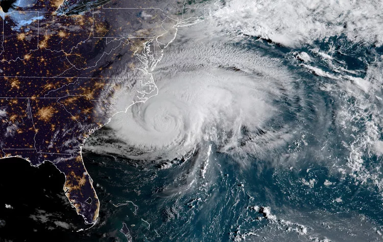
Yes, geospatial data is used to represent position information of something with respect to other things around it: your house on the city map, the hurricane on the world map and so on. So in this tutorial, you will take a look at the destructive hurricane Florence and track its location.
Don't skip ahead. This is an important part. If you are not sure you've satisfied the requirements, just check again. First and foremost, you will need to have all the packages below installed.
Install all the packages following the order above to ensure everything worked. Some packages are pre-requisites for the others, for example: to install GeoPandas, it requires Shapely, and to install Shapely; RTree, GDAL, and Fiona should be installed. The easiest way to install a package is: pip install PACKAGE_NAME
If you are using Windows and can't install the package that way, check this website to download the related packages and do pip install PATH_TO_PACKAGE.
As you may know, the terrifying hurricane Florence just passed through part of the East Coast of the United States, leaving an estimated damage of 17 billion USD. This tutorial will help you to find out where it came from, when and where it got stronger and understand more about this natural disaster and analyze it in Python. There are many websites providing information about this hurricane. For example, this website provided data for several storms and hurricanes in the States from 1902 to 2018, so there is a ton of available data for you to work later on. For this tutorial, you will only use the Hurricane Florence data
You will also use the US map geospatial data from the internet. The blog post by Eric Celeste has all kinds of boundary data files for US counties and states. The data used in this tutorial is the US States, 5m, GeoJSON file.
# Load all importance packages
import geopandas
import numpy as np
import pandas as pd
from shapely.geometry import Point
import missingno as msn
import seaborn as sns
import matplotlib.pyplot as plt
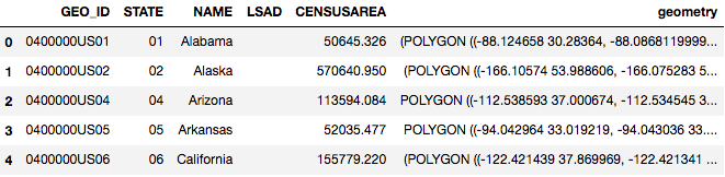
% matplotlib inlineFirst, let's look at the first geospatial dataframe: US States Geodata
# Getting to know GEOJSON file:
country = geopandas.read_file("data/gz_2010_us_040_00_5m.json")
country.head()
Checking the type of the dataframe that you just load in, you can see that it's Geo Data Frame, which has all the regular characteristics of a Pandas DataFrame.
type(country)
geopandas.geodataframe.GeoDataFrame
Checking the data type of the column containing coordinates: it's GeoSeries.
type(country.geometry)
geopandas.geoseries.GeoSeries
Each value in the GeoSeries is a Shapely Object. It can be:
Each object can be used for a different type of physical object such as: Point for building, Line for Street, Polygon for city, and MultiPolygon for country with multiple cities inside. For more information about each Geometric object, read this article: https://shapely.readthedocs.io/en/stable/manual.html#geometric-objects
type(country.geometry[0])
shapely.geometry.multipolygon.MultiPolygon
Similar to a Pandas DataFrame, a GeoDataFrame also has attribute plot, which makes use of the geometry character within the dataframe to plot a map:
country.plot()
<matplotlib.axes._subplots.AxesSubplot at 0x1cfe68c1358>
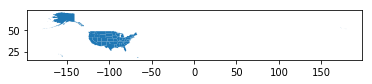
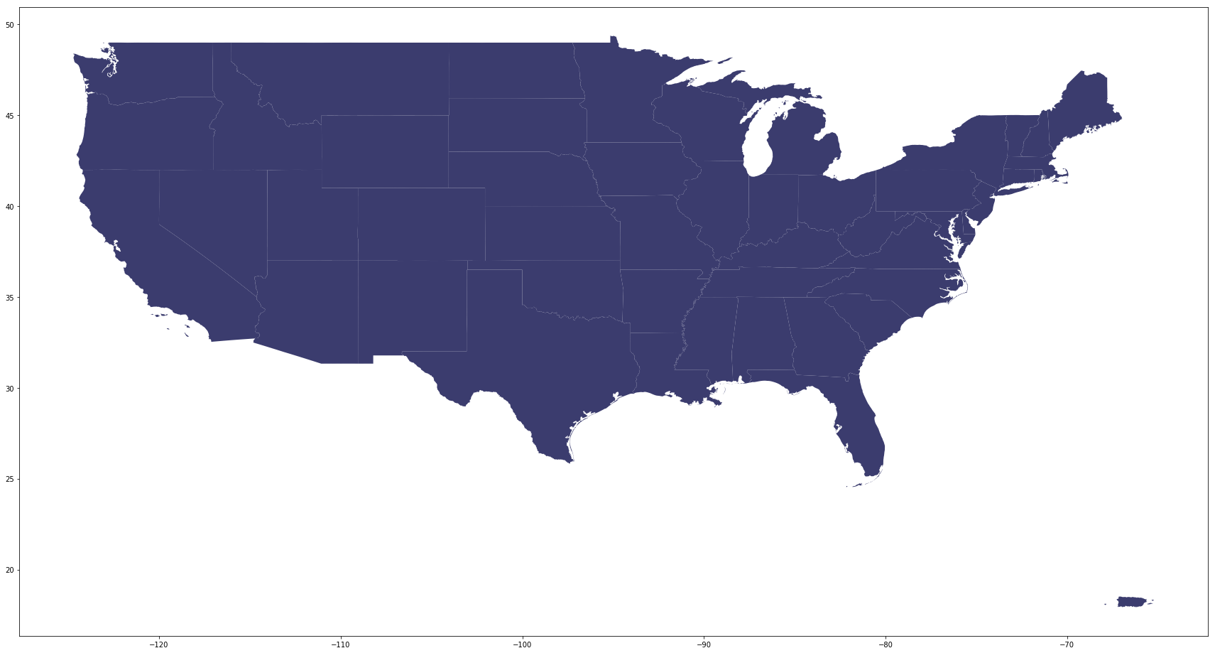
As you may see, the US map is relatively small compared to the frame. It's because the information includes Alaska, Hawaii and Puerto Rico, which spread out around. For this tutorial purpose, you can exclude Alaska and Hawaii as the hurricane did not go anywhere near those two states. You can also add the figure size and color to customize your own plot:
# Exclude Alaska and Hawaii for now
country[country['NAME'].isin(['Alaska','Hawaii']) == False].plot(figsize=(30,20), color='#3B3C6E');
Not so hard, right! Now you have the US map, let's load in hurricane data:
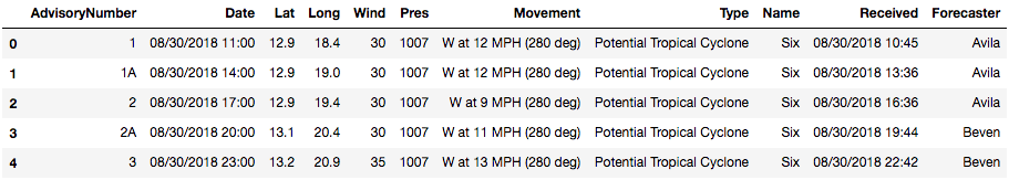
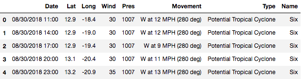
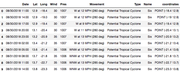
florence = pd.read_csv('data/florence.csv')
florence.head()
This is always the first thing you do when loading any dataset:
florence.info()
<class 'pandas.core.frame.DataFrame'>
RangeIndex: 105 entries, 0 to 104
Data columns (total 11 columns):
AdvisoryNumber    105 non-null object
Date              105 non-null object
Lat               105 non-null float64
Long              105 non-null float64
Wind              105 non-null int64
Pres              105 non-null int64
Movement          105 non-null object
Type              105 non-null object
Name              105 non-null object
Received          105 non-null object
Forecaster        104 non-null object
dtypes: float64(2), int64(2), object(7)
memory usage: 9.1+ KB
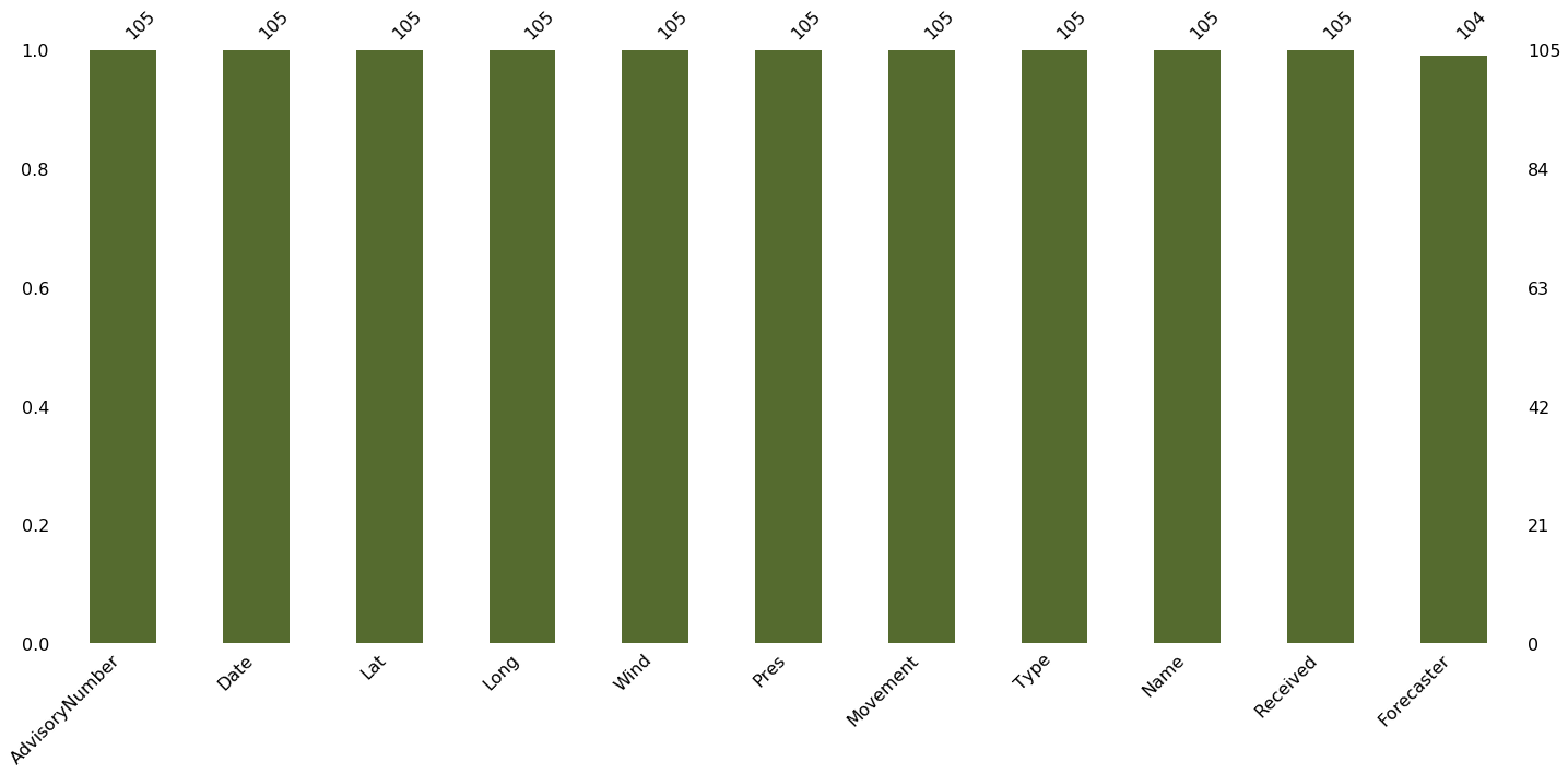
Checking missing values using the missingno package. This is a useful package using visualization to show missing data. As you can see below, there's only one missing value in the column "Forecaster" which you don't need for this tutorial. So you can ignore it for now.
# Notice you can always adjust the color of the visualization
msn.bar(florence, color='darkolivegreen');
Take a look at some statistical information, some could be very useful such as mean wind speed, maximum and minimum wind speed of this hurricane, etc.
# Statistical information
florence.describe()
| Lat | Long | Wind | Pres | |
|---|---|---|---|---|
| count | 105.000000 | 105.000000 | 105.000000 | 105.000000 |
| mean | 25.931429 | 56.938095 | 74.428571 | 981.571429 |
| std | 7.975917 | 20.878865 | 36.560765 | 22.780667 |
| min | 12.900000 | 18.400000 | 25.000000 | 939.000000 |
| 25% | 18.900000 | 41.000000 | 40.000000 | 956.000000 |
| 50% | 25.100000 | 60.000000 | 70.000000 | 989.000000 |
| 75% | 33.600000 | 76.400000 | 105.000000 | 1002.000000 |
| max | 42.600000 | 82.900000 | 140.000000 | 1008.000000 |
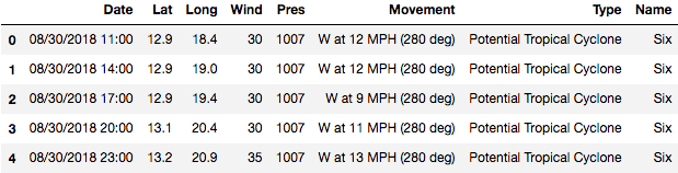
For most data, you will need to clean up and take only what you need to work on. Here, you only need the time, the coordinates: latitude and longitude, Wind speed, Pressure, and Name. Movement and Type are optional, but the rest could be dropped.
# dropping all unused features:
florence = florence.drop(['AdvisoryNumber', 'Forecaster', 'Received'], axis=1)
florence.head()
Normally, if you plot the data by itself, there is no need to take extra care for the coordinate. However, if you want it to look similar to how you look on the map, it's important to check on the longitude and latitude. Here the longitude is west, you will need to add "-" in front of the number to correctly plot the data:
# Add "-" in front of the number to correctly plot the data:
florence['Long'] = 0 - florence['Long']
florence.head()
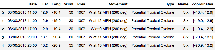
Then you can combine Lattitude and Longitude to create hurricane coordinates, which will subsequently be turned into GeoPoint for visualization purpose.
# Combining Lattitude and Longitude to create hurricane coordinates:
florence['coordinates'] = florence[['Long', 'Lat']].values.tolist()
florence.head()
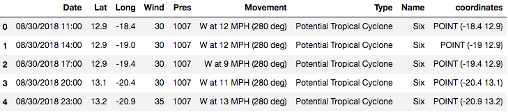
# Change the coordinates to a geoPoint
florence['coordinates'] = florence['coordinates'].apply(Point)
florence.head()
Checking the type of the florence dataframe and column coordinates of florence data. It's pandas DataFrame and pandas Series.
type(florence)
pandas.core.frame.DataFrame
type(florence['coordinates'])
pandas.core.series.Series
After converting the data into geospatial data, we will check the type of florence dataframe and column coordinates of Florence data again. Now it's Geo DataFrame and GeoSeries.
# Convert the count df to geodf
florence = geopandas.GeoDataFrame(florence, geometry='coordinates')
florence.head()
type(florence)
geopandas.geodataframe.GeoDataFrame
type(florence['coordinates'])
geopandas.geoseries.GeoSeries
Notice that even though it's now a Geo DataFrame and Geo Series, it still behaves like a normal DataFrame and a Series. This means you can still perform filtering, groupby for the dataframe or extract the min, max, or mean values of the column.
# Filtering from before the hurricane was named.
florence[florence['Name']=='Six']
# Groupping by name to see how many names it has in the data set:
florence.groupby('Name').Type.count()
Name
FLORENCE     6
Florence    85
SIX          4
Six         10
Name: Type, dtype: int64
Finding the mean wind speed of hurrican Florence:
print("Mean wind speed of Hurricane Florence is {} mph and it can go up to {} mph maximum".format(round(florence.Wind.mean(),4),
                                                                                         florence.Wind.max()))
Mean wind speed of Hurricane Florence is 74.4286 mph and it can go up to 140 mph maximum
So the average wind speed of hurricane Florence is 74.43 miles per hour (119.78 km per hour) and the maximum is 140 miles per hour (225.308 km per hour). To imagine how scary this wind speed is, the website Beaufort Wind Scale, developed by U.K Royal Navy, shows the appearance of wind effects on the water and on land. With the speed of 48 to 55 miles per hours, it can already break and uproot trees, and cause "considerable structural damage".

You don't want to be there at this moment.
Similar to pandas Dataframe, a GeoDataFrame also has .plot attribute. However, this attribute makes use of the coordinate within the GeoDataFrame to map it out. Let's take a look:
florence.plot(figsize=(20,10));
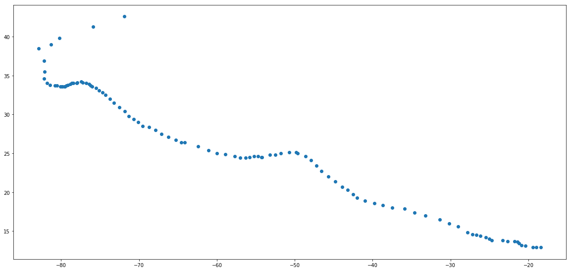
What happened? All you can see is a bunch of points with no navigation. Is there anything wrong?
No, it's all fine. Because this dataframe only have coordinates information (location) of hurricane Florence at each time point, we can only plot the position on a blank map.
So, the next step is plotting the hurricane position on the US map to see where it hit and how strong it was at that time. To do so, you will use the US map coordinates (data we loaded in the beginning) as the base and plotting hurricane Florence position on top of it.
 # Plotting to see the hurricane overlay the US map:
fig, ax = plt.subplots(1, figsize=(30,20))
base = country[country['NAME'].isin(['Alaska','Hawaii']) == False].plot(ax=ax, color='#3B3C6E')

# plotting the hurricane position on top with red color to stand out:
florence.plot(ax=base, color='darkred', marker="*", markersize=10);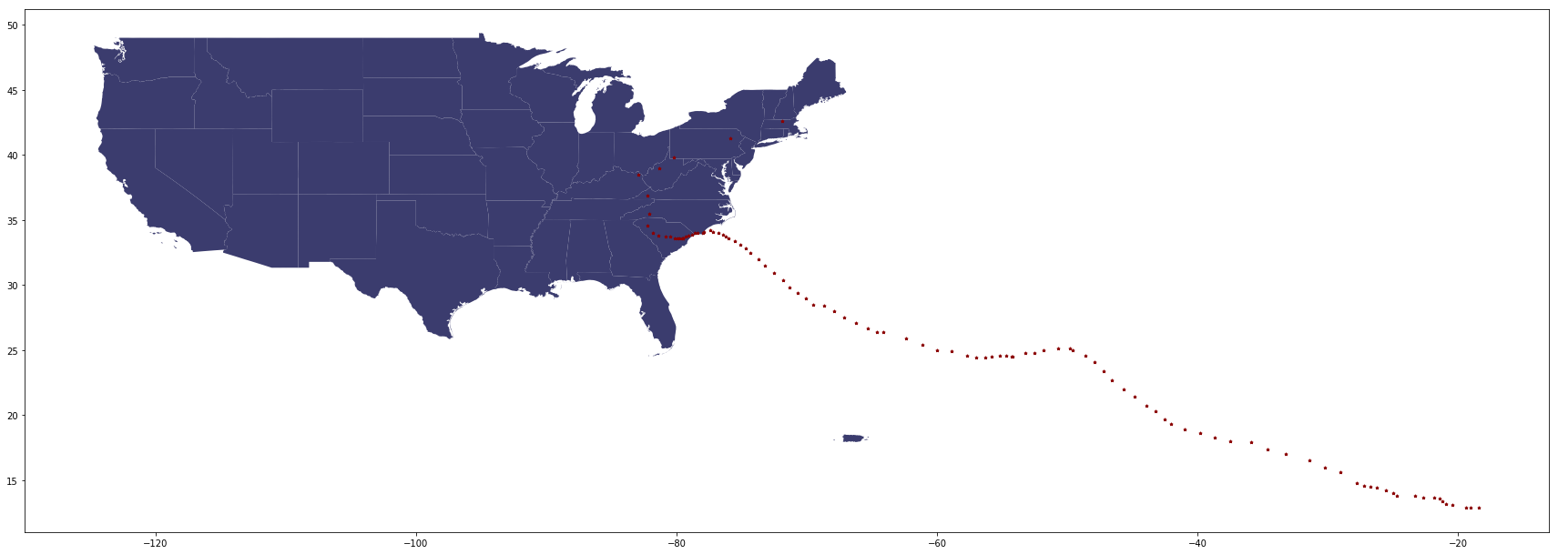
Looks great! Now, we will finish it with more details such as:
 fig, ax = plt.subplots(1, figsize=(20,20))
base = country[country['NAME'].isin(['Alaska','Hawaii']) == False].plot(ax=ax, color='#3B3C6E')
florence.plot(ax=base, column='Wind', marker="<", markersize=10, cmap='cool', label="Wind speed(mph)")
_ = ax.axis('off')
plt.legend()
ax.set_title("Hurricane Florence in US Map", fontsize=25)
plt.savefig('Hurricane_footage.png',bbox_inches='tight');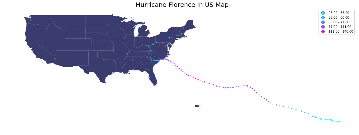
So the hurricane was strongest when it's offshore near the east coast. As it approached the land, the hurricane started losing its strength, but at the wind speed in range 60 to 77 miles per hour, it can still make horrible damages.
Great work! You have learned some necessary steps to work with geospatial data in Python. You also learn how to plot the geospatial data and customize the shape, color, and overlay of plots to show a story. If you want to practice your skills, there is a ton of geospatial data available online for you to try your hand on. One example is the weather website that I provided above.
For sources, please take a look at this book: “Python Geospatial Development Essentials” by Karim Bahgat (2015) for deeper guidance.
If you'd like to get in touch with me, you can drop me an e-mail at dqvu.ubc@gmail.com or connect with me via LinkedIn. Have fun learning and stay safe!
If you would like to learn more about geospatial data in Python, take DataCamp's Visualizing Geospatial Data in Python course.
Below is the data used in this tutorial:
Learn more about Python
Course
Course
Course
blog
Hugo Bowne-Anderson
13 min
Tutorial
Javier Canales Luna
Tutorial
Eugenia Anello
Tutorial
Joleen Bothma
Tutorial
Moez Ali
code-along
Blenda Guedes