Visualizations help us make sense of the world and allow us to convey large amounts of complex information, data and predictions in a concise form. Expert predictions that need to be conveyed to non-expert audiences, whether they be the path of a hurricane or the outcome of an election, always contain a degree of uncertainty. If this uncertainty is not conveyed in the relevant visualizations, the results can be misleading and even dangerous.
Here, we explore the role of data visualization in plotting the predicted paths of hurricanes. We explore different visual methods to convey the uncertainty of expert predictions and the impact on layperson interpretation. Also, we connect this to a broader discussion of best practices with respect to how news media outlets report on both expert models and scientific results on topics important to the population at large.
No Spaghetti Plots?
We have recently seen the damage wreaked by tropical storm systems in the Americas. News outlets such as the New York Times have conveyed a great deal of what has been going on using interactive visualizations for Hurricanes Harvey and Irma, for example. Visualizations include geographical visualisation of percentage of people without electricity, amount of rainfall, amount of damage and number of people in shelters, among many other things.
One particular type of plot has understandably been coming up recently and raising controversy: how to plot the predicted path of a hurricane, say, over the next 72 hours. There are several ways to visualize predicted paths, each way with its own pitfalls and misconceptions. Recently, we even saw an article in Ars Technica called Please, please stop sharing spaghetti plots of hurricane models, directed at Nate Silver and fivethirtyeight.
In what follows, I'll compare three common ways, explore their pros and cons and make suggestions for further types of plots. I'll also delve into why these types are important, which will help us decide which visual methods and techniques are most appropriate.
Disclaimer: I am definitively a non-expert in metereological matters and hurricane forecasting. But I have thought a lot about visual methods to convey data, predictions and models. I welcome and actively encourage the feedback of experts, along with that of others.
Visualizing Predicted Hurricane Paths
There are three common ways of creating visualizations for predicted hurricane paths. Before talking about at them, I want you to look at them and consider what information you can get from each of them. Do your best to interpret what each of them is trying to tell you, in turn, and then we'll delve into what their intentions are, along with their pros and cons:
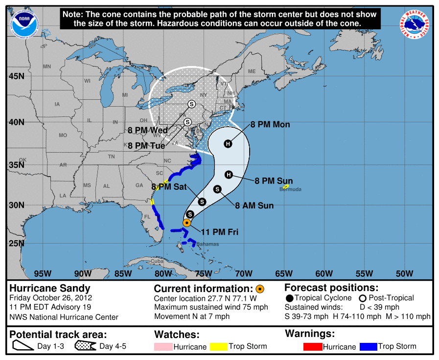
The Cone of Uncertainty
Spaghetti Plots (Type I)
Spaghetti Plots (Type II)
Interpretation and Impact of Visualizations of Hurricanes' Predicted Paths
The Cone of Uncertainty
The cone of uncertainty, a tool used by the National Hurricane Center (NHC) and communicated by many news outlets, shows us the most likely path of the hurricane over the next five days, given by the black dots in the cone. It also shows how certain they are of this path. As time goes on, the prediction is less certain and this is captured by the cone, in that there is an approximately 66.6% chance that the centre of the hurricane will fall in the bounds of the cone.
Was this apparent from the plot itself?
It wasn't to me initially and I gathered this information from the plot itself, the NHC's 'about the cone of uncertainty' page and weather.com's demystification of the cone post. There are three more salient points, all of which we'll return to:
- It is a common initial misconception that the widening of the cone over time suggests that the storm will grow;
- The plot contains no information about the size of the storm, only about the potential path of its centre, and so is of limited use in telling us where to expect, for example, hurricane-force winds;
- There is essential information contained in the text that accompanies the visualization, as well as the visualization itself, such as the note placed prominently at the top, '[t]he cone contains the probable path of the storm center but does not show the size of the storm...'; when judging the efficacy of a data visualization, we'll need to take into consideration all its properties, including text (and whether we can actually expect people to read it!); note that interactivity is a property that these visualizations do not have (but maybe should).
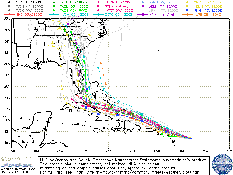
Spaghetti Plots (Type I)
This type of plots shows several predictions in one plot. One any given Type I spaghetti plot, the visualized trajectories are predictions from models from different agencies (NHC, the National Oceanic and Atmospheric Administration and the UK Met Office, for example). They are useful in that, like the cone of uncertainty, they inform us of the general region that may be in the hurricane's path. They are wonderfully unuseful and actually misleading in the fact that they weight each model (or prediction) equally.
In the Type I spaghetti plot above, there are predictions with varying degrees of uncertainty from agencies that have previously made predictions with variable degrees of success. So some paths are more likely than others, given what we currently know. This information is not present. Even more alarmingly, some of the paths are barely even predictions. Take the black dotted line XTRP, which is a straight-line prediction given the storm's current trajectory. This is not even a model. Eric Berger goes into more detail in this Ars Technica article.
Essentially, this type of plots provide an ensemble model (compare with aggregate polling). Yet, a key aspect of ensemble models is that each model is given an appropriate weight and these weights need be communicated in any data visualization. We'll soon see how to do this using a variation on Type I.
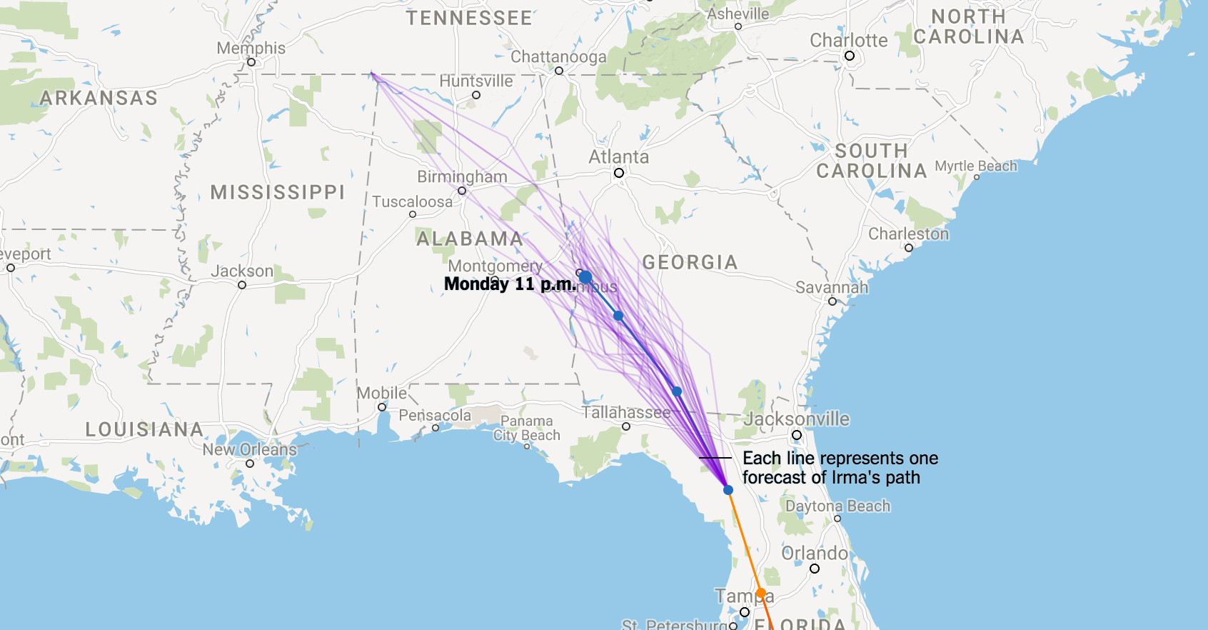
Spaghetti Plots (Type II)
These plots show many, say 50, different realizations of any given model. The point is that if we simulate (run) a model several times, it will given a different trajectory each time. Why? Nate Cohen put it well in The Upshot:
It’s really tough to forecast exactly when a storm will make a turn. Even a 15- or 20-mile difference in when it turns north could change whether Miami is hit by the eye wall, the fierce ring of thunderstorms that include the storm’s strongest winds and surround the calmer eye.
These are perhaps my favourite of the three for several reasons:
- By simulating multiple runs of the model, they provide an indication of the uncertainty underlying each model;
- They give a picture of relative likelihood of the storm centre going through any given location. Put simply, if more of the plotted trajectories go through location A than through location B, then under the current model it is more likely that the centre of the storm will go through location A;
- They are unlikely to be misinterpreted (at least compared to the cone of uncertainty and the Type I plots). All the words required on the visualization are 'Each line represents one forecast of Irma's path'.
One con of Type II is that they are not representative of multiple models but, as we'll see, this can be altered by combining them with Type I plots. Another con is that they, like the others, only communicate the path of the centre of the storm and say nothing about its size. Soon we'll also see how we can remedy this. Note that the distinction between Type I and Type II spaghetti plots is not one that I have found in the literature, but one that I created because these plots have such different interpretations and effects.
For the time being, however, note that we've been discussing the efficacy of certain types of plots without explicitly discussing their purpose, that is, why we need them at all. Before going any further, let's step back a bit and try to answer the question 'What is the purpose of visualizing the predicted path of a hurricane?' Performing such ostensibly naive tasks is often illuminating.
Why Plot Predicted Paths of Hurricanes?
Why are we trying to convey the predicted path of a tropical storm? I'll provide several answers to this in a minute.
But first, let me say what these visualizations are not intended for. We are not using these visualizations to help people decide whether or not to evacuate their homes or towns. Ordering or advising evacuation is something that is done by local authorities, after repeated consultation with experts, scientists, modelers and other key stakeholders.
The major point of this type of visualization is to allow the general populace to be as well-informed as possible about the possible paths of the hurricane and allow them to prepare for the worst if there's a chance that where they are or will be is in the path of destruction. It is not to unduly scare people. As weather.com states with respect to the function of the cone of uncertainty, '[e]ach tropical system is given a forecast cone to help the public better understand where it's headed' and '[t]he cone is designed to show increasing forecast uncertainty over time.'
To this end, I think that an important property would be for a reader to be able to look at it and say 'it is very likely/likely/50% possible/not likely/very unlikely' that my house (for example) will be significantly damaged by the hurricane.
Even better, to be able to say "There's a 30-40% chance, given the current state-of-the-art modeling, that my house will be significantly damaged".
Then we have a hierarchy of what we want our visualization to communicate:
- At a bare minimum, we want civilians to be aware of the possible paths of the hurricane.
- Then we would like civilians to be able to say whether it is very likely, likely, unlikely or very unlikely that their house, for example, is in the path.
- Ideally, a civilian would look at the visualization and be able to read off quantitatively what the probability (or range of probabilities) of their house being in the hurricane's path is.
On top of this, we want our visualizations to be neither misleading nor easy to misinterpret.
The Cone of Uncertainty versus Spaghetti Plots
All three methods perform the minimum required function, to alert civilians to the possible paths of the hurricane. The cone of uncertainty does a pretty good job at allowing a civilian to say how likely it is that a hurricane goes through a particular location (within the cone, it's about two-thirds likely). At least qualitatively, Type II spaghetti plots also do a good job here, as described above, 'if more of the trajectories go through location A than through location B, then under the current model it is more likely that the centre of the storm will go through location A'.
If you plot 50 trajectories, you get a sense of where the centre of the storm will likely be, that is, if around half of the trajectories go through a location, then there's an approximately 50% chance (according to our model) that the centre of the storm will hit that location. None of these methods yet perform the 3rd function and we'll see below how combining Type I and Type II spaghetti plots will allow us to do this.
The major problem with the cone of uncertainty and Type I spaghetti models is that the cone of uncertainty is easy to misinterpret (in that many people interpret the cone as a growing storm and do not appreciate the role of uncertainty) and that the Type I spaghetti models are misleading (they make all models look equally believable). These models then don't satisfy the basic requirement that 'we want our visualizations to be neither misleading nor easy to misinterpret.'
Best Practices for Visualizing Hurricane Prediction Paths
Type II spaghetti plots are the most descriptive and the least open to misinterpretation. But they do fail at presenting the results of all models. That is, they don't aggregate over multiple models like we saw in Type I.
So what if we combined Type I and Type II?
To answer this, I did a small experiment using python, folium and numpy. You can find all the code here.
I first took one the NHC's Hurricane Irma's prediction paths from last week, added some random noise and plotted 50 trajectories. Note that, once again, I am a non-expert in all matters meteorological. The noise that I generated and added to the predicted signal/path was not based on any models and, in a real use case, would come from the models themselves (if you're interested, I used Gaussian noise). For the record, I also found it difficult to find data concerning any of the predicted paths reported in the media. The data I finally used I found here.
Here's a simple Type II spaghetti plot with 50 trajectories:
But these are possible trajectories generated by a single model. What if we had multiple models from different agencies? Well, we can plot 50 trajectories from each:
One of the really cool aspects of Type II spaghetti plots is that, if we plot enough of them, each trajectory becomes indistinct and we begin to see a heatmap of where the centre of the hurricane is likely to be. All this means is that the more blue in a given region, the more likely it is for the path to go through there. Zoom in to check it out.
Moreover, if we believe that one model is more likely than another (if, for example, the experts who produced that model have produced far more accurate models previously), we can weight these models accordingly via, for example, transparency of the trajectories, as we do below. Note that weighting these models is a task for an expert and an essential part of this process of aggregate modeling.
What the above does is solve the tasks required by the first two properties that we want our visualizations to have. To achieve the 3rd, a reader being able to read off that it's, say 30-40% likely for the centre of a hurricane to pass through a particular location, there are two solutions:
- to alter the heatmap so that it moves between, say, red and blue and include a key that says, for example, red means a probability of greater than 90%;
- To transform the heatmap into a contour map that shows regions in which the probability takes on certain values.
Also do note that this will tell somebody the probability that a given location will be hit by the hurricane's center. You could combine (well, convolve) this with information about the size of the hurricane to transform the heatmap into one of the probability of a location being hit by hurricane-force winds. If you'd like to do this, go and hack around the code that I wrote to generate the plots above (I plan to write a follow-up post doing this and walking through the code).
Visualizing Uncertainty and Data Journalism
What can we take away from this? We have explored several types of visualization methods for predicted hurricane paths, discussed the pros and cons of each and suggested a way forward for more informative and less misleading plots of such paths, plots that communicate not only the results but also the uncertainty around the models.
This is part of a broader conversation that we need to be having about reporting uncertainty in visualizations and data journalism, in general. We need to actively participate in conversations about how experts report uncertainty to civilians via news media outlets. Here's a great piece from The Upshot demonstrating what the jobs report could look like due to statistical noise, even if jobs were steady. Here's another Upshot piece showing the role of noise and uncertainty in interpreting polls. I'm well aware that we need headlines to sell news and the role of click-bait in the modern news media landscape, but we need to be communicating not merely results, but uncertainty around those results so as not mislead the general public and potentially ourselves. Perhaps more importantly, the education system needs to shift and equip all civilians with levels of data literacy and statistical literacy in order to deal with this movement into the data-driven age. We can all contribute to this.