
Course
Introduction to Python
4 hr
6.9M
In this tutorial, we will get into the workings of t-SNE, a powerful technique for dimensionality reduction and data visualization. We will compare it with another popular technique, PCA, and demonstrate how to perform both t-SNE and PCA using scikit-learn and plotly express on synthetic and real-world datasets.
t-SNE (t-distributed Stochastic Neighbor Embedding) is an unsupervised non-linear dimensionality reduction technique for data exploration and visualizing high-dimensional data. Non-linear dimensionality reduction means that the algorithm allows us to separate data that cannot be separated by a straight line.
t-SNE gives you a feel and intuition on how data is arranged in higher dimensions. It is often used to visualize complex datasets into two and three dimensions, allowing us to understand more about underlying patterns and relationships in the data.
Take our Dimensionality Reduction in Python course to learn about exploring high-dimensional data, feature selection, and feature extraction.
Both t-SNE and PCA are dimensional reduction techniques with different mechanisms that work best with different types of data.
PCA (Principal Component Analysis) is a linear technique that works best with data that has a linear structure. It seeks to identify the underlying principal components in the data by projecting onto lower dimensions, minimizing variance, and preserving large pairwise distances. Read our Principal Component Analysis (PCA) tutorial to understand the inner workings of the algorithms with R examples.
But, t-SNE is a nonlinear technique that focuses on preserving the pairwise similarities between data points in a lower-dimensional space. t-SNE is concerned with preserving small pairwise distances whereas, PCA focuses on maintaining large pairwise distances to maximize variance.
In summary, PCA preserves the variance in the data. In contrast, t-SNE preserves the relationships between data points in a lower-dimensional space, making it quite a good algorithm for visualizing complex high-dimensional data.
The following table can help you compare t-SNE and PCA side by side:
| Characteristic | t-SNE | PCA |
|---|---|---|
| Type | Non-linear dimensionality reduction | Linear dimensionality reduction |
| Goal | Preserve local pairwise similarities | Preserve global variance |
| Best used for | Visualizing complex, high-dimensional data | Data with linear structure |
| Output | Low-dimensional representation | Principal components |
| Use cases | Clustering, anomaly detection, NLP | Noise reduction, feature extraction |
| Computational intensity | High | Low |
| Interpretation | Harder to interpret | Easier to interpret |
The t-SNE algorithm finds the similarity measure between pairs of instances in higher and lower dimensional space. After that, it tries to optimize two similarity measures. It does all of that in three steps.
The optimization process allows the creation of clusters and sub-clusters of similar data points in the lower-dimensional space, which are visualized to understand the structure and relationships in the higher-dimensional data.
In the Python example, we will generate classification data, perform PCA and t-SNE, and visualize the results. We will use scikit-learn to perform dimensionality reduction, and we will use Plotly Express for visualization.
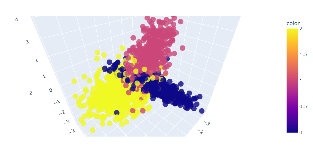
We will use scikit-learn’s make_classification() function to generate synthetic data with 6 features, 1500 samples, and 3 classes.
After that, we will 3D plot the first three features of the data using the Plotly Express scatter_3d() function.
import plotly.express as px
from sklearn.datasets import make_classification

X, y = make_classification(
    n_features=6,
    n_classes=3,
    n_samples=1500,
    n_informative=2,
    random_state=5,
    n_clusters_per_class=1,
)


fig = px.scatter_3d(x=X[:, 0], y=X[:, 1], z=X[:, 2], color=y, opacity=0.8)
fig.show()
We have a 3D plot of the data; you can also visualize the data in a 2D chart by using the Plotly Express scatter() function.
We will now apply the PCA algorithm on the dataset to return two PCA components. The fit_transform() learns and transforms the dataset at the same time.
from sklearn.decomposition import PCA

pca = PCA(n_components=2)
X_pca = pca.fit_transform(X)We can now visualize the results by displaying two PCA components on a scatter plot.
We have also used the update_layout() function to add a title and rename the x-axis and y-axis.
fig = px.scatter(x=X_pca[:, 0], y=X_pca[:, 1], color=y)
fig.update_layout(
    title="PCA visualization of Custom Classification dataset",
    xaxis_title="First Principal Component",
    yaxis_title="Second Principal Component",
)
fig.show()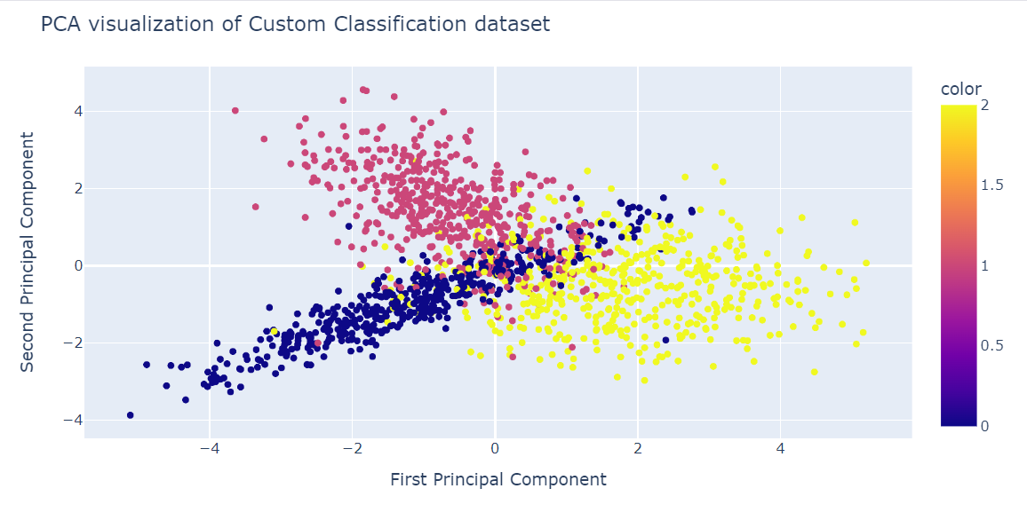
Now, we will apply the t-SNE algorithm to the dataset and compare the results.
After fitting and transforming data, we will display the Kullback-Leibler (KL) divergence between the high and low-dimensional probability distributions. Low KL divergence is normally a sign of better results.
from sklearn.manifold import TSNE

tsne = TSNE(n_components=2, random_state=42)
X_tsne = tsne.fit_transform(X)
tsne.kl_divergence_1.1169137954711914Similar to PCA, we will visualize two t-SNE components on a scatter plot.
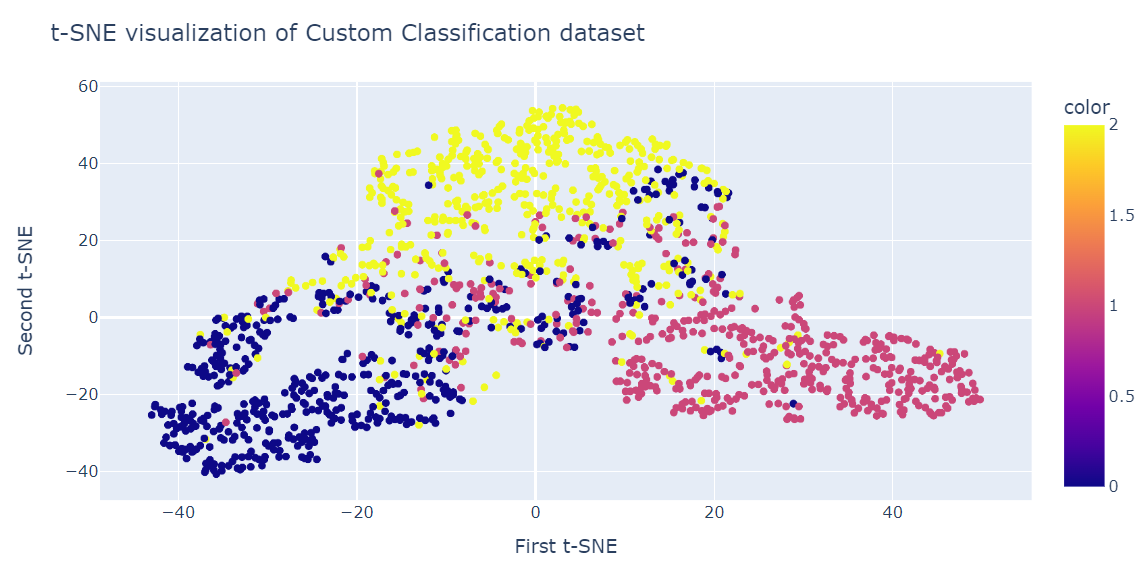
fig = px.scatter(x=X_tsne[:, 0], y=X_tsne[:, 1], color=y)
fig.update_layout(
    title="t-SNE visualization of Custom Classification dataset",
    xaxis_title="First t-SNE",
    yaxis_title="Second t-SNE",
)
fig.show()
The result is quite better than PCA. We can clearly see three big clusters.
In this section, we will use an Iranian telecom company's customer churn dataset. The dataset contains information on customers' activity, such as call failures and subscription length, and a churn label.
Churn means the percentage of customers that stop using a particular service during a given time frame.
Note: The code source and dataset from both examples are available in this DataLab workbook; if you want to tweak and run the code, just make a copy, and you're good to go!
We will load the dataset using pandas and display the first three rows.
import pandas as pd

df = pd.read_csv("data/customer_churn.csv")
df.head(3)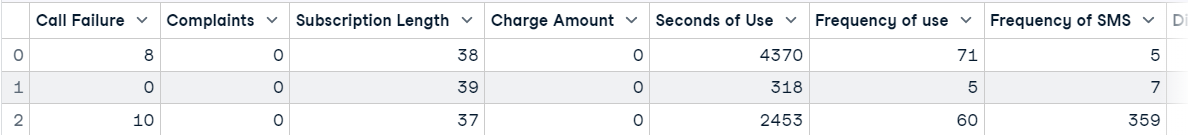
After that, we will:
from sklearn.model_selection import train_test_split
from sklearn.preprocessing import StandardScaler

X = df.drop('Churn', axis=1)
y = df['Churn']

scaler = StandardScaler()
X_norm = scaler.fit_transform(X)

X_train, X_test, y_train, y_test = train_test_split(
    X_norm, y, random_state=13, test_size=0.25, shuffle=True
)

pca = PCA(n_components=2)
X_train_pca = pca.fit_transform(X_train)

pca.score(X_test)-17.04482851288105We will now visualize the PCA result using the Plotly Express scatter plot.
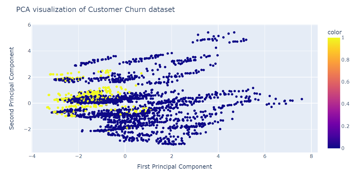
fig = px.scatter(x=X_train_pca[:, 0], y=X_train_pca[:, 1], color=y_train)
fig.update_layout(
    title="PCA visualization of Customer Churn dataset",
    xaxis_title="First Principal Component",
    yaxis_title="Second Principal Component",
)
fig.show()
PCA was not good at creating clusters. The data in the low dimension looks random. It could also mean the features in the dataset are highly skewed, or it does not have a strong correlation structure.
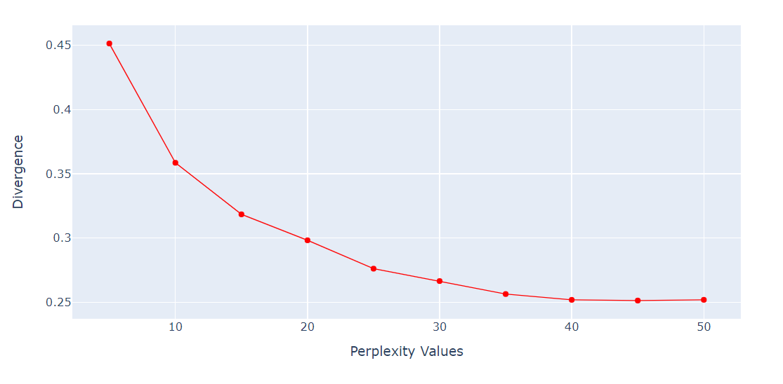
Perplexity is an important hyperparameter for the t-SNE algorithm. It controls the effective number of neighbors that each point considers during the dimensionality reduction process.
We will run a loop to get the KL Divergence metric on various perplexities from 5 to 55 with a 5-point gap. Then, we will display the result using the Plotly Express line plot.
import numpy as np

perplexity = np.arange(5, 55, 5)
divergence = []

for i in perplexity:
    model = TSNE(n_components=2, init="pca", perplexity=i)
    reduced = model.fit_transform(X_train)
    divergence.append(model.kl_divergence_)
fig = px.line(x=perplexity, y=divergence, markers=True)
fig.update_layout(xaxis_title="Perplexity Values", yaxis_title="Divergence")
fig.update_traces(line_color="red", line_width=1)
fig.show()
The KL Divergence has become constant after 40 perplexity. So, we will use 40 perplexity in the t-SNE algorithm.
We will now fit t-SNE and transform the data into lower dimensions using 40 perplexity to get the lowest KL Divergence.
from sklearn.manifold import TSNE

tsne = TSNE(n_components=2,perplexity=40, random_state=42)
X_train_tsne = tsne.fit_transform(X_train)

tsne.kl_divergence_0.258713960647583We will now use the Plotly Scatter plot to display components and target classes.
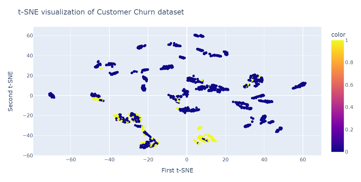
fig = px.scatter(x=X_train_tsne[:, 0], y=X_train_tsne[:, 1], color=y_train)
fig.update_layout(
    title="t-SNE visualization of Customer Churn dataset",
    xaxis_title="First t-SNE",
    yaxis_title="Second t-SNE",
)
fig.show()
As we can see, we have multiple clusters and sub-clusters. We can use this information to understand the pattern and develop a strategy for retaining existing customers.
While t-SNE is a powerful visualization tool for high-dimensional data, it comes with some limitations:
In recent years, UMAP (Uniform Manifold Approximation and Projection) has emerged as a popular alternative to t-SNE. While both are non-linear dimensionality reduction techniques designed for visualization, UMAP addresses some of the limitations of t-SNE:
The following table summarizes the computational complexity of t-SNE compared to UMAP and PCA:
| Technique | Computational complexity | Features | Suitability for large datasets |
|---|---|---|---|
| t-SNE | O(N2) | Preserves local structure, highly customizable | Moderate (slow for large datasets) |
| UMAP | O(N log N) | Balances local and global structure, faster | High (handles large datasets efficiently) |
| PCA | O(Nd2) | Linear reduction, interpretable components | High (very efficient) |
In summary, while t-SNE provides detailed insights into local relationships, UMAP is often a more efficient and scalable choice for modern datasets. PCA remains a fast and interpretable option for linear data. Depending on the dataset and goals, choosing the right technique involves balancing interpretability, computational cost, and the nature of the data.
Apart from visualizing complex multi-dimensional data, t-SNE has other uses:
t-SNE is a powerful visualization tool for revealing hidden patterns and structures in complex datasets. You can use it for images, audio, biologicals, and single data to identify anomalies and patterns.
In this blog post, we have learned about t-SNE, a popular dimensionality reduction technique that can visualize high-dimensional non-linear data in a low-dimensional space. We have explained the main idea behind t-SNE, how it works, and its applications. Moreover, we have shown some examples of applying t-SNE to synthetic and real datasets and how to interpret the results.
t-SNE is a part of Unsupervised Learning, and the next natural step is to understand hierarchical clustering, PCA, Decorrelating, and discovering interpretable features. Learn all of the topics by taking our Unsupervised Learning in Python course.
Learn more about Python
Course
Course
Course
Tutorial
Moez Ali
Tutorial
Abid Ali Awan
Tutorial
Kevin Babitz
Tutorial
Arunn Thevapalan
Tutorial
Elena Kosourova
Tutorial
Sejal Jaiswal