Course

Introduction to Principal Component Analysis (PCA)
As a data scientist in the retail industry, imagine that you are trying to understand what makes a customer happy from a dataset containing these five characteristics: monthly expense, age, gender, purchase frequency, and product rating. To better analyze and draw actionable conclusions, we need to understand the data set or, at the very least, visualize it. Human beings cannot easily visualize more than three dimensions, hence visualizing customer data with five characteristics (dimensions) is not straightforward. This is where principal component analysis (PCA for short) comes in.
“But, what is principal component analysis?”
It is a statistical approach that can be used to analyze high-dimensional data and capture the most important information from it. This is done by transforming the original data into a lower-dimensional space while collating highly correlated variables together. In our scenario, PCA would pick three characteristics such as monthly expense, purchase frequency, and product rating. This could make it easier to visualize and understand the data.
In this tutorial, I'll walk through the key concepts of principal component analysis and how to apply it to real-life scenarios using the corrr package in R.
Watch and learn more about Principal Component Analysis in R in this video from our course.
Learn R for Machine Learning
TL;DR
- PCA reduces high-dimensional data to fewer dimensions while preserving the most variance
- Always normalize your data with
scale()before running PCA to ensure equal variable contribution - Use
princomp()orprcomp()in R with theFactoMineRandfactoextrapackages for analysis and visualization - The first two principal components typically explain 80–90% of variance and are often sufficient for visualization
- Use scree plots to decide how many components to retain, and biplots to interpret variable relationships
Prerequisites
To follow along with this tutorial, you should have:
- Basic R programming knowledge — if you need a refresher, see the Getting Started with the Tidyverse tutorial
- Familiarity with loading and subsetting data frames in R
- R 4.x or later installed
- The following packages:
corrr,ggcorrplot,FactoMineR,factoextra(installation covered in the tutorial)
How Does PCA Work? A 5-Step Guide
Even though our focus is PCA, let’s keep in mind the following five main principal component techniques that aim to summarize and visualize multivariate data. PCA, as opposed to the other techniques, only works with quantitative variables.
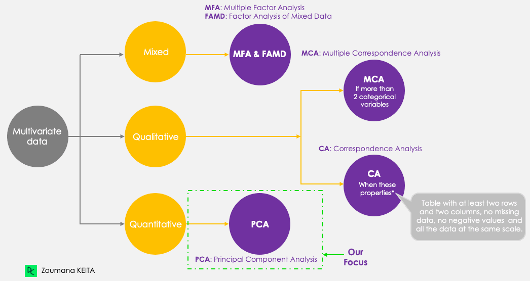
Principal component methods
We won’t go into the explanation of the mathematical concept, which can be somewhat complex. However, understanding the following five steps can give a better idea of how to compute the PCA.
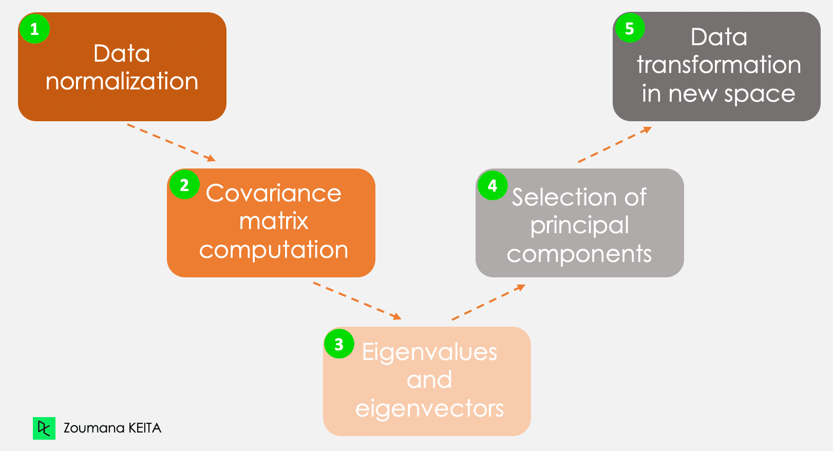
The five main steps for computing principal components
Step 1 - Data normalization
By considering the example in the introduction, let’s consider, for instance, the following information for a given client.
- Monthly expenses: $300
- Age: 27
- Rating: 4.5
This information has different scales and performing PCA using such data will lead to a biased result. This is where data normalization comes in. It ensures that each attribute has the same level of contribution, preventing one variable from dominating others. For each variable, normalization is done by subtracting its mean and dividing by its standard deviation.
Step 2 - Covariance matrix
As the name suggests, this step is about computing the covariance matrix from the normalized data. This is a symmetric matrix, and each element (i, j) corresponds to the covariance between variables i and j.
Step 3 - Eigenvectors and eigenvalues
Geometrically, an eigenvector represents a direction such as “vertical” or “90 degrees”. An eigenvalue, on the other hand, is a number representing the amount of variance present in the data for a given direction. Each eigenvector has its corresponding eigenvalue.
Step 4 - Selection of principal components
There are as many pairs of eigenvectors and eigenvalues as the number of variables in the data. In the data with only monthly expenses, age, and rate, there will be three pairs. Not all the pairs are relevant. So, the eigenvector with the highest eigenvalue corresponds to the first principal component. The second principal component is the eigenvector with the second highest eigenvalue, and so on.
Step 5 - Data transformation in a new dimensional space
This step involves re-orienting the original data onto a new subspace defined by the principal components. This reorientation is done by multiplying the original data by the previously computed eigenvectors.
It is important to remember that this transformation does not modify the original data itself but instead provides a new perspective to better represent the data.
Applications of Principal Component Analysis
Principal component analysis has a variety of applications in our day-to-day life, including (but by no means limited to) finance, image processing, healthcare, and security.
Finance
Forecasting stock prices from past prices is a notion used in research for years. PCA can be used for dimensionality reduction and analyzing the data to help experts find relevant components that account for most of the data’s variability. You can learn more about dimensionality reduction in R in our dedicated course.
Image processing
An image is made of multiple features. PCA is mainly applied in image compression to retain the essential details of a given image while reducing the number of dimensions. In addition, PCA can be used for more complicated tasks such as image recognition.
Healthcare
In the same logic of image compression. PCA is used in magnetic resonance imaging (MRI) scans to reduce the dimensionality of the images for better visualization and medical analysis. It can also be integrated into medical technologies used, for instance, to recognize a given disease from image scans.
Security
Biometric systems used for fingerprint recognition can integrate technologies leveraging principal component analysis to extract the most relevant features, such as the texture of the fingerprint and additional information.
Real-World Example of PCA in R
Now that you understand the underlying theory of PCA, you are finally ready to see it in action.
This section covers all the steps from installing the relevant packages, loading and preparing the data, applying principal component analysis in R, and interpreting the results.
The source code is available from DataLab.
Setting up the environment
To successfully perform this tutorial, you’ll need the following libraries, and each one requires two main steps to be used efficiently:
- Install the library to access all the functions.
- Load to be able to use all the functions.
corrr package in R
This is an R package for correlation analysis. It mainly focuses on creating and handling R data frames. Below are the steps to install and load the library.
install.packages("corrr")
library('corrr')
ggcorrplot package in R
The ggcorrplot package provides multiple functions but is not limited to the ggplot2 function that makes it easy to visualize correlation matrix. Similarly to the above instruction, the installation is straightforward.
install.packages("ggcorrplot")
library(ggcorrplot)
FactoMineR package in R
Mainly used for multivariate exploratory data analysis; the factoMineR package gives access to the PCA module to perform principal component analysis.
install.packages("FactoMineR")
library("FactoMineR")
factoextra package in R
This last package provides all the relevant functions to visualize the outputs of the principal component analysis. These functions include but are not limited to scree plot, biplot, only to mention two of the visualization techniques covered later in the article.
install.packages("factoextra")
library(factoextra)
Exploring the data
Before loading the data and performing any further exploration, it is good to understand and have the basic information related to the data you will be working with.
Protein data
The protein dataset is a real-valued multivariate dataset describing the average protein consumption by citizens of 25 European countries.
For each country, there are ten columns. The first eight correspond to the different types of proteins. The last one corresponds to the total value of the average values of proteins.
Let’s have a quick overview of the data.
First, we load the data using the read.csv() function, then str() which gives the image below.
protein_data <- read.csv("protein.csv")
str(protein_data)
We can see that the dataset has 25 observations and 11 columns. Each variable is numerical except the Country column, which is a character string.
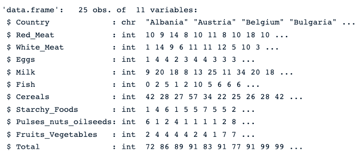
Description of the protein data
Check for null values
The presence of missing values can bias the result of PCA. Therefore, it is highly recommended to perform the appropriate approach to tackle those values. Our Top Techniques to Handle Missing Values Every Data Scientist Should Know tutorial can help you make the right choice.
colSums(is.na(protein_data))The colSums() function combined with the is.na() returns the number of missing values in each column. As we can see below, none of the columns have missing values.

Number of missing values in each column
Normalizing the data
As stated early in the article, PCA only works with numerical values. So, we need to get rid of the Country column. Also, the Total column is not relevant to the analysis since it is the linear combination of the remaining numerical variables.
The code below creates new data with only numeric columns.
numerical_data <- protein_data[,2:10]

head(numerical_data)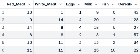
Before the normalization of the data (only the first five columns are shown)
Now, the normalization can be applied using the scale() function.
data_normalized <- scale(numerical_data)
head(data_normalized)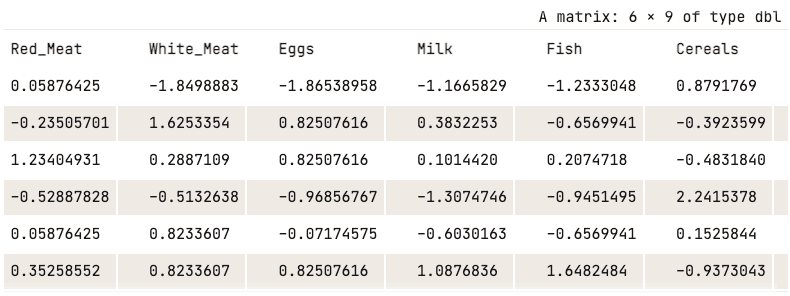
Normalized data (only first five columns shown)
Visualizing the correlation matrix
Before running PCA, visualizing correlations between variables confirms that PCA will be effective. High intercorrelations indicate redundancy that PCA can compress. I'll use the corrr and ggcorrplot packages installed earlier.
corr_matrix <- cor(data_normalized)
ggcorrplot(corr_matrix,
           hc.order = TRUE,
           type = "lower",
           lab = TRUE)
The heatmap reveals strong positive correlations between animal protein sources (red meat, white meat, eggs, and milk), which explains why the first principal component captures nearly 77% of total variance. This correlation structure is exactly what PCA is designed to exploit.
Note on PCA functions in R: This tutorial uses princomp(), which applies spectral decomposition on the covariance matrix. For most practical use cases, prcomp() is the preferred alternative — it uses singular value decomposition (SVD), which is more numerically stable for datasets with many variables. The key output difference: princomp() stores loadings in $loadings, while prcomp() uses $rotation. Both produce equivalent results on well-conditioned data like the protein dataset used here.
Applying PCA
Now, all the resources are available to conduct the PCA analysis. First, the princomp() computes the PCA, and summary() function shows the result.
data.pca <- princomp(data_normalized)
summary(data.pca)
R PCA summary
From the previous screenshot, we notice that nine principal components have been generated (Comp.1 to Comp.9), which also correspond to the number of variables in the data.
Each component explains a percentage of the total variance in the data set. In the Cumulative Proportion section, the first principal component explains almost 77% of the total variance. This implies that almost two-thirds of the data in the set of 9 variables can be represented by just the first principal component. The second one explains 12.08% of the total variance.
The cumulative proportion of Comp.1 and Comp.2 explains nearly 89% of the total variance. This means that the first two principal components can accurately represent the data.
It’s great to have the first two components, but what do they really mean?
This can be answered by exploring how they relate to each column using the loadings of each principal component.
data.pca$loadings[, 1:2]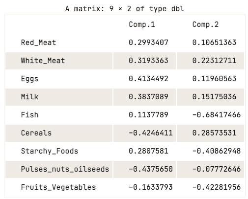
Loading matrix of the first two principal components
The loading matrix shows that the first principal component has high positive values for both red meat, white meat, eggs, and milk. However, the values for cereals, pulses, nuts and oilseeds, and fruits and vegetables are relatively negative. This suggests that countries with a higher intake of animal protein are in excess, while countries with a lower intake are in deficit.
When it comes to the second principal component, it has high negative values for fish, starchy foods, and fruits and vegetables. This implies that the underlying countries’ diets are highly influenced by their location, such as coastal regions for fish, and inland regions for a diet rich in vegetables and potatoes.
Visualization of the principal components
The previous analysis of the loading matrix gave a good understanding of the relationship between each of the first two principal components and the attributes in the data. However, it might not be visually appealing.
There are a couple of standard visualization strategies that can help the user glean insight into the data, and this section aims to cover some of those approaches, starting with the scree plot.
Scree Plot
The first approach of the list is the scree plot. It is used to visualize the importance of each principal component and can be used to determine the number of principal components to retain. The scree plot can be generated using the fviz_eig() function.
fviz_eig(data.pca, addlabels = TRUE)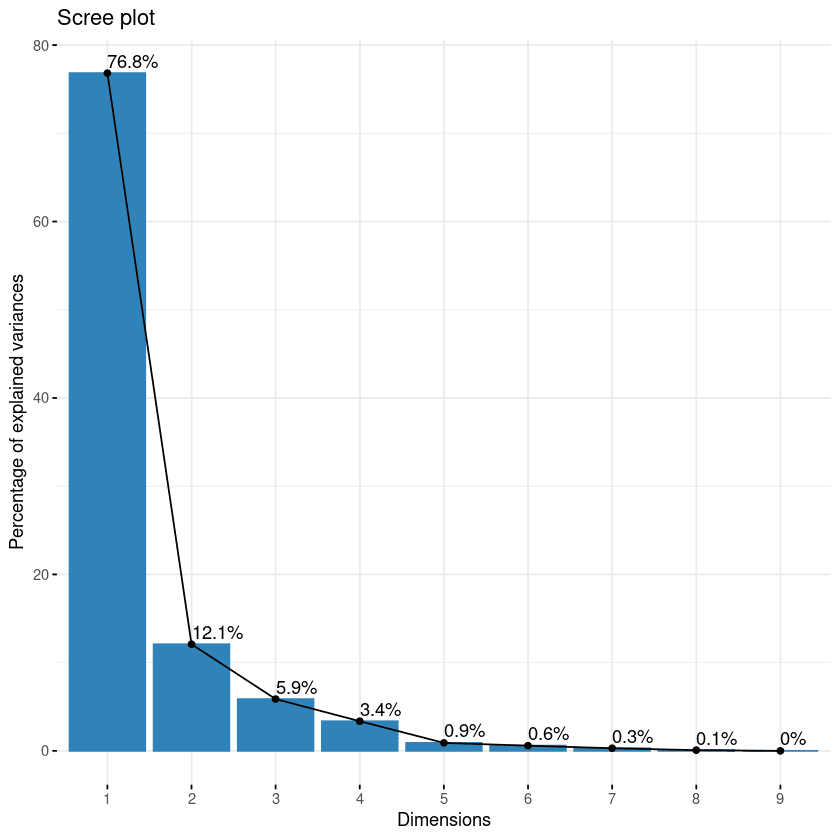
Scree plot of the components
This plot shows the eigenvalues in a downward curve, from highest to lowest. The first two components can be considered to be the most significant since they contain almost 89% of the total information of the data.
Biplot of the attributes
With the biplot, it is possible to visualize the similarities and dissimilarities between the samples, and further shows the impact of each attribute on each of the principal components.
# Graph of the variables
fviz_pca_var(data.pca, col.var = "black")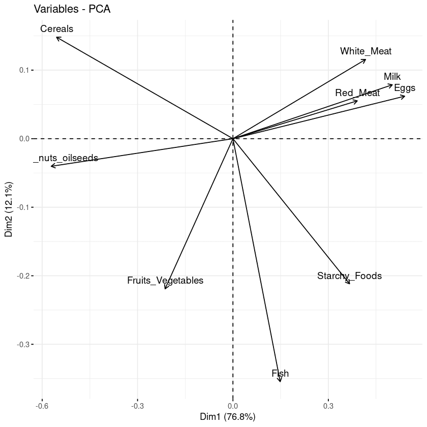
Biplot of the variables with respect to the principal components
Three main pieces of information can be observed from the previous plot.
- First, all the variables that are grouped together are positively correlated to each other, and that is the case for instance for white/red meat, milk, and eggs have a positive correlation to each. This result is surprising because they have the highest values in the loading matrix with respect to the first principal component.
- Then, the higher the distance between the variable and the origin, the better represented that variable is. From the biplot, eggs, milk, and white meat have higher magnitude compared to red meat, and hence are well represented compared to red meat.
- Finally, variables that are negatively correlated are displayed to the opposite sides of the biplot’s origin.
Contribution of each variable
The goal of the third visualization is to determine how much each variable is represented in a given component. Such a quality of representation is called the Cos2 and corresponds to the square cosine, and it is computed using the fviz_cos2() function.
- A low value means that the variable is not perfectly represented by that component.
- A high value, on the other hand, means a good representation of the variable on that component.
fviz_cos2(data.pca, choice = "var", axes = 1:2)The code above computed the square cosine value for each variable with respect to the first two principal components.
From the illustration below, cereals, pulse nut oilseeds, eggs, and milk are the top four variables with the highest cos2, hence contributing the most to PC1 and PC2.
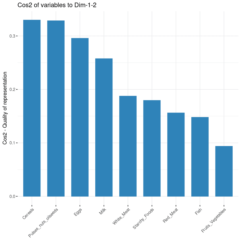
Variables’ contribution to principal components
Biplot combined with cos2
The last two visualization approaches: biplot and attributes importance can be combined to create a single biplot, where attributes with similar cos2 scores will have similar colors. This is achieved by fine-tuning the fviz_pca_var function as follows:
fviz_pca_var(data.pca, col.var = "cos2",
            gradient.cols = c("black", "orange", "green"),
            repel = TRUE)
From the biplot below:
- High cos2 attributes are colored in green: Cereals, pulses, oilseeds, eggs, and milk.
- Mid cos2 attributes have an orange color: white meat, starchy food, fish, and red meat.
- Finally, low cos2 attributes have a black color: fruits and vegetables,
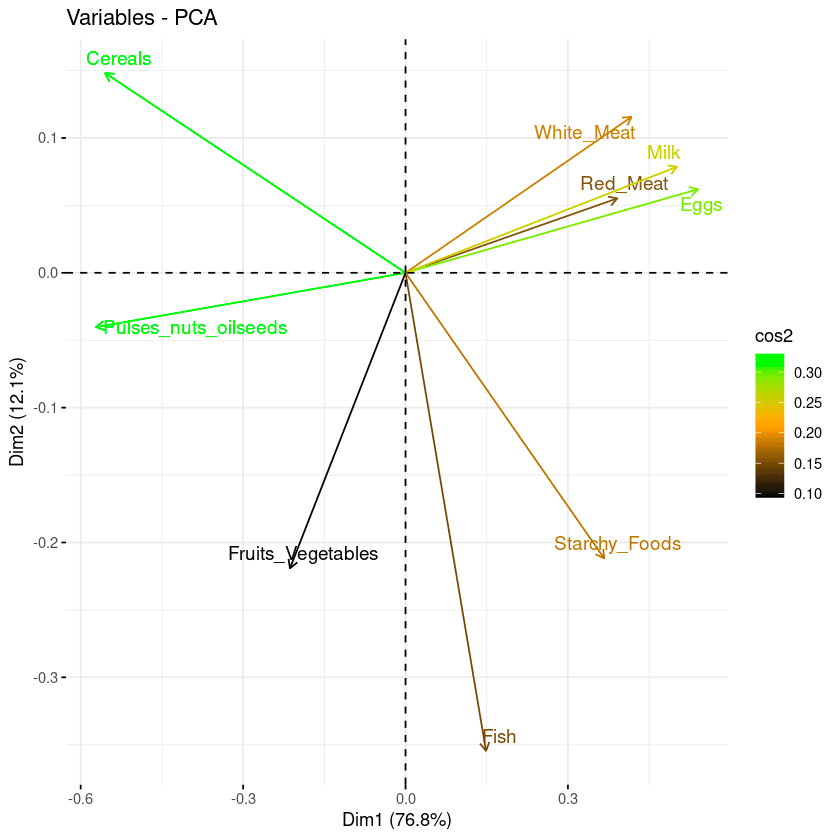
Combination of biplot and cos2 score
How to choose the number of components
Two practical rules help decide how many principal components to retain:
- Elbow rule: Look at the scree plot and find where the curve bends sharply. Components to the right of the elbow contribute little additional variance.
- Variance threshold: Retain enough components to explain 80% to 90% of the total variance. In this dataset, the first two components already explain about 89%.
Conclusion
In this tutorial, I covered what principal component analysis is and its importance in data analytics. Starting from the mathematical foundations through to hands-on R code, we walked through a complete PCA workflow on the protein dataset — from normalization and applying princomp() to interpreting scree plots, biplots, and cos2 visualizations to understand the relationship between principal components and the original variables.
Apply these techniques to reduce dimensionality, surface hidden structure, and build cleaner machine learning pipelines with your own datasets.
To go further, explore these related resources:
- Principal Component Analysis in Python — the same technique applied to tabular and image datasets
- Understanding UMAP — a non-linear dimensionality reduction alternative for complex data structures
- Understanding Dimensionality Reduction — a broader overview of techniques including PCA, t-SNE, and UMAP
- The Curse of Dimensionality — why high-dimensional data is challenging and how PCA helps
- Introduction to R — strengthen your R fundamentals with hands-on exercises
Get certified in your dream Data Scientist role
Our certification programs help you stand out and prove your skills are job-ready to potential employers.

PCA Analysis FAQ
Is PCA feature extraction or selection?
PCA leverages an unsupervised linear transformation to perform feature extraction and dimensionality reduction.
When should you use PCA analysis?
It is recommended to use PCA when dealing with strongly correlated variables. In case of weak correlation, PCA may fail to better reduce the data.
What are the limitations of PCA?
First, PCA only works with numerical variables. Then it does not work well when the variables are not strongly correlated. Also, PCA is sensitive to the scale of the features and the result is impacted by outliers.
What is the main advantage of PCA?
PCA includes multiple benefits and is not limited to :
- Reducing the number of variables in the data by removing noisy ones, which can also reduce overfitting.
- Improving algorithms performance by focusing only on the relevant features.
- Improving the data visualization for a better understanding of the data.
What is PC1 and PC2 in principal component analysis?
PC1 axis corresponds to the first principal direction along which the data exhibits the largest variation. The PC2 axis corresponds to the second most important direction along which the data exhibits the largest variation. Also, PC1 is always orthogonal to PC2.
What are the assumptions of principal component analysis?
The following assumptions are made by the principal component analysis:
- There is a linear combination between variables.
- It assumes that the principal components having the highest variance are more important than those which don’t, and consider them to include noise in the data.
- More outliers in the data include experimental errors.
- The data set from the PCA gives a great representation of the original data.
How to do PCA in R?
To perform PCA in R, normalize your data with scale(), then use either prcomp() (recommended — uses SVD for numerical stability) or princomp() from base R, or the PCA() function from the FactoMineR package. Use the factoextra package to visualize results with fviz_eig() for scree plots and fviz_pca_var() for biplots.
What is the difference between prcomp() and princomp() in R?
prcomp() uses singular value decomposition (SVD), which is numerically more stable and is the generally preferred method. princomp() uses spectral decomposition on the covariance matrix. Both produce equivalent results for well-conditioned data, but prcomp() is recommended for most practical use cases. The main output difference is that loadings are stored in $rotation for prcomp() and in $loadings for princomp().
Can PCA be used for machine learning preprocessing in R?
Yes. PCA is commonly used as a preprocessing step in machine learning pipelines to reduce the number of input features, remove multicollinearity between predictors, and speed up model training. In R, you can extract the principal component scores from prcomp() via $x and use them as input features for downstream models. The caret and tidymodels packages both support PCA as a preprocessing step via preProcess(method = "pca") and step_pca() respectively.
How do I choose the number of principal components to retain?
Three common approaches help decide how many components to keep:
- Elbow rule: Look at the scree plot and find where the curve bends — components to the right of the elbow contribute diminishing variance.
- Variance threshold: Retain enough components to explain 80–90% of total variance.
- Kaiser criterion: Keep components with eigenvalue greater than 1 (more reliable for larger datasets).
In R, use fviz_eig() from the factoextra package to visualize the variance explained by each component.
