course
How to Create and Customize a Box and Whisker Plot in Excel
Creating box and whisker plots in Excel is a valuable skill for any data analyst. These plots provide a clear summary of our data distribution, helping us make informed decisions based on our analysis.
In this tutorial, we'll learn why box and whisker plots are important, why Excel is good for creating them, and how to build these kinds of plots in Excel—both from scratch and in a very quick and straightforward way. In addition, we'll explore how to customize a box and whisker plot in Excel to make it more insightful.
The Quick Answer: How to Create a Box and Whisker Plot in Excel
To create a box and whisker plot in Excel, follow these steps:
- Select the Excel cells containing the values to be plotted.
- Open the Insert tab on the Excel ribbon.
- Click on the Recommended Charts button of the Charts group.
- Open the All Charts tab in the pop-up window.
- Select the Box & Whisker chart type.
- Press OK.
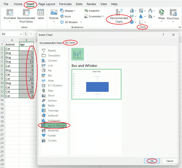
Creating a box and whisker plot using a dedicated Excel feature. Image by Author
To make sure your box and whisker plot in Excel yields valuable insights, you need to ensure first that your data is meaningful and properly cleaned and transformed. The Data Preparation in Excel course will teach you how to prepare Excel data through logical functions, nested formulas, lookup functions, and pivot tables.
Why Box and Whisker Plots Are Important
Box and whisker plots, also known as box plots or box and whisker diagrams, are a powerful type of visualization used to display the distribution of a data series. They are particularly helpful for statistical data analysis since they allow us to:
- Gather a comprehensive statistical summary of the data in interest, including the minimum, maximum, median, and mean values, as well as the first and third quartiles (Q1 and Q3).
- Understand the overall data distribution at a high level.
- Figure out if our data distribution is normal or skewed (and the direction of skewness).
- Identify the spread of our data.
- Detect outliers and their magnitude.
- Estimate data variability.
- Determine the best measure of center (median or mean).
- Compare the distribution of multiple categories next to each other.
To quickly start with Excel, consider taking the Introduction to Excel course.
Methods to Create a Box and Whisker Plot in Excel
In Excel, it's possible to quickly create a box and whisker plot by using a dedicated feature, as we saw earlier. Alternatively, we can decide to opt for the long way and do it from scratch. In both cases, Excel allows us to create either a single box and whisker plot or a set of plots next to each other, each for a separate category of the data. In addition, it's possible to build a horizontal box and whisker plot (or multiple plots) in Excel.
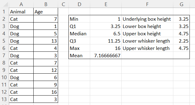
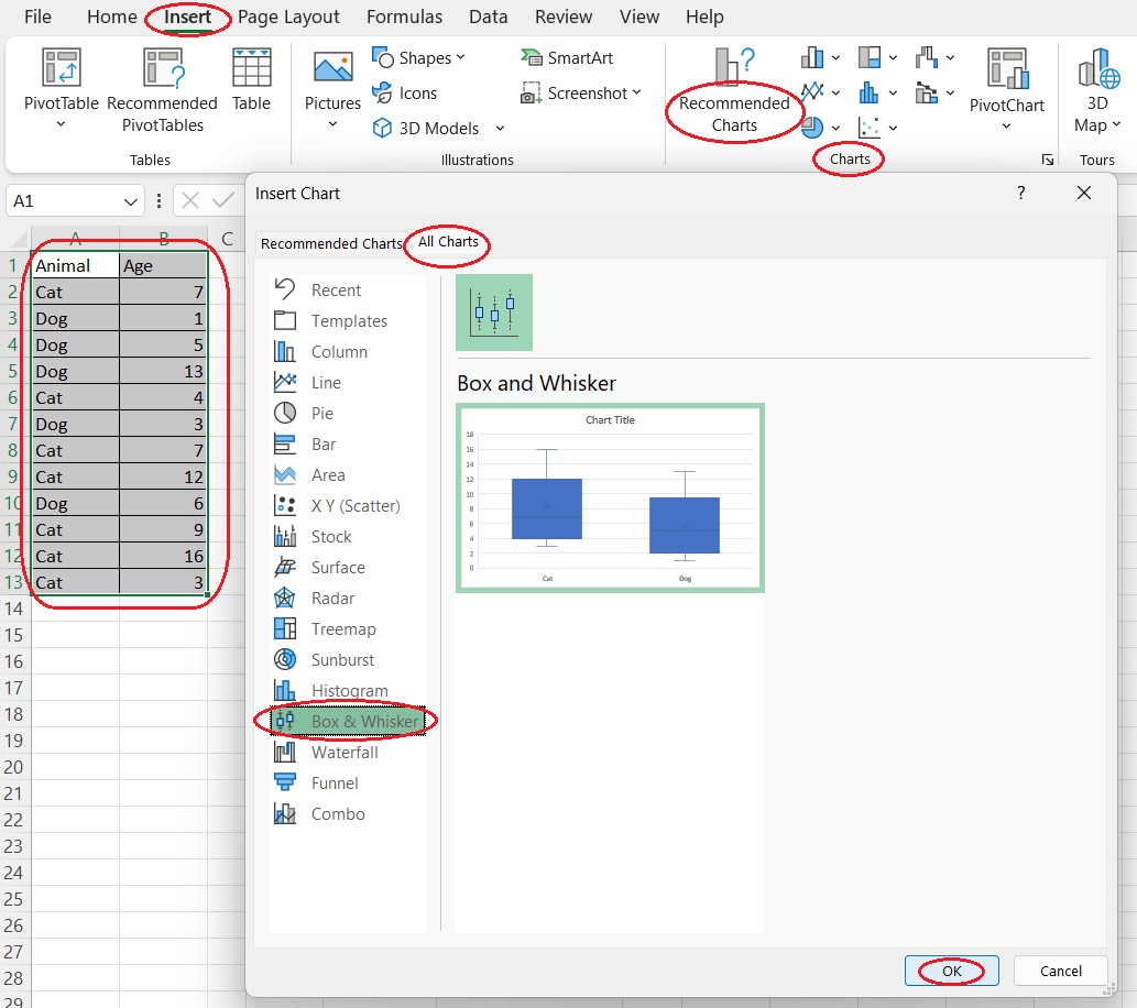
For simplicity, let's assume throughout the next three sections that we want to create a single box and whisker plot for a single column of values. Let’s consider a simple table containing the ages of cats and dogs from a hypothetical pet adoption center.
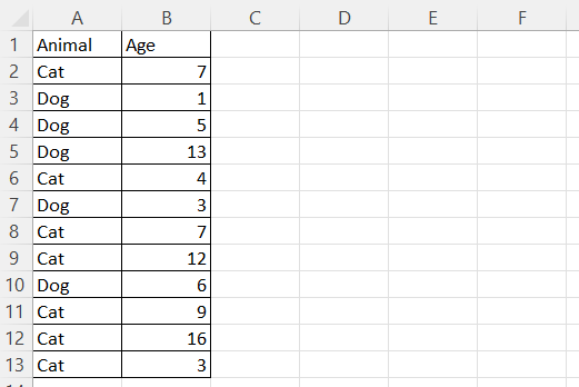
An example Excel table with cats and dogs. Image by Author
Creating a basic box and whisker plot using our own statistical measures
We can familiarize ourselves with box and whisker plots by building one from scratch using our own statistical measures.
Calculating the statistical values
To start, create an area for calculating and storing statistical values. Let’s call this area a statistical table. You can place it to the right or below your main table.
-
In the first column of the statistical table, enter the following, one per row:
-
“Min“
-
“Q1“
-
“Median“
-
“Q3“
-
“Max“
-
“Mean“
-
-
In the second column of the statistical table, calculate each statistical notation using the following Excel formulas. Here,
your_data_range
refers to the column of values for which you want to create a plot:-
=MIN(your_data_range)
-
=QUARTILE.EXC(your_data_range, 1)
-
=MEDIAN(your_data_range)
-
=QUARTILE.EXC(your_data_range, 3)
-
=MAX(your_data_range)
-
=AVERAGE(your_data_range)
-
Calculating the box heights and whisker lengths
Next, you need to determine the dimensions for the boxes and whiskers that will form the core components of your plot.
- In the third column of the statistical table, enter the names of the values to be calculated, one per row:
- “Underlying box height“
- “Lower box height“
- “Upper box height“
- “Lower whisker length“
- “Upper whisker length“
- In the fourth column of the statistical table, calculate each value in interest using the following formulas:
-
=Q1
-
=Median-Q1
-
=Q3-Median
-
=Q1-Min
-
=Max-Q3
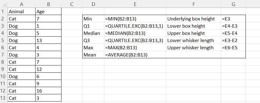
Calculating a statistical table in Excel. Formulas shown. Image by Author
Calculating a statistical table in Excel. Results. Image by Author
Creating the boxes
Now that you have your statistical values, you can create the visual representation by building the boxes.
- Select the three Excel cells containing the calculated values of the box heights.
- Open the Insert tab on the Excel ribbon.
- Click on the Recommended Charts button of the Charts group.
- Open the All Charts tab in the pop-up window.
- Select Column from the list on the left side of the pop-up window.
- Select the Stacked Column option.
- Press OK.
Creating the boxes from scratch in Excel. Image by Author
Formatting the boxes
To ensure your plot is clear and looks good, you need to format the boxes.
- Select the underlying box on the plot area.
- Right-click and select Format Data Series....
- Click on the Fill & Line button on the Format Data Series pane that appears on the right side of the screen.
- Click on the Fill drop-down arrow and select the No fill option.
- Select the lower box from the two boxes currently visible in the plot area.
- Select a color you want for the Color option in the Fill drop-down section on the Format Data Series pane (e.g., blue).
- Click on the Border drop-down arrow.
- For the Color option, select a darker shade of the same color you selected earlier (e.g., dark blue).
- Select the upper box from the two boxes currently visible in the plot area.
- For the Color option in the Fill drop-down section on the Format Data Series pane, select the color you chose earlier.
- For the Color option in the Border drop-down section on the Format Data Series pane, select the same color once again.
Formatting the underlying box from scratch in Excel. Image by Author
Formatting the upper box from scratch in Excel. Image by Author
Creating the whiskers
Next, you need to add the whiskers to your plot, which represent the range of the data.
- Select the underlying box, which is now invisible.
- Click on the Chart Elements button that appears to the right of the chart area.
- Hover over the Error Bars option until a drop-down arrow appears to its right.
- Select More Options....
- Click on the Error Bar Options button on the Format Error Bars pane that appears on the right side of the screen.
- Select the Minus option for Direction in the Vertical Error Bar drop-down section.
- Select the Custom option for Error Amount.
- Click on Specify Value in that field.
- In the pop-up window, remove the value in the Negative Value Error field.
- Select the Excel cell that contains the calculated value for the lower whisker length.
- Press OK.
- Select the upper box on the plot area.
- Click on the Chart Elements button that appears to the right of the chart area.
- Hover over the Error Bars option until a drop-down arrow appears to its right.
- Click on the drop-down arrow that appears.
- Select More Options....
- Select the Plus option for Direction in the Vertical Error Bar drop-down section on the Format Error Bars pane on the right side of the screen.
- Select the Custom option for Error Amount.
- Click on Specify Value in that field.
- In the pop-up window, remove the value in the Positive Value Error field.
- Select the Excel cell that contains the calculated value for the upper whisker length.
- Press OK.
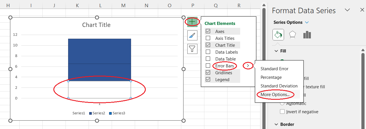
Opening more options for error bars. Image by Author
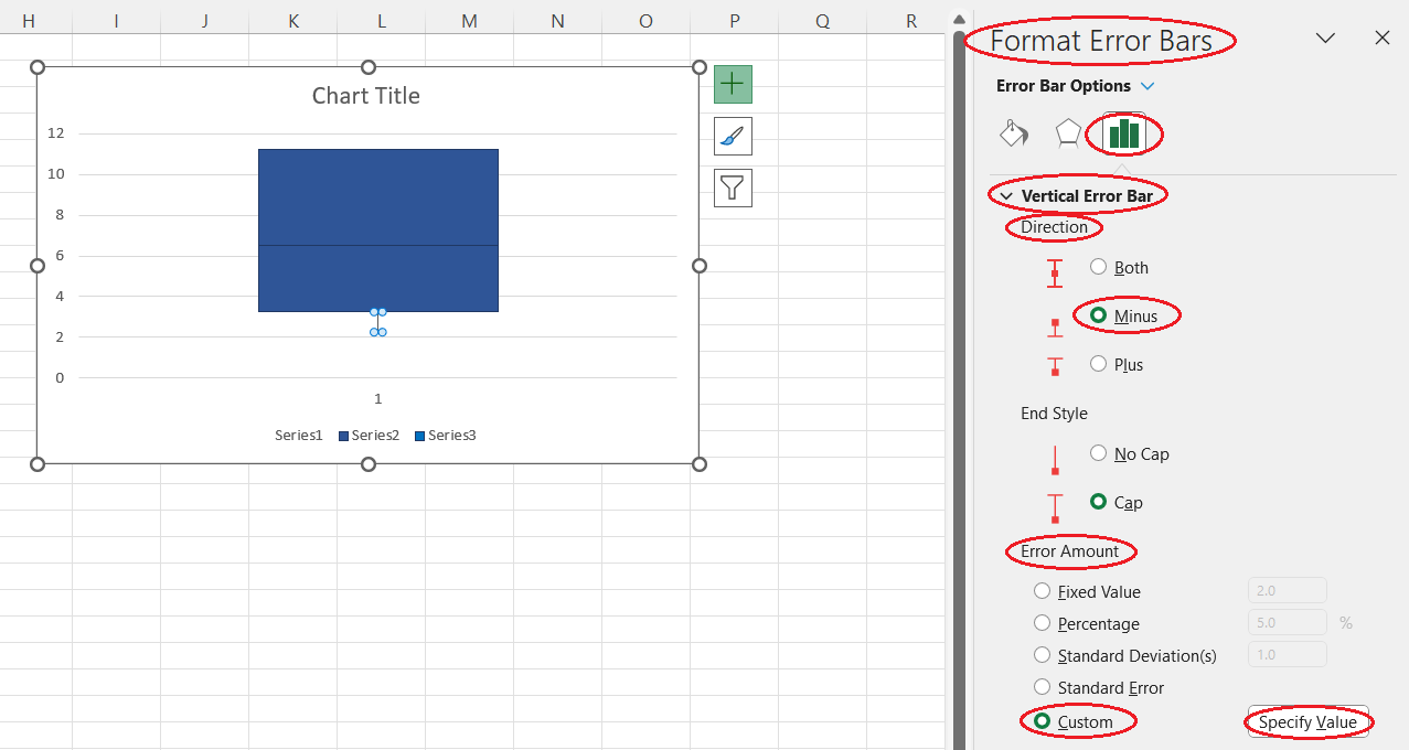
Setting the error bar options. Image by Author
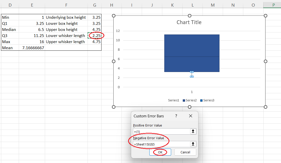
Creating the lower whisker from scratch. Image by Author
Adding the mean point
To complete the plot, you need to add the mean point, which gives an additional reference for the central tendency of the data.
- Copy the calculated value for the mean in the statistical table you created earlier.
- Select the chart area.
- Press Ctrl+V on your keyboard.
- Select any of the boxes in the plot area.
- Right-click and select Change Series Chart Type....
- In the pop-up window, find the last data series in the Series Name column.
- Select the Scatter chart type from the drop-down list for this data series.
- Press OK.
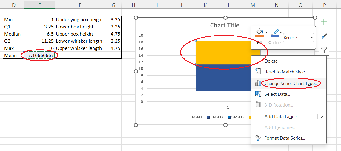
Changing the series chart type pop-up window. Image by Author
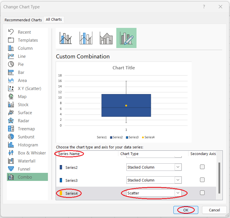
Changing the series chart type to scatter. Image by Author
Removing the redundant elements
Finally, to ensure the plot is clean and focused, you need to remove any unnecessary elements.
- Select and delete the legend from the chart area.
- Select and delete the horizontal axis of the plot (you'll see the only value 1 on it).
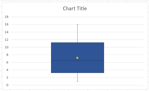
A simple box and whisker plot from scratch in Excel. Image by Author
Creating a horizontal box and whisker plot in Excel
To create a horizontal box and whisker plot, we follow the same instructions as for creating a vertical box and whisker plot from scratch, with some new steps, mostly related to adding the mean point. Below is the whole process step by step.
Calculating the statistical values and box and whisker lengths
-
On the same Excel worksheet, create an area for calculating and storing statistical values. Let’s call this area a statistical table. You can place it to the right or below your main table.
-
For clarity, consider delineating the statistical table (select the table—right-click—select Format Cells...—open the Border tab—click on Outline—press OK).
-
In the first column of the statistical table, enter the following, one per row:
-
“Min“
-
“Q1“
-
“Median“
-
“Q3“
-
“Max“
-
“Mean“
-
In the second column of the statistical table, calculate each statistical notation using the following Excel formulas. Here,
your_data_range
refers to the column of values for which you want to create a plot: -
=MIN(your_data_range)
-
=QUARTILE.EXC(your_data_range, 1)
-
=MEDIAN(your_data_range)
-
=QUARTILE.EXC(your_data_range, 3)
-
=MAX(your_data_range)
-
=AVERAGE(your_data_range)
-
In the third column of the statistical table, enter the names of the values to be calculated, one per row:
-
“Underlying box length“
-
“Left box length“
-
“Right box length“
-
“Left whisker length“
-
“Right whisker length“
-
In the fourth column of the statistical table, calculate each value in interest using the following formulas:
-
=Q1
-
=Median-Q1
-
=Q3-Median
-
=Q1-Min
-
=Max-Q3
Creating and formating the boxes:
-
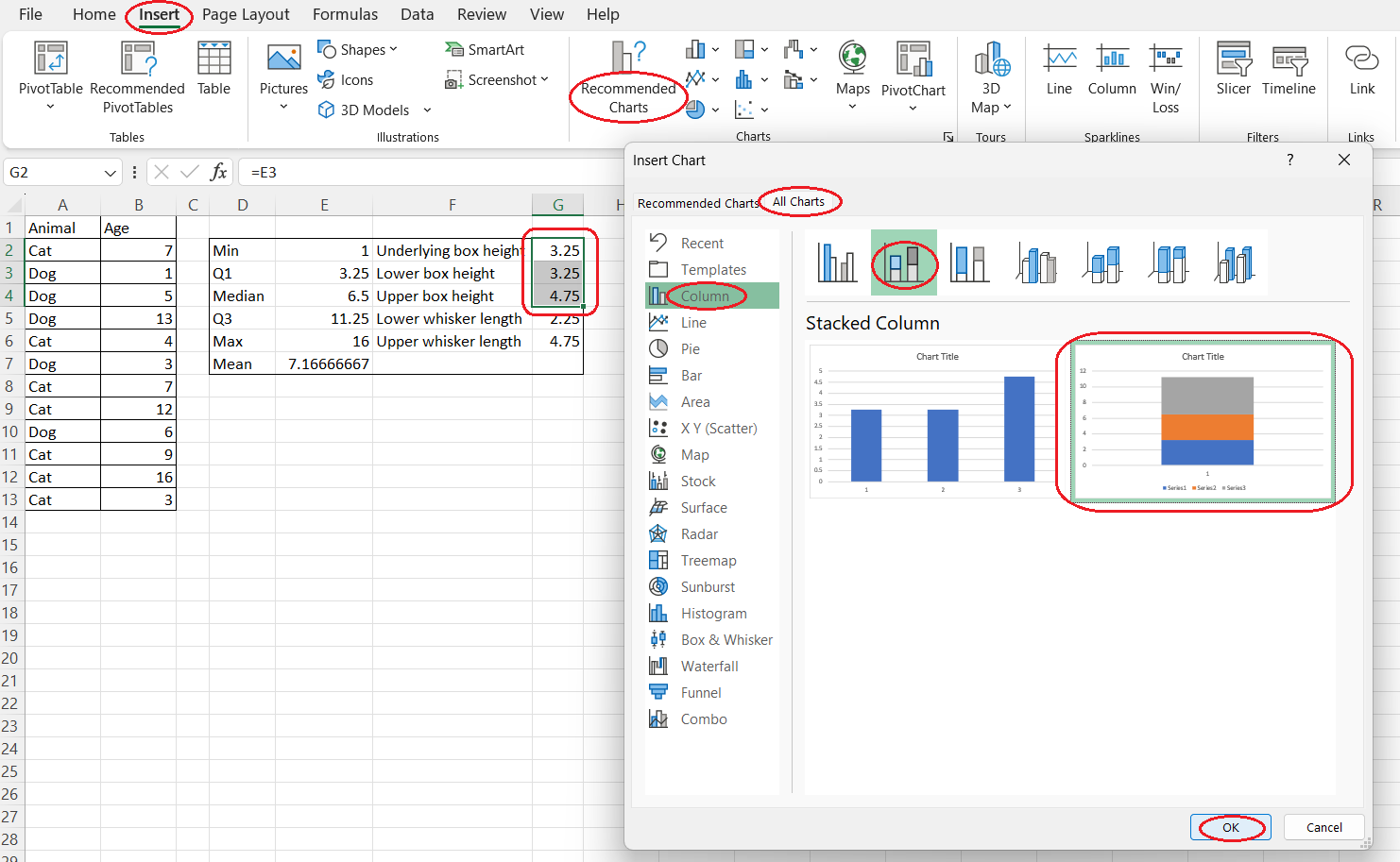
Insert the stacked bars:
-
Select the three cells with the box length calculations.
-
Go to Insert > Recommended Charts > All Charts > Bar > Stacked Bar > OK.
-
-
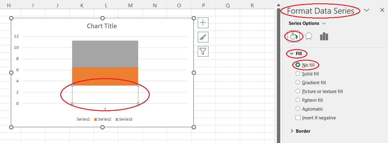
Format the underlying (base) box:
-
Select the box closest to the y-axis.
-
Right-click > Format Data Series...
-
In the Format Data Series pane, go to the Fill & Line (paint bucket) tab.
-
Under Fill, choose No fill.
-
-
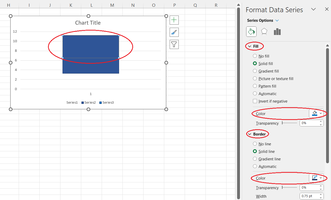
Format the visible boxes:
-
Select the left visible box, then in the Format Data Series pane:
-
Under Fill, choose a color (e.g., blue).
-
Under Border, select a darker shade of that color (e.g., dark blue).
-
-
Select the right visible box and repeat the same steps, using the same colors.
-
Add the whiskers:
-
Add the left whisker:
-
Select the now-invisible underlying box.
-
Click the Chart Elements button (+ icon) > hover over Error Bars > click the arrow > More Options...
-
In the Format Error Bars pane, choose:
-
Direction: Minus
-
Error Amount: Custom > Specify Value
-
-
Clear the Negative Value field.
-
Select the cell with the left whisker length.
-
Click OK.
-
-
Add the right whisker:
-
Select the right visible box.
-
Click the Chart Elements button > hover over Error Bars > arrow > More Options...
-
In the Format Error Bars pane:
-
Direction: Plus
-
Error Amount: Custom > Specify Value
-
-
Clear the Positive Value field.
-
Select the cell with the right whisker length.
-
Click OK.
-
Add the mean point:
- Add the mean data point:
- Copy the mean value cell.
- Select the chart area and press Ctrl+V to paste it as a new series.
- Convert the new series to a scatter plot:
- Right-click any box > Change Series Chart Type...
- Find the newly added series at the bottom of the list.
- Change its chart type to Scatter.
- Click OK.
- Adjust the scatter data:
- Right-click the new point > Select Data...
- Select the new series and click Edit.
- Series X values: Select the mean cell.
- Series Y values: Type
1
. - Click OK twice.
- Align the axes:
- Select the secondary axis (right side).
- In Format Axis > Axis Options, set Bounds (e.g., Minimum = 0, Maximum = 2) so that Y=1 on both axes aligns, placing the mean point within the box at the correct height.
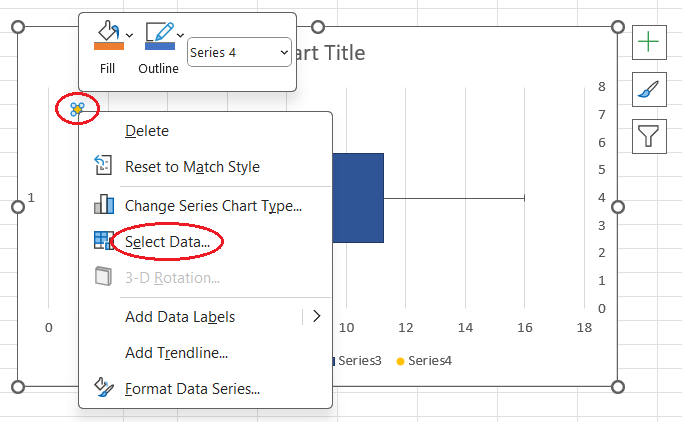
Selecting the data. Image by Author
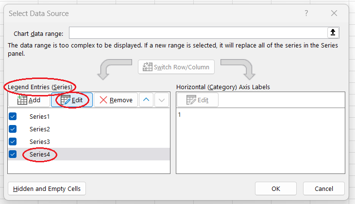
Editing the series. Image by Author
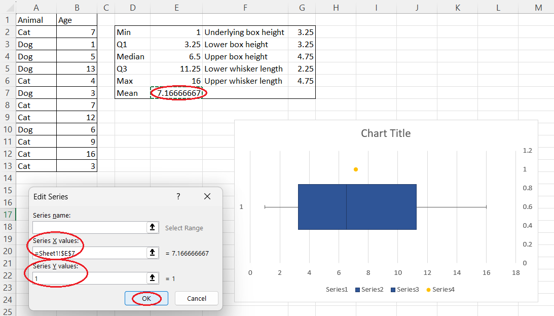
Changing the coordinates of the mean. Image by Author
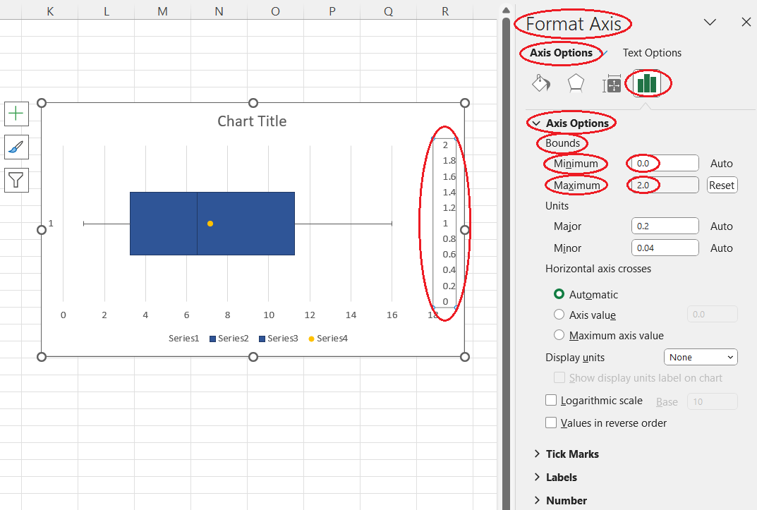
Customizing the secondary axis. Image by Author
Removing the redundant elements
- Select and delete the legend from the chart area.
- Select and delete the primary vertical axis of the plot (you'll see the only value 1 on it).
- Select and delete the secondary vertical axis of the plot.
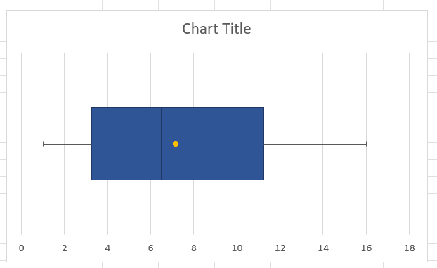
A horizontal box and whisker plot in Excel. Image by Author
Creating box and whisker plots for multiple categories in Excel
In all our approaches so far, we were building a box and whisker plot for the whole range of data (in our case—for the ages of cats and dogs from a hypothetical pet adoption center altogether). What if we need to create a separate box and whisker plot for each category but display all such plots on the same chart? Let's say that we want to visually compare the age statistics for cats and dogs.
- In the Excel worksheet where you store the table with the values to be plotted, select both the column containing the categories and the one with the corresponding values. If these columns aren't adjacent, press Ctrl before selecting the second range of cells.
- Open the Insert tab on the Excel ribbon.
- Click on the Recommended Charts button of the Charts group.
- Open the All Charts tab in the pop-up window.
- Select Box & Whisker from the list on the left side of the pop-up window.
- Press OK.
Creating a box and whisker plot for multiple categories. Image by Author
Customizing a Box and Whisker Plot in Excel
Now, let's briefly explore how we can customize a box and whisker plot in Excel.
Apart from various general adjustments applicable to all types of Excel charts—such as adding or removing chart elements or filters, formatting data series, customizing text, or changing chart style (you can learn more in the tutorial on How to Create and Format a Combo Chart in Excel, in the chapter How to Format a Combo Chart in Excel)—we can consider some modifications related specifically to box and whisker plots.
Note that the below instructions regard only box and whisker plots created by using the Box & Whisker Excel feature, discussed in the sections on Creating a basic box and whisker plot in Excel: the easy way and Creating box and whisker plots for multiple categories in Excel.
- Select your box and whisker plot (or plots) on the plot area.
- Click on the Series Options button on the Format Data Series pane on the right side of the screen.
- In the Series Options drop-down section, play with the following settings until the resulting chart satisfies your needs:
- change the gap width
- display the inner points
- hide the outlier points
- hide the mean marker(-s)
- display the mean line (only for multiple category box and whisker plots)
- calculate the quartiles including the median(-s)
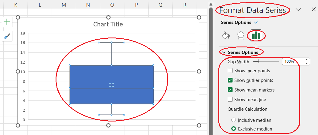
Customizing a box and whisker plot in Excel. Image by Author
Conclusion
To summarize, in this tutorial, we drilled down various approaches to creating a box and whisker plot in Excel, as well as some ways of its customization to make it more efficient for statistical data analysis. For further learning, check out these courses: Data Visualization in Excel and Data Analysis in Excel.

IBM Certified Data Scientist (2020), previously Petroleum Geologist/Geomodeler of oil and gas fields worldwide with 12+ years of international work experience. Proficient in Python, R, and SQL. Areas of expertise: data cleaning, data manipulation, data visualization, data analysis, data modeling, statistics, storytelling, machine learning. Extensive experience in managing data science communities and writing/reviewing articles and tutorials on data science and career topics.
Frequently Asked Questions
How to find the Box & Whisker feature in Excel?
By opening the Insert tab on the Excel ribbon, clicking on the Recommended Charts button of the Charts group, opening the All Charts tab in the pop-up window, and selecting Box & Whisker from the list on the left side of the pop-up window.
What kind of statistics can be shown on a box and whisker plot in Excel?
The minimum, maximum, median, and mean values, the first and third quartiles, and the outliers.
Is it possible to create a horizontal box and whisker plot in Excel?
Yes. Even though currently Excel doesn't offer any easy way to create a horizontal box and whisker plot, it's still possible to use a workaround to do it from scratch.
How to create box and whisker plots for multiple categories in Excel?
By selecting the Excel columns containing the category labels and corresponding values to be plotted, opening the Insert tab on the Excel ribbon, clicking on the Recommended Charts button, opening the All Charts tab, selecting the Box & Whisker chart type, and pressing OK.
What can be customized on a box and whisker plot in Excel?
Apart from general adjustments applicable to all types of Excel charts, it's possible to change the gap width, display the inner points, hide the outlier points, hide the mean markers, display the mean line, and calculate quartiles including the medians.
Learn Excel with DataCamp
course
Data Preparation in Excel
course
Data Visualization in Excel
tutorial
How to Create and Format a Combo Chart in Excel
tutorial
Clustered Column Charts in Excel: How to Create and Customize Them
tutorial
Graphs in Spreadsheets
tutorial
Visualizing Data in Excel
tutorial
Box Plot in R Tutorial

DataCamp Team
4 min
tutorial