Excel needs no introduction, but many users don’t fully harness the tool's power. In this tutorial, we’ll cover the different visualization options available in Excel to help you analyze and interpret your data.
Defining Data Visualization
We’ll first start by defining what data visualization is. Data visualization is a graphical representation of data. By utilizing charts, graphs, maps, etc., we can provide a simple and accessible way to understand our data and identify trends and outliers within our datasets. Note that Excel uses the term "chart" to mean a "plot". For example, a bar plot is called a bar chart in Excel terminology.
The purpose of this tutorial is to walk you through some basic charts to visualize your data before jumping into more advanced techniques later on. We highly recommend you check out our Data Visualization cheat sheet to learn more about the most common visualizations and when to use them.
Example Dataset
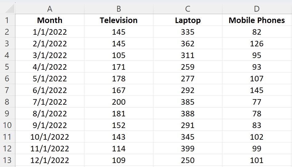
We first need a dataset to work with before creating any visualizations. This tutorial will use a simple dataset containing sales data for a local electronics store. The dataset contains information on the number of units sold for various product types in 2022 and totals for columns and rows.
|
Month |
TVs |
Mobile Phones |
Laptops |
Total |
|
1/1/2022 |
145 |
335 |
82 |
562 |
|
2/1/2022 |
145 |
362 |
126 |
633 |
|
3/1/2022 |
105 |
311 |
95 |
511 |
|
4/1/2022 |
171 |
259 |
93 |
523 |
|
5/1/2022 |
178 |
277 |
107 |
562 |
|
6/1/2022 |
167 |
292 |
145 |
604 |
|
7/1/2022 |
200 |
385 |
77 |
662 |
|
8/1/2022 |
181 |
388 |
78 |
647 |
|
9/1/2022 |
152 |
291 |
83 |
526 |
|
10/1/2022 |
143 |
345 |
102 |
590 |
|
11/1/2022 |
114 |
399 |
99 |
612 |
|
12/1/2022 |
109 |
250 |
101 |
460 |
|
Total |
1810 |
3894 |
1188 |
We’ll be working with this dataset throughout this tutorial. You can download the data file from GitHub.
Alternatively, you can import the dataset using the following steps:
- Open Excel and create a new workbook.
- Copy the dataset above and paste it into cell A1
Format the cells as needed (e.g., adjust column width, apply bold formatting to headers, etc.).
Creating Basic Charts in Excel
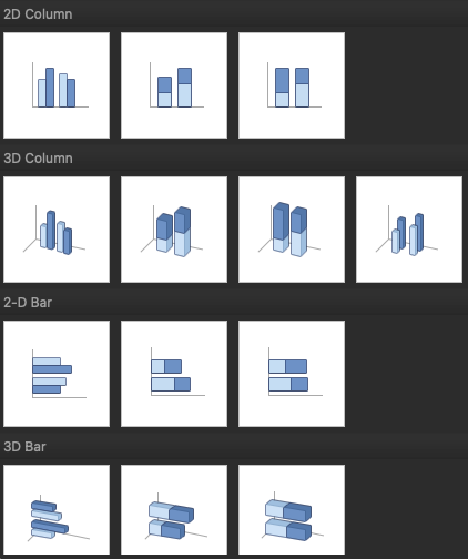
Excel has multiple options for choosing a particular chart type. For example, if you want to create a column or bar chart, you are often presented with various visualization options. For example, there are 2D and 3D versions and normal, stacked, and 100% stacked options. Depending on your requirements, you can choose the visualization type that best suits your needs.
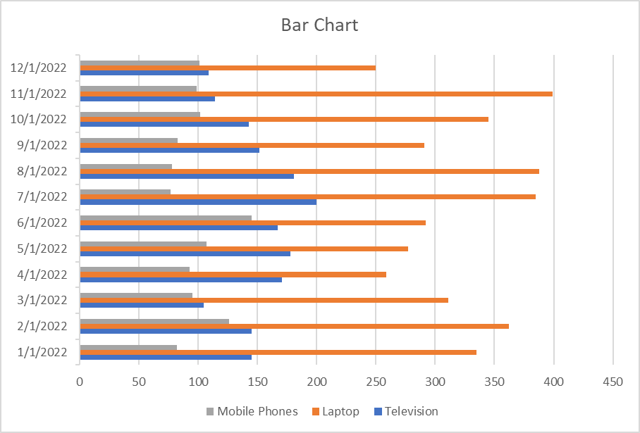
Excel bar charts
Bar charts are one of the easiest charts to interpret, enabling the person viewing the chart an easy way to compare categorical data quickly. On a bar chart, the categorical data is on the y-axis, and the values are on the x-axis.
To create a bar chart:
- Select the data range A1:D13
- Click the Insert tab in the Excel ribbon
- Click on the columns icon button dropdown, and under the 2-D Bar category, choose Clustered Bar
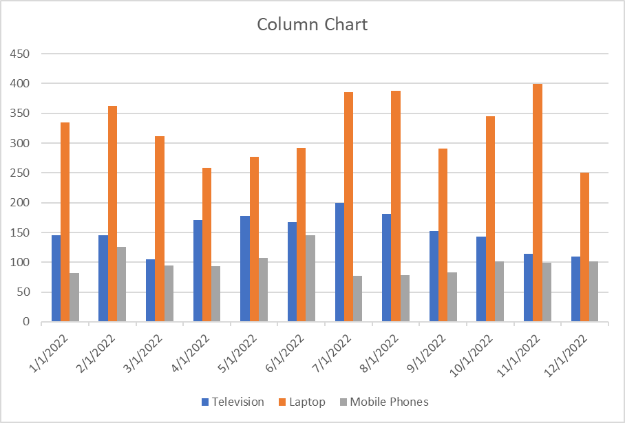
Excel column charts
A column chart, also known as a vertical bar chart, helps visualize data where categories are placed on the x-axis and the values on the y-axis. Similar to bar charts, they help visualize data across categories.
To create a column chart in Excel:
- Select the data range A1:D13
- Click the Insert tab in the Excel ribbon
- Click on the columns icon dropdown, and under the 2-D Column category, choose Clustered Column
You can now see a column chart that displays the number of units sold for each product category by the month.
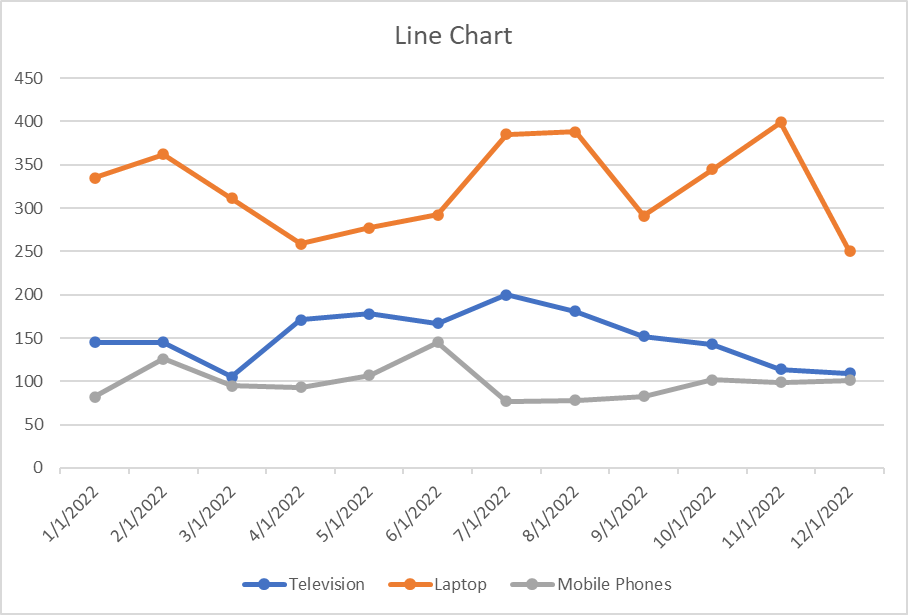
Excel line charts
A line chart is the most useful way to capture how a numerical variable changes over time. This is helpful to identify trends in numeric values.
To create a line chart in Excel:
- Select the data range A1:D13
- Click the Insert tab in the Excel ribbon
- Click on the line chart dropdown, and under the 2-D Line category, choose Line with Markers
You can now see a line chart displaying units sold each month split by product category. This enables you to compare each product category's performance over time easily.
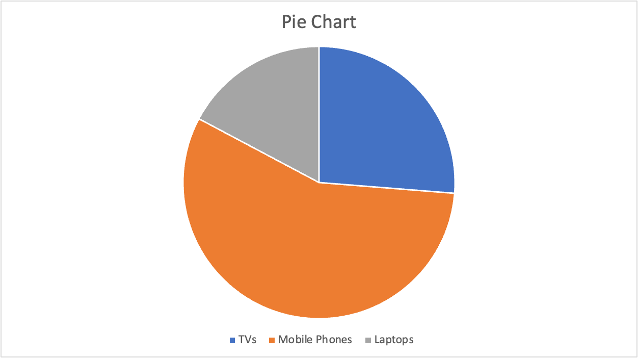
Excel pie charts
A pie chart is most commonly used to show the proportions of a whole. It’s like visualizing fractions when you were in high school. With this pie chart, we want to compare the total sales between the three categories.
To create a pie chart in Excel:
- First, select the data range B1:D1
- Second, using the command (for Mac) or ctrl (for Windows), select the second date range: B14:D14
- Click the Insert tab in the Excel ribbon
- Click on the pie chart dropdown, and under the 2-D Pie category, choose Pie
Advanced Excel Visualization Techniques
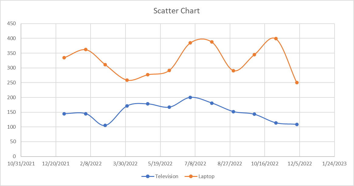
Excel scatter plots
A scatter plot is commonly used to visualize the relationship between two variables. It can be useful for quickly surfacing potential correlations between data points. We'll create a scatter plot to compare the number of TVs and Mobile Phones sold.
To create a scatter plot in Excel:
- Select the data range A1:C13 (Month, TVs, Mobile Phones)
- Click the Insert tab in the Excel ribbon
- Click on the Scatter or Bubble Chart dropdown, and under the Scatter category, choose Scatter (the first option, markers only — no lines)
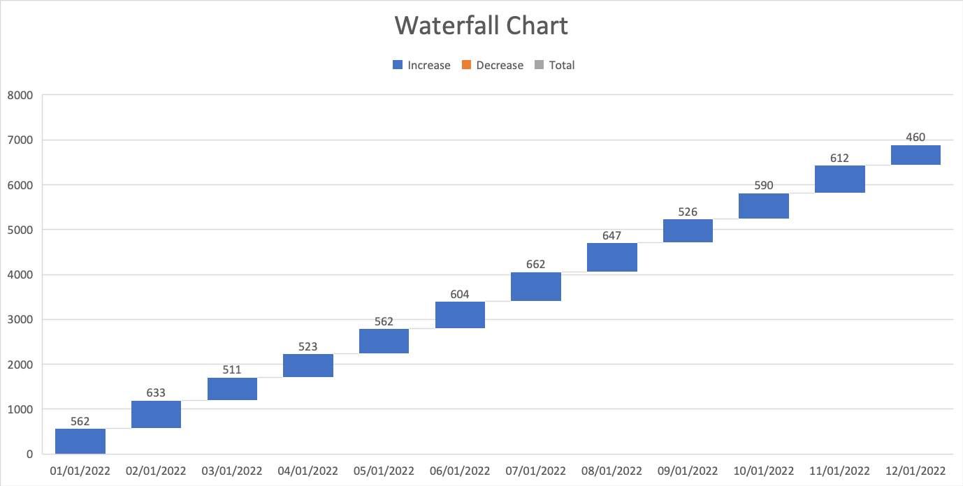
Excel waterfall chart
A waterfall chart is a special chart that helps illustrate how positive and negative values can contribute to a total. They can be great for visualizing changes over time. In our example, we’ll compare the total sales for each month regardless of the categories.
To create a waterfall chart in Excel:
- First, select the data range A2:A13
- Second, using command (for Mac) or ctrl (for Windows), select the second data range E2:E13
- Click the Insert tab in the Excel ribbon
- Click on the waterfall chart dropdown, and under the Waterfall category, choose Waterfall
We’ll only see positive values in our example because the Total column only contains positive values, but this chart can be great for comparing financial data and changes over time.
Customizing and Formatting Excel Charts
Aside from creating charts in Excel, there are many options to customize and format a chart. From here, we’ll discuss some common formatting options that’ll help you enhance your visuals.
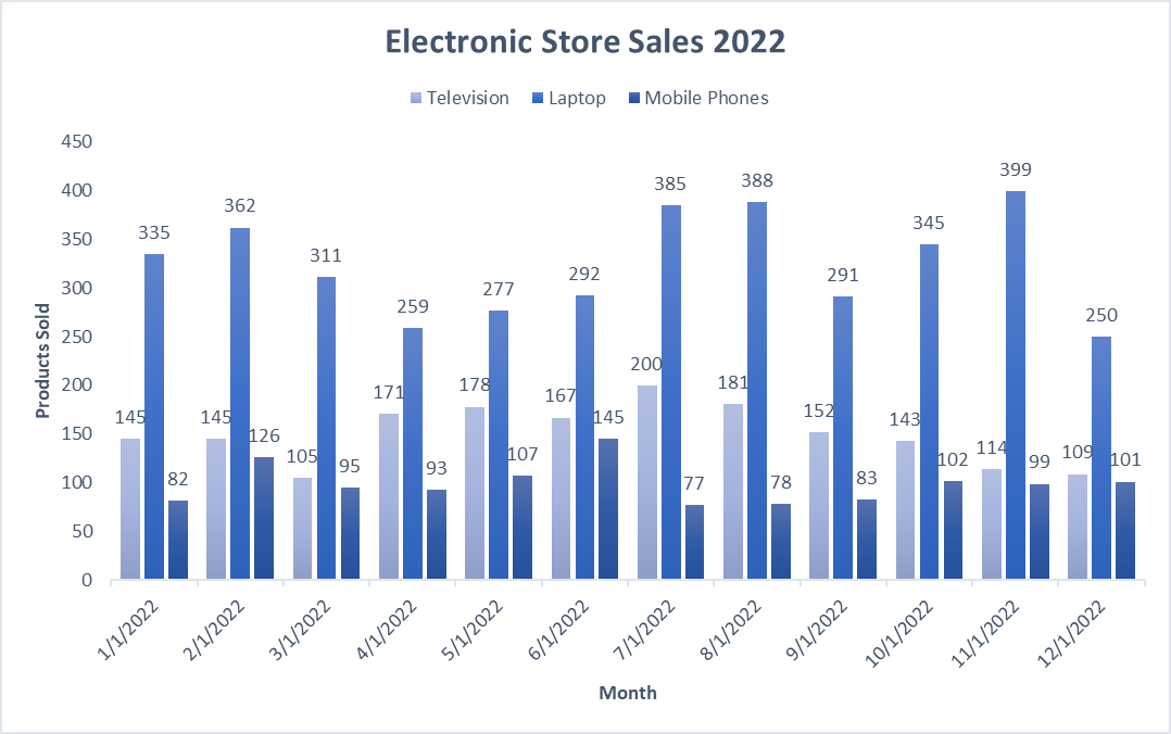
First, create a column chart based on our previous guidance that displays the number of units sold for each product category by the month.
Chart elements
Chart elements include titles, legends, data labels, gridlines, and axes. You can add, remove, or modify these elements as needed.
Click on the chart to select it.
- In the Excel ribbon, click the Chart Design tab
- Click the Add Chart Element dropdown to access the available chart elements
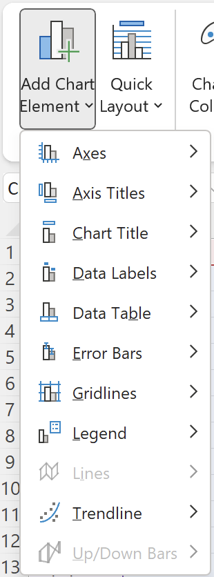
Chart title
- To add a chart title, click Add Chart Element > Chart Title and choose one of the available options (e.g., Above Chart or Centered Overlay). You can then click the title placeholder and type your desired title
- To remove a chart title, right-click on the title and select Delete
For this tutorial, rename the chart “Electronic Store Sales 2022”
Legend
- To modify the chart legend, click Add Chart Element > Legend and choose a position for the legend (e.g., Right or Top)
- To remove the legend, click "Add Chart Element" > "Legend" > "None"
For this tutorial, move the legend to the top of the chart.
Data labels
- To add data labels, click Add Chart Element > Data Labels and choose one of the available options (e.g., Center or Above). This will display the data values directly on the chart
- To remove data labels, click Add Chart Element > Data Labels > None
- To remove data labels from individual categories, right-click on the data label of the chosen category; this will highlight all relevant data labels. You can then click Delete
For this tutorial, add data labels for all categories.
Your chart should now look like this:
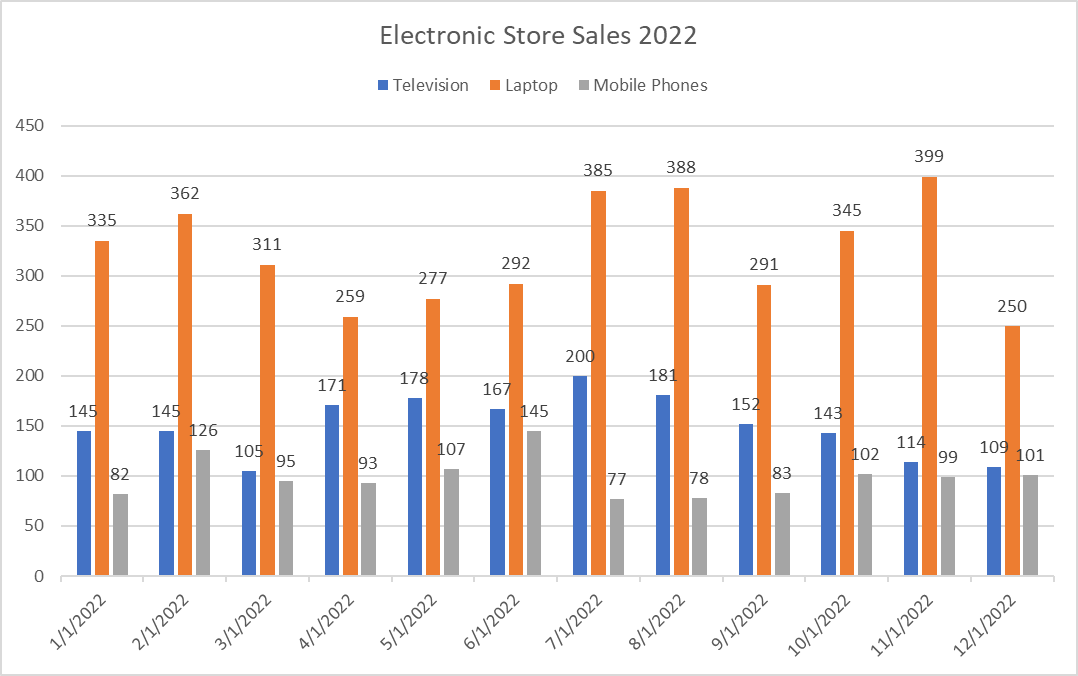
Chart Styles and colors
On top of customizing individual chart elements, you can change your chart's overall look and feel by applying different styles and color schemes.
To customize a chart style, select the visual you want to update. Then take the following steps:
- In the Excel ribbon, click the Chart Design tab
- Under the Chart Styles section, there is an option to change styles and change colors
- For chart styles: Browse the available styles and click one to apply to your chart
- For color changes: Click the Change Colors dropdown and choose a color scheme
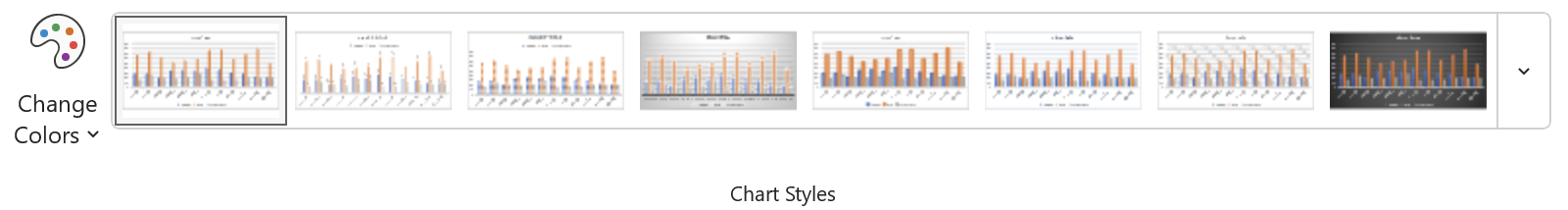
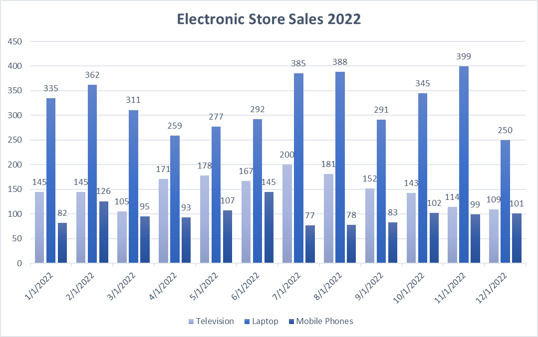
By implementing small visual changes, we can see a big difference in the aesthetic of the whole chart. Here’s an example of how our chart has changed by choosing Style 6 and Monochromatic Palette 8.
Formatting Excel chart axes
To improve the readability of our chart, we can format our axis in several ways, including axis titles, scale, or even visibility.
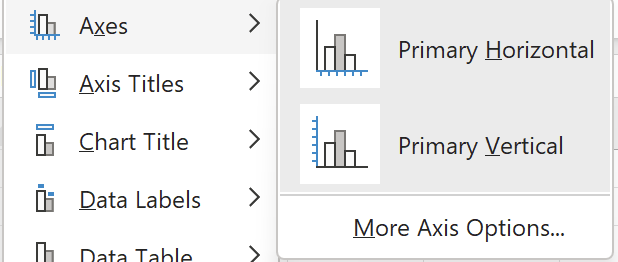
Axis titles
- To add an axis title, click Add Chart Element > Axis Titles and choose Primary Horizontal or Primary Vertical. You can then click the title placeholder and type your desired title
- To remove an axis title, right-click on the axis title and click Delete
For this tutorial, add an x-axis title Month and a y-axis title Products Sold.
Axis scale and number format
To adjust the axis scale or number format:
- Right-click the axis you want to modify and choose Format Axis
In the Format Axis pane, you can change the minimum and maximum values, major and minor units, or number format.
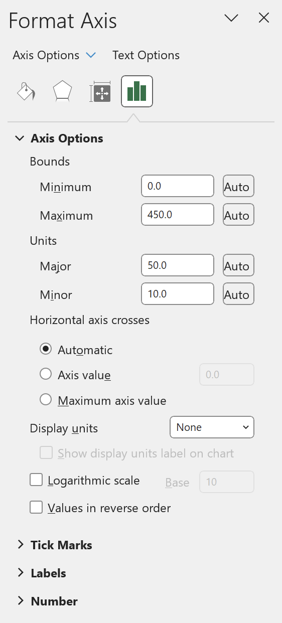
For this tutorial, we intend to keep these options the same but feel free to play around and test what each does.
Axis visibility
Finally, if you would like to remove the axis labels from showing, you can take the following steps:
- In the Excel ribbon, click the Chart Design tab
- Click the Add Chart Element dropdown and navigate to Axes
- By default, both options will have a darker gray box surrounding them. To remove an Axes, simply de-select the axes you’d like to remove
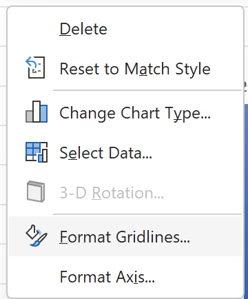
Other Excel formatting options
There are other formatting options available, including modifying data series colors, adjusting chart and plot area backgrounds, and customizing gridlines.
To access these options:
- Right-click the chart element you want to modify (e.g., data series, plot area, or gridlines)
- Select Format [element]
Conclusion
In this tutorial, we have covered some of Excel's most common visualization techniques, including basic charts such as columns and bars and adding advanced charts such as histograms and scatter plots. Additionally, we’ve covered how to level up your visualizations by applying customization and formatting. Following these steps, you can create compelling visualizations to analyze and understand your data better.
If you’d like to see what our final visualization could look like, take a peek below:
As with anything, practice makes perfect. Experiment with all the available options in Excel. Happy visualizing! If you want to learn more about some of the essential Excel formulas, check out our separate tutorial.
You can also check out our courses to learn more: Data Analysis in Excel or browse all of our Excel courses.
Advance Your Career with Excel
Gain the skills to maximize Excel—no experience required.