
Course
Working with DeepSeek in Python
3 hr
1.2K
Perplexity Labs is a project-based AI tool from Perplexity that can generate full reports, dashboards, and simple web applications using natural language prompts.
After testing the platform with my own prompts, I was genuinely impressed with both its code execution capabilities and its ability to generate polished web applications using just HTML, CSS, and JavaScript. What makes this even more appealing is that all of these features come with a $20 monthly subscription.
In this blog, I’ll explain what Perplexity Labs is, how to use it, and test its capabilities through five practical examples.
We keep our readers updated on the latest in AI by sending out The Median, our free Friday newsletter that breaks down the week’s key stories. Subscribe and stay sharp in just a few minutes a week:
Perplexity Labs is an AI-powered tool designed to transform user prompts into comprehensive projects such as reports, spreadsheets, dashboards, and simple web applications. If you’ve used Manus AI before, the experience is quite similar.
To help you understand how Perplexity Labs work, I’m going to walk you through an example from the Labs gallery: a portfolio performance dashboard that compares traditional and AI-powered investment strategies.
When you create a Lab, you’ll notice it looks different from a standard Perplexity chat. Unlike a traditional chat thread, a lab has additional panes for Apps, Assets, and Images on top of the regular Tasks and Sources panes:
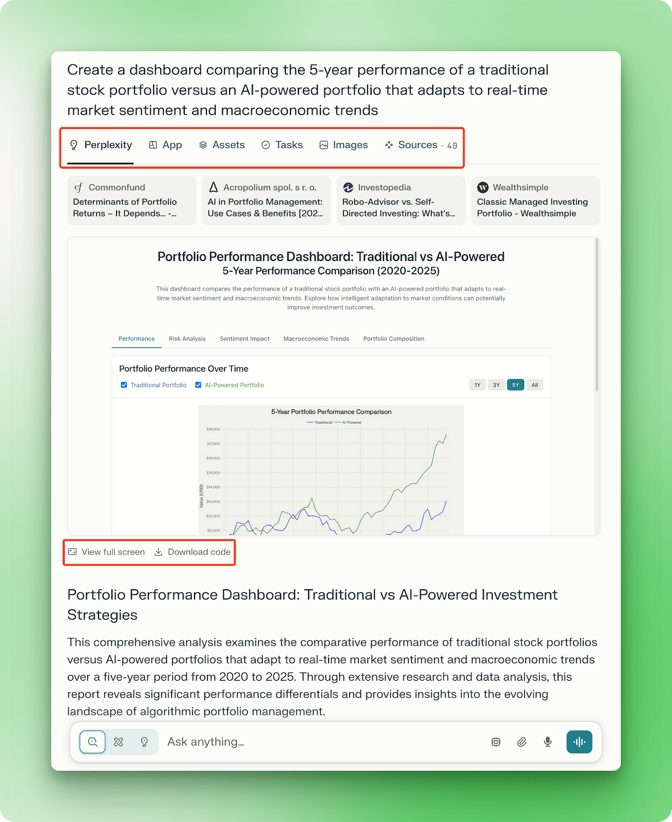
The Apps pane appears when you explicitly ask for a web app, a dashboard, or a presentation, like in this example:
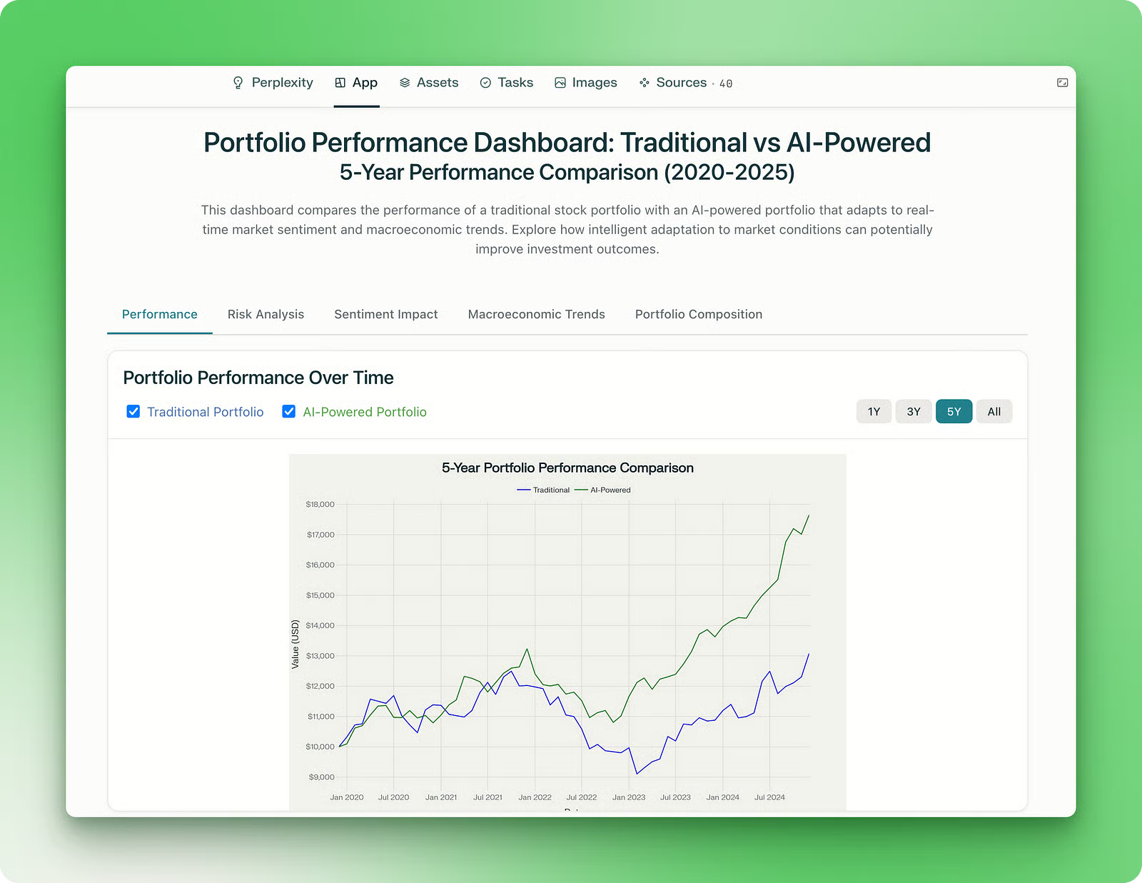
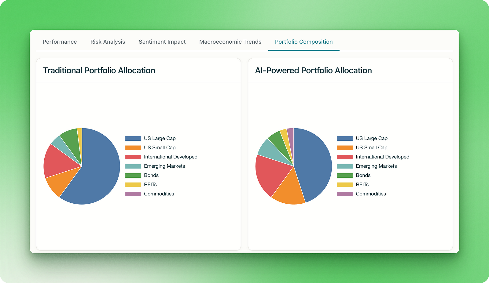
It shows the overall performance comparison of a traditional stock portfolio vs. an AI-powered one, with further sections on sentiment impact, macroeconomic trends, and portfolio composition:
What makes this particularly impressive is that the app gets deployed to a dedicated page that you can access outside of the Perplexity platform. You can bookmark it, share it, or revisit it later without needing to return to your original lab.
The lab also shows the entire code powering the application in the Assets pane:
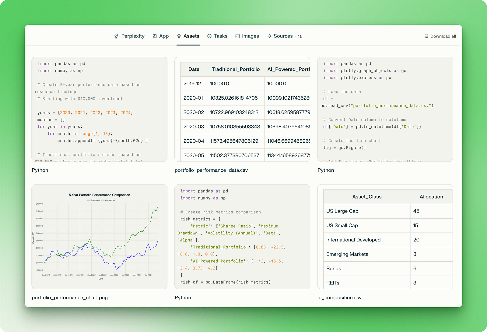
The assets include Python scripts for generating synthetic data and plots based on the research, along with CSV datasets and PNG images you can download and examine. The web application itself runs on just three files: HTML for structure, CSS for styling, and JavaScript for interactive features.
To give you the whole picture, the Tasks pane shows the exact order of how the research was conducted and how the consolidated information flows through the various Python scripts, data files, and the final web application:
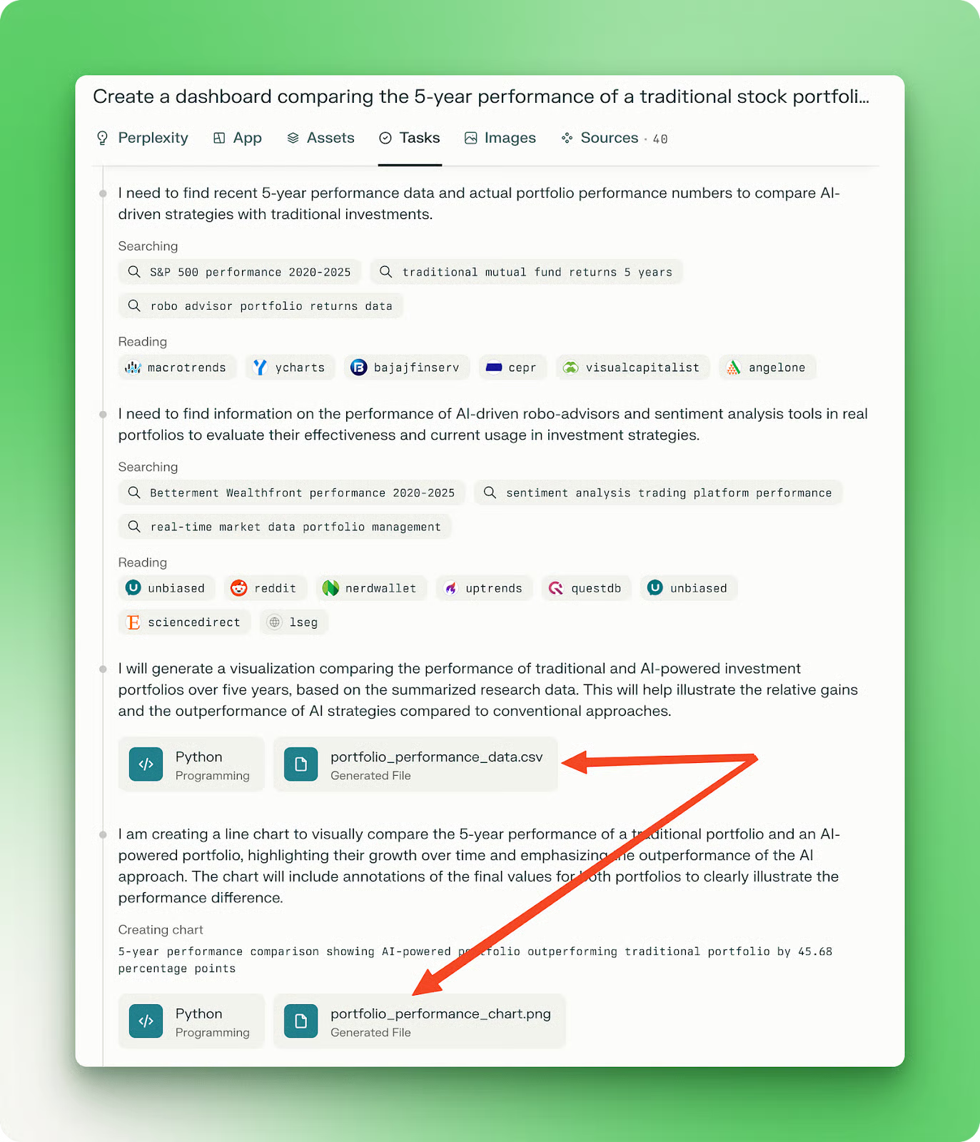
This workflow visibility helps you understand what was created and how Labs approached the problem , making it easier to refine your prompts for future projects.
What I appreciate here is the combination of multiple skills that made this dashboard possible:
Of course, this is a gallery example that the Perplexity team hand-picked, so we will have to put this feature to the test by creating our own Labs.
In the next section, I’ll walk you through the example projects I created using Perplexity Labs. Each example below took between 10 to 30 minutes to complete in separate Lab sessions. All but one example required just a single prompt to create the entire application. The results consistently showed clean design, appealing color schemes and most importantly, acceptable functionality.
I first tried a lab with a generic climate data visualization project. Here is the prompt:
Visualize global temperature trends over the past decade using interactive heat maps.
The application should display yearly and monthly temperature variations across different regions of the world, with the ability to zoom into continents, countries, or cities.
Include features such as a time slider, hover tooltips with exact temperature data, anomaly highlights (compared to historical averages), and filters for land vs. ocean temperatures.
The design should be responsive, data-rich, and intuitive, suitable for both researchers and general audiences. Use reliable open-source climate data sources (e.g., NASA, NOAA, Berkeley Earth).
Let’s see the result (you can also access the Lab here):
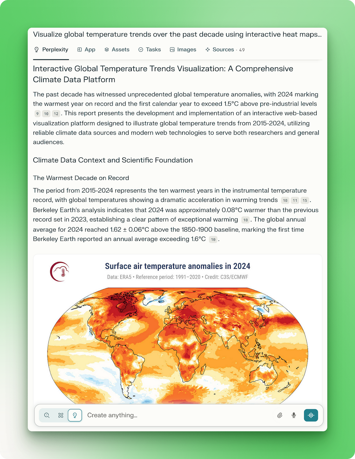
The generated report for the project was detailed and on point. However, the web app didn’t have many “cool” visualizations that I was hoping to get:
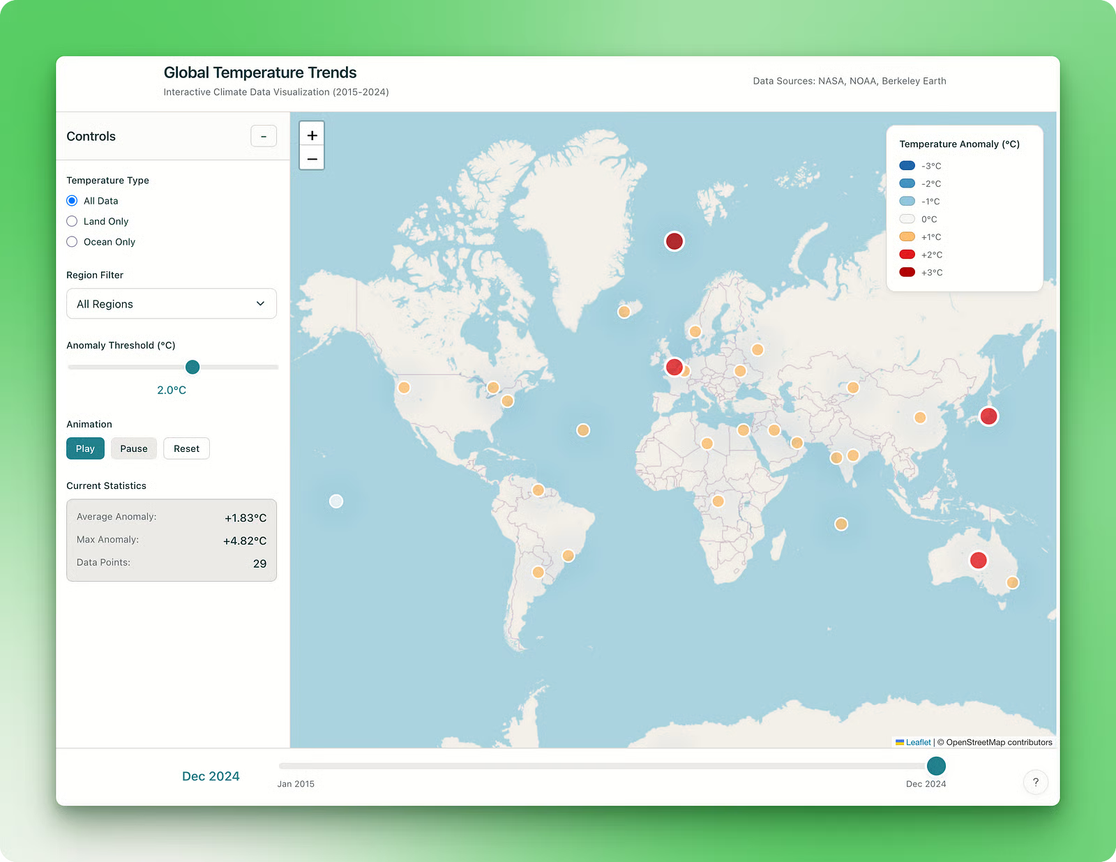
The application comes with a basic map that allows zooming in and out, highlighting climate anomalies across regions. Users can adjust the anomaly threshold through a simple control and navigate different time periods using the slider.
The app also includes an animation capability, though it doesn’t provide the depth of analysis you might expect from climate visualizations. Despite these limitations, all components on the page work as intended (see the Lab here for yourself).
My guess was that the prompt I used wasn’t as instructive and detailed enough to produce a more sophisticated application. For this reason, the rest of the projects use more descriptive and structured prompts.
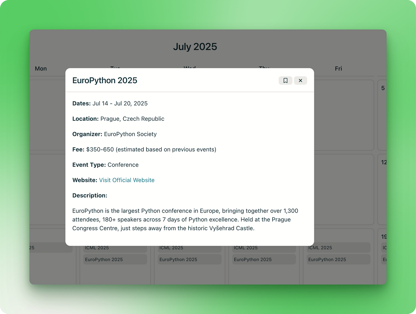
For this next project, I wanted a calendar-type dashboard that collected information on all upcoming major tech events such as conferences, meetups, dev days and hackathons organized by prominent bodies:
Design a visually appealing calendar web application that displays upcoming events in Python, AI, data science, and machine learning. The app should showcase high-quality conferences, meetups, developer days, and hackathons organized by official organizations and reputable companies only (e.g., PyCon, IEEE, NeurIPS, Google, OpenAI, Hugging Face, etc.).
Each event card should include:
1. Event Name
2. Date(s)
3. Location (city, country, or virtual)
4. Organizing Body or Host
5. Registration Fee or Ticket Cost
6. Event Type (conference, meetup, dev day, hackathon, etc.)
7. Website or registration link
8. Brief description (agenda, target audience, notable speakers, etc.)
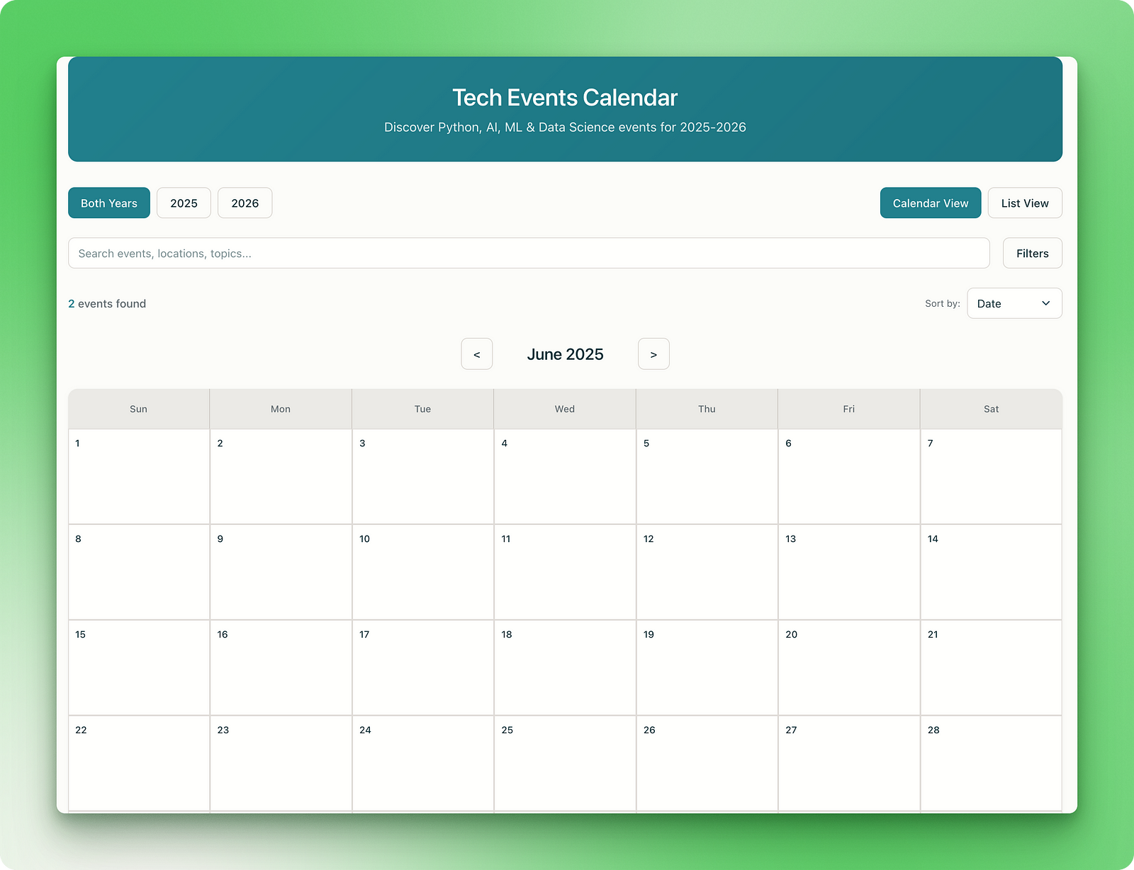
Prioritize clean and minimalist design and filter options (by date, topic, event type, location). The UI should support calendar view (monthly) and list view, with intuitive navigation and bookmarking for favorite events.The initial version of the application had everything I wanted in a minimalistic interface:
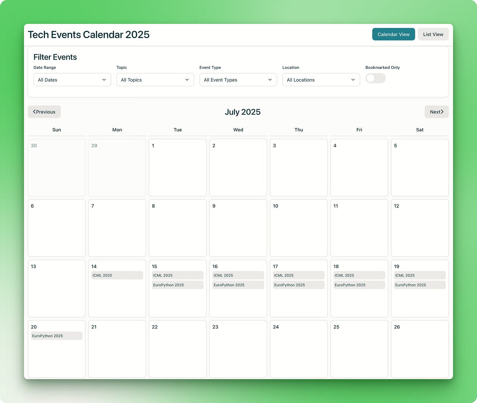
The events are correctly found and displayed, with multiple-day events taking up slots in the calendar for their respective days. Clicking on the event brings up the event card with a button to bookmark the event:
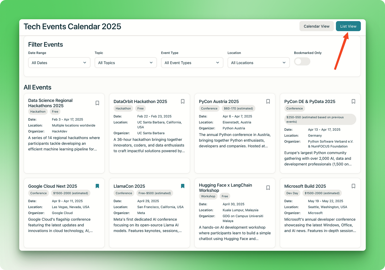
All the filters and controls are functional, as well as the list view:
After the initial version, I realized that the app only lists events up to the end of 2025. So, in the chat window, I asked Perplexity to include the events for 2026 as well:
Can you update the app with events in 2026 as well?At this point, the app broke. Perplexity Labs seems to be prone to the same issue that plagues most coding assistants: overengineering.
After about 15 minutes, Perplexity gave me the updated app with a better UI and a new bookmarks manager:
However, the app now included only two events for both years, which meant that the new UI broke the existing data pipeline.
So, this is an important point to keep in mind: always ask your coding assistants to fix problems by making as minimal changes as possible. This prevents the underlying language models from increasing the token count by adding unnecessary and unwanted features.
I am sure this bug can be fixed by a couple of further prompts, so why don’t you give it a try here?
As an FC Barcelona fan, I eagerly follow their match results, keep an eye on upcoming games, and regularly check the news for transfer rumors. With that in mind, I tried creating a dashboard to keep track of everything:
Create a comprehensive, real-time dashboard for FC Barcelona fans that displays the following:
1. **Last 5 Match Results** – Include opponent, date, scoreline, competition, and key stats (e.g., goalscorers, assists, possession).
2. **Upcoming 5 Fixtures** – Show date, opponent, competition, kickoff time, and venue.
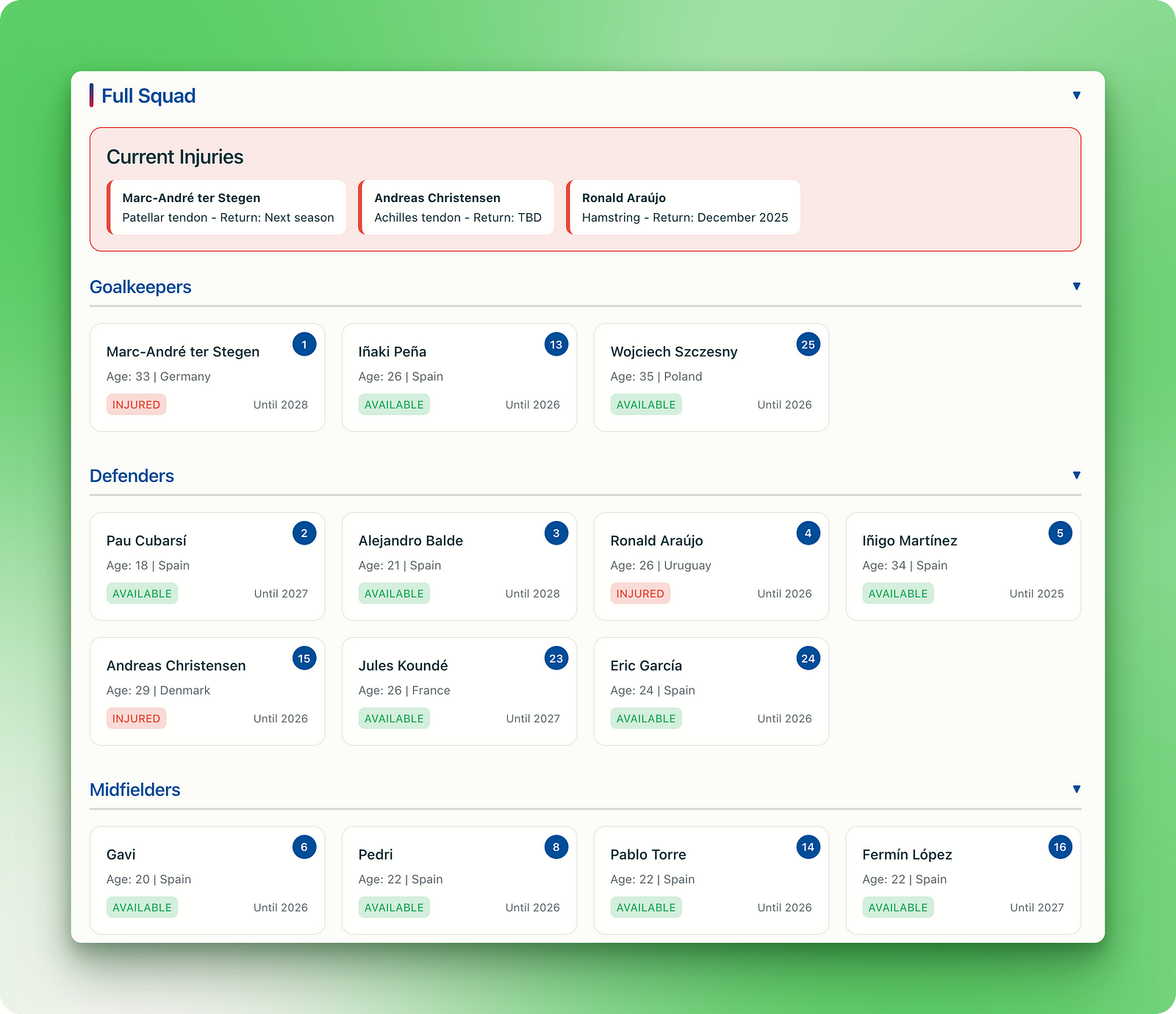
3. **Full Squad Overview** – List players by position with photos, jersey numbers, current contract status, contract expiry date, and injury status indicators.
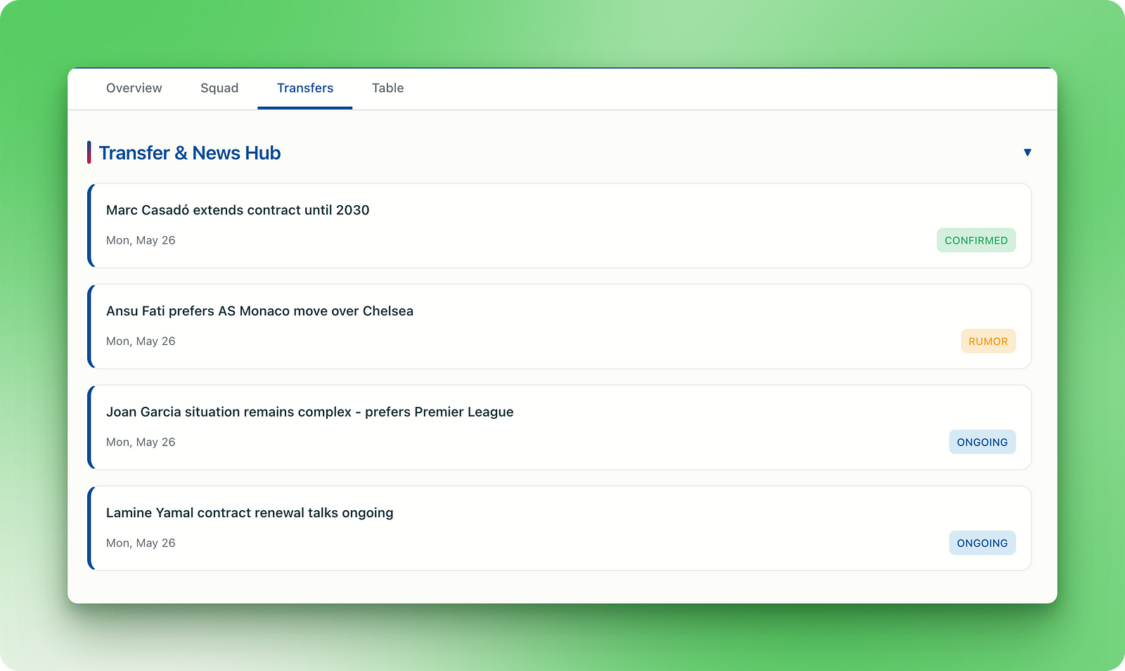
4. **Transfer & Rumor Hub** – A dedicated news section summarizing credible reports on potential signings, departures, renewals, and management changes.
5. **Additional Useful Features**:
* **League Standing** with live table updates
* **Injury List & Recovery Timelines**
* **Top Scorers & Assist Leaders**
* **Player Stats Summary** (minutes played, goals, assists, cards)
* **Manager and Staff Info**
* **Fan Polls or Reactions** for each match or transfer rumor
* **Live Match Alerts** and countdowns to kickoff
The dashboard should be visually engaging, mobile-friendly, and update automatically via APIs from trusted football data providers (e.g., Football-Data.org, Transfermarkt, ESPN, or Opta).Perplexity didn’t disappoint:
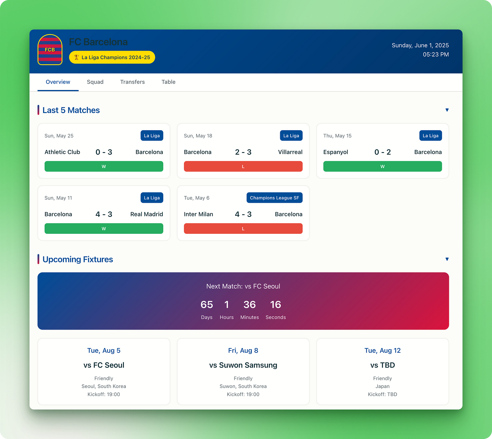
The application meets nearly all the requirements in the prompt with a nice UI in FC Barcelona’s official colors. It gives accurate information about the squad:
Additionally, there is a separate tab on rumors, potential transfers, and contract extensions:
However, there were a couple of inaccuracies in terms of contract extensions and injury updates but we can attribute these errors to flaws in the search process.
As a football fan, I know firsthand that even the best language models with deep research make mistakes when it comes to the complex world of football news. For example, ChatGPT makes similar mistakes when it comes to certain queries with complex timelines.
You can explore the application here.
The next project is about AI startups and shows the importance of clear instructions in prompts:
Build a dynamic web application that tracks top-funded startups in AI, machine learning, and data science worldwide. The dashboard should pull from reliable funding databases (e.g., Crunchbase, PitchBook, CB Insights, or open-source alternatives) and display a curated list of startups with the following information:
1. Name, logo, and founding year
2. Headquarters location (city, country)
3. Founders (with brief bios if available)
4. Total funding raised, funding rounds, and latest round date
5. Top investors and VCs
6. Key products, APIs, or technologies offered
7. Primary market focus or industry vertical
8. Website, social links, and hiring page (if available)
Dashboard Features:
* Filter & Search: By funding amount, country, industry, founding year, or investor
* Charts & Trends:
* Funding over time (line or bar chart)
* Top countries and industries by startup count
* Funding distribution by round type (Seed, Series A, etc.)
* Map View: Interactive global map showing startup HQs by funding volume
* Bookmark & Watchlist: Let users save startups they’re interested in tracking
* Automatic Updates: Sync regularly with open APIs or scrape if permitted
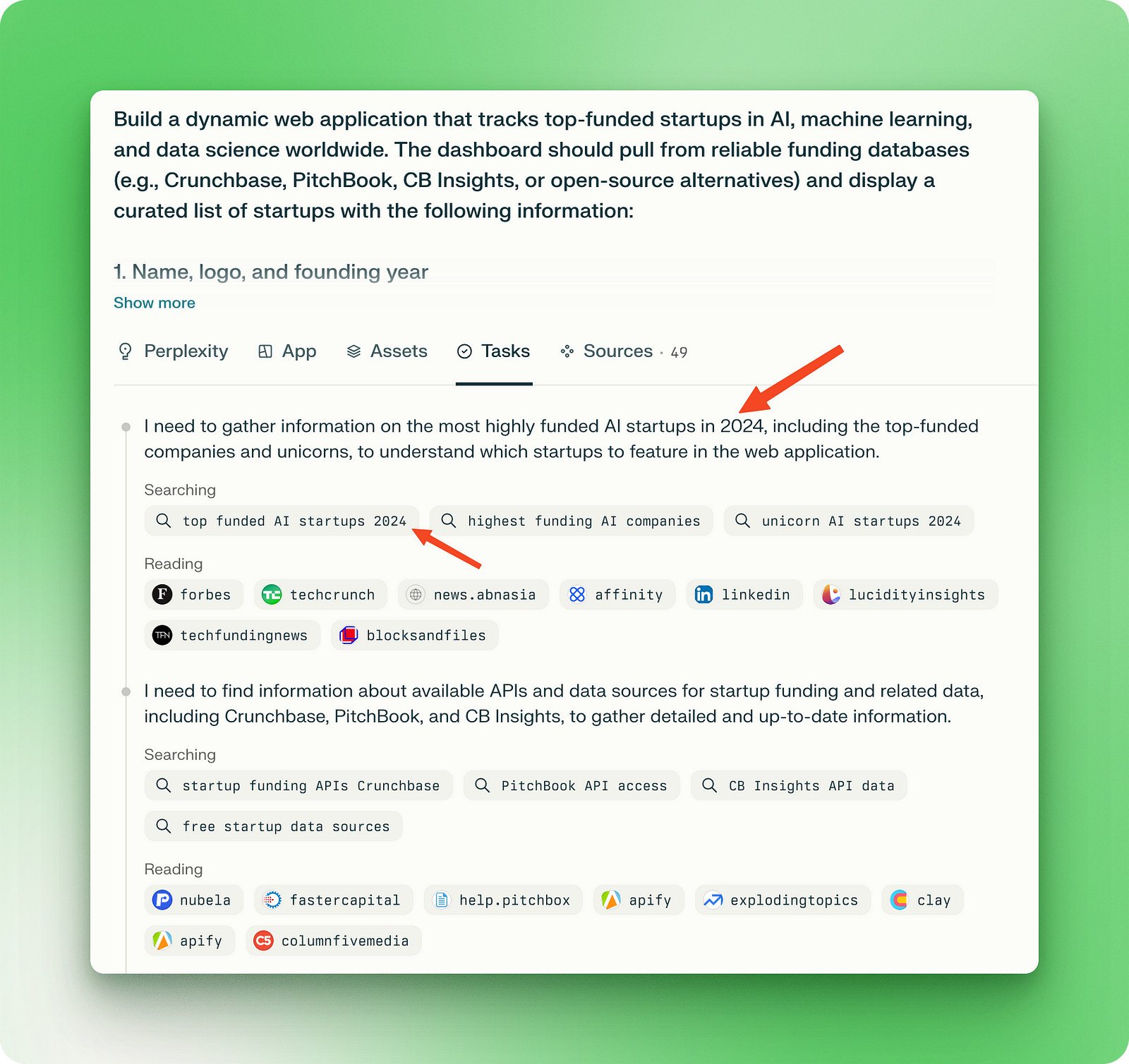
The UI should be clean, responsive, and professional—suitable for founders, investors, or researchers. Prioritize intuitive UX, minimal loading times, and visual clarity for data-heavy views. Add dark mode and export-to-CSV optionsEven though the prompt is well-structured and detailed, it is missing a key piece of information — the fact that we are living in 2025. This is reflected in all the tasks Perplexity executed, thinking that the year is 2024:
Subsequently, the application UI uses the flawed research results:
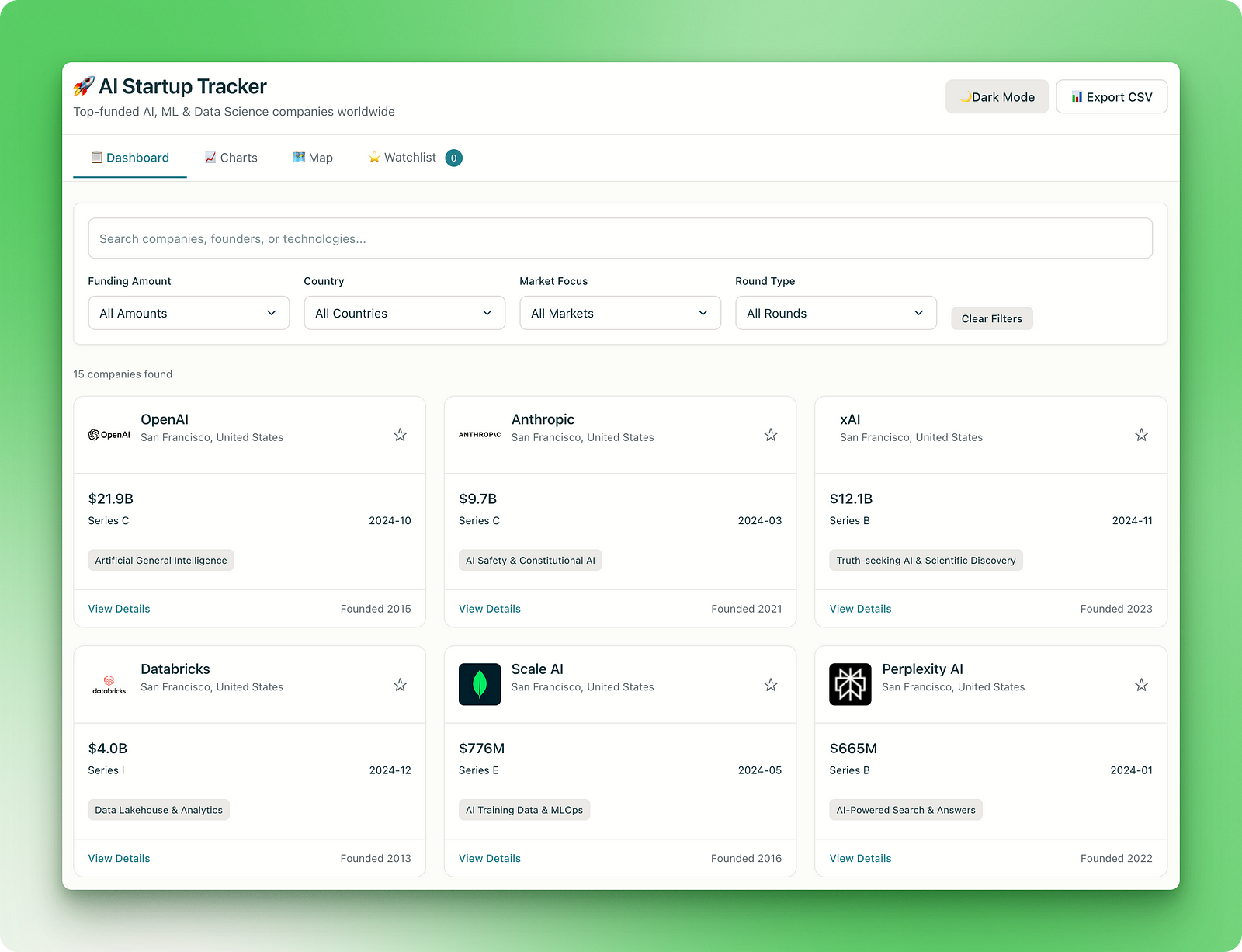
As you can see, the latest funding amounts are all from 2024. For example, OpenAI broke the record for the most amount of money raised in a single round in March 2025 with over $40 billion.
Apart from that, the main dashboard interface is functional and the dark mode works. But the “Charts” and “Map” tabs show illegible plots and the watchlist and “Export to CSV” functionalities don’t work at all.
Explore the Lab here.
Lastly, I wanted to build a dashboard showing global conflicts. Since this project needed real-time information too, I made sure to mention the year in the prompt:
Create an interactive web dashboard that visualizes ongoing global conflicts, geopolitical tensions, and humanitarian crises in real time in 2025 June. The app should display a world map with clickable regions that surface detailed, verified information on each active conflict or crisis. Use reputable sources such as CrisisWatch, UN OCHA, ACLED, and major news outlets to provide live updates.

Each conflict entry should include:

1. Conflict name and affected regions
2. Key actors or parties involved (governments, rebel groups, coalitions, etc.)
3. Timeline of major events or escalations
4. Current status (active fighting, ceasefire, post-conflict recovery)
5. Human impact (displacement, casualties, humanitarian aid needs)
6. Links to news articles, UN reports, and crisis briefings
7. Tags (e.g., civil war, territorial dispute, ethnic violence)

Dashboard Features:

* Filter by region, conflict type, escalation level, or last update
* Time slider to visualize conflict evolution over weeks/months
* Toggle between map view and table/list view
* Live alerts for newly emerging conflicts or ceasefire violations
* Shareable conflict reports or exports (PDF/CSV)
* Optional integration with Twitter/X and RSS for news stream

Design the UI for clarity and urgency, with accessible visuals and support for mobile devices. Make it useful for analysts, journalists, NGOs, and concerned citizens
The initial version of this app produced a non-responsive page. Still, when I pasted the same prompt to a new Lab, Perplexity produced the most visually striking and satisfying example in our list:
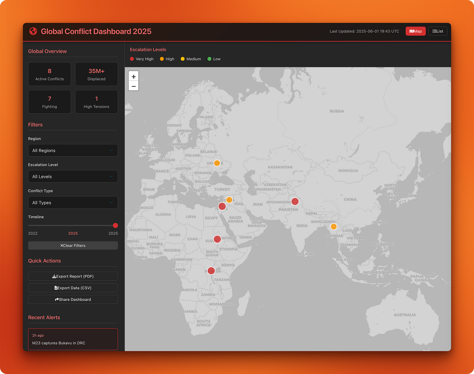
All aspects of the application are on point—the figures are accurate, the controls work, there are live alerts, and features that are yet to be implemented have a nice pop-up to nudge the user to add backend functionality.
Besides, the application’s black and red theme matches the context. The app lists the eight active conflicts with different color marks depending on the escalation level.
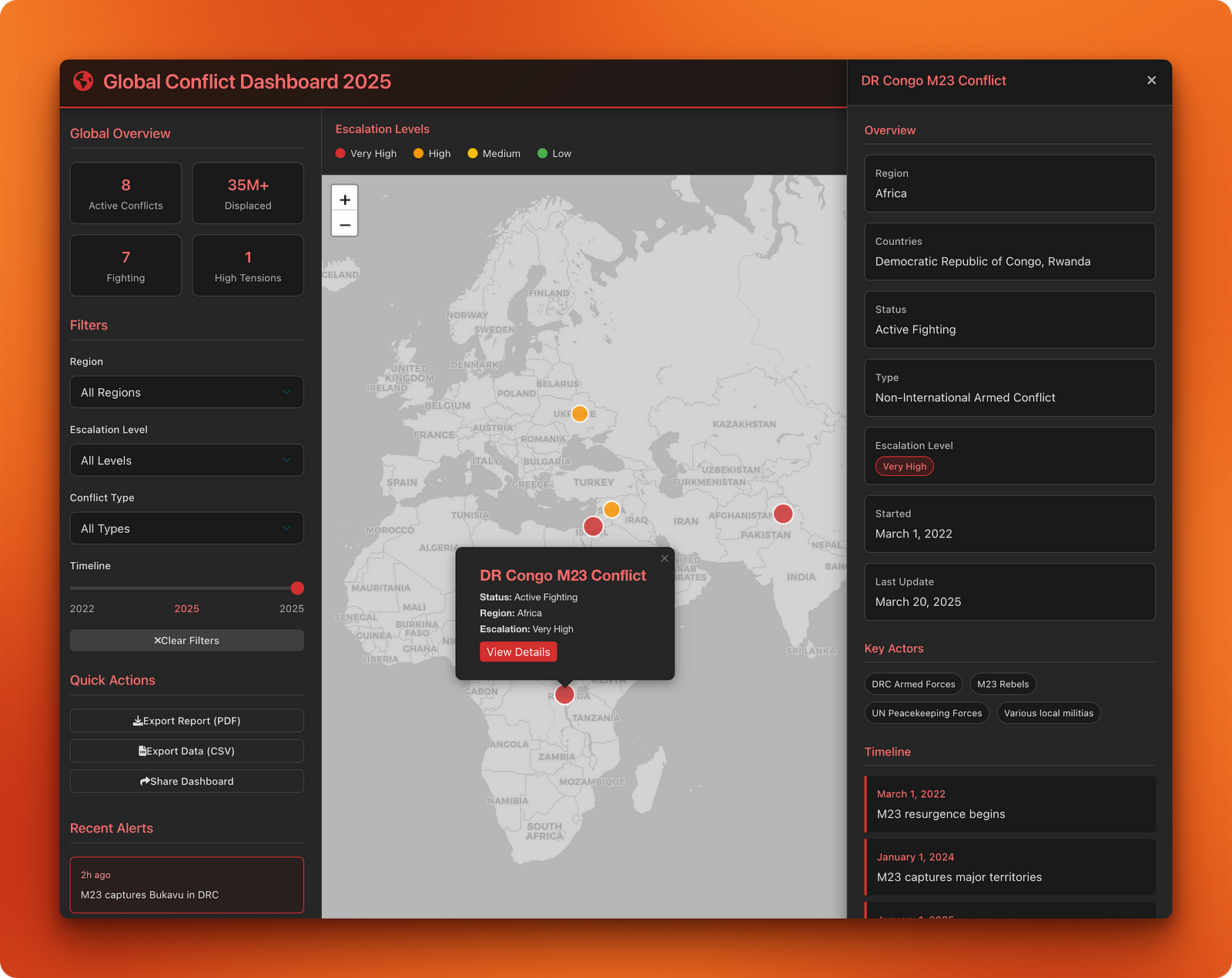
Clicking on any active conflict brings up a detailed card:
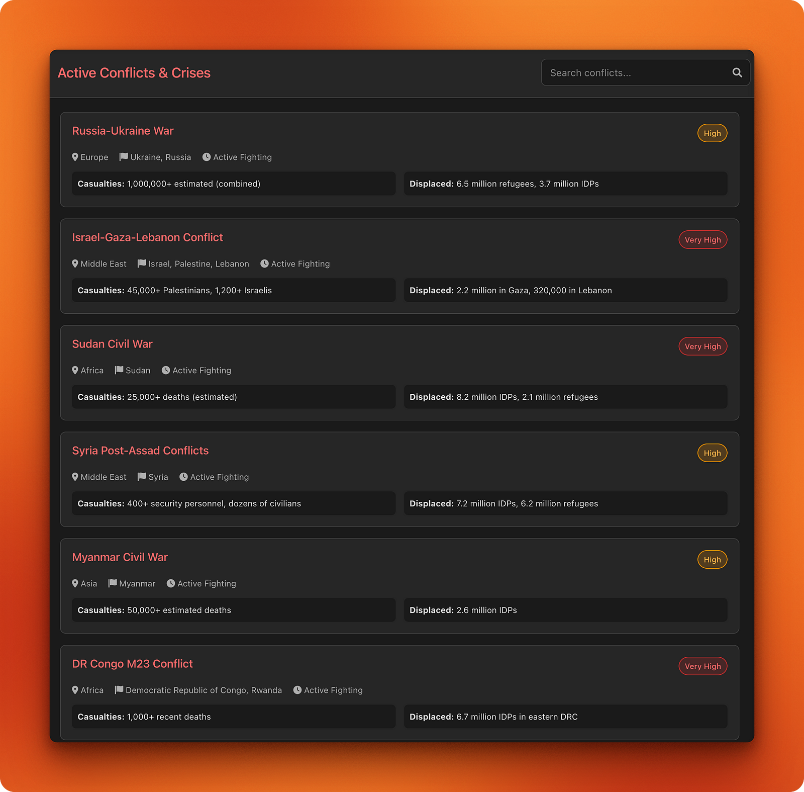
The list view shows a complete conflict list with the most important points summarized:
Explore the dashboard here.
As with any coding assistant, writing good prompts makes all the difference, and the examples we’ve just seen prove this point. To generate the prompts for these projects, I gave my rough ideas and requirements to ChatGPT to refine them.
I find that this approach works much better than manual prompt engineering since LLMs are getting much better at writing instructions to make themselves work better. Still, prompt engineering is an iterative process — as you saw, even the prompts generated by ChatGPT can fail in certain areas without your supervision.
When you test Perplexity Labs across different project types, you’ll find it offers impressive capabilities for combining research, data analysis, and web development into a single workflow.
Our examples showed that if you provide well-structured, detailed prompts, you can expect functional applications with clean interfaces and working features, while vague instructions produce disappointing results.
The testing has also revealed some limitations you should consider before relying on Labs for important projects. For instance, we’ve seen that real-time data accuracy remains inconsistent, especially for rapidly changing information like sports statistics or current events, and the system tends toward over-engineering when you request iterative improvements.
Despite these constraints, the $20 monthly subscription gives you access to a tool that would typically require expertise across multiple domains — from research and data analysis to UX design and web development — making it a valuable option when you need rapid prototyping and exploratory projects.
If you want to explore more AI tools, check out the following tutorials:
Learn AI with these courses!
Course
Course
Course
blog
Vinod Chugani
8 min
blog
Alex Olteanu
8 min
blog
Tom Farnschläder
8 min
Tutorial
Dr Ana Rojo-Echeburúa
Tutorial
François Aubry
Tutorial
Marie Fayard