Track
Classification models are among the most commonly used predictive algorithms. Various algorithms can be used to model a process, but how do you identify which model is the most effective one?
Model selection involves evaluating different models based on their performance metrics, such as precision, recall, F1-score, and AUC-ROC. While metrics like precision, recall, and F1-score provide insights about which model best fits the data, they do so only at a single threshold. On the other hand, the AUC-ROC, or Area Under the Receiver Operating Characteristic Curve, is a robust metric that evaluates the goodness of the model across the full spectrum of thresholds.
In this post, we'll understand what makes AUC-ROC a go-to metric for evaluating the performance of binary classification models and how we can use it to distinguish between the two classes. As we get started, consider also enrolling in our Machine Learning Scientist with Python career track. It will make you an expert in sklearn, which we will be using throughout this tutorial.
Become an ML Scientist
What is the ROC Curve?
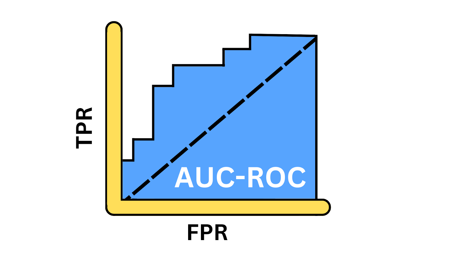
The ROC curve gives a visual representation of the trade-offs between the true positive rate (TPR) and false positive rate (FPR) at various thresholds. It provides insights into how well the model can balance the trade-offs between detecting positive instances and avoiding false positives across different thresholds. AUC, or Area Under the Curve, is a single scalar value ranging from 0 to 1, that gives a performance snapshot of the model. You only calculate AUC after generating the ROC curve because the AUC represents the area beneath the curve.

AUC-ROC Curve illustration. Image by Author
True positive rate
The true positive rate, also known as sensitivity or recall, reflects a model’s ability to correctly identify positive instances. It measures the proportion of actual positive cases that the model successfully identifies. Mathematically, this can be expressed by the following equation:

Where:
- TP or true positives are the number of positive class records the model correctly predicts as positive.
- FN or false negatives are the number of positive class records the model incorrectly predicts as negative.
False positive rate
FPR represents how often our model incorrectly classifies negative class instances as positive. It measures the proportion of actual negative instances that are incorrectly identified as positive by the model, indicating the rate of false alarms. Mathematical this can be expressed as follows.

Where:
- FP or false positives are the number of negative class records that are incorrectly predicted as positive.
- TN or true negatives are the number of negative class records that are correctly predicted as negative.
Why use the AUC-ROC curve?
Let’s understand scenarios where AUC-ROC is a more relevant metric.
Measuring performance
AUC-ROC provides an aggregate performance measure across all possible classification thresholds. Unlike accuracy, precision, or F1-score that depend on a specific threshold, it considers the model performance at different operating points.
Model comparison
AUC-ROC is a single scalar value that makes it easier to compare multiple models, regardless of their classification thresholds. Its threshold-independent nature makes it a better choice to draw a fair comparison between models with different optimal thresholds.
Looking at class imbalance
Most real-life datasets are imbalanced where one class is disproportionately more than the other, for example, sentiment analysis, fraud detection, and cancer detection. In such scenarios, metrics like accuracy provide a misleading assessment of model performance as they are biased toward the majority class. In such scenarios, metrics like AUC-ROC are more reliable.
Key Concepts of the AUC-ROC Curve
Let’s take a look at some of the key ideas.
Creating a ROC curve
To bring the ROC curve to life, we’ll calculate TPR and FPR at various thresholds. Let’s start with importing the libraries required for this demo.
from sklearn.model_selection import train_test_split
from sklearn.datasets import make_classification
from sklearn.linear_model import LogisticRegression
from sklearn.metrics import roc_auc_score, accuracy_score, precision_score, recall_score, f1_score, confusion_matrix, roc_curve, auc
import matplotlib.pyplot as plt
Next, we will generate a binary classification dataset using the make-classification() function, with 1000 samples and 20 features.
# Generate a binary classification dataset
X, y = make_classification(n_samples=1000, n_features=20, n_classes=2, random_state=0)
Let’s divide the dataset into training and test data–we’ll train the model on training set and measure its performance on the unseen test dataset.
# Split the dataset into training and testing sets
X_train, X_test, y_train, y_test = train_test_split(X, y, test_size=0.3, random_state=0)
Next, we define the model object by calling the LogisticRegression() class and then train it using the fit method on the training data, where X_train has the features and y_train represents the labels.
# Train a Logistic Regression model
model = LogisticRegression()
model.fit(X_train, y_train)
Now, the model is trained and ready to generate predictions. We call the predict_proba() function to generate the probability of a positive class. We use the predict() method to compute evaluation metrics such as accuracy, precision, recall, and F1-score.
# Predict the probabilities for the test set
y_probs = model.predict_proba(X_test)[:, 1]

# Predict the classes for the test set
y_pred = model.predict(X_test)
Next, we compute and print all these metrics using their respective functions.
# Calculate the AUC - ROC score
roc_auc = roc_auc_score(y_test, y_probs)

# Calculate other metrics
accuracy = accuracy_score(y_test, y_pred)
precision = precision_score(y_test, y_pred)
recall = recall_score(y_test, y_pred)
f1 = f1_score(y_test, y_pred)

# Print the metrics
print(f"AUC - ROC Score: {roc_auc:.2f}")
print(f"Accuracy: {accuracy:.2f}")
print(f"Precision: {precision:.2f}")
print(f"Recall: {recall:.2f}")
print(f"F1 Score: {f1:.2f}")
AUC-ROC Score: 0.93
Accuracy: 0.87
Precision: 0.87
Recall: 0.87
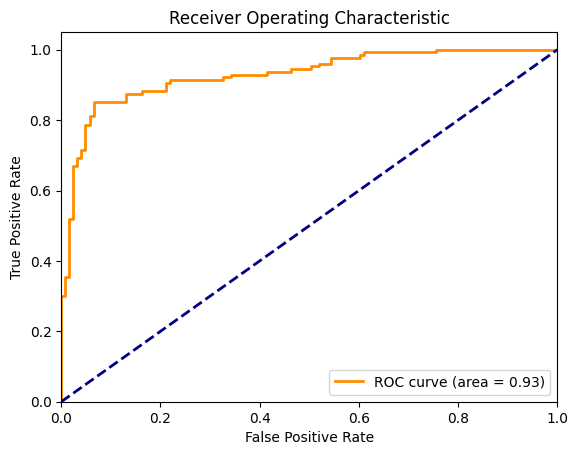
F1 Score: 0.87Now, let’s visualize the ROC curve along with the diagonal line representing a random chance model. To compute this, we require FPR and TPR for every discrete threshold between 0 and 1. In the graph below, the orange curve represents the ROC and the area under this curve is 0.93.
# Plotting the ROC Curve
fpr, tpr, thresholds = roc_curve(y_test, y_probs)
roc_auc = auc(fpr, tpr)

plt.figure()
plt.plot(fpr, tpr, color='darkorange', lw=2, label=f'ROC curve (area = {roc_auc:.2f})')
plt.plot([0, 1], [0, 1], color='navy', lw=2, linestyle='--')
plt.xlim([0.0, 1.0])
plt.ylim([0.0, 1.05])
plt.xlabel('False Positive Rate')
plt.ylabel('True Positive Rate')
plt.title('Receiver Operating Characteristic')
plt.legend(loc="lower right")
plt.show()
ROC curve for logistic regression. Image by Author
Choosing the Best Algorithm using the ROC Curve
Now, let’s use the same dataset and compare the performance of four classification algorithms using ROC. We will start by importing the RandomForestClassifier, KNeighborsClassifier, and SVC and compare these with the LogisticRegression.
from sklearn.ensemble import RandomForestClassifier
from sklearn.neighbors import KNeighborsClassifier
from sklearn.svm import SVC

# Define the models
models = {
    "Logistic Regression": LogisticRegression(),
    "Random Forest": RandomForestClassifier(),
    "SVM": SVC(probability=True),
    "K-Nearest Neighbors": KNeighborsClassifier()
}

# Initialize a dictionary to store AUC - ROC scores
roc_auc_scores = {}

# Plot the ROC curves
plt.figure(figsize=(10, 8))

for name, model in models.items():
    # Train the model
    model.fit(X_train, y_train)

    # Predict the probabilities
    y_probs = model.predict_proba(X_test)[:, 1]

    # Calculate the AUC - ROC score
    roc_auc = roc_auc_score(y_test, y_probs)
    roc_auc_scores[name] = roc_auc

    # Compute ROC curve
    fpr, tpr, _ = roc_curve(y_test, y_probs)

    # Plot ROC curve
    plt.plot(fpr, tpr, lw=2, label=f'{name} (AUC = {roc_auc:.2f})')

# Plot the diagonal 50% line
plt.plot([0, 1], [0, 1], color='navy', lw=2, linestyle='--')

# Customize the plot
plt.xlim([0.0, 1.0])
plt.ylim([0.0, 1.05])
plt.xlabel('False Positive Rate')
plt.ylabel('True Positive Rate')
plt.title('ROC Curve Comparison')
plt.legend(loc="lower right")
plt.show()

# Print the AUC - ROC scores for each model
for name, score in roc_auc_scores.items():
    print(f'{name}: AUC - ROC = {score:.2f}')
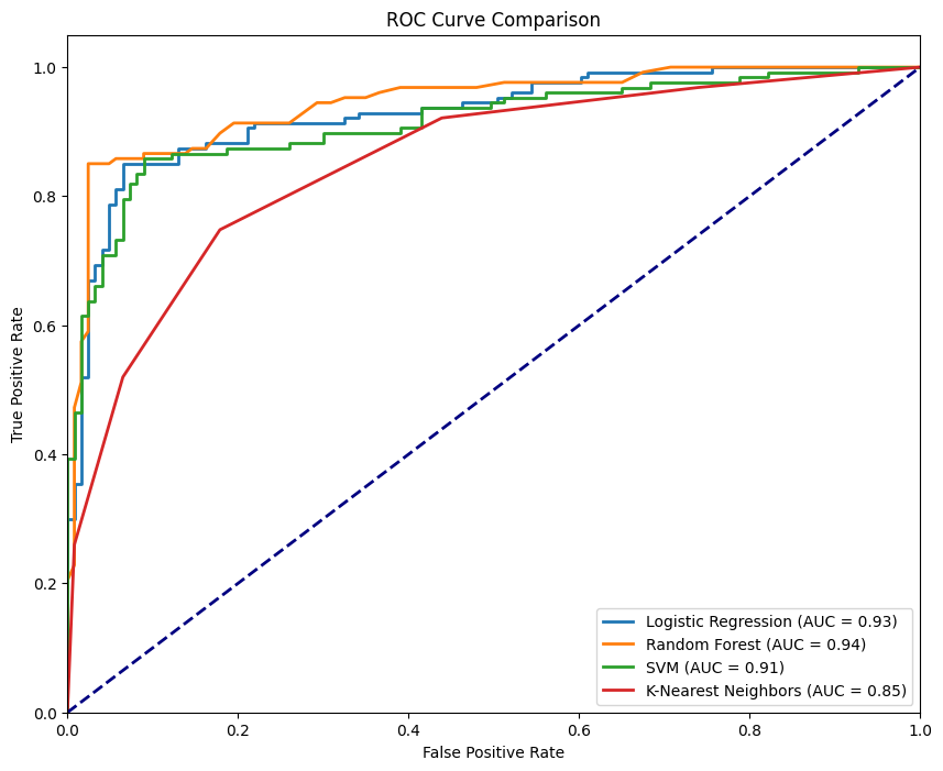
For each model object, we repeat the fit() and predict_proba(), compute the corresponding FPR and TPR, and then plot their respective curves.

ROC curve for different models. Image by Author
The figure above shows all four curves corresponding to the four classifiers, where the RandomForestClassifier performs the best with an AUC-ROC of 0.94 while the KNeighborsClassifier is the least performing with an AUC-ROC of 0.85. An ideal model would hug the top-left corner of the plot—where TPR is maximized and FPR is minimized. The closer the curve gets to this point, the better the model’s performance.
How to Read and Understand the AUC-ROC Curve
Let's break down the metrics the AUC-ROC curve provides and understand their significance.
Interpreting the AUC value
AUC values provide a quick reference to understand how well the model is performing. When AUC is close to 1, our model is at the top of its game. It shows excellent performance with a strong ability to distinguish between classes. AUC around 0.5 is a concerning scenario, as it highlights that the model isn’t doing any better than random guessing, signaling no discriminatory power. An AUC score closer to 0 is an alarming situation. This indicates the model is getting it entirely wrong, even worse than a coin toss.
True positive rate: measuring success
TPR, or sensitivity, is a critical metric that tells how well our model is capturing the positive instances. TPR is calculated as the proportion of actual positives correctly identified by the model. It’s a key indicator of our model’s effectiveness in detecting the true signals (positives). High TPR means our model is doing a great job of recognizing what matters most.
False positive rate: gauging the noise
On the flip side, FPR helps us understand the noise—how often our model falsely identifies negatives as positives. FPR is the proportion of actual negatives that our model incorrectly flags as positives. It’s a vital metric for assessing the trade-offs our model is making. A high FPR indicates a tendency to produce false alarms, which can be costly depending on the application.
Balancing sensitivity and specificity
The beauty and the challenge of binary classification lie in the threshold settings and therefore we fine-tune our model's sensitivity (TPR) and specificity (1 - FPR). We can control how sensitive our model is to detecting positive class instances and reduce false positives by tuning the threshold. In most real-world scenarios, the cost of false negatives (missing a positive) versus false positives (false alarms) can vary significantly.
Real-World Use Cases of the AUC-ROC Curve
AUC-ROC isn’t just a theoretical concept; here is how this practical metric is used across industries to drive critical decisions:
Medical diagnostics
AUC-ROC is used to compare different diagnostic tests. It is especially useful when the cost of false negatives (for example, missing a disease) can be much more than false positives (for example, unnecessary treatment). A noteworthy example would be cancer screening, where the threshold for further testing can be adjusted based on risk factors and resource availability.
Fraud detection
Machine learning models are increasingly used to identify fraudulent activities in the financial sector. Considering that fraud transactions are significantly rare, such datasets are highly imbalanced. Therefore, AUC-ROC is an effective evaluation metric that also allows for adjusting the threshold based on various factors, such as the magnitude of the risk involved with the transaction, the cost of manually verifying each transaction and the cost of customer inconvenience.
Cybersecurity
Similar to fraud detection, cyber-attacks are also relatively rare events. Hence, AUC-ROC also finds application in cybersecurity, balancing between detecting threats and avoiding alert fatigue from false positives.
Alternatives to the AUC-ROC Curve
AUC-ROC is a popular metric for evaluating binary classification models, but there are scenarios where alternative metrics may be more suitable. Let's explore some alternatives and when to use them:
Precision-recall curve
The precision-recall curve (PRC) is a metric for imbalanced datasets that significantly impacts the value of the machine learning model when false positives and false negatives have different costs. Unlike AUC-ROC, which can give a misleadingly optimistic view in imbalanced datasets, PRC focuses more on performance concerning the positive class.
F1 score
The F1 score is the harmonic mean of precision and recall, providing a single metric that balances both. It's used when we need a clear, single-number summary of model performance especially in imbalanced datasets. AUC-ROC provides a more global view, while F1 is a specific point on the PRC curve.
Conclusion
AUC-ROC is a gold standard in binary classification problems because it provides a more balanced view of how well the model performs across different thresholds, especially in class-imbalance scenarios.
We believe that the best way to reinforce our learning is through hands-on practice. Python’s versatility gives us the perfect opportunity to master essential concepts. Whether we’re refreshing our fundamentals or exploring more advanced topics, now is the ideal time to dive in. Let’s revisit our Python basics and challenge ourselves by working with AUC-ROC on complex datasets.
Become an ML Scientist

I am an AI Strategist and Ethicist working at the intersection of data science, product, and engineering to build scalable machine learning systems. Listed as one of the "Top 200 Business and Technology Innovators" in the world, I am on a mission to democratize machine learning and break the jargon for everyone to be a part of this transformation.
Frequently Asked Questions
What is AUC?
What is the AUC-ROC curve?
The AUC-ROC curve is a graph that illustrates the performance of a binary classification model across various thresholds by plotting the True Positive Rate against the False Positive Rate.
Why is the AUC-ROC curve important in model evaluation?
The AUC-ROC curve provides a comprehensive performance measure across all thresholds, making it particularly useful for comparing models and evaluating their ability to distinguish between classes.
How is the AUC score interpreted?
The AUC score ranges from 0 to 1, where a score closer to 1 indicates excellent model performance, 0.5 suggests random guessing, and a score near 0 means poor performance.
When should I use AUC-ROC over other metrics?
AUC-ROC is ideal when you need a threshold-independent metric, especially in cases of imbalanced datasets where traditional metrics like accuracy can be misleading.
What are some alternatives to the AUC-ROC curve?
Alternatives include the precision-recall curve for imbalanced datasets and the F1 Score, which balances precision and recall, offering a specific point evaluation rather than an overall performance view.

