
Track
Excel Fundamentals
16 hr
Excel is a data analysis tool that is used in many enterprise settings. Having a good grasp of Excel fundamentals is critical for any data professional, regardless of their technical acumen in Python or SQL. You may be used to creating visuals in Excel, but using sparklines is a creative way of generating space-efficient visualizations.
Excel Sparklines are small charts that sit inside cells that provide quick, visual summaries of data trends. Since sparklines sit within spreadsheet cells, they are a compact way to visualize data without taking up extra space. They’re especially useful for spotting trends at a glance. Excel supports three main sparkline types: Line, Column, and Win/Loss, each designed for different analytical needs.
Example of Sparklines from Excel
Whether you prefer using Excel’s interface or formulas, here are two quick ways to add sparklines for instant trend insights:
Method 1 – Ribbon (Classic Way)
Method 2 – Formula (Microsoft 365 / Excel Online) In F2, enter:
=SPARKLINE(B2:E2)
Or customize:
=SPARKLINE(B2:E2, {"charttype","column"; "color1","green"})
Before jumping into Excel, it helps to understand where sparklines came from and how they fit into the broader world of data visualization.
The concept of sparklines was popularized by Edward Tufte, a pioneer in data visualization who described them as “intense, simple, word-sized graphics.” His vision was to make visualizations compact enough to embed in text or tables, providing context without clutter. Microsoft later integrated sparklines into Excel (starting with Excel 2010), making them accessible to a broad audience of data practitioners.
Excel supports three primary types of sparklines:
By choosing the right type, you can ensure your sparkline communicates insights effectively. It is always good to think about how graphs appear in spreadsheets to choose the right visualization.
Creating sparklines in Excel is pretty straightforward for tabular data organized in a sequence. Once we get our data organized properly, it takes only a few clicks to generate sparklines.
Sparklines work best with clean, tabular data. Arrange your values in rows or columns with consistent intervals (such as months, quarters, or categories). Watch out for missing values or inconsistent formats, as these can distort the sparkline’s meaning.
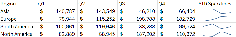
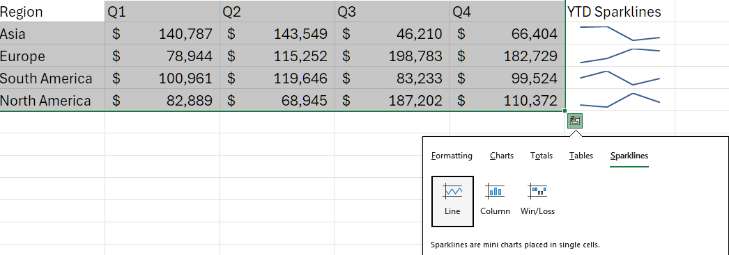
Take, for example, the data we had in the first image:
|
Region |
Q1 |
Q2 |
Q3 |
Q4 |
|
Asia |
$ 140,787 |
$143,549 |
$46,210 |
$66,404 |
|
Europe |
$78,944 |
$115,252 |
$198,783 |
$182,729 |
|
South America |
$100,961 |
$119,646 |
$83,233 |
$99,524 |
|
North America |
$82,889 |
$68,945 |
$187,202 |
$110,372 |
The data here is organized by region over four quarters. This is the ideal organization for sparklines.
If you’re using Excel for Microsoft 365 or Excel for the Web, you can create sparklines directly with a formula instead of the ribbon tools. This method is especially handy when building dynamic dashboards or working with structured tables.
Using the sample data:
| Region | Q1 | Q2 | Q3 | Q4 | Trend |
|---|---|---|---|---|---|
| Asia | 140,787 | 143,549 | 46,210 | 66,404 | (Sparkline here) |
In cell F2, enter the following formula:
This creates a line sparkline summarizing Asia’s quarterly performance. Note that this formula also works in Google Sheets.
To customize it, you can specify the chart type and color:
Then, drag the formula down through F3:F5 to generate sparklines for other regions (Europe, South America, North America).
This formula-based method automatically updates as your data changes, making it perfect for interactive financial or sales dashboards.
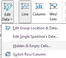
To insert a sparkline in other versions of Excel, highlight the data range and go to the Insert tab. In the top ribbon, there should be a section labeled Sparklines. Select Line, Column, or Win/Loss Sparkline. For our purposes, we will choose Line.
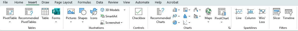
Sparkline is to the right of Charts
You’ll then specify the location range—the cell(s) where the sparkline will appear.
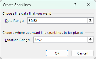
Choose the columns of interest
This will generate the sparklines similar to above in the column location you’ve selected. If you drag the bottom right corner down to the other rows, it will automatically generate the other sparklines as shown below:
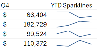
Final output of the sparklines
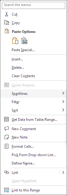
Alternatively, you can use Excel’s Quick Analysis tool to create sparklines instantly. You can do this by highlighting your dataset and clicking on the quick analysis tool in the bottom right.
Sparklines can also be inserted into multiple cells simultaneously, making it easy to apply them across rows of data.
The Create Sparklines dialog box provides control over both the Data Range (your values) and the Location Range (your sparkline cells). For dynamic data, you can use named ranges so that sparklines update automatically when new data is added. This is especially useful in financial models or dashboards.
Customization helps make sure sparklines follow graphical standards and stand out based on their level of importance.
Once you insert a sparkline, the Sparkline Tools Design tab appears, just like any other chart in Excel. You can change your sparkline between different types of sparkline charts even after creation.
You can also change the color of the line and other components to better fit your organization’s graphical standards. Choosing the right colors can help with readability as well.
You can make sparklines more informative by customizing markers, adjusting axes, and changing line width. For instance, you can highlight the highest/lowest points in a sparkline to show overall differences, negative points to show poor performance, or combined with the first/last point to show changes over time.
You can even customize the colors for each of these markers and increase the thickness of lines to further improve visibility.
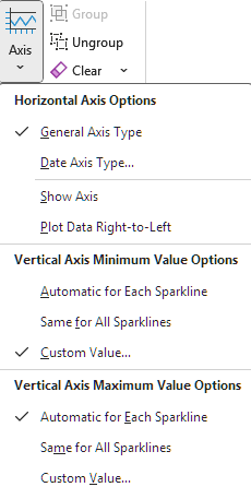
Adjusting your axes helps with readability. Sometimes default scaling can exaggerate or downplay differences, especially if there is high variability in data between rows. You can set consistent minimum and maximum values for the vertical axis to help with readability and reduce misunderstandings with the data.
The Style Gallery offers quick formatting presets, which can be great for applying custom formats to your sparklines. Grouping sparklines ensures multiple sparklines share the same formatting, while ungrouping allows individual customization.
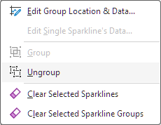
Settings where you can group/ungroup sparklines
You can also resize the cells containing sparklines. Making these cells wider helps show more detail in the trends, while making them smaller improves compactness. Choose the right width to showcase detail without becoming overwhelming.
Axes aren’t always visible in sparklines, but customizing them can make comparisons clearer.
By default, Excel auto-scales sparklines so that the entire line fits inside the cell. This could be misleading if different rows have vastly different values. You can set fixed minimum and maximum values to avoid misleading representations. For multiple sparklines, synchronizing axes ensures differences reflect real variation rather than scaling artifacts. You can also choose to show or hide the horizontal axis depending on your design needs.
Data isn’t always perfect, and sparklines need rules for how to treat gaps. This is particularly important for the Line style of sparklines. You can find these settings under the “Edit Data” dropdown in the ribbon.
In Excel’s settings, you can control whether empty cells are shown as gaps, zeros, or connected lines. A gap means that the data will be shown until the next valid point. Zeros will make the sparkline go to zero for a missing point. A connected line is the default and will simply draw a line connecting points and fill in gaps for lines. This can be misleading as it might show a trend that does not really exist.
Similarly, you can decide whether sparklines should ignore hidden rows and columns. These options prevent misinterpretations and ensure your visualization aligns with analytical intent.
Managing sparklines across multiple cells helps make them look consistent, and deleting unnecessary sparklines can reduce clutter.
Grouping allows you to apply consistent formatting across multiple sparklines at once. Ungrouping restores independence so you can customize them individually. This flexibility is valuable for balancing consistency with customization. This setting is in the top ribbon in the “Group” section.
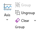
If your data changes, you can edit the data or the location range of sparklines through the “Edit Data” option. This lets you add more columns, change rows, and so on to make sure the sparkline is accurately reflecting the correct data. To remove sparklines entirely, use the Clear button in the Design tab under “Group”. You are unable to delete individual sparklines manually.
Sparklines become even more powerful when combined with Excel Tables and PivotTables.
As we’ve shown above, you can place sparklines in any cell and use data present in the selected range. In structured tables, sparklines can automatically expand with new rows or columns if we select a wider range, which helps ensure dynamic updates. This makes them particularly effective for growing datasets like monthly financials or sales logs.
Adding sparklines to PivotTables allows interactive exploration of trends across different categories or time periods. However, PivotTables can change structure when refreshed, so careful placement and formatting are important to avoid broken references. Make sure not to override your sparklines when generating new information in your pivot table.
Sparklines are super useful, but as with any data visualization, it’s super easy to create misleading visualizations. Let’s follow some best practices we’ve been mentioning to help minimize any misleading graphics.
Place sparklines near their data for context; putting them too far away reduces their readability. Keep axis scaling consistent across sparklines to ensure fair comparisons.
Use colors that align with your workbook’s theme or your organization’s graphic standards. Be aware of color blindness and select colors that ensure accessibility. Apply markers selectively to highlight key values rather than overwhelming the visualization.
Ensure data accuracy before creating sparklines. Document assumptions (like axis scaling) so collaborators understand how to interpret them.
Even well-prepared sparklines may face issues. Here are some common problems we run into when creating sparklines.
Errors often arise from incorrect data ranges or inconsistent scaling. Missing a column of data or selecting the wrong row can really throw your sparklines off, especially if you are updating the data with deletions. Double-check your references and consider setting fixed axis values when comparing across rows.
Versions of Excel before Excel 2010 won’t be able to view sparklines so when sharing workbooks, make sure recipients have a compatible version. In very large datasets, sparklines may slow down calculations, so consider limiting their use to summary rows.
Sparklines provide a nice little niche for data visualizations that need compactness and efficiency.
Traditional charts provide more detail, labeling, and interactivity. You can add things like callouts, and they might be better for transferring to something like PowerPoint slides. Sparklines, however, excel in compactness and at-a-glance trend analysis. Think of using sparklines for summaries or high level overviews and traditional charts for your core analysis.
Sparklines work well with conditional formatting, offering both numeric and visual cues. You can color sparkline cells based on a variety of conditional factors and can easily format based on trends.
Compared to specialized tools like Tableau or Power BI, sparklines are lightweight and integrated into Excel but lack advanced interactivity and scalability. You might find Tableau or Power BI better for more complex graphs that have a lot of row-level data that needs to be presented simultaneously, but sparklines really give a simple way to do that without needing extra software.
Sparklines have a wide variety of use cases in different industries like finance, sales, and healthcare.
Let’s look at a few use cases in different industries.
By embedding sparklines directly into spreadsheets, organizations can enhance day-to-day decision-making without requiring external tools.
Excel Sparklines are powerful mini visualizations that make trends and comparisons easy to see without overwhelming your spreadsheets. By mastering their creation, customization, and best practices, you can transform raw data into clear, contextual insights. While sparklines have limitations, they shine when used strategically alongside other visualization techniques. To get a better sense of Excel and data visualization in general, check out the following resources:
Top DataCamp Courses
Track
Course
Course
Tutorial
Aditya Sharma
Tutorial
Jess Ahmet
Tutorial
Javier Canales Luna
Tutorial
Joleen Bothma
Tutorial
Samuel Shaibu
Tutorial
Derrick Mwiti