Track
Excel Fundamentals
16 hr
Excel can help you manage and visualize project schedules without needing additional software, especially through the use of a Gantt chart; a simple yet powerful way to track tasks, deadlines, and dependencies over time. These charts provide a structured approach to project management, helping teams and individuals stay organized.
In this guide, I’ll walk you through how to build a Gantt chart in Excel, customize it to fit your needs, and even automate task dependencies to make scheduling easier. Whether you're working solo or managing a team, a good Gantt chart can make a huge difference.
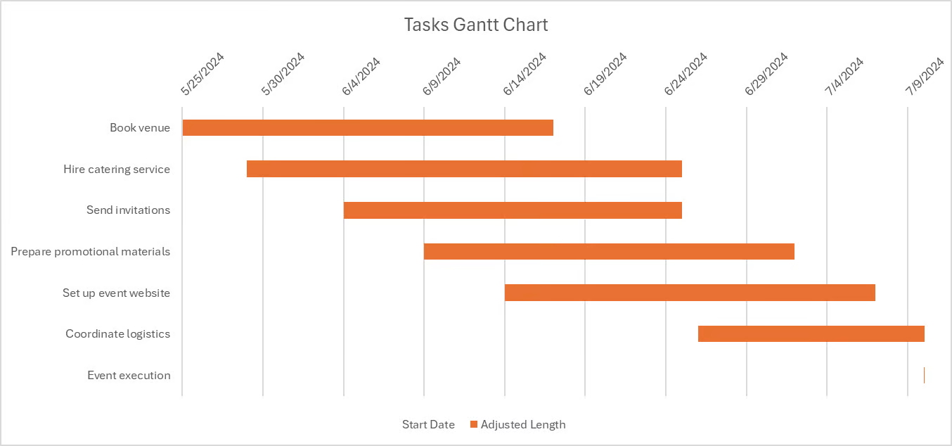
A Gantt chart is a visual timeline that helps in tracking project tasks over time. It consists of horizontal bars that represent different tasks, with their positions indicating the start and end dates. This format makes it easier to see dependencies, track deadlines, and identify potential delays.
These charts are commonly used in project management, task scheduling, and workflow planning. For example, a marketing team might use a Gantt chart to track campaign launches, a construction company can use it to plan building phases, and a student can organize assignments leading up to an exam.
Let’s take a look at the process for creating a Gantt chart in Excel. If you’re looking for other methods, check out our guides on creating Gantt charts in matplotlib and how to make a Power BI Gantt chart.
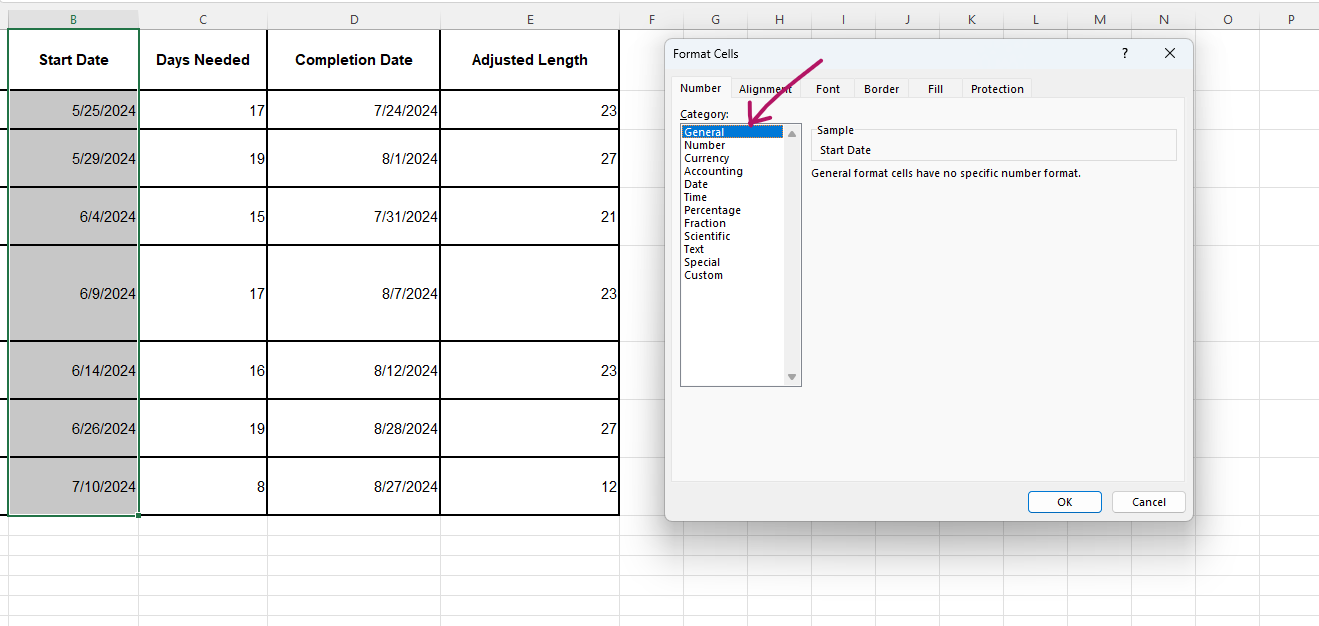
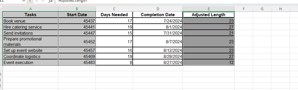
We need a structured dataset before creating the chart. For our example, the table should include columns for Task Name, Start Date, Duration, and End Date. The End Date is usually calculated by adding the Duration to the Start Date using a simple formula in Excel.
For instance, if your data is in Excel with:
Then in D2, the formula would be:
=B2 + C2For example:
|
Tasks |
Start Date |
Days Needed |
Completion Date |
Adjusted Length |
|
Book venue |
5/25/2024 |
17 |
7/24/2024 |
23 |
|
Hire catering service |
5/29/2024 |
19 |
8/1/2024 |
27 |
|
Send invitations |
6/4/2024 |
15 |
7/31/2024 |
21 |
|
Prepare promotional materials |
6/9/2024 |
17 |
8/7/2024 |
23 |
|
Set up event website |
6/14/2024 |
16 |
8/12/2024 |
23 |
|
Coordinate logistics |
6/26/2024 |
19 |
8/28/2024 |
27 |
|
Event execution |
7/10/2024 |
8 |
8/27/2024 |
12 |
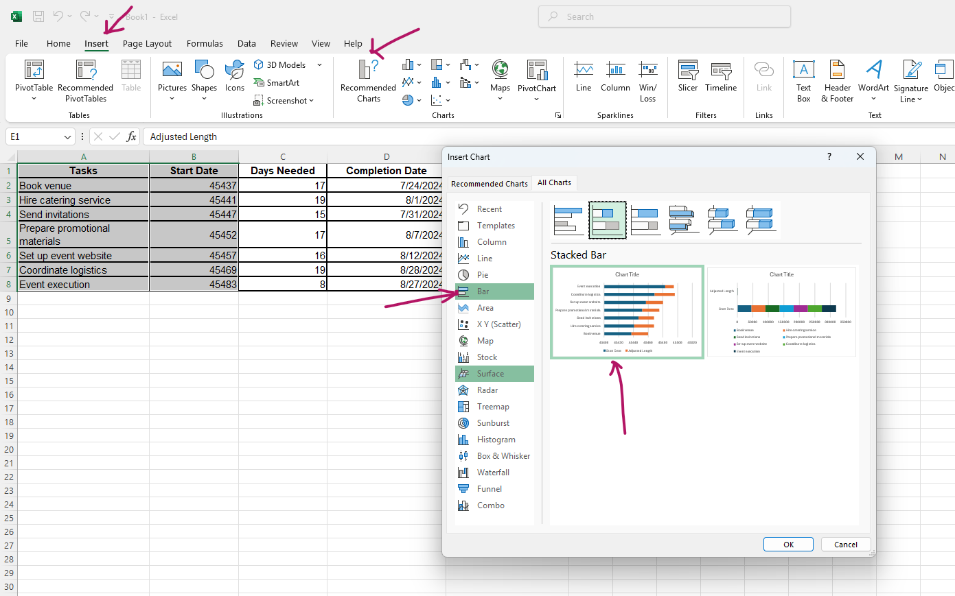
Once the data is ready, use a stacked bar chart to display it as a Gantt chart. To do this:
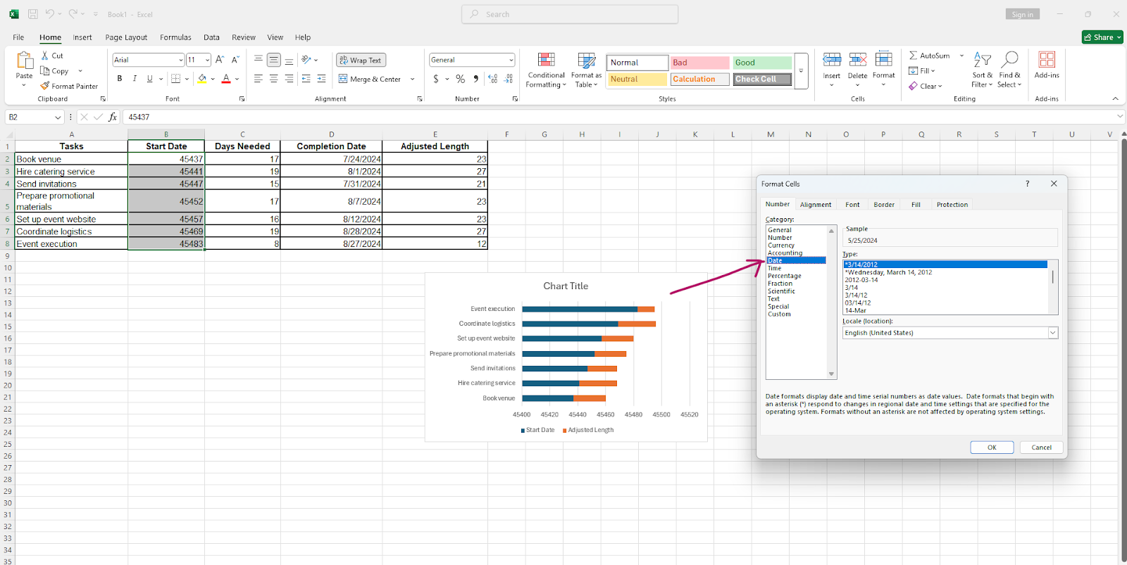
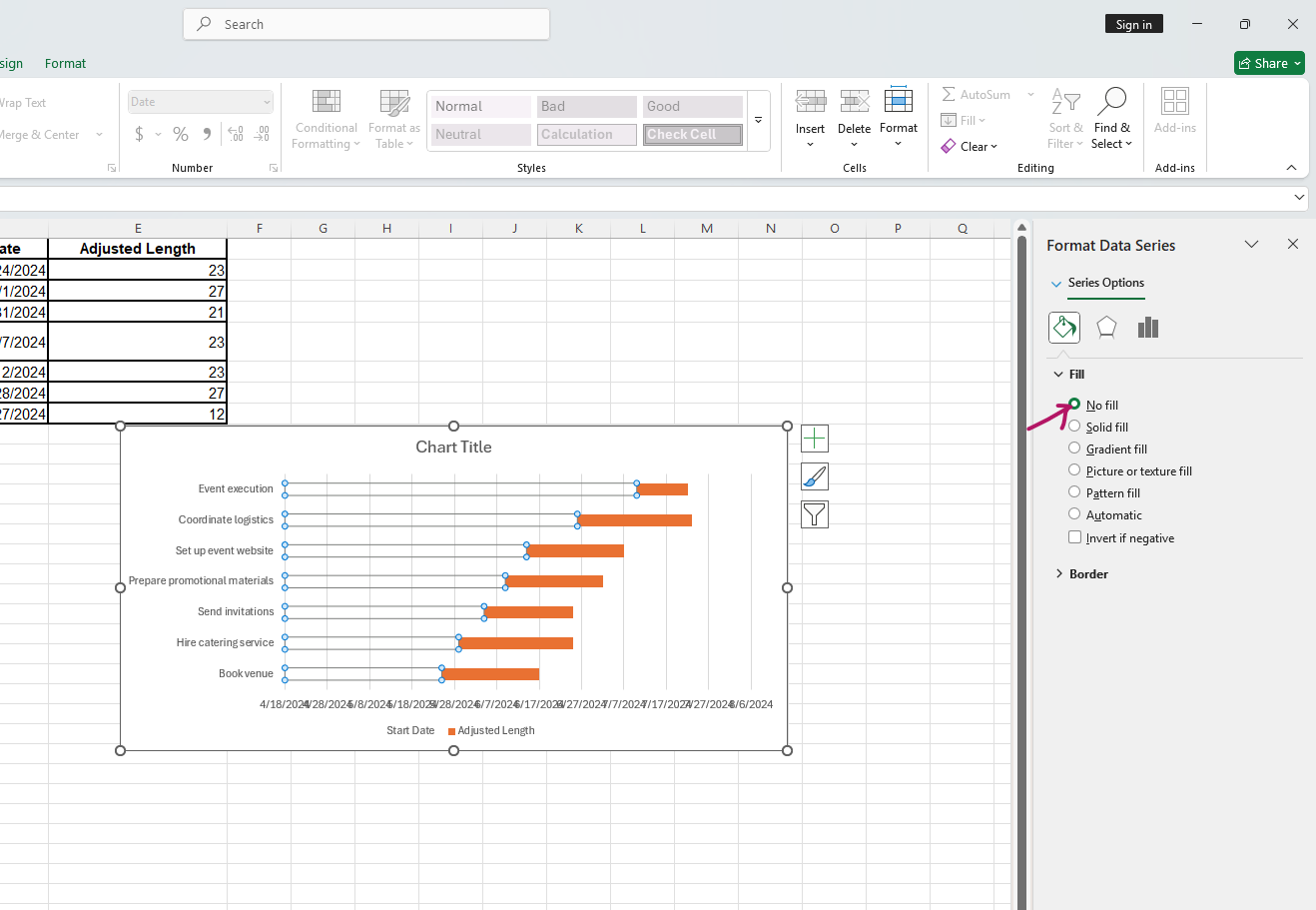
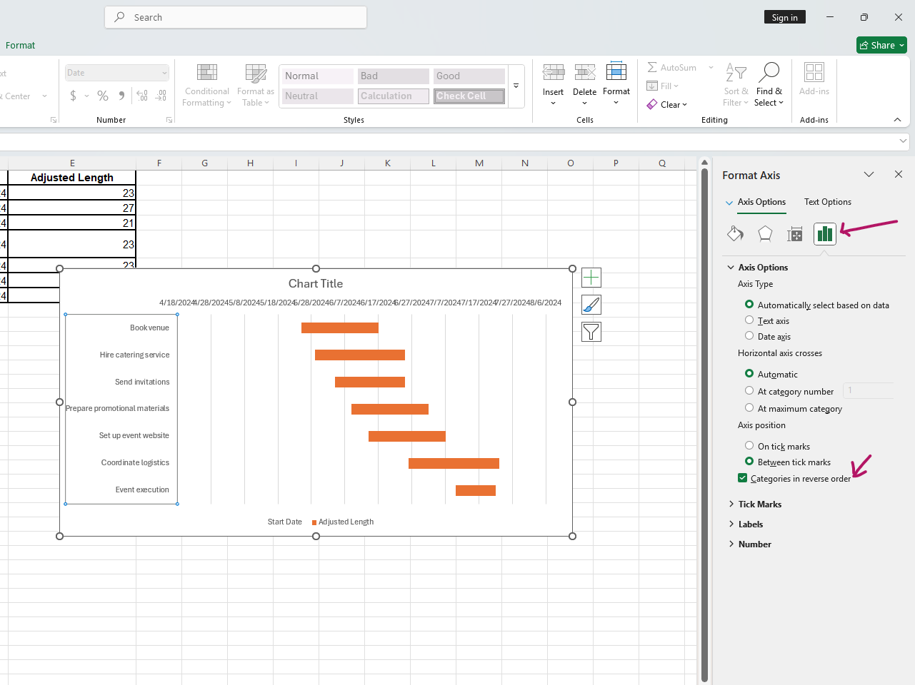
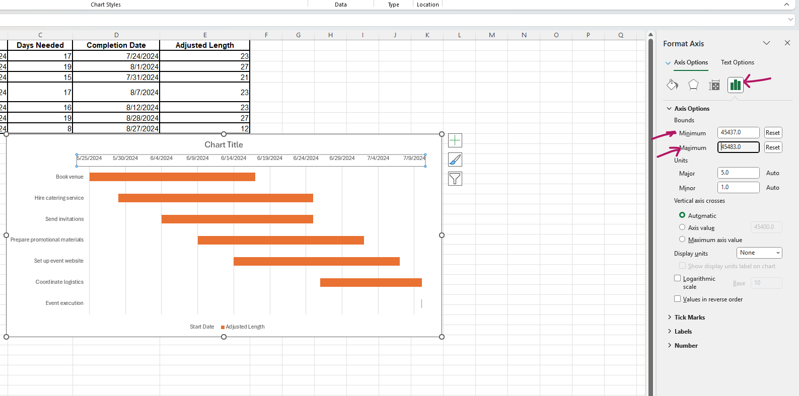
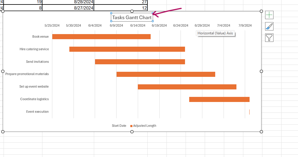
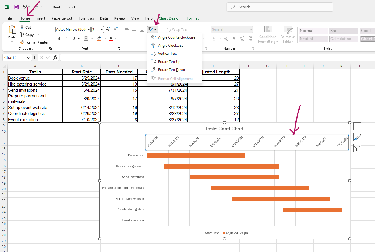
You can make the chart easier to read by making the following adjustments:
Now that we have a basic Gantt chart set up, the next step is to incorporate task dependencies. This helps ensure that tasks start in the correct order and adjust dynamically as the project evolves.
Dependencies indicate that a task cannot start until another is completed. For example, writing a report might depend on completing research. A new column can be added to track which tasks depend on others.
To make it easier, you can use Gantt templates that already include the dependencies functionality.

By using Excel formulas, you can adjust dates automatically based on dependencies. Use the WORKDAY Excel function to skip weekends, ensuring a more realistic schedule. For example:
=WORKDAY(B2, C2)This feature ensures that the next task starts only after the previous one is completed, making the chart dynamic.
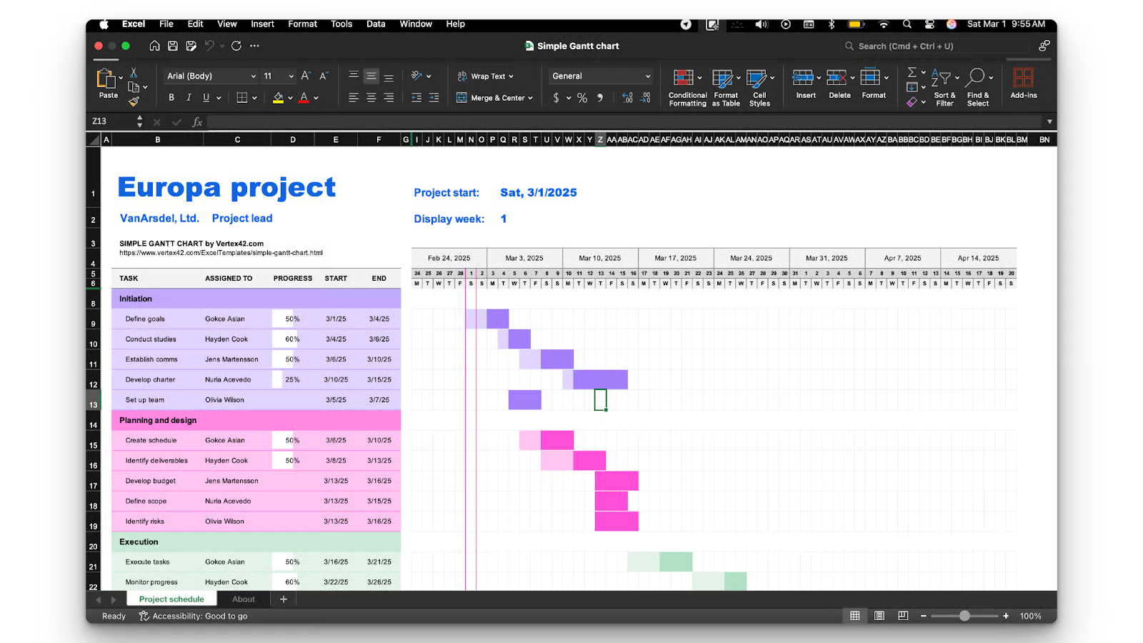
If building a Gantt chart from scratch feels overwhelming, templates can be a great alternative. Many free templates are available online that allow quick customization. These templates come with preformatted bars and formulas, making setup faster.
While templates save time, they may not always fit specific needs. Customizing a chart from scratch gives more flexibility, but a template can serve as a starting point.
You can get the template on the internet, for example, from Microsoft’s website. Download the template to use it in Excel.
Gantt charts are a powerful tool for visualizing project timelines and tracking progress. Consider a construction project to see how a Gantt chart works in practice.
For example, a construction company planning a new office building might break the project down into key phases: design, permitting, site preparation, foundation work, framing, electrical installation, and final inspections. Each of these phases depends on the completion of previous tasks, making a Gantt chart an effective way to manage dependencies and avoid delays.
With the project tasks and their timelines laid out, team members can adjust deadlines as needed, ensuring efficient coordination between subcontractors and suppliers.
Once the structured dataset is ready, you can create a Gantt chart using the same steps as before.
How to Make a Gantt Chart in Excel
Regular updates help in tracking progress, adjusting deadlines, and ensuring everything stays on schedule. A well-maintained Gantt chart keeps projects running smoothly, avoiding last-minute surprises.
Throughout this guide, we have explored how to create and customize a Gantt chart in Excel. By working through practical steps, we learned how to structure project timelines, visualize tasks, and manage dependencies efficiently.
From setting up a basic Gantt chart to incorporating task dependencies, Excel provides the flexibility needed to handle various project management needs. Following best practices, such as maintaining clear data organization, updating schedules regularly, and using formulas for automation, ensures that Gantt charts remain useful and easy to manage.
Understanding how to use Gantt charts in Excel helps improve task tracking and deadline management, whether planning a small project or overseeing a complex workflow. Apply these skills today to enhance your project planning process and keep everything on track. Refer to our Excel Fundamentals track to dive deeper into the essential Excel skills.
Top Excel Courses
Track
Course
Course
Tutorial
Adejumo Ridwan Suleiman
Tutorial
Derrick Mwiti
Tutorial
Samuel Shaibu
Tutorial
Laiba Siddiqui
Tutorial
Joleen Bothma
Tutorial
Oluseye Jeremiah