
Course
Introduction to Power BI
4 hr
793.3K
At times, projects can become large, making managing them complex. In Power BI, one helpful way to track and manage many tasks at the same time is the Power BI Gantt chart. In addition to aligning team members, these charts have been known to be good motivational tools by showing progress and milestones.
In this article, I will show you how to build a Gantt chart using custom visuals in Power BI. You will also learn how to customize and interpret a Power BI Gantt chart. If you are new to Power BI, check out our Power BI Fundamentals skill track to learn everything you need to know about one of the most (if not the most) popular business intelligence tools available.
A Gantt chart is a bar chart where each project task is represented by a horizontal bar. The start and end of this bar represent the task timeline. It also shows the relationship between bars and prerequisites before starting a particular task. A Gantt chart is made up of the following components:
Now, let’s go into how to create your own Power BI Gantt chart, which should make all these concepts clear.
The first step is to make sure you have installed Power BI Desktop. Also, download the project data we will use in this article.
A Gantt chart is not among Power BI built-in visuals, which means it’s a custom visual that you need to download. You do this by going to the Visualizations pane, on the ellipsis(...), and clicking on Get more visuals.
Note: to download custom visuals, you need a Power BI license. If you don’t have one, open a Microsoft Fabric account for a free Power BI license. We also have a blog post, What is Microsoft Fabric? If you want to do some research first.
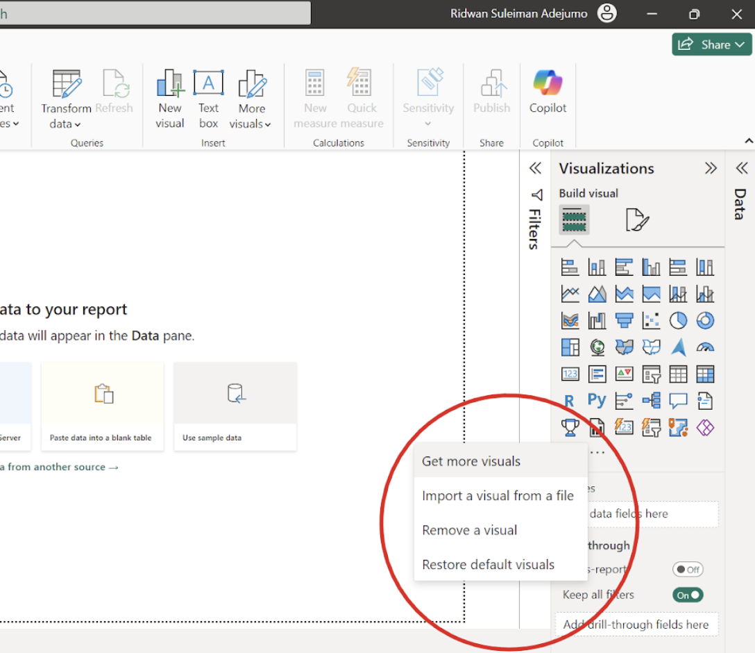
Downloading a Power BI Gantt chart. Image by Author
After the window opens, go to the search bar and type “Gantt” to get a list of various Gantt chart visuals, and select the one by Microsoft Corporation, then click the Add button.
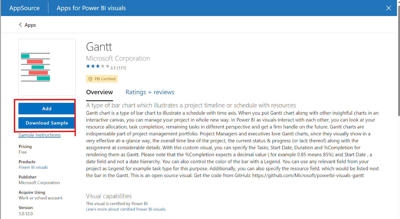
Adding the Gantt chart to Power BI. Image by Author.
The next important step to creating the Gantt chart visual is to structure your dataset based on the Gantt chart components discussed earlier. You need to ensure that your dataset has the necessary columns, such as:
Go to the Get Data icon under the Home tab on Power BI Desktop and click Text/CSV to import the project data.
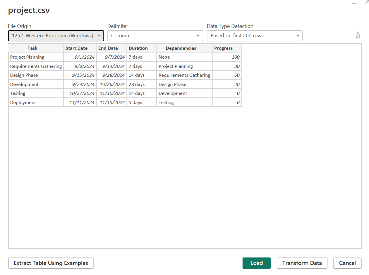
Seeing the project dataset preview. Image by Author.
If your dataset does not have the necessary chart columns, you can click the Transform Data button to apply the necessary transformations. On the preview window, click Load to load the data into Power BI.
Click on the Gantt chart icon on the Visualizations pane to apply an empty visual to the Power BI canvas. Select the empty visual and drag each field of your dataset to its respective Gantt chart field.
Note that you have to move the Dependencies field to the Power BI Gantt chart visual Resource field. Also, you can’t add Duration and End Date to a Gantt chart visual simultaneously. Instead, you choose Start Date with either Duration or End Date.
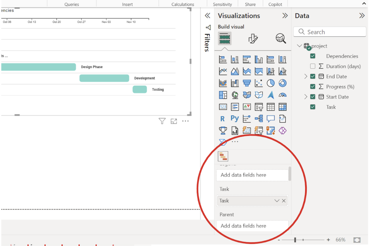
Power BI Gantt chart visual fields. Image by Author.
Master the world's most popular business intelligence tool.
Power BI gives you options to customize your Gantt chart visual, from changing the colors to axis labels and adding milestones to the Gantt chart visual.
You can change the colors of the bars to any color of your choice. To do that, select the Power BI Gantt chart visual on the canvas and go to the Format visual tab on the Visualizations pane. Then, select your preferred color under the Task Settings dropdown.
Changing the task column color in our Power BI Gantt chart. Image by Author.
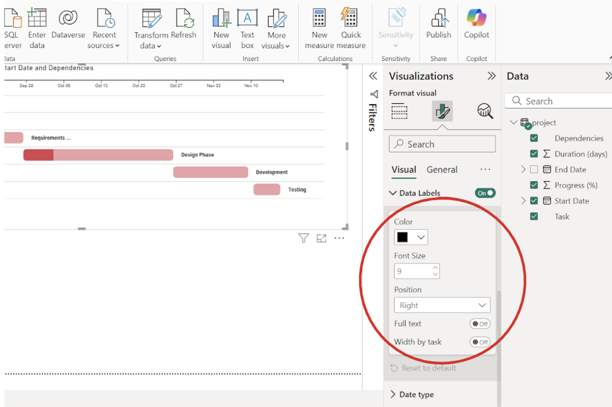
Below the Task Settings dropdown is the Data Labels dropdown, where you can format the labels of the Gantt chat visual.
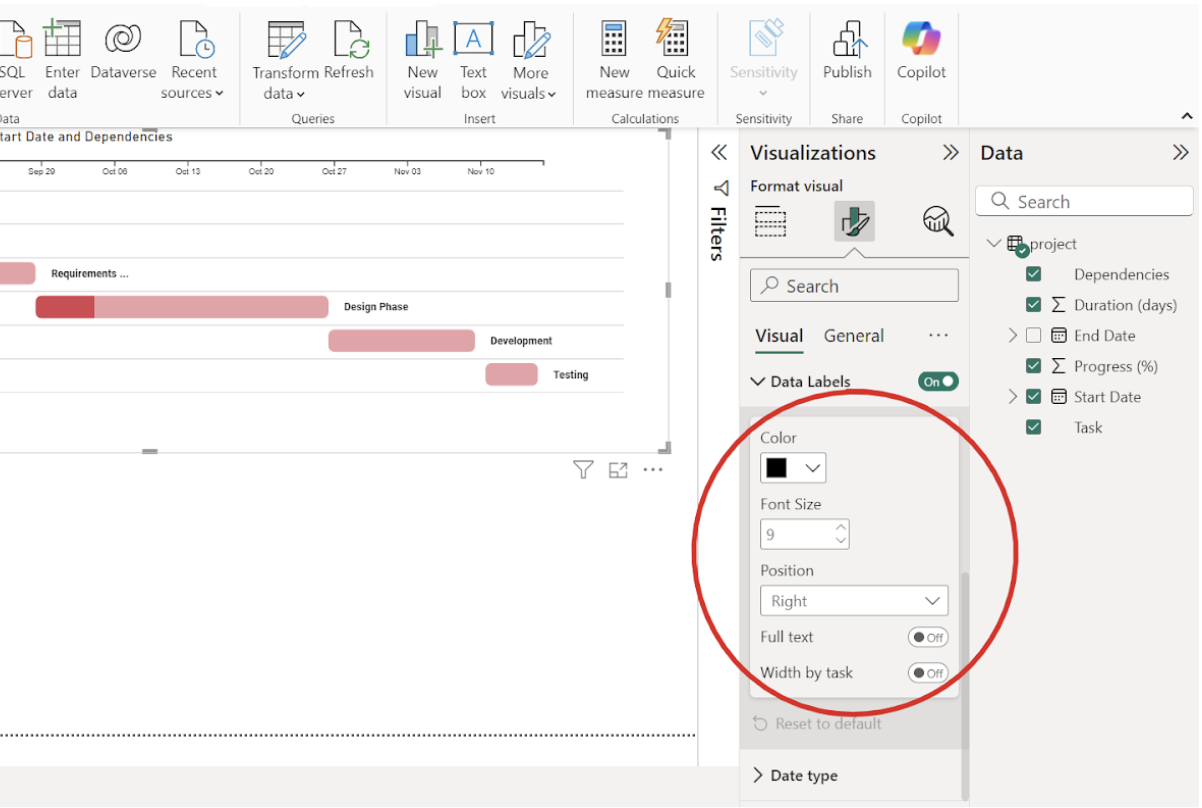
Formatting the Power BI Gantt chart data labels. Image by Author.
Milestones are used to mark significant events during a project lifecycle. You can add milestones in a Power BI Gantt chart visual by dragging any dataset field representing project milestones into the Gantt chart visual.
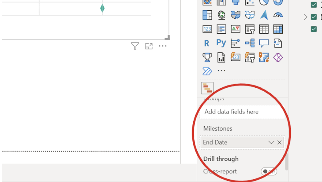 Adding milestones to the Power BI Gantt chart. Image by Author.
Let's now move on to how to interpret a Gantt chart visual so you can make the most out of it in your work.
A taskbar represents each project task timeline, and a dark color on a taskbar measures a task completion rate. Tasks already completed will have completely dark colors, while those still in progress will have shades of dark and light.
The x-axis represents the project tasks, while the y-axis is the project timeline. The Power BI tooltip lets you get detailed information about a task by hovering over the taskbar. This provides detailed information about a project task, such as the task name, start date, end date, progress, and the resources needed.
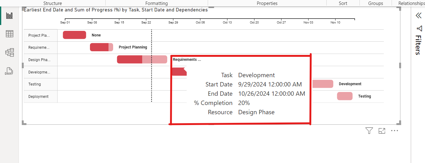
Use the tooltip to visualize task progress. Image by Author.
If you have added dependencies to your Gantt chart visual in Power BI, you should see the dependency next to each taskbar. The dependency is what you need to finish before moving on to the next task.
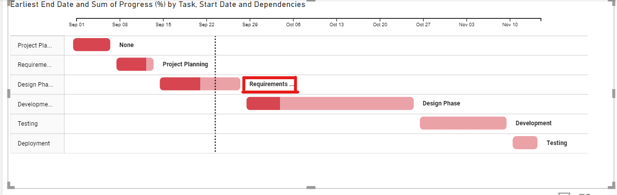
Seeing dependencies on our Power BI Gantt chart. Image by Author.
While trying to create a Gantt chart in Power BI, you may face some challenges due to not having the necessary Gantt chart columns or missing values in your dataset, or the Power BI Gantt visual not displaying correctly.
Before importing a dataset into Power BI, you can see a preview and see if the columns in the dataset are the necessary Gantt chart columns. You can click on the Transform button of the Power Query to open the datasets and see if there are any missing values or errors in the column formatting. These issues, if they exist, you can fix directly in the Power Query editor.
If you have created a Power BI Gantt Chart visual and you notice that after filling in all the fields, the visual is not displaying, the first thing you need to do is check if you have selected the proper fields from the dataset columns into the Gantt chart visual fields.
If you notice no problem with the fields, check your date columns and ensure they are in the proper format. Also, check the columns containing numeric values and ensure they are formatted as numbers, not strings. If you are using a dataset from a database, ensure your data model is specified correctly so that it can render. A final action is to reset and rebuild the visual. Starting afresh can help you identify where the problem is.
In this article, you have learned how to create and customize a Gantt Chart in Power BI and the steps to take when having issues creating one. The Format visual tab under the visualization pane offers many more customization options, which you can explore to make sure you have a beautiful Gantt chart that effectively explains and tracks your entire project, whatever it is.
To learn more about Power BI, check out the following DataCamp courses, skill tracks, and career tracks:
Also, to enhance your data visualization and storytelling skills, check out the following blogs, tutorials, and code-alongs:
Learn PowerBI with DataCamp
Course
Course
Course
Tutorial
Adejumo Ridwan Suleiman
Tutorial
DataCamp Team
Tutorial
Joleen Bothma
Tutorial
Kafaru Simileoluwa
Tutorial
Joleen Bothma
code-along
Nick Switzer