Course
Understanding Data Science
2 hr
856.8K
Pie charts are one of the most popular plots for visualizing proportions. You will probably know them by now, but if you don’t, just imagine a big pie, or a round Swiss cheese, cut into slices of different sizes.
Python offers multiple ways to create pie charts. In this tutorial, we will focus on how to create pie charts in Python using Matplotlib and Pandas, two of the most popular data analysis packages in Python. We will structure the article by method, so you can focus on the approach and syntax that fits better in your workflow.
In addition to these methods, we will provide some tips to enhance the, troubleshooting, accessibility, and usability of pie charts. Finally, we will also consider other chart alternatives that may be more suitable than pie charts in certain scenarios.
I’ll show you two different ways to create a Python pie chart, and you can decide for yourself which method you prefer. Both are popular and good options, so you can’t go wrong.
Let’s start analyzing how to create a pie chart with Matplotlib.
For this section, we will analyze data about the different courses available in the DataCamp course catalog, which you can find here. (I looked through the catalog and counted up the number of courses available in each technology and created a table with this info.)
To create our first pie chart with Matplotlib, we can use the plt.pie() function. We will use a list of the number of courses available for different data and AI technologies (each representing the wedge size), as well as a second list containing the names of the technologies, which will be included in the chart using the labels parameter. Alternatively, we can use plt.legend() to add a separate legend.
As usual, don’t forget to run the plt.show() at the end of your code to display the Matplotlib plot correctly.
import pandas as pd
import matplotlib.pyplot as plt

courses = [164, 127, 31, 31,12, 11]
labels = ['Python','R','SQL','Power BI','Excel','ChatGPT']
dictionary = {'courses':courses, 'labels':labels}
python_pie_chart_df = pd.DataFrame(dictionary)

plt.pie(x = python_pie_chart_df.courses, labels = python_pie_chart_df.labels)
plt.show()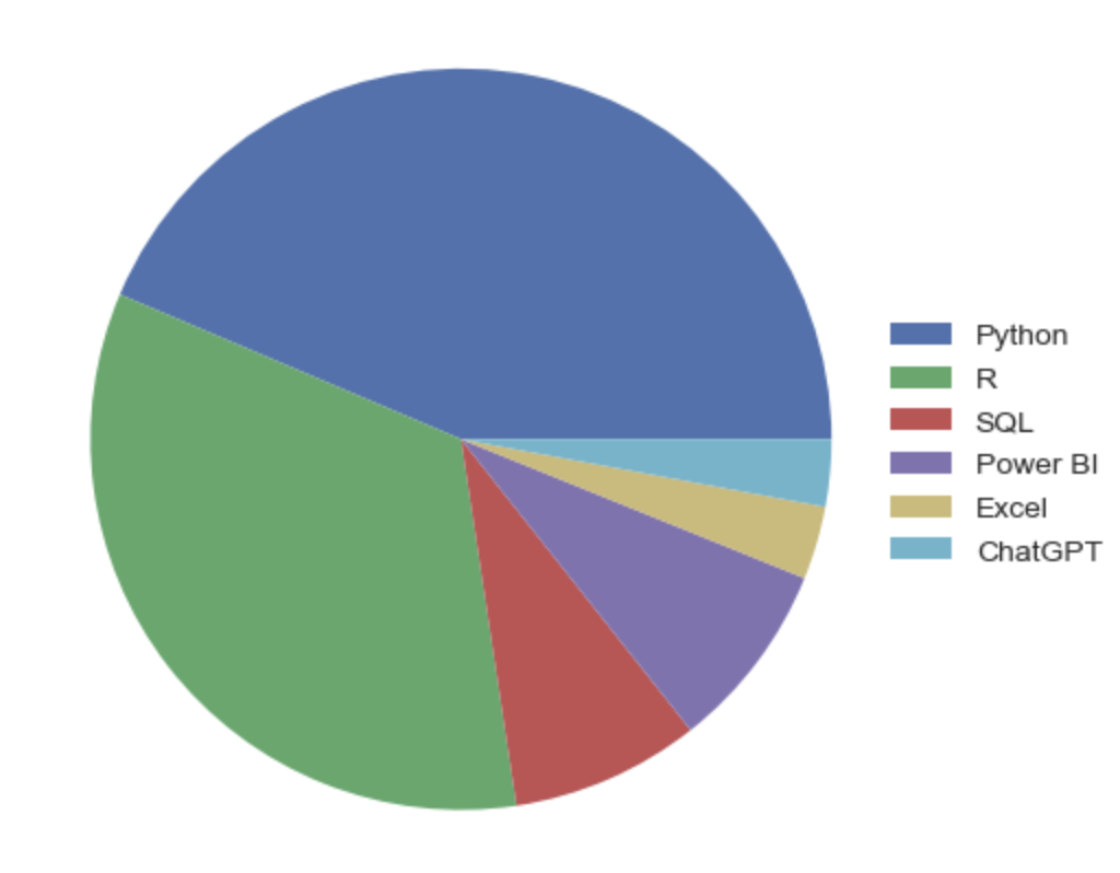
plt.pie(x = python_pie_chart_df.courses)
plt.legend(labels = python_pie_chart_df.labels, loc = [0.95,0.35])
plt.show()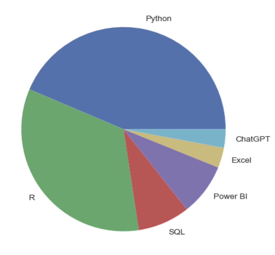
Additionally, we could also include the percentage of each wedge using the autopct parameter. In the following example, we include the size of the wedges using one decimal.
plt.pie(x = python_pie_chart_df.courses, labels = python_pie_chart_df.labels, autopct='%1.1f%%')
plt.show()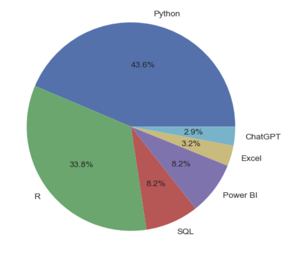
Pie charts in Matplotlib, as well as the slices that comprise them, are highly customizable. Let’s see some of the options that the pie.plot() function offers.
To change the color of the slices, we can use the colors parameter. We will use this parameter to apply DataCamp’s color palette to our chart.
datacamp_palette = ['#03ef62','#06bdfc','#ff6ea9','#ff931e','#ff5400','#7933ff']
plt.pie(x = python_pie_chart_df.courses, labels = python_pie_chart_df.labels, colors = datacamp_palette, autopct='%1.1f%%')
plt.show()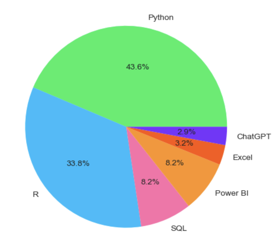
Looks way better, right? But there’s much more we can do to customize our pie chart. For example, we can play with the distance of the labels and the percentages, using the labeldistance and pctdistance parameters, respectively, and choose an angle to start the slicing with the startangle parameter.
plt.pie(x = python_pie_chart_df.courses, labels = python_pie_chart_df.labels, colors = datacamp_palette, autopct='%1.1f%%',
pctdistance= 0.8, labeldistance=1.1, startangle=180)

plt.show()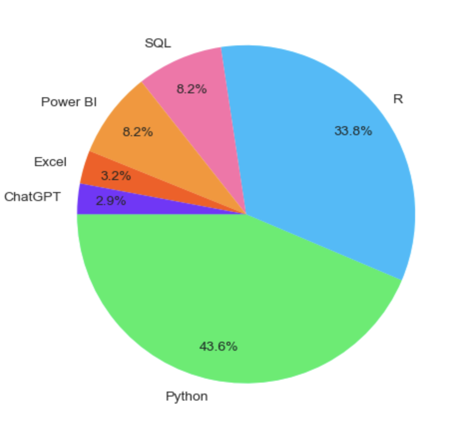
Finally, imagine you’re doing a presentation and want to focus on R courses. A handy way to highlight this is by exploding that wedge using the explode parameter, as follows:
explode = (0, 0.1, 0, 0, 0, 0)  # only "explode" the 2nd slice (i.e. 'R')

plt.pie(x = python_pie_chart_df.courses, labels = python_pie_chart_df.labels,
        colors = datacamp_palette, autopct='%1.1f%%',
        pctdistance= 0.8, labeldistance=1.1,
        startangle=180, explode=explode)

plt.show()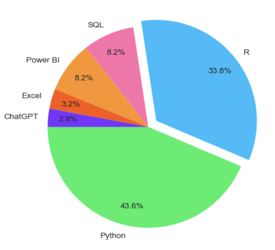
After you have created your pie chart, you are ready to share it with your collaborators. You can do this using the plt.savefig() function, which takes the file name as input to the function and allows you to save it in different formats, such as .png, .jpg, .svg, or .pdf. Additionally, you can use dpi to change the resolution of the image.
Here is an example of how to save your pie plot in .jpg format with 200 dots per inch.
plt.pie(x = df.courses, labels = df.labels,
        colors = datacamp_palette, autopct='%1.1f%%',
        pctdistance= 0.8, labeldistance=1.1,
        startangle=180, explode=explode)

plt.savefig('demo.jpg', dpi =200)
You can learn more about how to properly save visualization in our Introduction to Data Visualization with Matplotlib course.
Now that you know how to create a pie chart with Matplotlib, let’s see how it works in Pandas.
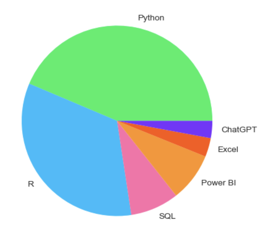
Pandas has a plot() method that can be used to draw several types of plots. This method works on both the DataFrame and Series objects in Pandas. The kind argument in the plot() method can help you specify the type of plot. In our case, you can create a pie chart using kind ='pie'. You can also add the labels parameter to include a name in every wedge and the autopct parameter to add the percentages of each slice.
python_pie_chart_df['courses'].plot(kind='pie', labels=python_pie_chart_df['labels'], autopct='%1.1f%%')
plt.show()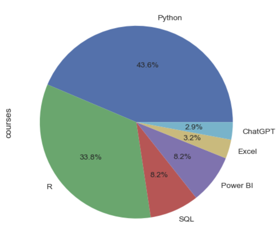
Pandas' plot() method provides a tool for quick plotting but comes with limited customization options. Fortunately, the method uses Matplotlib as a backend, meaning that you can use Matplotlib syntax outside the method to customize your visualization. Below, you can find an example of how to combine Pandas and Matplotlib.
ax= python_pie_chart_df['courses'].plot(kind='pie', labels=python_pie_chart_df['labels'], autopct='%1.1f%%',
                       colors=datacamp_palette, figsize=(5,5))

ax.set_title('Pie Chart DatataCamp Courses')
ax.set_ylabel(None)

plt.show()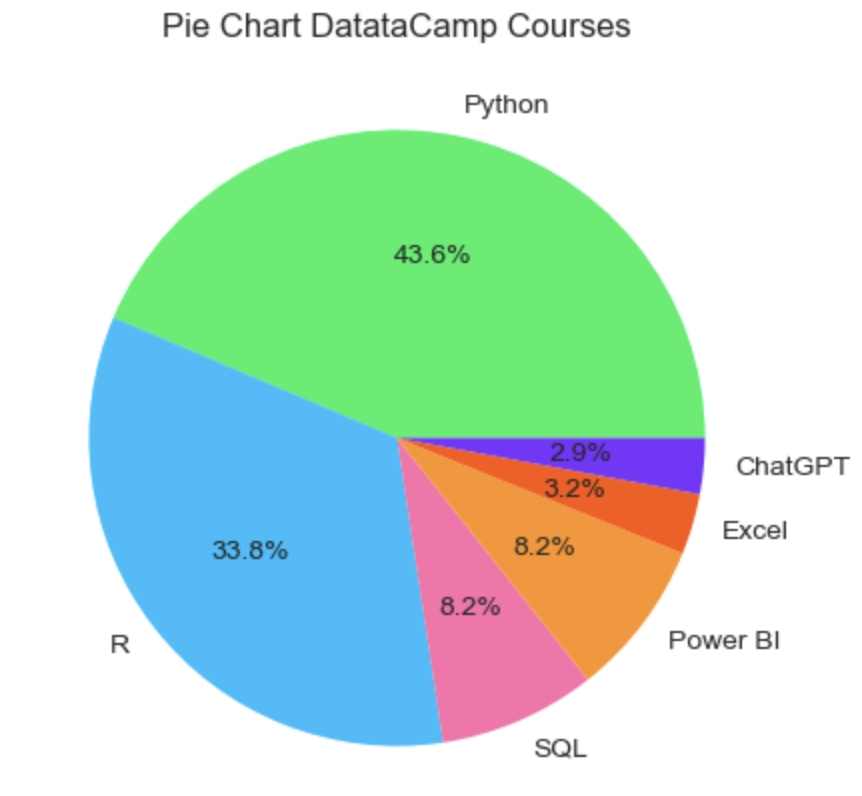
Saving pie charts in Pandas is exactly the same as in Matplotlib, as Pandas relies on Matplotlib under the hood.
ax= python_pie_chart_df['courses'].plot(kind='pie', labels=python_pie_chart_df['labels'], autopct='%1.1f%%',
                       colors=datacamp_palette, figsize=(5,5))

ax.set_title('Pie Chart DatataCamp Courses')
ax.set_ylabel(None)

plt.savefig('demo.png')To make sure your pie charts are displayed correctly, you must provide Matplotlib with the right data. That means you should always conduct data cleaning techniques in your dataframe, such as deleting null values with pd.dropna() and setting the right data types for your input columns.
Moreover, customization will be key in displaying a compelling and impactful pie chart. However, keep in mind that in case you’re using Pandas, advanced customizations like exploding may not be supported. As already mentioned, if you need more control over your pie chart, you may need to add Matplotlib code to your scripts.
When displaying your pie charts, you should stick to good practices.
Data visualization can be considered an art. Intuition and good taste can make a difference, but you should always consider the theory behind it. To know more about the best practices for effective data visualization, check out our Data Storytelling & Communication Cheat Sheet. Further, if you are working with dashboards, this article on Best Practices for Designing Dashboards is worth reading.
Truth be told, pie charts are among the most criticized plots. It’s been demonstrated that humans are not very good at interpreting angles. We can illustrate this with the pie chart we have used before. Consider the slices of Excel and ChatGPT. Can you tell at first sight which one has the biggest angle?
Arguably not, and that’s why many data visualization experts recommend using other charts to depict proportions, especially when dealing with many categories, such as bar charts and stacked bar charts, treemaps, or even donut charts. You can learn more about these alternatives in our article Types of Data Plots and How to Create Them in Python.
Congratulations on making it to the end of the tutorial. Python is a highly versatile programming language, offering several libraries and approaches to create pie charts. In this tutorial, we analyze how to create pie charts with Matplotlib and Pandas. Both are equally suitable for the job and have notable similarities. The idea is not to choose one but to use them interchangeably, according to your needs and workflow.
If you want to know more about pie charts and, more broadly, data visualization in Python, DataCamp is here to help you. Check out our dedicated materials to become and get ready to become a visualization wizard!
Learn with DataCamp
Course
Course
Course
cheat-sheet
Karlijn Willems
Tutorial
Samuel Shaibu
Tutorial
Kevin Babitz
Tutorial
Aditya Sharma
Tutorial
Elena Kosourova
Tutorial
Kurtis Pykes