
Course
Statistical Simulation in Python
4 hr
19.8K
The beauty of Sankey diagrams lies in their ability to simplify multi-stage systems. Instead of hunting through rows of data to find the largest energy losses or budget allocations, you can spot them instantly by looking for the thickest flows. This makes them useful for energy management, financial analysis, marketing funnel optimization, and any scenario where understanding the flow and transformation of resources matters more than precise numerical comparisons.
For those looking to expand your analytical capabilities beyond flow visualization, our Data Visualization in Power BI course and Data Visualization in Tableau course teach you to create professional dashboards and interactive reports using industry-leading business intelligence platforms.
A Sankey diagram is a specialized flow visualization where the width of connecting arrows represents the magnitude of flow between different stages, categories, or entities. Unlike traditional flowcharts that show process steps or bar charts that compare discrete values, Sankey diagrams excel at showing how quantities move, transform, or get distributed through a system.
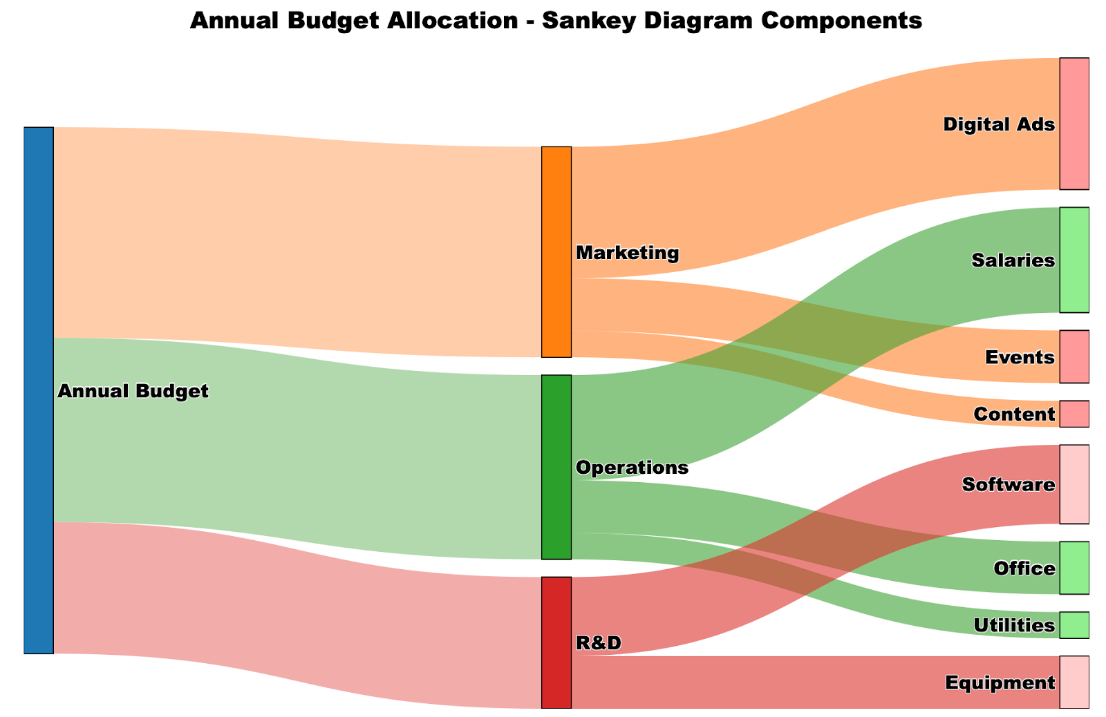
Sankey diagram components shown. Image by Author.
The diagram above illustrates how a $100,000 annual budget flows through different categories. Notice how the Marketing allocation ($40,000) appears as a visibly thicker flow compared to R&D ($25,000), making the proportional differences immediately apparent.
The first known Sankey diagram appeared in 1898 when Captain Matthew Henry Phineas Riall Sankey used it to show the energy efficiency of a steam engine. His diagram revealed that only a small portion of the fuel's energy actually contributed to useful work, with most being lost as waste heat.

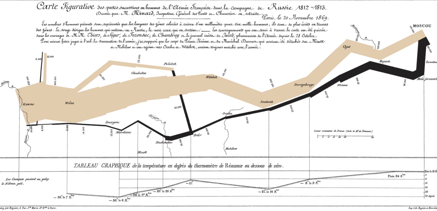
However, the concept of proportional flow visualization predates Captain Sankey. Charles Joseph Minard created what many consider the most famous flow diagram in 1869, depicting Napoleon's disastrous 1812 Russian campaign. Minard's diagram showed the army's diminishing size as it advanced into Russia and then retreated, with the line thickness representing the number of surviving soldiers.
Understanding the key elements of a Sankey diagram helps you both interpret existing ones and create your own effectively.
Creating Sankey diagrams requires different approaches depending on your preferred tools and technical comfort level. We'll walk through the same budget allocation example using Excel, Python, and R, so you can choose the method that best fits your workflow and expertise.
Excel doesn't include a native Sankey chart type, which means you'll need to use a third-party add-in to create these visualizations. In my experience, ChartExpo is one of the most popular and user-friendly options.
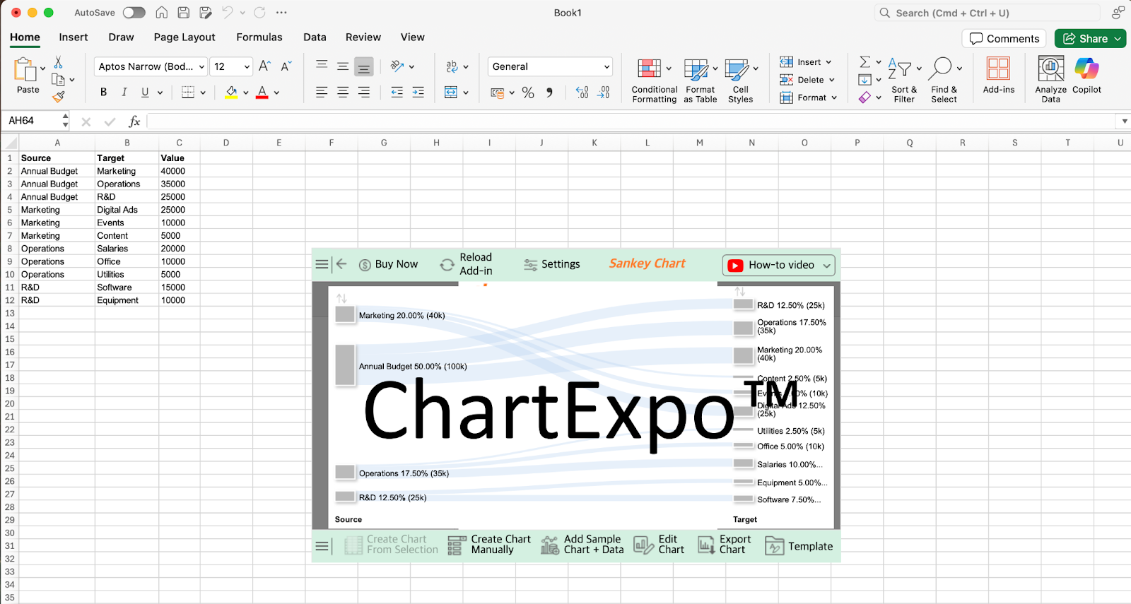 ChartExpo interface and Sankey diagram preview. Image by Author.
Before creating the diagram, you'll need to structure your data in a source-target-value format where each row represents one flow connection. For our budget example, this means listing each budget allocation as a separate row with the source category, target category, and dollar amount.
The process is straightforward once you have ChartExpo installed. First, install the add-in from the Microsoft AppSource or through Excel's add-in marketplace. Then, select your data range including the headers and choose Sankey Chart from ChartExpo's visualization options.
The add-in automatically detects your source, target, and value columns based on your data structure. As shown in the interface above, ChartExpo provides a preview of your diagram along with options to Create Chart From Selection, customize the visualization, or export the finished chart for use in presentations or reports.
Python offers excellent options for creating Sankey diagrams, with Plotly being the most recommended library due to its interactive capabilities and professional output quality. Using the same budget allocation example which we began with, we'll recreate that identical visualization through code.
Start by organizing your data into the format Plotly expects. You'll need three main components: a list of node names, and arrays specifying the source indices, target indices, and values for each flow.
import plotly.graph_objects as go

# Define all nodes in your diagram
nodes = ["Annual Budget", "Marketing", "Operations", "R&D",
         "Digital Ads", "Events", "Content", "Salaries",
         "Office", "Utilities", "Software", "Equipment"]

# Define the connections (using node indices)
source_indices = [0, 0, 0, 1, 1, 1, 2, 2, 2, 3, 3]
target_indices = [1, 2, 3, 4, 5, 6, 7, 8, 9, 10, 11]
values = [40, 35, 25, 25, 10, 5, 20, 10, 5, 15, 10]
The indices correspond to positions in your nodes list, so source_indices = [0, 0, 0] means the first three flows start from "Annual Budget" (position 0).
Create the core diagram structure using Plotly's Sankey object. The essential parameters are the node definitions and link specifications.
fig = go.Figure(data=[go.Sankey(
    node=dict(
        label=nodes,
        pad=15,
        thickness=20
    ),
    link=dict(
        source=source_indices,
        target=target_indices,
        value=values
    )
)])
This creates a functional Sankey diagram with default styling. The pad controls spacing between nodes, while thickness determines how wide the node rectangles appear.
Enhance your diagram with colors, improved layout, and professional formatting.
# Add colors and transparency
fig.update_traces(
    node_color=["#1f77b4", "#ff7f0e", "#2ca02c", "#d62728",
                "#ff9999", "#ff9999", "#ff9999", "#90ee90",
                "#90ee90", "#90ee90", "#ffcccb", "#ffcccb"],
    link_color=["rgba(255, 127, 14, 0.4)", "rgba(44, 160, 44, 0.4)",
                "rgba(214, 39, 40, 0.4)", "rgba(255, 127, 14, 0.6)",
                "rgba(255, 127, 14, 0.6)", "rgba(255, 127, 14, 0.6)",
                "rgba(44, 160, 44, 0.6)", "rgba(44, 160, 44, 0.6)",
                "rgba(44, 160, 44, 0.6)", "rgba(214, 39, 40, 0.6)",
                "rgba(214, 39, 40, 0.6)"]
)

# Update layout for better presentation
fig.update_layout(
    title="Annual Budget Allocation",
    font=dict(size=16, family="Arial Black", color="black"),
    width=900,
    height=600
)Display your diagram and save it in various formats for different uses.
fig.show()  # Display in Jupyter notebook or browser

# Export options
fig.write_html("budget_sankey.html")  # Interactive web version
fig.write_image("budget_sankey.png")  # Static image
For web applications, you can integrate this directly into Dash apps, making your Sankey diagrams part of interactive dashboards. The resulting visualization matches exactly what we saw in the opening visual. We have a great code-along that teaches you how to Build Dashboards with Plotly and Dash so you can try this idea for yourself.
R provides excellent capabilities for creating Sankey diagrams through the networkD3 package, which creates interactive, web-ready visualizations. Using our familiar budget allocation data, we'll demonstrate how R can produce the same professional results with built-in interactivity features.
The networkD3 package is specifically designed for creating D3.js-powered network visualizations in R, including Sankey diagrams. This approach offers several advantages: automatic interactivity (hover effects, zooming), easy integration with R Markdown reports, and seamless export options for web deployment.
First, install and load the required packages, then structure your data in the format networkD3 expects.
# Install required packages (run once)
install.packages(c("networkD3", "dplyr"))

# Load libraries
library(networkD3)
library(dplyr)

# Create nodes dataframe
nodes <- data.frame(
  name = c("Annual Budget", "Marketing", "Operations", "R&D",
           "Digital Ads", "Events", "Content", "Salaries",
           "Office", "Utilities", "Software", "Equipment")
)

# Create links dataframe (note: networkD3 uses 0-based indexing)
links <- data.frame(
  source = c(0, 0, 0, 1, 1, 1, 2, 2, 2, 3, 3),
  target = c(1, 2, 3, 4, 5, 6, 7, 8, 9, 10, 11),
  value = c(40, 35, 25, 25, 10, 5, 20, 10, 5, 15, 10)
)
The key difference from Python is that R requires separate dataframes for nodes and links, with the links dataframe using zero-based indexing to reference node positions.
Create your diagram using the sankeyNetwork() function with essential parameters.
# Create basic Sankey diagram
sankey_plot <- sankeyNetwork(
  Links = links,
  Nodes = nodes,
  Source = "source",
  Target = "target",
  Value = "value",
  NodeID = "name",
  units = "K USD"
)

# Display the plot
Sankey_plot
This generates an interactive Sankey diagram where users can hover over flows to see exact values and drag nodes to reorganize the layout.
Enhance your diagram with colors, sizing, and professional formatting options.
# Advanced Sankey with customization
(sankey_advanced <- sankeyNetwork(
  Links = links,
  Nodes = nodes,
  Source = "source",
  Target = "target",
  Value = "value",
  NodeID = "name",
  units = "K USD",
  fontSize = 14,
  fontFamily = "Arial",
  nodeWidth = 30,
  nodePadding = 20,
  margin = list(top = 50, right = 50, bottom = 50, left = 50),
  height = 600,
  width = 900
))R makes it easy to save your interactive diagrams in multiple formats and integrate them into reports.
# Save as HTML file
library(htmlwidgets)
saveWidget(sankey_advanced, "budget_sankey.html", selfcontained = TRUE)
# For R Markdown integration, simply include the plot object
# The diagram will render as an interactive widget in your document
# For static image export (optional - requires webshot2 package)
install.packages("webshot2")
library(webshot2)
webshot("budget_sankey.html", "budget_sankey.png", vwidth = 900, vheight = 600)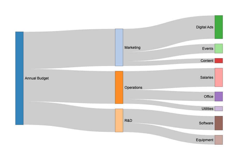 Interactive Sankey diagram created with R's networkD3 package. Image by Author.
This resulting diagram provides the same visual insights as our Python and Excel versions, but with built-in interactivity that helps users explore the data more thoroughly.
Sankey diagrams work best when you have clear directional relationships between categories, where the magnitude of flow matters more than precise comparisons. However, several situations call for different visualization approaches.
Avoid Sankey diagrams when there's no directional flow between your categories. If your data simply shows different groups or classifications without movement between them, bar charts or pie charts will communicate your message more clearly. For example, comparing market share across different companies doesn't involve flow, so a bar chart would be more appropriate.
Skip them when you need precise numerical comparisons. While Sankey diagrams effectively show relative magnitudes, the varying widths make it difficult for readers to extract exact values or make detailed comparisons. If stakeholders need to compare specific percentages or amounts accurately, tables or bar charts serve better.
Consider alternatives when your data becomes too complex and clutters the diagram. With more than 10-15 nodes or highly interconnected flows, Sankey diagrams can become visually overwhelming. The crossing lines and overlapping flows make it hard to follow individual paths through the system.
Choose simpler visualizations when your audience is unfamiliar with Sankey diagrams. Since they're less common than bar charts or line graphs, some audiences may focus more on understanding the format than interpreting your data. In presentations to general audiences, stick with familiar chart types unless the flow relationship is essential to your message.
Alluvial diagrams work better for categorical or time-based flows where you're tracking changes across multiple time periods or stages. While Sankey diagrams show quantities flowing through a system at one point in time, alluvial diagrams excel at showing how categorical data evolves. For example, tracking how voters move between political parties across multiple elections, or how students change majors throughout college, fits alluvial diagrams better than Sankey diagrams.
Parallel coordinate plots serve better for comparing multivariate data where you want to see patterns across multiple dimensions simultaneously. These work well when you have many variables for each data point and want to identify clusters or outliers. For instance, comparing cars across price, fuel efficiency, safety ratings, and performance metrics works better with parallel coordinates than trying to force these relationships into a flow format.
Bump charts handle rank changes over time more effectively than either Sankey or alluvial diagrams. When you're showing how different entities move up or down in rankings over time periods, bump charts clearly show the trajectory without the visual complexity of flows. Think of tracking how different companies' market positions change over quarters, or how sports teams move through league standings over seasons.
To learn more, read our Top 5 Business Intelligence Courses to Take on DataCamp blog post, which provides guidance on building expertise with the important BI tools.
Successful visualization depends on choosing the right tool for your specific situation. Use Sankey diagrams when directional flow relationships matter more than precise numerical comparisons, and when your audience needs to quickly identify the most significant flows in a system.
For readers interested in expanding beyond Sankey diagrams, our 10 Data Visualization Project Ideas for All Levels blog post provides hands-on project suggestions across different complexity levels to build your visualization portfolio. These projects help develop critical thinking skills and create tangible evidence of your data visualization capabilities.
Learn with DataCamp
Course
Course
Course
Tutorial
Samuel Shaibu
Tutorial
Derrick Mwiti
Tutorial
Laiba Siddiqui
Tutorial
Samuel Shaibu
Tutorial
Elena Kosourova
Tutorial
Elena Kosourova
